Reader Redesigns
Check out hundreds of amazing home makeovers, DIY projects, and awesome ideas that talented readers shared with us. We can't pick a favorite - they're all so inspiring!
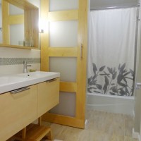
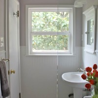
A Full Bathroom Reno For Under $2000
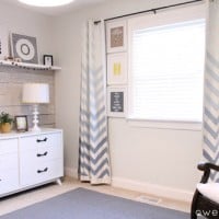
A Peaceful Gray & White Nursery

Painting A Multi-Colored Houndstooth Stencil On The Bedroom Wall
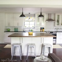
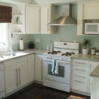
A White Kitchen Makeover With White Tile & A Butcher Block Island
A Small Bathroom Update With Teal Glass Tile
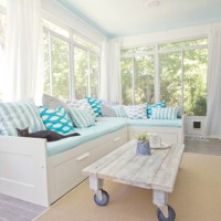
A Sunroom Makeover With Wood Tile By Jenna Sue
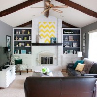
A Painted White Brick Fireplace In A Vaulted Living Room
A White Kitchen With Green Glass Mosaic Backsplash Tile
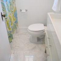
Updating A Bathroom With Marble Tile & Beadboard
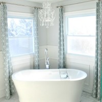
A Dreamy White & Gray Bathroom With Box Molding
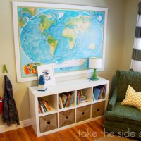
A Sweet Blue Boy’s Nursery Makeover With Bunk Beds
- « Previous Page
- 1
- 2
- 3
- 4
- 5
- …
- 20
- Next Page »