Furniture Upgrades & Building Stuff
Check out a ton of furniture upgrades and tips for things like Ikea hacks and other simple projects to update your home on a budget. Find detailed instructions for building stuff and making your space more organized and upgraded.
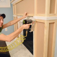
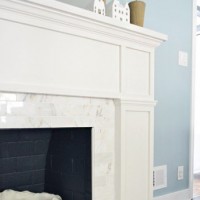
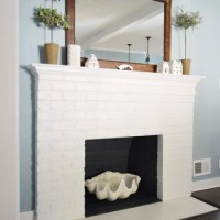
How To Build A Fireplace Mantel
How To Hide The Cable Box With A Remote
Planning & Buying Materials For A Fireplace Makeover
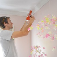
How To Install Crown Molding
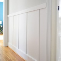
Board & Batten For Less Than $60
Using Annie Sloan Chalk Paint And Soft Wax
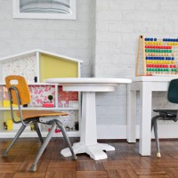
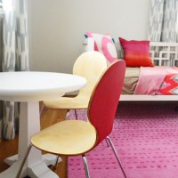
Cutting Down A Table To Make A Kids Table
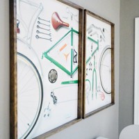
How To Make Wood Frames For Large Art Or Posters
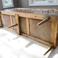
How To Clean And Restore Old Wood Furniture
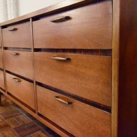
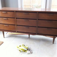
Thrift Store Find: A Dresser We’ll Make Into A Media Cabinet
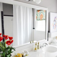
How To Build A Wood Frame Around A Bathroom Mirror
- « Previous Page
- 1
- …
- 4
- 5
- 6
- 7
- 8
- …
- 13
- Next Page »