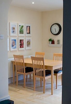
Check out this amazing kitchen mini-makeover from one of our readers all the way in England. It’s amazing what a few frames and some homemade art can do for a blank kitchen wall.
[ Read More ]
Home Decorating & DIY Tutorials
Check out this amazing kitchen mini-makeover from one of our readers all the way in England. It’s amazing what a few frames and some homemade art can do for a blank kitchen wall.
We’re going back, waaaay back, to bring you some pictures of our old NYC apartments (chock full of some crafty and cheap ideas for small spaces). And don’t miss the accompanying video tours too.
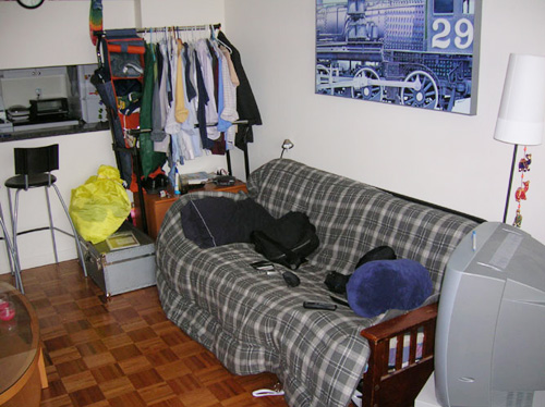
Our life of designing spaces together started very humbly when John wooed Sherry while living on this futon in the corner of a living room.
Check out a sweet and super simple idea that can help you remember every fun and fabulous vacation detail that you’d ordinarily forget a year later. Enter “Project Postcard” stage left.
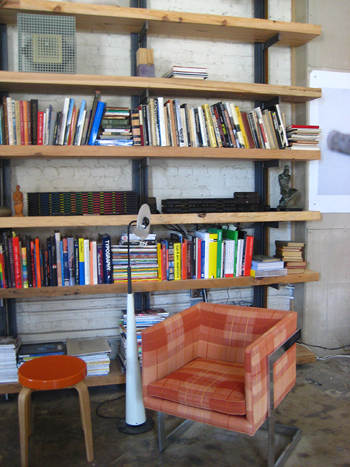
Check out the insanely cool studio that we crashed with industrial details and a modern edge. From the reclaimed wood shelving to the original concrete floors, this space is a must see.
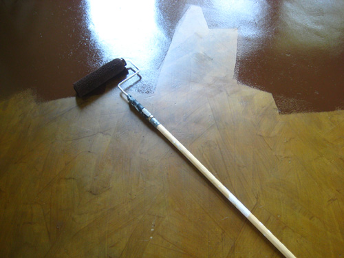
Check out this easy five step process to paint any floor with ease. Honestly, it’s no sweat.
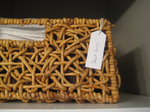
Check out this closet organization idea that’s fun and free!
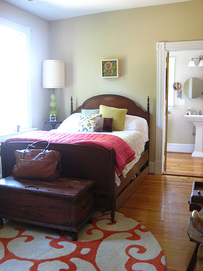
Take a tour of a completely renovated home that went from drifters and addicts to designer style and eclectic attitude. A must see transformation.
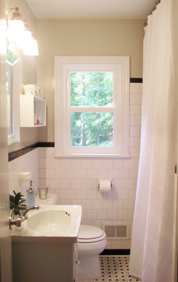
Here’s another easy bathroom update- an extra long shower curtain can swankify the whole room. Adding height and drama has never been easier.
Eeks! There are lots of chemicals in the air in your home, but there are quick and easy things you can do to keep your house safer for you, your children and your pets.
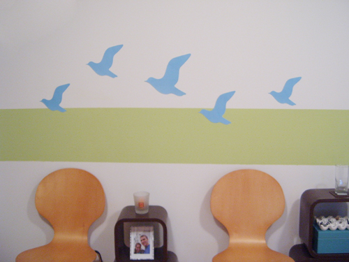
Check out this fast and fabulous chair makeover for under $12 and about 10 minutes of work. Gotta love bond-to-anything-spray-at-any-angle spray paint.
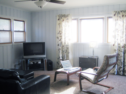
Check out this cheap family room makeover. It’s pretty hard to believe that everything cost less than $250! Pick up some tricks that you can use in your home!