Reader Redesigns
Check out hundreds of amazing home makeovers, DIY projects, and awesome ideas that talented readers shared with us. We can't pick a favorite - they're all so inspiring!
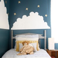
A Graphic Kid’s Bedroom Makeover
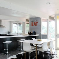
A Mid Century Modern Kitchen Renovation
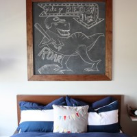
A Big Boy Bedroom With Orange & Navy
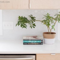
A Modern Kitchen With Blonde Wood Cabinets
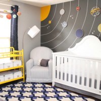
A Nursery With A Planet Wall Mural
A Marble & Dark Wood Bathroom
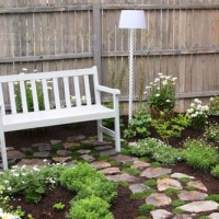
A Beautiful DIY Secret Garden
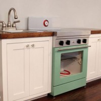
A Cute Play Kitchen With Light-Up Burners
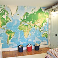
A Kids Bedroom With Map Wallpaper & Bunk Beds
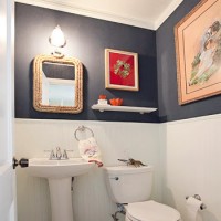
A Nautical Bathroom Renovation
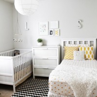
A Shared Nursery With A Crib & A Bed
- 1
- 2
- 3
- …
- 20
- Next Page »