We’re about to hop on a plane back from Boston (which is thankfully not canceled, despite the snowy weather), so this post is up a little early for ya but your comments might not pop up for a little while. Anyway, we’ve debated potential colors for the walls in this hall bathroom from almost the day that we moved in. For a while we were on the deep blue train, but after putting that in the adjacent guest bedroom, we’ve been going back and forth between several other options. Dark? Light? Colorful? Muted?
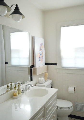
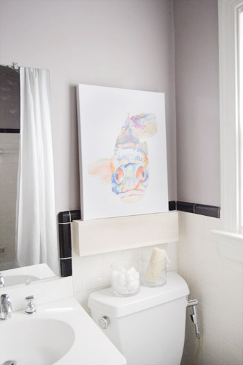
We finally found our focus when we put that bright fish painting on our whitewashed shelf. Suddenly we had a direction. Toned-down-but-not-completely-neutral walls with colorful accents (sort of like we’ve been doing throughout the rest of our house, but this time with a new undertone – plum). Yup, we went for it. Sherry flipped through our paint deck and plucked out Elephant Gray by Benjamin Moore (we went for a nice bathroom-friendly satin finish, and only needed a quart for the job). Like many of our walls, it was grayish – but unlike Moonshine, it had a warmer plummy undertone to it.
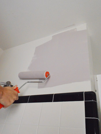
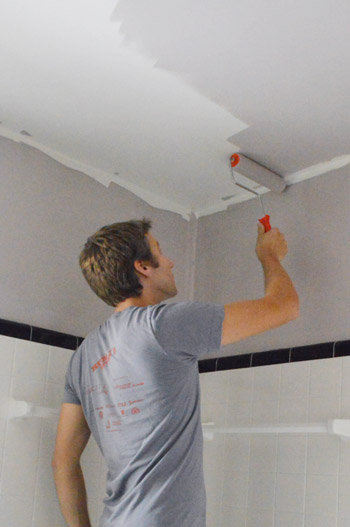
Just like we’ve done in our other bathrooms, we chose to paint the ceiling the same color as the walls. We find that in small rooms like these it actually makes the room feel bigger because the ceiling isn’t some jarring white plane and it all feels seamless and lofty. The pic below is a bit grainy because I had to zoom way in. My painting outfit involved just boxers and while maybe I should be flattered that Sherry thought that was worth sharing, I decided we should maintain some mystery in my relationship with you guys…
It wasn’t until we finished that we both stepped back and said “oh yeah, this kind of reminds us of Granny’s bathroom.” We were both so happy with how her bathroom makeover turned out, perhaps it was a subconscious inspiration. They look more similar in these photos than they do in person, since Granny’s “Hint of Violet” was lighter and felt more purple than gray while ours is definitely darker and more plummy (less pinky and pastel than Granny’s).
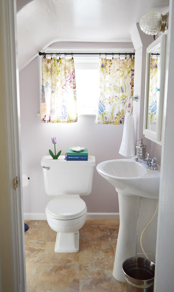
But either way, the idea of having a Granny-inspired bathroom in our own house is kind of awesome.
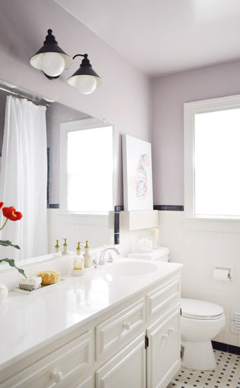
See how it pulls from the painting a bit, while providing a nice backdrop for the brighter oranges and blues – which we’ll definitely be bringing out a lot more with some crazy bold fabric that Sherry wants to use for a roman shade.
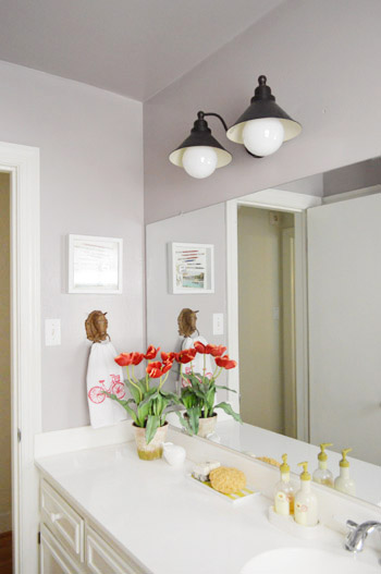
Here’s the other side of the room too. It’s nice that the soft and moody tone of the paint looks nice with some of the metal accents – like our iron horse head towel hook and the ORB light – to fit right in. But looking at these photos, it makes it painfully obvious how much we need to frame out that builder-bland mirror. Soon I hope!
That’s probably next on our list. Well, that or making a roman shade. Sherry’s got fabric hanging around that she’s been dying to use so we’ll see who wins and gets ‘er done first. #maytheoddsbeeverinmyfavor
The best part about this latest update? That fact that we’re making the existing tile work. I was not excited at the idea of busting that stuff out and starting all over, and it’s in much better shape than the tile in our first house’s bathroom, for which we’re eternally grateful! You know we love to use what we’ve got. So thanks to just a quart of paint, the room definitely looks a lot more polished and welcoming than it did just a few days ago:
What are you guys painting? Are you psyched that we went with a plummy gray after dropping the word plum at least thirty times in the past two years since we moved in? I gotta say, I’m a dude and I love my plum bathroom. Just don’t call it purple. For some reason that’s not nearly as enticing…

Joules (from Pocketful of Joules) says
I’m doing my own little hallway bathroom update (switched out some, um…groovy dark green pieces — a toilet and sink. blegh) and I think you guys have convinced me to paint the ceiling too. Love the color and can’t wait to see the finished room! =)
YoungHouseLove says
Aw thanks Joules! Good luck!
xo,
s
Liz E. says
Love it! We don’t have much painting going on now (definitely on our list, but the drywall has to come first haha). One thing we are working on now is upgrading our 70s era light fixtures. Do you have any tips on choosing a finish? I LOVE the ORB light you have in the bathroom here and would love to use that scheme in our house! Unfortunately, though, we had started replacing lights before now and have some brushed nickel going on…. What are your thoughts of mixing vs. matching?
YoungHouseLove says
We love to mix and match! As long as you have a few things in each finish (ex: a brushed nickel faucet and shower set with an iron towel bar, ORB light, and ORB doorknob) it’s all good! We have some ORB lights and other nickel ones throughout our house :)
xo,
s
Lindsay says
Along with your Mixing and Matching response – How do you feel about mixing ORB and shiny brass? Our house is outfitted with shiny brass door knobs, hinges, lighting, etc. I would love to refinish everything in ORB spray paint (using your technique of course), but am concerned about hinges and interior door knobs not holding up after painting. My husband is also not a fan of removing and painting every door hinge and fan currently sporting a shiny brass finish. I was thinking of redoing all of the lighting for now and leaving the knobs, but am not sure how well ORB and brass ‘go together’.
YoungHouseLove says
Hmm, I have sort of a hatred towards shiny brass, so personally I would love to spray all of our knobs (we have many of them too) in ORB and then just replace the hinges and plates since those aren’t too expensive I hope (haven’t looked into it, but I think for resale it’s an awesome upgrade to do, so you’d probably not be wasting money).
xo
s
Lindsay says
Thanks so much! Glad to know I’m not the only one with a strong dislike for shiny brass fixtures! Can’t wait to meet you both in Chicago this weekend!
YoungHouseLove says
Yay! So excited!
xo,
s
Crystal @ 29 Rue House says
I’m in the same boat as Liz E. I think mixing and matching is great but I just wanted to suggest to Liz that if she doesn’t like one of her brushed nickel lights she could always ORB it. I haven’t done this yet but that is also because my brushed nickel lights are boob lights so I just want to get rid of them altogether now. :)
Liz E. says
That makes me feel better! I feel like my “tastes” change frequently, and I often like so many different styles that sometimes I wonder how/if they can even go together!
Thanks for taking the time to respond. Hope you’re having a blast with your book tour!
YoungHouseLove says
Of course! You’re so sweet!
xo
s
susan says
I never considered painting the ceiling anything but white but, given Clara’s room and now this bathroom, I’m starting to re-think that attitude. Also, love the plummy paint color in the bathroom. It actually makes the room seem brighter than having it all white.
Janice says
Love it!! And I love the floating shelf although I dont think I commented on that post the other day. Definitely going to do something similar somewhere in my house. Still working on that basement right now though………argh.
Shannon says
I absolutely LOVE the color with the black and white tiles! Looks great! :) We are actually painting our teeny tiny under-the-stairs half bath in a very similar grey with purplish undertones! :) We painted the ceiling, too to make it look much larger! :) I’ll have to share some before and afters when we’re finished. 0:)
We are also currently remodeling our full bath if you’d like to take a peek here! :)
Shannon
Fabulously Vintage
YoungHouseLove says
Looks awesome!
xo,
s
Carla says
That looks awesome! And it really is amazing how much that grey looks like the “P” word that John doesn’t want to use!
YoungHouseLove says
Hahah!
xo
s
lizaanne says
Gorgeous color!!! The fishpic really pops on the soft plummy gray.
I just got two yards of black on white modern toile ( http://www.etsy.com/listing/73453247/oilcloth-by-the-yard-toile-black ). I plan to cover the top of our coffee table which is a black wrought iron frame with just a drop in top, and the top of a square storage ottoman – I’ll be painting the ottoman a shiny white enamel. With two kitties and a husband, I needed something that looks good, but can be wiped off easily after paw prints and spilt coffee. I think this should do it!! I will start painting and stapel-ing this weekend!! woohoo!!
YoungHouseLove says
Sounds so pretty!
xo
s
mary @ B&Gjournals says
i completely would have thought painting the ceiling would have the opposite affect but it looks great. and i’m still so impressed that you all never have to tape off with painter’s tape–sherry has such impressive cutting in skills
YoungHouseLove says
Aw thanks Mary! It comes from years of practice! I think anyone can do it with practice, because I’m a clutz. Haha!
xo
s
Lil says
That paint brush they recommended a while back makes ALL the difference…and it has to be that one…not the one on the counter that looks like the same thing at the big box store.
This paintbrush changed my life.
Premium XL Tight Spots 2? Angle Short Handle Brush
https://www.younghouselove.com/how-to-paint-trim-like-a-pro/
Melanie says
Wow I love it. It’s such a soft plum and it looks awesome with the fish! PS: as I was reading, I wondered if you would keep the black tile. #greatminds
PS: the fiance surprised me with a late bday gift yesterday… your book! So pumped!!!
YoungHouseLove says
Aw so sweet!
xo
s
Amanda says
loving the color! i wish our hall bathroom could have been saved with just a little paint and accessories… we recently tore everything out and are now working like crazy to get it all put back together before my family comes for Thanksgiving!
Maya says
Amazing difference!! The tile looks so much brighter with the new paint color!
Emma (Broke Ass Home) says
We’re pretty much doing the exact same thing. We’re finally done painting the cabinets and the walls. Next up, toilet, flooring, framing the mirror and working with the molding.
http://www.brokeasshome.com/2012/11/while-you-were-gone.html
Never a dull moment! It seriously does amaze me how much a $10 quart of paint can change a room though. Amazing. I think you guys need some sassy drawer pulls!
YoungHouseLove says
Love that!
xo
s
Sayward says
Holler!!!Plum undertones for the win! I’m moving into a new rental next month and I’m allowed to paint, so this has me all excited. Be safe in your travels :)
YoungHouseLove says
Thanks Sayward!
xo
s
littleoakcreations says
Wow! I would have never guessed that a color with a plum undertone could look so AWESOME! I agree with everyone else – the room actually looks brighter! And I bet it’s just a trick of the monitor, but those black tiles actually look like a deep plum now? Weird! But I like it! haha!
Petra says
Love the color! What texture did you use for the ceiling?
YoungHouseLove says
We didn’t use any texture (it’s all the same satin quart of paint that we just rolled on the walls and ceiling). Hope it helps!
xo
s
Marissa says
This color looks really nice! I actually have the same exact tile in my closet sized bathroom. Any tips on how to keep it clean and nice looking? My husband hates it, but I love the vintage look.
YoungHouseLove says
We cleaned our old house’s tile with some sort of peroxide that we found at the store (maybe search peroxide and tile on our sidebar and see it that post comes up? It seemed to work!
xo
s
Tracie@MiddleClassMod says
This is my 2nd house with old tile bathrooms, and this cleaned the grossest old tile I’ve ever seen. http://pinterest.com/pin/115475177916722915/
The secret seems to be using almost boiling water to rinse with. It really finishes getting all the nasties up.
I’ve been debating painting the ceiling when I paint our half-tiled hall bath, and now y’all have convinced me its totally worth it.
Christina @ Homemade Ocean says
Oh la la….looks great guys!
Do you know if the Chicago signing is sold out? When you announced I kept trying to RSVP but couldn’t get onto the site. Now it says something like registration is closed.
I will be devestated….but I would rather know if I wont get in before the 12 hour round trip :)
YoungHouseLove says
Oh yes, I would call the store. From what we understand if you get there early and line up they’re happy to let everyone in. I’d call though just to be sure. Hope to see you there Christina!
xo
s
leah says
We have the exact same tile in our bathroom–I’ve been trying to figure out how to get rid of it, but a good paint color is way easier and looks great too. thanks for the inspiration!
Diane says
Love your existing tile! Glad you kept it. Can’t wait to see the mirror framed. Do you decorate this room for the holidays?
YoungHouseLove says
Yes, we can’t wait!
xo
s
Danielle says
We are repainting the brand new trim we just installed, despite having spent 3 nights in the garage painting it so that all we had to do were touchups once installed. I several hours this week puttying the nail holes and “touching up” the paint. What I didnt realize until the whole room was done was that I used bright white ceiling paint for my touchups, instead of the nice creamy white they were painted. OOPS! This is what happens when you try to be mommy and painter at the same time. Needless to say, I will be spending this weekend repainting, in the correct color!
YoungHouseLove says
Oh no! Good luck Danielle!
xo
s
Cate says
Long time lurker de-lurking to say that I love the change the new colour makes (wasn’t a fan of the shelf I think just because the room still seemed sterile). And that I think this is THE colour I’ve been looking for to do my bedroom (similarly suffering from sterility after painting the walls white…which was an anything-is-better-than-the-previous-swamp-green decision).
A question, though….is there an easy way to colour match between brands? Like if I don’t want to use Benjamin Moore?
YoungHouseLove says
Sure! If you bring a swatch of it to a bog box store they can scan it or even just look up the color in the computer to match it. Hope it helps!
xo
s
Marissa says
Thanks S! I’m so sad I missed you guys in Ridgefield, NJ, we just couldn’t make it out with the storm (housing family who had no power, etc), I hope you’ll be able to reschedule NYC!!
YoungHouseLove says
Yeah we can’t wait! Sounds like we will, so I’ll keep you posted!
xo,
s
NYer says
oh, yes, I know the FLOR store is downtown, like we are, in the no-power zone last week, but we are so looking forward to having you here in NYC. Thanks! We can certainly use some brightness and good times (though Tuesday’s election certainly raised a lot of spirits!)
YoungHouseLove says
Wahoo! We can’t wait!!
xo
s
Maggie says
I’m taking a cue from you guys and changing the colors in a few rooms, the guest bedroom from a vibrant green and the kitchen from a pale turquoise to a greyish white by SW called Rhinestone. I used a color called Flexible Grey by SW in my master bedroom that looks light plum during the day and dark grey at night – my husband love it too!
YoungHouseLove says
Sounds so pretty!
xo,
s
Cristina says
The wall color looks really nice with the tile! Very cute! You’re lucky you just have black and white to work with. In my first rental we had the same kind of tile but it was cracked salmon pink. Yuck, haha!
Jillian {Her Split Ends} says
ohhhhhhh i love it!! what a difference it makes just adding that nice lovely subtle color!!
CHeers
~ Jillian
http://www.hersplitends.com
Melanie @ MJ says
I love that purple – it’s like the perfect shade of purple too! It’s amazing what a little paint can do for a room. Have a safe flight!
Melissa M says
Looks great you guys!
Julianna Strachan says
I’ll be waiting for the fabric roman shade post patiently….I’m planning on introducing some fabulous color into our small bathroom wih that strategy! Your book arrived yesterday. Lets all hope for a great morning nap from baby, soni can read a chunk!
YoungHouseLove says
Wahoo! Hope you love it.
xo,
s
treeclimber5 says
Love the the color! My family put a large sunroom on the house and ended up using a similar color. It changes with the light from gray to more plum and is gorgeous! Love the painting too.
Heather says
I love that painting! Did you make it? And the reference to the Hunger Games= Awesome! Safe travels!!
YoungHouseLove says
I wish I made it! Haha. It’s from joss and main (30 bucks for that big canvas wrapped print!)
xo,
s
Laura @ Chaotic Domestic says
It looks great. I’m glad you said it has “plum” (not purple) undertones. Sometimes it’s hard to truly tell in pictures. I have a hard time choosing gray paints because it’s tough with the undertones. The last gray I chose ended up kind of a blueish color. I want to paint our entryway a light gray, but am nervous about choosing the right color. I don’t want to be surprised by how it turns out. Any suggestions for a True Gray? Since it’s such a large space and gets a lot of light, I want to get the color right. Plus, we’ll need scaffolding, so I really don’t want to do it twice. :)
YoungHouseLove says
We love Moonshine and Gray Horse which are both pretty true grays in our house, but lighting can change that so getting a test pot after bringing swatches home can ensure a choice is really what you think it is! Good luck.
xo,
s
sara says
One tip I’ve read to determine the undertones in a paint color is to look at the bottom-most (darkest) swatch on the color card with your chosen swatch. That will help you determine if the grey is more purple, green, or blue. In my opinion, moonshine is on a card with an olive green undertone, so for that reason I had to avoid it. I am also looking for a true grey for my bathroom and the ones I’ve liked so far have charcoal-like colors at the bottom of the swatch card.
Carissa T says
Love the color! we just finished painting our whole entire house. Ceiling and closets included! It took forever to do but I totally love all the colors we chose. Benjamin Moore sure has some great colors
kyle says
HOLY COW! What a difference a coat of well thought out paint can make! It looks like a completely different room (polished, classy, and cozy at the same time). It even makes the retro tile look awesome and purposeful. I am blown away. Virtual high five, y’all!
YoungHouseLove says
Aw thanks Kyle!
xo,
s
Christina P. says
Luuuurve the gray color! It really does the room look more polished.
Leaving Cville at 4 to get dinner and then see you guys at R Home for the Holidays! So excited slash awkwardly nervous to see you guys!!
I know you’re traveling today and super busy but I couldn’t find any info anywhere about whether or not there’s a dress code for the event tonight. Wine and hors d’oeuvre and a silent auction sounds pretty fancy! Do you happen to know?
YoungHouseLove says
We have gone that past few years and it’s always fun! Jeans and a blazer with heels and big earrings are usually my outfit of choice. Hope it helps!
xo,
s
Kenzer @ Interiors By Kenz says
I love the idea of painting a ceiling in a small space.
I’ll be painting our trash-tastic bathroom soon, and when I do, the ceiling will be painted as well.
Be safe in your travelz. Word.
Anne says
I like it! Funny, I just painted a swatch of Elephant Gray from Behr Ultra yesterday in our living room. It’s a muddier gray/brown though! (I also got a test pot of your master bedroom color from BM. Haven’t put that up yet.) I hope the charity auction raises lots of money!! You’ll have to tell us what goes for the highest dollar. That might be a fun report. :-)
kaycee says
Love it! And now I need to go paint my ceilings, thanks lol!
Kathleen Copeland says
Wow! This paint makes a HUGE difference. So good!
Liz B. says
Hey guys! I love the color you chose for the walls, but it got me to thinking that the shelf you built to hide the soap dish, could look really awesome if it were painted a navy blue or dark purple. Just a thought. :-)
YoungHouseLove says
Love that! I’m definitely open to painting it as the room comes together! Will keep you posted.
xo,
s
Darcy says
I absolutely love the color. It’s so fresh and cheerful. I read above where you said you like to mix and match your finishes, but I would have such an impulse to ORB the heck out of the faucets and the horse towel ring to tie everything together. The way you have the hits of black in the tile and on the wall and with the light fixture, I think it would tie everything together and look super chic. To each his own though. It looks fabulous either way!
YoungHouseLove says
Oh yes, if money were no object I’d get a gorgeous ORB faucet. Although we have a chrome faucet in the kitchen with an ORB and mercury glass light above it and we love the mix!
xo,
s
Heather W says
I really really love this color!! It looks so good with the black and white you have in there. Just curious did you get this color matched like usual or did you get it straight from BM. I just wondered how close they got to the real deal if you color matched it.
Can’t wait to see what fabric you use for your blind!
YoungHouseLove says
We went straight from them. Ever since we used their paint for the kitchen cabinets and our master bathroom we have loved the coverage.
xo,
s
Samantha says
Do you guys not have textured ceilings? I can’t believe I haven’t noticed that before!
YoungHouseLove says
We’ve never had them! Maybe it’s a Richmond thing?
xo,
s
Carolyn says
Love the color and the bathroom! I’ve been debating what color to paint our upstairs (one big, all-paneled room) so there’s test stripes everywhere on the walls. For some reason the lighting up there makes everything look different, so it’s a trial-and-error process. Perhaps Elephant Gray will have to go in the mix. Safe travels and see you in Minnesota!
Karen says
Love the Plum gray! It helps to update the room an honor the vintage vibe at the same time. Hope you guys have a safe flight home, and I apologize on behalf of Boston for it’s not-so-warm welcome. I blogged about last night’s signing over on my blog: http://yearofserendipity.wordpress.com/2012/11/08/sherdog-and-j-boom/
YoungHouseLove says
Ahhhhh! I love your post. And I loved meeting you!! Thanks so much for coming out. You guys were all so sweet and friendly and awesome and we didn’t mind the weather at all because you guys were sunshine in a room. A well-styled West Elm room. Hahah! Thanks again for coming and having so much fun with us! We love you guys for braving the snow.
xo
s
katie says
Quick question for you….do y’all take everything down when painting (ie. the light fixture above the mirror and the horse head towel holder?) or paint around them?
YoungHouseLove says
This time we took them down. Sometimes I just edge around things but we did it right this time. Haha.
xo,
s
Elaine says
We got new windows recently and I’ve needed to touch them up for weeks now. The previous owners did the whole sand in the paint thing, so this touch up is just a little bit more complicated. Enough to make me put it off for weeks. Wish me luck!
YoungHouseLove says
Lots of luck!
xo,
s
Sarah J. says
love the plum with the black and white tile. it softens the room up a little without it feeling too “girly”. :) thanks for sharing these posts that show a little change can make a bit difference!
Cara says
It looks so much better. I was thinking the same thing before I read on “they really need to frame out that mirror”. Whitewash on the frame may be nice. My next painting project is to stencil the fireplace wall. If that goes well then I will stencil our long, narrow, boring hallway. Then painting out the red wall to dark teal in the kitchen. I also plan to repaint our master bedroom and guest bath. Lots of painting and we just painted the whole house 3 years ago when we moved in. I liked reading in your book that “it is okay” to change your mind. I feel like my style has changed a lot since we first moved to this home.
Rebecca says
On a separate note: I opened the Washington Post and went to the Local Living Fairfax Edition and found this article: http://www.washingtonpost.com/lifestyle/home/design-books-of-2012/2012/11/05/ec6d0710-2369-11e2-8448-81b1ce7d6978_story.html
The Design Books of Fall by Jura Koncius and “Young House Love” is prominently displayed. Fantastic!
YoungHouseLove says
Ahhhh! I love it! Thanks for the heads up.
xo
s
kyle says
DUDE! You guys are right there on top of Nate Berkus!!!! SWOON!
YoungHouseLove says
Aghhhhhhhhhhhh! Don’t make me barf! Haha. I get all nervous and sweaty.
xo,
s
tracy says
Very nice, I love it with that print. And…I’ve been photoshopping again. I just can’t help it. Personally, I think the vanity would awesome dark. And maybe some sort of pop of color happening in the insides of the vanity light? Or would that case weird colors in there? So here’s me being weird again, sorry for the lack of boundaries :) http://s290.photobucket.com/albums/ll277/murgiddy/public/?action=view¤t=bathroom.jpg
tracy says
*cast, not case…
YoungHouseLove says
Mmmmm, I love that! So much. And I love your lack of boundaries! Don’t stop photoshopping. Hahah! My only worry is that the room is small/tight (moreso than it looks in pics) so my only worry is it’ll feel crowded and the vanity will feel heavy (the white tile on the walls in and in the shower is nice and balanced with the white vanity for now). But who knows where we’ll end up! I promise to keep you posted!
xo
s
Lisa R. says
Oh gosh…I think the black cabinet totally makes the tile look like it was a choice and not a left over. I could probably go either way with the trim on the mirror…that could be white to match the window/door trim I think.
Laura says
I agree with Lisa R. that the black makes the tile feel much more intentional. Maybe other black accents could do that though. Like a few black horizontal stripes along the bottom of the shower curtain. Certainly the mirror frame could be stained black. Or, maybe bring in some newsprint somehow. I got some super cute knobs recently for a dresser, that were covered in newsprint. Something like that. Maybe the curtains will do something too. I’m looking forward to seeing what Sherry has chosen for that.
Jen says
This is the very first thing I thought when I saw the finished wall color!!! Graphite by BM, or something similar. I actually think that a dark color on the vanity would really help anchor the space. Right now, with the mostly white floor, white tile on the lower half of the wall, and a white vanity, the eye floats up to the painted walls, ceiling, and art, and the whole bottom half of the room disappears from the visual field. This effect may also be magnified once there is a bright shade on the window that will also draw the eye higher. A dark vanity would be a bridge between the bottom and top halves of the room, and would also tie in the black tile beautifully. I think it would look sooooo awesome!!!
That said, the wall color is gorgeous!
Carrie says
I totally agree too! Love the black vanity/mirror frame!