- The 12 Best White Paint Colors
- Benjamin Moore Edgecomb Gray
- Benjamin Moore Simply White
- Sherwin-Williams Pure White
- Sherwin-Williams Extra White
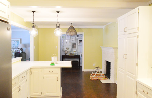
As for more about the kitchen color change, although you guys know we love grellow with a passion, it has been notoriously impossible to photograph (remember a hundred different phases of the kitchen project with “ahh, this color looks so much more subtle in person but is reading as lime green/bright yellow/neon slime for some reason”). And although that’s sort of definitely a dumb reason to repaint a room, I can’t tell you how annoying it is to not be able to share what you see in front of your eyes when you’re a home blogger.
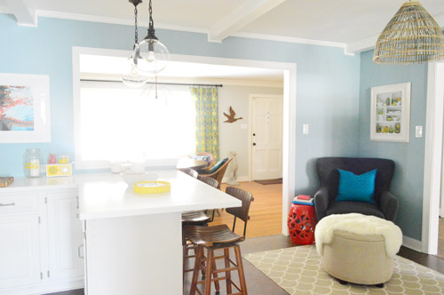
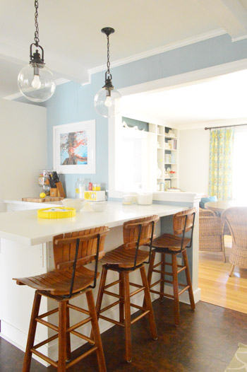
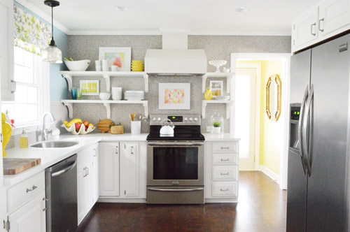
But the main reason for the change wasn’t that the color was hard to photograph, it was that over time we realized that the grellow didn’t let the other things in the room shine as much as they might have with a different choice. Take the white cabinets and counters for example. They looked little yellowed thanks to the wall color reflecting on them – and even the cork looked a little orangey-yellow (especially at night) instead of rich and mocha.
So here’s how we reasoned our way to a new color pick in five bullets or less:
- we worried that other tones of yellow and green would have the same yellowing-ish issue (say that three times fast) since they’d reflect on the counters, cabinets, and cork – even if they were deeper or lighter, so we nixed those options
- we wanted something deep enough in tone to provide a little more contrast, so the counters and cabinets would pop more (but nothing too dark since the room is windowless)
- we have gray backsplash tile and a few adjoining rooms are gray, so we didn’t want to go with more gray on the walls (dark, light, or schmedium) for fear of grayverload
- we wanted an actual color on the walls (since we chose such safe things everywhere else like: brown floors, white cabinets, stainless appliances, white counters, and gray backsplash tile)
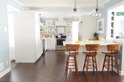
- we wanted a color that would tie the kitchen into the four spaces (yes, four!) that the kitchen opens up to – without getting too matchy-matchy (when a room adjoins so many other rooms, the wall color should work with those rooms since you’ll see them together all the time – it’s sort of like very carefully picking a hallway color that works with all of the rooms off of it)
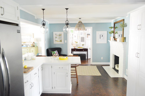
We definitely loved having a soft blue kitchen in our first house, and we actually don’t have any blue on the walls in this house except for the deep teal in the guest room and on the back of the dining room built-ins, so it’s nice to bring in a mid-tone blue that’s sort of in the middle of the guest room and our first house’s kitchen.
The funniest thing about this whole repainting escapade, which we realized while applying the second coat (we’re always loopy by then) was that in our first house we repainted every single room except for our kitchen and our master bedroom. And in this house we’ve only repainted two rooms: the kitchen and our master bedroom. Hilarious.
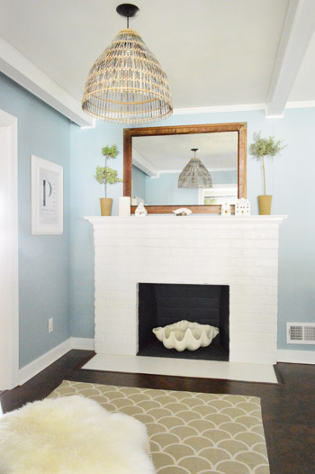
And if you count the time that we painted the fireplace area a different color for book photoshoots (only to repaint it back to normal a few days later) some parts of this room have seen four different paint jobs.
- it’s definitely an actual color (there’s nothing neutral about it)
- it still feels sophisticated (even though it’s not gray or navy or chocolate or taupe)
- it allows the white cabinets and counters to really pop (without yellowing them)
- it’s a great balance to the warm tones in the room (like the cork floors, the wood stools, the rustic cutting boards on the counter, etc).
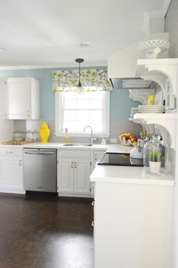
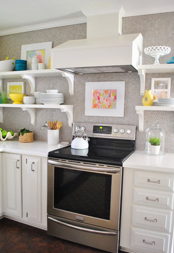
Not gonna lie though, the star of this room is still that wall full of penny tile. Picture me having an as-soon-as-the-show-ends bachelor breakup with the wall paint to run back to the penny tile with open arms. And it’s not that I don’t love the wall color – I just love the penny tile more than a person should love any inanimate object.

Crystal says
Now that you’re all moved in and cozy with things how do you make the leap to “undo” everything to do something big like repaint? Once my rooms are “done” I start to feel overwhelmed with the idea of tackling another big project in the space. For example, it would be great to refinish my hardwood floors but I feel like if we did it would be as much work as moving because we’d have to move everything out of all the rooms! What gives you the courage/inspiration to tackle “big” things especially on a redo?
YoungHouseLove says
Oh yes, we know that feeling! The good news is that the result of redoing something always has this exact reaction afterwards (mark my words): I made that so much bigger in my head! Clearing things out of the kitchen to paint maybe took an hour. Probably less! So in the end it was a one-day project with a huge impact, so we’ve learned if you have a nagging urge to do something to a room, even if you formerly called it “done” – a house is never really done. So just let it evolve and see where it takes you!
xo
s
Trisha D. says
Love the blue it really makes a difference.
FYI, voting ended yesterday and they announced the winners today. Hope that helps avoid confusion.
Thanks for the links a few weeks back. I love the contest through the virtual world. I hope they do this every year, or -gasp- twice a year! Ok that was a bit greedy.
YoungHouseLove says
Ack! Thanks!
xo
s
Amanda B. says
Love this! I must admit I was never a fan of the grellow, but the new color is fabulous, and I actually love that you left the grellow in the laundry room. Now it’s a sunny little glowing beacon! How do you manage to do a whole room with less than a gallon of paint, though? I did my (fairly small) bedroom last summer and *justbarely* got one coat on with a gallon of Valspar. Do you think it’s a difference in the type/quality of paint, or a low-nap roller, or what? (I use a 3/8″ nap roller and 2″ angled brush for cutting in.)
YoungHouseLove says
The thing about the kitchen is that it has four doorways and three walls of cabinetry (plus one wall of penny tile) so there’s actually not much wall to paint! Just a little over by the sink, next to the fridge, and over by the fireplace :)
xo
s
Riki says
LOVE IT! That blue really changes the tone of the entire room. Good choice.
I’m about to repaint my living room for the third time (except I haven’t told my husband yet). Third time’s a charm, right?
He hated the first colour so I agreed to change it. Then I picked the second colour in a panic, but now I hate it. Actually, hate is too kind. I loathe it with every fibre of my being and kind of want to scream when I see it. But I lived with it for a year and now I have finally selected the perfect grey (not that I’m copying you guys or anything, haha).
But it’s nice to hear that everybody changes their mind about paint colour once in a while!
Anne says
You had been considering this? I totally missed it in the Listy posts! What a fun surprise this morning. I love it. Sounds like you do, too! I am jealous of your freehand cutting in. Not in this house, lol. :-)
Leigh Anne says
Lady Marmalade! Love it!
Kitty says
Wow, it’s changed the entire feel of the kitchen. I love the colour (those shades of blue are totally my thing <3 ) and it makes all the little touches stand out so much more.
Rene @thedomesticlady says
The shot with the penny tiles and blue paint.GORGEOUS!
Debbie says
The blue is so much better than the grellow. SO much better. Good job! And also—That song is Lady Marmalade, isn’t it? :-)
YoungHouseLove says
Bingo!
xo
s
Jen says
Hey, no need to justify repainting!!! I remember asking Sherry at the local RVA book signing ‘how many times is too many times to repaint a room’ in front of my husband and the second she said to just keep on painting until it was right, that was all I needed! He had this worried look on his face too, lol! But get this, I just repainted the majority of our house at HIS request because he wanted to move away from matte/flat-finished paint to eggshell, which felt smoother to the touch, and I took that as an opportunity to pick out a new color (Silver Bells from Benjamin Moore). We both love it but now he wants to make the other rooms in the house eggshell-finished too. Time for more new colors!
YoungHouseLove says
Haha, it’s like that Nemo quote (just keep swimming). We need a t-shirt that says “Just keep painting!”
xo
s
Jen says
Let me clarify too that when I wrote that the painting was “his” request but that I did the work, it’s only because I truly believe I’m a much better painter than he is and I refuse to let him near my rollers and brushes. I blame my inner control-freak nature and my immense love for wall-painting.
YoungHouseLove says
Haha!
xo
s
Jill says
Jen,
You and your immense love for wall painting are welcome at my house ANY time.
I have this uncanny knack for making brownies whenever talented wall painters come over, so I feel like maybe we’re soul mates.
jennT says
oh–I’m jealous. we painted our master bedroom a bright yellow (sundance–yes, the name grabbed me–absolutely) that is totally reading greenish. I’ve disliked it since we painted, but I’m really growing a belly full of hate for it now. I WANT BLUE TOO!! :(
Joslyn says
I really love this color and may go check out a swatch. I am not happy with the blue i painted in my living room as it seems to have a yellow undertone. This seems to have a cooler grey undertone that I like. It’s always so hard to find the perfect color, but I think you guys really found it with this one. LOVE.
Sarah says
Love this blue! It’s similar to the blue in our bedroom, though ours may be a touch darker or moodier. I kinda want to repaint our bathroom (even though its only been 8-10 months since the first coat…the wall color is too close to our trim color. :( It’s kinda milky in there. I’ve got some bold accessories going on, but it still feels blah. Should I paint the trim a different color or the walls? It wouldn’t be so bad if I didn’t still have the dining, living, guest bed, office, upstairs bath, and hall yet to paint! Ah foreclosure love.
YoungHouseLove says
I would repaint the walls if you liked the trim to start. It always sounds big in your head, but redoing the kitchen just took a day and was so worth it!
xo
s
Sarah says
The trim is just the same color as my upper kitchen cabinets. A vanilla off white shade. (Lower cabinets are turquoise…=]) So I just decided to do the trim in the same off white. Not sure what color to do the walls though…ugh. The bathroom is circus horse themed (I framed old Barnum and Bailey ads for their horse acts and the theme stuck.)
YoungHouseLove says
So cute!
xo
s
Tammie says
This color looks great in your kitchen. Great choice!!! I have a very similar color in my living room paired with white accents.
Beepieruns says
Oh, yes I love this! Ever since you switched to those wood stools instead of the teal ones I wasn’t quite feeling the kitchen, but this color makes me like the stools! And the kitchen, of course :-)
Amy in PA says
Loved it before and love it now! Here’s my inspiration to get my paint brush on!!
Kim says
It looks incredible!
Kaitlin says
I liked the grellow. The blue is gorgeous. I’m a big fan of the aqua blue/chocolate brown combination that became popular a few years ago. And “grayverload” made my Wednesday :)
heather says
I have to say, I really really like this. It’s so much more calming and relaxing feeling. It’s definitely a kitchen where you feel like you can kick back in the corner chair while someone’s cooking and just have a nice conversation. I never thought that the grellow felt hyperactive or anything, but for some reason with the blue I get a feeling of just a cozy lovely hang out.
On our end we’ve been painting more and more, but the biggest thing we did recently was pour a concrete hearth. We learned some lessons along the way incase we pour concrete counters. Can’t win them all. Womp womp.
http://www.likeacupoftea.com/our-dyed-concrete-hearth-lessons-learned/
Aimee says
Love the paint change. Blue or green is always my go-to color. I’ve been painting our bathrooms blue for years. I just can’t stop.
Laurie says
Lady Marmalade for the song. Very nice for the paint. Blue is always soothing. My bedroom is that color. After seeing it in your kitchen area I may have to think about it in my family room with some board and batten.
Jodi T. says
I love the blue. I liked the grellow A LOT, but this is so pretty. Plus, I think the pops of color (especially red) look so much better with this color! Good choice. I’m lovin’ it!
mariela says
Very different and I like so much more! I have the same situation, a kitchen painted in a color that doesn’t make our kitchen look awesome, and I’ve been begging my husband to repaint it!
Nicole says
Yay! You guys, I love it! I have been on team Paint the Kitchen from the beginning, and it looks great! I definitely think the cork floors, especially, look nicer without the glare of the grellow. We are embarking on a bit of a kitchen reno this spring (nothing crazy, just refinishing the cabinets, new flooring, possibly paint) and I’ve been thinking about doing a gray-blue on the walls but am worried about the adjoining rooms…you’ve proven that it can look great!
ashley jensen says
LOVE LOVE LOVE IT! So I have to admit I did like the grellow paint until you brought in those wood stools (I liked the other ones better). It looked all wrong, and I actually had a hard time looking at the grellow against the cork floors. They browns and yellow just didn’t mesh well together to my eyes. I think the blue goes beautifully with all of it, the tile, floors and stools!
Laura says
I love this! I have to admit I was never convinced by the grellow (maybe just cuz it didn’t show up great in photos) but this looks so classy – big thumbs up!
Christine says
This is almost the same color we painted our family room, where we have a chocolate brown sectional. I love the color so much. It just calms me down and makes me happy! So happy that I painted my entry the same color!
Chelsey says
Ahhhhh….
Jen says
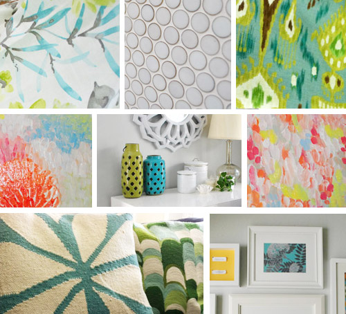
Love the blue! I’m trying to be more adventurous in our very neutral house. As always, you’ve inspired me! Sorry if you’ve mentioned this elsewhere, but where did that great blue graphic pillow in your adjoining rooms collage come from?
YoungHouseLove says
That was from HomeGoods a while back!
xo
s
Abbey says
Hey sista, go sista, soul sista, flow sista.
Love the color :-)
Virginia says
I love the blue! I liked the grellow because it was so fun and happy, but the blue makes all the little touches pop so much more. Now you’ve got me thinking about repainting my yellow kitchen a cool soothing blue!
Tyesha @ House Made Home says
We just wanted our living and dining room, Sherwin Williams Lazy Gray and it turned out blue too…I guess it lives up to its name though! lol ;)
http://www.thehousemadehome.blogspot.com/2013/01/the-paint-on-wall.html
Tyesha @ House Made Home says
*Painted
kristi@SimplePrettyThings says
This is an excellent change! I LOVE it when you WHAM us with a big surprise like this. We recently repainted our kitchen too but I have yet to do a post about it. It’s been so gloomy here in PA. Gosh I’ve always had a thing for blue kitchens!
kristi@SimplePrettyThings says
Ps I find it so very difficult to nail down the “perfect” blue so excellent job on that!
Anna-Lisa says
I love it! It’s so calming along with the greys you have going on in the rest of the house, plus the bright yellow kitchen accessories stand out so much more now.
Jill says
oh wow – I love it! I always liked the grellow, but now I think the wood in the bar stools looks amazing, as do the pops of yellow accessories. I’m so surprised at how different it looks – congrats on a great choice!
Megan @ Monroe Makeshift says
Love it! I have a grellow issue in my living room too. It looked great with couch, almost like a parchment, but when we brought in a wood TV console it all turned coffee stain yellow. Yuck. The blue looks great!
Abbey says
The blue is great and love that valance over the sink window!
Christi says
I rarely comment on any blogs, but this is a must! Love the color! Fantastic decision! I’ve been feeling like the kitchen was missing something all along, and now I know what it was… contrast! The cabinets, floors, lighting, and fireplace look brand new next to the blue! Love!
YoungHouseLove says
Aw thanks so much guys! You’re all so sweet.
xo
s
Amy J. says
A great bonus is how well the yellow accent pieces spread throughout the kitchen stand out now. I did like the grellow, but thought it almost neutralized all of your cute yellow accessories and kept the whole kitchen almost monotone, if you will. This makes them pop and I lurve it!
YoungHouseLove says
Yes, in person that’s so true! It looks so playful now with blue + pops of yellow instead of grellow + yellow, which sort of bended in.
xo
s
Leslie says
The yellow was nice, but the blue is so relaxing. It’s easy on the eyes and calming.
Kelli @ Little Cottage of Mine says
It looks great! I really really love it. We’re trying to find the perfect gray to go down the stairs to our basement. Any suggestions?
YoungHouseLove says
We love Moonshine, Gray Horse, and Rockport Gray (one’s light, one’s medium, and one’s dark) – all by Benjamin Moore. Hope it helps!
xo
s
Ellie says
I have to say I MUCH prefer this color over the old one. It looks gorgeous!
Crystal @ 29 Rue House says
I LOVE it!! It really does make the white cabinets shine!
I painted our dining room a soft avocado color (not the Sesame but greener) a few months back and I’ve been thinking about repainting it for a while. I do love the color but sometimes it feels like it is “glowing” too much. I haven’t told hubby yet, especially since I’ve painted the room 3 times in the 3 years we’ve lived there! :)
Melissa says
WOW. I thought your kitchen looked great before, but the new paint really makes it look incredible. I’ve always tended towards warm tones on my walls, but we recently repainted our living room/dining room/kitchen a blue-gray-green color I call “Blerg” a la Liz Lemon, and it’s so soothing. I bet you’ll let out a peaceful sigh whenever you go into your kitchen now.
Rebecca @ the lil house that could says
Looks awesome guys!! I’m always a sucker for some refreshing blue anywhere! Our kitchen is a similar color
We’re also about to repaint our office. You win some, you lose some, it happens :)
Amber says
What color is that ceiling? It looks like a grayish white maybe? It flatters the new color so nicely.
I really love the new blue walls. We’re about to close on our first house and I’m planning to use BM Wedgewood Gray (also totally blue) and Woodlawn blue throughout our office and bedrooms. I can’t wait!
YoungHouseLove says
The ceiling is just the stock white ceiling color it came, but you’re right about the beams and trim being a little whiter so the ceiling is a little softer.
xo
s
julie g. says
Good morning! The kitchen looks great – very zen feeling.
We live in a 1975 ranch and when we first moved in we painted every room a different color but realized that while it wasn’t an open floor plan you could still visually take in most of the common area walls and floors all at once and it felt choppy. So now all of the common areas are the same color and each bedroom and bath are different. After replacing the tile in the hallway with hardwood and refinishing all the floors the same color along with adding board and batten, after 7 years the house is finally feels like home and much more unified.
Why am I rambling on? Most of these changes were and continue to be inspired by you or as I tell my husband, “you know honey, the couple that is the better version of us”!
YoungHouseLove says
Aw, you’re so sweet! It sounds awesome!
xo
s
jackie says
At first I was thinking oh no they di’int. LOL. It seriously looks amazing though! The kitchen really stands out!
Gina says
WOW, that looks great!!
Sheela says
It looks so pretty! I’ve been on the hunt for the perfect blue color to repaint my kitchen for quite a long time now, and I’ll need to add your new color to my “swatch list” to see if it would work in my kitchen.
I also liked the grellow, but I think this blue really looks beautiful. Great work!