- The 12 Best White Paint Colors
- Benjamin Moore Edgecomb Gray
- Benjamin Moore Simply White
- Sherwin-Williams Pure White
- Sherwin-Williams Extra White
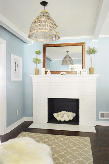
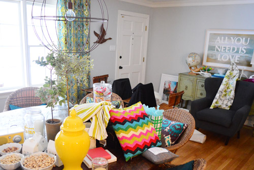
As for more about the kitchen color change, although you guys know we love grellow with a passion, it has been notoriously impossible to photograph (remember a hundred different phases of the kitchen project with “ahh, this color looks so much more subtle in person but is reading as lime green/bright yellow/neon slime for some reason”). And although that’s sort of definitely a dumb reason to repaint a room, I can’t tell you how annoying it is to not be able to share what you see in front of your eyes when you’re a home blogger.
But the main reason for the change wasn’t that the color was hard to photograph, it was that over time we realized that the grellow didn’t let the other things in the room shine as much as they might have with a different choice. Take the white cabinets and counters for example. They looked little yellowed thanks to the wall color reflecting on them – and even the cork looked a little orangey-yellow (especially at night) instead of rich and mocha.
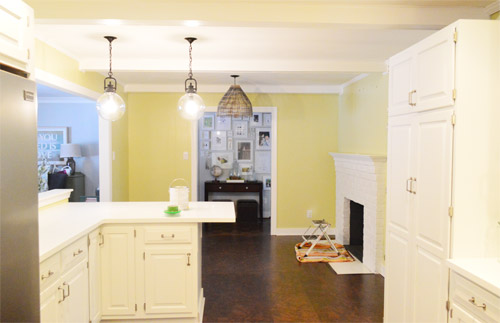
So here’s how we reasoned our way to a new color pick in five bullets or less:
- we worried that other tones of yellow and green would have the same yellowing-ish issue (say that three times fast) since they’d reflect on the counters, cabinets, and cork – even if they were deeper or lighter, so we nixed those options
- we wanted something deep enough in tone to provide a little more contrast, so the counters and cabinets would pop more (but nothing too dark since the room is windowless)
- we have gray backsplash tile and a few adjoining rooms are gray, so we didn’t want to go with more gray on the walls (dark, light, or schmedium) for fear of grayverload
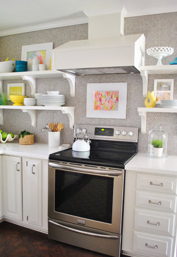
- we wanted an actual color on the walls (since we chose such safe things everywhere else like: brown floors, white cabinets, stainless appliances, white counters, and gray backsplash tile)
- we wanted a color that would tie the kitchen into the four spaces (yes, four!) that the kitchen opens up to – without getting too matchy-matchy (when a room adjoins so many other rooms, the wall color should work with those rooms since you’ll see them together all the time – it’s sort of like very carefully picking a hallway color that works with all of the rooms off of it)
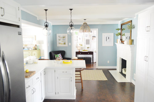
We definitely loved having a soft blue kitchen in our first house, and we actually don’t have any blue on the walls in this house except for the deep teal in the guest room and on the back of the dining room built-ins, so it’s nice to bring in a mid-tone blue that’s sort of in the middle of the guest room and our first house’s kitchen.
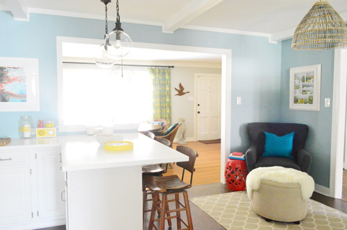
The funniest thing about this whole repainting escapade, which we realized while applying the second coat (we’re always loopy by then) was that in our first house we repainted every single room except for our kitchen and our master bedroom. And in this house we’ve only repainted two rooms: the kitchen and our master bedroom. Hilarious.
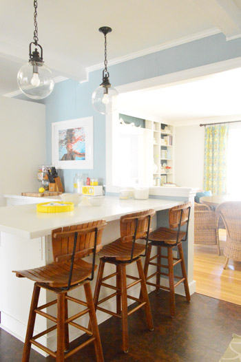
And if you count the time that we painted the fireplace area a different color for book photoshoots (only to repaint it back to normal a few days later) some parts of this room have seen four different paint jobs.

- it’s definitely an actual color (there’s nothing neutral about it)
- it still feels sophisticated (even though it’s not gray or navy or chocolate or taupe)
- it allows the white cabinets and counters to really pop (without yellowing them)
- it’s a great balance to the warm tones in the room (like the cork floors, the wood stools, the rustic cutting boards on the counter, etc).
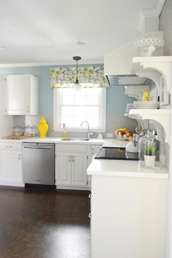
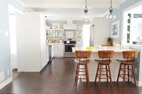

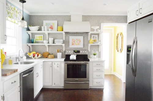
Not gonna lie though, the star of this room is still that wall full of penny tile. Picture me having an as-soon-as-the-show-ends bachelor breakup with the wall paint to run back to the penny tile with open arms. And it’s not that I don’t love the wall color – I just love the penny tile more than a person should love any inanimate object.


Emily says
Holy s**t!!! I’ve been thinking y’all should go light blue in there since you mentioned the idea of repainting. It looks so, so, so good! Now I need to scroll back up and gape at the glory some more.
Lauren says
YAY!! I always love how blue walls look next to white molding. Great choice.
Alissa says
My jaw definitely dropped at that first picture. But it looks lovely! I guess it’s called Colorado Gray because here in Colorado there are faaaaar more blue-skyed days than grey. Maybe for us a grey day would actually be considered blue by everyone else? :) (Okay, possibly I’m just grasping at straws for an explanation…)
YoungHouseLove says
Haha, thanks Alissa! I love it :)
xo
s
Erika says
I agree Alissa. Being born and raised in Colorado and then living in Oklahoma and now Ohio there is nothing grey about Colorado it is blue and beautiful so even grey days in Colorado are blue.
YoungHouseLove says
Sounds awesome!
xo
s
hjc says
You ladies beat me to it. As a Colorado native I can say with authority that there is no gray anywhere in this state! ;-)
YoungHouseLove says
That’s so charming!
xo
s
braelin says
I LOVE it! And, I concur with Alissa’s comments as another Coloradan– good theory! After all, we ARE “Colorful Colorado” (our state slogan/sign/?) so it is only fitting that we’d have a paint color named after us too.
Donna says
Alright, quit bragging, Alissa, us folks from Syracuse are getting jealous! We get lots of gray days :( John and Sherry, the color is gorgeous!
kim says
I love how clever the name is with your explanation behind it! Thanks for sharing.
Sonya says
Beat me to it; we get about 300 days of sunshine a year. Wouldn’t mind a bit more rain, actually…
Growing up in New Mexico we had an exchange student from Sweden. The first two weeks she did something outside every day – hiking, walking, swimming, playing tennis, etc. Then one morning at breakfast she asked “Is it ALWAYS going to be sunny here? Because trying to take advantage of every sunny day like we do back home is getting exhausting.”
Anele @ Success Along the Weigh says
I LOOOOOOVE IT!!!! It’s so calming and I love the way it makes the fireplace pop. We just recently painted our yellow bathroom a medium gray and it just looks so much better. Yellow serves it’s purpose of course but I also think it runs its course quicker, if that makes any sense.
Jen McCrady says
I am OBSESSED with this!!! I hardly ever comment but I just had to let you know that this looks wonderful!
Jenna says
I LOVE the change! It looks so much more sophisticated and calming at the same time.
Jenna says
I love it! It looks so great — glad you made the change!
Alex says
Awesome! I genuinely feel this made your entire house more breezy and light. Your kitchen also looks cleaner and less yellowed! Love the blue, love your kitchen more now! I also appreciate the leaving of trellis in the laundry room for as much light as possible in the most used entryway of the house. So happy about this paint job.
Alex says
*grellow…not trellis. Ugh
YoungHouseLove says
Haha, I knew what you meant! Silly auto-correct.
xo
s
kara @ launching our life together says
Oh wow!! That’s awesome. I loved that grellow, but I love this even more! Looking good!!!
Jennifer H. says
LOVE IT! I know the grellow never looked the same on my screen as it did in your house, but I just never felt it in the kitchen. I think the new shade makes those beautiful penny tiles SHINE. Perfect!
Jules says
I could ramble on and on but all I’m going to say is I LUV IT!!!!
Amanda says
I love the new color! It looks gorgeous, and it’s kind of crazy how much a simple paint color can change the entire look of a room…it looks completely different now! I’m definitely a fan. :)
Alicia M says
Went out to check your blog this morning, and the minute I saw the first picture, I automatically and audibly said to myslef “Holy Sh*t!!” What a surprise! LOVE IT!!
Wendy @ New Moms Talk says
It looks awesome!
I always love middle-of-the-project awareness moments.
The hub and I had one last night about how what we were working on totally mirrored his upcoming conference presentation.
Stephanie says
It looks SOOOOOOOOOOOOOOOO great! I was a fan of the grellow, but this really takes the cake! So fun! Does Clara love it?
YoungHouseLove says
She’s funny. She says things like gorgeous now and it makes me laugh for hours. I think she learned that word at school since I say “pretty” most of the time. She also called it “wonderful” I think, which made me melt.
xo
s
SingleMama says
Love that color in the kitchen, so soothing.
Julia @ Chris Loves Julia says
Nailed it.
Emma (Broke Ass Home) says
Oh Guys! That looks so great! I love the blue- we just painted a bathroom blue and it did the same thing (bring the yellow down about a thousand points) YAY FOR BLUE!
Paige @ Little Nostalgia says
It looks amaaaaaazing! It’s so soothing and fresh in there! And as much as I liked the grellow, I think this feels a little better if you think about the rest of the house. It’s like trying on several shirts that are cute, but then finding The One that looks snazziest.
High-five, yo!
Kim says
LOVE THE BLUE!
Alisha says
I absolutely LOVE the new paint color. I always felt like something was off in the kitchen. I wasn’t its biggest fan. Now I am in love! You two are so smart.
As for painting I’m am itching to paint my great room. Can’t decide on the color though.
Gretchen@BoxyColonial says
Nice! Benjamin Moore is funny about naming colors. Our very much blue master bedroom and nursery are painted “Newburg Green” :) I think someone over there at Benjamin Moore is trying to make us all doubt our ability to recognize colors “oh, that looks BLUE to you? Well, bless your heart, you just go ahead and call it blue then, sweetie.”
YoungHouseLove says
Haha, oh yes I know that color! It’s totally blue!
xo
s
Annabel Vita says
I once used a Dulux paint that was definitely blue (sort of greek blue), it was called “positively purple”.
YoungHouseLove says
So funny! It was very confident with “positively” wasn’t it?! Haha!
xo
s
Amy says
As good as the grellow looked and as much as I liked it, yeah, I didn’t realize how yellow it made everything else look. I love the blue, gray, whatever!
And, yes, I have been painting. Lots of touch-ups, by myself, with a 3-year-old, while my husband is working M-F in another city. FUN! The boy is much more interested in the paint for my sanity. I’m keeping lots of wet paper towels handy for drips and spills.
Lindsay says
I’m glad you repainted. I loved the yellow but was over it once the cabinets went white. However, I think blue kitchen it a little “safe”. It ties well with everything though! Just not a fan of the typical country blue scene.
Nadine says
Love, love, LOVE the blue!
Catherine says
I really love yellow but I love this blue better in here. That looks great! Oh, and that penny tile? Swoon…
Robin says
wow! so different, sounds like you love it! Nobody gets it right the first time! Way to go.
Amy says
Cute! I love the way it looks with the curtain over your sink! I have a similar blue in my kitchen and it just makes everything look good!
Jess @ Little House. Big Heart. says
So. Much. Better. I’m sure grellow looks great in person, but it seemed a little unappetizing for a kitchen in photos!
This color is really similar to what we painted our bedroom with (Martha Stewart Ice Rink). You’re going to love living with this color (at least, we love living in it)!
Martha says
Omigosh, I love it! I’ve spent the past 2 weeks painting our main living area (which includes the kitchen) a light blue (SW’s minor blue) and all the trim white. I was so excited to see 2 blogger’s “new” blue kitchens today. Apparently my hours of labor are right on trend!
Petra says
Love the blue! Makes everything go “heeeere am I!”
Also painted my open space kitchen/living room in Elmira White from a somewhat Oatmeal/biege color, and am loving it!
Jenny@simcoestreet says
I am madly in love with the new colour! Amazing how much it changes the look of the space. I didn’t think it needed a change but now that I see it I think it is perfect! Dudes, you nailed it! We are renovating our very first house and went mostly neutral but I just painted the dining room a similar blue and this made me happy I did – so thank you ;)
Jenny
http://Www.simcoestreet.blogspot.com
Anjali says
Lady Marmalade!! The song…not the room.
But P.S It looks amazing!! Love the colour!
P.P.S LOVING reading your book! It goes from home to work and back again each day with me. Can’t wait to have my own home to make it as amazing as yours.
YoungHouseLove says
Aw thanks so much Anjali! So glad you’re enjoying our book :)
xo
s
Rebecca says
Love, love, love it!
Guylaine says
The song is Lady Marmelade and your kitchen is very beautiful!!! The all house is also very beautiful. Is it your last house or , when it will be all finish, you will want to transforme another one?
Guylaine :)
YoungHouseLove says
We’d definitely entertain the idea of selling if we finished up here and happen to find another home that needed lots of love (that’s pretty much our passion, not to mention our livelihood these days) – but we also wouldn’t mind staying here forever and getting another house to fix up and rent – so you never know where we’ll end up! We’re open to whatever comes our way. Five years ago we never could have guessed we’d be here, so we’ve stopped trying to guess where we’ll be in five more years :)
xo
s
Guylaine says
I ask that because it is my fourth house and I question myself if it will never end. I always dream of the next home…
I suppose that is because I love design and I choose the wrong job. It cost less money to do decoration for the others…
YoungHouseLove says
Aw, I think some people are just made like us – we always find another house to rescue!
xo
s
Lesley says
To the last comment from Sherry about “finding another house to rescue”. My dad finds and restores antique wood boats (expensive hobby), but he loves that he is returning them to their former grandure and adding to the stock of them available for others to enjoy. Some people restore cars, others locate and rehabilitate furniture, art, clothing… It is a common and noble calling.
It is also very green – fix what’s already made, especially when it is well made, no need to tear down and build everything new.
YoungHouseLove says
That’s amazing!!
xo
s
Rachel says
I’m actually going to go against the trend and say I think I preferred the grellow. I was just so happy! But the blue is lovely too (maybe it’s just the shock of seeing it change?) and as long as it you like it, that’s what matters!
It reminds me some of the blue you used to have in the bedroom before repainting – is it similar in real life?
YoungHouseLove says
It’s a little deeper and more bold than the bedroom blue (I’d describe that as airier and grayer and the kitchen color and more of a statement).
xo
s
Jessica says
I just love the change…although I liked the grellow color too. I totally see what you mean about the contrast with the cabinets and the floor and tile, though. We are inching towards repainting our kitchen walls and cabinets – do you recommend color on the walls, or color on the cabinets? We have a small house with a kind of long, rectangular area for the kitchen, dining “nook” and living area. I recently painted the living room white so was thinking of continuing the white walls with blue cabinets. But as your kitchen shows, repainting is totally doable if my first choice does not work the way I hope. Thanks for the inspiration!
YoungHouseLove says
Ooh white walls with blue cabinets sounds awesome! I’d love to see a picture!
xo
s
JenB says
We’ve thought about painting our cabinets a color as well. I painted them black in our old house and loved it. The rest of the kitchen was very, very white, so the black cabinets looked good. Although, I did this in about 2001 and it shocked a few people!
The blue is fabulous! I didn’t realize how much the grellow washed out the rest of the kitchen. Now everything looks so crisp and bright. Excellent choice!
Emily says
Never commented before, but I have to say – it’s gorgeous! What a mouth-dropping change! For me it was love at first sight!
Liz O says
It’s funny I was just talking to my husband about our “middle” bedroom. It was our bedroom when I first moved in with him and his brother, then a junk room, then a liter of foster kitten’s room, then a computer room, and we’re redoing it to be our son’s room! It has gone through a ton of changes in the last few years!
kaycee says
Love it! I have a similair story with the paint colors. My house came with white laminate counters/counter tops that were in good condition but the walls in the kitchen were yellow, which made everything in the room feel yellowed. So I painted my kitchen a light blue, Glidden’s Barely Jade. It made a big difference and now my kitchen is fresh and white just like yours. Thanks for the surprise!
Katie Smith says
Love a blue and white combo just so elegant! New bar stools too!? I’d love to know the story behind those and where they are from :)
YoungHouseLove says
Here’s that post for ya: https://www.younghouselove.com/something-crazy-happened-2/
xo
s
Kate says
Thank the lord! I am a tried and true blue girl and it has been interesting to watch you kind of come back around to this palate. This makes those touches of yellow really pop and looks wonderful with all of the hard work you have put into the kitchen!
Kristin says
Perfect – you nailed it.
And that happens to be a favorite color of mine to boot.
Mandy says
You’re so right – the yellow definitely reflects off the white cabinets in an unflattering way that you don’t even notice until you compare the before/after. I did my kitchen a gray/blue to set off the carrara marble tiles and white cabinets and it is by far my favorite room in my whole house!
I still have floors to do though, which leads me to ask…how’s the cork holding up to Burger’s nails?
YoungHouseLove says
Great! Not a scratch! I think sealing it was key :)
xo
s
Maureen says
I love it! The grellow was always a little too jarring for me. It’s cute in the laundry room because it’s small, but this is definitely a better color for the kitchen. Maybe I am bias because I have blue walls and white cabinets. :)
Ginny says
I LOVE IT! It’s a gorgeous color and with all the light it looks great :)
Leigh Anne says
Painted my livingroom Driftwood Gray by Martha Stewart and I think it should be called Driftwood blue!! Most of the day it reads blue-ish until the sit starts to set then it goes gray. I didn’t love it at first, but now I do! As always, love your choice!
julie says
Fabulous!! LOVE that color! I am contemplating repainting my kitchen and family rooms…CALGON! Picking colors is hard work! Great job and good use of Nonna-time too!
Kathryn says
It’s a great colour. My brother and sis-in-law just painted their kitchen that colour too and it’s fabulous!! I’ll have to tell them that the new name for it is $herdog blue! haha
YoungHouseLove says
Hahah! Get it going Kathryn.
xo
s
Erin J says
love it, but I love just about anything blue :)
Lady Marmalade :P