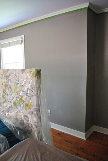
Yup, we went for it. We slapped up two paint colors that we love (and already had on hand) in our bedroom to see if darker walls (which is something John that has been campaigning for over the last few months) is the way to go.
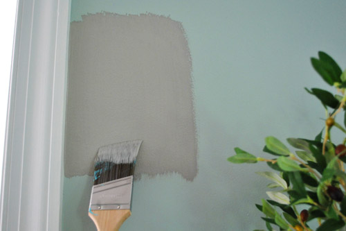
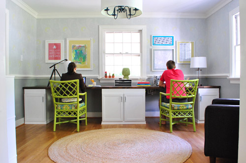
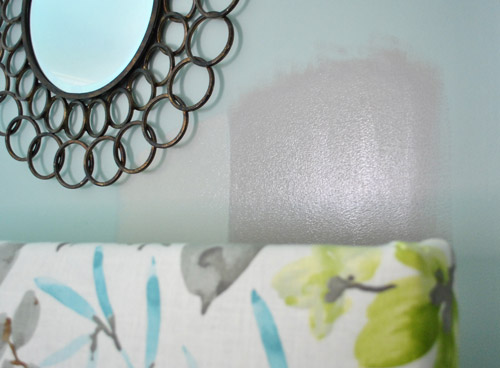
Remember when we poorly photoshopped it a while back? Except picture it more brown-gray, like a putty color (instead of blue-gray), since there are plenty of colors in the rug and the bedding already. We tried one of our favorite smoky gray colors (Gray Horse by Benjamin Moore) which is under the chair rail in the office and also tried the darker and moodier color that’s more of a browny-gray that we used in our attached bathroom (Rockport Gray by BM). Let’s just say that we were definitely surprised by our swatches. See how dark Gray Horse looks in our office under the chair rail (especially on the left of the pic)? At least in person it feels pretty dark since it’s a few shades darker than the Moonshine color that’s above the rail.
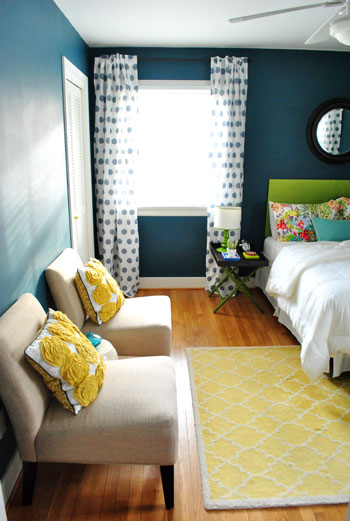
Well, check out how much lighter/less obvious it reads in the bedroom (the one on the top)? Meanwhile Rockport Gray was awesome (the one on the bottom). It was love at first swipe. This picture doesn’t quite capture the putty-ness of it (it’s almost equal parts mocha and gray) but it really is an awesome color.
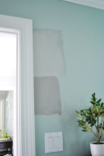
I painted some test swatches of each one in three places in the room (just to be sure we liked how it read on a bunch of different planes) like:
- the wall next to the bedroom door
- the wall next to the bathroom doorway
- the wall behind the bed (since we wanted something dark to help the headboard really pop)
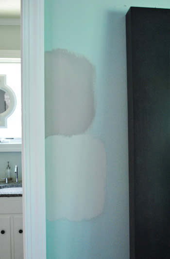
See how you can barely see the Gray Horse swatch under the right half of the mirror, but the Rockport gray one further to the right makes the headboard look awesomesauce? At least in our imagination when we picture it on that whole wall…
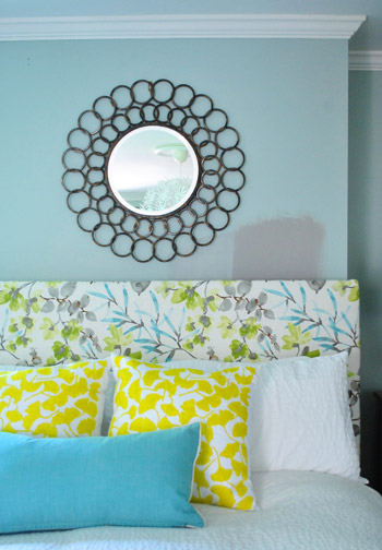
Bingo. Rockport Gray it is. Especially since it’s already in our bathroom, so it makes sense to bring it out into the bedroom. Plenty of main bedrooms have the same color in the bathroom as the bedroom, and it totally lets the headboard be the star (while there are still some bright colors in the other bedding and the rug). So although it’s a neutral, it’s not a boring choice when you look at the room as a whole. We’re also thinking that we could add a very soft light blue tone to the ceiling to compliment the moody gray walls someday. Could be fun, right?
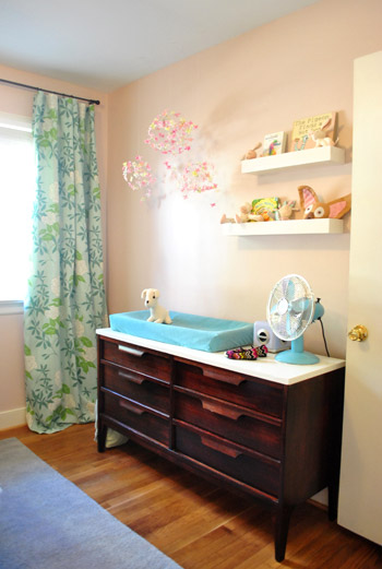
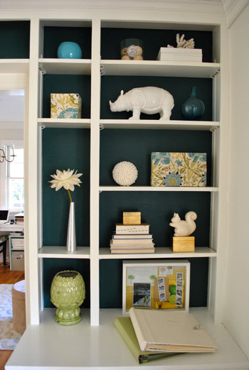
Rockport Gray is the darkest color we’ve used in this house except for the dark teal in the guest room and on the back of the dining room built-ins, but that’s kind of what’s nice about it (the whole house feels balanced with some pops of color, some lighter tones, and some darker colors all working together as one big master-palette if that makes sense). It’s fun to have a nice mix going on. Like the soft pink in Clara’s room…
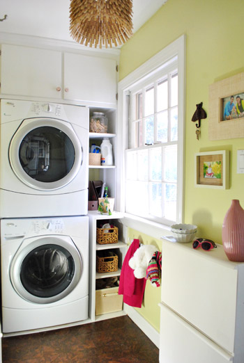
… some greeny-yellow in the kitchen and laundry room…
… dark teal in the guest room…
…and on the back of the dining room built-ins…
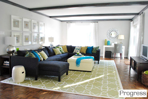
… and light gray in the living room and dining room.
We’re learning that the rooms with more neutral walls (like gray) are usually the rooms that we have fun adding a lot more color with accessories (like a bright rug, headboard, pillows, art, etc). See how the bright art and accessories in the office (along with those happy chairs) layer over light neutral walls and give the room a vibrant feeling – even with soft and neutral walls?
Same deal with the living room (neutral walls + bright pops of color in the rug, art, and pillows = a nice balance). The dining room follows suit too (soft and neutral walls + colorful curtains + dark pops of color in the back of the built-ins + our new/old painted buffet).
In other words, rooms with more neutral wall colors seem to free us up to more color-possibilities, so we can layer in a lot of things “over” them if that makes sense.
So that’s where we are. We picked a color. Actually we’re here…
Be back tomorrow with the after pics (and a time lapse video) once it’s all dry and put back together! What have you been painting lately? Do you repaint rooms when the urge strikes? Thankfully repainting is one of the cheapest ways to change things up, and it usually only takes us around a day to complete. So you don’t have to live with a paint color that you don’t love since it’s usually one of the easiest & most inexpensive changes to make. In our first house we painted every single room twice to get it right except for our bedroom, so it’s hilarious to us that the first room that we’re repainting here is none other than our bedroom!
In other words: we’re definitely still just using the same method we relied on six years ago when we moved into our first house: trial and error. It sounds kinda risky, but it’s the best way that we’ve found to learn what we like and don’t like (and inch towards a house that feels even more like home). We’ve definitely learned that being frozen in indecision or trying to love something you just don’t (by forcing yourself to work with it) don’t work nearly as well as being brave, diving in, and making a change. So here’s hoping we can knock the rest of this out by the end of the day…
Psst- We took our favorite monthly picture of Clara ever. That girl has officially gone diva. Check out her moves over on Young House Life.

Leave a Reply