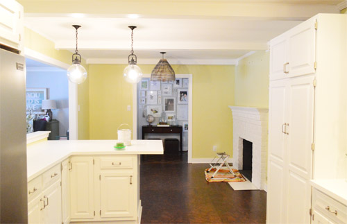
As for more about the kitchen color change, although you guys know we love grellow with a passion, it has been notoriously impossible to photograph (remember a hundred different phases of the kitchen project with “ahh, this color looks so much more subtle in person but is reading as lime green/bright yellow/neon slime for some reason”). And although that’s sort of definitely a dumb reason to repaint a room, I can’t tell you how annoying it is to not be able to share what you see in front of your eyes when you’re a home blogger.
But the main reason for the change wasn’t that the color was hard to photograph, it was that over time we realized that the grellow didn’t let the other things in the room shine as much as they might have with a different choice. Take the white cabinets and counters for example. They looked little yellowed thanks to the wall color reflecting on them – and even the cork looked a little orangey-yellow (especially at night) instead of rich and mocha.
So here’s how we reasoned our way to a new color pick in five bullets or less:
- we worried that other tones of yellow and green would have the same yellowing-ish issue (say that three times fast) since they’d reflect on the counters, cabinets, and cork – even if they were deeper or lighter, so we nixed those options
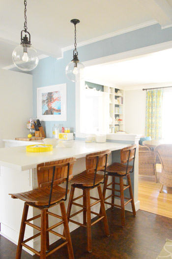
- we wanted something deep enough in tone to provide a little more contrast, so the counters and cabinets would pop more (but nothing too dark since the room is windowless)
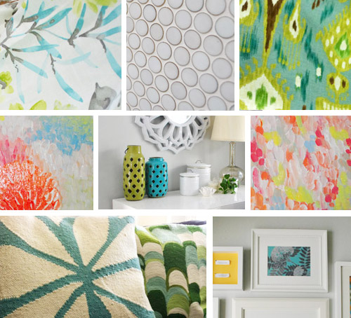
- we have gray backsplash tile and a few adjoining rooms are gray, so we didn’t want to go with more gray on the walls (dark, light, or schmedium) for fear of grayverload
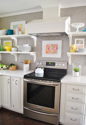
- we wanted an actual color on the walls (since we chose such safe things everywhere else like: brown floors, white cabinets, stainless appliances, white counters, and gray backsplash tile)
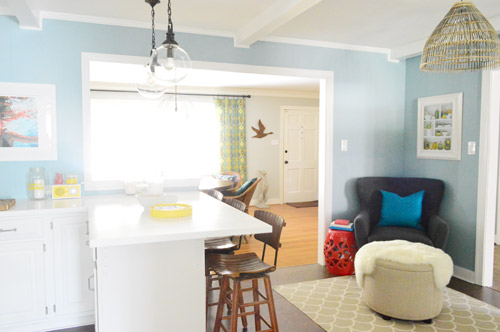
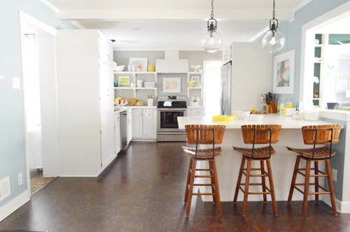
- we wanted a color that would tie the kitchen into the four spaces (yes, four!) that the kitchen opens up to – without getting too matchy-matchy (when a room adjoins so many other rooms, the wall color should work with those rooms since you’ll see them together all the time – it’s sort of like very carefully picking a hallway color that works with all of the rooms off of it)
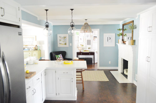
We definitely loved having a soft blue kitchen in our first house, and we actually don’t have any blue on the walls in this house except for the deep teal in the guest room and on the back of the dining room built-ins, so it’s nice to bring in a mid-tone blue that’s sort of in the middle of the guest room and our first house’s kitchen.
The funniest thing about this whole repainting escapade, which we realized while applying the second coat (we’re always loopy by then) was that in our first house we repainted every single room except for our kitchen and our master bedroom. And in this house we’ve only repainted two rooms: the kitchen and our master bedroom. Hilarious.
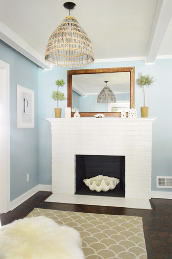
And if you count the time that we painted the fireplace area a different color for book photoshoots (only to repaint it back to normal a few days later) some parts of this room have seen four different paint jobs.
- it’s definitely an actual color (there’s nothing neutral about it)
- it still feels sophisticated (even though it’s not gray or navy or chocolate or taupe)
- it allows the white cabinets and counters to really pop (without yellowing them)
- it’s a great balance to the warm tones in the room (like the cork floors, the wood stools, the rustic cutting boards on the counter, etc).
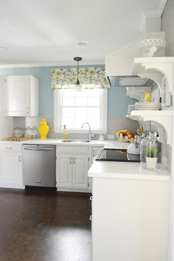
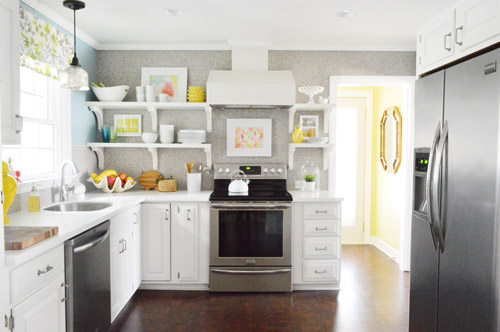
Not gonna lie though, the star of this room is still that wall full of penny tile. Picture me having an as-soon-as-the-show-ends bachelor breakup with the wall paint to run back to the penny tile with open arms. And it’s not that I don’t love the wall color – I just love the penny tile more than a person should love any inanimate object.

Leave a Reply