Archive for January, 2013

One Little Two Little Three Little Updates

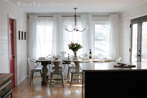
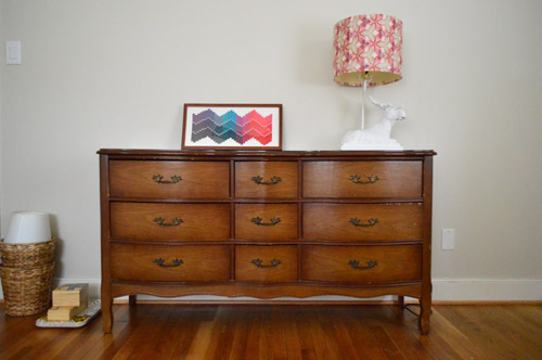
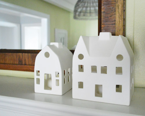
Even though we blog about house stuff every day it’s surprisingly easy to forget to fill you guys in on the little changes that we make… until someone sees a picture and says “wait, you didn’t tell us you did _____!” And sometimes it’s the little things that make you smile when you walk into the same room you’ve been walking into every day for the last 700+ days anyway, if you know what I mean. So since this blog is as much about over-sharing the small stuff as the big stuff, here are three oops-we-forgot-to-show-you updates.

You guys have asked where my little ceramic houses that John got me for Christmas landed, and I’m happy to report that they’ve been living it up on the kitchen mantel for nearly a month:

Aren’t they cute? The imperfectly shaped matte ceramic finish is amazing. I tell John I want to move into them (we’ll take one and maybe the Bowers can move in next door?).

This mantel still feels wintery to me (with the sweater vase, etc) but I can totally see how these little white ceramic houses can be year-round fixtures. Picture them next to a vase full of pink tulips and a few small teal and yellow oil paintings leaning up there around them. Total spring vibe, right?

Okay and the next update is one that folks have been asking for quite regularly since this post. So we’re very sorry it has taken this long for us to share full room shots of our new chandelier.

I’m sure some of you might notice that we also added pillows to all of our dining chairs, so let’s dive into that, shall we?

Step one: cut a hole in a box. Just kidding. Step one: put pillows on chairs. Done.

I tried a few combinations and ended up liking three different prints (a solid satin-y one, an ikat-y one, and an abstract chevron-ish one). They might seem sort of random in some pics, but in person they actually seem to play really nicely together since they’re all from the same color palette (literally, the same tone of blue is carried across each one, as well as two of them having the same plum and the same white hits of color). They go but don’t match if you know what I mean. Someone else might want all the pillows to match each other, or to keep them solid in color, and that works too – just do whatcha love. Bottom and middle pillow: HomeGoods a while back, top pillow: one I made from on-sale napkins here.

And since we already owned all of them this was a little free act of pillow madness executed by none other than The Girl With The Pillow Problem herself (yes that’s me). The fun thing is that the curtains are another pattern in the room, but since they also have the same colors, they seem to play just as well as they would with say, a patterned napkin or runner on the table. So if you just think of dining room pillows as 3-D patterned napkins, you’re all set. Also it might feed into your pillow problem. You have been warned.

As for if they get stained by food or if we’re worried about that – we haven’t had an issue with that yet, but none of our pillows are too expensive and precious, so we figure we can just spot clean them, remove their covers and run them through the wash, or even just pull a fast one and flip them over so the stain is on the back if something insane happens that involves a not-coming-off mark. Fastidious Downton Abbey maid, I’m not.

Oh and they tie into the dark-teal color on the back of the built-ins. And the abstract chevron-y one (along with the curtains) also have the same green color that’s on those lime green chairs in the office, so that’s nice too. Even Clara’s little yellow high chair seems to slip in there with a wink and a smile. Oh that coy highchair…

So there are three little updates that have made a few areas in the house feel a little more “loved.” Plus I knew some of you eagle-eyed readers might notice them in other pics and demand details, so there ya go. Ha! Now if you’ll excuse me we have a little Macklemore Challenge to get ready to post tomorrow. Wooooooooot! $herdog’s so excited and she just can’t hide it.

  Leave a comment

Reader Redesign: Killer Kitchen

Jaw dropping is not a term I like to just throw around, but I think this makeover earned it. Emily’s got lots of info about her makeover, so I’ll just let her dive right in and show it off to you guys. Here’s her letter:

We bought this house as a foreclosure a little over two years ago. We got such a great deal on the house that it hasn’t been as difficult to save our money for the updates it needs. The house was built in 1987 and the interior had not been touched since, except for adding a layer or two of wallpaper over the original wallpaper.  Floral explosion all up in the house! I really enjoy cooking and being in the kitchen, so that room was always on the top of my list to re-do as soon as possible. Our kitchen was so icky feeling – the formica countertops were stained, loose from the cabinets, and just plain old (but not in the cool vintage-y way).

I browsed for hours and hours on different design sites and I eventually fell in love with the look of bi-color cabinetry. I felt like it would give me a little bit of a modern look without being too much, because I always have re-sale value in my head when making changes to the house. I didn’t want to do something too crazy that it would be difficult to sell later on if we ever need to move.

In order to save big bucks, and not be wasteful, we had the cabinets re-painted rather than ripped out to buy new ones. We hired a contractor to do a lot of the work (mostly to save time… and our marriage) but we DIYed the whitewashed plank walls to cover the terrible attempt at my first wallpaper removal.

Adding the plank walls took two Saturdays with my husband and I both working on it, and I would say that it’s a moderately easy project to take on.

Thankfully my wallpaper mistake turned in to a design success. 

Another big savings was in purchasing all of our appliances at IKEA during their kitchen sale. We were able to get our dishwasher, a 5-burner oven range, an exhaust hood, a microwave, and a wall oven for less than $4,000. Having the cabinet built to surround the refrigerator is hands-down the best decision I think I made in the kitchen. The built-in look makes the room look so finished and luxurious. And another easy DIY was the chalkboard wall. I like to feel relaxed in a room and the silliness of writing on the walls did the trick for me.

Another major cost saver was using subway tiles for the backsplash. We were able to get them for 21 cents each ($1.61 sq/ft). The countertops were a splurge though: a quartz product by Cambria (the color is called Torquay). It is such a low maintenance product which was the top reason for choosing it, but a close second was because it looks like Carrera marble!

Our dining table is from a Restoration Hardware Outlet. The list price is $1395 for the 96 inch table, but we got it for $600! The curtains are all from Ikea. The dining area feels so cozy now and we’re able to close the sheer panels for privacy. The chandelier is from West Elm. It’s a bit funky, but I felt that the space needed a little funk! I hope you like it! - Emily :)

Killer, right? And I think it’s a great reminder that mixing splurges and affordable DIYs while looking at outlets and big box stores for sales can add up to a polished and expensive looking finished product. Oh, and if this wasn’t enough house hotness for you, Emily’s got lots more on her blog. Thanks so much for sharing your kitchen Emily! Now let’s play the ol’ what’s-your-favorite-part game. Mine’s the dining table and the counters and Sherry’s are that red door behind the table and the dark paint on those french doors and the window sash over the sink.

  Leave a comment

Rolling Out The Pink Carpet

Quick note: Tonight we’ll be in NYC at FLOR on 142 Wooster Street at 6:30 for a signing full of treats (wine, cookies, you name it). You can find more info & RSVP here. Hope to see you there!

You’ve heard of rolling out the red carpet, but what about the pink one? It’s Clara’s favorite color, and a nice warm tone (after filling most of the house with cool blues, greens, and grays, it’s nice to bring in some warm tones to balance things out). Plus the way the playful dots in the rug mix with the bold colors in Clara’s big girl bedding = almost more fun than my brain can handle. In person it’s even more happy! Seriously. Come over right now.

As for the price? Pretty darn hard to beat. We’ve had our eyes peeled for a while for something that would work with the blanket and general color scheme that we’re doing in there (red + pink with a lot of other pops like navy, yellow, teal, etc) but everywhere we looked (local decorating outlet, Overstock.com, Target, etc) was selling larger 7 x 9′ rugs for around $400-700, which was a little more than we wanted to spend. We even tried craigslist and ebay to no avail.

So we held out and kept looking and finally spotted this 7′ x 9′ guy for $236.95 (marked down from $629) on Joss & Main. It’s 100% wool, hand tufted, and the gradated color and fun imperfect dots that appear to be drawn on just felt so “Clara” to us. So we went for it. Not gonna lie, I was giddy when we clicked that order button. Especially since they were running a free shipping special (shipping fees can really add up on a big item like a rug).

Then after clicking that order button all giddiness subsided and we did that thing where we silently freak out about ordering a rug sight unseen. But since it worked out so well with our living room rug, we just tried to hope for the best.

Then it arrived and this happened:

Apparently rugs are fun even before they’re unrolled in the room.

Then when Clara was napping we finally got to see it in her big girl room. This room definitely started out super tame with very soft milky-tea colored walls…

… and now it’s looking pretty crazy-pink thanks to the bedding and the rug…

… but we think once we add in the art, curtains, new light fixture and other items that will break the pink up and balance things out (there will definitely be a large object or two on the rug and we’re thinking about navy for some of the frames and maybe even the light fixture). Remember how the middle makes no sense? Well I’m crazy impatient. Haha. Can’t wait to see it after a few more steps!

In the meantime we’re soaking up some of the plushness and pattern (polka dots + a gradient!) that the rug adds. Most of our rugs are the same tone throughout, so we’ve never had one that gets darker as you step into the room.

The polka dots are definitely my favorite part though. No doubt.

Are you guys ordering any rugs online and holding your breath until they come? Are you working on a room that’s only about 20% done so you’re in that giddy-can’t-wait-for-this-to-come-together stage like us? It’s so funny how this room has been a pretty even combination of paint, furniture we already had, craigslist finds, and now there’s a new rug in the mix. Gotta love a smorgasbord…

  Leave a comment