Archive for September, 2011
September Superlatives
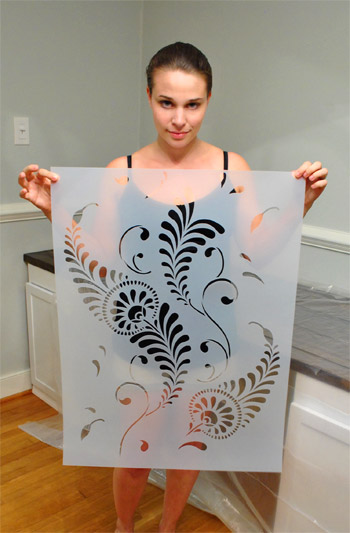
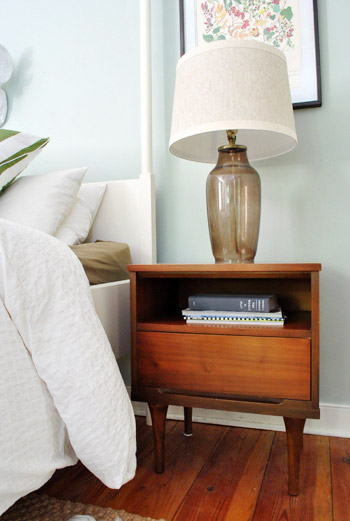
It’s that time again! When we take a moment to look back on all that we’ve done in the past month at a glance (and gather all the links in one handy place for ya). And of course we tossed in some never-before-seen stuff, just because we’re over-sharers. This month felt pretty scattered since we did everything from finding secondhand night stands and starting to stencil some walls to building a 13 foot desk, altering a light fixture, framing out a mirror, making free art, and beyond. So let’s take a walk down memory lane, with yearbook-esque superlatives. Why? Because that’s our idea of a good time.
Most Pro-Banquette: Starting off the month with a half-baked idea to add a kitchen banquette.
Most Pro-Banquette (Runner-Up): The continued discussion on the topic in this follow-up post, which included a reader submitted rendering (where I looked a little bit like a receptionist).
Least Pro-Banquette: Ending the month with the exciting revelation that we’re over the banquette idea and happy to our true love: a peninsula.

Weirdest Giant Metal Chicken: This girl (aka Beyoncé) that we spotted on our way to Delaware (if you don’t know how she got her name, you must read this (warning: there’s profanity, but it might be the funniest thing on the interweb).
Best Deal: Our $11 yard sale night stands, which we added to our bedroom (along with a faux gold banding treatment on our bedposts).

Least Appetizing: Our empty fridge after Hurricane Irene, which we refilled with a coupon-tastic trip to the grocery store. (Update on that: we put in a $250 “spoiled food claim” with our electric company, who actually accepts those – so we don’t have to worry about insurance premiums going up or meeting a deductible at all – hooray!)
Most Improved: Our $1 (each) orange secondhand cabinets became slightly-taller, white office built-ins thanks to some wood and paint.
Most Tall, Long, Dark & Handsome: The 13-foot wood tabletop made for our built-in desk out of framing lumber and dark stain (for just 27 beans).
Most Inebriated: The walls in our office, after getting their Moonshine on (see what I did there? Moonshine is the name of the paint color, but also a reference to alcohol…).
The Josh Groban “You Raise Me Up” Award: Our office light fixture, which got hung higher (no more head bumps for me), sprayed indigo, and covered with a discounted drum shade.
Most Grounded: The trim that we added to the bottoms of our desk to give it a more built-in look.
Most Secretive: These never before seen parts of our house that we hadn’t highlighted before now, like our spaceship-like sunroom roof line:
The “You’ll Be Missed… But Not Much” Award: The tree growing on our house that we finally removed (to avoid any risk of foundation damage), along with trimming some overgrown shrubs nearby.
Most Persistent: Not giving up on this bathroom mirror framing project (even after a false start with too-small trim and, oh yeah, the whole thing crashing down after the first attempt).
Most Photogenic: Our television. Yes, we have a weird habit of taking pictures of the TV to document decor inspiration.
Easiest: Making a fast & free food coloring print for the hallway frame gallery.

Easiest (Runner Up): Sherry’s simple faux cross-stitch that she broke out to make a personalized anniversary gift for her brother and his wife.
Most Likely To Result In Claw-Hands: Stenciling the walls of the office, which isn’t exactly a quick project – but should be well worth it in the end (we hope to share final pics on Monday).

Best Sentence Ever Uttered By A Sixteen Month Old: “Iss my hoo hat.” Which was said by Clara after insisting that we help her put on a jacket and a crocheted hat (that looks like an owl) over her pajamas. Such a snappy dresser.

Most Three Dimensional: My take on the pros & cons of three different 3D interior design tools.

Most Intense: All of the Blogiversary posts last week…

… so if you missed any of those – here’s a quick recap of what was covered:
- An hour-by-hour look at a day in the life of us Petersiks
- Pie charts illustrating topics like how we spend our time & how we make money
- A breakdown of interesting (and weird) numerical stats about YHL
- A video response to various personal questions you asked us on Facebook
- A chance to talk about yourselves by answering our reader poll
- Setting goals for year 5, while evaluating how we did on year four’s
- Basic tips and advice on the coding side of blogging
- A play-by-play recap about how a post goes from concept to completion
- Ten lessons we’ve learned over our four years of blogging
So there you have it. September at a glance. What have you guys been up to this month? Have you ever made a list of accomplishments to look back on? It’s nice to take a break from adding things to our to-do list and take a moment to appreciate what we’ve accomplished. Just for a minute. Then it’s back to that $%@**&ing stencil…
Psst- You can check out July’s superlatives here and August’s here.
Pssssst- We’re so excited about the curated collection that we put together for Joss & Main (it comes out this Tuesday!). Click here to sign up and get alerted when the sale goes live!
Let’s Frame Some Food Coloring
All week I imagined a big office stencil reveal post here. Sadly, it’s not done yet. Oh DIY, why do you take such pleasure in toying with my emotions? Quit playing games with my heart, home improvement. But regardless of the fact that it’s not exactly a quick project, it’s looking awesome and totally going to be worth the blood, sweat, and tears (all three of which have occurred, incidentally). So hopefully by this weekend I’ll be doing some celebratory Rocky laps around the house (yes, with music blaring and fists in the air) and I can share photos & deets of the whole shebang on Monday. Woot! Until then, here’s a still-needs-to-be-finished wall (the bottom edge above the chair rail is still on the agenda):

In the meantime, how about a bloodless-sweatless-and-tearless project in the “quick, easy, and free” vein? See, John had this genius idea that we should try to get an ombre effect on paper (that we could then frame) using food coloring. Namely soaking it in food-colored water and waiting for it to travel up the page and potentially upping the intensity by adding more color to the water and letting it soak a bit less for a two-toned effect.

Yeah… that didn’t work at all. Zero travel-age back up the paper. Just wetness. Haha. So…

… fail!
But we had some fun messing around with drips and drops, just to see what we liked. First I made an ode to Dexter with a few drops of red food coloring.

How fun would stuff like this look framed all over the house for a Halloween party? You could even take regular family photos and splash “blood” (aka: red food coloring spatters) over them to weird the observant people out at your little shindig (or use a red sharpie to create the effect on clear transparency paper and place it over them so as not to ruin the original prints/photos).
Anyway, then we started messing around with drips down the page but we really fell in love when we hit on this simple collection of dots (we were using regular old card stock by the way):

All we did was make three dots of each color next to each other (squeezing a bit harder on the middle one so it was a wee bit larger). Then we just waited for it to dry…

… and framed it…

Bam, an instant zero dolla (holla!) “food coloring masterpiece” for our always-changing gallery frame wall:

I actually love how it picks up on the circles in the fabric that we framed a few feet up (in the middle). And it’s so fun to tell people who come over (and just stand in front of that wall for twenty minutes) that it’s just drops of food coloring. I can’t really explain why, but it looks kind of exotic and collector-ish. So it’s always fun to see the look on their faces when they realize it was done in five minutes with cupcake baking supplies.
Anyone else going to try their hand at some food coloring art? Or throw a Dexter-themed Halloween party? If so, I would LOVE to see pics of any and all faux blood spatter that you use as decor! Geek for life.
In other news, that might be the shortest post I’ve written in about a year. Hootie hoo for trying to meet some recently mentioned goals. We’ve definitely had our share of long beefy posts this week, so sometimes a quickie here or there feels nice too. Wait, that didn’t come out right.
Break Out The 3D Glasses
Okay, not really. Put them away. This blog will not be coming to you in any additional dimensions today.
As you saw in our latest kitchen planning post yesterday, I finally bit the bullet and learned me some Google Sketch-Up (as many of you recommended). But having been a loyal user of Floorplanner.com in the past and having recently become acquainted with Ikea’s Kitchen Planner, I thought I’d give you my take on how these three 3D modeling tools stack up against each other… because there’s actually not a clear winner in my book. Each have pros, cons, and a different scenario where they might take the win.

Floorplanner.com is what we’ve used to create just about every digital floor plan you’ve seen on our site (like this one), so we’ve got a soft spot for it. But when I gave it spin last week to render our new kitchen plans, here’s what I observed:
PROS:
- No software to download. It just loads in your browser.
- Easy & fast to use. I find the interface very user-friendly, so if you’ve got your room measurements handy you can have a simple whole house plan done in a matter of minutes.
- Good finish options. They have a lot of standard finishes, like flooring, with adjustable colors so you can bring more life to your drawing.
- Nice library of furniture. Floorplanner comes stocked with dozens of furniture options (chairs, tables, rugs, plants, appliances, etc) to help decorate your spaces. You won’t find perfect matches to your real life items, but you can usually find something similar.
- 2D or 3D: It lets you easily toggle between a 2D and 3D view.


CONS:
- Only kinda free. You can create one plan for free, but after that you may have to fork over some dough.
- Limited kitchen designs. Kitchens are probably one of the toughest rooms to design, so Floorplanner is quick to fall short when it comes to trying to precisely layout a kitchen (I could only find one type of base cabinet, for example).
- So-so 3D rendering. I like the look of their 3D rendering, but it’s a bit clunky to navigate around and I had issues with things not showing properly (see below how my counter got wonky and my rug disappeared from the kitchen). Also, I found the only thing I could change in the 3D version were my wall colors, so I ended up working in 2D most of the time.

BEST USE: In my very humble inexpert opinion, Floorplanner is best if you’re short on time or technical skill and need to create a 2D floor plan (of one room or even your whole house). It’s also great for testing out furniture arrangements thanks to their library of stock furniture and the ease at which you can move things around in your virtual space.
On to the next one…

Ikea’s Kitchen Planner popped up on my radar when we were considering their cabinetry for our wall-to-wall office desk. Having had a good experience with that, it was actually the first place that I turned to when deciding to plan our kitchen’s new layout in 3D.
PROS:
- It’s free. There is some software to download, but once you do that you can access it anytime on their website using your free log-in.
- Allows multiple designs. I’ve saved three or four different files (aka different kitchen layout options) and so far I haven’t hit any “max projects limit” like I did on Floorplanner.
- Works with real life products. Ikea lets you design using real products from the catalog (and not just cabinets and counters, but chairs, tables, etc) so you know there’s some “reality” to your design when it comes to size/layout/planning. It even offers to print out a shopping list when you’re done. Convenient, but only if you’re getting everything at Ikea.
- Works with real life finishes too. Like above, you can pick from a range of cabinet sizes, front styles, drawer & shelf configurations, finishes, colors, hardware, etc to get a very customized look. Obviously it’s limited to Ikea’s real life finish options, but they’re pretty plentiful.
- A real-ish 3D rendering. Continuing the “real” theme, I thought Ikea’s 3D view was the most life-like of all of the three tools.
- 2D and 3D. Like Floorplanner, you can quickly toggle between these two views. However, Ikea’s version gives you equal editing capabilities in both options, so I found myself working mostly in 3D, which was nice.


CONS:
- It’s just kitchens. Unless I’m missing something, Ikea’s software only lets me create one room in my plan (which makes sense since it’s supposed to be just for planning your kitchen) but as someone who needed to see how things would look in the kitchen from the dining room (through a doorway) it fell short.
- It’s just Ikea. Since the cabinets and furnishings are only Ikea, you may have trouble finding pieces that suit you if Ikea-style isn’t your thing.
- Limited decorating options: I’d understand just being limited to Ikea furniture, but it’s also limited to only kitchen-appropriate Ikea items. So I wasn’t able to render a rug or an armchair to create a seating area near the fireplace. And why are “decorative items” limited to just plants? Can’t a brother get a fruit bowl?

BEST USE: Designing a kitchen (surprise!) especially if you plan to use Ikea products. But even if you don’t, a lot of their sizes are standard enough that you can get a good idea of what you might also be able to find elsewhere. Just don’t expect to “decorate” your virtual kitchen very much.

Google Sketch-Up is new to me as of a couple of weeks ago. I turned to it after being frustrated by Ikea thwarting my multi-room design (and after a bunch of you sang its praises). I’m still pretty new to it and feel like I haven’t unlocked all of what it can do (like apparently I can turn off the guides that you see in my screenshots below). Nevertheless, we’re becoming fast friends.
PROS:
- It’s free. Like lots of products in the Google-verse, it costs $0 to download.
- It’s offline. While some may see having to download software a “con,” I liked that I didn’t need to be connected to the Internet to use it or to access my files. You know, in case we have another Hurricane Irene.
- It’s precise. Google’s software feels much more “technical” than the other two, so I feel more confident that we can actually make cuts into our wall based on Sketch-Up measurements (with the help of a pro, permit, & architect of course).
- The possibilities seem endless. If you’ve got the time, skill, and patience it seems like you could render just about anything in Sketch-Up – rooms, furniture, buildings, cars, chihuahuas – so you won’t find yourself limited like the other two sites.
- Most functional 3D. Navigating through Google’s 3D rendering is the most intuitive and flexible, it seems. You can look above, below, through, and around every inch of your design quickly and easily. The rendering looks very much like a rendering, but that’s okay.


CONS:
- Talk about a learning curve. Being the most technical of the three, Sketch-Up has the steepest learning curve by far. I spent about 15 minutes watching Google’s tutorials before starting and still found myself struggling to hit my groove.
- No 2D: I find 3D hard to work in sometimes, so not being able to toggle to a simple 2D floor plan was something that I personally missed. The closest I’ve found in Sketch Up is the “Parallel Projection” camera viewed from the top.
- No built-in furniture library. Unlike the other two which have furniture options built into the software, with Google you have to download it separately from their warehouse (I didn’t know this until a few helpful commenters enlightened me on yesterday’s post, which is why every cabinet, fireplace, chair, and table was “drawn” by me for that sketch – which certainly didn’t help my rendering look any more lifelike). Oh well, live and learn.
- Somewhat inflexible. I found it difficult to make changes or tweaks along the way. If I wanted to shift my chair a bit, it took making sure all of the right edges and surfaces were selected (and none of the wrong ones) first. This took time and also gave me a lot of accidentally skewed walls and floors along the way. Did I mention I’m still learning? Update: just figured out how to group things/make components. So helpful.

BEST USE: Anything 3D… as long as you’re willing to put in some time to learn it. It ended up being perfect for planning our doorway because I have the most flexibility to render the room AND I can trust the precision of the measurements. Now if only it didn’t take me so long to make changes…
So that’s how Sue John sees it. I haven’t spent more than a few hours with each program, so my comments aren’t based on weeks of research or anything. If you guys have had your own similar (or different!) experiences with these three tools (or others that I haven’t heard of yet) I’d love to hear your thoughts – and tips if you’ve got any.
Psst- We announced this week’s giveaway winner. Click here to see if it’s you.


