Archive for July, 2011
Clothes Encounters
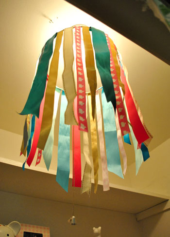
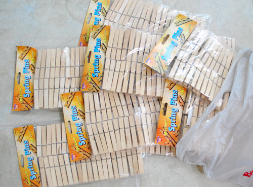
Sure it’s Sunday, but how about a little bonus behind-the-scenes tale of hunting down clothespins for the Pinterest Challenge light fixture that we have in the works? Other considered titles:
- “The Petersik Clothespin Tour of Richmond”
- “Wow, I’m a really patient husband.”
- “Sorry environment, we vow to plant three trees to make up for all that driving”
Okay, so here’s the deal. When we first started our clothespin light fixture (first mentioned here), we snagged four bags of clothespins at Ben Franklin just to get us started. We knew we’d need more, but we didn’t want to go crazy buying them until we decided on a pattern and had a better sense of how many we’d need. Oh, and Ben Franklin only had four bags at the time too. Minor detail.

Once we started clothespinning away, we realized we’d definitely need more. LOTS more. So just as Clara went down for a nap, Sherry sent me out on a quick errand to get more packs (8-ish was my instruction). Neither of us knew my “quick” errand would turn into a 2 hour, 54-mile trek around the Richmond suburbs.

Since we had already started using the four packs that we bought at Ben Franklin, I needed to get more packs of the exact same sized clothespins to add to our collection (which sadly meant places like Target and the dollar store were out due to only carrying pins that were too large or too small). So I decided to hit up the same Ben Franklin from before [Marker "B" above] hoping they had been restocked. They hadn’t. Zero clothespins secured.
I only knew of two other Ben Franklin stores in our area, so I stopped by a nearby Bed Bath & Beyond (“we don’t sell clothespins”) and Michael’s that shared a shopping center [Marker C]. Michael’s carried another brand of clothespins that came in large, small, and mini sizes. Wouldn’t you know we needed the medium size (since those fit perfectly into our wire light fixture frame and would look consistent next to the pins from the four bags that we already had).

Sidenote: And yes, my wife has me labeled as “Husband – John” in her phone. Like she knows so many other Johns that she would get confused withouth the whole “husband” part.
But back to my hunt. Thanks to failing at my first few stops, I realized that I needed to expand my errand circle to the next Ben Franklin [Marker D]. Score, they had three packs of mediums in stock. Maybe they never stock more than 3 or 4 at a time? But that would mean going to the only other known Ben Franklin store [Marker G] wouldn’t get me up to my goal of 8 packs. Crap. Time to break out the big guns: JoAnn Fabrics [Marker E] and Hobby Lobby [Marker F].
Though they were both far out of town, they’re both really big and located off a nearby highway with a high speed limit and low traffic volume. So basically, the need for speed* tricked me into what I would later find out was a bad decision.
*If you’re rolling your eyes because this sounds like a typical testosterone-fueled poor decision, allow me to remind you the decision was also swayed by the possibility of finding CLOTHESPINS at a JOANN FABRIC or a HOBBY LOBBY. I was deserving of a masculine moment, okay?
Anyway, you’ve probably guessed where this was going. Sherry actually did some calling around and they both said they had clothespins, they just didn’t give her specifics on size or brand, so I had to check those things out myself. Spoiler alert: both JoAnn and Hobby Lobby failed me (once again, only large, small, and mini sizes). At least the Burger King I stopped at in at between them didn’t let me down (it had been over an hour of clothespin hunting and clearly I was growing weak). So with almost all hope lost – and visions of a half-filled clothespin chandelier creeping into my mind – I trudged my way to my last Ben Franklin [Marker G] where Sherry had also called ahead for me (but couldn’t get any assurance that they had the specific brand and size that we needed).
Here’s where I should’ve been ecstatic: they had them. But here’s also where I felt like an idiot: they had nine packs. NINE. Yep, had I gone here in the first place (a mere 8 miles from home, no less) I would’ve found all of my clothespins in one spot. No two hours wasted. No getting tired of cashiers joking “you must have lots of laundry to do!” No Burger King-induced stomach ache.

Oh well. Shoulda, woulda, coulda right? Even by calling ahead and identifying places to avoid (Target, the dollar store, Bed Bath & Beyond, etc) it was still was a pretty exhaustive tour of my fair city. The bright side is that the chandelier is shaping up to be really cool. Sherry and I have been experimenting with a lot of different clothespin patterns and we can’t wait to finalize things, hang it up, write a picture-riffic tutorial, and share the results on Tuesday morning (and hear what all of you guys tackled if you opted into the whole Pinterest Challenge thing too).
The only bummer? We have four leftover packs of unopened clothespins to return to Ben Franklin, my new home away from home. Yup, there was a mild to moderate over-calculation. So we really only needed four more packs in the first place (as opposed to the eight that I bought home). In the words of the always eloquent Homer Simpson: d’oh.
July Superlatives
We’ve been getting requests for some sort of monthly roundup or recap when it comes to all of our undertakings (just so it’s easier to hunt posts down and see what we’ve recently conquered at a glance). And because we wanted to put our own weird little spin on it, while we were out to dinner alone (for the first time since Clara was born, mind you) we started chatting about how cheeky little nominations and titles for certain projects might be funny (or not, you decide)… and so the idea of monthly superlatives was born! As was the conviction that we have to get a life and stop talking about the blog while on our first date in 14 months.
Oh and since we’re on the subject of superlatives, you should know that John was voted “Friendliest Male” (three years in a row, actually – by his high school marching band) while I was awarded the title of “Best Friends” in the back of the yearbook (with Jenny Czajkowski, who helped me highlight my hair in her sink with mustache bleach). But enough about us. On with the July superlatives:
Most Cheerful: Painting The Laundry Room A (Pretty Darn Happy) Greeny Yellow Color

Most Improved: Adding Some Laundry Room Built-Ins (then painting them and filling them with stuff we already had)

Nicest Legs: ORBing Those Parsons Chair Legs

Most Likely NOT To Succeed (At Least The First Time Around): The Guest Room Light Switcheroo (And ReSwitcheroo)

Runner Up, Most Likely NOT To Succeed (At Least The First Time Around): Framing Our Anniversary Note Cards (And Then Reframing Them Without Borders)

Most Likely To Please The Queen: Tea Dying Some Pillow Covers (<–not only pleasing to the royals, but free).

Most Likely To Result In A Crack Joke: Filling The Patio Cracks With Polymeric Sand

Runner Up, Most Likely To Result In A Crack Joke: Caulking The Laundry Room Ceiling (Slash Kicking Off Some Other Laundry Projects)

Most Outdoorsy: Spray Painting The Patio Furniture (you guessed it, ORB).

Runner Up, Most Outdoorsy: Our Mini Porch Spruce Up

Class Nerd: Coding A Room Gallery

Most Boob-Centric: My Breastfeeding Post (who would’ve thought that little diary entry of sorts would get almost 1,000 comments?!)

Most Free Spirited: My Unironed Ribbon Chandelier (which shockingly still remains unironed, and I’m usually so anal…)

Most Controversial: Priming & Painting Our Laundry Cabinets, Switching Out The Hardware, and Hanging Our Ironing Board (which resulted in quite the directional debate).

Most Glamorous: Painting Clara’s Closet Pink & Playing Around With Champagne “Stencils” (update: I played around with some more homemade stamps/stencils and have completed around 20% of the closet – I’m hoping to finish this weekend and have a post for ya early next week).

Most Embarrassing: The Pinterest Challenge Video. By far.
Most Spontaneous: We didn’t really post about it because it happened sort of gradually, but around the beginning of July, Clara just decided to walk (after lots of funny one-legged crawling like this). And just like that she’s too cool for us. See it here if you can’t below.
Most Immature: The Whole Twig & Berries Thing (Spraying Painting Frames & Mats & Losing Our Duvet)

So there you have it. July at a glance. And yes, this was more fun than we probably should admit. Dorks for life.
Anyway, what have you guys been up to this month? Have you ever made a list of accomplishments to look back on? We’re so used to adding things to the to-do list that stopping to see what we already did is kind of nice. And it’s interesting to look back and pick out the super cheap stuff (tea dying our pillows, painting our laundry room, painting Clara’s closet, and making that ribbon chandelier were under $2 total) and the more major stuff (like creating custom built-ins and adding an inspiration gallery) along with all the other stuff in between. We were all over the place, huh? Just the way (uh-huh, uh-huh) we like it.
Budget Blooms: What The Heck Are These?
Oops, we totally fell off with the whole used-to-be-monthly budget blooms thing. But lookie what I found growing in the jungle that is our front lawn:

Allow me to put on my best Australian nature-show voice to set the scene for you: The air is still. Not a predator in sight. Something moves in the brush. A buzzard circles overhead. Somewhere in the distance a lion roars. No wait, that’s a baby crying. And just like that I’m out of character.

I don’t know the real name for them (flower whisperer, I’m not), but I like the sound of Purple Ring Pops. So that’s how I’ve been referring to them. At first I just admired them on our way up and down the driveway. Then I thought a little snip snip was in order so I could take some of the stems inside to be ogled more regularly. Here are a few cuttings living it up on the back of the living room console table.

Sidenote: Everything looks better with a white cardboard rhino in the background (from here a while back, bee tee dubs).

I think this vase gets used more often than any other in the house (it’s from Crate & Barrel three years ago or so). Pink and purple sounds like it could sway into the unicorn/fairy princess realm… but somehow it works.

Anyone know the real name of these blooms? Have you found any fun mystery flowers – either in a field, at the farmer’s market, at the grocery store or in your yard? Do you ever have that internal debate about whether you should leave flowers outside to enjoy when you’re out there, or snip ‘em and bring them inside, where you spend more time? I usually leave things outside for a few days and then can’t help myself and bring in a few cuttings. Oh and did anyone notice I snapped these pics before our frame switcheroo (mention this morning) but it just took me longer to write this post than it took John to get his done? Maybe we should add Overachiever to his roster of middle names. John Overachiever Danger Soda Petersik. I like it.
Psst- Wanna see our first cheap-o bouquet from January of 2009? And February, March, April, May, June, July, August, and September’s too? How about our 2010 blooms from January, February, March, April, May, June, and July along with one from a few months back? Can you even handle all of that glorious nature in one sitting?
Squaring Off
Well well well, if isn’t those little photography note cards again. You know, the ones we bought on our anniversary from a local art gallery to hang in our bathroom? You might not even have registered them in that post since everyone went bananas over the whole Sherry-haircut thing.

Anyway, hanging them in the bathroom was the initial plan. Until I noticed some of the photo colors were in the same neighborhood as our framed $5 scrapbook paper. That neighborhood being Sue-the-Napkin-ville. Or is it Sue-the-Napkin Heights?

We figured that maybe our $4 a pop Sherri Conley note cards were destined to live in these eight frames (plus we couldn’t decide on a configuration for the bathroom, so we liked the idea of enjoying them out in the living room). But it meant we had to get four more of them first, so we shucked out another $16 to round out our “local art collection” (from Crossroads Gallery here in Richmond).

The idea was to add the small square of art into the middle of the colored paper square that already sat inside the square frame. Thereby making the colored square of paper into a fun little colored square mat. Wow, lots of squares going on. We’re one do-si-do short of a square dance.
First we had to cut our rectangular note cards into… you’ll never guess… squares. I used an exacto and a ruler to keep my lines straight, but was brave enough to just eye the placement of my slice. Yup, my middle name should be Danger. Or soda. Or both. John Danger Soda Petersik. I like it.

As you can see, we left a thin white border on the pictures to, I dunno, further emphasize their squareness? They sort of looked like little polaroids to us.

Then one by one the frames came off the wall so the photos could be scotch taped into place on each colorful background which essentially became the “mat.” To get them centered we eyed them, then used a yardstick to make sure they were actually centered. To do that we just lined up the yardstick across two opposite corners, and then repeated that with the other two corners to make sure they seemed to intersect equally.

Finally, everything was reframed and ready for our viewing pleasure.

Only problem, we weren’t totally psyched by the result. We didn’t mind the small size (it just makes us want to lean in and take a closer look) – although I know some folks might think bigger is better (that’s what she said). Our issue was that something about them was really interrupt-ish and busy and, well, just too square-y (it honestly looks better in pictures than it did in real life). And yes, the reflection on the glass totally bites for taking pics, but we’re not quite ready to splurge on eight panes of museum glass just yet.

We realized the white borders I left on when trimming the note cards might be the problem. It made the distinction between the photo and the colorful mat so defined that we kind of lost the fun coincidence that each pairing was sort of linked by color. So rather than the paper feeling like an extension of the art’s hues, it just felt like a tiny picture on top of a thick bright mat on top of a thick white mat. It was a square vortex and it was threatening to eat our brains.

So after a few days of living with it (and not growing any fonder) Sherry took it upon herself to remedy the situation. And since she has a much steadier hand than I do, she didn’t even use a level and an exacto (just a regular old scissors). Cocky much?

Of course her cuts were great. And now we’ve got this:

We like it muuuuch better – especially in real life. Although we’re the first to admit that for some reason the white framed note cards didn’t photograph as crazily as they looked in person, so there’s not as much of an obvious improvement from the square-on-square-on-square action that was going on before. But in person it was such a relief. We worried we might have to scrap the whole note card idea entirely, but once they were trimmed down and put back in place, all was right with the world. Or at least with the left wall of our living room.
We like that they feel less busy and that subtlety is much preferred. They don’t scream “check-me-out!!!” but are nice when your eyes meander around the room and happen to land on them. So for a total of $4.64 per frame (64 cents for the scrapbook paper backgrounds and $4 a pop for the photo note cards) we’re psyched.

I still wouldn’t go as far as to call this our forever art solution for these frames. We’ve learned our lesson when it comes to making those sort of giant declarations since our house is always a WIP (work in progress). Not to be confused with an ORB (even though Sherry is definitely demonstrating her undying love of all things oil-rubbed-bronze). So we think adding these small photographs are a good warm-up for us since they might end up laying the ground work for something else that we may want to transition to a bit further down the line. So let’s call it a baby step. We’ve introduced some small photography, so maybe in a while we’ll try some larger photography, rehang the note card photos somewhere else, and scrap the 60 cent scrapbook paper altogether… who knows.

What I do know is that looking at some of these photos makes me want to go on a ferris wheel. Oh, and eat funnel cake. Yeah, definitely that.

Has anyone else made any art-y updates lately? Or used note cards as wall decor? Or gotten sucked into a square vortex, never to be seen or heard from again? Well, if you have, I guess you wouldn’t be able to comment…
Psst- We announced this week’s giveaway winner. Click here to see if it’s you (plus the $15 discount code for everyone is still valid until August 31st).
House Crashing: Style For Miles
Who’s in the mood for some house crashing? This gorgeous old home is in the Forrest Hill area of Richmond, and we couldn’t wait to scope it out for you. Because, get this, Wendy’s house is used for commercials and photoshoots! As in, it’s such an amazing backdrop, the house is practically famous. Cool huh? And she’s a professional retail design and merchandising pro who just happens to design light fixtures when she’s not styling spaces. In other words, she’s got mad skillz (more on her here) so we couldn’t wait to snoop around. Oh look, here’s Wendy out on the porch to welcome us in:

Her porch was super charming with everything from a pretty light blue ceiling to a chippy old door and a happy red vintage mailbox. And you know I love those extra wide porch steps, right?

Once inside there’s a grand staircase that leads upstairs and a fun shimmering silver wall that Wendy painted herself with craft store paint when she was bored. Naturally we hit it off since I’m known to go a little crazy with craft store paint too (as seen here). Wendy said she just pulled it up and down the wall in sort of a “dry brush” method, so it looks like fun metallic wallpaper with a vertical “grain.” We also thought those three exterior lights over the art were really fun and unexpected.

If you look to your right while standing in that subtly metallic hallway, you see the dining room. And yes, John and I were utterly smitten with the cool pink industrial cart on casters. See the white duck on the top shelf? Yeah, basically I said “I’m home” and ran in and geeked out about it. Composure is a beautiful thing to lose. Anyway, check out the fun metal stars above the doorway with the small framed art dancing around up there. So playful and cool. Of course Clara loved the doggie too.

When you walk further into the dining room there’s an awesome old fireplace and a school-sized chalkboard that’s jam-packed with scribbles, notes, and letters to and from visitors. It’s really amazing. Oh and do you notice that the table is also the same metallic color as the entry hallway? Wendy was having a New Year’s party and thought her dining room “needed something” so she painted the table silver with her daughter – just for fun. Coolest mom ever? She’s definitely in the running.

Wendy had some of the most stunning lights we’ve ever seen. Check out this handsome guy:

It was really inspiring to learn that Wendy has hunted down nearly all of the stuff in her house from places like local thrift stores and secondhand shops (she loves Trash To Treasure on Lakeside Ave). She even finds things on the side of the road, yet her place looks so elegant and – well, expensive. Here’s my beloved pink castered cart up close and personal. And my white duck friend. Is he not the best looking wood duck you’ve ever seen? I like how he slyly tucks into the top shelf looking dapper.

When you enter you can also turn to your left to see the living room, complete with a giant teal sofa that Wendy saved up for after “visiting it at the store a bunch of times” (it’s from La Diff here in Richmond). Wendy’s basically me in another (more stylish) body. I visited Karl The Sectional for months before we got him. So I understand the deep sofa love that she described. And look- more fun metal stars over the doorway:

I was immediately drawn to the giant clock over the piano. It was actually a gift from her father so it’s really meaningful along with being just plain cool. And do you notice something about the coffee table? It’s another old cart on casters. So simple yet full of character. This was just one of those houses that you feel so comfortable and casual and “welcomed” as soon as you step inside. It’s a wonder I didn’t flop down on the big teal sofa for a little afternoon nap (well, it’s actually not a wonder because Clara doesn’t let me get away with that sort of thing).

And now for a clock close up:

Here’s the view from the piano looking into the entryway and the dining room beyond:

Oh and this is the view from the teal sofa. Yup, there’s yet another awesome original fireplace. And see that awesome tripod floor lamp in front of the fireplace? That’s one of Wendy’s designs. It was so gorgeous in person- this photo doesn’t do it justice. I could totally picture it in a Candice Olson room or something.

Beyond the stairs that lead upstairs was a nice spacious washroom. Aren’t those old doors cool? Wendy made them. Yeah- she added a chippy paint technique along with some architectural salvage finds (the iron grates, the handles, and even the ornate corner pieces) to create two one of a kind doors that obscure her washer & dryer.

This was one of those awesome old homes with tons of character, so this is a shot of her second staircase. Yup, she has two. The front one and this one, which is right off of the kitchen and the washroom. So cool. And I loved that she hung a basket on the wall like that. It kind of looked like a faux tortoise shell. And you know how I get about animal decor…

Here’s her awesome kitchen with an old cabinet in the center of the room. She got it from a school that was getting rid of it and remagined it as a kitchen island. John and I fawned over all those long skinny drawers. I also really loved how she hung what looked like a plate rack vertically and stuffed it with napkins and linens. Sweet.

Here’s a guest room in the back of the house. Once again Wendy wowed us with her use of charming old items in new ways.

This time it was those chipped multi-colored shutters, where she hung a little tin basket of faux blooms:

Wendy was a really inspiring “curator” (which is probably why she gets paid to style things for a living, haha). John and I especially loved this asymmetric wall of frames, shelves, letters, and even old lighting hoops that Wendy had on hand.

Here’s Wendy’s master bedroom with a charming four poster bed that called my name. Don’t worry, I restrained myself and did not try to swan dive into it. But Clara tried. Twice.

And here’s her light and airy master bath. Doesn’t it look like a beach house out of a magazine? I loved the breezy little half-curtains and the weathered old secondhand dresser that Wendy uses for linens and towels.

So there you have it. A local home here in Richmond that we’re still talking about. Thanks so much to Wendy for letting us poke around! And get this, Wendy is selling her gorgeous house. So if anyone’s interested, you can contact her through her site. Now let’s play the favorite part game. I’m dying for the pink cart on casters, the cutie pie white duck decoy, and the soft blue paint on the porch ceiling. Meanwhile John will not shut up about the giant clock. But is anyone really surprised by that?
Psst- Check out our recently created inspiration gallery (where you can search by color or room) with over 330 other stunning spaces!


