If you’ve never been to Kennebunkport, ME this giveaway gives you good reason to go. Enter to win $150 towards anything from Spaces Kennebunkport through 6/2.
[ Read More ]
Home Decorating & DIY Tutorials
If you’ve never been to Kennebunkport, ME this giveaway gives you good reason to go. Enter to win $150 towards anything from Spaces Kennebunkport through 6/2.
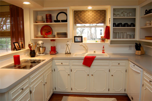
When Bonnie sent us her charming kitchen before and after pictures we just had to share the goods. Here’s her letter: I’ve been enjoying YHL for the last year. My husband and I bought my grandparents home this past November and have had so much fun renovating it! We turned the place upside down and within about five weeks we got this outcome. We were on a really tight budget, so most everything is from Ikea, thrifted or made by us. We drew tons of inspiration from Young House Love and referred to your ‘how to’s’ quite often! My readers really enjoyed our kitchen before & afters, so I thought you might like to see
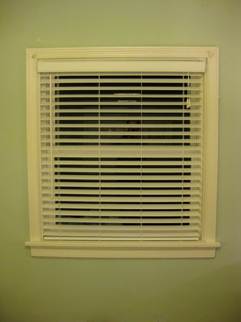
We first brought home a pair of white faux wood blinds back when were decorating the nursery (since a nice dark room sounded like a good idea when it came to encouraging some serious pee-wee shut eye). The ironic thing is that literally for years we’ve been dying to bring them into our very own bedroom. See, the window above the bed was never covered, and although the sun doesn’t rise on that side of the house we knew it could definitely stand to get darker with the help of some sort of rolling or slatted blind. Plus the other window in the room had the original plastic roller shade that came with the house
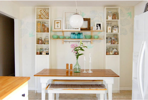
When Rachel sent us her recently DIYed kitchen makeover we had to share the goods. Here’s her letter: To say that there are touches of YHL in our newly renovated kitchen/dining room would be an understatement. I “borrowed” many of your ideas! First we removed the upper half of the wall separating the kitchen from the dining room. And after the dated wallpaper came down we painted both rooms with a 5 gallon bucket of Valspar paint to cut costs. We removed the upper kitchen cabinet doors to create an “open” look while the lower doors are original (we sanded, primed, & repainted them). We also added new hinges & hardware. Then we installed a
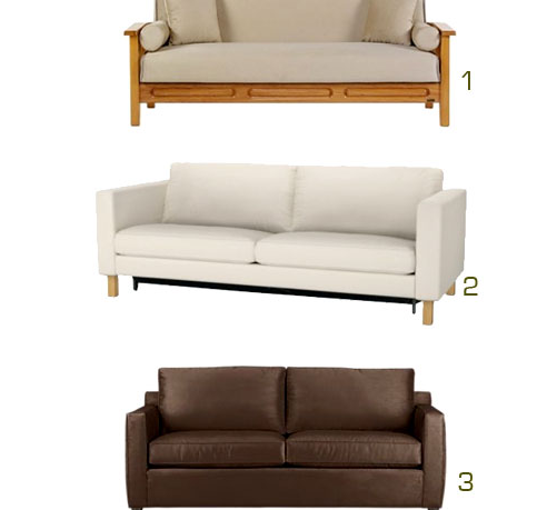
After recently revealing that John would be coming on as a full time blogger here on the home front (and mentioning that we had a full scale guest bedroom to office-slash-guest-bedroom-slash-playroom makeover in the cards) we’re back to spill more details about that space’s big switcheroo. Spoiler alert: we need a sleeper sofa, STAT. Let’s take a look back – waaaaay back – at what the room looked like when we moved in. It was actually a pretty blank slate to begin with, so replacing the ceiling fan with a flush mount fixture (like this- basic and cheap, but still an improvement) seemed to raise the ceiling about a foot. Then we just painted the
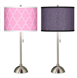
Can you be trusted to design your very own lamp shade? With the help of this giveaway from Lamps Plus we think you can be! Enter now through May 26th.
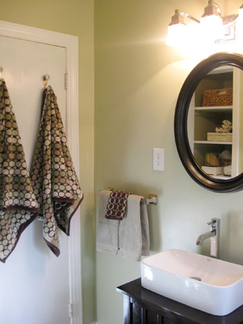
Ever been trapped in the bathroom? We were. All the time. Every spring and summer, thanks to a bit of increased humidity, our full bathroom’s door used to swell just enough in the top left corner to keep the door from opening on the first pull. Or the second. Or the third. In fact it usually took some serious “door flapping” (grabbing the knob and rocking back and forth until it sprung free on the fifth or sixth tug) to get out of the bathroom every time we used it. And forget about our poor friends and family members who innocently ducked in there and then freaked out about a minute later when they thought
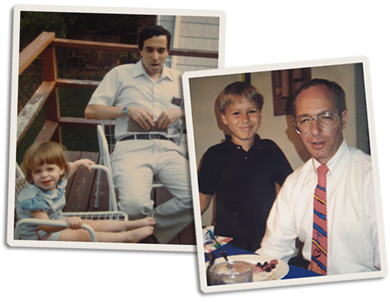
John’s dad’s nickname is El Cheapo and he truly is one of our money management role models. It’s not like he wears shoes with holes in them or lives without creature comforts- he just saves for what is truly important to him (like a family-sized vehicle and even a vacation home for us to gather) and forgoes things that don’t mean as much to him (like fancy meals on the town and a room-sized flat screen TV). Of course deciding what matters to you and being frugal in other areas is truly a personal decision (so if a flat screen TV will give you more joy than a minivan you should certainly follow your heart
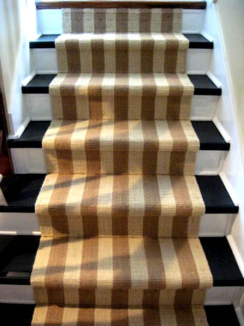
When Rhoda sent her amazing DIY staircase makeover we had to share the goods. Here’s her letter: I wanted to pass along photos of my latest project, since y’all are such DIY loving people. I hated the carpet on our downstairs set of steps, so I ripped all the carpet up. Oooops, you can see from the pics what I had to work with… and these stairs were never meant to be shown to the public. But, I slowly transformed them by adding TONS of molding (I just used my hand miter box and lots of paint- including porch and floor paint for the stair treads). Then I added a natural jute runner down the
Announcing the winner of our YHL Baby Pool. Someone guessed Clara’s birthday correctly as May 14th and now they’re getting 100 bucks to West Elm!
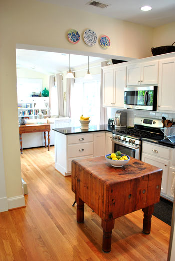
We’re back with another House Crashing adventure, and this one happened right here in Richmond. This charming Westover Hills house was just too pretty to pass up, so when Lori and her husband Greg invited us inside to poke around we knew we had to bring our camera and snap some photos for you guys as well. And here’s the cute couple now… Lori’s actually expecting a wee one in August, but although the whole nesting thing hasn’t quite kicked in just yet, her house was spotless none the less. Here’s the view as soon as you step into the front door. Gorgeous and sundrenched would be exactly how we can describe their entire house.
Just thought we should mention that we recently welcomed a new member of the family. On Friday the 14th at 5:57pm, Clara Kenley Petersik was born with a paint brush in her hand weighing in at 7 lbs 10 oz and measuring 20.5 inches long. We’re insanely in love with her. And she and Burger are already best buddies. Seriously, he thinks it’s his job to stand guard next to her at all times. Clara was named after John’s grandmother on his dad’s side. And her middle name, Kenley, is an homage to my dad (Ken) with John’s mom’s maiden name worked in there (Kelley) along with a reference to my great aunt on my