Two weeks ago when John shared this post about the times that we’ve made bad painting decision, we received a bunch of requests for a follow up post in the comments:
Q: I guess I just have a hard time picking colors because I have a hard time telling which swatches have grey or brown undertones. Maybe you can show some swatches (of say the teal from the built ins). One that has a grey or brown undertone and one that is more saturated? It might be helpful to see them side by side! – Aubrey
Q: Thank you for this! I actually think tip #3 (pick a muddier color) surprised me the most because I’d never heard that or thought of that. But it rings so true in my experience! Although colors don’t show up perfectly on monitors, I would *LOVE* to see a post with color samples and explanations like, “We love this peacock blue, but we think it would be too garish on a wall. Instead, we’d try this color, and probably get the effect we’re looking for.” -Heyruthie
Sounded like a good time to us. Comparative swatches will probably demonstrate more than words ever could. So let’s just let the swatches do the talking.
First we have the bold and fun color you might be going for on the left, so if you envision a deep teal tone, you might be tempted to use Classic Teal after seeing the swatch. But on the right, we put the swatch for Plumage, which is actually what we used in our guest room. See how grayed out the swatch looks?
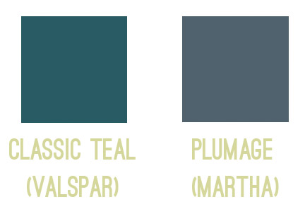
Yet on the walls it’s every bit as bold as we hoped!
Colors in general – and especially dark ones – seem to amplify by a TON when they’re up on the walls, so we’ve had luck picking the ones that look a bit faded or grayed out, knowing that once they’re up on the walls they’ll look a lot more clear and bold. You can read more on the guest room here.
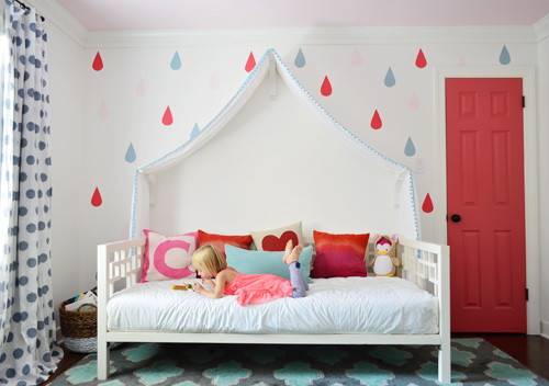
Next we have a swatch on the left that you might be tempted to pick if you want a bright and happy accent of pink – perhaps for the door of a kids room, like we used on Clara’s closet. But the swatch on the right is actually the one that we picked. A small square of it looks a lot more muted (sort of faded) compared to the bold and happy color on the left…
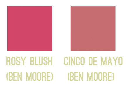
… but once it’s on a nice big area in the room (like the door), you can see how bright and clear that color reads. So even though the swatch on the left might be the pure and unfaded one you’re initially drawn to, in a nice large chunk it could almost read as neon. You can read more about Clara’s closet and those raindrops here.
Another coveted color seems to be a cheerful aqua tone, but in our re-painting-riddled experience it can be hard to get right. The color on the left is a peppy Tiffany Box blue… which is actually a color that seduced us when we moved into our first house… but once we had it on the walls of our dining room, well, it was a little overwhelming. Of course it depends on your room (someone with an amazing room full o’ light could make it look stunning) but in our experience, that color’s just not muddy enough not to get blindingly bright on the walls. So we’d be drawn to something like the swatch on the right, which should still clearly read as a pretty aqua tone in such a large quantity (here it is in a laundry room makeover).
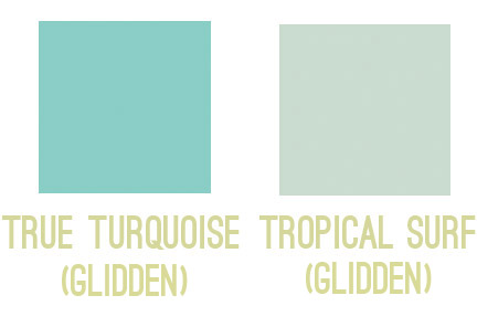
So my general rule is that for painting smaller items (like a tray, side table, accent chair, or lamp base), those more clear/unfaded/unmuted colors can be great. But for larger expanses (doors, walls, ceilings), we tend to prefer muddier tones of the same color – like a softer aqua with more of a gray-green undertone – just so it doesn’t go from chic-tiffany-box blue to punch-you-in-the-face-when-you-walk-in blue.
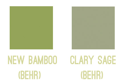
The same thing seems to ring true for greens for us. Something bold and clear can work really well on a piece of furniture or a bathroom vanity (but not necessarily all of them, ha!). But when it comes to the walls, the color on the left would likely turn most rooms into Kermit Theee Frog (I love when he says his name that way). Meanwhile, the one on the right might look dull by comparison, but on the walls it could be really pretty. Sage is always gorgeous with wood trim or cabinetry, so that could be a nice choice for a kitchen with wood cabinets or a den with wood trim.
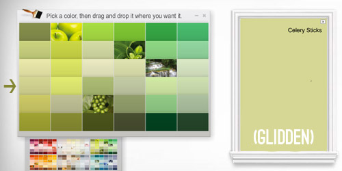
Here’s another way I thought I could attempt to illustrate the strange mystery of how a swatch with those muddy/muted undertones can almost look beige in your hand in some instances… but then when it’s on a bigger area, it’s very clearly a color. See how muted and almost wheat-toned the swatch on the left with the arrow next to it looks below? Yet when it’s in a bigger area (that’s the exact same color in a larger rectangle on the right) it definitely looks green and not tan or beige anymore.
Update: Someone asked if the muddy version of a color would typically be on the same swatch as the bright one (if you slide up or down) or if it’s on a different swatch. In our experience, it’s almost always on a different swatch, so there might be a whole range of clear tones on one swatch (from bright aqua to a light baby blue) but you’d want to go a few swatches over to the one that has a much grayer or muddier top color (like a deep blue-gray) and slide down to find those muddier counterparts.
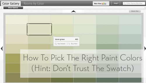
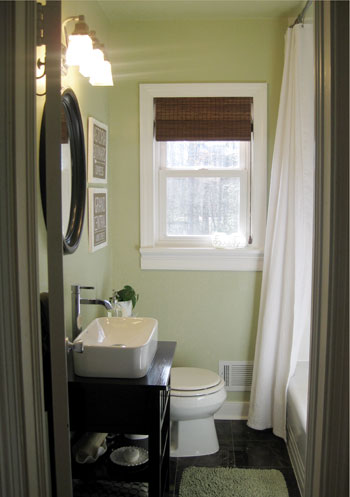
One last example would be Dune Grass, which we used in our first house’s bathroom. It looks almost completely cream/beige/tan in a small swatch (with just a tiny hint of green) – especially when it’s arranged with other green tones that are a lot less muted…
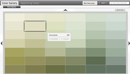
… but in our bathroom it clearly reads as a soft green color. Once again, when it’s up on the walls, there’s just a lot more of it, and it’s definitely amplified from the neutral-looking swatch. So if you’re looking for a light or subtly colored wall (be it green, blue, pink, yellow, orange, purple, etc) you might want to consider those lighter wheat or gray toned swatches that almost look like there’s just a drop of that color in them. The result can be a room that’s clearly that color, but a soft and subtle version of it. You can read more about that big bathroom reno here.
As Heyruthie mentioned, colors aren’t always great on monitors, but hopefully just seeing these comparisons might help. And when making a final choice, the best method we’ve found has just been to bring some swatches home, check them out in our lighting situation throughout the day, and then grab a test pot (or three) of paint if we’re still nervous. Those small sample pots are only a few bucks and they can save you a whole lot of re-painting trouble.
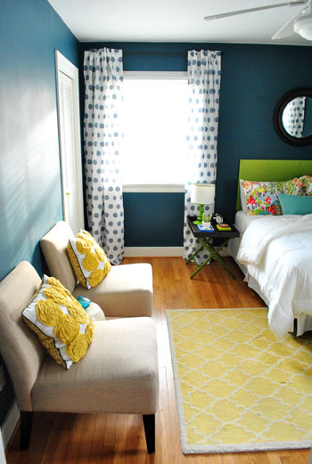
It’s also amazing how different the same paint color can look in a variety of rooms/lighting situations, so I’m sure there are folks who’ve used those bolder colors in the left columns above with great results – so it really does depend on your room, how much light it gets, and how you layer stuff in. Like this could-have-been-blinding bright blue paint color, which looks awesome in a lofted and light-filled studio – especially when it’s tempered with lots of tan texture in those pin boards and that over-sized mirror.

Oh and since we’re on the subject of buying paint, here are a few tips we’ve learned over the years about scoring a discount:
- “Oops paint” can be awesome (it’s someone else’s already-mixed paint that has been returned for some reason, but it’s usually extremely marked down as low as $1 for a whole gallon, so you can even get a few cans and mix them in the hopes of creating a color you like for a serious discount).
- If you have a favorite paint shop (ours is a local place called Virginia Paint), you might want to pop over to their Facebook page and click the Like button or sign up for their mailing list. By doing that you’ll often be alerted if they’re running sales or specials, and sometimes you can save $10 or even score 40% off.
- If you get paint from a big box store like Home Depot, you can hit up their website and check out their Paint Promotions page.
- You can also get 5% off any purchase at Home Depot or Lowe’s if you use your store credit card there (Lowe’s does it automatically, and you just have to ask for Home Depot to match the 5% off that Lowe’s provides when you’re checking out and they will).
- Sherwin Williams tends to run some great specials. In fact right now they’re having their big 40% off sale. And I’ve heard you can buy untinted gallons (like a whole bunch of them) for 40% off and then bring them back later to get them tinted at no charge (I’d check with your individual store, but that’s the rumor). So even if you’re not sure what colors you want right now, if you have a bunch of rooms to paint it’s a great way to save serious loot.
- It never hurts to click around on any paint website for promotion info. Right now Behr is having a $5 off promotion and Benjamin Moore is offering a buy-one-get-one-free deal on a quart of paint.
Do you guys have any other paint undertone tips to share? Or just some stories about going for the wrong swatch? Any other tips for getting paint at a discount?

Laurie says
I’m a big fan of the test pots. When I found out you could do that I was gobsmacked! I had to paint my kitchen and family room and I took full advantage of them and it was a HUGE help! Plus, I painted a big square in both rooms even though they are connected and saw a difference in how the lighting worked with the colors in the different areas which also helped me pick a color.
My left over test pots are still colors I like (after all, I was going to put them on the walls) and I’ve used them to paint furniture and even the back of a bookcase. One of the colors was a little brighter and darker than I wanted, but because it is the same “palette” as the color that was finally selected, it is a fantastic accent color!
Thanks for the examples, they illustrate the concept really well!
YoungHouseLove says
Love the use of other test pots as accent colors! So smart!
xo
s
Marissa says
When I was at Benjamin Moore buying test pots, the paint rep warned me against using them for anything besides color testing. He said the paint used for samples is “inferior to even their lowest line of paint, and prone to chipping and fading” because it was only designed for temporary application. I was a little taken aback, because those pots are still pretty expensive!! Just wondering if anyone has ever heard of this or had problems with test paint durability? Any paint employees out there who can confirm/deny this info?
YoungHouseLove says
We’ve used test pots for a bunch of small projects and have never had it crack or chip or fade or anything, but I’d love to hear back from others if they have! I’ve talked to two different people who manufacture paint and work at plants (not distributors who sell it at stores) and they have both said they think that’s just a rumor. They also told me that those test pots of paint actually lose companies money (they cost more to make than they sell them for) but they take that hit in the hope that they inspire people to come back and buy the gallon (where they make their money) so one guy said he thinks stores encourage their customers to buy the larger quantities in stores by saying that about the test pots. The other person just said he never heard that, but he believes it’s the same paint and it’s tinted with the same machines right in the store that they use for the big cans, so that isn’t going to vary either.
xo,
s
Richelle says
Our Sherwin-Williams sale is a deal! We got all of our kitchen paint (4 full gallons, since we did the cupboards, and we bought the top-of-the-line for durability) for $150. Our sales rep mentioned that our store will let you buy untinted paint during the sale, and come back to tint it later. Not sure if there’s a charge at that point (we waited to buy our paint during the sale, and we knew what colors we needed), but if there is, I would bet it’s pretty minimal. Certainly less than buying the paint can at full cost!
YoungHouseLove says
Love that!
xo
s
Bethany says
I recently painted my half bathroom. As the paint was going up, the color I thought would be a greyed light navy looked more like a periwinkle blueish violet. But I went back to Sherwin Williams and they retinted the remaining paint for me (for free) and now the color is a navy I love! I’m sure it wouldn’t work in every case, but it saved me buying a whole new gallon of paint! Yay!
YoungHouseLove says
That’s awesome Bethany!
xo
s
Clare says
Great tips! Just wondering, are the winter and summer lights important in the color picking process? How about with what direction(s) the windows are facing?
YoungHouseLove says
We’ve had luck painting in all different seasons, and stuff we pick in the summer looks the same to us in the winter, and vice versa. But I did have a reader once tell me that she loves her paint colors in all seasons except the spring when it looked more yellow, and I asked if she had a ton of trees around that could reflect that new-yellow-green leaf color into the windows and perhaps yellow her colors, and she said “that’s totally what it is!” – so I think in some dramatic cases, that can affect things (our houses have all been in wooded areas and we haven’t noticed this, so maybe it depends how close the trees are to the house, etc).
In terms of which way the windows face, some rooms get more light than others (north facing is typically the lightest) but as long as you pick the color in the room where you’ll use it- that should be how it reads and you shouldn’t have to worry about things (ex: don’t pick a color in a north facing room and then use it in a south facing room).
xo
s
Brittany says
OMG this was a fantastic post!!!!! I agree, I matched a color directly to an accent pillow once, but on the wall it was too bright and too much! The ‘muddier’ colors end up being exactly what you’re looking for – you explained it so well!
Heyruthie says
Oh, I’m so excited to see the “Pick this, not that” post finally come to life, in response to my original question! Honestly, this was even *more* helpful that I imagined. Even after your previous post, I still didn’t “get it.” I can’t believe how muted some of those colors look on the color cards, compared to how they “paint up” in a room (is that a verb??) I would never be drawn to those swatches. but a picture is worth a thousand words, and I finally think I’m beginning to “see” the colors. This is really going to force me to start looking at paint chips differently, and I’m so excited because I think the result will be that I finally have a fighting chance to like the results. I’ve spent too many years hating my paint jobs, because they look like a circus carnival! Thank you, Sherry. This was fantastic :-)
YoungHouseLove says
Aw, I’m so happy to help Heyruthie! Happy swatch sifting!
xo
s
Gretchen@BoxyColonial says
Interesting! I’ve definitely noticed that colors tend to look brighter and bolder than the swatch on whole walls and sort of more timid/less colorful on furniture, but I’d never thought of it in terms of “muddiness” before :). Our current house is so much brighter than our last one that it seems like every paint color decision we make is of enormous significance–everything just shows up so much more, for better and for worse.
Carol says
I’ve been a victim of the looked-like-grey-but-was-really-color swatches. Or, I should say that my wallet and kitchen walls were the victims.
Try 1: BLUE
Try 2: slightly greyish BLUE
Try 3: grey, but too dark
Try 4: FINALLY a soft grey
Sometimes the “y” in diy is really for “why????”
YoungHouseLove says
So funny (and true)! I’m glad it worked out in the end.
xo
s
Sarah J. says
thanks for this! definitely always a plus to have advice on paint. i feel like it’s not too expensive to change, but way time consuming! especially when you have two little boys who are drawn to all things wet and messy. :) so anytime i can get it right on the first try is a huge score for me.
Nora Rose says
Sheffield Grey was our dining room color that read really grey on the swatch and then was a gorgeous deep blue on the walls with just the right muting. I will have to remember this for my teal bathroom plans!
Robin @ our semi organic life says
What are your tips on how much paint to buy/coverage questions and issues. I’m a beginner and have no idea how much I should buy or # of coats it’ll take.
YoungHouseLove says
Typically every room we paint gets two coats (really dark rooms like the guest room in our last house get tinted primer + 2 coats) and we usually just need a gallon of paint, even for pretty big rooms. If we’re doing the ceiling it might be a little more than that, but it seems to vary. If you’re doing a very small space (a tiny bathroom with tile halfway up the walls) a quart can usually do it, but otherwise we go for the gallon (nothing’s worse than running out and needing to grab more mid-project).
xo
s
Monica says
I have been reading your posts for years and have always appreciated your advice, but this is the best post ever!!! I recently painted a room with a color that I absolutely loved but HATED the results and I couldn’t figure out why it didn’t work and this totally explains it. This will help me more than you can possibly imagine in the future. I think this post just changed my decorating life. Thanks! You guys are the best!
YoungHouseLove says
I’m so glad Monica! Good luck!
xo
s
Anela says
Painting my living room was a NIGHTMARE. In my head, I had the perfect shade of a muted green but when I got it on the wall, it was more of a light, minty color that made me tear up. Then I went with something darker than that but I didn’t want DARK and that’s what I got. A medium-darkish green that made me full blown ugly cry. It’s still on my walls 5 years later because I just gave up. On the upside, I may have just found our new living room wall color in the form of that there Clary Sage you showed up there. I’ll wait until after the holidays though because I think the Mr would be the one crying if I tried that this time of year!
YoungHouseLove says
Aw, I hope it works! Definitely bring home the swatch (with a few others for comparison) and see how they look in your lighting. Good luck Anela!
xo
s
Lou says
Thanks for this! I just bought my first home after living in unpaintable apartments for four years, and am so excited to get started on my blank canvas! I will definitely be using this advice when I pick out my new homes colors!
Stacy says
I started working with our local Benjamin Moore paint store and they were so helpful with teaching me about undertones and color theory. When I went to buy all our paint he offered me the contractors rate to match the sale at Sherwin Williams i had mentioned and I’ve gotten it since then. They were so helpful with mixing custom colors too. Love local color and paint talent!
YoungHouseLove says
That’s so nice! Such a great tip to mention other sales going on and see if your store will match them!
xo
s
Megan says
Great post! It’s so helpful to see “real life” examples when it comes to paint, as there are so many factors that can change how things look. Generally, I spend ages picking out a color, buy it, panic when we open the can, panic when it’s first going up, and then love it the next day. I hope I’m not alone in that! haha! Also, we’re still in the middle of repainting our large living/dining/kitchen area and I was SO happy to see Sherwin William’s deal because we just discovered we need at least another gallon or two. I’m definitely going to check our store to see if they’ll tint later for free, which will be so handy when we get to the bedrooms!
Joanna says
Thank you so much for this post! I love bold saturated colors and have gone too far, too many times. This new knowledge will definitely help save me a few headaches… and brush strokes in the future!
Yvonne NC says
I tend to go for a more neutral palete. I’ve gone to the paint store and actually asked for the formula for the swatch. That way I can get a better idea of the undertones in the swatch.
YoungHouseLove says
So smart! Never thought to do that, but it would break down exactly what’s in it!
xo
s
Lara says
I had what seems to me to be the opposite experience. I knew exactly what color I envisioned for my living room walls, and it was the color of a candle that I had. I found a color that matched the candle pretty exactly when put next to it in the living room light. But when I put it on the walls, it was way too washed out and not at all what I envisioned. So I went two shades darker on the same paint strip and it was perfect. I did learn that what is on a tiny swatch can change when it’s on the big wall, though!
YoungHouseLove says
Oh no! That sounds like a nice problem to have, because it sounds like your room is soooo full of light!
xo
s
Laura at RatherSquare.com says
One thing we found out when painting rooms in our house was that you can sign up for a “corporate” account on Benjamin Moore’s website, and they will send you large swatches for free. The swatches are often as large as 8″ x 8″ and help avoid the need for test pots, since you can see a larger area. I just ordered a ton of shades of the color groups I was interested in and they shipped them to me.
YoungHouseLove says
Wow, that sounds so helpful!
xo
s
Marianne in Mo. says
Glad you put the word out on this topic, I’ve seen so many ugly walls out there in t.v. land!
My then teen daughter wanted periwinkle blue in her room once. I tried to sway her to the washed out shades, but she wasn’t having that. The paint went on while I was at work, and when I came home, walked down the hallway, the light from the room was glowing a harsh blue. Never got used to it, so I made sure her door was always shut after that! Soon as she went off to college, we re-did her room a soft tan!
As for a hint to readers, instead of painting tests directly on the wall, try using foam board. You can lean it on the wall or tack it up, move it from wall to wall, and even save it as a sample. Whack off a corner, write the paint info on the back, and take it with you when shopping for accessories and decor.
YoungHouseLove says
Great foam board tip Marianne!
xo
s
KathyG says
Fabric! My SIL taught me this trick – find the color chip you think you want, then go buy a yard or two of a solid piece of fabric that same color. A sheet, shower curtain, I even used a pair of pants one time. Hang that up on the wall for a couple of days. Gives a good sense of the color for the room.
YoungHouseLove says
Smart!
xo
s
Andrea says
This post is SO helpful — thank you! The more saturated colors are so lovely but choosing them can be so difficult… This guidance is wonderful!
Kristy @ Kristy's Health Revolution says
THANK YOU. When I read the previous post, I was on the same train — what do they mean by having more greys or browns? It all makes sense now! So glad you posted this before I decided to paint anything bright green!
YoungHouseLove says
So glad it helped Kristy!
xo
s
Jenny says
As someone who has been picking paint colors not just for myself but for friends for many years, I couldn’t agree more. And I am still learning…I painted the kitchen cabinets in our beach condo a happy light apple green, Behr’s Cornhusk Green in semigloss, and we love it. So I decided to paint one wall of my office the same color, but in flat, and it looks completely different–much darker and greener. A coworker said, if you painted the whole office this color you would feel like you were sitting in a giant margarita all day long, and that’s about right!
YoungHouseLove says
Oh man, it sounds like a good time to dip your toe into margarita-ville, but sitting in it all day could be a little intense!
xo
s
Sally G. says
Excellent advice (and deals)! The previous owners of our new house painted the basement living space what I’m sure they thought was a light sky blue, but with all the daylight from our patio doors, it’s like having blue highlighter on the walls. I can’t wait to paint and I have about a dozen paint swatches taped to various walls, but haven’t found colors that I’m really loving yet.
http://barksandbaking.wordpress.com/2013/11/06/new-house-tour-page/
John says
Not only how much light you get but the type of light bulb and the color it puts out. Cool, warm or daylight will modify the color sample.
YoungHouseLove says
So true!
xo
s
Clare says
So true! In that case, what type of light bulb is commonly used by painters to get the color they want, such as the ones who picked Benjamin Moore colors?
YoungHouseLove says
I’m not sure if there’s one type they all swear by since different rooms tend to look better with different bulbs. We have tried a bunch and seem to prefer warm white. Daylight and Reveal bulbs always read as too blue/cool for us, but we know other folks who swear by daylight/reveal bulbs in their house and say warm white looks yellow, so it really seems to depend on the room, the lighting, it’s orientation, the colors going on, etc.
xo
s
Sarah K says
I love all the advice flying around. This is a great sharing session! I have two things to add: First, I have made the mistake of picking my wall color before having a comprehensive plan of how I was decorating my room. Rookie mistake that cost me some repainting and lots of grumbling. After trial an error the wall color is one of the last things that I choose in my design process. This is a hard point to follow because when you really want to make a low cost and quick, impactful change paint seems like the best option. It is best to hold your horses and figure out what else is going on in that space to be most successful.
Secondly, I have had luck returning a stain to HD after using it. It was supposed to be ‘barn red’ and looked more purple. They took it back no questions asked.
Thanks to all for contributing, and to J & S for rocking it everyday while guiding us on our design/DIY journeys.
YoungHouseLove says
Great tips Sarah! Thanks for sharing!
xo
s
Kathleen says
Great article and explanation. Thanks!
Why oh why don’t online retailers reference the Pantone color system for describing the colors of items? Saying a color matches or is close to a particular Pantone color would be sooooo helpful, don’t you think? It could be a helpful little code or two posted near the price. It would be a start toward precision, and certainly easier than trying to ascertain or convey a color’s full “personality” to a person with a limited color vocabulary. I’m just saying–I’ve got 64 crayons to color in *my* coloring books, not just eight, you know?
YoungHouseLove says
Oh yes, that would be amazing!
xo
s
sally says
Definitely a great post! This is one of the most useful and well-explained tips I’ve seen on a blog in a long while! Very useful
YoungHouseLove says
Thanks Sally! So glad to help.
xo
s
Margaret says
This was very helpful – thank you! I wanted to add that if anyone is looking for a pale yellow color for, say, a nursery or a breakfast nook, then I’d suggest Creamy Buttermilk from Glidden. I kept choosing paint chips that looked pale yellow in my hand, and they were WAY too yellow on the wall. I must have gone through at least 7 paint samples. Creamy Buttermilk looks beige on the chip, but it’s a lovely, muted yellow on the wall. Hope that helps someone!
YoungHouseLove says
So funny, last night when I was picking the visuals for this post I was staring at that on their site and thinking it looked perfect since it wasn’t too intense – looked nice and subtle.
xo
s
Ashley says
You can buy paint at Sherwin Williams and get it tinted later, I’ve done this numerous times!! Also google Sherwin Williams coupon to get a $10 off a $50 purchase! It can be combined with the 40% off sale going on right now!! Thanks for all the tips on paint colors!!
YoungHouseLove says
That’s amazing! Holy cow, with $10 off on top of 40% off it’s such a deal!
xo
s
Ashley says
Yes it is!! And it’s even more awesome that you don’t even have to know what colors you want, just buy it untinted and get it tinted later!
Allison says
Here is a link I found for $15 off a $75 purchase or more.
http://www.potterybarnkids.com/design-studio/design-services/sherwin-williams.html?cm_ven=SocialMedia&cm_cat=Facebook&cm_pla=WallPost&cm_ite=SherwinWilliams
Anyone have any recommendations on what Sherwin Williams paint to buy? I’ve never bought their paint before and want to make the best decision! Thanks!
YoungHouseLove says
Love the link! Anyone have tips for Ashley on SW paint?
xo
s
Lindsey d. says
Found it! Awesome! Fiance and I are going Sunday or Monday to Sherwin Williams to buy paint for half the house… I think we’ll need at least 6 gallons for the kitchen, living room and master, plus two gallons for the trim and doors. We need every discount we can get!
I’m considering not telling him that we might be able to buy the paint untinted. He will never make up his mind if he knows that…
Lindsey d. says
This is the coupon I found for $10 off $50. Good until the end of the year — http://www.tryittoday.com/common/sherwin.html
YoungHouseLove says
Sweet! Thanks for sharing!
xo
s
Patti says
Very informative post YHlovers! Another tip is get to know your local paint store owner. They have a lot more flexibility when it comes to getting a deal and in my experience, much better service!
YoungHouseLove says
Love that!
xo
s
Julie says
Thanks guys! Helpful info :) I was just doing a little shopping online and came across this ceramic Chihauhua stamper. Had to share it! http://www.anthropologie.com/anthro/product/home-office/F25682014.jsp
YoungHouseLove says
Love him so much!
xo
s
Crystal says
Nice post! The paint buying tips were definitely the icing on the cake here!!
I had no idea that HD would give you 5% off when using their card to match Lowe’s!!!! We have a Lowe’s card because of that discount but do 99.5% of our shopping at HD because of location. I’ll be filling out that HD card application tomorrow! :)
Have a great weekend!
Brenda says
This is so incredibly helpful, especially since I’ve never painted an entire room before. I gaped at the example from the old guest room, because I really had no idea there was such a difference once it’s on a wall!
Monique says
Great advice. I should say that I used to get hung up on these things until I discovered Maria Killam, “color expert.” I’m a huge fan of hers now. I got her e-book and the girl breaks it down to a science. I can honestly say her advice saved me from making a $$$$ mistake. I know I sound like I work for her or something, but I’m for real!
YoungHouseLove says
That sounds awesome Monique!
xo
s
Ashley says
This post is AWESOME! I’ve made so many color mistakes since buying our house 3 years ago, and if I ask my husband to repaint one more room he may leave me. I’m going to show him this, let some more time pass, and give it another go. I think Sherry just saved my marriage ;-)
YoungHouseLove says
Haha! I can hear your husband groaning and rolling his eyes from here!
xo
s
rachael says
HAHA! My husband too!! I mentioned painting our bedroom and he sighed but was fine b/c it’s small, like 12×12. Then I slid in the whole living room painting idea and his eyes shot daggers at me. I told him I was just joking….but I’m not.
YoungHouseLove says
When we meet couples randomly around town or on the book tour, around 50% of the men admit that they semi-hate us for the ideas that we plant in their other half’s head (which end up on their to-do list). It’s hilarious! We apologize to husbands everywhere!
xo
s
Karen says
Best way to get paint . . . free! One time our neighbor put all his old paint cans on the curb with a FREE sign. We were in a season of life with a room needing painted and no money to do it. My husband went over and picked through the cans till he found enough to paint the room. That weekend our home office got a warm taupe color on 3 walls and 1 forest greenish accent wall. With some art repurposed from another room in the house to go on the green wall, it was great. Might not have been my first choice of colors, but I couldn’t beat the price. Gather together your DIY friends and go through each others paint leftovers! You just never know what you’ll find.
YoungHouseLove says
That’s so sweet, I love that Karen!
xo
s
Renee says
Oh my goodness, I can’t believe that first one (Classic Teal vs Plumage!) Crazy!
This post reminds me of an optical illusion I saw a long time ago that shows how our brain judges color based on surrounding colors. http://www.slate.com/blogs/bad_astronomy/2009/06/24/the_blue_and_the_green.html (spoiler: the “blue” and “green” spirals are actually the same color!).
YoungHouseLove says
WOAH! That’s mind-blowing.
xo
s
Stephanie says
Hi!
I was actually thinking about this awhile back when you painted the front door of your new house blue. It looked familiar, but not… But I recognized the name- I have the same colour in my sadly windowless kitchen, and it looks completely different. I meant to send you pictures at the time, but never got around to it.
And funnily, I also have the imfamous Sesame in my living room- and I want to paint over it because in sunlight, it looks 100% beige. It only ever looks green at night with lamps on.
Paint, so unpredictable!
YoungHouseLove says
That’s so funny! Sesame is another one that’s a good example of the swatch looking only completely beige with just a drop of green, but I can see how in certain lighting situations it would be hard for that green to break through. Bummer that you have to repaint!
xo
s
Kavya says
Hi Sherry,
This is an awesome and an absolutely useful post to me. We bought our first home last year, and in our sheet excitement , painted the mud room a bright orange. In our defense, we wanted the space to be happy when we enter the house! It’s just way too bright now! These tips will help me pick a muddier color. Thanks!
Kavya
YoungHouseLove says
Good luck Kavya!
xo
s
Lara says
Most helpful post, I expect this to COMPLETELY change the way I buy paint and the colors I choose. It explains so much about why I always have a hard time finding JUST the right color. THANK YOU!
YoungHouseLove says
So glad Lara! Best of luck!
xo
s
Rachel says
This is so helpful! Thank you! We had the hardest time picking out colors for our house that we just moved into. We ended up with some pretty basic choices – tans and greys for continuity in the house – but now that the house is all painted, I’m itching to add some fun colors to the house. I’ve learned to bring swatches home and keep them in the rooms/on the surface they’ll be on to get a sense, but I didn’t understand what you meant by “muddier” colors. Definitely keeping that in mind when I paint the next room. Especially since it’ll probably either be dark blue or soft turquoise!
Karen W says
About the SW paint…I have bought it untinted and on sale and then brought it in later for tinting. In fact, it was the SW paint guy that made the suggestion. We were in the middle of a remodel/addition to our house and need to buy for 900 sq feet of space, but I hadn’t decided on colors yet. It was a huge savings when paint is 40% off.
YoungHouseLove says
I love that!
xo
s
Aubrey says
Thanks guys! This was very helpful to see! I love it when you share paint tips, because your walls ALWAYS look so pretty. Is it weird that I feel famous for being mentioned in the post!? haha
YoungHouseLove says
Haha, thanks Aubrey! You’re totally famous.
xo
s
Rachel says
Just wanted to chime in about the Sherwin Williams rumor. We bought our first house in August and knew we basically needed to repaint the entire thing. We did exactly what you described when we hit Sherwin Williams for a 40% off sale. We just needed to know what base we wanted for each room (satin, semi-gloss, etc.) and an estimate of how many gallons we needed. I think we ended up buying about 15 gallons of paint and primer all at 40% off. The awesome SW employee even agreed to break the purchase up into a few transactions so we also used multiple $10.00 coupons. We ended up saving a TON. As we have painted each room we return to SW and get the paint tinted and shaken. Works like a charm.
YoungHouseLove says
That’s so awesome! I love that Rachel.
xo
s
Jennifer W. says
Love reading your thoughts on all things paint! Quick question: Have you ever thought about sharing thoughts/tips about how lights change things?
For example, I can love a color swatch during the day, but in the evening under our ceiling lights/lamps the tones drastically change. So I have tried chosing colors in the evening only to discover that I dislike the swatch during the day. Holy indecisiveness, Batman! I know they say the cooler temperature bulbs read more true to day light, but then I feel like my house is glowing blue!
So I’m curious, what color temperature bulbs do you use/like. I steer clear of cool tones like in the 5000k range, but things in the 2700k are almost too warm. Thoughts?
YoungHouseLove says
We love warm white light bulbs (we have tried daylight and reveal ones but they always read as too cool/blue for our house). As for how colors change during the day and night and in evening and morning light, the best way to deal with that is just to check out swatches at all of those times of day in those circumstances. So don’t just pick a swatch at noon, check it out at night and in and morning and even on a rainy day after a sunny one to see if you still like it best. Same for test paint (if you do a big square on the wall, check it out at all times of day and with lights on and off to see how it changes). By doing that before committing to painting the whole room, it really cuts down on surprises later!
xo
s
Rosie says
A piece of advice I got years ago has really helped me – if you are going for a bold color, choose the color you really love, find the swatch with the 4-5 shades on it and choose the one at least one step down from the color you think you want. It really has worked for me on bright colors. It’s not true on light colors! For pale yellows, whites or beiges, I just pick the color I think I want and hope for the best.
YoungHouseLove says
Great tip Rosie!
xo
s
Lori G says
Such a great post and so helpful! I’m sorta new here so I don’t know if you’ve do e a post before on paint tools and cleanup. Like how does John hold the roller tray when he’s up on the ladder, how do you store paint brushes & the riller tray & the other stuff when painting a 2day project. Things like that… I jusy don’t know if I’m doing it the most effective way. Love your posts and and your webpage! Thx!
YoungHouseLove says
Aw thanks Lori! We keep the roller tray on the floor on a drop cloth or piece of cardboard, so even when we’re up on ladders we will come down and dip in the tray on the ground (that long pole is really hard to maneuver on a ladder and I’d worry it would flip the tray right onto the ground). We typically don’t store that stuff for a second day (we try to do it all in one day even with multiple coats if we can) but whenever we have to, slipping things into a bag and sealing it tends to keep things from drying out (we’ve been known to stick a paint brush in a ziplock bag overnight to avoid cleaning it if we’ll be using the same color again the next day).
xo
s
Jess13 says
I have done our entire house in Sherwin Williams paint based on their 40% off sales. Never thought about buying untinted paint during the sale and going back later for the color, if your store tells you that’s cool then that is a fantastic idea.
I am in love with their Cashmere paint, it is the smoothest, easiest to work with paint I’ve ever used. During the 40% off sale it is same price as the crap you get in Lowes/HD. I’m using their ProClassic Alkyd for our new baseboard and that stuff is a miracle in a can.
YoungHouseLove says
That’s awesome Jess!
xo
s