- The 12 Best White Paint Colors
- Benjamin Moore Edgecomb Gray
- Benjamin Moore Simply White
- Sherwin-Williams Pure White
- Sherwin-Williams Extra White
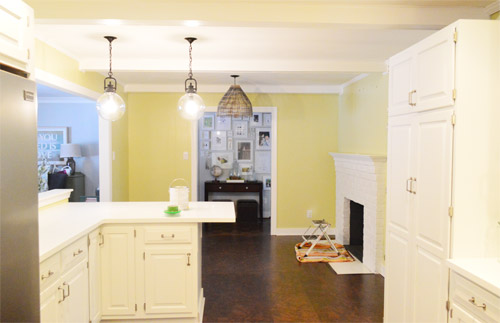
As for more about the kitchen color change, although you guys know we love grellow with a passion, it has been notoriously impossible to photograph (remember a hundred different phases of the kitchen project with “ahh, this color looks so much more subtle in person but is reading as lime green/bright yellow/neon slime for some reason”). And although that’s sort of definitely a dumb reason to repaint a room, I can’t tell you how annoying it is to not be able to share what you see in front of your eyes when you’re a home blogger.
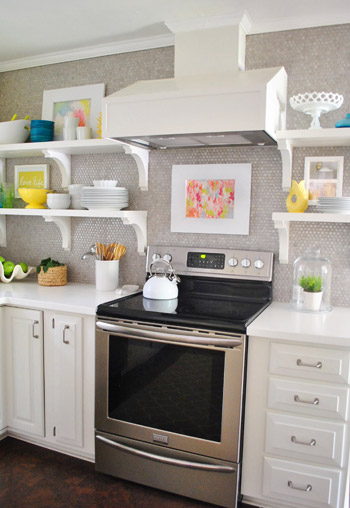
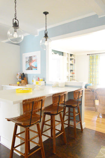
But the main reason for the change wasn’t that the color was hard to photograph, it was that over time we realized that the grellow didn’t let the other things in the room shine as much as they might have with a different choice. Take the white cabinets and counters for example. They looked little yellowed thanks to the wall color reflecting on them – and even the cork looked a little orangey-yellow (especially at night) instead of rich and mocha.
So here’s how we reasoned our way to a new color pick in five bullets or less:
- we worried that other tones of yellow and green would have the same yellowing-ish issue (say that three times fast) since they’d reflect on the counters, cabinets, and cork – even if they were deeper or lighter, so we nixed those options
- we wanted something deep enough in tone to provide a little more contrast, so the counters and cabinets would pop more (but nothing too dark since the room is windowless)
- we have gray backsplash tile and a few adjoining rooms are gray, so we didn’t want to go with more gray on the walls (dark, light, or schmedium) for fear of grayverload
- we wanted an actual color on the walls (since we chose such safe things everywhere else like: brown floors, white cabinets, stainless appliances, white counters, and gray backsplash tile)
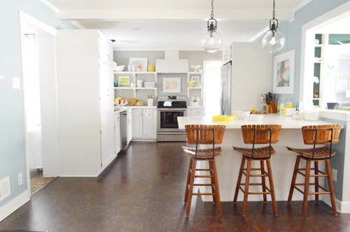
- we wanted a color that would tie the kitchen into the four spaces (yes, four!) that the kitchen opens up to – without getting too matchy-matchy (when a room adjoins so many other rooms, the wall color should work with those rooms since you’ll see them together all the time – it’s sort of like very carefully picking a hallway color that works with all of the rooms off of it)
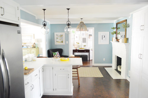
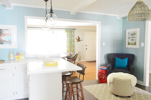
We definitely loved having a soft blue kitchen in our first house, and we actually don’t have any blue on the walls in this house except for the deep teal in the guest room and on the back of the dining room built-ins, so it’s nice to bring in a mid-tone blue that’s sort of in the middle of the guest room and our first house’s kitchen.
The funniest thing about this whole repainting escapade, which we realized while applying the second coat (we’re always loopy by then) was that in our first house we repainted every single room except for our kitchen and our master bedroom. And in this house we’ve only repainted two rooms: the kitchen and our master bedroom. Hilarious.
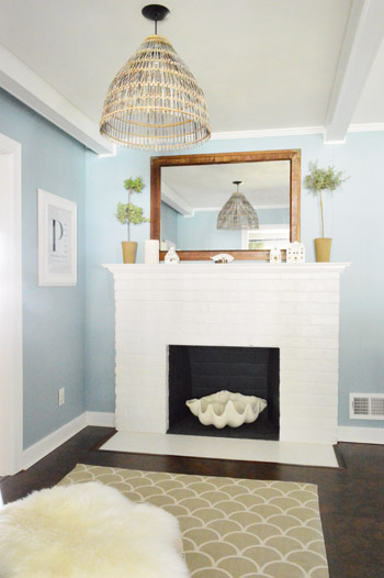
And if you count the time that we painted the fireplace area a different color for book photoshoots (only to repaint it back to normal a few days later) some parts of this room have seen four different paint jobs.
- it’s definitely an actual color (there’s nothing neutral about it)
- it still feels sophisticated (even though it’s not gray or navy or chocolate or taupe)
- it allows the white cabinets and counters to really pop (without yellowing them)
- it’s a great balance to the warm tones in the room (like the cork floors, the wood stools, the rustic cutting boards on the counter, etc).
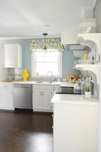
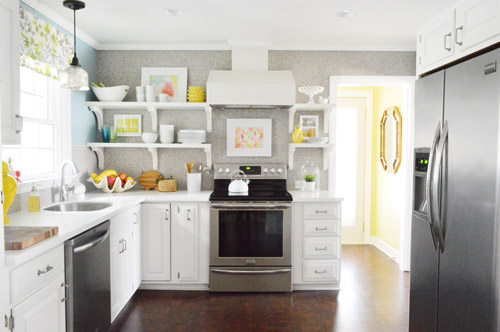
Not gonna lie though, the star of this room is still that wall full of penny tile. Picture me having an as-soon-as-the-show-ends bachelor breakup with the wall paint to run back to the penny tile with open arms. And it’s not that I don’t love the wall color – I just love the penny tile more than a person should love any inanimate object.

Andrea says
Uh, guys… That $herdog blue kicks a$$. It’s amazing. I love it. What a great change. The cabinets have never looked sharper. Nice and crisp and WHITE (not off-white)!
YoungHouseLove says
Haha, thanks Andrea! Way to keep $herdog Blue going.
xo
s
Kirstin says
Beautiful! I am obsessed with this change! Although blue is cool tone, I actually think this is more warm and inviting than the grellow.
Alicia says
Looks great! Have you ever thought about adding a skylight (or 2) to bring in some natural light? I’m semi-new to reading the blog, so I’m not sure if you’ve mentioned it before. I think it would be a great idea, I love the skylights at my house. And it sounds so awesome when it’s raining :)
YoungHouseLove says
We’d love that, but there’s an attic over the kitchen so it would need to be one of those solar tubes, which aren’t as fun as a big giant skylight. I’d love that though!
xo
s
Melissa says
Love it!! Was never a fan of the grellow.
Sarah says
Mocha Chocalata ya ya…. gotta love Lady Marmalade!!
The blue looks wonderful!! I actually just decided to paint my kitchen too, still deciding on a colour to go with our wood cabinets.
Chelsea says
LOVE it. Such a huge improvement!
amy says
much better! feels balanced now. ;)
kate says
SWOON! I was all for the grellow…but now I’m over the moon with the blue. You guys never cease to amaze me how you can take something from wow to wowsers! And I agree, the penny tile is still the star of the show. Is it weird that I want to rub my face on it? Probably a little.
YoungHouseLove says
Come on over! Face rubbing time is scheduled for 11am.
xo
s
Liz E. says
I stared at the title of this post wayyy too long, trying to figure it out (PS: I did finally get it ;)) and then stared at the first picture for probably a solid minute with what I can only assume was a stunned look of confusion. Something didn’t look the same…and I couldn’t place it…then BAM! The walls are blue!
I L-O-V-E the color! You guys have inspired me in 2 consecutive days! We’re redoing our basement (hello renovation!) and are trying desperately to figure out can lights (how many we need, where to place them, etc). AND to top it all off, I want to repaint our kitchen. The color I chose before is gorgeous, but much too dark for our space that lacks much natural light. I’m still trying to whittle my husband down to let me paint the cabinets. We’ll see!
Jessica says
Woah! Color me surprised (see what a did there?) when I saw your first picture! I think it looks amazing. I love how each portion of the room has a different feel to it, yet it all blends together seamlessly. The basket shade pendant gives the fireplace nook a beachy vibe while the opposite end looks very casual modern. Love it!
YoungHouseLove says
Haha, color me surprised. Hilarious.
xo
s
Darcie says
I’m so happy you painted! I love the blue with the penny tile!
MaKaela says
Hahaha the title to this post made my whole day… Pretty sure that song’ll be in my head for the rest of the day :)
Roxanne M says
I love it! It looks great. We have a VERY similar color in our living room, Sherwin William’s Breezy or Rain (I forget which). We love the color and it looks great with our many photographs of Oceans. We love traveling!
The color also contrasts with our bright white baseboard as well. We have silver curtains and a dark laminate floor, similar to the color of your cork floor. We’re thinking of moving and I’m already planning on just recreating the look in our next home. It just works!
Melanie says
It’s so soothing! I like it a lot. And also love that you left the laundry room grellow.
Is your curtain over the sink the same fabric that your headboard is made out of?
YoungHouseLove says
Yup! We loved it too much to hide it away in our bedroom :)
xo
s
Aly says
That’s the same exact color we painted our kitchen! And we have white cabinets and dark mocha floors too! Unfortunately we still have the ugly salmon pink boomerang patterned counters that came with the house. Bleh. Maybe if I show your kitchen to my husband hell see how pretty any other countrrtop in existence would be in our house compare to salmon pink. :-) also I’m glad you kept the laundry room grellow. I’m loving me some brightly colored tiny rooms.
Anessa says
I HEART it so much!!!!! Love how everything really pops now in there. So PRETTY! Like that you kept the grellow in the laundry room though. Nice to change up the colors a bit and it adds another pop of color from the kitchen. Also love how each rooms color looks nice together but is not matchy matchy.
Anne says
KaPOW…that’s big change! Looks good! It’s funny, I kinda miss the grellow. Never thought I’d feel that way about someone else’s kitchen.
Tasha says
Love it! Probably my favorite change of all time you’ve done!
Nicki says
I love it! I actually had Aegean Teal in my kitchen before the remodel. It looked great with wood tone cabinets. I went with white cabinets in the new kitchen and went a little lighter than Aegean Teal, which for my room and light was BM Buxton Blue. I call it blue/gray/green :) my hallway is moody gray and my laundry room a yellow-green so I am feeling you on your choices on the house overall! :D
YoungHouseLove says
Sounds so pretty!
xo
s
Ashley@ The Houston House says
Ohhhhh snap, LOVE the blue! I think it definitely accepts this rose.
YoungHouseLove says
Haha, at least until the reunion show…. yikes!
xo
s
Jaimie says
I love, love, love the new colour! I think it looks fantastic and totally lets the features in your kitchen stand out!
Kristen | Popcorn on the Stove says
Oh man, I LOVE how the blue looks on the walls! I totally get why you chose grellow in the first place (it’s a fun color) but I think that this blue is by far a better fit for the space :)
Cathryn says
I love that color! I’m getting the itch to paint again but I’m waiting on a diy bathroom project to be finished (total gut, already hit the 1-year mark) but thats almost exact color I want the bathroom to be in the end! I realized my top colors are blues and yellows and need to start branching out. Lots of inspiration from you all!
jennifer beck says
WOW WOW WOW!!!!!!!!!!!!! LOVE it!!!!
Julia @ This Idiot's Guide says
WOW I love it!! What a perfect choice! The blue really does brighten up the space and makes the white cabinets and gray penny tile really shine! Plus I love how all of the accent colors in the kitchen play off of the blue – they pop in a much more noticeable and fun way! (I particularly love the little red stool thingy next to the chair in the “nook”… my kitchen right now is a slightly richer shade of blue, and the main accent color is bright red.. sounds quirky, but I love it, and love to see that color combo in your kitchen too!) Good work, it’s a fabulous transformation!
Donna Jean says
Okay, so I seriously have that exact color in a little sample jar (along with providence blue and new born’s eyes) waiting to go up on the kitchen wall so we can decide which color to use when we paint the kitchen over my husband’s spring break. It’s also the one that I’ve been leaning towards since we picked up a million swatches a couple weeks ago. I can’t wait to get those samples up on the wall tonight! We’re planning on painting our fugly cabinets over the summer (they are currently a nasty looking dark brown and we are planning on painting them white). Now if only I could figure out what to do with the hideous bi-fold doors that hide the washer and dryer…
YoungHouseLove says
Ahh, that’s so exciting! Happy painting!
xo
s
Theresa says
I’ve been wanting to repaint my kitchen for sometime. When we first moved in, the floors were a beautiful light oak, the cabinets were blonde and the walls painted a soft butter yellow. With abundant sunlight coming in from the sunroom the place just radiated cozy. Well, 8 years later and the golden… The clear finishes on the cabinets and floors have yellowed. I am in yellow overload. I’ll be painting the cabinets later in the year(white cabs will be great with the black granite) and picking a new wall color. But I do have one question. How do you cut inaround the refridgerator? I’m 5’3″ and struggle to reach. (our ceilings are 9′ with a 6″ crown. I can never reach over the cabinets high enough!
YoungHouseLove says
My secret to that is that I stood on the counter for the right side and on a step ladder on the left side :)
xo
s
Katy says
Ahh, voting is closed! Good thing I already did! :)
YoungHouseLove says
Whew! Me too!
xo
s
ramona says
Just had to tell you that just as I was reading “So Colorado Blue, I ain’t mad atcha.”, Pandora was kind enough to pull up 2Pac’s “I Ain’t Mad At Cha”. Always love the little throw back shout outs!
YoungHouseLove says
Hahah, nice! Pandora and I are thinking alike today.
xo
s
Christina P(NS) says
“Mocha Chocolata YA-YA”
Kitchen looks awesome! We have the swatches for our possible living room choices taped to the wall as we speak and guess who’s in the running – Moonshine!!!
We have so many plans it’s hard to start, we plan to replace the carpet w hardwood but don’t want to do that until we redo the bathroom (which involves hauling the tub out and downstairs) so why paint until all that is done…..leaves us in the planning w/o too much tackling stage right now :(
Plein Jane says
Speaking of the kitchen, did you know you guys got a big shout-out in the April issue of Real Simple magazine? The write-up especially mentioned the kitchen renovation as a favorite project. But, oddly, there was no mention of the book!
Oh, and I love the new color!
YoungHouseLove says
Ahh, that’s so exciting! We haven’t seen it yet (still waiting for our issue to arrive) but can’t wait!!!
xo
s
Plein Jane says
It’s on page 44 (just in case you see the issue at the grocery store or something).
YoungHouseLove says
Thanks so much!
xo
s
Kim S says
I loooove it!! That’s pretty much my all time favorite color, and in fact, I was just looking at the Benjamin Moore web site the other day and this particular one jumped out at me. I remember thinking “Colorado Gray…funny, I love it but it looks more blue.” Glad to know it’s that way in person too! Definitely at the top of my list next time I have a room to repaint.
YoungHouseLove says
No way! That’s hilarious!
xo
s
Dawn says
LOVE it! It really does look amazing and makes everything else look brighter and more balanced. Great choice. Looove!
Emma says
Winning!
JB says
Absolutely fabulous!
Katie M says
I’m getting a nautical vibe with the blue which pulls in the swimming painting and the wooden stools in a way the grellow didn’t. I really like it and think you could even play it up with other nautical details, if you wanted to. Great example of how the color really makes the room.
Laura (Blogging Over Thyme) says
It looks great! I have to say, I was never a big fan of the yellow (but trusted that it looked better in person), but I think this really ties everything together much nicely and makes the cabinets really pop.
Well done! :)
Courtney says
That looks amazing! There was always something about the kitchen shots that looked off to me, and now that I can see the pop in the white cabinets, that was it, the yellow just gave everything a 60’s feel, the blue-gray color looks wonderful! Very fresh.
Shannon says
Love it! I liked the grellow too, but its funny I never noticed what you said aobut the cabinets looking more yellowish until you changed it. A nice soothing color and makes whole house seem to flow room to room. You guys are wicked smaaaht. (said in my best Boston accent)…
Stacey @ Likes to Smile says
This is really gorgeous! Everything pops.
I love watching how you are willing to just make a change when you think something isn’t working great. It’s great inspiration for the rest of us who aren’t home bloggers!
YoungHouseLove says
Aw thanks Stacey!
xo
s
Nancy says
Looks great!!
Noel M says
Love the Moulin Rouge song reference! Silly clever $herdog ;) hehe
…And the new kitchen color, although I always loved the grellow too, I can see how much the white counters/cabinets pop now!
Sarah says
omg it looks AMAZING. SOOO glad you guys did this. It makes all the difference in the world and it looks like a totally different room now. All the pops of color actually do pop now, instead of being too much to take in at once. (that’s not coming out right, but hopefully you know what I mean.) Gorgeous!
Kate B says
Ya nailed it! Loooove the color and I think it’s one that you wore grow tired of– very classic.
Maggie says
I loved the “grellow” but this blue looks great also! It’s amazing what a difference the new color makes in the kitchen.
I just bought my house in August, so I’m currently paiting for the first time. So far I’ve managed to paint one wall in my bedroom. I’m trying to choose a grey for the other 3 walls, I had no idea how many different colors of grey there are!
Mallory says
It’s beautiful! It has a really calming effect on the room, but still makes those white cabinets POP!
Gabriella @ OLinA says
I have to be honest – I love both colours…I really haven’t found a colour that you’ve used that I didn’t like. LOL
That being said, the blue in the kitchen is absolutely stunning. :-D
Samantha says
No side-by-side before and after photo?!
YoungHouseLove says
Sorry Samantha! Maybe we’ll whip one up later! You get the gist from the first pic and the third pic of the post though :)
xo
s
Amanda says
Oh my. I haven’t commented on your posts in so long; miss me?! HA!
I’m loving this colour; I loved the first photo you showed and I was like “what? It’s always looked that beautiful! Oh oops, it used to be yellow” Which either means two things; it’s like it was meant to be or my memory sucks. We’ll go with both, because it DEFINITELY looks like it was supposed to be that colour the whole time!
YoungHouseLove says
Hahah!
xo
s
Erin@Managing the Manor says
The blue looks great! It’s funny,but me and my hubs are the opposite with cutting and rolling: he cuts while I roll. He has the free-hand down to an art like you, Sherry!