Me + a picture of our kitchen + photoshop = this post.
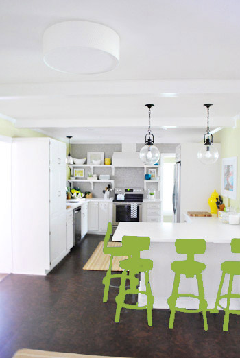
Back in December when we bought our kitchen stools (from a school supply store for $32 a pop) we mentioned we were entertaining a number of ways to tweak them down the line (painting them, upholstering/staining the seat, etc) but just couldn’t shake the feeling that we should live with them a while first – just to make sure we weren’t doing anything rash in the middle of a kitchen remodel. We basically wanted the room to come together, live with them a little, and then make the call.
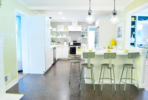
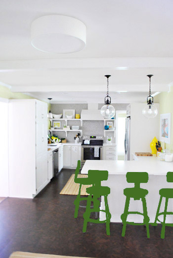
It was actually really nice how they tied into the stainless appliances, felt kind of geek-industrial, and even brought the gray color in the wall of penny tile over into the other side of the room. But after a nice long time of thinking it through and weighing our options, we decided… it’s time to paint them! It’s not that we don’t like how they look as-is as much as we think a new coat of paint could look infinitely better. From good to great if you will. So without further ado, our musings…
Our first thought was a dark teal color. Don’t mind our horribly photoshopped stool rendering (it’s not a very accurate portrayal at all, but in our brain we think we can almost picture it).
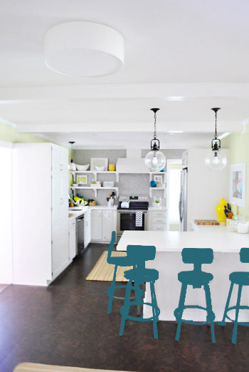
Why dark teal? Well, see the back of the built-ins in the adjoined dining room in this older shot of the room on the right?
Since the kitchen and the dining room are now open to each other, we just love seeing a sliver of that dark teal on the built-ins when we’re in there, so we thought bringing a bit more of that color in with the stools could be fun. Although it could be a little too matchy-matchy too, so we kept playing around with other options.
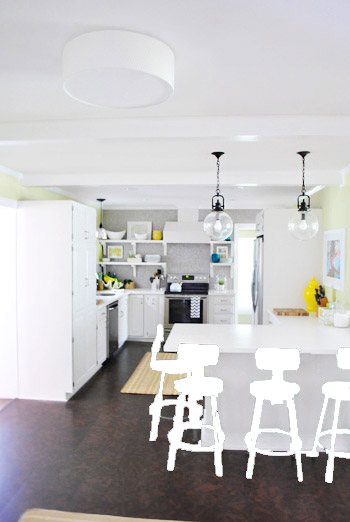
Like white, which is a little too… white for us. Haha. There’s just so much lightness in the cabinets and counters that although glossy white stools would look modern and clean, we think it’s just too flat for us.
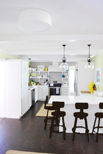
Next we tried ORB (oil-rubbed bronze), which would probably be an easy win. We worried it would blend in too much with our floor, but at least from this terrible rendering they look like they’d pop in front of the white cabinets/counter. And they’d balance the dark hardware on the pendant lights above (I also tried a dark charcoal gray but they didn’t look as good as the ORB rendering, so I figured that was the better option. But it’s not the most happy and exciting choice out there.
Then we tried yellow since we like the other random pops of yellow in the room – like that jar next to the fridge and that planter on the open shelves. But it looked crazy-scary. Might just be photoshop though, so I decided to bring Clara’s yellow highchair in and see how that looks in front of the peninsula (since surely it can’t look this nuts in real life).
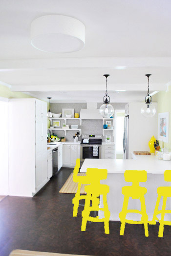
Sure enough, it looks pretty cute:
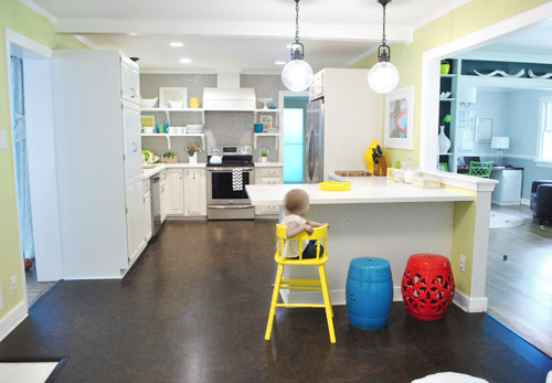
I also brought in a random HomeGoods/Joss&Main stools from other rooms (blue = HomeGoods, red = Joss&Main) just to see how those colors would look. We actually really liked all three of these color options. It’s fun to have a little pop of happy at the peninsula, right?
Of course the blue one looked awesome with the pops of blue on the open shelves, but this exercise actually got us seriously considering tomato red, since it’s not in many other places around the house (so it feels exciting and new). It would also pick up some of the red tones in our Lady Swimming print next to the fridge, which could be fun. But since the chairs wouldn’t be low-lying garden stools, and would be four metal stools with backs, in order to picture it, I bounced back to my good friend Photoshop.
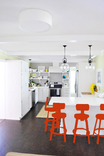
Our only fear is that with the yellow-green walls, red or deep orange chairs are a little too McDonalds for our tastes (especially when viewed from the other side of the kitchen – looking back towards the fireplace nook, which has a lot more green paint going on than this view). So next we decided to give leaf green a try…
… and a deeper emerald color…
All of them could probably work, so they got logged as other alternatives. It was at this point that we realized that a number of things could work in our pretty neutral kitchen (white and gray and brown pretty much goes with everything), so it’s just going to come down to choosing whatever color we like best.
Next it was onto blue, where we tried a lighter teal color with a fair amount of gray in it:
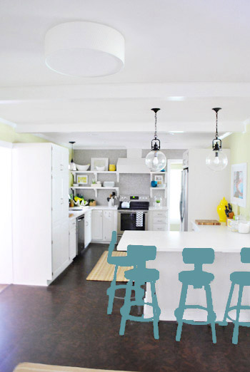
Of course these renderings aren’t very true to what things will really look like in real life with light bouncing around and not everything being the same flat shade – so something that looks the best here could totally read differently in real life. But the truth is that we love a room with a pop of color in the stools, like this, this, and this), and our minds change about what color we want to go with every day.
Oh and how funny is this? Right after I shot this picture…
… I walked into the office and saw this stack of books…
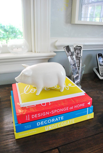
Guess I’m just a die-hard fan of those colors. Haha. For accessories, potential stool colors, and beyond!
You know we’ll keep you posted when we make a final decision! Hopefully within the next week or two – because these renderings are getting us excited. Haha. And this little photoshop exercise was comforting because it helped us realize that there are any number of ways we could go instead of having to find the “one right color” like hunting for a needle in a haystack. I’m sure you guys will weigh in with your favorite stool colors in the meantime, right? Anyone else playing around in Photoshop or bringing items from other rooms to see how certain colors or shapes will work?

Leave a Reply