Me + a picture of our kitchen + photoshop = this post.
Back in December when we bought our kitchen stools (from a school supply store for $32 a pop) we mentioned we were entertaining a number of ways to tweak them down the line (painting them, upholstering/staining the seat, etc) but just couldn’t shake the feeling that we should live with them a while first – just to make sure we weren’t doing anything rash in the middle of a kitchen remodel. We basically wanted the room to come together, live with them a little, and then make the call.
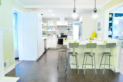
It was actually really nice how they tied into the stainless appliances, felt kind of geek-industrial, and even brought the gray color in the wall of penny tile over into the other side of the room. But after a nice long time of thinking it through and weighing our options, we decided… it’s time to paint them! It’s not that we don’t like how they look as-is as much as we think a new coat of paint could look infinitely better. From good to great if you will. So without further ado, our musings…
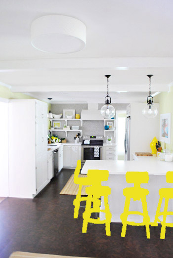
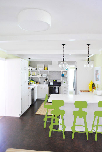
Our first thought was a dark teal color. Don’t mind our horribly photoshopped stool rendering (it’s not a very accurate portrayal at all, but in our brain we think we can almost picture it).
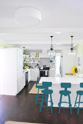
Why dark teal? Well, see the back of the built-ins in the adjoined dining room in this older shot of the room on the right?
Since the kitchen and the dining room are now open to each other, we just love seeing a sliver of that dark teal on the built-ins when we’re in there, so we thought bringing a bit more of that color in with the stools could be fun. Although it could be a little too matchy-matchy too, so we kept playing around with other options.
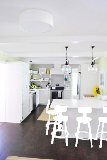
Like white, which is a little too… white for us. Haha. There’s just so much lightness in the cabinets and counters that although glossy white stools would look modern and clean, we think it’s just too flat for us.
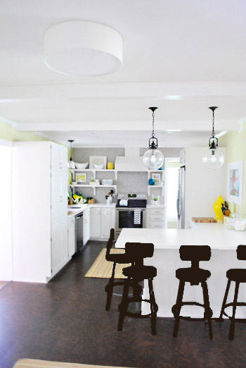
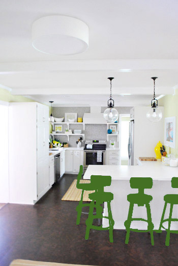
Next we tried ORB (oil-rubbed bronze), which would probably be an easy win. We worried it would blend in too much with our floor, but at least from this terrible rendering they look like they’d pop in front of the white cabinets/counter. And they’d balance the dark hardware on the pendant lights above (I also tried a dark charcoal gray but they didn’t look as good as the ORB rendering, so I figured that was the better option. But it’s not the most happy and exciting choice out there.
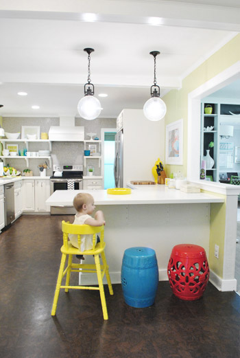
Then we tried yellow since we like the other random pops of yellow in the room – like that jar next to the fridge and that planter on the open shelves. But it looked crazy-scary. Might just be photoshop though, so I decided to bring Clara’s yellow highchair in and see how that looks in front of the peninsula (since surely it can’t look this nuts in real life).
Sure enough, it looks pretty cute:
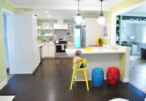
I also brought in a random HomeGoods/Joss&Main stools from other rooms (blue = HomeGoods, red = Joss&Main) just to see how those colors would look. We actually really liked all three of these color options. It’s fun to have a little pop of happy at the peninsula, right?
Of course the blue one looked awesome with the pops of blue on the open shelves, but this exercise actually got us seriously considering tomato red, since it’s not in many other places around the house (so it feels exciting and new). It would also pick up some of the red tones in our Lady Swimming print next to the fridge, which could be fun. But since the chairs wouldn’t be low-lying garden stools, and would be four metal stools with backs, in order to picture it, I bounced back to my good friend Photoshop.
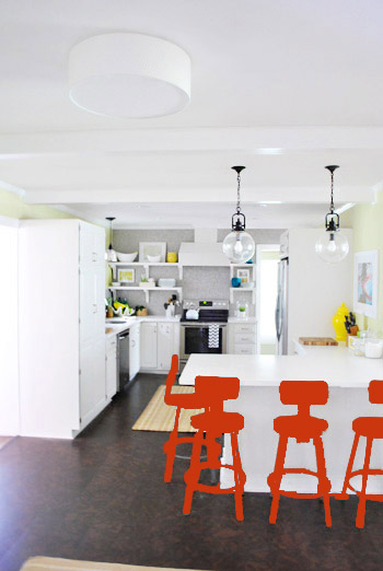
Our only fear is that with the yellow-green walls, red or deep orange chairs are a little too McDonalds for our tastes (especially when viewed from the other side of the kitchen – looking back towards the fireplace nook, which has a lot more green paint going on than this view). So next we decided to give leaf green a try…
… and a deeper emerald color…
All of them could probably work, so they got logged as other alternatives. It was at this point that we realized that a number of things could work in our pretty neutral kitchen (white and gray and brown pretty much goes with everything), so it’s just going to come down to choosing whatever color we like best.
Next it was onto blue, where we tried a lighter teal color with a fair amount of gray in it:
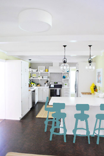
Of course these renderings aren’t very true to what things will really look like in real life with light bouncing around and not everything being the same flat shade – so something that looks the best here could totally read differently in real life. But the truth is that we love a room with a pop of color in the stools, like this, this, and this), and our minds change about what color we want to go with every day.
Oh and how funny is this? Right after I shot this picture…
… I walked into the office and saw this stack of books…
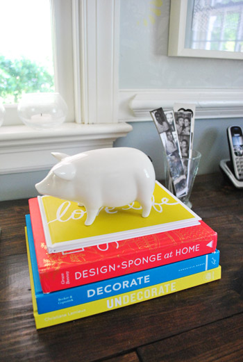
Guess I’m just a die-hard fan of those colors. Haha. For accessories, potential stool colors, and beyond!
You know we’ll keep you posted when we make a final decision! Hopefully within the next week or two – because these renderings are getting us excited. Haha. And this little photoshop exercise was comforting because it helped us realize that there are any number of ways we could go instead of having to find the “one right color” like hunting for a needle in a haystack. I’m sure you guys will weigh in with your favorite stool colors in the meantime, right? Anyone else playing around in Photoshop or bringing items from other rooms to see how certain colors or shapes will work?

Erica says
Have you thought about having the stools be all different colors? Like Monica’s kitchen on Friends?
YoungHouseLove says
We did think about that for a little while but wondered if it’s too rainbow-bright for us. I think we like all of them the same color like the bright stooled kitchens we linked to as inspiration down near the end of this post!
xo,
s
Sabrina says
The different colors would SO be my husband’s first choice (well, our kitchen table chairs are all currently different (sadly faded to subdued) colors.
Amanda K says
i thought the same thing – paint them all different colors. then if you hated the rainbow brite look, you can commit to one of the colors (and paint the rest to match).
of course, that’d be a lot of work.
(i also really like them as-is. that’s the option that involves the LEAST amount of work!)
Joelle says
I thought the same thing too! One yellow, one blue, one red!
Randa says
I was going to ask if you were thinking about picking two colors, like the outer two in teal and the inner two in yellow or something. That could be fun without too much chaos.
Kitty O says
I really think that would be overkill. You already have so many different bright colors in that room; adding more would just seem riotous. I think it would look like a kindergarten classroom.
kristin says
i like this idea – each stool a different color – but only if each stool was a different style….
Jenny B. says
I know you already nixed the idea, but I agree – different colors would be really cute! :)
I also think you could put something big down the side of the pantry. Maybe something like this:
http://www.sweetpickinsfurniture.com/2012/05/eat-letters-from-reclaimed-lumber.html
Fun stuff! :)
YoungHouseLove says
Those are fun! I love how huge they are!
xo,
s
Anne Weber-Falk says
That’s what I thought too. I really like the yellow red and blue together. It’s fun and not too serious. Go for it! If you don’t like it you can still change it. Just a little time and a bit more paint.
Vidya @ Whats Ur Home Story says
I know I’ve cribbed about you guys using too much yellow. But I’m kind loving the yellow stools!!! Have you thought about using different colors for the stools? Just a thought. The blue, red, yellow, and white looks good together.
YoungHouseLove says
We did think about that but wonder if it’s too rainbow bright for us. I think we like all of them the same color like the bright stooled kitchens we linked to as inspiration down near the end of this post!
xo,
s
Eric says
Not much going on at the house these days I see. Hopefully you’ll have an update soon on a project.
YoungHouseLove says
We’re working on deck stuff today as we mentioned yesterday (it rained yesterday so we couldn’t get out there – boo!). We also got a permit, tackled a Dude Get On That Challenge and tried out a ton of rugs for our kitchen in the past two days. We definitely hop around and do projects big and small pretty much all the time, so some weeks it’s big stuff and some weeks it’s smaller stuff!
xo,
s
Cassidy says
I’m not sure what blog you’re reading but they update every day, sometimes twice a day!
Elisa says
I’m with Cassidy, haha. Not everyone can do complete room makeovers every day (if that was the case, YHL would have bought their 47th house by now.) Sometimes tweaking is just as important as a massive project, and personally I think learning about there process is just as interesting!
YoungHouseLove says
Aw thanks guys! Our posts definitely run the gamut! Sometimes we’re demo-ing something and other times we’re just talking about cleaning and organizing!
xo,
s
Amy says
While I totally get that you aren’t going to be redoing a room a day, I still think an entire post dedicated to hanging up a clipboard is pushing it, haha.
YoungHouseLove says
We love small Dude Get On That challenges like the clipboard project, and they seem to get lots of comments (even requests for more when they fall off for a while) so they stay! Our blog is definitely about everything house-related, so the small/quick/free projects are just as much a part of our site as the large and elaborate stuff. It’s a smorgasbord around here!
xo,
s
Teresa @ wherelovemeetslife says
Oh please don’t stop posts like these!! I agree that the process is just as interesting. I love how you decorate, and reading your blog has been very helpful in helping me grow in decorating my own house. :)
YoungHouseLove says
No worries Teresa, we love posts like these too! They’ve been a YHL staple since nearly five years ago when we started! They stay!
xo,
s
Kristin H. says
Guys!! Please don’t try to stifle J&S!! J&S- I absolutely adore and admire your ability to never be stifled.
YoungHouseLove says
Haha, thanks Kristin! No worries. We know not every person will love every last one of the 2,500 posts that we’ve written, and it would be crazy to even aim for that (one person’s favorite post is another person’s least favorite!). So we just do what we’ve done the past almost-five years: use this little corner of the internet as our DIY diary, full of undertakings that work, things that fail, random tangents, plenty of planning, and projects big and small!
xo,
s
Wendy says
Count me in for being interested in all the small little things! I think the little things really make a big impact and bring everything together. Secretly I’ve been wondering if you’ll fill us in when you get a bathmat for your master bathroom because I’m curious if you’ll coordinate it with the towels or if it will be a different color. But I’m wondering if that will be big enough news to make a post…
YoungHouseLove says
Haha, oh yes! That will be a giant fashion show since I have photographed a bunch that didn’t work (waiting to find the one that does to share the whole shebang). You know we love a fashion show!
xo,
s
Heather Flint says
I am absolutely loving these posts lately where you show the decision making process of making a choice (ex. rug fashion show, photoshopping stool colors, etc. etc. etc.!!). It’s actually comforting to realize all the little steps and decisions that you guys have to make to turn your house into something so beautiful. So many times on blogs, you see an ugly before picture of a kitchen, and then TADA! the picture-perfect after. I then go ahead and leave the land of reality and daydream about snapping my fingers and having our kitchen remodeled. Explaining to my fiance, “LOOK HOW EASY IT IS!!”. LOL!! I love the step-by-step (ohhhh baby! gonna get to you girrrrrrl……) okay, where was I? Oh yes, I think I was saying our awesomely awesome you guys are!! Love me Young House Love…look forward to your posts every day!!:)
YoungHouseLove says
Aw thanks so much Heather! You’re so sweet! Good luck with everything in your home – it might take time, but it’s so worth it!
xo,
s
Anneliese says
Oooohhhh, a color picking party… you just know you’re going to get 750 replies today, with everyone picking different colors, right? Right.
My vote (for what it’s worth) is for the deep teal or the leaf green. With all your other light, bright action going on in the kitchen, those stools would bring some nice, deeper, calmer tones and balance.
But you really can’t go wrong with any of them… any interest in picking one color per stool? You could calm it down by staying in the blues/greens, but still bring in some interest.
YoungHouseLove says
We did think about some sort of subtle gradient or something that’s not too busy, but I think ultimately we love the bright stools in the inspiration kitchens that we linked to so much (and they’re all the same color in each room).
xo,
s
Mary says
Anneliese – I agree with your choice too! I think the yellow would be a great option as well. And the gradient might be a nice touch!
I’m an overthinker as well! I renovated my whole house in the last year with only the bathroom left to do (there are so many options!!). If there is no “overthinking” then there could be a lot of re-doing! Overthinking will save you time and money in the end :)
Mona O | Renters In Love says
Arg! All that and no actual painting?
YoungHouseLove says
Haha- sorry Mona! We’re nothing if not chronic over-thinkers and over-sharers! Hopefully within the next few weeks we’ll actually stop changing our minds and pick a color!
xo,
s
Laura says
Pretty colors…..I’m loving all the greens/teals, and also love a pop of color.
I’m thinking of even spraying my traditional dining room chairs a pop of color, or upholstering each chair in a different color…..I think the different colors is fun too!
The Mrs @ Success Along the Weigh says
I’m not a big yellow fan but I’ve gotta say, that was my favorite! (Especially after you brought Miss Clara’s chair in) Can’t wait to see what ya pick!
Kristen @ Popcorn on the Stove says
Yay for painting! I love the teal, yellow, and leaf green but I think either the teal or leaf green would look the best since it’s not too matchy-matchy. I don’t know how you two will ever decide!!
Sheila says
Or maybe… you could make each stool a different color. That would be fun!
YoungHouseLove says
We definitely thought about that, but worried it might be a little rainbow bright for us! It would work better if we had a collection of different stools I think (like how we had different garden stools an that high chair mixed and matched in different colors).
xo,
s
sarah says
so…i think maybe you should think about that….sell off two stools and get different styles and go for the paint variety! we are going to do different styles/colors around our dinette table when we get into our new house someday.
YoungHouseLove says
We actually considered different types of stools before we bought these but we realized with eight chairs in the nearby dining room and four in the kitchen it would probably be too busy for our space- but in other homes it could look awesome!
xo,
s
Mary says
I vote dark teal or the emerald green!
Jessica Dixon says
Lots of amazing choices I think I like the last option best, the lighter teal with hint of grey. Good luck choosing!
Nicki says
me too!
Emily says
my fav too!
Ali says
that’s my fave, too.
Julie S says
Me too!
Janine says
Another vote for the lighter teal.
Clare says
I like the light teal best too, or maybe 2 this colour and 2 in the yellow – I normally hate yellow but I think it might actually look great!!
Katie says
I agree!! The lighter teal is just enough color without being overwhelming.
Krystle @ ColorTransformedFamily says
I love all the darker color. Since your cabinets and walls are light it helps add a little visual weight to the room. Several of them look good though. I’m not sure which one I would pick but I am lad ou decided to paint them.
bridget b. @623Designs says
Would you use spray paint to paint the stools? And would it be the metal parts as well as the seat? Can’t wait to see what you guys go with.
YoungHouseLove says
We’ll cover all the painting steps we take when we get there for sure!
xo,
s
Sara says
My vote: leaf green or the lighter teal.
heather s. says
I agree! I would have loved to see an eggplant color in there since I thought it was one of Sue the Napkin’s colors and one we haven’t seen in the house yet.
YoungHouseLove says
Always another possibility!
xo,
s
Leslie says
i agree with sara! the leaf green and light teal were my two favorites.
Kate Leonard says
I agree! light teal or leaf green
Julie says
TEAL! I vote for teal!
Sarah says
Me too! I like teal the most.
Leslie says
I was rooting for the teal (light or deep) the whole post! I also liked the leaf green, but oh–the teal! I never would have thought about the connection to the next room, and now I think it is so smart and by no means too matchy. I also appreciate these posts about decision-making as I am incredibly indecisive and like to see how others navigate choices like these. I appreciate the many visuals you two provide as well! :)
Lauren says
Me too! I like either of the teals, both so pretty!
Christy says
I wasn’t loving the yellow photoshopped image but when you showed the pic with Clara’s highchair in the room I fell in love! LOVE the yellow! I think it’s the perfect contrast with the pops of blue on the shelves. Can’t wait to see what you settle on@
Izzy says
I vote for the yellow or leaf green – definitely not red. Although I personally like them as they are…
Erica T says
I also vote yellow or leaf green–I’m glad they’re getting pushed up a notch.
Jessica D. says
I vote teal to match the built ins. Plus I think teal and the yellow high chair would look great together when you use the high chair in the kitchen without being too much yellow. A great punch of color without being nuclear lol.
julie says
Go with the Leaf Green!! It looks awesome! :)
And side note, thank you for responding to my comment re: the pig speaker from West Elm! Bought one for my Mother-in-law for Mother’s Day, and bought one for myself too! :) We love it, she loved it, and I’m pretty sure our Aunt ordered a few for gifts! So again, thanks for the feedback!!
YoungHouseLove says
Aw, so glad! We still love ours so much! Ceramic pig that plays music = the best thing ever. Haha.
xo,
s
Jillian says
Thank you, Julie, for mentioning it was on sale! I bought one for myself that same day and I love it.
Jessica says
My vote is for yellow, leaf green, or dark teal…..but I honestly love them as is. lol!
Jess @ Little House. Big Heart. says
I have to say I prefer them stainless (I’m loving the industrial-chic thing:) ), but if you just had to paint them I’d go with one of the teal-y options.
I do like those colors together… maybe you just paint all the stools a different color and be done with it? No? Too much?
YoungHouseLove says
We did think about that but wonder if it’s too rainbow bright for us. I think we like all of them the same color like the bright stooled kitchens that we linked to as inspiration down near the end of this post!
xo,
s
tia says
I like the teal, but I also like how that 1st green gives a little nod to your grellow walls.
Reenie says
I like the yellow or lighter teal :)
Casey says
Have you decided what you’re going to do with the back of the peninsula? White bead board? Distressed wood in a chevron pattern? Color? It might be easier to pick a stool color after deciding that versus picking a stool color then having to decide on a peninsula treatment based on whatever stool color you select.
YoungHouseLove says
We definitely think it’ll stay white (since the side and front of the cabinet is white and some sort of dark color on one side might look weird when you view it from a corner and see both of them meeting oddly at a seam). Not sure if it’ll be beadboard or white wainscrotting, but we’ll get there someday!
xo,
s
Casey says
Oooooh that makes sense. So texture change but no color change. Now I can visualize it. I’m on Team Torquoise Gray. Consider me a Torqhard. I think the sheer volume of comments will prove there are a million options, none of them wrong. Did something walls off (like orange or plum) just look too random?
YoungHouseLove says
Yeah, we tried both of them and the purple just sort of looked like ORB when it was dark and was too Barney when it was bright. Orange also seemed to clash with the gray tile wall since it was so honey-ish and warm (like our rugs that didn’t work with honey-orange undertones).
xo,
s
Emily says
Team Dark Teal!
Emma says
You know, I actually prefer the cool industrial/vintage looking metal. If it were my place (which it obviously isn’t) I’d make a circular cushion (cardbord bottom) out of very cute fabric and glue it to the seat of the chair. But you guys clearly know what you’re doing and I know the end result will be smashing.
YoungHouseLove says
Aw thanks Emma! We have seen restaurants that have left them as-is and they’re so awesome! I think we’re just color freaks and when we moved into this house we really vowed to push ourselves and bring in more happy color (it’s scary but thrilling all at the same time- haha). We just love those inspiration kitchens we linked to with bright stools!
xo,
s
Ingrid says
Do your color choices still need to blend with Sue the napkin? I liked most of your choices except for the red. I’ve tried to incorporate your idea of Sue the napkin into our home – not the exact colors, but the idea of tying everything together to blend well. Thanks!
YoungHouseLove says
Yeah, the red didn’t work with Sue, and also gave us the McDonalds vibe with the green walls so it’s not really a contender anymore. We definitely want all of our rooms to feel cohesive yet interesting enough not to be clones of each other- so pops of different accent colors here or there could definitely work!
xo,
s
annabelvita says
My vote is an orangey coral
Cassidy says
The whole time I was reading this I was yelling, “YELLOW! YELLOW! YELLOW!” in my head, haha. I LOVE the idea of yellow. I’ve been trying to add an accent color to my living room (brown couch, espresso tv stand and frames, just very brown). I toyed with green but now I’m not loving how not fun it is, so I’m thinking yellow. Do yellow and brown go? What other color would you add? I just picked up a cute cabinet from a garage sale that I’m thinking of painting yellow to store my kids’ toys. Would that go well?
YoungHouseLove says
Yellow and brown look great together! I’d try adding in some celery or some emerald too- along with some fresh white!
xo,
s
Laura says
I feel like you can’t go wrong with any of the bright, fun colors. I am quite partial to yellow, though. :)
Theresa says
Just to make your decision a little more difficult..could you pick two colors and maybe paint parts of the stools in the two colors? Maybe even different parts on different stools? The playfulness might be fun for Clara and future friends.
YoungHouseLove says
We did think about that but wonder if it’s too rainbow bright for us. I think we like all of them the same color like the bright stooled kitchens we linked to as inspiration down near the end of this post!
xo
s
ShellyP says
Sherry: Loved the post and the photoshop renderings. I am glad that you have decided to paint the stools; I think that is the right decision. Now, for color! My vote is for two yellow and two blue. Have tomato red cushions made for all 4 stools. Or, paint all 4 stools yellow AND blue (the softer blue, not the dark teal). Horizontal parts are yellow and vertical parts are blue for instance.
If you don’t like it, you can always repaint!
YoungHouseLove says
Always another possibility! Thanks to everyone for sharing their fun ideas! Will definitely keep you posted!
xo,
s
Renee L says
Love the dark teal!
Lori says
I love either the first or last choice – the two shades of teal. They also tie in nicely with the accessories on the open shelving.
How timely – I also just did some photoshopping to try to pick a front door color! http://familylovehome.blogspot.com/2012/05/front-door.html
YoungHouseLove says
Fun! Gotta love photoshop!
xo,
s
Sarah says
I’m voting the first teal. I don’t think repeating the color once in adjoining rooms is too matchy matchy, I think it ties to two rooms together. I think SOME repetition of the color would be great.
MS says
Totally Unsolicited Photoshop Tip!
If you want to change the color of something, and maintain the highlights/basic form of the object:
1. Duplicate your background layer
2. Clip out the object in the copy layer
3. Desaturate that layer (Image>Adjustments>Desaturate)
4. Duplicate the desaturated copy layer. This will be your color layer. Select the object in this layer (Ctrl+A then Up and Down arrows will do the job) and fill with the color of your choice. Set this layer to “Overlay” and you’re done!*
*This isnt a fool-proof method, but it will work about 75% of the time. Really light or really dark objects are tricky.
**Also, I am terrible at explaining things, but hopefully the results would be similar to this: http://i69.photobucket.com/albums/i53/missa1105/kitchen-reveal3.jpg
YoungHouseLove says
Thanks so much for the tips MS!
xo,
s
Viviana says
I vote yellow or blue (teal or matching the back dining room wall)… or Teal with yellow cushions…
Bethany says
love how clara is just chillin like a villan in these pics!
YoungHouseLove says
Haha- totally! I think she’s used to me changing things around all the time by now!
xo,
s
Cathy says
I like the yellow – it does scream “happy and fun”. Though you could do a more muted yellow – not so sunshiny, so that it wasn’t too bright.
Hey, an idea for a future post. I’d love to know what each item is on your open shelves – and where you got them. I’ve been admiring so much of it (like the yellow artichoke thingy) every time you show a picture of those shelves. Would love to know more of what each is & where you purchased. Just a thought.
YoungHouseLove says
Aw thanks for the idea Cathy! That artichoke vase is from HomeGoods for $9! Hope it helps! Would love to rundown the other items someday in a post for you too!
xo,
s
nancyo says
I know you didn’t ask for a vote but I like how the blue tied in with the back of the cabinets.
Wait .. is the stool painting going to be like the dining room chair upholstering/painting/changing? ;)
If so, we should all embrace for at least 10 more posts about stools. I’m poking fun at the dining room chairs jokingly — I really did love all the thought out options with the dining room chairs.
Kim B says
I like the lighted teal blue or the yellow. Love how it picks up other accents in the room without being too matchy. (and if you hate it once painted, you can always repaint) :)
rachel says
I vote blue – like the blue of the garden stool! It just pops so perfectly, but it’s not too loud. And it really ties in with the blue bowls on the other side of the room, as well as the swimming lady painting.
Um, and the title of this post kind of made me giggle like I was in fifth grade. Know what I mean? :)
YoungHouseLove says
Haha, ah yes, the stool connotation isn’t always good…
xo,
s
kelsey says
I giggled too!
Cat says
I like the first one and the last one best – evens out the bright white on the cabinets.
Rebecca @This Nest is Best says
I crushing that first one, the dark teal…but don’t you want to wait for the rug before committing to a stool color? Or maybe you have the rug and just haven’t shared yet… ;)
YoungHouseLove says
Yes, we mentioned that we ordered the rug so it’s on it’s way – we’ll share that as soon as it comes! Assuming it works we’ll be one step closer to actually making a stool color decision! Haha.
xo,
s
Katie @ explanationrequired says
My vote is for the emerald green. It still allows that gorgeous penny tile to be the attention grabber, but doesn’t get lost. The perfect balance I think!
Whitney Dupuis says
I vote yellow or leaf green. I think you are right – the red looks too McDonald’s.
:)
JB says
How about some colorful patterned fabric on the seat insert that ties in all of the colors that you like, then you could pick from there?
YoungHouseLove says
Always another possibility down the line!
xo,
s
Jamie says
I still really really hate those school chairs- mostly because I think they look just like that- a school chair. I think you guys could use a bit of texture or pattern there. But, if you are going to keep them, I’d go ORB and recover the center of the stools in a bright fun print. Can’t wait to see what you do regardless.
Donna says
Um, that’s not a really nice way to put it.
Jamie says
@Donna Maybe I shouldn’t have used the word hate but I don’t usually sugar coat- it’s NMS. I really dislike them if that is better. Anyway, as I said – I can’t wait to see what they decide to do! Maybe they will change my mind….
Bree says
I love both teals and the leaf green. I just worry that seeing both the office chairs and the stools from the front door might be too matchy-matchy.
(you could always paint them aubergine to tie into your rooster, haha)
Chelsea says
I love the second teal! And I know you said that too many would be too rainbow bright (ha!), but maybe two and two? Like two of the second teal and two brown or yellow or ORB or white? And then even upholstering the seats with the opposite color (the teal have a white cushion, the white have a teal cushion)? Maybe that’s too much, ha, but I’m sure it’ll look great.
YoungHouseLove says
Always another possibility! Thanks for all the ideas guys!
xo,
s
Jill Palmer says
Is this a “Twilight” thing? Can I be on team yellow?
YoungHouseLove says
Haha, I love it. I’m on team Eric. I just made it a True Blood thing.
xo,
s
Kylie D. says
Love the yellow and blue!!
Foundation Repair San Antonio says
I think the yellow and blue is pretty awesome as well considering that was my school colors a couple of years back! I also think a muted teal/emerald would look nice. No offense but your photochops are pretty rough…i’m sure someone else on here has some shop skills they could put to good use here!
Robin says
I wondered the same as everybody else: do they all have to be the same color?
I can understand you don’t want to end up with a rainbow at your island, but had you thought of choosing two colors and doing 2 and 2? Or, choosing one color (say, green) and then painting the four chairs in a range of hues (for example, leaf green, bright green-chartreuse, grellow and yellow?)
YoungHouseLove says
We definitely thought about it but just keep going back to the fact that those three kitchens with the bright stools that we love all have stools in the same color! We’re smitten!
xo,
s