This art wall makes us so happy – and we didn’t overthink it (to the point of what-should-we-frame paralysis – which can happen if we’re not careful). Although we did talk about a few other options and eliminate them based on certain factors, such as:
- one giant piece of art on each side of the window = too symmetrical for our taste, and too repetitive with the big rectangular window in the middle (so it would look like three big boxes)
- open shelving = too much shelving since there are two walls of it thanks to the dining room built-ins (it would be shelving with more shelving beyond it)
- mirrors = too much, since we already have a large framed mirror hanging over the file cabinet on the opposite office wall
So we decided to use frames that we already had in a balanced-but-not-completely-symmetrical arrangement. And as is the usual agenda, we tried to go with things that have meaning, feel personal, and make us smile. Are they perfect? Nah. But perfect is overrated. They just make us happy like our chipper green office chairs. So in a way, the fact that it’s not perfect is kind of perfect for us.
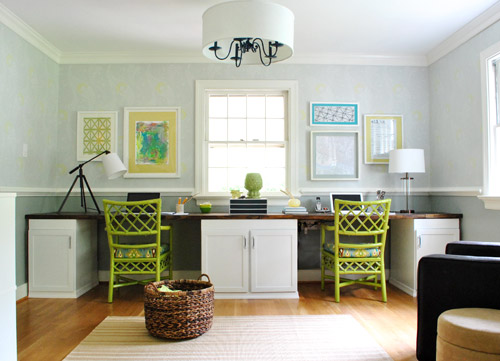
We liked that we had a “John’s side” (the right) and a “Sherry’s side” (the left) so since John loves maps, typography/handwriting, travel, and high-contrast geometric shapes, he ended up with this little medley:
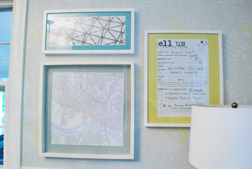
Not only does it represent a bunch of things he loves (type, maps, travel, geometric shapes, etc), it’s also personal because:
- the map is a typographic map of Richmond by a local artist (it’s actually made up entirely of words, more on that here) – I just painted the Ikea mat with the same gray paint that we used under the chair rail to help it pop
- the handwritten/typed item on the far right is a blown up copy of a tiny comment card from a meal that we shared in Alaska during our Honeymoon (we wrote things that we ate and what we saw on the comment card and kept it as a souvenir to remember that day)
On my side I knew I wanted Clara to paint me something (everything she makes is my favorite thing ever, what can I say?) and I liked the idea of framing a textile that I loved (some fabric leftover from Clara’s weekly project, which I also used a few years ago to reupholster a bench that now sits in her nursery).
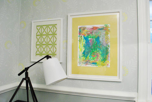
It doesn’t hurt that the lattice shape of the fabric ties in with the lattice detail on the chairs… and also seems to relate to the high-contrast geometric print on John’s side. Gotta love happy accidents like that. To us that just screams: meant to be.
As for how we approached the whole office art thing, here’s the order of this whole project (although we’ve done this multiple ways so there’s definitely not one “right” formula):
- Went through our existing frames to see what we had to possibly work with (and found the five that we used for a grand total of $0 spent)
- Laid the frames out on the floor in groups until we hit on a balanced but not symmetrical arrangement that we liked
- Hung the frames without anything in them, just to get a sense of how they’d look on the wall instead of the floor
- Began the art hunt (we figured we could trim/blow things up to work with the frames we had – although sometimes art comes before frames for us – it varies)
- Pulled our typographic Richmond map out of the playroom since we knew it was one of the things we wanted to hang (and painted the mat for that frame with leftover wall paint from under the chair rail)
- Went through our “memory box” full of movie stubs and love notes (it’s just a shoebox-sized container full of keepsakes), which is where we found the comment card from our honeymoon (which we blew up 420% at a copy shop to fit the frame)
- Dug up some sentimental fabric that I loved (which was also used here and here)
- Found a high-contrast print in my little file o’ art from years past that worked nicely on John’s side (it balanced out the handwritten comment card and the detailed type-map)
- Stripped Clara down to a diaper with some water-based Crayola paint and had her go to town on a large sheet of paper that would fit the frame I wanted to use with it
- Ran to Michael’s to grab some large colorful sheets of paper to create “mats” for some of the art (to better fill the frames and tie in some happy color since the office is our cheerful little bubble of unicorns, rainbows, and puppy dogs)
It definitely feels mixed & matched yet balanced enough for us – and it’s bold & happy without giving us a headache. We like that the color palette is diverse (Clara’s painting is full of color and there’s a black & white print, so it’s pretty varied). Even with all those colors/styles, the dominant tones (like teal and grellow) relate to the chairs and the dining room curtains – and the white frames help unify things. We definitely plan to play around with room accessories in other colors though (some pops of orange or coral on the desk might be fun) so we’ll have to see where things go…
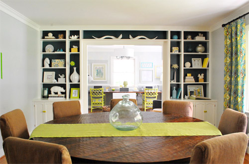
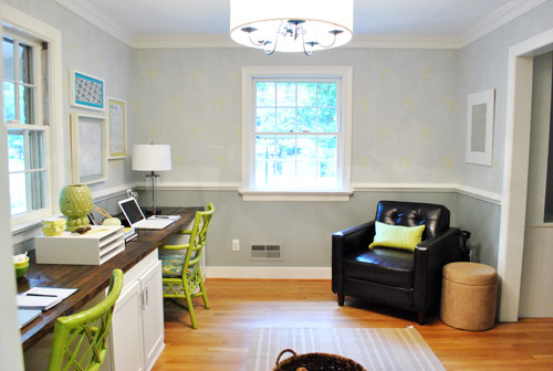
Oh and here’s the view from the dining room. I love that the office is so light-washed and the dining room built-ins are so dark. It really helps keep the spaces from blending into one big rectangle-fest. Oh and I’m on the hunt for a new runner that’s not so matchy (plum could be fun – or even textured burlap).
As for how much this entire update cost us, since we already owned all the frames we just spent around $9 at Michael’s on the large colored paper “mats” and $4 at the copy shop (FedEx Office) blowing things up. So that’s a total of 13 bucks for five pretty big pieces that we get to stare at whenever we’re not gazing at our laptop screens.
We still have other office things on the agenda, like: getting a permanent rug (most likely longer, not as wide, and darker), adding more permanent art to the other side of the room…
… hanging some window treatments (probably homemade roman shades), and adding a proper lamp and side table for the leather chair corner, etc. But for now we’re just grateful to have something on those have-been-blank-for-the-last-ten-months walls. Can’t believe we have stared at blank walls for almost a year. The shame! Especially since the frames were just sitting around in our playroom and it was only $13 to fill them with some happy-go-lucky stuff.
But enough about us. Have you guys ever blown things up at a copy shop like a comment card from a memorable meal? How about stripping down your toddler and “commissioning” some custom art? I thought I was going to be really Type A about colors and design but I just gave her every color of the rainbow and watched her go to town. My little artist…
Psst- Here’s another post about a ton of sentimental things we’ve framed around the house.

Leave a Reply