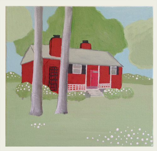
This week’s craft project has me skeered, I’m not going to lie. For the past month and a half I’ve had fun doing a simple and quick crafty thing each week, like making a fall wreath, stenciling a pillow, painting baskets, decorating pumpkins & gourds, making vacation keepsake globes, and taking ceramic paint for a spin on a bowl full of colorful cacti. Each of those projects took under an hour, and they were pretty easy and straightforward (paint this, wrap this around that, caulk this) – so I don’t know what got into me this week and whispered “how about painting a little portrait of your first house?”
It easily took me five times as long as any other Weekly Crafty project that I’ve tackled, but I’m nervous about it. I don’t know, it’s kinda cute and simple and John really likes it (and if you see where it started – woof! – well, it came a long way) but it’s a far cry from those amazing house portraits on Etsy. This blog has always been about sharing the good, the bad, and the ugly though, so here’s how it all went down…
First of all, it’s a 10 x 10″ canvas from JoAnn (snagged during one of their 50% off sales for $4) and I used a set of acrylic paints that I already had, but I think if you need to buy one it’s around $12 at most art/craft stores (unless it’s priced higher at a place like JoAnn since they assume you’ll use a 50% off coupon).
By far the most fun slash cringe-worthy part is watching the progression of this little painting of mine. Here’s a “slideshow” of sorts with ten shots that I snapped as it went – many of which make me groan out loud – but I was channeling Dori pretty much the entire time. “Just keep swimming painting, just keep swimming painting.”
I thought a breakdown of each step might be helpful in case anyone was wondering how I “built” the portrait in about ten different layers/stages, so…
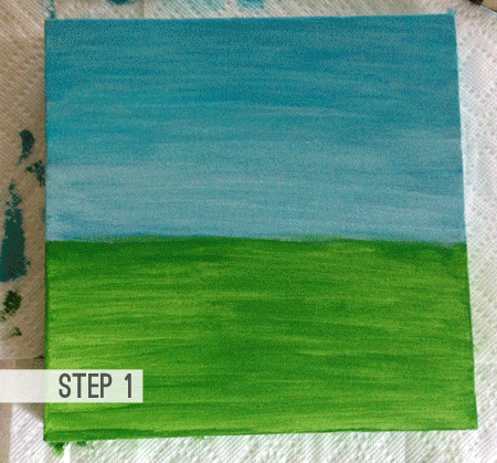
- Step 1: I quickly spread some green paint on the bottom and some blue on the top, just for a base coat for the grass and the sky. They both felt too bright and primary for me, but I thought it was fine for the base, knowing I’d be layering paint on top of it as I went.
- Step 2: I stared at an old picture of our house and then just tried to transfer the shape of the house onto the canvas, capturing the general perspective, and including the chimneys and stuff. I ended up hating how brown/dark it was, but again, I knew I’d be layering more paint on top of it as I went, so I tried not to freak out.
- Step 3: I added the roof in black and some red paint on top of the original brick color I had chosen to de-brown it. I also outlined the edges with a thin line of black, just to give it a little dimension.
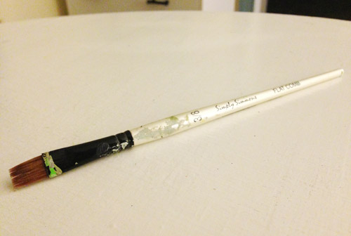
- Step 4: I used black paint to add the shutters, the chimney caps, and the lattice thing after I was sure all the red paint was dry (there was about an hour-long break just to avoid any smearing). Oh and for every single step of this portrait I used one brush, which I cleaned throughout the process. It has a nice flat tip, so I could get some good lines for things like the shutters and the lattice just by using the edge of it, so that kept things nice and simple. Although I did think about Bob Ross and his happy little fan brush. Oh Bob Ross, you were such a stud.
- Step 5: With a few shades of green paint, I added the bushes on the sides of the house, and the trees. I just sort of mixed some colors up to get a few different tones (some darker, and some lighter) to hopefully achieve something that looked a little less flat than using all one color.
- Step 6: Next I added all of the white details, so that meant the porch and the window ledges. This is when I realized I hadn’t even accounted for the porch in the roof-line, so I extended it and gave the roof a lighter layer of paint. I also lightened up the neon-ish grass that I started with by mixing a lot of white into a few green globs of paint.
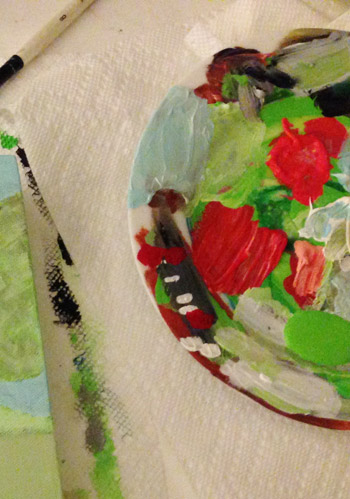
- Step 7: After lightening the grass, I thought it was time to lighten up the trees and bushes, so those got the same treatment. Oh and I was just mixing all of my colors on an old plate and dabbing them on paper towels.
- Step 8: I finally added the two trees in front of the house on the left side, and since I had some gray-brown paint on my brush, I just played around with it on a few other surfaces (like the roof, the trees, the bushes, etc)…
- Step 9: … but it looked dirty and muddled to me, so I layered more light green onto the bushes and trees and realized that a lot of times the roof reflects the greenery around it, so I took some artistic license and made that an even lighter green tone. It seemed a lot more harmonious than the stark white did, so I decided that adding a little tint of color, even to the porch, would make it fit into the scene a little better.
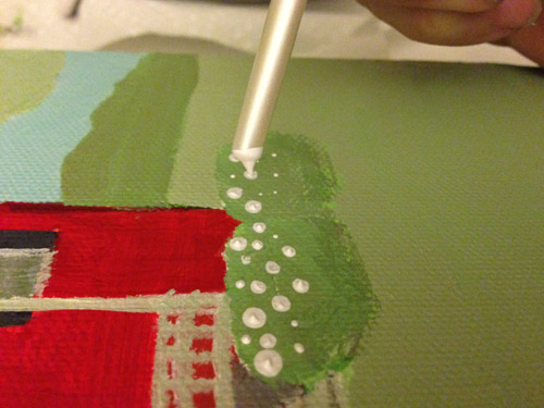
- Step 10: Here’s where I went dot crazy. I thought that it would be fun to use the back of the paintbrush to make some little elevated dots on the bushes in front of the house since they were white azaleas. And when I did it, I loved the look so much…. that I went a little nuts. Before I knew it, I had added them to all the other bushes and even did dark green dots on the tree behind the house. BAD! So I quickly painted those dark dots out of the tree, and left just the ones in the bushes (and a few in the grass) that I thought were sweeter.
Then I stared at it for a good ten minutes and finally said “I’m calling it done.” All told, it was probably five hours of painting (spread across three days) and for the most part I really enjoyed the process. There was something comforting about knowing that I could always just add another layer of paint over something if I didn’t like how it turned out. It was like a challenge with endless do-overs.
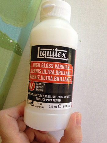
After I was sure I was finished, I just let it dry for a good 24 hours and then I realized I should seal it, so I emailed an artist friend of mine and asked what she uses on top of her acrylic paintings to make them glossy and finished looking.
She clued me in on Liquitex High Gloss Varnish, which I think I vaguely remember using years ago in college, so I grabbed some at Michaels (yes, predictably with a 50% off coupon) for about $9 I think, and applied three thin and even coats about four hours apart. I was surprised this stuff was so much money ($18 regular price for a small size) but it’s really thin – sort of like poly – so a small bottle like this could easily last you 30+ paintings. So now that I have it I just have to try not to lose it. And to try and drum up the confidence to paint something else…
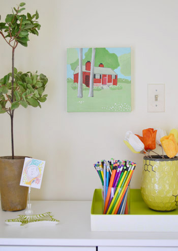
Here it is all hung up in a corner of the office. John has been earning mad husband points by saying it looks really nice there, but I think it would look better paired with another painting… maybe of our second house if I ever get the urge to dive back in and make one.
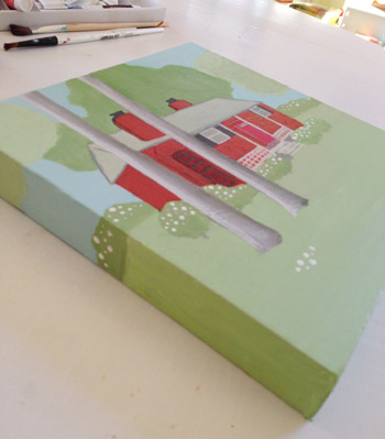
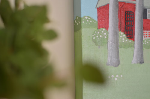
When I peer a little closer, that’s when I say “this is kinda cute” so I thought I’d toss in a little detail shot for you. I debated painting the sides of the canvas white or green or even charcoal but in the end I wrapped the image around the side by just continuing the sky/trees/bushes/grass, which I think ended up being a good call.
So that’s the story of my crafty house portrait pursuit this week. Upon further reflection, I think I wish I had done the middle tree behind the house in the lighter green tone and the two on the outside in the slightly darker green color. That might have looked a little more like the house had kind of a halo of lightness with the darker things on the outside edges.
Have any of you guys attempted a house portrait? Was it with paint? Mixed media like fabric or decorative paper? Did you do something in photoshop with one of those filters like watercolor? Or did you shoot a portrait with your camera and get it all framed up and matted nicely?

Leave a Reply