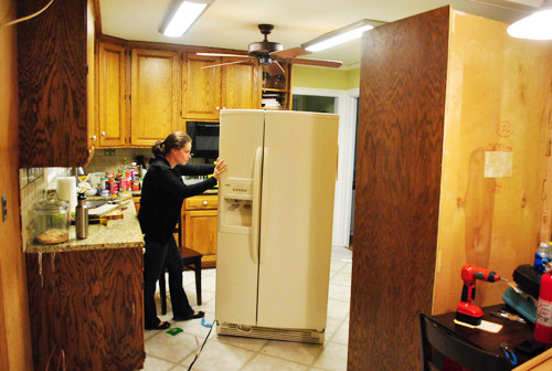
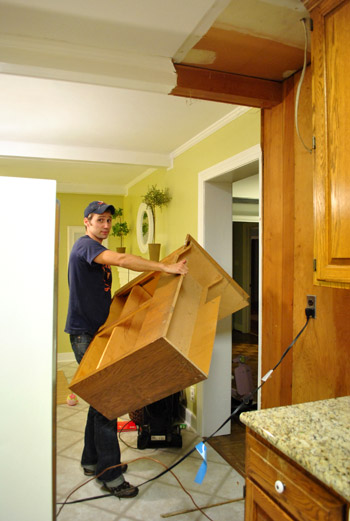
Archive for October, 2011

Counter Conclusions

We’re inching right along in the kitchen (wish we could share kitchen updates every day but we’re doing this thing real-time). Which brings us to our latest decision: the new counters that we’ll be going with.

We’ve been debating possibilities for weeks (there are a junkload of options out there with pros and cons to each one). And ten people would probably make ten different decisions, so it can feel especially hard to hone in on the “right” thing since there are so many variables. So here’s how we landed on the choice that we like best for our kitchen/family/life. But first the thing we’re sad about: although we had high hopes of DIYing concrete counters (I pinned about a million tutorials) they’re not a good choice for our kitchen. After talking to a few concrete experts (who actually make ‘em for a living) we learned that in order to accommodate the double 12″ overhang (on two of the four sides of the giant 3 x 5′ peninsula that we’ll be adding) we would need to pour the slab extra thick, which is an issue because:

Cue the sad trombone sound effect. We debated doing some sort of concrete “slipcover” (for lack of a better word- some folks just coat another countertop material with a thin layer of concrete) but it ended up having more cons than solid concrete, so we decided to explore a few other options in hopes of finding The One. But we’re diabolically determined (picture me stroking my chin like an evil genius) to mess around with concrete one way or another. Maybe we’ll make a long concrete dining table for an outdoor deck area that we have yet to tell you about/build (it’s on the to-do list, so we’ll hopefully get there eventually). But back to the kitchen…

Once concrete was off the table (or the counters, har-har) we decided that hitting up a bunch of local kitchen shops as well as the usual home improvement guys (like Lowe’s and Home Depot) would be a good way to see what other counter materials were out there… and what they were going to do to our budget. Back when we did our first home’s kitchen we really splurged when it came to the counters (to the tune of $3,700 after a $300-off promotion), but they kind of made our kitchen and we had saved up the money to pay them off right away, so we didn’t regret that choice.

But we definitely went into this kitchen makeover vowing to come in substantially under that number. Which is funny given that we have about twice as much square footage (since we’re adding a big peninsula and this kitchen is a lot larger than our last one). For example, to use the same “pashmina” granite from Home Depot that we used for our last kitchen would cost us over $7,000! Which is just not in the budget. At all.

At first we thought about butcher block (Ikea sells it so affordably and it can be stained to get a richer chocolate look). But with the dark wood counters in the adjoined office (just five steps from the stove and three from the fridge) we decided that would be too much wood. Plus we loved the slick and easy-to-wipe-down surface that granite offered us in our first kitchen. Call us spoiled. But this time we wanted to go with something different (and had heard good things about quartz, solid surface options like Corian, and even cool eco options like recycled glass). So after hitting up a bunch of places, here are all of the samples that we brought home to mull over:

  1. Top left: LG Viatera quartz in “Geneva” found at Lowe’s (note: any of these options are probably available at a number of places)
  2. Bottom left: Caesarstone quartz in “Pebble” found at a local spot called Kitchen & Bath Solutions
  3. Right: Silestone quartz in “River Blanco” found at Kitchen & Bath Solutions

  1. Top left: Cambria quartz in “Torquay” found at Kitchen & Bath Solutions
  2. Bottom left: Cambria quartz in “Sussex” found at Kitchen & Bath Solutions
  3. Top right: Allen & Roth quartz in “Alloy” found at Lowe’s
  4. Bottom right: Cambria quartz in “New Quay” found at Kitchen & Bath Solutions

Oh and here’s a pile of white solid surface options from Lowe’s, Home Depot, and Kitchen & Bath Solutions (the one on top is Glacier White by Corian, and there are other options by LG Hi-Macs and Allen & Roth under it).

We also admired a few awesome eco options like recycled glass but they sadly weren’t in the budget (at least we got cork floors and can reuse almost all of our cabinetry to keep things green).

The one we loved most? This Silestone guy (River Blanco):

But after we learned that it would be over 5K for those counters alone (!!!), we knew it wasn’t meant to be. But don’t cry for me Argentina. It all worked out in the end and we found something that’ll be a great choice for our kitchen/family. The winner? Glacier White Corian:

We’re in love and have all but forgotten the 5K option that we once called a favorite. That’s actually not a white Corian square pictured above, but that bigger white tile was the same color so it represents the new counter better than a tiny Chicklet-sized square sample. Oh and the stainless steel bottle represents our new stainless appliances and the paint swatch is the current wall color so you can see how those things layer in with other things like our backsplash tile and the mocha cork.

Why did it win? So many reasons:

I know it might sound really bland to do white cabinets with white counters, but many of the rooms that we love in our inspiration files have the white on white look. And given our recent backsplash choice it’ll all hopefully make sense (the gray-green penny tiles will stand out along with colorful items on our open shelves while the counters and cabinets are classic & clean).

We’re also toying with the idea of some sort of subtle color on the cabinets (maybe a soft taupe-gray like this kitchen that we crashed a while back). Not sure where we’ll end up, but we’ll definitely keep ya posted! What about you guys? Has anyone else decided to go with Corian? Or concrete? Or quartz? Or granite? Or butcher block? We’d love to hear which counter you picked for your kitchen! There are so many delicious options out there…

Psst- We announced this week’s giveaway winner. Click here to see if it’s you.

  Leave a comment

Some Slap Happy Office Art

You know… slap happy. As in it makes us happy and we slapped it up on the walls without over-thinking it (to the point of what-should-we-frame paralysis – which can happen if we’re not careful). Although we did talk about a few other options and eliminate them based on certain factors, such as:

So we decided to use frames that we already had in a balanced-but-not-completely-symmetrical arrangement. And as is the usual agenda, we tried to go with things that have meaning, feel personal, and make us smile. Are they perfect? Nah. But perfect is overrated. They just make us happy like our chipper green office chairs. So in a way, the fact that it’s not perfect is kind of perfect for us.

We liked that we had a “John’s side” (the right) and a “Sherry’s side” (the left) so since John loves maps, typography/handwriting, travel, and high-contrast geometric shapes, he ended up with this little medley:

Not only does it represent a bunch of things he loves (type, maps, travel, geometric shapes, etc), it’s also personal because:

On my side I knew I wanted Clara to paint me something (everything she makes is my favorite thing ever, what can I say?) and I liked the idea of framing a textile that I loved (some fabric leftover from Clara’s weekly project, which I also used a few years ago to reupholster a bench that now sits in her nursery).

It doesn’t hurt that the lattice shape of the fabric ties in with the lattice detail on the chairs… and also seems to relate to the high-contrast geometric print on John’s side. Gotta love happy accidents like that. To us that just screams: meant to be.

As for how we approached the whole office art thing, here’s the order of this whole project (although we’ve done this multiple ways so there’s definitely not one “right” formula):

  1. Went through our existing frames to see what we had to possibly work with (and found the five that we used for a grand total of $0 spent)
  2. Laid the frames out on the floor in groups until we hit on a balanced but not symmetrical arrangement that we liked
  3. Hung the frames without anything in them, just to get a sense of how they’d look on the wall instead of the floor
  4. Began the art hunt (we figured we could trim/blow things up to work with the frames we had – although sometimes art comes before frames for us – it varies)
  5. Pulled our typographic Richmond map out of the playroom since we knew it was one of the things we wanted to hang (and painted the mat for that frame with leftover wall paint from under the chair rail)
  6. Went through our “memory box” full of movie stubs and love notes (it’s just a shoebox-sized container full of keepsakes), which is where we found the comment card from our honeymoon (which we blew up 420% at a copy shop to fit the frame)
  7. Dug up some sentimental fabric that I loved (which was also used here and here)
  8. Found a high-contrast print in my little file o’ art from years past that worked nicely on John’s side (it balanced out the handwritten comment card and the detailed type-map)
  9. Stripped Clara down to a diaper with some water-based Crayola paint and had her go to town on a large sheet of paper that would fit the frame I wanted to use with it
  10. Ran to Michael’s to grab some large colorful sheets of paper to create “mats” for some of the art (to better fill the frames and tie in some happy color since the office is our cheerful little bubble of unicorns, rainbows, and puppy dogs)

It definitely feels mixed & matched yet balanced enough for us – and it’s bold & happy without giving us a headache. We like that the color palette is diverse (Clara’s painting is full of color and there’s a black & white print, so it’s pretty varied). Even with all those colors/styles, the dominant tones (like teal and grellow) relate to the chairs and the dining room curtains – and the white frames help unify things. We definitely plan to play around with room accessories in other colors though (some pops of orange or coral on the desk might be fun) so we’ll have to see where things go…

Oh and here’s the view from the dining room. I love that the office is so light-washed and the dining room built-ins are so dark. It really helps keep the spaces from blending into one big rectangle-fest. Oh and I’m on the hunt for a new runner that’s not so matchy (plum could be fun – or even textured burlap).

As for how much this entire update cost us, since we already owned all the frames we just spent around $9 at Michael’s on the large colored paper “mats” and $4 at the copy shop (FedEx Office) blowing things up. So that’s a total of 13 bucks for five pretty big pieces that we get to stare at whenever we’re not gazing at our laptop screens.

We still have other office things on the agenda, like: getting a permanent rug (most likely longer, not as wide, and darker), adding more permanent art to the other side of the room…

… hanging some window treatments (probably homemade roman shades), and adding a proper lamp and side table for the leather chair corner, etc. But for now we’re just grateful to have something on those have-been-blank-for-the-last-ten-months walls. Can’t believe we have stared at blank walls for almost a year. The shame! Especially since the frames were just sitting around in our playroom and it was only $13 to fill them with some happy-go-lucky stuff.

But enough about us. Have you guys ever blown things up at a copy shop like a comment card from a memorable meal? How about stripping down your toddler and “commissioning” some custom art? I thought I was going to be really Type A about colors and design but I just gave her every color of the rainbow and watched her go to town. My little artist…

Psst- Here’s another post about a ton of sentimental things we’ve framed around the house.

  Leave a comment

It’s baaaack…


Yup, Katie B (and Will & Jeremy) drove up to VA to pay us a visit this past weekend. Sneaky little Bowers. And among other things, we posed in the yard holding big white signs. You know, the usual. We’ll share more what-we-did details a little later in the week, but for now we’re here to issue the second ever Pinterest Challenge (it’s not actually sponsored or endorsed by Pinterest – we’re just obsessed fans).

My Pinterest addiction runs deep (as you know from this heartfelt post of yore), so a few months back when Katie called me to say that she thought we should challenge ourselves to make one thing each season that’s inspired by all the amazing stuff that we’ve pinned over there (and call it… wait for it… The Pinterest Challenge) I thought it sounded like fun. It’s a welcome slap of stop-pinning-and-start-doing. Because I’ve pinned 1001 things and only done about 1% of them. We ended up having a great time with our first Pinterest Challenge this summer, so we’re back with the fall edition.

The only rule is to do your take on something inspirational that you’ve pinned, so it can be anything- big or small (decor or sewing or cooking related – or beyond). Last time John and I made a clothespin light fixture for the laundry room, but this time we thought something seasonal could be fun (since the winter edition of the Pinterest Challenge won’t roll around until January). So I thought I’d seize the opportunity to whip up a bunch of Pinterest-inspired ornaments for a (hopefully) charming “homemade for the holidays” effect.

I’ve already pinned about fifty ideas, but I’m not sure which ones John and I will end up doing (and what our riff on them will look like) – but we’ll be back with all of those details when we complete the challenge next week. Oh and you’re probably wondering who else is playing along with Katie Bower from Bower Power (aka: The Pinterest Challenge Founder – somebody get her a beard and a top hat). We thought it would be fun to ask different folks to “guest host” with us each time, so we’re thrilled to have:

So here’s the part where I extend my arm with an awkward smile and an uncoordinated curtsey and humbly invite you to join in… and do your own spin on something you pin! We figured we’d give everyone (and ourselves) the weekend to work on stuff and reconvene next Wednesday morning (the 2nd) to share our projects. We’re hoping this’ll turn into the same über fun share-fest that we soaked up this summer (check out all the amazing linked-up projects here). So just drop in next Wednesday to see what we’ve done – and to submit links to stuff that you’ve completed so we can all check it out. Maybe we’ll even pin a few things. And so the vicious cycle continues…

One more time, for the people in the back: regardless of the fact that I say Pinterest ten million times (drinking game, anyone?) this wasn’t paid or perked by them or anyone else. We’re just eye-candy obsessed gals who love a good pin-fest. Sometimes while watching certain Beverly Hills Housewives.

  Leave a comment