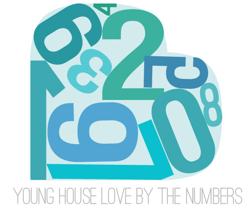
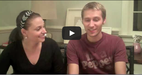
Archive for September, 2011
Bad News For Banquette Fans
For all those wondering when the heck we’ll tackle that kitchen banquette idea that we mentioned a few weeks ago (here and here), well… probably never. Cue the frowny face emoticons.
Here’s the deal. After getting lots of positive feedback on the idea a few weeks ago (over 1,400 comments total!), Sherry and I were certain your collective enthusiasm would push us from “we think this is a good idea” to “this is definitely a good idea.” And it nearly did. But parts of us still questioned the whole commitment-factor when it came to actually doing it (we definitely described it as a half baked idea when we shared it). We worried if it’d really be the most practical solution (would it be a pain to scoot in and out of?) and if it’d really make the most of the space (we couldn’t figure out the right balance of big-enough seats while still maintaining flow around it to keep it from feeling cramped).

So one evening we decided there was a reason that we were stuck in Hesitation City: it just wasn’t The One. So we did what we always do when we get stuck. We went back to the drawing board to see if we could come up with something else that we ended up liking better. We made a few quick sketches of the floorplan, asked ourselves “what are we not thinking of???” and just started sketching ideas – no matter how good or bad our guts told us they were. Kinda like those DON’T THINK, JUST DRAW exercises that they teach you to access your subconscious or something. Of course some of them completely blocked the doorway to the dining room (fail!) and nearly all of them were completely out of scale (so things were too big or too far over) but it definitely got the ol’ wheels turning again…

We tried returning to some version of table in the middle (top left) and even modification to the banquette (top right, bottom left). But somewhere in that mess we had one of those “Ah-ha moments” that ol’ what’s-her-name used to talk about on the TV (this is a joke for my Oprah-loving wife). So allow us to introduce the banquette’s successor: the peninsula! Cue the confused emoticons.
Let’s explain. First, here’s our CURRENT floating-table-in-the-kitchen-and-larger-table-in-the-dining-room arrangement (courtesy of my rough Google Sketch-Up drawing):

Now for the doorway opened, cabinets painted, counters replaced, floor slightly discolored (not intentionally) and (of course) peninsula’d version:

Woo hoo. Before we go any further, we should warn you: we’re 100% sold. The above depiction of it is probably not going to make a believer out of everyone, but from taping it out in the space and moving around it “in person” for a while we giddily came to the following conclusion: it’s The One! So no worries if it’s not your jam or you love Mr. Banquette (he was a lovable guy – and there are always gonna be people who would do things differently if this were their house) but we’re definitely going for it. And we can’t wait to get started.
As for why we didn’t come up with the peninsula idea sooner, we were so stuck on the fact that a peninsula coming off of the cabinetry that we already have would actually hit (or come very very close to hitting) the fridge on the other side of the room. So it wasn’t until we came up with the idea of adding a base cabinet to the right of the cabinetry that we already have to space the peninsula further away (a smidge towards the fireplace) for better flow and even more counter space.
Speaking of counter space, when it comes to executing this whole thing, we’re basically planning to add some base cabinetry (and counters) near the opening itself to create a counter-height peninsula. Which accomplishes a lot, actually:
- It adds additional work surface & cabinet storage to the kitchen side of the room (so it’s easy-access)
- It helps extend and better define the kitchen space without blocking flow or feeling too heavy
- It creates a casual eating space, keeping it distinct from the dining room table, which is just steps away for larger groups and more formal gatherings
- We can most likely seat four people at the peninsula (it’s flexible, so ignore the three chunky chairs shown)
- It can be used as a buffet to set out food (or to seat additional guests) when we have parties
- It can be used for homework, laptop browsing, and general hanging out by the kiddo(s) as they grow
- It even makes sense of our very off-center fireplace by creating a small casual living space that we’ll use as a little “chill corner” of sorts (the peninsula doesn’t block the fireplace, which our banquette friend did from most angles)

That last perk (centering the fireplace) was a nice surprise, since it’s something we’ve struggled with a lot (it’s just in such an odd place, practically shoved in the corner of the room). But you can see from this virtual view through the future doorway how it almost makes the fireplace placement seem intentional (picture it with a nice round mirror above it to balance that doorway next to it). Oh happy day.

We just love that we’ll get to see the fireplace from the dining room (it won’t be blocked by a heavy banquette) and if overflow guests sit at the peninsula, they won’t have their backs to the people seated in the dining room (which would have happened with the banquette).
For those who don’t do well with renderings (or are still scratching your heads), here are some pics we snapped to give you a better idea of how it’ll work in the real world. We moved some existing furniture around to mimic the placement (the table represents the peninsula) and have lived with it for the last week-ish to make sure it actually makes sense. Placements aren’t totally exact, but pretty darn close to what we’re thinking. Here’s the view from the laundry room. Ignore the broken pendant light in the far back (it finally crapped out on us). Instead look, there’s that fireplace nicely framed!

We also traced out the future opening (again, not exact) to show how that’ll work too. We’re thinking there will be a little half-wall (i.e. knee wall) where the peninsula meets the open doorway…

… like we showed in this rendering:

We considered a narrower doorway (where the peninsula doesn’t hang over into the opening) but we think this wider version makes it feel much more open and lets in more light, so it’s the current winner. And of course as previously mentioned, we love how balanced the fireplace and doorway look through the cutout.
Admittedly it took us a little while to figure out what to do with the space in front of the fireplace. It was our biggest hurdle in getting on board with this idea, actually. But after we brought in a placeholder chair, ottoman, rug, and light we realized it was actually completely awesome. There have been approximately 14 hours of reading-with-Clara from that chair in the last week or so. We’re even toying with the addition of some sort of tall built-in bookshelf behind the chair to balance the tall cabinets on the other side of the doorway. Not sure yet, but we’ll keep you posted.

We’ve already discovered it’s a great spot for Clara to play while we’re getting stuff done in the kitchen (since we can’t see her if she’s in the living room, but it’s easy enough to peek over the peninsula to check on her if she’s in the kitchen on the rug).

Sherry’s already making plans for how she’ll relax in front of a fire (we’re contemplating one of those convincing modern-looking electric inserts that Candice Olsen uses – possibly even a double sided one if we can eventually open the back of the fireplace into the living room as planned).

Meanwhile I’m dreaming of a little TV mounted above the mantle so I can watch the news during our morning breakfast routine (Sherry is rolling her eyes as I type this- so we’ll have to see where we land on that). Either way, can you tell we’re getting more than a little excited about this set up? Yup, it’s The One.

The peninsula will also give us 3-ish base cabinets worth of deep functional storage, unlike the largely decorative storage (open 12″ bookshelves) that the banquette would’ve provided. Plus a nice wide 3′ x 5.5′ work surface for prep, serving, eating, and homework is FAR more functional than what we would’ve gained from a distant island or a narrow banquette located a lot further away. And we’re probably gonna use the new counterspace as an excuse to change the countertops in the whole kitchen. We’ve never loved our existing granite color (it has a few pitted/stained parts too), so it seems silly to actually buy more for the new peninsula (we’ve debated a mismatched look, which we like for an island, but for a peninsula it seems like it would look most like it has “always been there” with the same counter to keep things seamless). Of course we plan to craigslist the existing granite and put that money towards whatever we’ll use for the new material (not gonna lie, we’re already talking about DIYing concrete counters).

Oh and for anyone debating a peninsula, we’ve learned that the pros recommend 42″ of walking space between the peninsula and whatever’s on the other side (in our case it’s the fridge, which we hope will sink back a foot or so when we replace it with something that’s counter-depth). So that’s how we arrived at our peninsula length.

In fact, flow through the room is almost better because there’s one straight pathway through the room, whereas the old table (and the once planned banquette) made us walk in a slight circle. Hoorah for ten less steps a day. Haha.

So now that we’re unequivocally sold and geeky-excited about our new plan, it’s just going to come down to working out the logistics. Namely how to find/build perfectly-sized cabinets that match our old ones without breaking the bank. And finally hire a licensed contractor and get the permits needed to bust out that load bearing wall of ours. But that’s a story for another post. Another ten posts, probably…
Update: You can check out the new “cozy corner” behind the future peninsula in action (on video!) over on Young House Life.
Another update: Lots of people are sweetly suggesting some sort of bookcase or built-in feature on the side of the cabinets that face the dining room (instead of a knee-wall) but we’re unsure if that’ll be too much since there are already built-ins in the dining room that are just a few feet away. We’ll keep you posted as we go though! Who knows where we’ll end up…
Psst: Tomorrow I’m going to post my thoughts on trying Google Sketch-Up for the first time (and how it compares to two other 3D rendering tools I’ve used). So stay tuned for that if you’ve got any questions about how I made the 3D graphics for this post.
Reader Redesign: Gorgeous In Grey
Just as we mentioned last week, Reader Redesigns are back y’all!! And we’re kicking things off with Michelle’s amazing bathroom renovation. She and her husband David gutted the crazy yellow bathroom, completely reconfigured the layout, and built it back up in beautiful greys and fresh sparkling whites. Here’s her letter:
Hi Sherry & John! Your bathroom at your first house sparked me and my hubs to renovate our 1952 master bath. We followed soooo many of your tips (we ran into all of the same demolition problems, including the wire mesh). It was no bueno! But thank goodness all of the hard work is done. I shared the big final reveal of the bathroom here on my blog Ten June, and you can also look back at the entire renovation here. Anyways, I just wanted to say THANK YOU for your insight! So excited that Reader Redesigns have returned! -Michelle
Um, it’s insane. Seriously, it doesn’t even look like the same room. Just check out these before pics:
And now for the holy-cow-that’s-amazing afters:
Not only is that shower – ahem – double shower awesome because it sits where the toilet and bathtub formerly were, but it also has these killer hex tiles….
…which Michelle and David smartly echoed as details elsewhere in the shower.
Sherry and I may or may not have gone nuts over that tile. And everything from the soft gray vanity to the glittering angled mirrors have us in a gorgeous-bathroom-induced haze. As Michelle said, there are more before, during, and after pics on her blog: Ten June (namely, here and here). Thanks for sharing your awesome project with us Michelle!
Got your own awesome before & after project? Send your story, pics, and related links to submission@younghouselove.com to be considered for a possible Reader Redesign feature. You know we love any and all design eye candy!
Dude, Stencils Are No Joke
I did it! I bit the bullet and ordered the stencil that John and I have been pining after for the past month (mentioned here a few weeks back). We loved the idea of adding some subtle tone on tone detailing above the chair rail in our office (we didn’t want anything with too much contrast since it’ll compete with the dark teal built-ins and the fun curtains in the nearby dining room). So we settled on a softer gray tone with a tiny pop of color (leftover grellow paint from the adjoining kitchen). At 54 honking dollars it was hardly a drop in the bucket, but let me tell you, this stencil is hardcore. First of all, it’s made of super durable plastic, so I don’t have to worry that it will rip or crease while I’m taping it, untaping it, and bending it manhandling it to get into the corner crevices (I’m pretty sure I would have trashed a thinner stencil after one wall, just because it’s kind of a more rigorous application process than I expected). And let’s just talk about how big it is. It’s over two feet tall and almost two feet wide, so it helps to make things go faster since you don’t have to reposition it every three seconds like you would with something smaller.

And yes, this is quite an evil face I’m making. No idea why. I remember saying something like “make sure I don’t look naked” when John snapped this, but had no idea I was giving off such an I’m-the-female-Hannibal-Lecter vibe.
Another way that I’m rationalizing my purchase is that we only spent $6.30 on cabinets for the built-ins and $27 to build a 13 foot counter, so maybe it’s time we splurged in the office. Haha. I also figure any type of wallpaper (even the cheap stuff at Lowe’s and Home Depot) would be way more than $54 for the entire room above the chair rail, so there ya go.
I’ve actually never done a giant repeating stencil like this on a wall (we did stencil the floor of our first house’s sunroom) so here’s where I’ll get to the keeping it real part: stenciling is haaard. I’m not gonna lie, my arms were cramping after about an hour and it took four and a half solid hours (from 8pm to twelve thirty in the morning) just to almost finish one wall (out of the four that I want to do). But in the spirit of sharing things real-time as we go, I couldn’t wait to share the in-progress madness. Here’s a close up:

And here’s one side of the wall that I almost completed (I still have to do those last 6″ above the chair rail). Oh but ignore the weird dark and light vertical shadows on the wall (couldn’t wait for the lighting to be better – too impatient and excited to share, haha).

As for my method, here’s a little breakdown of what seemed to work for me:
1. I prepped the room by clearing it and tossing a drop cloth over the desk so we wouldn’t get paint splatters on it.

2. I used Martha Stewart Craft Stencil Adhesive Spray from Michael’s (purchased with a 40% coupon of course) to spray the back of the stencil before taping it up on the wall with painters tape. This helped the middle parts of the stencil stay close to the wall and not bend out for a nice crisp line. I probably repositioned the stencil two or three times before re-spraying it (when I noticed it holding less firmly to the wall I just took it down and sprayed it and taped it back up for the next application). Oh and you’ll want to use a large piece of cardboard or drop cloth to spray the back of your stencil so you don’t get stick stuff all over the floor).


3. As for where to start, John held the stencil up in the top middle of the wall so we could center the pattern and work out from there in all directions.

4. I also used delicate surface frog tape for holding the stencil up at the top, bottom, and sides (we already had it on hand and I didn’t want to tear off fresh paint as I moved it around the room so it seemed to do the trick).
5. I used small foam craft brushes (also from Michael’s). They were basically dowels with flat foam tips.

6. As for how I loaded my little foam brushes, I just dipped them in the paint (more details on the paint colors later) and dabbed the brush around the lip of the plate to remove excess before tapping it against the wall to apply the stencil.

7. I always tapped the wall at a right angle with a not-to-gloppy foam brush for a nice clean edge (so the paint wouldn’t slip or drip behind the stencil and smear around).


8. If I feared that a little bit of paint somehow got behind the stencil, before repositioning it on the wall for the next application I would lay it on my drop cloth on the floor (face down) and wipe the back with a dry folded paper towel to remove the excess paint. Then I would respray my stencil adhesive and stick it back on the wall for the next application.
9. The way that the stencil is applied means that there are repeats. So you position it right over the last 3″ that you previously stenciled and work your way across the wall that way. I didn’t wait for the paint to dry before moving the stencil (that would have probably taken five million hours), so I just took my time applying the paint so nothing got behind the stencil and then matched up the stencil carefully for the repeat and continued on. Since there was no wet paint on the back of the stencil, it was fine to be pressed against the 3″ of wall that was already done, and it didn’t look any different than the non-overlapped part. I wonder if the application of paint was so thin that it was drying really quickly so it didn’t make a difference…

10. The corners were the hardest part. To get the stencil to lay flat against the wall in the corner so you can cram your brush into the small little stencil openings was sort of impossible to get perfect. But I did learn that this stencil is extreeeeemely forgiving (probably because it’s a more organic pattern than a regularly spaced geometric one, which would probably make any inconsistencies a lot more obvious). So when I didn’t quite get deep into all the corners, once it dried it was somehow not obvious at all (a stenciling miracle?). Of course I’m not exactly a corner expert because I’ve only attempted one of them, so as I go around the rest of the room maybe I’ll have more tips.

After about three hours I was here on the first wall:

And after 4.5 hours I had one wall almost all done (sorry for the terrible picture, I was sort of losing it at this point).

So although I wasn’t completely done with that wall, I decided that 12:31 am meant it was time to put the foam brush down and throw in the towel for the night. And do some finger stretching (I seriously had cramped up hand-claws).

Oh and as for the colors, here you go:
- Walls: Moonshine by Benjamin Moore (color matched to Olympic No-VOC paint in a satin finish)
- Main stencil color: I just asked the paint guys to give me a half-tint of the wall color (also color matched to Olympic no-VOC paint in a satin finish). This means they just add half as much tint to the white base as the original formula calls for, so you end up with a half-as-intense tone-on-tone effect.
- Grellow stencil flower accent color: Leftover wall paint from the kitchen, which is Sesame by Benjamin Moore (color matched to Olympic no-VOC paint in semi-gloss). You actually can’t tell the difference in finish unless the light hits it just right from the side and the grellow sort of looks iridescent, which is actually awesome. Yay for happy accidents.
I also made a video to hopefully help demonstrate the foam brush prepping and actual stenciling part of the process (including a quick demo on corner stenciling):
So that’s where I am with the stencil. One wall-above-the-chair-rail almost done, three more to go. I’m planning to tackle another 4+ hours tonight and hopefully can fit in one more session this week (my goal is to be done by Thursday or Friday, soreness permitting). It’s definitely one of those projects that you just need to force yourself to complete as fast as possible – because as soon as you start all you want is to get to the point where you can let out a huge sigh and say “so glad that’s over!”
But so far I have to admit that it’s totally worth the trouble. We’re loving the effect (it’s sort of like subtle modern wallpaper, not too in your face but not too tame and unnoticeable either). It’s sort of the perfect amount of “ooh, look at that” without being too competey and chaotic with the adjoined dining room. And John and I both have said the following sentence about ten times so far: “the pop of color totally makes the entire thing.” So might I recommend a splash of grellow (or any color you love actually) to take something that’s gray on gray to the next (still-kinda-subtle) level?

Ok, now I have to hear from you guys. Have you ever stenciled something, be it an accent wall, piece of furniture, or entire room? Do you have any secrets you’d like to share? How long did it take? Is four and a half hours for the top half of one 13 foot wall (with a big ol’ window in the middle) about right? I might just be moving at a turtle-like pace. Haha. Just too nervous about getting paint all down the back of my stencil if I go any faster. Anyway, hopefully I’ll be back with finished pictures (and maybe a bulging right bicept from dabbing away) by Thursday or Friday. Until then, picture me standing on a chair at 11pm wearing my inside out painting clothes and listening to shows on Hulu (I tried radio, but somehow hearing Community and Parks & Rec play in the background kept my spirits up a little more).
Psst- I’m over on BabyCenter chatting about my favorite kids clothing store and how I save money when it comes to shopping for Clara’s clothes & shoes. Did I mention that I snagged 47 cent shoes on my latest mission? Excited doesn’t even begin to describe it. Check it out here.


