Archive for June, 2008

House Crashing: Sister Act

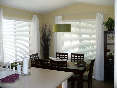
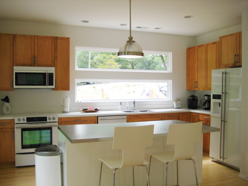
John’s sister Emily has been a busy girl since our last post about helping her move into her fabulous new home (that she and her husband Todd designed themselves). Yes, only a month later, she’s managed to furnish, fluff and feather nearly every room and has graciously allowed us to invade her space once more to bring you some fresh & fabulous after photos. Let the house crashing begin…

Here’s a shot of the swanky modern exterior with Emily and Olivia hanging out on their front deck. The house’s theme was clean lines, modern touches and windows galore. When you buy a corner lot with nothing but green in three directions it’s easy to see why it’s all about the view. And although the house appears to be one level, it’s actually three generous floors since it was built into a steep incline. You enter into the third floor living area from the front, but walk out the bottom floor’s sliding glass doors into the backyard at the base of the hill. Tres cool.

The minute you walk in the front door, you’ll find yourself in an airy open space for living, dining, and cooking. The crisp white walls accented by tones of wood and a little bling in the form of stainless steel light fixtures really make the space feel sleek, simple and sophisticated.

Emily’s kitchen is insanely enviable. From the new glass front Jen-Air appliances to the Restoration Hardware pendant illuminating the Ikea island, the kitchen is a mixture of high and low that comes together in a totally seamless way.

Emily even convinced her builder to work in a pull out pantry from Ikea, which can be accessed by her two snacky kids from either side. Delicious.

The master bedroom also resides on the top floor with an attached bathroom boasting both a jacuzzi tub and a separate shower. The coolest feature has to be the barn door that they incorporated into the design, which slides along a stainless track to obscure the view of the bathroom for privacy and style to spare.

Another noteworthy detail of the master bedroom is the amazing wall of contemporary closetry (which also hails from Ikea). Emily and Todd decided that they’d rather leave room to tuck these spacious wardrobes right into the floorplan instead of having their builder craft a traditional closet. They liked the outcome so much that they used Ikea armoires in both of the kids’ rooms in lieu of closets as well.

Speaking of the kid’s rooms, they’re still a work in progress, but stay tuned for some fun DIY projects (like how to make an upholstered headboard) in the coming weeks. Until then, we’ll leave you with this swanky pic of their delightful guest bedroom, sporting some Target bedding, a few West Elm pillows, an Ikea lamp and a chair from a thrift store. Now that’s our kind of room. Too bad the fact that we live eight minutes away makes a sleepover semi-improbable.

So whaddya think? Did the pull out pantry and that sliding bathroom door make you drool? Do tell. And if you have any fun rooms of your own (modern or otherwise) that you’re itching to share, feel free to send ‘em on over. Ta ta for now.

  Leave a comment

Our Home In R. Home

Ok, so we’ve extended our 15 minutes of local fame a smidge thanks to the latest issue of R. Home magazine, the much loved home & garden offspring of our hometown’s über popular Richmond Magazine.

We’ve been anxiously awaiting this July/August issue since way back in April when they first contacted us for an interview and a professional photoshoot (I know, we’re fancy), and it’s finally here. And I must say we’re thrilled (especially Sherry, who has worried for two months that her pose on the second page might make her appear one-legged).


young house love in r home magazine

The article chronicles the short story of us and the birth of Young House Love, while sporting some swanky, professional pics of a few of our favorite before and afters (the sunroom, the den, the master bedroom and, of course, the kitchen).

Click here to read the full article as a PDF or (if you’re local) pick up a copy of your very own at Kroger, B&N or Ukrops. We promise it’s better in all of its glossy glory. And if you’re a new visitor thanks to R. Home: welcome! Feel free to kick off your shoes and stay awhile. Hopefully we’ll bump into you around town one of these days (feel free to shriek if you recognize us).

  Leave a comment

Nine Designers Walk Into a House…

Sounds like the start to a good joke, eh? It’s not (but I’m open to punchline suggestions). It’s actually the concept behind the Washington Design Center’s Design House, where nine of DC’s top interior designers divide and conquer to turn nine blank spaces into nine trend-setting design concept rooms. And this past weekend we stopped by in search of some inspiring, well, inspiration.

This season’s theme was “What Hue Inspires You?” So each room – with names like Silver Lining, Something Blue and Paprika Passion – showcased how to bring color into your home while steering clear of tacky and heading straight for elegant.

We’ll start with the Paprika Passion foyer, which features a seating area anchored by an oversized light fixture. We learned there’s a trend toward using chairs instead of couches because as our rooms become more mutli-use, chairs can be more easily rearranged – especially when they’re on casters – to face each other for conversation or towards a TV for movie watching.

But not all the seating we saw was designed for function. For instance, this stuffed-panda-bear seat in the quirky Black Splash living room is probably meant more for conversation than it is for comfort. A reminder that it’s sometimes okay if the only thing a piece adds to a room is a good story (although this isn’t a story we’d necessarily want to tell).

Next we meandered into the Silver Lining bedroom and lounge, which stole Sherry’s heart with a metallic shine on just about every surface in the room (iridescent ceramic floor, metallic paint stenciled walls, mirrored four-poster bed, etc). Sounds crazy, but it was actually – brace yourself – very relaxing. Who knew shine could soothe?

But it was the White Wash spa room (i.e. bathroom) that was truly the epitome of soothing. Maybe it was the wall-to-wall sisal carpet, the giant marble bathtub or just the fact that we are sorely lacking in the master bath department but we couldn’t take our eyes off of this room. It made us dream of one day creating a bath, I mean, spa room of our very own.

Next was the Something Blue sitting room, a room that took its name literally and included only one blue something (a painting over the couch). An interesting note is that the designer apparently loved the existing floor and wall color so much that he practiced the often overlooked skill of restraint and kept them exactly as he found ‘em when he started designing the space. Bravo.

The last room on our tour was the Gold Rush ladies boudoir. Once I got over the discomfort of being a man in a “boudoir” I totally appreciated the subtle art deco touches (like the diagonals in the screen and sharp curves of the chaise), not to mention the ability to work with the smallest space in the house.

But perhaps the most inspiring lesson learned at the Design House was the generous use of texture. From a capiz-pattern wallpaper and a hand-stamped brocade paint treatment to a unique twist on traditional hardwood floors, we’re now on the lookout for ways to bring more unexpected texture into our house. Does painted wood paneling count?

If you wanna see these rooms for yourself, the DC Design House tour is free and runs through this Saturday, June 28th (you can visit their website for details, directions and all that jazz). And the Fall Design House opens on September 26th and features completely different designers (working with a different theme) so stay tuned for more inspiration later this year.

  Leave a comment