Well well well, if isn’t those little photography note cards again. You know, the ones we bought on our anniversary from a local art gallery to hang in our bathroom? You might not even have registered them in that post since everyone went bananas over the whole Sherry-haircut thing.
Anyway, hanging them in the bathroom was the initial plan. Until I noticed some of the photo colors were in the same neighborhood as our framed $5 scrapbook paper. That neighborhood being Sue-the-Napkin-ville. Or is it Sue-the-Napkin Heights?
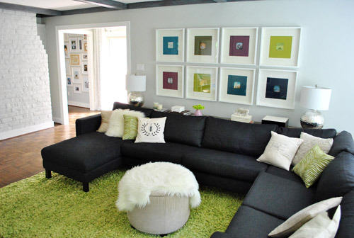
We figured that maybe our $4 a pop Sherri Conley note cards were destined to live in these eight frames (plus we couldn’t decide on a configuration for the bathroom, so we liked the idea of enjoying them out in the living room). But it meant we had to get four more of them first, so we shucked out another $16 to round out our “local art collection” (from Crossroads Gallery here in Richmond).
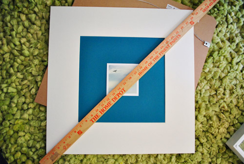
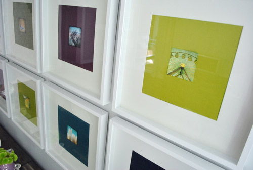
The idea was to add the small square of art into the middle of the colored paper square that already sat inside the square frame. Thereby making the colored square of paper into a fun little colored square mat. Wow, lots of squares going on. We’re one do-si-do short of a square dance.
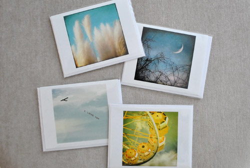
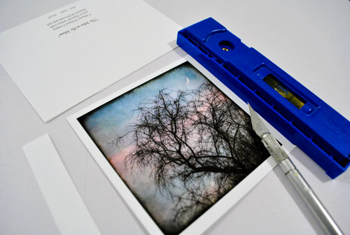
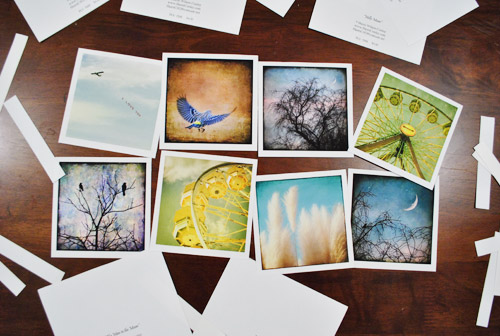
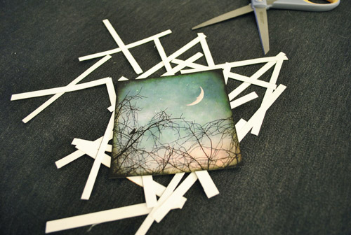
First we had to cut our rectangular note cards into… you’ll never guess… squares. I used an exacto and a ruler to keep my lines straight, but was brave enough to just eye the placement of my slice. Yup, my middle name should be Danger. Or soda. Or both. John Danger Soda Petersik. I like it.
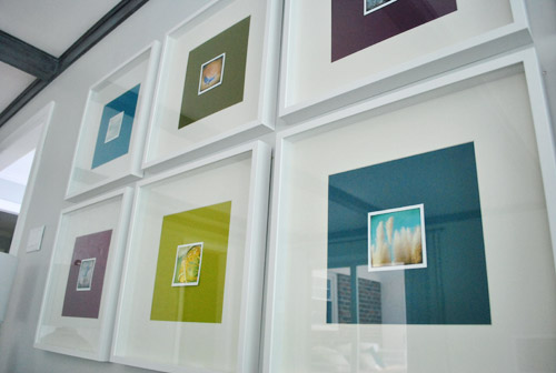
As you can see, we left a thin white border on the pictures to, I dunno, further emphasize their squareness? They sort of looked like little polaroids to us.
Then one by one the frames came off the wall so the photos could be scotch taped into place on each colorful background which essentially became the “mat.” To get them centered we eyed them, then used a yardstick to make sure they were actually centered. To do that we just lined up the yardstick across two opposite corners, and then repeated that with the other two corners to make sure they seemed to intersect equally.
Finally, everything was reframed and ready for our viewing pleasure.
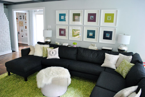
Only problem, we weren’t totally psyched by the result. We didn’t mind the small size (it just makes us want to lean in and take a closer look) – although I know some folks might think bigger is better (that’s what she said). Our issue was that something about them was really interrupt-ish and busy and, well, just too square-y (it honestly looks better in pictures than it did in real life). And yes, the reflection on the glass totally bites for taking pics, but we’re not quite ready to splurge on eight panes of museum glass just yet.
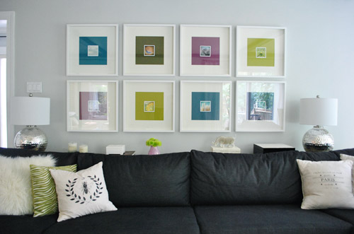
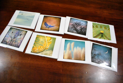
We realized the white borders I left on when trimming the note cards might be the problem. It made the distinction between the photo and the colorful mat so defined that we kind of lost the fun coincidence that each pairing was sort of linked by color. So rather than the paper feeling like an extension of the art’s hues, it just felt like a tiny picture on top of a thick bright mat on top of a thick white mat. It was a square vortex and it was threatening to eat our brains.
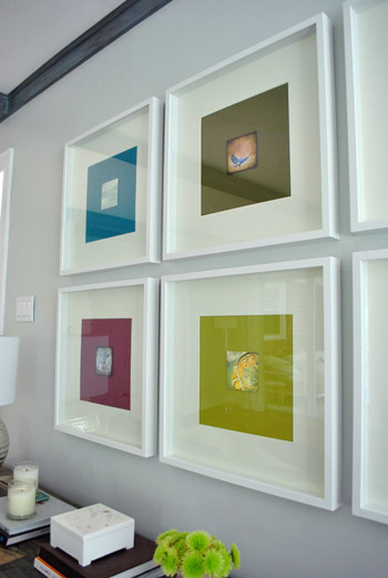
So after a few days of living with it (and not growing any fonder) Sherry took it upon herself to remedy the situation. And since she has a much steadier hand than I do, she didn’t even use a level and an exacto (just a regular old scissors). Cocky much?
Of course her cuts were great. And now we’ve got this:
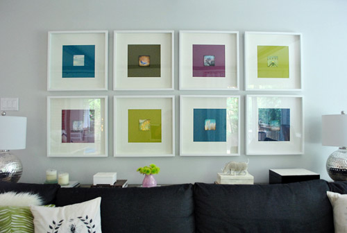
We like it muuuuch better – especially in real life. Although we’re the first to admit that for some reason the white framed note cards didn’t photograph as crazily as they looked in person, so there’s not as much of an obvious improvement from the square-on-square-on-square action that was going on before. But in person it was such a relief. We worried we might have to scrap the whole note card idea entirely, but once they were trimmed down and put back in place, all was right with the world. Or at least with the left wall of our living room.
We like that they feel less busy and that subtlety is much preferred. They don’t scream “check-me-out!!!” but are nice when your eyes meander around the room and happen to land on them. So for a total of $4.64 per frame (64 cents for the scrapbook paper backgrounds and $4 a pop for the photo note cards) we’re psyched.
I still wouldn’t go as far as to call this our forever art solution for these frames. We’ve learned our lesson when it comes to making those sort of giant declarations since our house is always a WIP (work in progress). Not to be confused with an ORB (even though Sherry is definitely demonstrating her undying love of all things oil-rubbed-bronze). So we think adding these small photographs are a good warm-up for us since they might end up laying the ground work for something else that we may want to transition to a bit further down the line. So let’s call it a baby step. We’ve introduced some small photography, so maybe in a while we’ll try some larger photography, rehang the note card photos somewhere else, and scrap the 60 cent scrapbook paper altogether… who knows.
What I do know is that looking at some of these photos makes me want to go on a ferris wheel. Oh, and eat funnel cake. Yeah, definitely that.
Has anyone else made any art-y updates lately? Or used note cards as wall decor? Or gotten sucked into a square vortex, never to be seen or heard from again? Well, if you have, I guess you wouldn’t be able to comment…
Psst- We announced this week’s giveaway winner. Click here to see if it’s you (plus the $15 discount code for everyone is still valid until August 31st).

Serina says
Good call on removing the white border, and how crazily amazing is it that those photos coordinated so well with the existing framed paper!
I actually had a white border happy accident occur when I printed out photos slightly too small for the openings of a pre-cut matte. So the photos unexpectedly ended up with white borders, but I think it all worked out for the better in the end:
http://applesforolive.wordpress.com/2011/01/05/picture-perfect/
YoungHouseLove says
Oh yeah- that looks great!!
xo,
s
Sonya says
I think it might look nice with a solid colored and subtly patterned scrapbook paper behind the photos. Kind of like when people paint stripes or stencils on the wall in the same color paint, but a different sheen.
YoungHouseLove says
That could be pretty down the line too!
xo,
s
Alissa says
so cute!!! if you’re feeling a little edgy, the neighborhood might be Sue-the-Napkin Heights-Adjacent
YoungHouseLove says
Haha. This is true.
xo,
s
homeatlast says
I think the photos in the notecards coordinating perfectly with the colors you already had in the frames is . . . serendipitous!
Bob says
I think I like the photos with white border better than without. But, I can’t see them in person until our slumber party. So I will reserve final judgment until then.
YoungHouseLove says
You’re funny this week Bob. I like the sweet Bob who is choosing love.
xo,
s
Bob says
That’s funny. This week I decided to take my meds. I guess they are working out for me after all.
Anything to not have my slumber invite revoked.
More meds please!
Leigh M. says
Love it! And I agree, it looks much better without the white frame around the pictures.
Have you guys considered getting a polarizing filter for your camera? It’d be able to eliminate most or all of those reflections and is great for outdoors too. You can get them for around $20 and they’re easy to use.
YoungHouseLove says
Thanks for the tip! Never even heard of them, but we’ll have to check them out!
xo,
s
heather @ like a cup of tea says
Ohhh yeah, I definitely recommend one. They’re great. Mine just screws onto my lens and stays there almost all of the time. Not only does it work great, it helps protect my actual lense from damage (which is a lot more expensive to replace). Filters = Friends.
YoungHouseLove says
Thanks!!
xo,
s
Ashley L. says
Make sure that the filter fits the width of your lens, so be sure to bring in your camera to the store. A good filter will spin while it’s screwed onto your lens so that you can vary the degree of polarizing-ness, depending on what you’re photographing. You’ll have to adjust your shutter speed to let in a tiny bit more light but other than that, polarizers are made of glory.
YoungHouseLove says
Thanks so much!
xo,
s
Zoe Feast says
DIY art work that’s right up my street! Definitely looks better without the white border as you reduce the contrast.
I have a whole collection of DIY art in my house,
http://www.creativeinchicago.com/2011/07/diy-wall-art.html
and I took a great take away from your blog the other day..the post you wrote about your bedroom prints and spray painting the mats. A few of the pieces in my house have “not so white” looking mats so last night I bought a can of white spray paint and am going to have a go at whitening them up.
Just have to wait for it to stop raining here in Chicago so I can take them outside …don’t want to “fume” myself up.
YoungHouseLove says
Love those! Especially the amazing one by your daughter! I can’t wait until Clara can doodle a bit more!
xo,
s
Zoe Feast says
Yes I love that princess picture too…it lived on my fridge for quite a while before I framed it. I am sure Clara has inherited your creativity and will produce you some masterpieces to display!
Emma says
A very nice “incremental” improvement. Much cuter than the paper palce holders. Our homes are always evolving right? Viewing your home as a WIP is a great way to take some risks! There are very few things that can’t be undone so why try some things out right? Well done!
Brooke says
I recently completed our gallery wall. I’ve also done the note-cards-in-frames as art. However, I didn’t like the way they looked on the huge walls in our new house, so they haven’t made it up there yet. But notecards are definitely one of my favorite sources of affordable and frameable art.
Marla says
haha – love the hot drink/stack of books on the console – guessing it’s Sherry’s? I remember reading specifically that would be one of the things you’d use the console for. Even funnier if you told us you staged it :)
YoungHouseLove says
That’s totally for my tea! Haha. I use it every single night.
xo,
s
Allison says
I haven’t been sucked into the square vortex yet, although I am glad to see how many stores carry square frames now… but I have been sucked into the John W. Golden (of etsy) vortex! I purchased a print of his and gosh was it a strange size. My final solution was to purchase a floating frame where the print is sandwiched between two panes of glass. It looks awesome but it was a butt to center without smudging the glass :)
YoungHouseLove says
Haha. I love your story and double the use of “it was a butt to center.”
xo,
s
Meredith says
It looks wonderful! I never would have realized that it was the white border making things weird… but you guys were totally right!
heather @ like a cup of tea says
My aunt is a well known watercolorist in Maine (though she would be modest and just shake her head and ask if you want a big italian dinner). So come wedding time she painted our wedding card and signed it. I full plan on matting it and hanging it on our wall. Not only is it a beautiful piece of art, but it means a lot that it’s from her. I also took my dslr to her gardens recently to photograph for some interesting wall art. They are currently taped to the walls and my husband has found me standing there like a flamingo with one eye shut, hands on hips and staring at them as I mull them over.
cec says
we did something to similar effect by taking hipstamatic pics and printing them out and framing.
we thought the quality of the prints might suck, but they turned out great.
bethany says
We just printed out an Avett Brothers quote from here: http://www.madebybird.com/diy-song-lyric-prints/
Then hung it up! Love love love it! PLUS it was free since we already had the frame.
Roshni says
I feel the photos are just too small, so really they don’t seem to be doing anything special to the photo frames you already have up there. Just my opinion.
YoungHouseLove says
Thanks Roshni! It’s definitely a personal preference thing. We love that they draw you in so you lean closer to check them out, but we get that some folks like things bigger!
xo,
s
kristen says
that’s what she said.
YoungHouseLove says
Haha, I walked right into that one.
xo,
s
Roshni says
eep!! Me too!! ;)
Kathy says
Hi, I think the room (with the new postcards images) is taking more of a country”ish” feel. It’s amazing how simple changes(i.e. pillows-artwork) can change the entire look of a room.
It will be interesting see how the room evolves down the road.
I love the curtains.
Suzanne says
I’m going to second that, with the softer pillows, small knick-knacks, rustic touches, and now with the small pictures instead of the big blocks of color, it is feeling distinctly country – not traditional, per se, but more cottage/country.
I thought you were headed in a distinctly more Ranch-Modern direction, but you do seem to prefer that cottage/country look – I noticed it in the guest room too. It’s a great style! And it is a ranch after all! haha
Calypso says
LOVE BUTTON!!!!
Michelle says
Eeeek!! so pretty :) I love how the little “Polaroid’s” match each of the scrapbook papers colors
Lisa says
Love it! (As usual…)
Becca says
Have you considered that the multi-colored mats are just too busy? I love the small photos, and the idea of the large mats with the small bold images. I think the bright, multi-colored mats compete with the photos though, so that the photos get lost. It seems like if you went with just one of the mat colors (and I think preferably a dark one to contrast the white frame) it would be a beautiful arrangement. Just my two-cents!
YoungHouseLove says
There’s always the possibility to lose those mats down the line as we mentioned! Right now we think it’s fun how the color of the pics is carried into the mat so they’re sort of related and connected in that way. But you know we love clean white mats too!
xo,
s
Alison says
Love it! Where are the frames from? Ikea? Thanks!
YoungHouseLove says
Yup, they’re $19 Ikea ribba frames. They come in other colors too. Hope it helps!
xo,
s
OwningSingle says
Cool. I’m probably the only one who liked the framed paper by themselves the most but this is a great idea too. I do like it without the white border better.
Kim says
Thanks for the ikea tip! Thinking about Karl….
Jessica M. says
I framed some postcards I got from the MOMA in NYC in some fun IKEA frames in my single days. I still have them & hate to get rid of them since they are sentimental, (my now hubby’s 1st trip to the best city EVER!) but maybe I can get the creative juices flowing…
Liz says
I’m on team ditch-the-colored-backgrounds-and-go-with-white. I think it would be more sophisticated, but that’s just my humble opinion…so I’ll do that in my house and let you rock your colored paper!
erin says
i do like this…i also had a vision for putting fun, personality filled photographs of clara, burger, and you two in these. Color, black and white, or both!
something along the lines of this:
http://tarawhitney.com/justbeblogged/2008/06/opam-may-08-photo-wall-in-living-room-after/
YoungHouseLove says
I had the same vision! But John pointed out that the family gallery wall in the hallway is really close to these frames (you can actually see it in the background of some of these pics) so he thinks it might be family overload in that we’re-so-into-ourselves-our-pics-are-everywhere way. You know? We’ll have to see what we end up with down the line though. Because I still love the idea of some artistically cropped photos of Clara’s hand holding an ice cream cone and Burger’s feet in the tall green grass…
xo,
s
janie says
This is actually a comment on an older post, but it’s been bugging me. How can you be spray painting at this time of year. I’m not too far from you, and I had to stop outside painting six weeks ago. What brand of spray paint do you use? Mine says not to use when the temp’s over 90, and at night when it’s below 90 there are too many bugs to paint outside.
YoungHouseLove says
I always spray in the early morning or evening when it’s not quite as killer-hot as it is during the middle of the day (although sometimes I’d guess it’s still in the low 90s in the early morning or later afternoon). The issue is that things can take longer to dry if it’s super hot, so I just give them more time to cure (often 48-72 hours before framing them or hanging/handling them). Hope it helps!
xo,
s
Kate S. says
I’ve got to say, if I were a guest in your home, I would sit in that room, wondering what is in those tiny squares of art, but I would probably feel really uncomfortable standing up, turning around and leaning over your giant sectional and console table to peer up at them. So while I sincerely hope that most of the people coming in and out of your home as guests know you well enough that they wouldn’t feel uncomfortable craning to see your miniature works of art, it still seems really strange.
YoungHouseLove says
Our guests come in and plop down on the sofa, so they can just turn to see what’s hanging there if they’d like. When you’re sitting on the sofa it’s easy to see all of the photos – we just took pics a lot further back to share more of the room. Some of the close ups are taken while standing in front of the sofa, so maybe that’ll show the detail you get from a few feet away.
xo,
s
Linda says
Looks great! Just this week I framed notecards and hung them up in my kitchen. Such a great way to have beautiful, yet inexpensive art. :)
Mandee says
they look so great! I loved the plain squares, but the pictures really add that extra oomph to them.
I just hung a gallery wall in our entry way, which also counts as the first EVER frames to go up on our walls since we’ve been in our home. my husband thinks I was a *tad* too excited about it.
Amy says
Well over a decade ago a good friend of mine went to France and brought back a ton of postcards for me. I wasn’t sure what I wanted to do with them until one day I found a 6-slot white photo frame at Christmas Tree Shoppe that fit my postcards perfectly! It has been hanging in our bathroom for a while, but now that we’re moving I’m pretty sure I want to do something different with them.
Bridgit says
Off the subject a little but seeing candles on your console reminded me that I needed to get some. Got any good candle recommendations?
YoungHouseLove says
We got those from a local guy who makes them here in Richmond and sells them at the farmer’s market! They’re 100% soy with cotton wicks so they’re eco too. Don’t know of any links to online folks who do that- anyone know of any for Bridgit?
xo,
s
Catherine says
I love the tiny photos in the center of the colorful squares but I think a cool way to break up all the squareness going on would be to put a circular pattern behind the photos. I’m pretty sure you talked about doing a white geometric pattern over the solid colors back when you first put those frames up.
YoungHouseLove says
Yeah we still think about altering the colored paper mats with some sort of pattern or stencil – always a possibility!
xo,
s
Paige says
Make coasters out of them if/when you decide to switch them out!
YoungHouseLove says
That’s a really cute idea!
xo,
s
Lesley says
That’s a great idea! Or magnets.
Michelle says
Have you tried using a polarizing filter to cut down on glare in photos? I got mine for around $16, and I keep it on my lens all the time. You just twist it when you want to get rid of glare or make skies look really blue. It’s one of my favorite photography gadgets–and much cheaper than museum glass!
YoungHouseLove says
Thanks for the tip! Someone else mentioned it and we had never heard of it, but we’ll have to look into that!
xo,
s
Barbara H. says
Great art! The photos are lovely and this way you get to appreciate them every day. I wonder, though – have you considered swapping pictures and backgrounds? The photo of the bird flying just cries out to me that it wants to live on the paper in the picture below. And the picture beneath it wants a little more contrast, too. It’s hard to tell from the pictures, though, so if you’re happy, that’s what counts.
YoungHouseLove says
I think it’s one of those in person things. We swapped out the squares a bunch and just eyed what looked the closest in person. Might be how the light hits the glass of the frames in the pics though!
xo,
s
Skye says
I’m pretty sure the reason Sherry was able to cut those edges so smoothly was because she has those special “john don’t touch these scissors or i will cut your fingers off” scissors!! :)
YoungHouseLove says
Haha- those are my secret weapon.
xo,
s
Kelly says
I have to admit, I am not a fan. The scale seems off- the pictures are just too tiny for that grouping of frames, and the big room. Just my 2c.
Anna F says
To eliminate the reflections/glare on glass you can buy a polarizing filter to snap on the lens of your camera which should reduce the effect.
YoungHouseLove says
Thanks for the tip! You’re the third one to recommend that so we’ll have to check them out!
xo,
s
Shanelle says
Love the new look, it definately adds to your color squares!:) BTW, I saw this original oil painting on Etsy and thought of you guys: http://www.etsy.com/listing/77771189/bee-183-12×12-inch-original-oil-painting
Sarah says
Ugh, I appreciate your efforts, but that room is just not coming together as well as I thought it would by now. The couch is overwhelming and very limiting, the custom console now a permanent feature because of the couch (lovely console, but way too massive), the dark beams heavy and way too disecting and distracting, and the those picture frames way too Ikea in presence. Those beautiful cards look positively lost in space. The challenge with design is that when we make a change, we tend to be fooled by the before and after effect and get distracted by the change, to the point that poor or underwhelming design choices get favored in lieu of how things were prior to the change. That’s what is happening with your house. Your design talents were well suited for a smaller space, but in a larger home I think you’re floundering. It seems you’re becoming aware of this, though, so hopefully once you hit the four-year mark like you did on your first home, things will be vastly improved.
KiTx says
I’ve decorated with postcards before- my old bathroom had a set of 2 flower postcards with a rubber ducky in between, and the kitchen had framed utensil postcards from IKEA for awhile. My weirdest decorating-outside-of-its-function moment, though, has been putting up a couple of hard placemats (cork background, hard resin decorative top with a black and white flower design) up as wall art in my guest bathroom. It’s a tiny space, and those fit the walls and tied into the shower curtain without feeling overcluttered- and cost me only $12 altogether! I’m all for using whatever you find wherever it might work!
Lesley says
It thrills my heart anytime I hear of someone supporting a local artist! You are doing it the right way– buy what you can afford, but support the local creatives. The photos look much better without the border, good call.
How deep are your white frames? Have you thought about using a little foam core behind the white mats to bring them forward a bit? It creates a really lovely & interesting shadowbox effect. You could also mount the photos on foamcore to make them look a little sculptural. This was one of my favorite ways to frame works on paper when I worked in a gallery. So much more interesting than the norm.
I would love to eventually see a giant canvas behind Karl incorporating all those colors you have up there now. It would really take that room to the next level. Have you ever seen Lisa Nankivil’s work? ( http://www.nankivil.com ). You could probably DIY something similar. Or something more abstract expressionist with bursts of color & lots of white would be amazing. You should totally Color Splash yourself.
YoungHouseLove says
Oh yeah- they’re like shdowboxes, so we could definitely build things out down the line! And as for a huge piece of art over Karl someday, that would be amazing. Lisa Nankivil’s work is mind-blowingly fantastic. Not sure I could Color Splash it myself though. Haha.
xo,
s
Jennifer C. says
Not sure if you’ve seen this blog or not but Patricia Zapata of A Little Hut has some really inspiring ideas for DIY wall art. She’s a paper artist. http://alittlehut.blogspot.com/
Her designs are free or very affordable ($2-4) pdf downloads. With your mad cutting skills this would be a cinch! Plus… she seems to share Sherry’s love of white frames! :) I love the “M” she made.
YoungHouseLove says
Gorgeous!
xo,
s
JMill says
I worked for my university’s alumni center in college. They threw and event that had a beautiful invitation featuring some bright red fall trees around campus. After the event was over, I swiped all the leftover invites and made a collage that people, to this day, wonder where I got!
Joan says
John and Sherry,
Do you both still love your couch? Ikea just opened in Colorado, finally, and I’m strongly considering the Karlstad. We have two pups and a baby on the way, so I want to make sure whatever I get will hold up to some high traffic and sitll look clean and modern.
By the way, I love the photo art.
Thanks!
Joan
YoungHouseLove says
In love! No complaints at all!
xo,
s
Jamie says
S&J….I guess I didn’t know the inexpensive price on these frames until today–where did you find cute frames for this price? I’m always looking for cute frames.
YoungHouseLove says
They were $19 a pop from Ikea (called Ribba frames, they come in other colors and sizes too). Hope it helps!
xo,
s
Sheryl J says
Interestingly enough I bought some similar prints off etsy from ( http://www.etsy.com/shop/CassiaBeck ) a couple of months ago and placed them in small white Ikea shadow boxes. When the seller comes back from maternity leave you should check them out! Here’s their sold items for now: http://www.etsy.com/shop/CassiaBeck/sold
And here’s where I got the idea from:
http://www.nicholeloiaconodesigns.com/
Hope this helps!
YoungHouseLove says
Love it! Thanks!
xo,
s
joyjoy says
I like it a lot better without the white borders! For some reason when I saw the initial shot with the borders my first reaction was, “Woah, those prints are way too small.” Then after you chopped the borders off and the prints blended into the paper, the whole thing seemed more substantial. Is that weird?
YoungHouseLove says
Oh yeah that might make sense since the art sort of “bleeds” out onto the colored paper so they read as something related…
xo,
s