Well well well, if isn’t those little photography note cards again. You know, the ones we bought on our anniversary from a local art gallery to hang in our bathroom? You might not even have registered them in that post since everyone went bananas over the whole Sherry-haircut thing.
Anyway, hanging them in the bathroom was the initial plan. Until I noticed some of the photo colors were in the same neighborhood as our framed $5 scrapbook paper. That neighborhood being Sue-the-Napkin-ville. Or is it Sue-the-Napkin Heights?
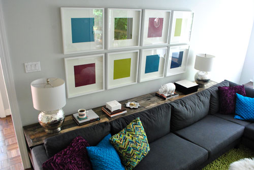
We figured that maybe our $4 a pop Sherri Conley note cards were destined to live in these eight frames (plus we couldn’t decide on a configuration for the bathroom, so we liked the idea of enjoying them out in the living room). But it meant we had to get four more of them first, so we shucked out another $16 to round out our “local art collection” (from Crossroads Gallery here in Richmond).
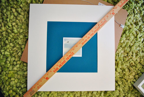
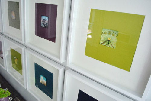
The idea was to add the small square of art into the middle of the colored paper square that already sat inside the square frame. Thereby making the colored square of paper into a fun little colored square mat. Wow, lots of squares going on. We’re one do-si-do short of a square dance.
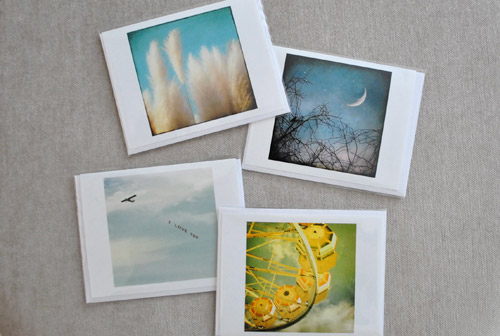
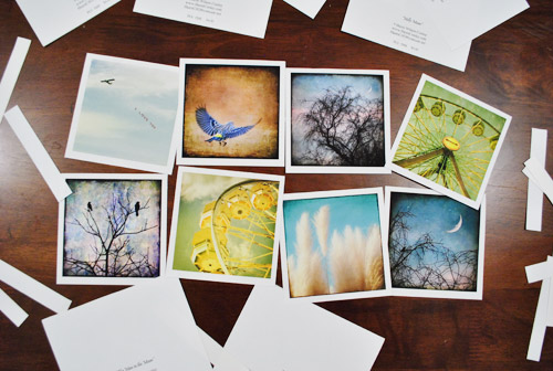
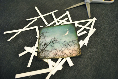
First we had to cut our rectangular note cards into… you’ll never guess… squares. I used an exacto and a ruler to keep my lines straight, but was brave enough to just eye the placement of my slice. Yup, my middle name should be Danger. Or soda. Or both. John Danger Soda Petersik. I like it.
As you can see, we left a thin white border on the pictures to, I dunno, further emphasize their squareness? They sort of looked like little polaroids to us.
Then one by one the frames came off the wall so the photos could be scotch taped into place on each colorful background which essentially became the “mat.” To get them centered we eyed them, then used a yardstick to make sure they were actually centered. To do that we just lined up the yardstick across two opposite corners, and then repeated that with the other two corners to make sure they seemed to intersect equally.
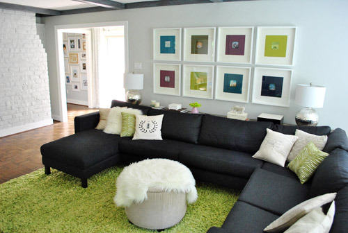
Finally, everything was reframed and ready for our viewing pleasure.
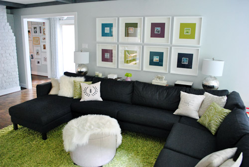
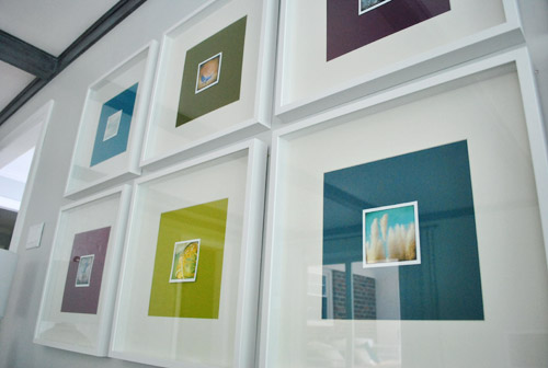
Only problem, we weren’t totally psyched by the result. We didn’t mind the small size (it just makes us want to lean in and take a closer look) – although I know some folks might think bigger is better (that’s what she said). Our issue was that something about them was really interrupt-ish and busy and, well, just too square-y (it honestly looks better in pictures than it did in real life). And yes, the reflection on the glass totally bites for taking pics, but we’re not quite ready to splurge on eight panes of museum glass just yet.
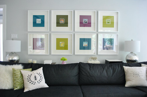
We realized the white borders I left on when trimming the note cards might be the problem. It made the distinction between the photo and the colorful mat so defined that we kind of lost the fun coincidence that each pairing was sort of linked by color. So rather than the paper feeling like an extension of the art’s hues, it just felt like a tiny picture on top of a thick bright mat on top of a thick white mat. It was a square vortex and it was threatening to eat our brains.
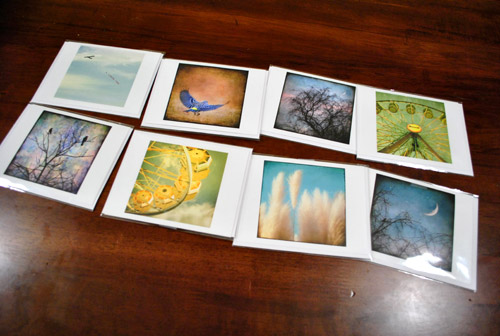
So after a few days of living with it (and not growing any fonder) Sherry took it upon herself to remedy the situation. And since she has a much steadier hand than I do, she didn’t even use a level and an exacto (just a regular old scissors). Cocky much?
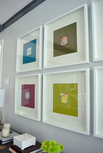
Of course her cuts were great. And now we’ve got this:
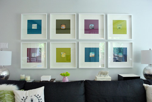
We like it muuuuch better – especially in real life. Although we’re the first to admit that for some reason the white framed note cards didn’t photograph as crazily as they looked in person, so there’s not as much of an obvious improvement from the square-on-square-on-square action that was going on before. But in person it was such a relief. We worried we might have to scrap the whole note card idea entirely, but once they were trimmed down and put back in place, all was right with the world. Or at least with the left wall of our living room.
We like that they feel less busy and that subtlety is much preferred. They don’t scream “check-me-out!!!” but are nice when your eyes meander around the room and happen to land on them. So for a total of $4.64 per frame (64 cents for the scrapbook paper backgrounds and $4 a pop for the photo note cards) we’re psyched.
I still wouldn’t go as far as to call this our forever art solution for these frames. We’ve learned our lesson when it comes to making those sort of giant declarations since our house is always a WIP (work in progress). Not to be confused with an ORB (even though Sherry is definitely demonstrating her undying love of all things oil-rubbed-bronze). So we think adding these small photographs are a good warm-up for us since they might end up laying the ground work for something else that we may want to transition to a bit further down the line. So let’s call it a baby step. We’ve introduced some small photography, so maybe in a while we’ll try some larger photography, rehang the note card photos somewhere else, and scrap the 60 cent scrapbook paper altogether… who knows.
What I do know is that looking at some of these photos makes me want to go on a ferris wheel. Oh, and eat funnel cake. Yeah, definitely that.
Has anyone else made any art-y updates lately? Or used note cards as wall decor? Or gotten sucked into a square vortex, never to be seen or heard from again? Well, if you have, I guess you wouldn’t be able to comment…
Psst- We announced this week’s giveaway winner. Click here to see if it’s you (plus the $15 discount code for everyone is still valid until August 31st).

Kristen @ Popcorn on the Stove says
What a creative way to use those photos! I like the way they look – it’s nice without being in your face.
Annie says
this is totally my kind of artwork! {and I like the borderless pics better too!} way to be!
ALittleBite says
They lokk great! Although I have to admit, I liked them with the white border.
KarenAnn says
I think it was meant to be (those note card pics and the scrapbook paper go together like PB&J)! LOVE it!
CarliJean says
Ooooh! I like, and so does Burg’s BDLF! I really like the one with the moon and the trees. I made some updates, if you call taking the already framed art work out of a box and putting it on the wall. :)
Ashley Watson says
LOVE IT! trimming the edges made it mucho better… great ideas… and everything has a meaning.. which i love!
Alyson says
Agreed! The before pics with the white borders made me go, “Um. Wow. Not good,” and cutting off the borders changed everything so it went from ugh to ooh.
Ade@fortheloveofpainting says
I am a little torn…I kinda liked it plain, but I am growing on the pictures. I guess I liked the simplicity of the colors without interuption. I am curious to see what other people think! I am also not in the room, and that always makes a huge difference!
RMS says
I also prefer the plain colored paper to the pictures
Crystal says
I added a ‘love & bird’ wall stencil over my daughter’s bedroom closet (which she can stare at while lying in bed) and a free printable I got from Nicole’s Making it Lovely blog. http://theweekendhomemaker.com/big-girl-bedroom
YoungHouseLove says
So pretty! Love Nicole’s printable in there!
xo,
s
Gina says
Isn’t it weird how things look better in real life? I’m having troubles catching how awesome my dining room looks.
You guys can switch out those photos for a change of pace when you get tired of them. Maybe different ones for different seasons? They look great though… I love how they happen to match the color blocks perfectly. : )
g.
http://beatbeatheartbeat.com
Robin @ our semi organic life says
I totally thought they were bigger when you first posted them. I think they look pretty good on the colored backgrounds. Clara and friends will be climbing all over the back of the couch & console to get a close up view of that art. How cute.
Rachel Wester says
I like the tiny squares within a square. It makes you want to look closer to see what the photos are. I think it might look a little cleaner with white mats cut to the size of the photos, but this is definitely a great “in-between” solution when you’re not sure what you want to do (and don’t want to spend the $$$ on custom mats when you aren’t sure you’ll like it). We have those same frames hanging over our couch–3 black ones with B&W photography of our city.
Monica says
Good idea. I like it with and without the border.
Stephanie M. says
Wow, I didn’t realize how small those photos were until you framed them. Guess that’s why you call them notecards, huh? Anywho…I LOVE THEM! It looks great! And cutting off the white border did make a huge difference. Y’all always have the cutest ideas for stuff!
Allyn says
I love this! I’m going to look for cards on our Scotland honeymooon (9 days! Woop!) so we can do something like it!
Gotta love cheap art.
Hayley says
John Danger Soda Petersik, sounds like a character from the “Outsiders.”
Those prints are awesome, do they come in larger sizes?
Hayley says
Oops, nevermind…just saw the link you provided to her etsy shop! :)
YoungHouseLove says
They do sell them in a few larger sizes (although buying eight of them at those dimensions was a bit outside of our price range) but we loved the larger versions too!
xo,
s
Lindsey @ A Pear to Remember says
REALLY fab. I have been rotating our art gallery for small prints from the Lorton Workhouse (former prison made into huge art gallery, like the Torpedo Factory in Alexandria).
Some of the photographers have their photos available on handmade paper for greeting cards, but I have been putting them in frames (sometimes 5×7 so you can see the artist signature), and it’s so fun. A yellow bicycle from Amsterdam, coral tulips from a Paris market. Always swapping the photos around from family to scenery.
Keeps life interesting.
anna says
they’re really beautiful! what a great collection. and those square ikea frames are my all time fav, if they ever stop selling them I’ll cry. Maybe if you nixed the colored scrapbook paper and went with white the pics might pop more? Just a thought, they’re beautiful as they are too. :)
YoungHouseLove says
Yeah we’re definitely open to switching out the scrapbook paper down the line!
xo,
s
rosita designs says
not sure if someone else already said this, but i was thinking it might look good if you didn’t go so matchy-matchy w/ the pics & the background colors. so maybe the lime green ferris wheel would stand out more on the purple bkground. i’m sure you did lots of tests first tho.
i actually just made my own art for our bedroom – have yet to hang it, but i created it! i think it’s right up your alley – http://rositadesigns.blogspot.com/2011/06/graphic-wall-art-tutorial.html
YoungHouseLove says
Yup, we switched them all around and loved when they seemed to “bleed” into the mat color the best. But who knows where we’ll end up in there!
xo,
s
Jenny A. says
I agree. It looks more seamless without the white border. I really like the way your project turned-out. Just the the little somethin’ somethin’ the colored paper/white frame art needed. Gives me ideas…
SingleMama says
definitely looks better with out the white frame!
Rebecca @ the lil house that could says
Haha I just posted about the mass amount of squares in my dining room yesterday! I’ve decided it needs to be balanced with a round drum pendant light rather than… the rectangular one I have now. I unknowingly went crazy on the squares :)
I had no idea those pictures were so small until I saw them up there! I love how you matched the colors in the picture to the scrapbook paper. I especially love the sunset-y tree on the purple.
Abbey_S. says
Too bad you couldn’t enlarge the prints. If they were bigger they might give you a nice eclectic, interesting focal point.
gayla says
we love your home(s) such great detail and touches!!
ps do you know the photog on those notecards?
YoungHouseLove says
We linked to her etsy shop in the post. Her name is Sheri Conley. Here ya go: http://www.etsy.com/shop/sherriconley
xo,
s
Elizabeth says
“oil rubber bronze”?
That’s what she said.
YoungHouseLove says
Bwahahahaha.
xo,
s
Emily says
You beat me to it!
Katie says
What a unique was to bring a little extra interest to the space! And easy to change out if you want something a little different in the future.
Maya says
I love the prints, but I almost wonder if centering them ISN’T the way to go here? It kind of emphasizes their smallness but makes it look unintentional. It could be cool to mount them on actual polaroid-shaped pieces of white paper and place them more randomly in the frames? Or maybe stencil some off-centered summery lettering into the craft paper in the background? I think this idea is SO close to working beautifully!!
YoungHouseLove says
That could definitely be fun down the road!
xo
s
Rachel @ Common to Moms says
I like this idea!
Sara says
I LIKE that idea!
Julia @ Chris loves Julia says
Those little pictures are precious. Having a constant reminder of funnel cake–especially in the same room as the tv, would not be good for me and swimsuit season. Haha. I did do some switching around of art ’round here due to my little 17 month old becoming way too interested in a vignette
http://chrislovesjulia.blogspot.com/2011/07/greta-induced-redecorating.html
BUT the good news is, it made way for fulfilling the Pinterest challenge which is in the works now.
Chris loves Julia
Pip says
Phew – avoided the brain eating square vortex – nice one! Chrysanthemums (?) in the little pink guy are really cute.
Liz says
This is great! I have many large frames for a wall collage (like your hallway), but some of the photos are much smaller. They look great!
kathy says
I see what you mean about the white lines – They definitely look better without the white border on the note cards. But to me they just look so small in that vast land of scrap book paper. But you look at it everyday, so if you like it, that’s what’s important =)
Sarah says
I love the ideas that you have going on here, but I agree that maybe the actual pieces of art (note cards) aren’t a “forever fix”. I wonder almost if it would look better without the colored backing? However, I love that you are keeping the art local and accessible!! I recently made a photo wall in our dining room and ran into some of the same problems with proportions. I think the best thing to do is to leave it for a few days and reflect genuinely on what exactly it is that leaves you wanting for more. Good luck. As always, I love your projects and your blog!!
YoungHouseLove says
We’re definitely open to losing the scrap paper and tweaking everything in those frames down the line!
xo,
s
Jess @ Little House. Big Heart. says
I like it! I always thought the bare color blocks looked a little like Candyland cards. Now they look more… grown up?
Elisa @ What the Vita says
FUNNEL CAKE! That isn’t nice… now I will think about eating one for the next hour. Good thing there’s no carnival nearby right now.
The art looks great! I have a similar plan for the ribba frames in our nursery – scrapbook paper with cutouts of b&w animals on them – hope they turn out as great as yours!
Meredith @ La Buena Vida says
I like the end result both with and without the borders, but you’re totally right about some things just bothering you in person no matter how okay they seem in photos, and it’s your house, so obviously you should change it if it bugs ya.
The only wall art I’ve emarked on lately is making a giant family manifesto. It was a cheapo way to get a pop of color and something meaningful to our family.
Ali says
Hi YHL…quick question…do the notecards look as small in person as they do in the photos? Maybe it’s b/c the photo is snapped from a few feet away, but it seems like the notecards are a little lost n the colored mats, and I’m curios if that how it appears in person.
YoungHouseLove says
They’re like little polaroids in person. Subtle and sweet. Someday we might go with big bold photos or prints, but we like how these “tuck in” and don’t scream atcha. Haha.
xo,
s
Sandy says
Great idea…I have scrap paper up, but never thought to put anything of top of it. Also, I thought your walls were brick and I had a question about nailing into brick. I guess it can be done, but anything special I need to do? I want to hang a mirror so it’s kind of heavy. Thanks!
YoungHouseLove says
We had brick walls in our last house (and on another wall in our living room in this house) so we just used a masonry bit on our drill to go into the mortar (never go into the face of the brick). Good luck!
xo,
s
JennyB says
We have a friend who runs a frame shop. On the side, he goes to people’s homes & hangs heavy pictures, mirrors, etc. for people. He’ll also hang items on tricky surfaces like brick. Maybe someone at a frame shop in your town know someone who can do it for you.I’m always nervous about hanging large and/or heavy items.
YoungHouseLove says
That’s a smart idea too!
xo,
s
Emily says
I like them! I wish the photos were bigger, but then that might defeat the purpose of having the colorful scrapbook paper underneath.
And not to be a stickler but you wrote “oil-RUBBER-bronze” up there. Since it’s already been established that Sherry has the humor of a 12 yr old, I have to admit to giggling a bit. Maybe I’m the only one who thought the oil/rubber combo was funny though…
YoungHouseLove says
Haha, funniest typo ever. All fixed!
xo,
s
Elizabeth says
Looks awesome!!!
Veronika says
Clever little Petersiks!
I love it! I love the grellow ones the most (with the Ferris wheels) because they seem to blend with the color better, I mean the transition from background to center photo is smoother. But the fact that the others aren’t as smooth is great because it creates an abstract feeling.
I think. Either way, I like it! It’s a lot of fun too, just looking into the art closely to see the photos does it for me!
Gloria says
I really like the way these turned out because I loved the plain paper that was up before, but with the pictures it compliments it well without totally taking over. I just ripped out a few prints from a old, large coffee table book to use as art. I have yet to frame them, they’re just pinned to the wall. We have no Ikea and frames aren’t cheap. I guess I’m channeling the Petersiks, live with it before deciding.
Bey says
Maybe it’s just from spending too much time with a particular friend of mine who’s a professional archivist, but I cringed when I read that you used scotch tape on these pretty little pictures. Even if something’s not your eternal art solution, I would still highly recommend using some kind of archival tape, available in the scrap booking section of craft stores everywhere. I’ve personally found little tape runners like this one to be very handy to use;
http://www.hawksphotovideo.co.uk/lg_images/Kenro_Doubletosided_Adhesive_Tape_Runner_PC103_102285_0.jpg.
Thanks for listening. -Bey
YoungHouseLove says
Thanks for the tip Bey! We’ll have to check it out!
xo,
s
Miranda says
Nixing the white was a great move, it totally threw off the balance of the photos. Nothing like a white, color, white, color pattern going on from frame to photo. Nice job! Love the images you chose, by the way… :)
Andrea @ DwellRepurposed says
They look great! Creative thinking there. Altough, personally, I liked the white trim, now it seems like they blend too much. Either way, love the prints!
Louis Cameron says
The photo art cards reminded me of instagram pictures as soon as I saw them squared. I have been printing out my instagram photos of my pug and trying to fill one of my cubical walls at work. Here’s a link to a picture of it: twitpic.com/5x69nm
Love it after the white was cut off too. It looks like it “pops” and goes much better with the scrapbook paper!!
YoungHouseLove says
So cute! Love me some pug.
xo,
s
Jessica says
Love the pics! Nothing like inexpensive wall art…I love stretch fabric over a canvas, and right now, I have framed Targe wrapping paper ;)
Jenna Smith says
Hey guys,
I can’t help but stare at your Karl sectional and wonder how it magically looks great all the time. I have the Karl in ullevi gray (with the tufts) and our cushions are always scooting off the couch. I’m thinking about doing a Velcro attack on them to keep them lookin as fine as yours do. Whats your secret?
YoungHouseLove says
Maybe it’s our fabric? It’s like denim, so it doesn’t slide at all. Everything stays put really well. It is kind of magical. But I bet velcro will help yours!
xo,
s
Wendy says
I had the same problem with a very slippery leather couch. It was so bad that you couldn’t sit on it when I got it home. I bought a roll of the rubbery shelf liner stuff from target and just laid it straight across underneath the cushions. Problem solved!
YoungHouseLove says
So smart!!!
xo,
s
Lauren Tal says
I don’t know if it has been mentioned (you usually have way too many comments to read through)… but Sue the Napkin made a celebrity appearance this week. She was moonlighting on The Next Food Network star when the judges were tasting the contestants dishes. I kept pointing and yelling “Sue is the guest judge this week!”
YoungHouseLove says
So exciting!!! Sue is famous!!!! And to think we knew her back when she was just a clearance napkin from Crate & Barrel. Such humble roots.
xo,
s
Rachel @ Common to Moms says
Is anyone else wondering what those white frames would look like spray painted ORB? It might connect with the colors in the pictures and connect to the wood pieces in the room? Hmmmm… just wondering out loud:)
YoungHouseLove says
Don’t think I haven’t thought about it. Haha. But I love those guys in white since the beams and the sofa are dark gray (and the console is dark brown) so it’s a nice light pop of balance, ya know?
xo,
s
Rebecca @ the lil house that could says
I like this idea! Since you’d still have bright white mats and the walls are fairly light :)
YoungHouseLove says
Sorry folks – I’m an ORB addict, but you know I love me some whiite frame deliciousness too (like in the adjoined hallway gallery). See how you can see both the frames over the sofa and the hallway frame gallery when you stand in front of the sofa? I love that they relate and that the white frames make totally different art displays work together.
xo,
s
Rachel @ Common to Moms says
that’s true about the hallway frames- you’re right- got a little tunnel vision over the couch there- haha :)
Amy says
it’s like you have a case of battling duel-addictions. which will win? white frames or the need to ORB most things in sight…
YoungHouseLove says
Haha, I have two angels on my shoulder. One who represents The Land of ORB and one who loves all things white.
xo,
s
Becca says
I see exactly what you meant by the vortex of squares. You could fall down like that! Or, at least, I would. Without the white border, the picture just kind of melts into its background color. Well done. Let me know when you get that museum glass, though. :)
Julia Lolita says
I love how the artwork matched the scrapbook paper. Awesome! Thanks for all the blog posts. I love them.
Jodi says
Isn’t it funny that I found out that you had a new post up by seeing the images on Pinterest already! I saw a picture of your frames I had never seen before and being a daily follower knew it had to be new! So funny!
YoungHouseLove says
Now that is crazy. My head may have just exploded.
xo,
s