Two weeks ago when John shared this post about the times that we’ve made bad painting decision, we received a bunch of requests for a follow up post in the comments:
Q: I guess I just have a hard time picking colors because I have a hard time telling which swatches have grey or brown undertones. Maybe you can show some swatches (of say the teal from the built ins). One that has a grey or brown undertone and one that is more saturated? It might be helpful to see them side by side! – Aubrey
Q: Thank you for this! I actually think tip #3 (pick a muddier color) surprised me the most because I’d never heard that or thought of that. But it rings so true in my experience! Although colors don’t show up perfectly on monitors, I would *LOVE* to see a post with color samples and explanations like, “We love this peacock blue, but we think it would be too garish on a wall. Instead, we’d try this color, and probably get the effect we’re looking for.” -Heyruthie
Sounded like a good time to us. Comparative swatches will probably demonstrate more than words ever could. So let’s just let the swatches do the talking.
First we have the bold and fun color you might be going for on the left, so if you envision a deep teal tone, you might be tempted to use Classic Teal after seeing the swatch. But on the right, we put the swatch for Plumage, which is actually what we used in our guest room. See how grayed out the swatch looks?
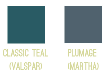
Yet on the walls it’s every bit as bold as we hoped!
Colors in general – and especially dark ones – seem to amplify by a TON when they’re up on the walls, so we’ve had luck picking the ones that look a bit faded or grayed out, knowing that once they’re up on the walls they’ll look a lot more clear and bold. You can read more on the guest room here.
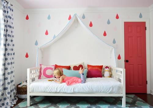
Next we have a swatch on the left that you might be tempted to pick if you want a bright and happy accent of pink – perhaps for the door of a kids room, like we used on Clara’s closet. But the swatch on the right is actually the one that we picked. A small square of it looks a lot more muted (sort of faded) compared to the bold and happy color on the left…
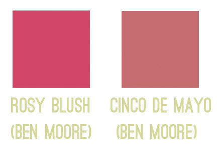
… but once it’s on a nice big area in the room (like the door), you can see how bright and clear that color reads. So even though the swatch on the left might be the pure and unfaded one you’re initially drawn to, in a nice large chunk it could almost read as neon. You can read more about Clara’s closet and those raindrops here.
Another coveted color seems to be a cheerful aqua tone, but in our re-painting-riddled experience it can be hard to get right. The color on the left is a peppy Tiffany Box blue… which is actually a color that seduced us when we moved into our first house… but once we had it on the walls of our dining room, well, it was a little overwhelming. Of course it depends on your room (someone with an amazing room full o’ light could make it look stunning) but in our experience, that color’s just not muddy enough not to get blindingly bright on the walls. So we’d be drawn to something like the swatch on the right, which should still clearly read as a pretty aqua tone in such a large quantity (here it is in a laundry room makeover).
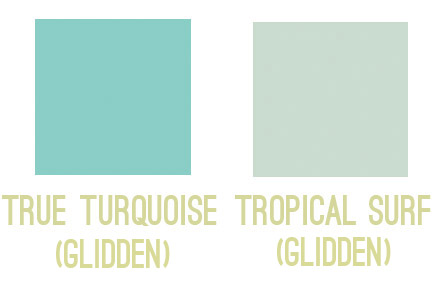
So my general rule is that for painting smaller items (like a tray, side table, accent chair, or lamp base), those more clear/unfaded/unmuted colors can be great. But for larger expanses (doors, walls, ceilings), we tend to prefer muddier tones of the same color – like a softer aqua with more of a gray-green undertone – just so it doesn’t go from chic-tiffany-box blue to punch-you-in-the-face-when-you-walk-in blue.
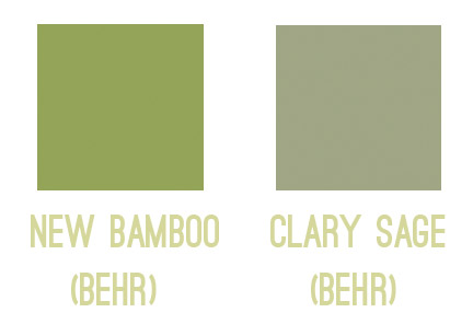
The same thing seems to ring true for greens for us. Something bold and clear can work really well on a piece of furniture or a bathroom vanity (but not necessarily all of them, ha!). But when it comes to the walls, the color on the left would likely turn most rooms into Kermit Theee Frog (I love when he says his name that way). Meanwhile, the one on the right might look dull by comparison, but on the walls it could be really pretty. Sage is always gorgeous with wood trim or cabinetry, so that could be a nice choice for a kitchen with wood cabinets or a den with wood trim.
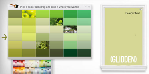
Here’s another way I thought I could attempt to illustrate the strange mystery of how a swatch with those muddy/muted undertones can almost look beige in your hand in some instances… but then when it’s on a bigger area, it’s very clearly a color. See how muted and almost wheat-toned the swatch on the left with the arrow next to it looks below? Yet when it’s in a bigger area (that’s the exact same color in a larger rectangle on the right) it definitely looks green and not tan or beige anymore.
Update: Someone asked if the muddy version of a color would typically be on the same swatch as the bright one (if you slide up or down) or if it’s on a different swatch. In our experience, it’s almost always on a different swatch, so there might be a whole range of clear tones on one swatch (from bright aqua to a light baby blue) but you’d want to go a few swatches over to the one that has a much grayer or muddier top color (like a deep blue-gray) and slide down to find those muddier counterparts.
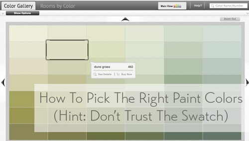
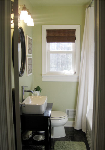
One last example would be Dune Grass, which we used in our first house’s bathroom. It looks almost completely cream/beige/tan in a small swatch (with just a tiny hint of green) – especially when it’s arranged with other green tones that are a lot less muted…
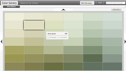
… but in our bathroom it clearly reads as a soft green color. Once again, when it’s up on the walls, there’s just a lot more of it, and it’s definitely amplified from the neutral-looking swatch. So if you’re looking for a light or subtly colored wall (be it green, blue, pink, yellow, orange, purple, etc) you might want to consider those lighter wheat or gray toned swatches that almost look like there’s just a drop of that color in them. The result can be a room that’s clearly that color, but a soft and subtle version of it. You can read more about that big bathroom reno here.
As Heyruthie mentioned, colors aren’t always great on monitors, but hopefully just seeing these comparisons might help. And when making a final choice, the best method we’ve found has just been to bring some swatches home, check them out in our lighting situation throughout the day, and then grab a test pot (or three) of paint if we’re still nervous. Those small sample pots are only a few bucks and they can save you a whole lot of re-painting trouble.
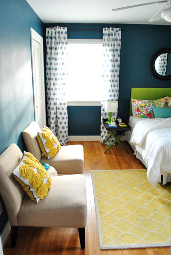
It’s also amazing how different the same paint color can look in a variety of rooms/lighting situations, so I’m sure there are folks who’ve used those bolder colors in the left columns above with great results – so it really does depend on your room, how much light it gets, and how you layer stuff in. Like this could-have-been-blinding bright blue paint color, which looks awesome in a lofted and light-filled studio – especially when it’s tempered with lots of tan texture in those pin boards and that over-sized mirror.

Oh and since we’re on the subject of buying paint, here are a few tips we’ve learned over the years about scoring a discount:
- “Oops paint” can be awesome (it’s someone else’s already-mixed paint that has been returned for some reason, but it’s usually extremely marked down as low as $1 for a whole gallon, so you can even get a few cans and mix them in the hopes of creating a color you like for a serious discount).
- If you have a favorite paint shop (ours is a local place called Virginia Paint), you might want to pop over to their Facebook page and click the Like button or sign up for their mailing list. By doing that you’ll often be alerted if they’re running sales or specials, and sometimes you can save $10 or even score 40% off.
- If you get paint from a big box store like Home Depot, you can hit up their website and check out their Paint Promotions page.
- You can also get 5% off any purchase at Home Depot or Lowe’s if you use your store credit card there (Lowe’s does it automatically, and you just have to ask for Home Depot to match the 5% off that Lowe’s provides when you’re checking out and they will).
- Sherwin Williams tends to run some great specials. In fact right now they’re having their big 40% off sale. And I’ve heard you can buy untinted gallons (like a whole bunch of them) for 40% off and then bring them back later to get them tinted at no charge (I’d check with your individual store, but that’s the rumor). So even if you’re not sure what colors you want right now, if you have a bunch of rooms to paint it’s a great way to save serious loot.
- It never hurts to click around on any paint website for promotion info. Right now Behr is having a $5 off promotion and Benjamin Moore is offering a buy-one-get-one-free deal on a quart of paint.
Do you guys have any other paint undertone tips to share? Or just some stories about going for the wrong swatch? Any other tips for getting paint at a discount?

Tammy Terrio Wallace says
Your timing could not have been more perfect! Thanks Sherry. I’m planning on repainting our dining room. The wall colour in Revere Pewter (a warm soft, dove-like grey by BM) and we also have about 18 inches at the top separated by picture moulding in which I was going to paint Polar Jade (which is a very dark teal/green). The colours coordinate nicely with fabric I just bought for the curtains. I almost bought the paint this afternoon but had second thoughts so I didn’t and then I read your post. Now I must ponder…
Andrea says
Great post! It will definitely come in handy later. We learned this lesson the hard way when we painted our bedroom what you called punch-in-the-face color. It looked white on the swatch with just a hint of blue but NOPE. Definitely VERY blue. This was when we first started a house remodel so of course, we didn’t know about test paint so we bought the whole gallon.
Jaimee says
Best paint savings tip? If you work for a major employer in your area, ask SW if they offer a discount for said employers. Our local stores offers discounts to teachers, city workers and hospital employees. My husband is a city employee and we are able to buy their “Harmony” line at $15/gallon!!! REALLY came in handy when we were painting EVERY. SQUARE. INCH. of our house!
YoungHouseLove says
That’s such a great tip!
xo
s
dkl says
I am considering doing a large art piece with all my leftover and mistake paints. It might be fun since I made the too bright mistake multiple times.
YoungHouseLove says
I love that! Turn those lemons into lemonade… er, art.
xo
s
Cherise says
This is such a great post Sherry! Do you find the same to be true for exterior colors?
YoungHouseLove says
Thanks Cherise! If you click the link to John’s original post in the first sentence, there’s a section in that post about exterior colors (they’re a whole different ballgame!).
xo
s
Gilly says
You guys might have already answered this somewhere, but does the “muted/muddy” policy work on the color gray too, or do you have a different method for determining gray?
YoungHouseLove says
Most gray colors tend to be grayed out/muddy already (haha!) so for those we just look at what undertones we want (like a mocha gray or a true gray or a blue gray, etc) and just put a bunch of swatches up and compare them (some will be warmer, some cooler, some darker, etc – then we just pick the one we like).
xo
s
Mary says
This might be the most useful post I’ve ever seen on here. Thank you! Bookmarking for future reference. :-)
Sayward says
This is totally amazing and helpful. Thanks for taking the time to make this!
YoungHouseLove says
Of course! So glad!
xo
s
Jo @ To a Pretty Life says
Great tips! It is nice to see the comparisons. I’ve been using the “go greyer/muddier” rule for years, and haven’t yet had a too-bright mistake.
Actually, I just (as in, an hour ago) finished painting our master bedroom grey. I chose a colour that I thought was really neutral, not too brown, too blue, or too green. Then when I started rolling it on the wall, it suddenly looked mauve! The walls were originally yellow. Luckily, it was just the yellow accentuating its complementary colour in the paint. As soon as all the yellow was covered, the walls looked perfectly neutral. I’m glad! I’m too cheap to repaint (since we’re probably moving in a few months), and really didn’t want to live with purple-toned walls.
YoungHouseLove says
Oh my gosh, I would have panicked when it went mauve. I’m so glad it worked out!
xo
s
Susan says
If you have a Military ID (active or retired), both Lowe’s and Home Depot will give you 10% off of your total, any day of the year, on almost every product. They don’t advertise it, but they do it just the same….
YoungHouseLove says
That’s awesome!
xo
s
Karen says
You SURE you don’t work for HGTV, Sherry?? ;-)
Well, that’s the advice I heard over & over again on there is you wanted to go with a COOL, bright color. To always lean towards a grey undertone to avoid a cartoonish color…
And from now on, every time you see a color on someone’s wall, you’ll know exactly if it’s right or wrong!
YoungHouseLove says
Haha!
xo
s
KatK says
I think all the Martha Stewart colors at Home Depot have the grey or brown undertones. I found her palette worked well in my historic house, and I actually appreciated not having fifty gajillion choices. If you want a semi-no-brainer, her line of colors is great. (I’d use Sherwin William or BM paint though.)
YoungHouseLove says
I think you’re right! Those do seem to be generally semi-muted (but still very bold on the walls, like Plumage, which we love).
xo
s
Pam the Goatherd says
Thanks for the linky to the paint pot coupon! I’ve been wanting to test a couple colors for our master bedroom makeover but wasn’t sure I wanted to pay for more than one. Now I can get two for the price of one! That’s great for someone like me who is on a very tight budget.
YoungHouseLove says
So glad!
xo
s
myamogabi says
wow! This is an awesome post! Love the side by side comparison! I’d never have guessed the “muddier” colors would look so good on the walls, and would have chosen the ones on the right instead. Thank you so much for sharing!
jotioo says
This is very informative! Thanks for sharing! (ps…this is my first comment ever on a blog!)
YoungHouseLove says
Thanks Jotioo!
xo
s
Sarah says
Is that a West Elm rug in the top picture?
YoungHouseLove says
It’s actually from Pottery Barn a long time ago (they no longer sell it but maybe try ebay?).
xo
s
rosie says
Thank you for this post! It is so helpful. We painted our dining room last month, and I was hoping for a blue-gray shade. It came out very blue….pretty, but not what I expected. Do you have any tips for toning things down a bit after the paint job is complete? I was thinking about buying some gray curtains. We have this orange zebra rug in the room with dark wood floors and dark wood furniture:
http://www.overstock.com/Home-Garden/Hand-tufted-Safari-Orange-Wool-Rug-8-x-10/5070560/product.html
YoungHouseLove says
I would play around with lighting (something cooler like a daylight bulb instead of warm white might cool it down). You might want to try curtains and art and other accessories too, but I also have learned (the hard way) that when you try to work around the thing you don’t like instead of just changing it sometimes you can spend a ton of money and end up with something you still don’t like (in which case I finally fold and repaint and then I love it and wish I hadn’t spent all that money trying to “dress up my mistake” ya know? Good luck!
xo
s
Susan says
GREAT post! This is so helpful. I’ve read so many articles over the years about how to pick paint, but I’ve never seen the side-by-side comparison that you provided. I learn better with visuals, so you can be sure that I will refer to your post before I pick my next color. Thank you!!
S says
The no fail way I choose paint is to get all the swatches I think I might like, then tape them all up in the space I’m going to paint. I then live with them up for a while, taking down swatches as I decide they are too dark, too light, too muddy, too bright, to green, etc. After a few days, I’m left with one paint chip up, and I’ve found my winner! This always works for me. :)
YoungHouseLove says
Love that!
xo
s
Jo @ To a Pretty Life says
That’s exactly what I do! Even if I don’t have a lot of time to make a decision, I still try to see the colours in all different kinds of light in the room before choosing one.
celia says
This was really helpful! Would love for you to do a post like this about neutrals. I go crazy trying to tell the difference between cool grey and warm grey or beige vs taupe, off white vs cream…
YoungHouseLove says
That could be fun! Thanks for the suggestion Celia!
xo
s
Kaija says
Great post! It explains why my clay orange backsplash did not work at all!
Did someone say “coupon”?
Sydney B says
So does this advice work for exterior doors as well? I really want a nice teal like plumage but my husband is skeptical. I’d really like to get it right the first time and prove him wrong:)
YoungHouseLove says
Click the link in the first sentence of this post for John’s original post which has a section about what we learned with exterior colors. It definitely varies depending on lighting, but they’re a whole different ballgame than indoor colors. Although we wanted a bold turquoise door and still went with the bold but muddy turquoise, so the muddy thing still works, there’s just a lot more light outside sometimes, so you might need to go darker than you think (light blue can become white on a door). Hope it helps!
xo
s
Rena B says
Oh the paint color quandary. When I’m choosing a color the first one I look for is a true black swatch then I start looking for the real color I’m looking for. I hold the color against the black so I can rule out the neon undertones for the grey or “muddy” undertones which are less overpowering when they go up on the walls.
YoungHouseLove says
Smart!
xo
s
Maria@TheBrooklynFig says
This was extremely helpful…although a little too late in my case since I bought the paint already LOL. It took me forever to choose a paint color- seriously- and I’m still doubting the choice. Now I’m thinking we should’ve gone for a muddier version, but I guess we’ll see once we start painting!
Kim C. says
I love this post, because I may be the worlds worst paint picker. Once I picked a brown tone that ended up making our living room look purple. Now I want to go paint something!
Marie says
Colors aside, (since you can always color match) can you guys tell the difference between a Benjamin Moore $40 gallon of paint, a Sherwin Williams gallon of paint, and a Valspar gallon of paint? (assuming their all in the same finish)? I always find myself buying Benjamin Moore because thats what all the shiny blogs use….but in your experience, can you tell the difference in quality of paint from a $40 gallon compared to a $25 gallon? Sorry if someone has already asked this! I’m too lazy to read all 400 comments ;-/
YoungHouseLove says
We’ve actually never tried Sherwin Williams ourselves (the pros who painted the outside of our house used it and we loved the result though). I think everyone has different favorites, but after trying a bunch of them (Olympic, Behr, Glidden, Benjamin Moore, Mythic, Valspar) over the last seven years, I think if you blindfolded us we could easily pick out Benjamin Moore paint from Glidden/Behr/Valspar/Olympic (I think even you could, there’s just a thickness and faster coverage to it) – so we tend to prefer Benjamin Moore for that added coverage/durability if we’re doing a more permanent/major project (ex: painting cabinets, painting walls). We might be biased because we create a color collection with them each January, but we’ve used their paint since well before that partnership, and we always pay for our own paint, so we truly do like it best. If we’re doing a small crafty thing (like painting a plant pot) we might use a tester of Behr though, and we recently used Olympic on the stenciled floors in the bathroom (since we’ll be removing the subfloor to tile that space down the line when we do a full reno). Hope it helps!
xo
s
nicky says
Thank you so much for explaining this! One thing that stops me using colours on our walls is the fear they’ll end up with that “hospital” look. Muddying woukd fix that and I’d never have thought of that myself!
Kelly says
I LOVE the tip about going for a muddier, toned down version of the color your hoping for…so helpful!! Before we were married, I helped my husband paint the bathroom in his apartment. A teeny-tiny space. He was going for a pale, subtle yellow. We should have gone muddier. When were were done it actually hurt our eyes to walk in there first thing in the morning. My husband kept saying “It looks like the sun threw up in here.” We painted over it…fast!
Lori says
Hilarious! I’ve had that exact same experience, but didn’t have your husband’s awesome words to describe it.
Kee says
I am leaving work now to buy paint to begin tackling several rooms in our new (1st!) house…I have been reading your blog for years (and met you in Chicago)…I feel like I have been preparing for this shopping trip for YEARS and this most recent post was icing on the cake! Thanks!
YoungHouseLove says
Aw thanks for coming out to see us in Chicago! We loved that stop! And happy paint-picking!
xo
s
Kaity says
I love you guys! This stuff is so helpful. We just bought our first home and I’m about to bite the painting bullet – wish me luck!
Tamara says
I think this might be my most favorite, practical post of all time from you! I swear I am the world’s WORST when it comes to picking paint colors. Sometimes I can see the undertones, when comparing one color to another, but somehow it doesn’t translate when I get it up on the wall. I just had the most happy accident and found a soft, pale sage green that I am in love with and now want to paint the whole house with it! Trying to resist that temptation! Anyway, thank you bunches for sharing this tip – I’ll be sure to try this during my next painting foray!
Cassie Dearborn says
This is so helpful! Thanks!
Erin says
One of the most useful blog posts I’ve ever read. Thank you!!
YoungHouseLove says
You’re so welcome!
xo
s
Amanda Warren says
I read this post and the entire time was thinking, “Ooooooooooohhhhh! Now I get it!” I LOVE how you guys can “dummy it down” for peeps like me! You’re my Dr. Phil of decorating!
YoungHouseLove says
Haha! I need to work on my accent!
xo
s
Lori says
Love this post! It’s giving me flashbacks to when my husband painted my daughter’s room the “bright yellow” she requested. Let me tell you… it was BRIGHT. Like, emitting-its-own-light bright. When I got home from work, I could see the room glowing when I got to the top of the stairs, and it was the third door down the hall. (It was actually hard to be in the room with it when we repainted!)
Gail says
Maria Killam taught me a LOT about undertones. Her e-book and system are awesome. Whenever I want to try a color, I buy a sample and paint the sample onto a big piece of poster board. This way, I can move the sample around the room, check in different light, against fixed room elements, etc. I LOOOOOVE Maria!!
YoungHouseLove says
Sounds awesome!
xo
s
Betsy says
I had success buying a TON of paint at Sherwin Williams and bringing it back slowly to tint as I picked colors, so I know some stores will definitely do that. They were so pleasant about it too!
YoungHouseLove says
So glad!
xo
s
Lindsey says
The timeliness of this post is amazing – I broke down and repainted our living and dining rooms (like, literally, now) after finding from the first go-around that the grey-green I chose was on the blue side and clashed with pretty much all our furniture (almost looked “minty” at night). I got a tiny swatch of a warmer grey-green from the paint store and lived with it for a few days, patting myself on the back, thinking “self, you did good.” Bought two gallons, painted both rooms during the day – it looked great. Then, I turned on the lights at night, and my walls turned florescent/neon-y green…boo. I even changed out the lamp shades, thinking that would help. Nope.
I’ve since read your post, done some more research, and found a grey-green-beige color that reads muddy grey green and won’t make me cry if I paint with it. Third time’s the charm, right? :D
On the plus side, painted the perfect front door color, and perfect colors for four other rooms, so I’ll just have to suck it up for these two. Thanks for the inspiration!
YoungHouseLove says
Aw I hope it’s perfect! Good luck Lindsey!
xo
s
Kate Craig says
this is fascinating! In both those first examples I would have thought the color in the picture was the swatch on the left
Nicole says
I recently went rounds with blues, lol. I wanted a robin’s egg blue…and it took me 16 test paints in stripes on the walls to find the one I loved. HA! One would look perfect on the swatch but translate so different on the wall. Lesson learned. I always buy tester paints before painting. Def. worth it for me. I had the home depot lad scold me for coming back over and over; something to the effect that I could have bought a gallon of paint at that point. She was right; but it would have been a color that I didn’t want!
I finally went with Aqua Smoke by behr, in case anyone’s wondering, lol.
YoungHouseLove says
So glad you found The One!
xo
s
Julia at Home on 129 Acres says
I can’t believe the difference between the swatches and how they actually end up looking when they’re on the wall. I’ve loved your peacock guest room for awhile and have a stack of dark teal paint chips, but they’re definitely all closer to classic teal than they are to plumage. I think this post will help me avoid a paint mistake.
The Tiffany blue is another lesson I recently saw first hand. A friend had a jewelry box colour matched a the paint store. When it was on the wall, we all stood there saying, “Ummm… it’s a little bright.”
Claire says
I love DIY-for-dummies posts like this one! I’m still a renter so I don’t have much chance to DIY now, but I’m definitely filing away these tips for the future. I love living vicariously through you guys while dreaming about the day I have my own walls to paint… Thanks for such a fun and helpful post!
Laura says
Very helpful post, thank you! I definitely have a too bold accent wall where this advice would have been useful!
Patty says
Hi! My husband and I close on our FIRST house SOON and this post couldn’t have come at a better time. I have a few questions: is there really a difference in the quality of paint? I know you like Benjamin Moore colors… but do you buy BM paint? Or do you buy a cheaper paint and then have that paint “tinted” to a BM color? Also, we are considering hiring a painter to paint the main living room/dining room/hallway (the rest we can DIY). Our painter is wanting us to get our paint through Diamond Vogel (bc he says it’s great quality and he can get a discount there). Are you familiar with this paint store? And if so, is there stuff REALLY that much more quality than paint from Home Depot or Lowes? One last question… we bought an older home with with trim and noted the white trim is pretty glossy and the walls are more matte. What kind of ‘finish’ on the paint do you recommend. We have an 18 month old, and I would love to be able to wipe the walls clean (if need be) and not have to re-paint the area I just cleaned (if you know what I mean). AND we want to re-paint some of the kitchen cabinets, so I’m thinking of the finish of the cabinets vs. walls vs. trim… etc. Thanks SOOOOO much!!
Patty says
Sorry, I am adding onto my previous comment: oh yes, I had mentioned to the painter that I would probably test a few colors with some ‘test pots’ and he said Diamond Vogel sells them but they are like $10-12 a pop! So, really I could try a test pot at from a box store and get whatever paint I wanted ‘tinted’ to the color from the test pot, right? Who knew there could be so much “stuff” to learn about paint. Thanks so much!!!
YoungHouseLove says
We’ve never tried Diamond Vogel so I’m afraid we can’t vouch for it, but painters in general like the good stuff, so I’d follow their recommendations. As for what we use, after trying a bunch of them (Olympic, Behr, Glidden, Benjamin Moore, Mythic, Valspar) over the last seven years, we tend to prefer Benjamin Moore for that added coverage/durability if we’re doing a more permanent/major project (ex: painting cabinets, painting walls). We might be biased because we create a color collection with them each January, but we’ve used their paint since well before that partnership, and we always pay for our own paint, so we truly do like it best. If we’re doing a small crafty thing (like painting a plant pot) we might use a tester of Behr though, and we recently used Olympic on the stenciled floors in the bathroom (since we’ll be removing the subfloor to tile that space down the line when we do a full reno). For your walls I’d go eggshell or satin (both are nice and wipeable) and for the trim and doors always go semi-gloss (that’s standard for those surfaces and so easy to clean). Cabinets can be satin or semi-gloss, depending if you want more shine or less. We have done both and preferred satin a bit more, just because it felt a little more expensive to us.
xo
s
MG says
This has been literally eye opening for me! One of my favorite posts I think. I have a terrible time picking colors and am then kind of paralyzed by it because of picking the wrong color. This makes total sense….I just needed someone to explain it to me. Thanks so much!!
Gaenor says
Kind of interesting to have a full breakdown of what we managed to achieve by accident…
We painted our lounge/dining room last year and decided we wanted a bold red on one wall. I was really drawn to a bold bright red, but sampled a couple of other reds, just because… Turns out the one which was a bit more orangy (that I was way less keen on on the computer) was so much better on the wall. And given that we painted a 9 metre wall in it I’m glad we got it right!
Georgia says
I painted EVERY room in our house with a similar mind set. I really love muted colours that change with the light…so I call one room the “green room” where as most people think it is grey…but in certain light, it is gorgeously green (Barely Jade by Glidden). I’ve also found that by keeping colours muted and in a similar
tone area, the flow from room to room is really nice and never jarring. My kids complain that our whole house is “grey”, but to me it is blue and silver and purple and green, just all very nicely matched (all of them, just about, from the neutrals by Glidden).
Also, light is SOOO important. I would buy testers during the week when we were in our actual house to take up to our holiday house 2 states away. I would think I had chosen a colour during the week, but when I got up to the house and put in on the walls it would look TOTALLY different.
As for buying paint…plenty of times have I bought Oops paint. I also keep on hand a range of paint tints, so that I can get it to where I want it. I have also been known to mix my own left over paints to get a new colour. Especially when I have a colour that is almost right in a lot of left over paint (it happens…I’m still terrible at judging how much I’ll need, and some paints just have so much better coverage). Some of my favourite rooms were done this way…or a “feature wall” or a book case.
Carrie says
That was so helpful!! Thanks! Usually my mother picks the paint samples for me, and they look great, but this was a great tutorial of what to think about.
rocky213 says
I have a question about paint … How long does paint last ? I have a couple of gallons that are a little over 1 year old, can I still use them ? I was thinking of bring them to Home Depot to get them shaken up but I was wondering if the color was still good or if there was anything else I should be aware of.
Thanks !
YoungHouseLove says
As long as they haven’t frozen (sometimes that can ruin them) they should be just fine after a year (we have used a lot of paint years later with success). The idea to get Home Depot to shake it for you is a good one, and then if you open it as long as it doesn’t smell weird or look chunky or anything you should be good to go!
xo
s
Diana says
I appreciate this post, lots of good information I never thought of! We’re pretty done painting our current house but I’ve already started thinking about a whole house palate for our next, even if it’s years away!