- The 12 Best White Paint Colors
- Benjamin Moore Edgecomb Gray
- Benjamin Moore Simply White
- Sherwin-Williams Pure White
- Sherwin-Williams Extra White
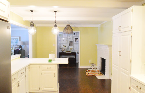
As for more about the kitchen color change, although you guys know we love grellow with a passion, it has been notoriously impossible to photograph (remember a hundred different phases of the kitchen project with “ahh, this color looks so much more subtle in person but is reading as lime green/bright yellow/neon slime for some reason”). And although that’s sort of definitely a dumb reason to repaint a room, I can’t tell you how annoying it is to not be able to share what you see in front of your eyes when you’re a home blogger.
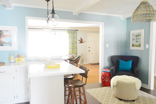
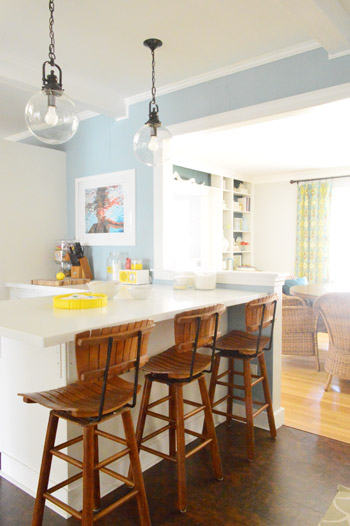
But the main reason for the change wasn’t that the color was hard to photograph, it was that over time we realized that the grellow didn’t let the other things in the room shine as much as they might have with a different choice. Take the white cabinets and counters for example. They looked little yellowed thanks to the wall color reflecting on them – and even the cork looked a little orangey-yellow (especially at night) instead of rich and mocha.
So here’s how we reasoned our way to a new color pick in five bullets or less:
- we worried that other tones of yellow and green would have the same yellowing-ish issue (say that three times fast) since they’d reflect on the counters, cabinets, and cork – even if they were deeper or lighter, so we nixed those options
- we wanted something deep enough in tone to provide a little more contrast, so the counters and cabinets would pop more (but nothing too dark since the room is windowless)
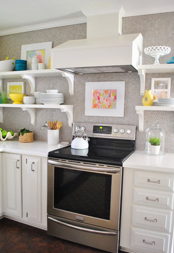
- we have gray backsplash tile and a few adjoining rooms are gray, so we didn’t want to go with more gray on the walls (dark, light, or schmedium) for fear of grayverload
- we wanted an actual color on the walls (since we chose such safe things everywhere else like: brown floors, white cabinets, stainless appliances, white counters, and gray backsplash tile)
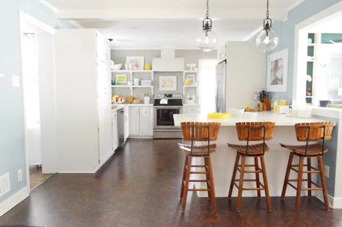
- we wanted a color that would tie the kitchen into the four spaces (yes, four!) that the kitchen opens up to – without getting too matchy-matchy (when a room adjoins so many other rooms, the wall color should work with those rooms since you’ll see them together all the time – it’s sort of like very carefully picking a hallway color that works with all of the rooms off of it)
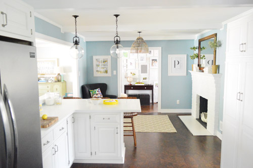
We definitely loved having a soft blue kitchen in our first house, and we actually don’t have any blue on the walls in this house except for the deep teal in the guest room and on the back of the dining room built-ins, so it’s nice to bring in a mid-tone blue that’s sort of in the middle of the guest room and our first house’s kitchen.
The funniest thing about this whole repainting escapade, which we realized while applying the second coat (we’re always loopy by then) was that in our first house we repainted every single room except for our kitchen and our master bedroom. And in this house we’ve only repainted two rooms: the kitchen and our master bedroom. Hilarious.
And if you count the time that we painted the fireplace area a different color for book photoshoots (only to repaint it back to normal a few days later) some parts of this room have seen four different paint jobs.
- it’s definitely an actual color (there’s nothing neutral about it)
- it still feels sophisticated (even though it’s not gray or navy or chocolate or taupe)
- it allows the white cabinets and counters to really pop (without yellowing them)
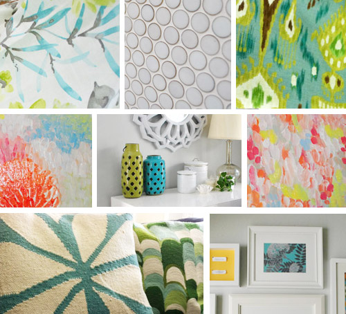
- it’s a great balance to the warm tones in the room (like the cork floors, the wood stools, the rustic cutting boards on the counter, etc).
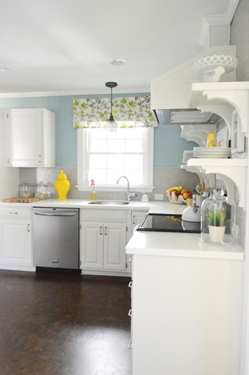
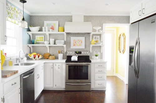
Not gonna lie though, the star of this room is still that wall full of penny tile. Picture me having an as-soon-as-the-show-ends bachelor breakup with the wall paint to run back to the penny tile with open arms. And it’s not that I don’t love the wall color – I just love the penny tile more than a person should love any inanimate object.

Emily says
Wow that is a perfect example of the difference a little paint can make. It looks like a different room! Love it.
Priscilla says
You two are such an inspiration! Clara was right in describing your new paint job as “wonderful”! As a Colorado native, I’m sure the name of the paint color, “Colorado Gray” was intended to be an inside secret. Instead of gray skies here, we are lucky to have the same gorgeous blue skies as your paint color, most days of the year here. You’ll just have to come out and see for yourself!
YoungHouseLove says
I love it! It was an “insider name.”
xo
s
Kristin F says
Love that blue. We recently painted our laundry room a soft blue…it was the next to last room to paint in our house. I’ve picked a softer, paler blue for the kitchen to go against white cabs and black granite (when we finally get to it!) since our kitchen has no windows as well. Blue just makes white trim, etc. pop so well. But I feel your repainting pain, this will be the second go round for the kitchen and I’ll be repainting the daughter’s room this summer. So just after year three, the repainting rounds have begun.
Oh, and I’m curious, do you think Sean and Catherine are going to last? I’m rooting for them!
YoungHouseLove says
I actually didn’t watch this season (shame on me! I blame the tour travel breaking up our TV habit a lot) but I’m obsessed with Bachelor Pad. Like a lot.
xo
s
Angie says
I like it. I wonder if my computer monitor is off on the color though because in your previous post about John’s sister’s house you made a comment about the “happy green front door” and it is TOTALLY yellow on my screen. Nothin’ green about it!
YoungHouseLove says
So funny! It’s the color of a pickle in real life (there’s yellow in there but I’d call it green).
xo
s
kasey @ girl in the gray house says
i love it! but then again, i’m always partial to blue…….
kathleen says
my first thought was, and they hung pendant lights too! but no, they were there before they just totally blended into the yellow! looks great!!
YoungHouseLove says
Yes, those things pop a lot more too!
xo
s
Laura says
I Love it!!! I liked the kitchen before, but I have to say I think the blue looks better. We just redid our farmhouse kitchen and the wall color I chose was Misty by Sherwin Williams. Not as bold as what you have, but it is blue for sure. I was hesitant at first because it wasn’t how I visualized it, but now I love it. We also have white cabinets and wood floors, and hearing you talk about how YOUR blue works, makes me feel good about my blue. :)
lisa says
Surprised by the change but I love the blue!
Randi says
I LOVE LOVE LOVE the new shade in the kitchen. I know you guys are in serious love with the grellow but it’s never really grown on me. However I always trust your taste, so I figured it was just me. I really do adore the new shade so much more, and love your decision-making process.
Thanks as always for sharing!
Pam in NC says
Oh – so much better! Perfect choice.
Meredith says
It looks so good! I squeeked when I saw this and immediately emailed my husband, congratulating us on being AHEAD of the times for once – we painted our kitchen this color last summer (also white cabinets) and were feeling iffy about it (we thought it would be more gray and it’s definitely blue), but seeing it in another house seals the deal! Now to add the pops of yellow and green like you did, which makes it all come together so nicely.
YoungHouseLove says
That’s so sweet! Happy yellow-pop-adding!
xo
s
Emily Fridenmaker says
Oh my…LOVE that cool blue!
Amy L. says
Looks great! Very fresh and crisp. I love seeing cool tones in kitchens too, and you’re right. It does make the cork look more rich. You all are keeping those paint companies in business! :)
Megan says
Oh man, I am repainting at least three rooms in my house over the next couple months. Our kitchen/great room, the craft/guestroom, and our den. The new paint in your kitchen is actually pretty close to what we’re going for in our kitchen/great room. It’s currently blue already, but it turned out to be more of a baby boy nursery blue and less of the beachy summer sky on the verge of a storm vibe we were hoping for. I am both insanely excited and dreading it at the same time because while I know painting is one of the easiest ways to change the look of a room, my back and arms just don’t care.
Tamisha says
Love the new blue much better than the grellow, but perhaps that was the photography. Love it much much better. I was wondering if you were thinking of going a shade lighter blue on the ceilings. I can’t tell if it’s the pic or reality but the ceilings are taking on a kind of yellowish look. I think the blue in a shade lighter (half and half with white?) would look stunning.
YoungHouseLove says
That could be fun!
xo
s
Marlayna says
Hey guys, lovvvvve the new kitchen color! Seems serene but still energetic! If you know what I mean! How are the painted cupboards holding up? Any Knicks, dents, or chips from normal use or are they staying strong? We’re planning to paint ours from wood to white and I was told to use Rustoleum Transformations because that’s what it’s made for. I’ve only really followed you’re painted cupboards so I have nothing to compare. Do you know much about that product?
YoungHouseLove says
100% mint! I’m telling you, I’m obsessed with BM Advance paint. Clara has beaten them with legos and dolls and cars and it looks amazing! We’ll have to post an update with detailed pics, but even the silverware drawer (which typically gets the most wear) still looks as good as new! As for Cabinet Transformations, I would go with the process we shared for painting our cabinets since we haven’t used that kit but we love this paint (and it’s what the pros use).
xo
s
Marlayna says
Thanks so much! I’m pretty much sold now that you shared their withstanding Lego attacks! :) oh happy day! I am sooo looking forward to creating a lighter, airier kitchen! Especially knowing it will hold up to daily life!
cleartrampoline says
Love it!
Shauna says
Hallelujah! I have always thought the other color didn’t do the rest of the room justice but my style is more traditional and country than modern. Every thing looks so much crisper and more beautiful! I love the window treatment with the wall color and the bar stools look even richer now. Way to go!
Meg says
Oooooh! I LOVE IT! I liked the grellow, but I LOVE $herdog blue!!!
Jeremy and cynthia says
WOoooow!!! Sherdograble color!!!!we live in France and enjoy everything you do! Amazing job! Xo us two
YoungHouseLove says
Haha, thanks J & C!
xo
s
LARY@ Inspiration Nook says
So pretty. Again, how crazy what a simple color change can do. Absolutely love it.
P.S That’s the color our of our bedroom. When you rent, painting is the only nice change you can do.
Denise says
I love it, the kitchen is gorgeous! I think I may have to paint a room in the new house this colour, it’s beautiful.
Ashley @ Yeah. We Bake. says
Can I just commend you on the number of Bachelor references in this post? I love it! I LIVE it!
I also love the new kitchen ;)
xo,
Ashley
YoungHouseLove says
Haha, thanks Ashley!
xo
s
Lisa @ Floating Along... says
Wow!! It looks absolutely amazing!! I liked the yellow – but I LOVE the blue. Gorgeous color!
Krystle @ Color Transformed Family says
Wow! Such a huge difference but oh so much better. It’s kinda funny that by switching to a cooler color the room actually looks warmer. It might be that the cork flooring actually stands out now since it’s not competing with the grellow walls.
We just painted our kitchen yellow, Sherwin Williams Lemon Chiffon. I was a little nervous at first but thankfully we have a ton of natural light in our kitchen plus I plan to paint the cabinets light gray.
http://www.colortransformedfamily.com/2013/02/27/winter-pinterest-challenge-in-progress/
YoungHouseLove says
Pretty!
xo
s
Rebekah says
Maybe that color is a sign that you should come to Colorado for a book signing? I’d be the first in line! But all joking aside, I really do love how it transformed your kitchen!
YoungHouseLove says
Haha, we’d love to!
xo
s
Lynn @ Our Useful Hands says
That song had me think “What ever happened to Mya?” Oh well. I’m sure she’s somewhere countin’ her dollas! :) I love the new blue. If our living room wasn’t such a pop of blueberry this blue would so work with our white cabinets as well. I was thinking of a tan/brown family type color but who knows where we end up?
My best, Lynn
YoungHouseLove says
Yes! What ever did happen to Mya? We need answers!
xo
s
Lisa Dreissig says
Looks great!!
Rebecca Nepomnaschy says
The blue definitely ties all the shared spaces together. I think the best part is that now all of your yellow accent pieces in the kitchen pop and create a beautiful, bright contrast.
Charmaine says
Mocha chocolata ya ya!
Jen@The Decor Scene says
OMG I LOVE IT!!! I love blues, so this really strikes my fancy. What a great change. :)
Colette says
Oh yes, that’s much nicer than the grellow. I did wonder what you were thinking with that color. I usually love everything you guys do but … well, let’s just say I didn’t want to be rude, haha.
Jenn says
I totally Meg Ryan’d “yes, yes, yes” a la When Harry Met Sally when I saw this.
We’re just about to paint our kitchen a grayish blue and I feel so much more confident now. Not like I needed your approval but I feel affirmed in my decision now.
It makes the penny tile look even better!
YoungHouseLove says
Haha!
xo
s
Becky says
LOVE the new color – and what a peasant surprise! It’s similar to the color in my living room which I just adore. Nothing makes me happier than a swath of calming blue. Hope you enjoy it!
Morgan says
Love, love, love the new color!!
Charlotte @ Ciburbanity says
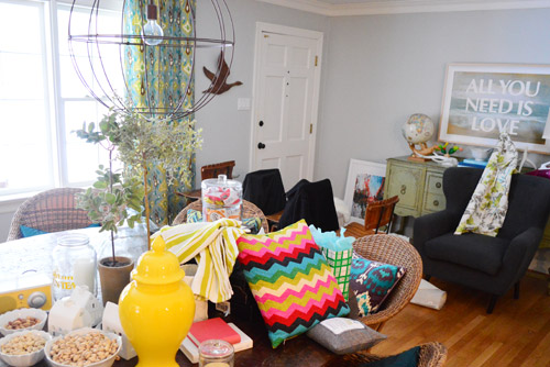
What I love is what appears to be the three bowls of snacks moved from the kitchen and sitting on your dining room table!!
Color looks amazing… what a lovely change to the space! They say blue isn’t right for an eating area, but I’ve always LOVED it. (They also say red stimulates your appetite and should go in a dining area, but I’ll never go that route either…)
xo
Heidi says
What a beautiful color!! I love that it’s not the typical baby blue. Two thumbs (and 8 paws) up!
Momcat says
Gawd. Your kitchen is So. Freaking. Clean. My kitchen is hanging its’ head in shame.
Great color! The blue is just right, for all the justifications you gave us and also, just because you like it. I like it too!
And, the song is Lady Marmalade, of course. Can’t believe you didn’t know that ;) And the original Patty LaBelle version is so much better than the more recent mashup with Christina/Pink/LilKim/Mya wail-fest (this girl’s opinion, anyway!)
Karly says
Wow that makes the room look so much bigger! On my tiny computer screen anyways :) Looks great!!
Georgia says
I seriously love this colour!
Makes it have a beach vibe, but sophisticated and grown up at the same time. definately makes your accessories pop!
xx
Kylie says
Oh, wow. HUGE improvement. It looks like it was made for your house!
Elizabeth says
I absolutely LOVE the change! It might just be my screen, but the blue makes the lighting in the kitchen look less artificial, and more like natural daylight.
Melissa @ ReThreads Cville says
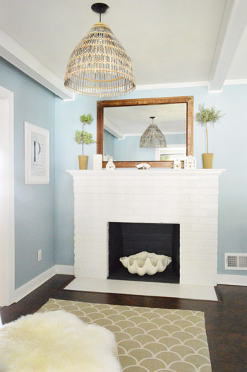
Wow – I was a fan of the grellow but you’re right that the blue just makes everything else pop more! Great job! One question: Do you still plan to keep the rug in the fireplace sitting area? It seems like it was perfectly suited for the grellow walls…
YoungHouseLove says
It still works with the blue walls (it’s gray and mimics the backsplash shapes, so it’s a nice tie in to that on the other side of the room) so we think for now we’re happy with it :)
xo
s
Soleil B says
I really do love the color change. You’re right, it definitely adds a sophisticated element! Also, just wanted to say I love the shout out you guys got in Real Simple! Definitely a blog to follow. :))
YoungHouseLove says
Aw thanks Soleil! We haven’t seen it yet (we’re still waiting for our issue to come!) but we can’t wait!
xo
s
Mahareen says
I loved the grellow, we have a similar shade in our kitchen (although we have dark Cherry cabinets and wood floors). I never liked the color of your cork floors, but now I see the real color! Great job on figuring out what works even better than a color that already looked beautiful!
Laurie says
Love the new kitchen colour! So welcoming and fresh! Everything pops more now, including the artwork. Is that kitchen lamp the one you made from the basket you found? It rocks. I love the way you described your process. As a true weenie about painting, it made me really think about colour and continuity and adding life to different rooms in different ways. Thank you! I love all the artwork!
YoungHouseLove says
Yes, that’s our little basket lamp. Love that guy!
xo
s
Kristan says
Love the new color! I’ve only been at my house 3 years, but I think of repainting my living room and bedroom every day. At least I’m not alone in my perfect color quest.
Katie says
Hypothetical: In a world where you didn’t have the blog, would you have ended up repainting? (My reading-between-the-lines skills weren’t good enough to figure that one out.)
Second (and this might sound a little crazy), but the first thing I thought when I saw the new Colorado Grey color is that it would also be perfect in Clara’s new room. I think the walls in there would be fantastic something a little bolder.
YoungHouseLove says
Oh yes, we definitely would have painted either way (we didn’t like how the paint yellowed the cabinets and counters with the reflection) – and as for Clara’s room, we love the neutral wall color for now since it allows us to layer in virtually any other pop of color we’d like, but you never know where we’ll end up!
xo
s
Kim says
Oh, wow. I didn’t see this coming. But I like it! Your kitchen looks like an oasis of calm. It’s amazing how much a simple paint change can transform a space.
decoratica says
Sherry, I just want to tell you that I love the way you write and tell stories. It always amazes me.
xo
YoungHouseLove says
Aw thanks so much!
xo
s