- The 12 Best White Paint Colors
- Benjamin Moore Edgecomb Gray
- Benjamin Moore Simply White
- Sherwin-Williams Pure White
- Sherwin-Williams Extra White
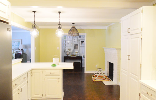
As for more about the kitchen color change, although you guys know we love grellow with a passion, it has been notoriously impossible to photograph (remember a hundred different phases of the kitchen project with “ahh, this color looks so much more subtle in person but is reading as lime green/bright yellow/neon slime for some reason”). And although that’s sort of definitely a dumb reason to repaint a room, I can’t tell you how annoying it is to not be able to share what you see in front of your eyes when you’re a home blogger.
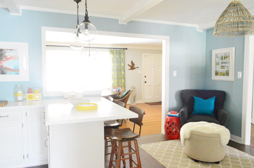
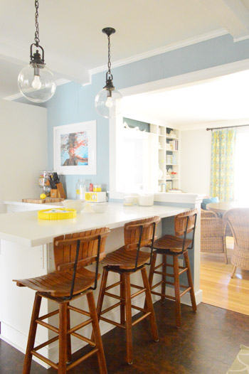
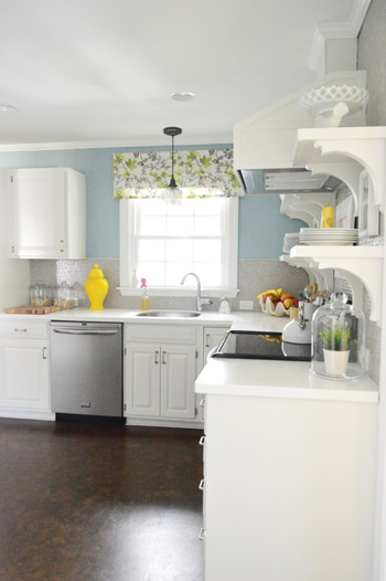
But the main reason for the change wasn’t that the color was hard to photograph, it was that over time we realized that the grellow didn’t let the other things in the room shine as much as they might have with a different choice. Take the white cabinets and counters for example. They looked little yellowed thanks to the wall color reflecting on them – and even the cork looked a little orangey-yellow (especially at night) instead of rich and mocha.
So here’s how we reasoned our way to a new color pick in five bullets or less:
- we worried that other tones of yellow and green would have the same yellowing-ish issue (say that three times fast) since they’d reflect on the counters, cabinets, and cork – even if they were deeper or lighter, so we nixed those options
- we wanted something deep enough in tone to provide a little more contrast, so the counters and cabinets would pop more (but nothing too dark since the room is windowless)
- we have gray backsplash tile and a few adjoining rooms are gray, so we didn’t want to go with more gray on the walls (dark, light, or schmedium) for fear of grayverload
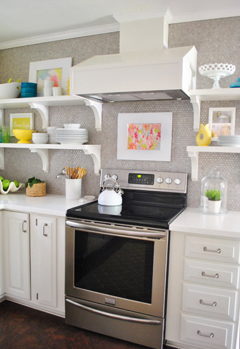
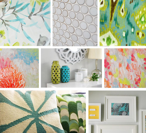
- we wanted an actual color on the walls (since we chose such safe things everywhere else like: brown floors, white cabinets, stainless appliances, white counters, and gray backsplash tile)
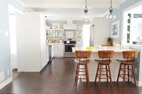
- we wanted a color that would tie the kitchen into the four spaces (yes, four!) that the kitchen opens up to – without getting too matchy-matchy (when a room adjoins so many other rooms, the wall color should work with those rooms since you’ll see them together all the time – it’s sort of like very carefully picking a hallway color that works with all of the rooms off of it)
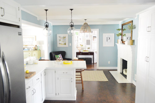
We definitely loved having a soft blue kitchen in our first house, and we actually don’t have any blue on the walls in this house except for the deep teal in the guest room and on the back of the dining room built-ins, so it’s nice to bring in a mid-tone blue that’s sort of in the middle of the guest room and our first house’s kitchen.
The funniest thing about this whole repainting escapade, which we realized while applying the second coat (we’re always loopy by then) was that in our first house we repainted every single room except for our kitchen and our master bedroom. And in this house we’ve only repainted two rooms: the kitchen and our master bedroom. Hilarious.
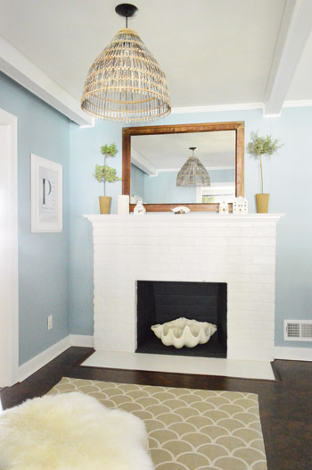
And if you count the time that we painted the fireplace area a different color for book photoshoots (only to repaint it back to normal a few days later) some parts of this room have seen four different paint jobs.
- it’s definitely an actual color (there’s nothing neutral about it)
- it still feels sophisticated (even though it’s not gray or navy or chocolate or taupe)
- it allows the white cabinets and counters to really pop (without yellowing them)
- it’s a great balance to the warm tones in the room (like the cork floors, the wood stools, the rustic cutting boards on the counter, etc).
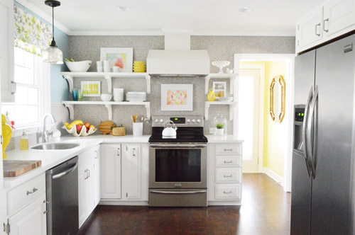
Not gonna lie though, the star of this room is still that wall full of penny tile. Picture me having an as-soon-as-the-show-ends bachelor breakup with the wall paint to run back to the penny tile with open arms. And it’s not that I don’t love the wall color – I just love the penny tile more than a person should love any inanimate object.

Gloria says
I always like the grellow, but I’m LOVING the blue!
Margaret says
It’s purty. I liked the grellow, but this is lovely.
Ashley says
I love!!! I did love the grellow though, and I’m happy to see it stay in the laundry room.
And thank you for not sponsoring this post with Frog Tape, or your phone, or anything else. I can’t take it anymore. I love yo no swag, gurl:)
Carli says
I. LOVE. THIS!! What a beautiful change up! Great work you two!
Autumn@fallfordesign.com says
Wow, love this blue! We actually are planning to paint an accent wall in our living room a similar blue!
BTW, I must have missed it. I noticed the picture above the chair in your kitchen.. it looks like a photograph of your shelves are is in the picture frame. Is this something new?
YoungHouseLove says
That has actually always been there (it switches sides with the P print on the other side of the doorway sometimes when we paint, hah) – it’s a print from allposters.com (the images is of kitchen things on shelves, like olives and lemons).
xo
s
Sarah says
Love it! I think it works really well with the floor and the window treatment and the grellow laundry. How do you keep the your framed pictures clean from kitchen grease? I guess the answer to that is pretty obvious! I love the open shelves and the accents you have placed on them, but I just wondered how often you have to clean them off and whether is is annoying?
YoungHouseLove says
We just wipe things down if we notice any marinara splashes or anything, but the range hood sucks up grease and steam so that really helps to keep anything from getting greasy :)
xo
s
Amanda says
Love this color! Great choice to re-paint. A little FYI for you: we just painted our due-next-week baby’s room a soft grey using Benjamin Moore’s Ultra Spec 500. I wanted no-VOC for the room and the choices were the Ultra Spec and the Natura. Our local dealer said that some folks have commented that the Ultra Spec covers better than the Natura, and it’s nearly half the price ($34 compared to $60 something, here in Maryland) so it was an easy choice for us. We really liked working with it, it did cover over a darker brown well in 1 coat (we put up 2 anyway) and for less $$ we couldn’t be happier. Just FYI in case you want to give it a try next time, or read more about it.
YoungHouseLove says
Ooh I love the tip! Sounds awesome! Can’t wait to try it!
xo
s
Andrea says
I love it and the white cabinets really do pop now!
LMN says
Jaw drop. What a fabulous!!! change. Man oh man oh man.
Amanda says
PS, has anyone told Sherry that she looks like the blonde dragon mother character on Game Of Thrones (minus the wardrobe and hair styling, of course)? My husband made me watch an episode the other night and she reminded me of Sherry!
YoungHouseLove says
Oh yes, I think she’s my sister. People say I look like a lot of people, but with her I totally see it. Especially the pics on IMDB of her with her brown hair. It’s kind of crazy.
xo
s
MJB says
I’m a huge fan of “real color” against white cabinets. I also like to play it safer with expensive hard-to-change things (like cabinetry and tile) and go a little wilder with the easy-to-change things (like paint and pillows. And more pillows, if you’re a member of Pillows Anonymous like some people who shall remain nameless.) Love the paint!
Renee says
It looks fantastic! I think that the blue really enhances the penny tiled-wall.
One question, and you may have already answered this: Do you ever consider getting rid of/altering the pantry? I love the look of your re-worked kitchen, I just feel that the HUGE pantry sort of messes with the flow.
YoungHouseLove says
It’s just so functional (and a selling feature too, it has pull out doors and things) so we think it’s better to keep it around for functional reasons. In person the rooms definitely big and long, so it’s sort of balanced with the fridge, which is another big object we have to keep for function, haha!
xo
s
Sara says
Been wondering about the pantry too. You mentioned a while back the idea of putting a chalkboard there, but nixed that idea as clothing would brush up against it. Is there such a thing as a black white-board and white erasable markers you could use there? Might help to minimize that big hunk of furniture. Love the blue!!!!
YoungHouseLove says
Oh yes, we’ve definitely thought about a few other “message board” options but haven’t quite settled on anything yet. Will keep you posted!
xo
s
Natalie says
Beautiful kitchen. go boom!
Kristen says
Wow! Beautiful! Great change!
Lisa says
Glad I wasn’t the only one with “holy sh*t!” as a first reaction! Total surprise. It looks absolutely wonderful!!
ren says
ok so I have to ask with all your Bachelor references in this post…did you watch this season? Who did you want Sean to pick??
YoungHouseLove says
We didn’t watch this season but I LOVE Bachelor Pad. Like woah.
xo
s
Penny says
Y’all just made me go YOWZA out loud to nobody. I love when that happens. What a gorgeous color!!
YoungHouseLove says
Haha, score!
xo
s
Cathy says
What a great color choice! It definitely “wakes” up the kitchen. Love it!
Mo says
I think what is so impressive about you guys is how you tweak things. I never in a million years would’ve ever thought about repainting the kitchen. It went with the rest of the house, it was light and bright, and it was a pretty color. But the new blue color really just puts the finishing touch on the room. I wish I could pick out those finishing touches for my house! That’s the hardest part.
YoungHouseLove says
Aw thanks so much Mo! That’s so sweet!
xo
s
Marci says
That paint color and all the wicker-y, wood-y, cork-y tones = match made in heaven :)
Brenda says
Love, love, LOVE it! It looks so beautiful and relaxing. All the yellow accessories totally pop now.
Katie says
To be honest I didn’t think it would make a huge difference but it is fabulous! I absolutely LOVE that blue and am adding it to my paint something with it list :)
Lilli says
Wonderful! This is such a lovely change. It’s funny how a little change of color can really mix things up. I love how things now “pop”. Good job guys (insert hand clapping sound).
Lisa says
And the Internet gives a collective “Hallelujah!” So. Much. Better. The grelllow was awful lol This is lovely.
Ashley@AttemptsAtDomestication says
I love the blue! It’s absolutely gorgeous!
How do you guys like the wood tones from the stools and light with the blue? I loved it with the grellow, but it seems a little competey with the blue. I think the wood would all still look lovely, but maybe a deeper shade?
YoungHouseLove says
We actually love that there are warm touches in the room (the cork, the stools, the pops of yellow in the accessories, the basket light) since they balance out the cool things (blue walls, white cabs, etc).
xo
s
Zuzanna says
Love it! I think the old color was the only thing in your house that I was not so crazy about. This is PERFECT!
Emily says
Beautiful!
Brittnee says
I Love It! And I’m probably stealing the idea I love it so much! I’ve been fighting with myself over colors for our home because everything is open to each other except for the bedrooms. This is such a nice color with just the right amount of pop.
Sara V says
Oh I lalaloove it!! When I first read about you wanting to repaint the kitchen I was like “NOOO!!!” Because I love the grellow but, surprise! This is even better! It’s so easy on the eyes. Great choice,guys, as always!
Jennifer C. says
That looks beautiful. Very serene. I just painted my kitchen the same color! (And I had previously used your penny tile cutting technique to put in some lovely mosaic tile that is that same pretty translucent-y blue color.) I’m moving much more slowly than you are on my kitchen. I have a huge stack of ceramic tile that I have to try to make time to figure out.
Lauryn says
I don’t usually comment (but love everything you guys do!) THIS LOOKS AMAZING. Great choice, it compliments your kitchen perfectly!
YoungHouseLove says
Aw thanks Lauryn!
xo
s
Stephanie Oh says
I LOVE the blue! Agreed, this is a great change (even though I loved the grellow while it lasted). And I love that you kept the grellow in the laundry room – it’s such a fun and happy statement for the small space. You guys always manage to take something great and make it even better.
Nicole says
Hi Guys! The grellow was great, but the blue is so.much.easier.to.see on my monitor. Love it!
Lisa says
Ah, so so so much better. I’m not a huge yellow fan, but it definitely looks perfect in a lesser dose in the laundry room with accents throughout the kitchen. Love the blue!!!
TammyLee says
Just painted my whole upstairs living spaces Barely Jade by Glidden. But it reads a pale bluish gray and I love it!
michelle rosales says
I love that color! I painted my dining room Benjamin Moore palladium blue on Saturday. My husband was out with his friends and he came home a freshly painted room to his surprise.
Cassidy says
Ah I love this color so much more! It really makes everything else pop, especially the wall o’ penny tile!
pomfoolery says
The kitchen looks sooooooooo much better with the new paint. Please, please, please do something about the vent hood.
Jessica G. says
I LOVE IT! The grellow was such a warm color but everything else in the kitchen felt so cool… the blue seems to make it all feel harmonious.
Britta says
I’m painting the sunroom next week “moon beam” – it’s a cool tone pale yellow. And after that’s up, we’ll finally get around to spending that $500 FLOR giftcard you so graciously gave us. So glad winter is breaking and the snow is melting!
Brianna says
Yay for the color change! I think blue kitchens are so attractive. In fact, I painted the kitchen & dining room in my last house the same color! It was Colorado Gray above the chair rail, and Aegean Teal below. Friends thought I was crazy (blue kitchen? really? really!) It looks so nice in your space! Not only does it make your cabinets pop, but it helps bring out the richness of the cork. (I was one of those that thought it was too orange when your walls were grellow) :) Though I do have to say that the Colorado Gray is a bit darker than it appears in your photos here, but it’s very close to accurate. Great change!
**If you care, you can see how the color combo looked in my house here: https://picasaweb.google.com/lh/photo/Riiz1awieWnx49o5ljHsPsSAWY8GKXZyP2usFSocbwk?feat=directlink
YoungHouseLove says
So cute!
xo
s
Laura M says
OMG, I love it. We’ve been in love with blue forever!!! Just when I thought it was getting old you’ve reminded me why I love it so much.
Oh, why do the paint companies call all the wrong paints gray? Cra, cra!!
Ethne @ Wom-Mom says
This is great! I love blue. Cool and calm, but it still seems happy with your colorful accents and the grellow laundry room/entryway. A+ Petersiks. Your necks and shoulders must be so strong from all the painting, I swear I ache for days after I paint!
Koliti says
Who needs a window or a skylight when you can have “$herdog Blue”? It’s like you’ve opened a window and let the fresh air in…ahhh
YoungHouseLove says
Hahah!
xo
s
Heather says
Everything is better in blue. And I’m saying that as someone who was against repainting. I loved the grellow, but this just looks soothing & elegant.
I had a major FML painting moment yesterday =( I had just painted 5 closet doors. And I went to the bathroom to wash paint out of the roller and I hear a crash. One of my freshly painted doors fell forward. The room is our “painting room”, so luckily I didn’t have to worry about carpet or furniture. But when I pulled the door back up, a ton of pet hair, dirt, bits of frog tape and a stirrer were stuck to the stupid door.
I wanted to cry.
YoungHouseLove says
Oh no!
xo
s
Gaby says
Wow, guess I am the only one who does not like it? To me personally it’s a safe, overused color. It feels outdated and very cold. But, it isn’t my house :)
Tiffany says
I LOVE it!!
Lauren says
Ahhhh LOVE IT!!! I really liked the old paint too but this one is even better!! And so random you mentioned that song today because I listened to the Moulin Rouge soundtrack this morning for the first time in like 7 years. Love!
YoungHouseLove says
No way! What are the odds. Haha!
xo
s
Andrea says
Love it!! It definitely eliminated the yellow tint to the cabinets. The blue really highlights the penny tile wall too!
Robin says
I have Colorado Grey in my half bath and downstairs hallway and find it very versatile; the hallway has creamy white wainscoting and the bath has black cabinets and it works well with both. Funny, when the painter first opened the can and started using it, she insisted the store had given her the wrong color cause all she saw was blue. Having previously painted my walls with that color I assured her it was actually Colorado Grey. Looks great in your kitchen and allows the penny tile and accent colors to really shine. – Robin
YoungHouseLove says
So funny!
xo
s