- The 12 Best White Paint Colors
- Benjamin Moore Edgecomb Gray
- Benjamin Moore Simply White
- Sherwin-Williams Pure White
- Sherwin-Williams Extra White
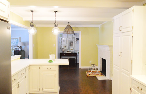
As for more about the kitchen color change, although you guys know we love grellow with a passion, it has been notoriously impossible to photograph (remember a hundred different phases of the kitchen project with “ahh, this color looks so much more subtle in person but is reading as lime green/bright yellow/neon slime for some reason”). And although that’s sort of definitely a dumb reason to repaint a room, I can’t tell you how annoying it is to not be able to share what you see in front of your eyes when you’re a home blogger.
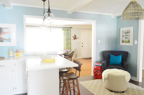
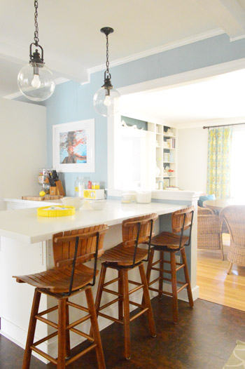
But the main reason for the change wasn’t that the color was hard to photograph, it was that over time we realized that the grellow didn’t let the other things in the room shine as much as they might have with a different choice. Take the white cabinets and counters for example. They looked little yellowed thanks to the wall color reflecting on them – and even the cork looked a little orangey-yellow (especially at night) instead of rich and mocha.
So here’s how we reasoned our way to a new color pick in five bullets or less:
- we worried that other tones of yellow and green would have the same yellowing-ish issue (say that three times fast) since they’d reflect on the counters, cabinets, and cork – even if they were deeper or lighter, so we nixed those options
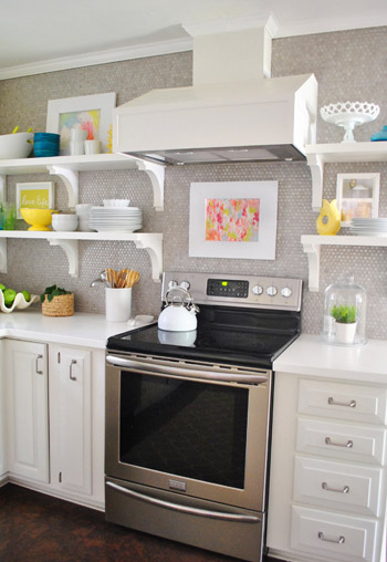
- we wanted something deep enough in tone to provide a little more contrast, so the counters and cabinets would pop more (but nothing too dark since the room is windowless)
- we have gray backsplash tile and a few adjoining rooms are gray, so we didn’t want to go with more gray on the walls (dark, light, or schmedium) for fear of grayverload
- we wanted an actual color on the walls (since we chose such safe things everywhere else like: brown floors, white cabinets, stainless appliances, white counters, and gray backsplash tile)
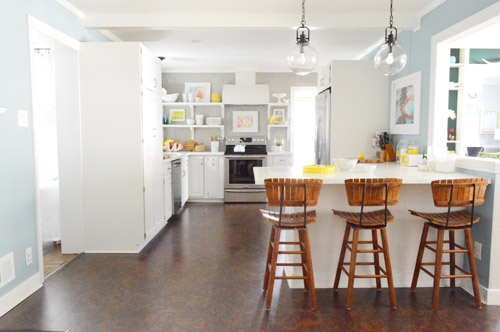
- we wanted a color that would tie the kitchen into the four spaces (yes, four!) that the kitchen opens up to – without getting too matchy-matchy (when a room adjoins so many other rooms, the wall color should work with those rooms since you’ll see them together all the time – it’s sort of like very carefully picking a hallway color that works with all of the rooms off of it)
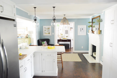
We definitely loved having a soft blue kitchen in our first house, and we actually don’t have any blue on the walls in this house except for the deep teal in the guest room and on the back of the dining room built-ins, so it’s nice to bring in a mid-tone blue that’s sort of in the middle of the guest room and our first house’s kitchen.
The funniest thing about this whole repainting escapade, which we realized while applying the second coat (we’re always loopy by then) was that in our first house we repainted every single room except for our kitchen and our master bedroom. And in this house we’ve only repainted two rooms: the kitchen and our master bedroom. Hilarious.
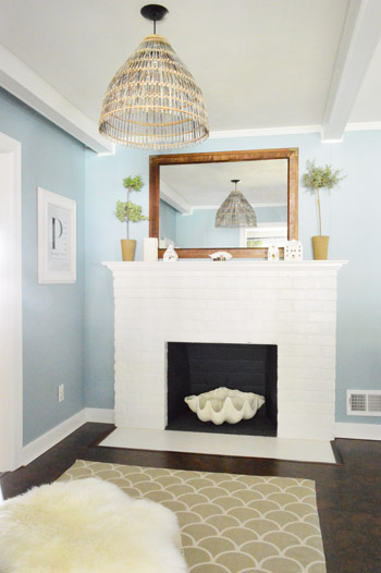
And if you count the time that we painted the fireplace area a different color for book photoshoots (only to repaint it back to normal a few days later) some parts of this room have seen four different paint jobs.
- it’s definitely an actual color (there’s nothing neutral about it)
- it still feels sophisticated (even though it’s not gray or navy or chocolate or taupe)
- it allows the white cabinets and counters to really pop (without yellowing them)
- it’s a great balance to the warm tones in the room (like the cork floors, the wood stools, the rustic cutting boards on the counter, etc).
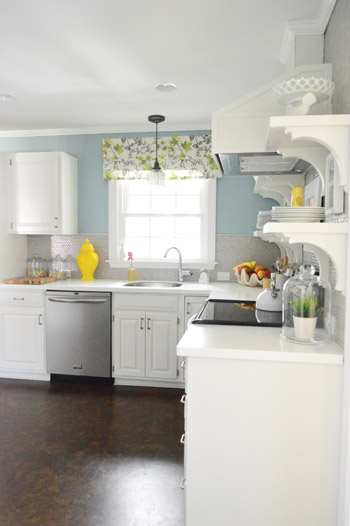
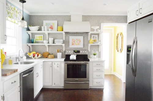
Not gonna lie though, the star of this room is still that wall full of penny tile. Picture me having an as-soon-as-the-show-ends bachelor breakup with the wall paint to run back to the penny tile with open arms. And it’s not that I don’t love the wall color – I just love the penny tile more than a person should love any inanimate object.

Kate says
We have the same color in our living room! LOVE it in your kitchen!!! Looks fabulous!!
Sabrina says
It looks great! I may be a little biased though, since I recently worked (*working) on a kitchen remodel of my own with really similar colors. Thanks for being such an inspiration – including inspiring me to document my own successes and disasters in home improvement.
M.C.@ ThousandStoryKitchen says
It really is gorgeous! Good job on that color! My husband looks at me like I have three heads if I mention repainting a room I’ve already painted…anyone else have that problem? (okay, to give him credit, it isn’t our house…)
Hailey says
It feels much more soothing than the green/yellow – I really like how it turned out! Well done!
Carly Cleghorn says
I don’t know if someone’s mentioned this, but …
Denver has ~300 sunny days a year–more than even San Diego! The skies are hardly ever grey over Colorado. The sun shines even while it’s snowing.
So I reckon the paint name is a play on that. A joke for the locals! (Coloradoans?)
Looks great, guys!
Carley says
I’m in major <3 with this color and room. Blue is my favorite color, and I can't believe how it just brings the room together! Gorgeous!
Monica says
So please tell me about this Facebook coupon you mentioned :)
YoungHouseLove says
My best tip is to “like” the page of your local paint store that sells Benjamin Moore (here it’s a store called Virginia Paint). Since you’ve liked them, you will see them post pics and sales periodically, so we try to buy our paint when we see a sale pop up on Facebook!
xo
s
Erin says
Thanks for painting your kitchen and giving me inspiration! I have been looking at websites galore trying to find the right blue-gray color. I think this is it! Picked up a gallon after work and I’m gonna paint the guest room this weekend!
Cheryl says
I like the way the blue contrasts with everything. It doesn’t look as bold as you describe it on my screen. I like SW Aleutian and SW Distance. They are found with the gray shades, but very blue and make the white pop.
Jennifer F says
LOVE IT! We took our kitchen from oak cabinets, green and white tile counters, white walls and an ivy boarder to white cabinets, grey granite countertops, blue walls and a glass tile backsplash in blues and greys. Happened a few years ago and I still love it so much.
Amy W says
I LOVE the blue your choose for your kitchen. I’ve been looking for a new color for our kitchen that would work with our bisque colored cabinets. What do you think? Yay or Nay? P.S. We live just west of Charlottesville in the mountains, and loved seeing your house tour of a local farmhouse awhile back. So fun!
YoungHouseLove says
I think it would be gorgeous!
xo
s
Ashley Smith says
I love the blue! Where did you get your yellow accent pieces. I’ve been looking all over for some of these for my home, but haven’t had any luck:(
YoungHouseLove says
HomeGoods! I love that store!
xo
s
Chloe says
Ah it looks so much better! I was never a fan of the yellow, even though you insisted it looked different in person. Amazing how the blue has made everything else pop.
erin says
LOVE!!!!!!!! Now your yellow accents pop and the color you chose really DOES look sophisticated. I’m stoked that you got to keep your grellow in the laundry room. It looks even better from the kitchen now. woot woot!
P.S. I painted my master bedroom Carolina Club in Aqua (your MB’s ex-bff). Do you miss it? Ever think of bringing it back in another room or painting an accessory with it? I just love it sooo much. It might travel with me to my next house too.
YoungHouseLove says
Aw, it’s such a pretty color! I did love it. Maybe it’ll end up on the ceiling or something in some room!
xo
s
Misty says
I love the blue! I have actually been toying with re-painting my pale lime-ish kitchen [for the THIRD time] into a very similar blue that is in my adjoining laundry area… you guys may have inspired me to do it [when my husband isn’t looking so I won’t have to hear him grumble about my lack of decision making skills]… Anyway, my random question of the day is: where did you get the cake plate on your open shelving?
YoungHouseLove says
That was from HomeGoods a while back!
xo
s
MelissaG says
I was at our local Farm and Fleet and noticed that they had B Moore paint there. I looked for both Moonshine and your kitchen swatch (blanking on name but I looked it up there). They had neither. I know they could probably look up the formula but I was just curious to see what the swatches looked like in person. Any idea why they wouldn’t have them? They had a flip book thing that you could look for colors by name and it told you were to find it in the huge array of swatches. Thanks!
YoungHouseLove says
Hmm, I have no idea other than just that they have 1200+ colors, so books probably don’t have every color in them, maybe just a smaller collection of them (and the wall of color at most of the big stores has all of them). Hope it helps!
xo
s
EM says
big change!
Chelsea says
Wow, your kitchen is GORGEOUS. I like my house ok but wish you guys could come tell me a few pointers to make it incredible, like yours. So, so, so pretty. The blue is awesome.
YoungHouseLove says
Aw thanks Chelsea!
xo
s
Claire says
You’ve probably answered this question before & I’ve not seen your response…do you mind sharing why you choose not to prime before painting?
I’ve always primed because I was afraid that I would have to do more than 2 coats of paint but I’d love to end the hassle of priming & get straight to the fun part–paint! :-)
YoungHouseLove says
We prime when we’re going from super dark to super light or vice versa, so in this case two coats of paint worked well without any primer :)
xo
s
Brenda Cofer says
I only have two comments:
1. “AAAHHHHH! so peaceful and serene looking now!”
AND,
2. “LOVE IT! LOVE IT! LOVE IT!”
: )
GREAT JOB, guys!
Lauren L says
omg WHAT a difference! I literally feel calmer looking at your kitchen in that new color. You guys are so awesome. Great pick, it looks SO good!
Anita@comfyheaven pillows says
this color is so so beautiful. I am such a fan of blue , I love the fact that it does look so sophisticated. So beautiful. P.s love the blue pillow on the couch too.
Jenny B. says
I almost squealed when I read your color choice! I’ve been eyeing Colorado Gray for our kitchen lower cabinets! It looks SO awesome in your kitchen – like it was always meant to be. Now, I’m second-guessing my plan to use it on the cabinets… maybe it needs to go on the walls instead. :) Love it!
Susan Telfer says
I love it! I am thinking about what colour to repaint my kitchen right now (The Summer Harvest makes our tile look dirty) I was thinking of Sesame because of a mood board of yours but now I will think some more. We have a beautiful blue (Blue Grass) in our living and dining rooms, but like you say, I don’t want all the rooms the same colour.
Christine says
I was so happy to find out about your blog in HGTV magazine this month. I read a lot of “house porn” and will be adding your stuff to the pile. I loved your house redo featured there and it’s motivated me to try some projects after a while of not doing much. My job as a newspaper editor keeps me busy, and it is creative, but sometimes you just want to forget about it and do some homey stuff. I might make an “all you need is love” painting, for one thing.
What motivated me to write was that I was looking at your kitchen in the mag, and my 3-year-old granddaughter came in and started looking at it with me. (I won’t tell you where I was … hint: it was in the room with the bathtub.) The first thing she noticed was the pig on the pillow in the sun room photo, which I didn’t even notice. She couldn’t stop talking about the kitchen. She’s a little nonverbal for her age, so I like to show her pictures and ask her what things are (banana, spoon, pig, doggie were some of the items in the photos). All of a sudden she took off, giving an entire narrative of the kitchen like we lived there. “Nana’s chair? My chair? Spoon. Make pancakes. (points to stove) Here, pancakes. You sit on chair with me? We go ride to house. Come in door. We eat food here (table in sun room). I sit on piggy with my butt. Etc.
It was hilarious. She’s never done that with a decorating magazine before, but something about the room just struck her, I guess. It is a great kitchen, I admit.
Can’t wait to see what you do with the new place!
YoungHouseLove says
That’s awesome and so adorable, Christine! So glad she enjoyed the “tour” of our house!
xo
s