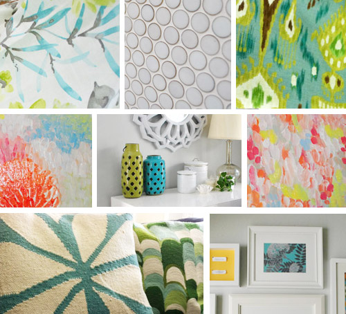
- The 12 Best White Paint Colors
- Benjamin Moore Edgecomb Gray
- Benjamin Moore Simply White
- Sherwin-Williams Pure White
- Sherwin-Williams Extra White
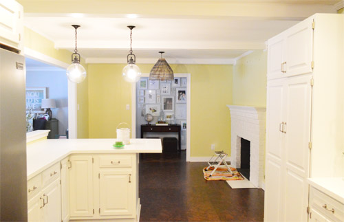
As for more about the kitchen color change, although you guys know we love grellow with a passion, it has been notoriously impossible to photograph (remember a hundred different phases of the kitchen project with “ahh, this color looks so much more subtle in person but is reading as lime green/bright yellow/neon slime for some reason”). And although that’s sort of definitely a dumb reason to repaint a room, I can’t tell you how annoying it is to not be able to share what you see in front of your eyes when you’re a home blogger.
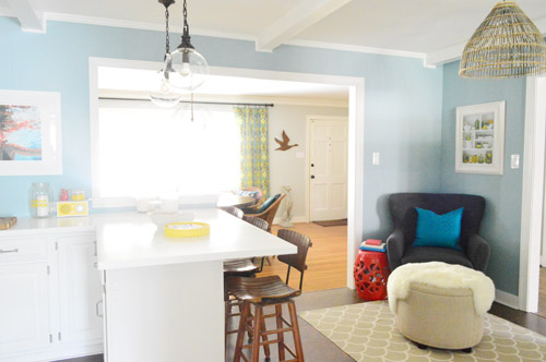
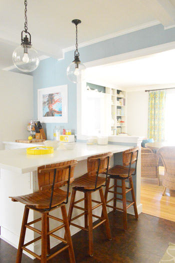
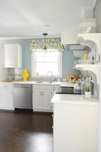
But the main reason for the change wasn’t that the color was hard to photograph, it was that over time we realized that the grellow didn’t let the other things in the room shine as much as they might have with a different choice. Take the white cabinets and counters for example. They looked little yellowed thanks to the wall color reflecting on them – and even the cork looked a little orangey-yellow (especially at night) instead of rich and mocha.
So here’s how we reasoned our way to a new color pick in five bullets or less:
- we worried that other tones of yellow and green would have the same yellowing-ish issue (say that three times fast) since they’d reflect on the counters, cabinets, and cork – even if they were deeper or lighter, so we nixed those options
- we wanted something deep enough in tone to provide a little more contrast, so the counters and cabinets would pop more (but nothing too dark since the room is windowless)
- we have gray backsplash tile and a few adjoining rooms are gray, so we didn’t want to go with more gray on the walls (dark, light, or schmedium) for fear of grayverload
- we wanted an actual color on the walls (since we chose such safe things everywhere else like: brown floors, white cabinets, stainless appliances, white counters, and gray backsplash tile)
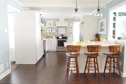
- we wanted a color that would tie the kitchen into the four spaces (yes, four!) that the kitchen opens up to – without getting too matchy-matchy (when a room adjoins so many other rooms, the wall color should work with those rooms since you’ll see them together all the time – it’s sort of like very carefully picking a hallway color that works with all of the rooms off of it)
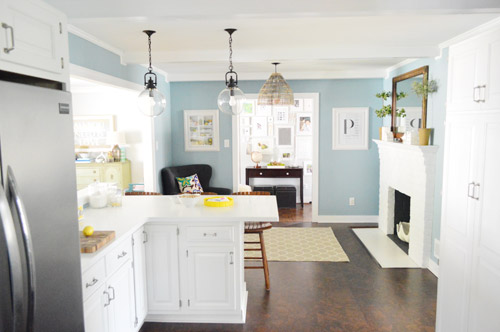
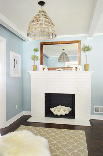
We definitely loved having a soft blue kitchen in our first house, and we actually don’t have any blue on the walls in this house except for the deep teal in the guest room and on the back of the dining room built-ins, so it’s nice to bring in a mid-tone blue that’s sort of in the middle of the guest room and our first house’s kitchen.
The funniest thing about this whole repainting escapade, which we realized while applying the second coat (we’re always loopy by then) was that in our first house we repainted every single room except for our kitchen and our master bedroom. And in this house we’ve only repainted two rooms: the kitchen and our master bedroom. Hilarious.
And if you count the time that we painted the fireplace area a different color for book photoshoots (only to repaint it back to normal a few days later) some parts of this room have seen four different paint jobs.
- it’s definitely an actual color (there’s nothing neutral about it)
- it still feels sophisticated (even though it’s not gray or navy or chocolate or taupe)
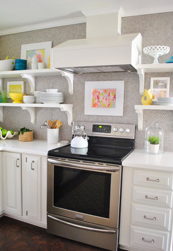
- it allows the white cabinets and counters to really pop (without yellowing them)
- it’s a great balance to the warm tones in the room (like the cork floors, the wood stools, the rustic cutting boards on the counter, etc).
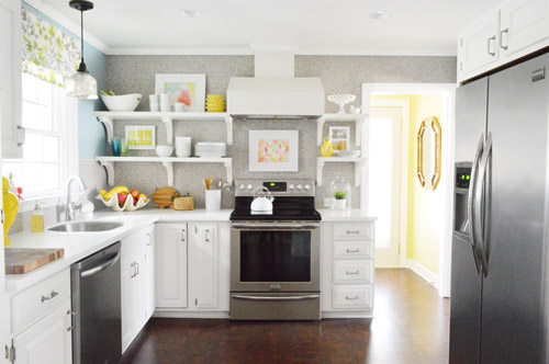
Not gonna lie though, the star of this room is still that wall full of penny tile. Picture me having an as-soon-as-the-show-ends bachelor breakup with the wall paint to run back to the penny tile with open arms. And it’s not that I don’t love the wall color – I just love the penny tile more than a person should love any inanimate object.

debi says
That blue looks amazing! I thought it was perfect before but looking at the pictures with it all painted blue makes it look and feel so much better!
I swear I need yall to come redo my kitchen!
Sarah F says
Seriously. So. Beautiful. Makes me want to paint my kitchen again !
Maggie says
Love it! Yellow tones can be really hard without a lot of natural light. Glad it still gets to cheer up the laundry room and that the kitchen gets it’s own fun hue.
Erika says
As an *expert* in all things gray here in Seattle . . .
It *definitely* looks blue to me! And oh so beautiful!
LOVE it!
Emily says
I love the blue a lot more then the other color….even though it looked great too, this one feels like it’s less forced, if that makes sense?!
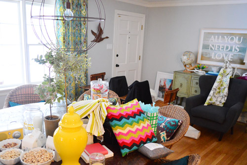
We’re always painting something, tearing something down, building it back up around my casa so the dishevled room looks VERY familiar!
Needle little Balance says
Lovely! What a change!
What I find interesting about your new wall color is that your kitchen has now those colors that I love and chose for our home as well: natural wood, dusty blues, light greys, linen colors, lots of white with a few sparks of color. Quite scandinavian!
But at _your_ house I enjoyed the grellow colors so so much and I really loved the aqua barstools you had a while back. Maybe because it is so very different from our place and therefore exciting even though I wouldn´t copy it 100%. Don´t know if this makes sense to anyone else but me? ;)
CAM says
Okay, so I love the blue. Love it. It’s gorgeous and it sets of the penny tile beautifully (complimenting the ‘star of the room’ without competing against it). But I need to share a little secret with you…the peninsula chairs? I don’t love them. I didn’t like them in the grellow kichten and I really don’t like them in the grey / blue kitchen. I know these are close to your heart so I am loathe to slam them…but to me, they are the one element of the room that sticks out like a sore thumb.
Elisabeth says
SOOO much better!!! The yellow definitely tired the kitchen down. The contrast with the white cabinets just didn’t work in my opinion. Now, the kitchen looks impeccable: crisp, fresh and bright. Bravo!
Jessica says
This post is motivating me to get my butt into gear and finally repaint our downstairs. I painted it this cafe latte beige when I moved in 5 years ago because I thought it would match everything. Ugh. Now I’m itching for a pretty pale gray – Benjamin Moore ‘Stonington Gray’.
YoungHouseLove says
That’s such a pretty color!
xo
s
Kathryn says
It *does* look fantastic. And I love that you both have the ability to realise when something’s time has been and gone and ‘get on that’. But… I have to admit a soft spot for the grellow + blue lab stool days. (Though I’m sure my posterior would appreciate the current seating!)
Alix says
Hey youngsters! LOVE the blue – the more I look at it the more I love all the tones and shades you’ve captured just in this one post. Looking forward to seeing more; thanks so much for sharing all that you do about your home! It is definitely an inspiration. :)
Alix says
Also, digging the barstools more and more. I was PSYCHED when they appeared in place of the science-lab-esque ones, but they’ve really stood the test of time and are awesome. Just because I’m sure you’ve been waiting on my opinion to fully enjoy them! ;)
YoungHouseLove says
Haha, thanks Alix!
xo
s
Elizabeth says
When we remodeled our kitchen in 2010 we put in Bianco Antico granite countertops, painted our cabinets white, installed a walnut stained hardwood floor and painted the walls a medium- toned blue called Rain by Sherwin Williams. The rest of the downstairs is an off white (Divine White) or beige (Kilim Beige in the adjacent den.) I love the blue!
Ash says
Love the blue! It looks great.
Emily V. says
Love the blue! Very nice!
Aryn says
So much better! Still hate the stools (sorry – they just don’t work for me) but the color looks great with the floors and makes all the white pop!
Joanie says
I was a big fan of the grellow until I saw that shot of how they made your cabinets look like a cream color. AAAAHHHH
Very good lesson for us all – the wall color casts color onto other light colored surfaces in the room. It makese sense but I never thought of it until I saw the photographic evidence. I am wandering around my house looking at cast off shades now…yikes.
maddy says
love it! so much! I liked the grellow, but I think this is just so sophisticated and happy! I was wondering, I really want to paint my room, it is currently a really pretty pastel fresh green but it wasn’t a good paint job, I was wondering if you have any posts about how to best paint a room? taping off and advice etc? I’m just not sure how to go about it, which is weird, because I’m an art student, but still!
thank you! xo
YoungHouseLove says
Oh yes, here you go: https://www.younghouselove.com/2010/09/email-answer-how-to-paint-a-room-yhl-style/
xo
s
Jeanine says
Wow! I’m totally in love with the new kitchen color! I was always a little on the fence with the grellow, but you guys knew how to make it work. But this new blue is perfect!!! It totally makes that beautiful penny tile pop!
kirsten oliphant says
Liked the grellow, LOVE this color. It’s like it was made for the room. I want to paint my face that color! Okay, maybe not. But yeah–it’s lovely.
harmony g says
I have to say that i love the new color. I wasnt so sure about the yellow until you put it up but seeing the blue, its like…. wow. It really seems to let your eyes rest on the important parts of the room a lot more. Great job!
Teresa says
Looks almost exactly like our kitchen colour..We have BM Mount Saint Anne, which was in our master bdrm in the last house (and always looked more gray there). In our kitchen it definitely looks more blue in the sunlight. I like it but I may eventually paint it Revere Pewter like most of the other rooms on the main floor.
YoungHouseLove says
Sounds so pretty!
xo
s
Sherree Hartwig says
I Love the Bluuuue! Do a side by side photo of before & After. Good Job!!!
Brianne says
OBBBBBBSESSSSSSED! It looks so much better, I love it.
Lisa G says
I love it!!Glad Nonna was here to make it happen. We have a blue kitchen also and I’m so in love with the color- Jet Stream by BM.
Sherri says
I picked up a sample of this today – but my colorado gray looks more green than blue to me? Maybe I’m comparing it to too many grays?
YoungHouseLove says
Green? That’s funny! Lighting in different homes definitely varies, but in our house it’s a lot more blue than green.
xo
s
heather s. says
I like the blue better than the grellow but it feels a little too soft – like a color you’d use in a little boy’s bedroom. I think I would have gone with a slightly deeper blue or blue/gray tone.
Kudos for painting though!
Abby says
Okay, I loved your kitchen before… the cabinets, the countertops, the appliances, your accessories, and the stools! But now I looooooove your kitchen!! It’s absolutely chic and serene! In our first home, I painted the kitchen cabinets white and the walls blue to replace the dark brown cabinets and the 70’s-green walls from the previous owners. I loved that kitchen! I am in love with my current kitchen because the layout is awesome, and I have my white cabinets again. But I’m hoping to replace the pink counters (ick)and white walls down the road… soon. :-) I love reading your blog!!! And my 3 kiddos enjoy seeing the pics and videos of Clara. :-)
YoungHouseLove says
Aw thanks Abby!
xo
s
Tracey says
Love it! My husband could NEVER paint without a drop cloth – he’s a roller overloader and a wrist flicker with a brush.
Janet says
It’s beautiful!! Excellent choice of colors. :)
Whitney says
I love it! I am dying for our own home so I can paint and break out walls like you guys :)
Miss Charming says
Great color choice! (My kitchen is painted a different shade of bluey-green which I absolutely love.) We’ve been in our home over 13 years now so many of the rooms have seen multiple coats of paint.
Jill says
I had to come back and take another look, the color is beautiful.
YoungHouseLove says
Aw thanks Jill!
xo
s
Susan says
That is a great color! The white really pops against it. Love it!
Jillian@TheHumbleGourmet says
I’m going to go on record to say that I love the blue! I’m a big fan of cooler colors for the very reason you stated…they seem to compete less with the accents in a room. Plus, I feel like cooler colors work better with a wide array of colors than warmer colors do. Does that make sense?
YoungHouseLove says
Totally!
xo
s
Michelle K. says
LOOOOOOOOOVEEEE IT!!! Looks GREAT in blue!!
HeatherM says
Thank you for posting pictures of your messy house, as requested! It is very reassuring to see your house doesn’t always look perfect, even though it tends to on the blog.
shevy says
wow! it looks great! i never really understood why you painted the walls grellow, but the blue looks amazing and so much more sophisticated!
nat says
Love love love it. I never seen a ceiling speak to me but I think your ceiling is like “how about me?” Especially on that first picture. But it doesn’t want to be blue no, it wants to something else, may be light light grellow or something.
YoungHouseLove says
Could be fun!
xo
s
Kim Birum says
We’re so excited around here to finally have the main floor painted after a year of white walls interspersed with crazy faux-finishing (leftover from the previous owners). Loving how color can make everything fresh and new. Your blue kitchen is lovely. Digging Colorado blue/gray over grellow.
Barb says
At first I thought it might be too cold, but then I warmed up to it by the end of the post (haha!). I have painted my kitchen 6 (!!) times in 9 years. All Benjamin Moore (since I used to work for a dealer and after a 4 year haitus, I’m now a part owner of one.
In 2004 I started off with Muslin.
A few months later I added a Deep Rose accent wall to the Muslin.
In 2005, I painted over that with Louisiana Hot Sauce.
In 2006, I painted it Aegean Teal (which I loved!!).
This fall I repainted it Skydive (which we used in our store (in fact I took home the paint tray and the bagged brush & roller and painted that night). I LOVE the colour at work, but it sucked in my kitchen… definitely an impulsive act. In fact while I was painting my 4 year old told me how much he hated that colour and that I should be paint it back to the darker colour (Aegean Teal).
I lived with it until a few weeks ago when I repainted it Cinder.
Kitchen – 6 times
Bathroom – 3 times (though I painted the old wainscotting about 3 times before settling on the perfect white)
Master bedroom – 4 times
Office – 2 times
Living Room – 3 times
Front Entry – 2 times (soon to be a third)
Dining Room/Hallway – 4 times
Laundry Room – 2 times
Kids Room – 3 times
Only 2 of those repaints were because of unfortunate colour choices (kitchen & bathroom).
My husband doesn’t care what I do as long as he doesn’t have to help :)
YoungHouseLove says
Haha, I love it! You’re a girl after my own heart!
xo
s
Ellen says
Hi Sherry and John,
Hi, I’m Ellen and I read your blog every day :) Actually I check both yours and bower power since you two mention each other so much. I always tell my husband I need to see what my two friends Katie and Sherry have been up to.
Anyway, I love your blog and my 1 and a half year old son loves the Clara videos! But I write for the first time today because I just love the change of color in your kitchen. My favorite color is yellow and we have a yellow kitchen now. But, with not much light in our kitchen either, I know what you mean about shadows and things looking yellowish. That’s so funny to me; we’ve had the same conversations lately about our yellow kitchen problem!!
So, thanks for sharing!! Keep up the good work. I really love reading your blog; it’s definitely a highlight of my day :)
Take care!
Ellen
YoungHouseLove says
Aw thanks Ellen! You’re so sweet!
xo
s
Jessica @ Dear Emmeline says
perfect choice! love it!
Amanda @ The Scacchi House says
Love it! Great color choice!
Ali says
Love it! I was never a huge fan of the grellow, not that it matters. :) Looks great!
Ashley C. says
I never disliked the grellow…until I saw it next to the blue. Holy crap, it looks amazing! Awesome choice, guys!
KimG says
Wow..I usually never post comments on your website..but that kitchen color is Absolutely FAB! Great job Guys…:-)
Jeanna says
Blue kitchen? Yes ma’am. In 2008 we painted our kitchen walls a slate blue/green called “Cold Shoulder” by Glidden when we moved in. Bold, gutsy and still lovin’ it! Cabinets are white and floor is maple and it gets lots of light so it feels like an ocean view cabana in there.
Then you recommended it as an accent color in this post:
https://www.younghouselove.com/2009/01/erica-keiths-color-conundrum/
So, I was feelin’ like one of the cool kids (and ahead of my time, haha). If YHL recommends a color, you know it’s legit.
Welcome to the land of blue kitchens. It’s lovely here. Your penny tile thanks you.
YoungHouseLove says
Haha, I love it!
xo
s
Brandie says
Love this color! Of course, I could be biased since I painted my kitchen the very same color a few months ago. Such a happy color to have in the gloomy northwest! :)
Christian says
Funny… When I first saw the picture I said to myself how great that colour looks, then you said the name and I was shocked to see that I am sitting in a room painted that very same colour!
Alison says
I absolutely love it. Totally polishes the kitchen. Look at your house tour, your house is almost there!