Please tell me you sung that title to the tune of the Brady Bunch? If not I’ll give you a minute to get to it.
Now that we have that out of the way, I thought I’d share our inspiration command center when it comes to the new house. It’s this napkin that we scored on clearance from Crate & Barrel (which you might recognize from this post of yore).
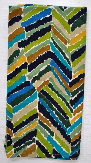
I kid you not. That napkin is like the Sue Sylvester of Casa Petersik when it comes to picking colors and pinning down that ever elusive whole-house-color-scheme. She’s loud. She’s totally in charge. And she’s fun to watch. Thankfully no bullhorn though. That wouldn’t go over well with Burger.
When it came time to choose a color for the back of the built-in bookcases, Ms. Napkin was the inspiration. Same with our bedroom walls and the artichokey green color that we’re thinking about in the kitchen. We literally pull swatches, hang them on the wall in each room to see what we like, decide on a favorite, and then make sure that they look nice next to El Napkin before running to the store to get paint. We definitely haven’t been holding swatches up to the napkin to find a perfect match to every color or anything (we’re picking based on what looks best on the wall in each room, and then just making sure it “goes” with Sue). Look, here we have some of our favorite swatches with her:
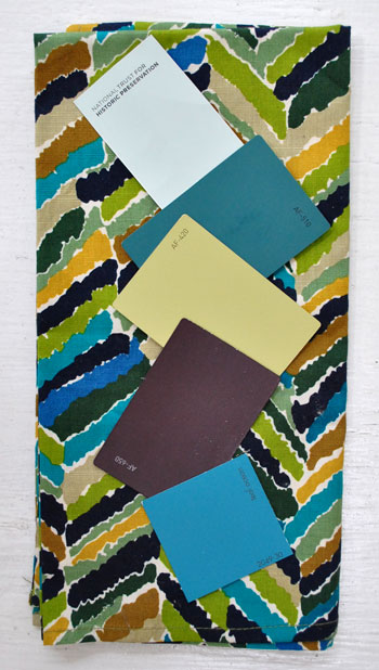
Not all of the swatches are reading exactly as they look on the wall (which of course is par for the course, so always hold something up to the wall in your space to see how it looks depending on the lighting sitch), but the top swatch is our blue-green-gray bedroom swatch (looking quite tame next to all that color and pattern): Catalina Crescent Roll Carolina Inn Club Aqua by Valspar (get that joke here). The second swatch (which is reading less dark and moody in this pic) is the color that we used on the back of the bookcases (Dragonfly from Benjamin Moore’s Affinity line). The third one is the color we’re contemplating for the kitchen walls… when we finally work up the momentum to tackle that room (Agave from Benjamin Moore’s Affinity line). The fourth one is a deep aubergine plummy tone with chocolate undertones (Caponata from Benjamin Moore’s Affinity line) that we’d love to work in somewhere when I put on my big girl pants and grow some cojones). And the bottom swatch is a super layered and moody deep teal (the photo does its depth of color no justice) that I’m working up the guts to use in the hall bathroom (Benjamin Moore’s Teal Ocean). Yeah, it should be interesting to say the least…
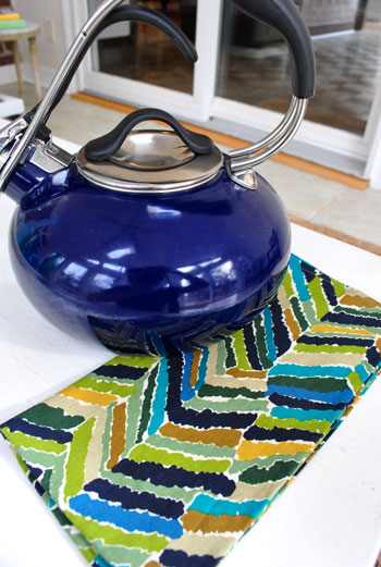
What is it about that napkin that speaks to us? We have no idea. Other than the fact that we like the colors and we like how they look together. So if they can work on a square of fabric why shouldn’t they work in a house? It might be a foolish plan of attack, but we intend to see it through either way. And it’s so easy to pop Sue in my purse and keep her with us when we’re out shopping. Because even though our colors don’t match her to a T, they definitely “go.” So if we see something that goes with El Napkin, it probably will go with our house. Look, it even looks good with my Christmas teapot from the hubs. Nicely done Mr. Petersik.
Who really knows where we’ll end up. We’re just taking things one day at a time and are definitely dedicated to taking more risks with bold color and pattern than we did in our first house. Especially with the bambino around. We’re just feeling the more-playful-splashes-of-color approach over the whole beachy-airy-neutral thing that we did last time. Should be fun.

reyanna says
As a matter of fact, I *did* sing the title! LOL. And then I laughed out loud at your first sentence. It was funny…. I was on the phone with my sister, so she heard me sing (and read) that part too. Then I put her on speaker, so she could sing along to the YouTube video with me. LOL. Ahhh… fun times. :-)
And cool napkin! I love using something like that as inspiration. I did that with a pillow for our guest room. :-)
And I just have to say… I think yours is my favorite blog. I talk about it and you guys SOOO much to my husband. LOL. The other day, I was like, “Oh! John and Sherry… yada yada yada,” And he said, “Wait, who?!?!” And I said, “Really?! John? Sherry? Clara? I friggin talk about them ALLLLL the time! The Young House Love couple!” And then he goes, “Ohhhh! Sheesh… why didn’t you just say the ‘Young House Love Couple’ then?!” LOL. Umm… because they have N-A-M-E-S. LOL. ;-) It was pretty cute.
amanda says
i kid you not. i painted my kitchen agave (color matched to olympic) YESTERDAY! i have dark cabinets and floors with white bead board and white countertops. i LOVE how it looks – it’s very sultry and sophisticated. how crazy!!
YoungHouseLove says
Sweet! So glad to hear it’s as great on the walls as the swatch!
xo,
s
jennifer says
You should make some throw pillows out of those napkins!! It’s easy peasy!! If the sewing machine is intimidating (which I highly doubt) hit me up, I’ll whip those up for you!
I LOVE all the new colors you are picking!! This is more my speed than all the whites!!
sophie says
funny how the sensuality and tactility of fabric can end up defining who we are and where we want to go. Over the years, I’ve picked up scraps of fabric at value village that I’ve liked – bits and pieces of batik and sari fabric that have touched my soul in some way. I just hung onto them, thinking taht I’d use them for something. Turns out that all those pieces work together in a really unique way and now three of them are adding amazing pops of colour to our bedroom: curtains out of a deep purply-pink sari with silver accents, and ‘fabric prints’ (the fabric stretched across homemade wooden frames) from two different batik fabrics. It all works brilliantly, and it’s shaped itself over 10 years of fabric gathering. I think it really has to do with the sensuality and ‘touch’ sense of fabric. it is more alive when it’s made of cloth.
I’m liking the bold colour choices; go for it! what’s the worst that can happen? You’ll be out some $$ and some hours of your time, and you can always repaint. We started out all white and are now embracing our inner jewel tonish selves.
Gayle says
I call this concept CALIBRATION. lol!
At my last house, I coveted the color palette of some curtain panels I got from Pier One and they were in my kitchen. Mustard, Eggplant, a rusty-red, a blue in that mix.
That was my go-to scheme…the place I calibrated my palette and my eye for the rest of the house. It was a big, spread-out house, and it helped me to keep it together.
Paint swatches had to go with the panels before they were introduced to the rooms. I’d bring bedding to the kitchen and calibrate with the panels, sofa pillows, bath towels, etc.
If I wanted to introduce a new color scheme in a room…or just add a small splash of color somewhere…as long as it calibrated with the curtains and enough elements were cohesive, it was my permission to go forth with ideas.
My ex-H had no style and didn’t want much change, but he liked the panels too. The calibration idea made logical sense in his no-style brain, and I guarantee that was the 1 thing which allowed me to do a few things around the house without excess grief. Strange, but true.
Chaela de Gouveia says
Hey! I just noticed the mirror in the second tear sheet picture. It’s almost the same one you used in the bathroom!
YoungHouseLove says
Isn’t that funny?I We didn’t even notice that until someone pointed it out this morning!
xo,
s
erin pearce says
i love sue! i have been obsessed with peacock blue, teals etc! i go through these phases where i’m obsessed with certain colors, so its been hard to pin down a color scheme for our home, i keep worrying will i still like the colors in the future, or is it just a phase! do you guys ever have that issue?
Katie Truelove says
a)totally sung the title to the brady bunch intro tune
b) i love that you guys give little glimpses into how your style inspiration comes about! My favorite color combos always come from the unlikeliest of spots…
Natalie says
Oooh fun napkin! I love that the color scheme of your new place matches your new teapot, or vice versa. Well done, John! :)
Question/Favor: Would you mind stopping by and sharing any advice you have on shooting indoors at night? I’m helping out with my sister’s wedding reception this weekend and could use all the help I can get! Thanks!
YoungHouseLove says
Hey Natalie,
Hopefully this post comes in handy? Although the whole at-night thing is definitely a challenge. https://www.younghouselove.com/2010/02/email-answer-snap-to-it/
And this one is full of reader tips in the comment section. Hopefully there are some external flash details in there somewhere! https://www.younghouselove.com/2010/04/stop-or-ill-point-and-shoot/
Hope it helps! And goooood luck…
xo,
s
xo,
s
Lyndsey says
Hahaha I think Catalina crescent roll is the best one yet!! lol
Estelle says
I love the concept… reminds me of that Domino column where they’d turn an outfit into a room. Plus, it’s a great way to have fun with color but show some restraint when you like too many competing styles, which is my problem. :(
Ali says
You two are so good at knowing what you like and then finding a plan to put it in to design action! I’m always impressed! :) Love the new colors and so cool that you found beautiful inspiration in something so simple! Way to go!
~ Ali
Elizabeth says
I just saw this on making it lovely and thought it matches Sue very nicely!
http://www.anthropologie.com/anthro/catalog/productdetail.jsp?subCategoryId=HOME-CURTAINS-EMBROIDERED&id=083015&catId=HOME-CURTAINS&pushId=HOME-CURTAINS&popId=HOME&sortProperties=&navCount=280&navAction=top&fromCategoryPage=true&selectedProductSize=&selectedProductSize1=&color=001&isSubcategory=true&isProduct=true&isBigImage=&templateType=hybrid
YoungHouseLove says
Hey Elizabeth,
Totally! We love Making It Lovely. And those are so pretty.
xo,
s
Rebecca Foxworth says
Did you notice the quatrefoil shaped mirror in the second tear sheet…and how you ended up with a quatrefoil shaped mirror in your bathroom? I guess those “vision boards” and “style files” really DO influence us without our noticing, huh?
YoungHouseLove says
Isn’t that so funny? We didn’t even notice that until someone pointed it out to us yesterday!
xo,
s
Beth-BTW says
Good for you! I have done the same thing with the first floor of our house using a striped chair fabric that I luuurve. I think it’s workout out quite well. Love having the focus and basis for the decisions made. =)
One day, we might even have the whole house done that way. For now, the bedrooms are their own deal, though. My 6yo has opinions. Haha!
Sarah says
My wedding colors were based on a napkin ring I found at Crate & Barrel. What is it about that place?!
andrea p says
Hey YHL,
I remember reading that eventually you would love to have a round pedestal table in your dining room. I was wondering if you were thinking of wood tone or white? Also, are there any you have your eye on right now? Any suggestions?
The reason I ask is I am helping my sister find one for her new place :) Fun!
Thank you :)
YoungHouseLove says
Hey Andrea P,
We want a giant wood one with a nice chunky pedestal and a leaf so it can seat at least 8 people. Let me just tell you that those are hard to come by. We’ve looked in all of the usual places (Pottery Barn, Crate & Barrel, Target, Ikea, Overstock, JC Penney, etc) and have come up empty handed, so we’re thinking we might have to find something at an antique shop or thrift store. We’ll definitely post about whatever we find when we find it! And as for your sister, checking the stores we listed above might help. Good luck!
xo,
s
andrea p says
Thanks for the speedy response!
I like the lines of the LIATORP pedestal table from Ikea, but it only comes in white & I worry about wear and tear. Tpp bad it doesnt comes in a distressed solid wood because at $249 the price is hard to beat!
YoungHouseLove says
Bummer! That would be awesome in wood! Maybe they’ll add it. Sometimes they change the finish on things (or materials used) from time to time…
xo,
s
Lindsay says
My kitchen has loads of white cabinets, so we actually did the walls in almost the same color as your plum/purple swatch. It was called Quixotic Plum from Sherwin Williams. The greatest moment was when my husband and father-in-law stood back to view the completed (dried) project and said, “I ‘see’ it now! I love it!” (Apparently they were secretly doubting my bold choice at first.) :) It was also neat to discover that all sorts of cafe colors – the deep reds, mustards, greens – all look great against that color.
andrea p says
One more thing if you don’t mind…..when you do find the table of your dreams, what chairs were you thinking of? I mean, what style/look color?
I really appreciate your guidance….I envy how creative you two are and how you visualize things!
YoungHouseLove says
Hey Andrea,
For now we’re envisioning something upholstered so they’re not too hard and it doesn’t look like wood overload with the big table. But since we have a kiddo we want it to be kid friendly (and food resistant) so maybe something like light green leather parsons chairs would be cute (google parsons chair to see what silhouette I mean). Hope it helps!
xo,
s
andrea p says
Oooo I can see the light green chairs really tying in with the light green kitchen! Can’t wait to see how it all turns out & thanks for the help :)
- Sarah :-) says
Heeyyy… that mirror in your middle tear sheet is the same shape as the one you put in your master bath. INNteresting…
Claire @ Claire K Creations says
It’s a brilliant plan of attack. I love how brave you guys are being with the new house and it’s really paying off!
Crystal says
I definitely had the Brady Bunch song stuck in my head for the entire day after reading this post!! But no worries, if it wasn’t this song it would have been another one (I basically have a musical life…because I make it that way by singing and dancing randomly all the time) lol It makes life interesting! Anywho! I love this post! I am currently looking for inspiration for my house! And thanks for listing where you got some of the pictures! They are now in my ‘pile of things that might be inspiration’ :)
Kat @ Me Simplified says
Ha! I bought the same napkins. Gotta love a bargain. My house and vintage dishes are similar colors. I was thrilled to find them after much searching for something that accents what I have.
Cari says
Ohhhh here you are sharing these napkins again…I got the same ones (freakishly around the same time you did) and let me tell you; LOVE! The colors and pattern are so amazing; kuddos to you for using it as your inspiration: extra dose of approval from me!
Melissa says
Oh my gosh. The Jonathan Adler kitchen…love, love, love! I actually pulled that same pic as an inspiration for our upcoming kitchen redo…Love it!
Anne Alexander Sieder says
Love your colors – my inspiration for our house is a shell tiles, which actually have a rainbow of iridescent colors along with brown, beige, gray and silver. My husband and was looking at me like I was nuts when I kept pulling out the tile sample to hold up next to master bath tiles, but hey, I’ve got a THEME to keep to here. Anyway, I’m really looking forward to see how yours come’s together.
Gabrielle Miller says
So cool we share the love of the same napkin. Our whole house matches the napkin too. I even put Jonathon Adlers beautiful kitchen on the blog a while back. Thanks for sharing!
annie says
i just linked back to this post from your dance party post and re-read the color choices you’ve made for your home so far. i painted my living room bm’s agave, and it really does look gorgeous! the color is beautiful at all times of day and with so many colors. (plus i have a deep purple caponata-like dining room, so i’m totally on board with your palette!)
YoungHouseLove says
That. Sounds. Delicious.
We’ll have to check out Agave for sure!
xo,
s
JWill says
Our kitchen is close to your green swatch above. However, our cabinets are 1970’s and a whole lot of dark oak. As soon as the weather breaks here in Indiana, my husband and I are painting them a crisp white, thanks to inspiration and painting tips from your site. I can’t wait to get rid of the dark oak!
YoungHouseLove says
That’s going to look amazing!
xo,
s
Taryn says
Just in case Burger is on the hunt for a new stylin’ collar and would like to channel “sue the napkin” for spring, he needs to check this out!
http://www.birdestudios.com/product/burst-of-green
I just came across this dog collar and felt compelled to firstly, purchase one and then pass the gem along.
Happy shopping Burger!
YoungHouseLove says
Cute! Burger would look so dapper…
xo,
s
Heather @ Craftiliciousness says
Was watching The Next Food Network Star tonight and I spied “Sue the napkin” in it when the judges were tasting the dishes!!! I immediately thought of you! :)
YoungHouseLove says
Woot! Go Sue!
xo,
s
simplyblythe says
just noticed your beloved napkin on the next food network star!
YoungHouseLove says
Sue’s a star!
xo,
s
Jennifer says
Ended up on this page today while sitting in a hotel in Germany…aaand thought the outfit on the right looked Sue-esque. Go Target! :)
http://www.thefader.com/2011/08/10/missoni-debuts-a-humungous-collection-for-target/
YoungHouseLove says
Totally Sue-esque!
xo,
s
Aubree says
Hey Sherry and John,
I know, random comment on a post forever ago. I’m just reading through all your old stuff since I found you just a couple months ago.
Thank you for this post. I’ve had it on my mind as I try to get a handle on what I want for my new house that we just moved into in July. I was so lost- and reading about fixing your disjointed color scheme in your new house made me sad. You see, I had all sorts of ideas about each room and what would be fun (sage and aubergine in the living room, a darker tealy blue and caramel in the bedroom, a nursery JUST like your pear and aqua one *lol*, a green and chocolate bathroom, and an airy “water chestnut” and white basement family room with pops of turqoise to replace the dark wood paneling….) It seemed kind of disjointed. I didn’t want to give up all my beautiful colors for a very limited blah set (so it would be “safe”)
So I’ve been on the hunt for a “sue the napkin” of sorts. Something that I know will make me happy every day for a long time.
You’ll be happy to know that yesterday, I FOUND IT! I was at hobby lobby for halloween stuff, and I passed by the poster section, and Kismet happened. I glanced at an alphabet poster, and without thinking twice, I scooped it into my cart and bought it. I keep looking at it, because it’s utterly perfect. It has varied washes of green, teal, chocolate, caramel and beige which just tie in everything that I was dreaming about for my home in a really nice balance. And even more incredible is the textures that the background colors are rendered in. My favorite swirls, brocade patterns and rounded geometric patterns!
While it is a full-on 24×36 poster, I’m pretty sure I’m going to take a photo of it to stash in my purse(can’t find it online, darnit) as I now head out into the world with direction and excitement.
Thanks for the tip on how to build your color scheme, I really really really appreciate it! Hopefully I can share pictures as the dream unfurls!
Thank you thank you thank you!
YoungHouseLove says
LOVE IT LOVE IT LOVE IT! You have no idea how happy that makes me. Congrats and good luck!!
xo,
s
Siobhan says
Sue the duvet?
http://www.westelm.com/products/organic-oasis-duvet-shams-b819/?pkey=cnew-bedding
YoungHouseLove says
Cute!!
xo,
s
MC says
I know this is old…but I’m doing a lot of catching up since I only discovered you a month or so ago. And I was in TK Maxx this week (TJ Maxx, but in the UK, not a typo)… And there was a pillow with the same Sue-the-Napkin
colors. Different pattern, but scary similar! I even took a picture of it, haha!
On another note, I love how you guys let your quirky flags fly high! So many people don’t and they make things seem impossible to obtain. Seriously, I love just about everything on this blog!