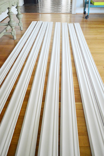
Alternate punny post title: Gimme Some Moore. Yes, that was a Busta Rhymes reference. Dude, that song was my junior year jam. And speaking of jams, our new nail gun is our latest. John’s totally ready to get his crown molding install on this weekend, assuming he can wrestle it out of my hands. Just gotta let these guys acclimate a little bit longer…
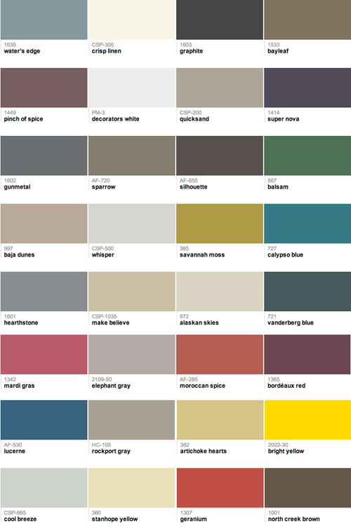
So while the crown molding gets to know our house a little better (and I dreamily gaze at it while whispering sweet nothings) we’re excited to share our 2013 Benjamin Moore paint picks! We’re a little tardy for the party with this – and a big thanks to everyone who has been asking about it! – but we just didn’t want to pull them out of a hat. So we took our sweet time finding the colors we wanted to marry. All 32 of them. It’s going to be the wedding of the century, guys.
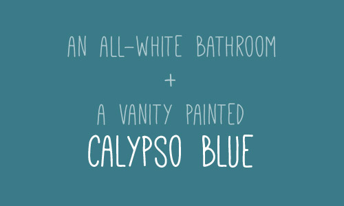
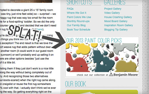
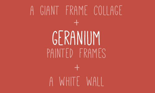
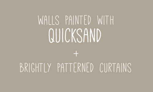
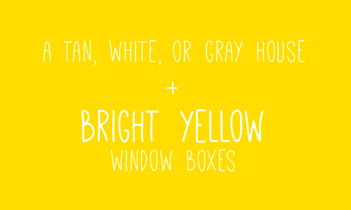
We thought it would be fun to toss out some more specific ideas for using a few of our picks right in this post, so here’s one now:
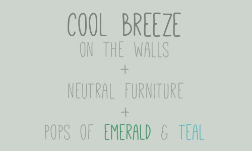
And here’s another one (you’ll find four more peppered throughout the post).
Some of the colors in the collection are tried and true tones that we’ve already used, some are colors that we’ve eyed forever, and some are colors that we used for our book (so we’ve seen those in action as well). You can check out all of our colors here (if you told us five years ago that we’d end up on the Benjamin Moore website, we’d have laughed at you for five minutes, gained our composure, and laughed at you for five more). And you can pop over to view our collection whenever you’d like by following this little sidebar button of ours…
We’ve been using Benjamin Moore colors for around half a decade, and we’ve been buying their actual paint since 2011 (we first tried it out on our office built-ins), so when they invited us to curate a collection of our favorite colors last year, it was pretty much a dream of ours. And jumping back in to choose 32 new colors for 2013 was just as much fun. This partnership is just like any other side gig that helps pay the bills – like writing a magazine column or our book – except we get to play with paint chips for this one, so… yeah buddy.
Our process was pretty simple. If by simple you mean splaying out 561 paint swatches (you think I’m kidding) in order to choose our favorite 32 colors. It was beautiful chaos, I tell ya. And I loved every undertone-investigating minute of it.
The goal is simple too. We just hope anyone out there who’s overwhelmed by a giant wall full of swatches will find comfort in a smaller collection of favorites to peruse and potentially use in their home. And we hope that some of the suggestions spattered throughout this post get your motors running. You know, in that exciting I-want-to-paint-something-right-this-second way. Or in that I-want-to-paint-something-but-first-I-need-a-marshmallow way. Either one.
And since we’re on the subject of color, have you guys used any paint colors that you’ve loved lately? Do you keep a little folder of your favorite swatches? Or a pinterest board full of ’em? How do you keep track of them all?

When we were choosing this collection we discovered that cutting out swatches individually and laying them all out on a neutral background (dark charcoal colored Karl, haha!) was a great way to see how they all worked together. And it helped us “balance” things by being sure we had enough dark choices, bold ones, neutrals, and soft and serene colors that weren’t too bright or too neutral. In short: if you have a few spare weekends and a neutral colored sofa, I highly recommend playing around with paint swatches instead of watching TV. Seriously, it’s right up there with a marathon of The Walking Dead (albeit a lot less bloody).
Psst- We picked a winner for this week’s giveaway, so you can find out if it’s you right here.

Allison H. says
We recently purchased a home and literally every single room needs paint, I am trying to do a room at a time so as to not overwhelm myself. I am finding I love the Benjamin Moore colors though, I spend an awful lot of time on their website these days (though we have been color matching the paint at Home Depot as Behr… we are long time users of that brand). I have been using Pinterest to organize the colors I like and the colors we ultimately use. This really helps to see the colors I have used laid out next to each other and since I am doing the room to room method, helps me put the colors next to each other to ensure there is some kind of flow to them. I am really liking your Pinch of Spice! That didn’t look so much purple to me until I saw it blown up above. I am looking to do our guest bathroom a dark purple (only room I think my husband would let me put purple in) and I will be adding that color to my list of contenders now :)
YoungHouseLove says
Wahoo! It’s really pretty in person!
xo,
s
jill aemmer says
Love all your colors and especially LOVE your wall color “Moonshine”. Do you think that color gray would jive with brazillian cherry hardwood floors?
YoungHouseLove says
Oh yes! I’d bring home a swatch but I bet it’ll look great!
xo,
s
Lilly says
oooooh myyyyyyy…I love these. I have been looking at Galapagos Turquoise with a cherry wood crib and otomi fabrics for a gender-neutral nursery base, but it might have to be Calypso Blue now. Seems a touch brighter and more bebe friendly! Thanks for sharing!
October says
I so love those paint colors! I also love the Moonshine color that you guys used in a couple of your rooms. Have you compared the new Whisper color to the Moonshine? Can you tell what the tonal or brightness differences are?
I recently found your blog by searching for a DIY tutorial on floating shelves, and I’ve been hooked ever since. I love the inspiration I get here and also LOVE your book. Congratulations and I wish you even more success!
YoungHouseLove says
Whisper and Moonshine are really close! Depending on the lighting in your house they’ll read differently, so I’d bring home two switches and see what they do :)
xo,
s
MeredithB says
Love the font you used on the idea swatches. What is the name of it?
(Also a big fan of your blog! You guys are the bees knees)
YoungHouseLove says
Thanks! The font is called “Mathlete” but I’m not certain where I downloaded it from. Maybe FontSquirrel?
-John
Adrienne says
I’ve been a “silent” follower of your blog for years now (ooo that sounded creepy!), however I cannot stay silent anymore. Last week my husband and I wandered into a Books-A-Million in Tampa as we were perusing the mall on vacation, and what happened to catch my attention? YOUR BOOK! I was so excited, I told him all about how I’ve been reading your blog for years and how I’m totally envious of how you’ve turned your amazing talents into your career, AND how I knew you had recently published a book! I just wanted to stop by to let you know how much I enjoy reading your blog and watching as you both transform your house into a home truly reflective of yourselves. Your hard work and creativity is an inspiration! … oh and on a side note, I also told my husband all about Burger (as I proceeded to play “Where’s Waldo” in your book to find ALL of his pictures). We have two Chihuahuas ourselves, and adore anything “Chi” :)
YoungHouseLove says
Aww, thanks Adrienne! Burger says Hi to your Chis!
-John
Simply Modern Home says
LOVE elephant grey and cool breeze! You guys made some beautiful choices. Congrats on your partnership with Ben Moore!
Susan
simplymodernhome.com
Joanna Banana says
I’ve been eyeing geranium for awhile now! Good pick!
Kathryn Griffin @TheDedicatedHouse says
I love Benjamin Moore paint. Have been using them for close to a thousand years…at least it feels like it. All the paint in my house so far has been Benjamin Moore. They have the best coverage around. Looking forward to seeing what you guys come up with. Wishing you a pretty weekend. Toodles, Kathryn @TheDedicatedHouse
jen @ The Well Read Fish says
Too many great colors .. . not enough rooms! . . .must paint. . . too many choices. . . argh!
I’m in the process of buying a house and planning the paint colors. A few were recs from y’all: BM Moonshine, MS Plumage or BM Dragonfly, and possibly now BM Calypso Blue.
We’re also using BM Storm, BM Spiced Pumpkin, and BM Van Courtland Blue.
I also REALLY want to use BM Deep Space, but Husbs thinks it is too dark. Meh. What do boys know?
Véronique says
I so enjoy seeing the evolution of your colour choices. They have gotten moodier over the years… Love it!
Kate says
I love pinch of spice! I would love it for a master bath… I think purple and gray are both relaxing!
Elizabeth says
I love “Pinch of Spice!” It looks like a grey-purple-beige on my screen.
Jill Nachel says
Wish I could’ve used those colors back in December when I painted my room!
Jill
http://lovebythemooon.blogspot.com/
Mel says
LOVE the all-white bathroom and calypso vanity idea! I have been daydreaming about doing the very same thing for a while now, but perhaps needed a little reassurance it’s a good idea!
Pure genius.
michele double you says
I didn’t read the almost 200 comments posted (first page only tonight), so apologies if someone already said this, but…one way to save your paint colors and be able to take them with you when shopping is to paint one end of a paint stir stick, label the unprinted end with the paint info and date, and–if you want–drill a hole in the end and attach all your room/home colors together with string.
I have great ideas, but my follow-through sometimes sucks. I didn’t do this for a single one of the colors in my home.
Renée says
love these combinations! I just used Benjamin Moore tapestry beige for our main wall colour and cloudy sky fpr our bedroom. love how they turned. out!!
YoungHouseLove says
Sounds awesome!
xo,
s
lesli devito says
hi there kids, You know I love these colors, especially because I already have a calypso blue dresser!!! hmmm and I seriously like the idea of putting that color in an all white bathroom…might just do it!
off to LA…(love saying that!)
hugs!
YoungHouseLove says
Haha have fun Lesli!
xo,
s
Erica says
Those are some beautiful colors! I confess, I’m bummed there isn’t a brightish orange! I’ve been looking for the perfect shade of orange for an accent wall in my son’s room for AGES! My plan was to do three beigey walls, a deep dark, almost black brown dresser, a limey green bed frame, and a brightish orange accent wall… But I can’t find the orange!!! Don’t suppose you have a suggestion?
YoungHouseLove says
Ooh you could try 14 Carrots (that was in the collection last year and is really fun).
xo,
s
Val Caldwell says
Great colors.
danielle says
i wish i had your collective visualization talents. all of your suggestions sound awesome– love the colors! might use “quicksand” in our nursery if we don’t end up with “fusion”…
Eugenie says
Ewwww!
Im sorry but you guys should not do color work. You do so many things really well but i have to be honest and say putting together color stories is not a strength.
Heather W says
Really loving the Lucerne and Vanderberg blue color also, the Hale Navy you had picked last time. Do these colors read teal or more Navy in person. I am really debating on whether to go dramatic and dark or light in our half bath with no window….. I would love to know your thoughts,,, Good luck with the crown molding….
YoungHouseLove says
It really depends on the light in your house (some things read navy more in certain lights and more teal in others) but my best description is that Hale Navy is really navy and Lucerne is the most varied (some green is in there, at least in our light).
xo
s
Andrea K says
loveee the emerald and teal!!!
m3g says
Great tutorial thanks! Think this will add som debth to our future home. Question that is slightly off topic…I noticed you guys don’t typically use drop clothes when painting. Are you that perfect and careful Fha you don’t spill – ever?? With Clara and Burger running around I would imagine it has to happen. Do you have a super secret clean up method I don’t kknow about?? If you could shed some light on this if only to satisfy my wonderment :thanks!!
YoungHouseLove says
We only paint when Clara’s sleeping (either napping or in bed for the night) and Burger is scared of all the screeching of the step stool so he stays away! Haha! So we have learned after 6+ years of painting rooms regularly that for hardwoods any drips can easily be wiped up (and even if you miss them they can be “cracked off” with your nail after they dry) since the floor is sealed. We’d never paint without a dropcloth on carpeting, but on wood floors it works for us!
xo
s
Jessica says
About 6 months ago I finally had ENOUGH of our crazy colored kitch, and the barely there color of our living/dining room. I perused the intertubes for a suggested combination of grays that would create more “flow” in our large combined area. My plan was to paint the kitchen (including cabinets) and the living and dining room areas. After much deliberation, and not a ton of support from my husband, I finally chose Benajamin Moore “Sparrow” and “Thunder”. The living/dining room is painted sparrow, and the kitchen cabinets are also sparrow. I chose thunder for the kitchen walls, and a very light gray (almost white) for the kitchen cabinet doors. It was a HUGE change; but every time I see “sparrow” on a list of awesome colors…I feel like I made the right decision! :-) Thanks for sharing your BM color picks!
YoungHouseLove says
Haha, I love it! Sounds gorgeous!
xo
s
Sassafras says
Okay, here’s a cheap trick we did in the hallway of our last house for the crown molding. Take the 59 cent a foot floor trim molding and turn it upside down and used it as crown. No one notices anything and it looks great and made my eye rest so much easier at the ceiling line. Crown molding ‘to me’ makes a house a home.
Jenny says
SUCH a random question, but what is the font you’re using in the graphics? Love you guys! :)
YoungHouseLove says
It’s called Mathlete and I downloaded it here: http://www.fontsquirrel.com/fonts/mathlete
-John
Bethany L. says
I clicked on the sidebar link and it took me to the paint colors, but I wound up finding this page and loved it as a starting place even more (even though I’ve read your bio before). Just as a recommendation!
http://www.benjaminmoore.com/en-us/for-your-home/young-house-love-colors
YoungHouseLove says
Thanks Bethany! Glad to hear you liked it!
-John
Susanne says
Just had my entire downstairs painted Gray Mirage. A beautiful green gray that is warm but actually light and airy. Love love love it. Trim is Cloud White. I cannot tell you how thrilled we were with this color. If you are looking for a greeny gray.. this one is fabulous! Thanks.
YoungHouseLove says
Sounds really pretty!
xo
s
Mary says
Love these colors! Question…how to inject some new vibrancy in the things that can’t change like a couch and 2 upholstered chairs. I’d send you a picture if I could find an email! Case in point…we have a large leather sectional couch in our family room. The syle is somewhat modern and streamlined. The color is closest to geranium above, but leans more towards a deeper red. The two upholstered charges have a lot of geometric pattern in them with touches of that red, some rusty orange like the Moroccan spice, some brown like the bay leaf, and a green somewhat lighter than the balsam. Walls are a neutral BM bleaker beige and fire place wall is a chocolate brown. I want new and brighter accents in pillows etc, but these colors are somewhat muted as they are. How do you liven up colors like this? Tanks
YoungHouseLove says
I would just bring home a ton of pillows from somewhere like Target or HomeGoods or Crate & Barrel and mix and match them to see what you like- then return the rest. It’s like a fashion show for your room- and you won’t know what pairs the best until you see it in your room, so I’d cast a wide net!
xo
s
Jackie says
So…I guess you are no longer using yr old standby Olympic paints? I just find BM very expensive and totally outta my budget.
YoungHouseLove says
We actually used Glidden for the first few years of blogging, then moved to Olympic, and then in 2011 we tried Benjamin Moore for our office cabinets (which we linked to in this post – well before ever talking about a partnership with them- they didn’t know who the heck we were) and loved it so much and have used it pretty much ever since! The coverage was so awesome, and jobs that used to take four coats (like brick in our first house’s sunroom) only took two with BM (like the brick in our current sunroom) so to us there’s a definite value in the time and paint that we save. Many rooms that would call for two gallons of Olympic only needed one of BM, and it’s more scrubbable too. Hope it helps :)
xo
s
Lena McKown says
Hey Guys! I loooove everything about everything about YHL. I am scanning the archives to see if you have done any how to’s on painting laminate cabinets white. Is there a specific post that you’ve done on the subject? Our house needs it! Thank Yas!
YoungHouseLove says
We haven’t done an article about that yet but we think bringing a door or drawer of the piece to a paint pro and asking what they’d use would help (there are new primers and paints that are great for that). Good luck!
xo
s