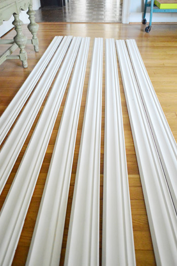
Alternate punny post title: Gimme Some Moore. Yes, that was a Busta Rhymes reference. Dude, that song was my junior year jam. And speaking of jams, our new nail gun is our latest. John’s totally ready to get his crown molding install on this weekend, assuming he can wrestle it out of my hands. Just gotta let these guys acclimate a little bit longer…
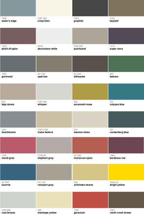
So while the crown molding gets to know our house a little better (and I dreamily gaze at it while whispering sweet nothings) we’re excited to share our 2013 Benjamin Moore paint picks! We’re a little tardy for the party with this – and a big thanks to everyone who has been asking about it! – but we just didn’t want to pull them out of a hat. So we took our sweet time finding the colors we wanted to marry. All 32 of them. It’s going to be the wedding of the century, guys.
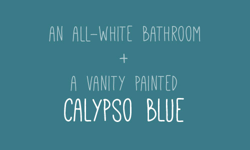
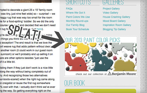
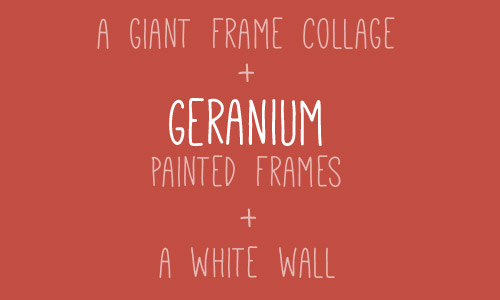
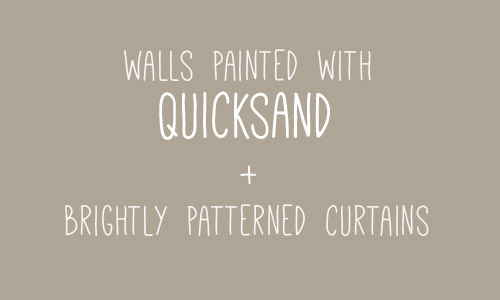
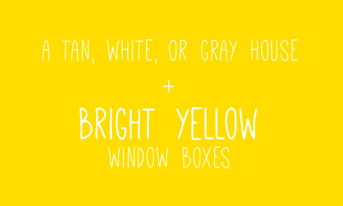
We thought it would be fun to toss out some more specific ideas for using a few of our picks right in this post, so here’s one now:
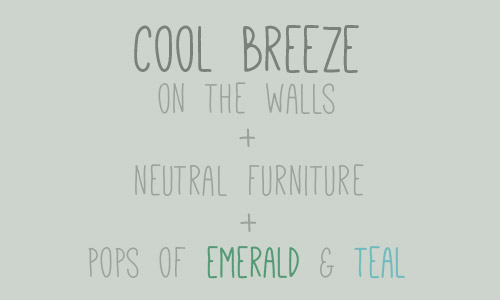
And here’s another one (you’ll find four more peppered throughout the post).
Some of the colors in the collection are tried and true tones that we’ve already used, some are colors that we’ve eyed forever, and some are colors that we used for our book (so we’ve seen those in action as well). You can check out all of our colors here (if you told us five years ago that we’d end up on the Benjamin Moore website, we’d have laughed at you for five minutes, gained our composure, and laughed at you for five more). And you can pop over to view our collection whenever you’d like by following this little sidebar button of ours…
We’ve been using Benjamin Moore colors for around half a decade, and we’ve been buying their actual paint since 2011 (we first tried it out on our office built-ins), so when they invited us to curate a collection of our favorite colors last year, it was pretty much a dream of ours. And jumping back in to choose 32 new colors for 2013 was just as much fun. This partnership is just like any other side gig that helps pay the bills – like writing a magazine column or our book – except we get to play with paint chips for this one, so… yeah buddy.
Our process was pretty simple. If by simple you mean splaying out 561 paint swatches (you think I’m kidding) in order to choose our favorite 32 colors. It was beautiful chaos, I tell ya. And I loved every undertone-investigating minute of it.
The goal is simple too. We just hope anyone out there who’s overwhelmed by a giant wall full of swatches will find comfort in a smaller collection of favorites to peruse and potentially use in their home. And we hope that some of the suggestions spattered throughout this post get your motors running. You know, in that exciting I-want-to-paint-something-right-this-second way. Or in that I-want-to-paint-something-but-first-I-need-a-marshmallow way. Either one.
And since we’re on the subject of color, have you guys used any paint colors that you’ve loved lately? Do you keep a little folder of your favorite swatches? Or a pinterest board full of ’em? How do you keep track of them all?

When we were choosing this collection we discovered that cutting out swatches individually and laying them all out on a neutral background (dark charcoal colored Karl, haha!) was a great way to see how they all worked together. And it helped us “balance” things by being sure we had enough dark choices, bold ones, neutrals, and soft and serene colors that weren’t too bright or too neutral. In short: if you have a few spare weekends and a neutral colored sofa, I highly recommend playing around with paint swatches instead of watching TV. Seriously, it’s right up there with a marathon of The Walking Dead (albeit a lot less bloody).
Psst- We picked a winner for this week’s giveaway, so you can find out if it’s you right here.

Teri says
Hi! I don’t usually post…just a lurker, but when I saw that I used one of the BM 2013 paint picks I thought I would share. I painted my bathroom Calypso Blue and used white bead board on bottom half of wall. I have some tangerine/red accents thrown in the mix. Love it! My inspiration was from Lonny Magazine a few years back.
http://www.lonny.com/photos/Hillary+Thomas/XL_4vJjc5Ut
YoungHouseLove says
Ahhh! I love it! So pretty.
xo
s
Christina @ Homemade Ocean says
I love that you all have embraced color so :)
I like all the moodiness you got going on too!!!
Carli says
Ooooooo can’t wait to see the crown molding go up!! So exciting!
Shari says
Speaking of marriage, Savannah Moss and Calypso Blue totally need to get married! Did you notice what a good looking couple they made? And Sue the napkins would SO be the maid of honor.
YoungHouseLove says
Hahah! I love it!
xo
s
liz @ bon temps beignet says
Loooove love love love bayleaf, sparrow, and Rockport Gray. We’ve been trying to pick a color for the extterior of our house and those would be awesome.
Being from New Orleans, I figured a paint color called Mardi Gras would be purple, green, or gold…. not pink. Silly Benjamin Moore.
YoungHouseLove says
Haha, it’s true!
xo
s
Brittany Olson says
ok this is SUPER helpful! I just repainted my computer desk and was a little stuck on color combos.. I LOVE the Cool Breeze, Emerald and Teal. Woo hoo Thanks! You guys Rock!
YoungHouseLove says
Aw thanks Brittany! Good luck with everything!
xo
s
Annie says
These colors are sooooo pretty! Great inspiration for my bedroom/bathroom overhaul that is (hopefully) starting soon.
Could you clarify, were these colors new on the market for 2013 or are you looking at the whole library of Benjamin Moore colors and picking shades that you like for this year?
YoungHouseLove says
They’re our color picks for 2013, meaning from all of their thousands of colors, we weeded through them all and picked these as our favorites of the year that we love most :)
xo,
s
Laurie says
Mmmmmmm paint! My favorite thing. I just painted my 10 year old daughter’s tween room “Gentle Fawn” by Sherwin Williams. It is a lovely butterscotch-y, toffee color. Her bedding is blue and white toile and she has a white iron bed and maple hardwood floors. The room feels a little beach-like but not over the top since we live in the desert. The other color I am totally loving is Library Pewter by Sherwin Williams. I think I am going to paint her closet doors this color and do a white diamond pattern on them. I want to leave work right this minute and get my paint on! Your colors are lovely. My oldest daughter wants me to re-furbish an old piece of furniture for her and I am loving your Geranium color. Sigh. Swoon.
YoungHouseLove says
Sounds really gorgeous Laurie!
xo
s
Daniela says
Do you guys have to pay full price for BM paints? (Not insinuating anything, just curious.) I do love their paints too, I just wish they weren’t so expensive, especially their no/low VOC lines. I painted my place using BM paint a couple of years ago, and it was around $60/can (I’m in Toronto). But, it’s worth it not to smell paint for days on end!
YoungHouseLove says
Yup, we don’t accept any special treatment, freebies, or perks – so we pay the same thing you guys do. But we do use coupons that we find on their facebook page (we love a deal that everyone else can get too!), which usually makes it $40 to 50 a gallon (and a gallon goes a long way thanks to the coverage!)
xo
s
meganleiann says
Pinch of Spice is so sultry! I have to find someplace to use it!!! Don’t be surprised if my old ugly bookshelves that were going to be white end up that color! It’s reading plummy, grayish brown on my screen.
YoungHouseLove says
Wahoo! It’s even prettier in person! Wait until you see the swatch!
xo
s
Eileen says
Better Homes and Gardens magazine has a feature every month that features paints grouped by theme – like “mossy greens” or “spice colors.” This is the single reason I subscribe, and every month, I rip out that page and file it away. I have found some great colors that way.
YoungHouseLove says
That’s so much fun!
xo
s
Val says
So excited about the crown molding! I’ve been wanting to do it forever, but I have no idea how to choose it. I get the sense that it should be as tall as the baseboards, but past that I have no clue.
How does one procure a whole paint deck? Can you just walk into a Benjamin Moore store and buy it?
YoungHouseLove says
Yes, usually you can buy one in the store or they can order one for you (maybe call first to be sure they have one).
xo
s
Amber says
This is just what I needed! Thanks YHL! :) I just DIYed a pintuck duvet close to the Vanderberg Blue color, and I’ve been looking for the right colors to add some pop. Maybe the Savannah Moss and the Geranium tones? They’d look great with with the neutrals and the dark wood I already have. Work with what you got, right? So excited to keep pulling it all together!
YoungHouseLove says
Love it!
xo
s
Katie says
I was looking for a neutral color to paint our playroom when you guys painted Clara’s big-girl room “Alaskan Skies.” I went into my local BM store to get a swatch and he told me that “Edgecomb Gray” is the same exact color. Do you know if this is true?
YoungHouseLove says
Yup, it’s true!
xo
s
Laura@JourneyChic says
So happy to see Water’s Edge as one of your picks! We painted our master bathroom that color and love it. It works well with the unfortunately off-white trim (BM “Muslin” is the closest) as well as the white vanity.
YoungHouseLove says
Sounds so pretty!
xo
s
Gabriella @ OLinA says
Oh I love water’s edge…so pretty.Have a great weekend!
YoungHouseLove says
You too!
xo
s
Jeri says
As much as I’m excited to see the crown molding go up and enjoy the color trends, I just wanted to pop in to say how much I’m in love with my new YHL metal strap light! It’s gorgeous, inexpensive for such a major statement, and I got a ton of compliments on it when we had my daughter’s bday party over the weekend. Great job on the collection!
YoungHouseLove says
Aw, that’s so exciting to hear! So glad you love it :)
xo
s
katalina says
Hi– I was hoping you would have some light gray green sage choices in there. Been looking for a sage color for the kitchen for awhile…!!
YoungHouseLove says
Benjamin Moore Dune Grass has been a favorite of ours for a while!
xo
s
Melissa @ CookedandDevoured says
Omg — was that a Kim Zolciak reference?? I love that I know that…
YoungHouseLove says
Haha, I’m totally a Housewives watcher. Which reference was it though, I missed it myself! Haha!
xo
s
Lauren says
I’m starting grad school in May and have wanted to redo our office before then. Most of my house is cool grey-blues, so I wanted something a little brighter. It’s a small room, but with cathedral ceilings and 2 windows. Our office furniture is white and grey. Gimme your best pick! Maybe calypso or lucerne? Or where can I find the names of your 2012 picks?
YoungHouseLove says
Lucerne would be awesome! Or Calypso. Can’t really go wrong with either one. Oh and there’s a link in this post to our first collection, so hopefully that helps :)
xo
s
Crystal says
Ok I may have missed it at some point but why did you guys switch from using cheaper paint, color matched to Benjamin Moore to actually using Benjamin Moore paint? I have always bought Olympic paint and color matched because it was cheaper. Is it simply because now Benjamin Moore sponsors you or is there a real advantage to spending more for the paint? Thanks!
YoungHouseLove says
Way back in 2011 (before Benjamin Moore knew us from Adam, haha!) we switched over to Benjamin More Advance paint for our built-ins in the office because we heard it was the best of the best for painting furniture & cabinets. It was amazing (great coverage, self leveling) and totally worth the money. So from there on we tried their no-VOC Natura paint (and used it on the kitchen cabinets, in a bunch of rooms, for a ton of book projects, and even to paint Granny’s bathroom). We pay the same amount anyone would for each gallon and completely think it’s worth it (we don’t get perked or take freebies). Once you try it the coverage is addicting, so it’s hard to go back to thinner paint & using more coats of the cheaper stuff :)
xo
s
Crystal says
Thanks for clearing that up. I know you guys don’t push products based on sponsors so was really looking for a honest opinion on the whole paint thing. I will have to give Benjamin Moore a try…I definitely love their color selection! Thanks for the help!
YoungHouseLove says
Sure thing Crystal!
xo
s
Melissa @ CookedandDevoured says
Haha, her single!
“We’re excited to share our 2013 Benjamin Moore paint picks! We’re a little **tardy for the party** with this”
http://www.youtube.com/watch?v=7McvrUn5Mn4
:)
YoungHouseLove says
Hahah, oh yes of course! That was definitely a Kim reference. Forgot I put that in there. Ha!
xo
s
Erin @ Vale Design says
What font is that on the color blocks?! It is so cute! Thank you. Happy weekend!
YoungHouseLove says
It’s called Mathlete and I think it’s from Font Squirrel.
-John
Emily says
Ha, it’s funny to me that calypso blue is in your picks. A previous tenant of our apartment painted the kitchen calypso blue, and it’s a great color but the paint job was so horrible (paint all over the ceiling, no straight lines anywhere, didn’t take out the fridge to get behind it so the paint just stops) that I’ve come to not be able to stand it. Good prep is important, people!
YoungHouseLove says
Haha, so true!
xo
s
Steph says
I totally had no idea you had to let wood acclimate, that just seems like a perfect excuse for me to procrastinate something, I love it! I’m thinking of letting other things acclimating, too. Oh those AC Moore bags full of stuff I bought for a Pinterest project I never started? Just letting the stuff acclimate to our house :)
YoungHouseLove says
Hilarious!
xo
s
Emily says
Question for you: Why put crown molding in the bedrooms? Would you still take this step if you had a two-story house? In a two-story house, is it enough to just have crown molding throughout the lower floor?
YoungHouseLove says
I love crown in every room (it really draws the eye up) and since we have it in our bedroom, it seems weirdly missing in the other three bedrooms, so we think it’s a nice cohesive update. Once we do them, all the rooms in our house have it. But if you have it all downstairs and not upstairs at all, that makes sense too! Since our house is one floor and most rooms have it, we just want to finish those last few rooms off :)
xo
s
Laurel says
We recently painted our office with Martha Stewart’s “Tobacco Leaf” and we love it. It’s a nice neutral gray/beige/taupe with green undertones that has a lot of depth and changes depending on the time of day. We layered in black and wood furniture, with navy rug, beige couch, and huge bright watercolor floral pillows, and the paint color grounds all of that craziness!
YoungHouseLove says
Sounds really moody and fun!
xo
s
Kristin says
I started playing “Gimme Some More” in my head when I saw the post title, but before clicking on the link. I got so excited when I read that that’s what you were thinking about! We are definitely kindred spirits when it comes to thinking of random songs to go with random situations. :)
My plan was to go to Benjamin Moore this weekend to get a sample of the gray you have throughout your house (love it), but now you have given me some more options to look at. Thanks guys!
YoungHouseLove says
Aw you’re welcome Kristin!
xo
s
Krista S. says
My boyfriend is constantly coming up to me and saying “pin something I need a marshmallow.” Cracks me up every time. You guys have an adorable little meme on your hands. :)
YoungHouseLove says
Hahah!
xo
s
AmandaL says
LOVE all of these colors! I desperately want to paint my house this year – all the walls – and I have a feeling I’ll be picking several from this list to try out. I’m really feeling the grays and teals, just need to figure out how to translate it so some of the small rooms don’t feel dark.
YoungHouseLove says
Aw, good luck Amanda! I’m sure it’ll be gorgeous!
xo
s
bridget says
Oh so many pretty colors! We have palladian blue in my kids rooms and i LOVE it! We had the hardest time finding the right color for the downstairs because it does not get enough light so finally after way too many paint sample pots we went with moonshine…I figured it must be great if you guys went with it. And it is perfect really enlarges and brightens our downstairs and even my picky husband loves it. We have metro gray in our bedroom and it is too dark and maueve for our taste so it needs to be redone :( but i am loving whisper and cool breeze (it is a small room).
YoungHouseLove says
Aw, so glad that it worked for you! We love us some Moonshine! Haha!
xo
s
Ana says
Great picks. I considered Rockport Gray for my main living/dining areas, but went with Mindful Gray from Sherwin Williams. However, I did pick a great Benjamin Moore color for my bedroom: Icing on the Cake, which is a crisp, pale blue. (And, yes, the name of the color swayed me over similar colors from other brands. Ha!)
YoungHouseLove says
Sounds so sweet (and delicious, haha).
xo
s
Sara says
We just painted our whole house a slightly creamier tone of stanhope yellow, and it is so perfect! It’s neutral, but just yellow enough to make the whole house seem bright and cheery even on the gloomiest winter days. I look forward to pairing it with some bright curtains in the baby room, and with some other neutral tones in the living room.
YoungHouseLove says
Aw, so glad! We saw it in person and fell in love!
xo
s
Leigh says
Just this week I told my husband I think we need to paint our 20 month old son’s dresser in BM Lucerne. I thinks it’s a gorgeous navy-ish color. Now that it’s YHL approved, let the painting begin!
YoungHouseLove says
Wahoo! Send pics for sure!
xo
s
Jenny says
No moonshine? Was that among your colors before and needed a rest, or was there some other reason for leaving it out? I was planning to go pick up a test pot of it today, having already painted two other greys that didn’t work (one turned out to be light blue! So annoying — it was literally almost the same as the light blue in our dining room, painted ages ago).
But anyway, now I’m wondering if I should be looking at whisper instead…
YoungHouseLove says
We’ll always love Moonshine! It was just in last year’s collection and we did all new colors for this one.
xo,
s
Jordan@the2seasons says
Will you do project #120 in your book with your new paint color paint samples?? You need to do some sort of project with your collection paint sample chips.
YoungHouseLove says
Haha that would be fun!
xo,
s
angie says
$herdog… which of your picks would you suggest with a basement with some decent natural lighting. We’ve got wood paneling that we’ll be covering and I want something that is natural enough but also would work as a playroom color!
YoungHouseLove says
Alaskan Skies or Cool Breeze could be awesome!
xo,
s
Monica says
I’m basically in love with your mood boards, and I’d be so excited to see some mood boards using these colors! They’re all beautiful
YoungHouseLove says
Ooh fun!
xo,
s
Janelle says
Your picks for 2013 are fantastic! A few neutrals, a few bold choices and a few never-fail colours. I’m drooling over Balsam. Get on my walls, STAT. Or better yet, I have a chair that could use painting. What about dipping it’s legs in a bit of gold? Oh, look what you’ve started….
YoungHouseLove says
Hahaha you’ve got me all excited too!
xo,
s
Tania @ Run To Radiance says
Love your pics!! So fun! There is NO WAY I would have been able to narrow it down to 32- you all did a great job. This is why there are still 14 (for real) different sample paints all over our master bedroom…for the past 3 months :P
YoungHouseLove says
Aw good luck Tania! I bet you’ll ouch the perfect one.
xo,
s
Carole says
Can’t tell you how many gallons of Benjamin Moore paint I have bought in the last 2 months! One of my favs is “Polar Bear”. I have painted all new interior doors, crown molding, cabinets and 10,000 shelves (:) with this color and LOVE it.
YoungHouseLove says
That sounds awesome and I love the name!
xo,
s
Carole says
Oops-that is a Behr color. I also used Benjamin Moore Connected Gray with stained shelves in pantry and Aloe with white shelves in craft room. LOVE them both.
YoungHouseLove says
Sounds really pretty!
xo,
s
Oh Buoy Boston says
Love the color choices! They would translate well to our new, hand painted jewelry line :)
-Lindsey & Amanda
Oh Buoy Boston
Betsy says
I am loving stanhope yellow! We have brown leather couches and lots of red and cream accents, but our striped curtains have a little pale yellow stripe in them and now I am thinking stanhope yellow would be perfect for our family room…
YoungHouseLove says
We’ve seen it in a family room and its gorgeous!
xo,
s
Jenny says
Love your colour picks!
Jenny
http://www.simcoestreet.blogspot.com
Amy says
2013 colors?!? I JUST (as in 2 hrs ago) finished painting my craft area Richmond Green. I’m so 2000-late. *sigh*
YoungHouseLove says
Haha, no way! We love our paint pick babies all the same, whether we picked them last year or this year :)
xo,
s
angie says
Love all these colors. Thanks for taking the step to offer ideas to go along with. My fav is the cool breeze! Long time silent reader, love your site!
YoungHouseLove says
Aw thanks Angie!
xo,
s
Krissy says
I love the color of our bathroom, except that we used Valspar and I would definitely ask them to match the color to another brand of paint next time… it’s called Canyon Haze, it’s a really pale orange, so it looks kind of creamy/yellow.
And we just painted our bedroom Behr’s Harmonious, which looks much darker in our room than I was expecting – but I actually love it. It’s cozier than the stark white it was when we moved in, and I’ve got ivory and light brown accents all over, very calming.
YoungHouseLove says
Sounds really pretty!
xo,
s
Georgia says
I’m not a pink girl, but oh my word. Geranium speaks to me.
YoungHouseLove says
Wait until you see the swatch in person!
xo,
s
Ash says
I was so dorkily excited to see Pinch of Spice was one of your picks! It’s my top contender for the master bedroom. Red and purple are colors of passion, and that shade is a perfect warm-but-subtle blend of both. Yum!
YoungHouseLove says
Haha I love it!
xo,
s