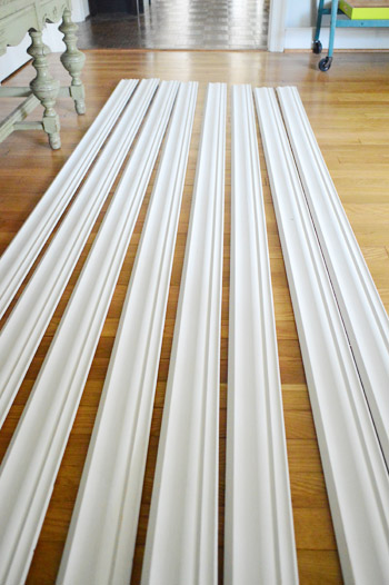
Alternate punny post title: Gimme Some Moore. Yes, that was a Busta Rhymes reference. Dude, that song was my junior year jam. And speaking of jams, our new nail gun is our latest. John’s totally ready to get his crown molding install on this weekend, assuming he can wrestle it out of my hands. Just gotta let these guys acclimate a little bit longer…
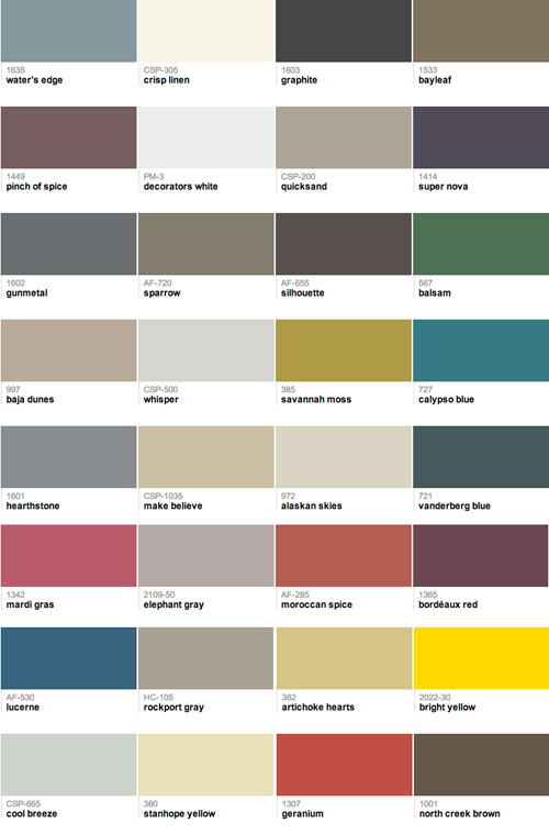
So while the crown molding gets to know our house a little better (and I dreamily gaze at it while whispering sweet nothings) we’re excited to share our 2013 Benjamin Moore paint picks! We’re a little tardy for the party with this – and a big thanks to everyone who has been asking about it! – but we just didn’t want to pull them out of a hat. So we took our sweet time finding the colors we wanted to marry. All 32 of them. It’s going to be the wedding of the century, guys.
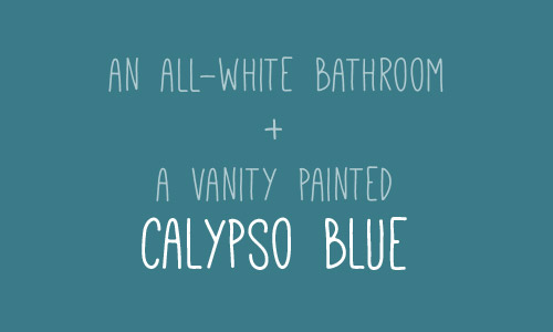
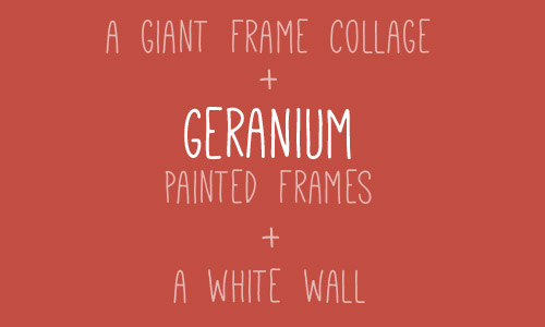
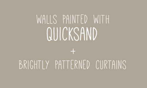
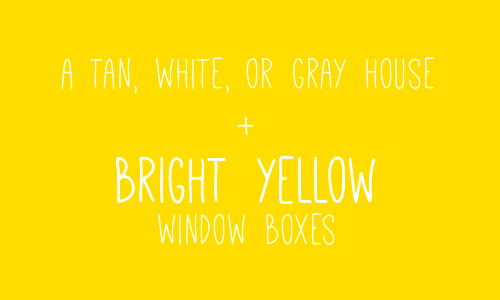
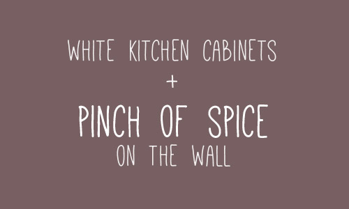
We thought it would be fun to toss out some more specific ideas for using a few of our picks right in this post, so here’s one now:
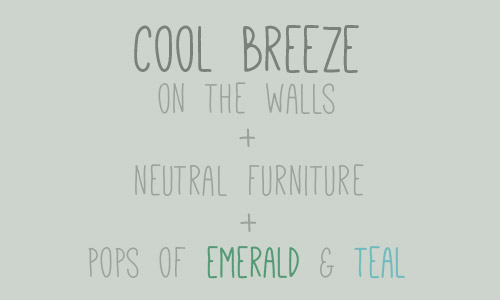
And here’s another one (you’ll find four more peppered throughout the post).
Some of the colors in the collection are tried and true tones that we’ve already used, some are colors that we’ve eyed forever, and some are colors that we used for our book (so we’ve seen those in action as well). You can check out all of our colors here (if you told us five years ago that we’d end up on the Benjamin Moore website, we’d have laughed at you for five minutes, gained our composure, and laughed at you for five more). And you can pop over to view our collection whenever you’d like by following this little sidebar button of ours…
We’ve been using Benjamin Moore colors for around half a decade, and we’ve been buying their actual paint since 2011 (we first tried it out on our office built-ins), so when they invited us to curate a collection of our favorite colors last year, it was pretty much a dream of ours. And jumping back in to choose 32 new colors for 2013 was just as much fun. This partnership is just like any other side gig that helps pay the bills – like writing a magazine column or our book – except we get to play with paint chips for this one, so… yeah buddy.
Our process was pretty simple. If by simple you mean splaying out 561 paint swatches (you think I’m kidding) in order to choose our favorite 32 colors. It was beautiful chaos, I tell ya. And I loved every undertone-investigating minute of it.
The goal is simple too. We just hope anyone out there who’s overwhelmed by a giant wall full of swatches will find comfort in a smaller collection of favorites to peruse and potentially use in their home. And we hope that some of the suggestions spattered throughout this post get your motors running. You know, in that exciting I-want-to-paint-something-right-this-second way. Or in that I-want-to-paint-something-but-first-I-need-a-marshmallow way. Either one.
And since we’re on the subject of color, have you guys used any paint colors that you’ve loved lately? Do you keep a little folder of your favorite swatches? Or a pinterest board full of ’em? How do you keep track of them all?
When we were choosing this collection we discovered that cutting out swatches individually and laying them all out on a neutral background (dark charcoal colored Karl, haha!) was a great way to see how they all worked together. And it helped us “balance” things by being sure we had enough dark choices, bold ones, neutrals, and soft and serene colors that weren’t too bright or too neutral. In short: if you have a few spare weekends and a neutral colored sofa, I highly recommend playing around with paint swatches instead of watching TV. Seriously, it’s right up there with a marathon of The Walking Dead (albeit a lot less bloody).
Psst- We picked a winner for this week’s giveaway, so you can find out if it’s you right here.

Leave a Reply