
Saving Money
Here are dozens of ways to help with saving money and cutting back spending - from how to make a budget and learn how to coupon to how to save money on utilities or save up for DIY projects - here are some ways to live a debt free life (paying in cash feels great!).
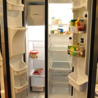
Using Up Everything In The Fridge Before Moving

The Process Of Selling Our House By Owner & Buying A New House

14 Tips For Saving Money When You Have A Baby
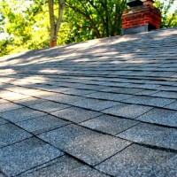
Answering Your Questions About Getting A New Roof

Take It Back: Returning Things That Don’t Work
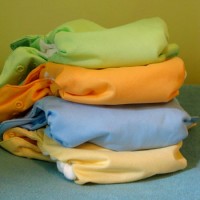
Cloth Diaper Tips

Some Great Money Saving “Dad Advice”

How We Stay Debt Free & Save Up For Purchases And Projects

10 Inexpensive Home Updates That Make A Big Difference
5 More Ways To Save Money
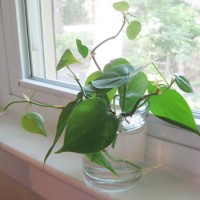
How To Grow Free Plants From Clippings
- « Previous Page
- 1
- …
- 4
- 5
- 6
- 7
- 8
- Next Page »