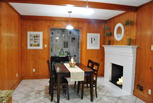
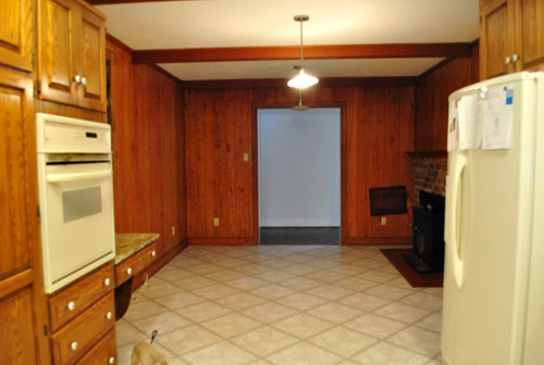
About a week ago (after we painted our brick fireplace) our kitchen looked like this:
Then we removed the desk and upper cabinet (that will be in the way of our big future doorway to the dining room) and after one coat of not-covering-at-all primer it looked like this:
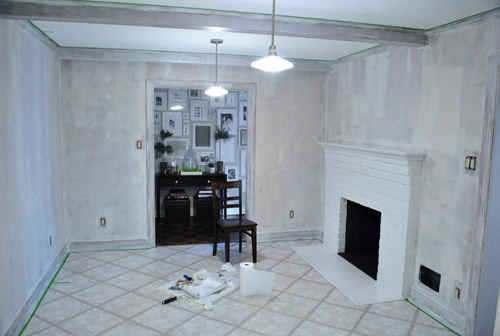
Then we finally got the primer thing right after dealing with maddening bleed-through issues thanks to two days of applying coat after coat and three different types of primer (more on that here):
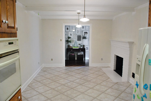
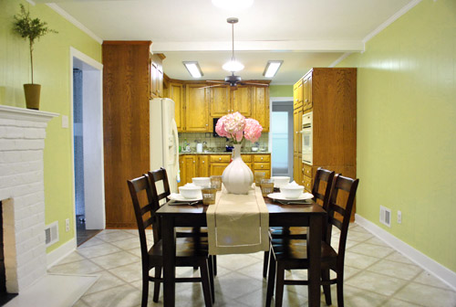
And now it looks like this, although it reads a bit more yellow in these photos than in person (it’s a smidge greener in real life).
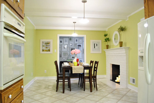
It’s definitely a warm golden green tone (aka: grellow). Sort of like the color of an artichoke heart.
There’s definitely a lot more to do in there, but we’re so glad to have the whole prime-and-paint-the-paneling thing checked off. Here’s a fun little video that encapsulates the entire process in three short minutes. Which is more than a little ironic because it took us just a wee bit longer in real life (you know, just a smidge). Just convert those minutes to days. See it below or here on YouTube.
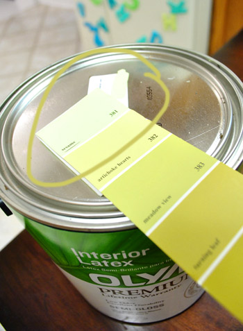
As for the paint color, after a decent amount of debate (and some pretty thorough consideration of the adjoining rooms that will be seen along with the kitchen) we opted for our new favorite color, which turned out to be Sesame 381 by Benjamin Moore (color matched to Olympic No-VOC paint in semi-gloss).
We were inspired by this kitchen (found here via Pinterest) since our cabinets will eventually go white, possibly along with our backsplash.
We chose this warm yellow-green color because we want the kitchen to be bright and happy (there aren’t any windows to the outside world – just one that looks into our sunroom) and it was suuuuuuper dark before we painted that paneling. We also knew the room could take a decent amount of color because:
- it won’t have any big long walls remaining when we add the extra-wide doorway to the dining room across from the fireplace (just slivers of wall here or there will remain, so the color won’t be overwhelming)
- we’ll be painting the cabinets glossy white later in this phase of our little kitchen makeover along with un-busying the backsplash (which will further temper the color on the walls)
- we’ll be adding an island in the place of our too-small table someday (with a different countertop and most likely a non-white base color to keep things interesting and layered)
- this room is surrounded by the dining room, the hallway, and the living room, which all have soft gray walls (so we wanted this space in the middle of them all to have some cheerful color going on)
When it came to our swatch-selecting technique we just hung up a ton of them and looked at them at all times of day to see which one we preferred. As for why we chose this swatch specifically, we decided:
- this golden-green tone will tie into the chartreuse curtain tones in the dining room and the cheerful green tone in our shaggy living room rug without being too matchy-matchy across the board (we didn’t want the exact same tone of green everywhere for fear that it would look a bit too “orchestrated”)
- a warm yellow kitchen is always a classic choice, but this color feels modern and crisp with the green undertones (and it’s not completely terrible with the oak cabinetry, which will stay for a little while)
- this tone is in Sue the Napkin – albeit a bit darker (a sure sign it’ll work with our whole house palette really well)
- unlike some of the other softer greens and greeny-gold tones that we considered, it really makes the white trim pop (lighter swatches didn’t have the same crisp effect next to the fireplace or the trim)
Here’s how it looked with the first coat going up around the fireplace (thanks to all that primer prep– we had really awesome coverage). Again, it’s looking more yellow and less green than it does in person in these photos, but you can really see how the white pops and how it turned a dark and brown-everywhere space into a sunny and bright room in the middle of the house.

We also decided that it was high time we switched out all of the “bisque” colored vents, outlets, and light switches.
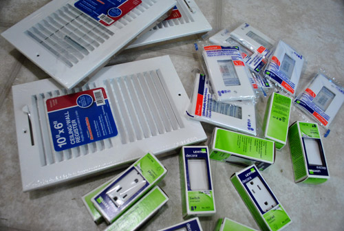
So we grabbed a bunch of crisp white ones from Lowe’s, turned off the power, removed the old ones, connected the new wires the same way they were connected to the previous switches, added the outer switchplates, and turned the power back on. The whole switch swap took about twenty minutes. So much better:
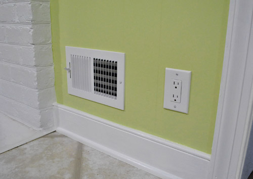
Some people opt to paint their vent covers so they blend in more, but for now we’re happy to leave ours crisp and new since we’re so used to old drippy painted-over covers (clean paint-free ones kind of feel like a luxury). Who knows if we’ll decide to add a few thin and not-drippy coats of paint to blend those vents in later though. We’ll keep you posted.
Oh and it’s really fun to go back and look at our fireplace, which originally looked like this:
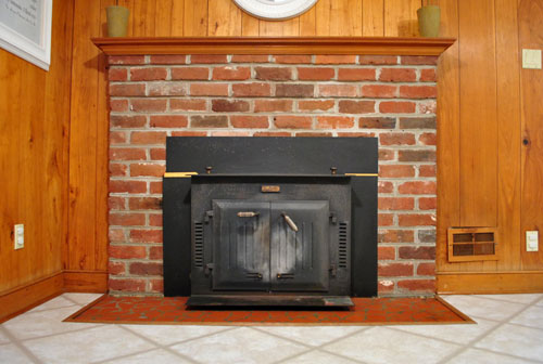
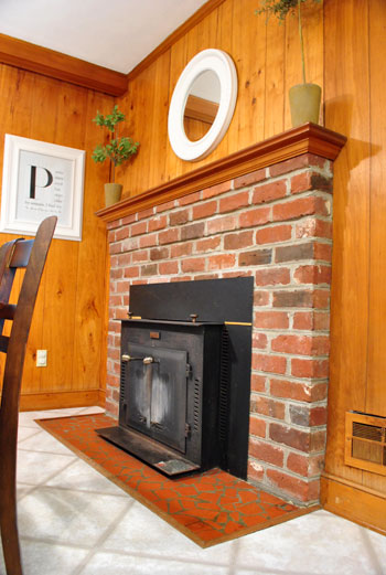
Then we removed the old unused wood stove and painted the brick, and it looked like this:
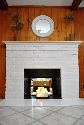
It’s amazing how much painted paneling can freshen things up even more:
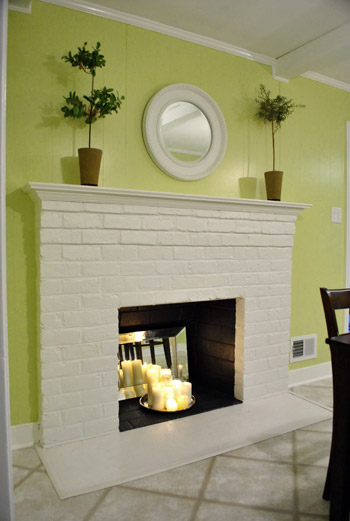
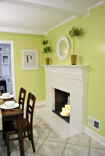
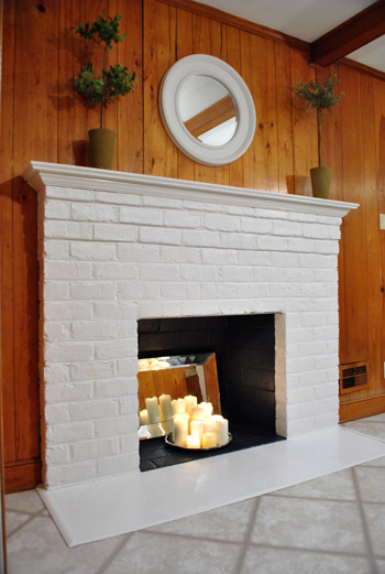
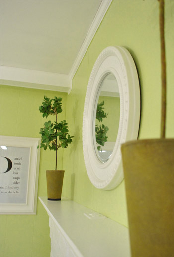
And we love how things like the white frames and the round mirror above the fireplace layer right in with the glossy white trim and beams:
Burger likey (he knows how to work that runway):
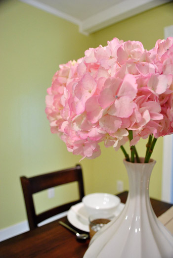
Oh yeah and see those pink hydrangeas? I wish I could say that we grew those, but they’re from the store. We figured to celebrate all that priming and painting we could spring for something soft and sweet, so these little pink snowball-looking-guys had me at hello (that’s an old vase from Target btw):
As for the opening to the dining room, here’s where it’ll be (it will line up exactly with the dining room window on the other side for balance):
We learned that we’ll need a permit to knock out so much of that load bearing wall, so it sadly won’t be anything we can do very quickly (and we’ll definitely be leaning on some pros for help). But we can’t wait to tackle it as soon as we can get through all the permit business and hunt down the right expert for the job.
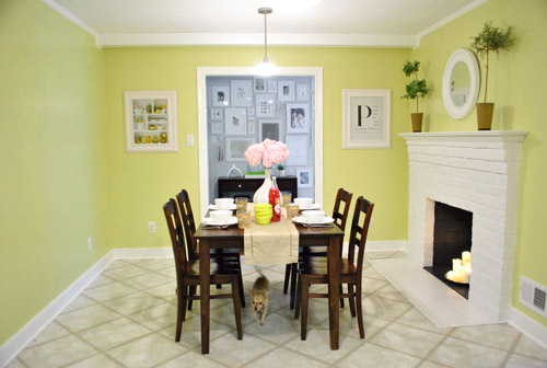
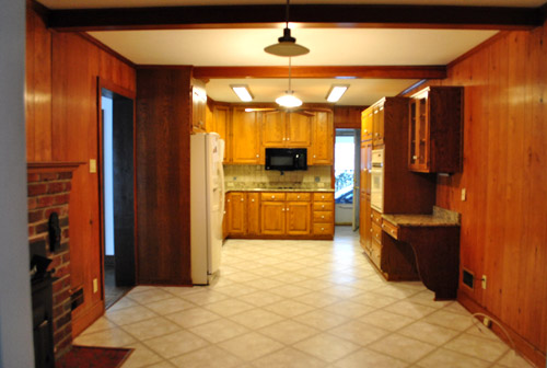
Now for some before & after bid-ness. Just because that’s my favorite part. Here’s the kitchen as it looked on moving day about six months ago:
And here it is now (still can’t wait to add that island, paint those cabinets, and upgrade the floor & appliances someday though):
Moving day again (yes, one of those lights was out):
And now:
The crazy thing is that these photos were taken around the same time of day so it definitely demonstrates how much lighter and more cheerful the space feels now that the dark paneling is a thing of the past. Oh and here’s the budget breakdown:
- Olympic Premium No-VOC primer from Lowe’s: $12
- Behr 2-in-1 Primer + Paint (in semi-gloss white): already owned
- Kilz Clean Start No-VOC Primer from Home Depot: $20
- Olympic No-VOC paint (in Sesame by Benjamin Moore) from Lowe’s: $22
- New vent and outlet covers from Lowe’s: $43
- Brushes/rollers/tape/paint tray: already owned
- Total: $97
So there you have it. The kitchen madness has officially begun. As we mentioned here, we’re definitely going to do this in phases (gotta save our pennies and just take things on as we can afford them). But it should be a whole lot of fun. As in, more fun than a barrel of monkeys. And definitely more fun than priming that paneling five hundred times. Do any of you guys have long term kitchen plans like painting the cabinets or adding an island or upgrading the flooring or making some overhead lighting switches (we’re definitely in need of some of that too)? Oh the possibilities…
Psst- We announced this week’s giveaway winner. Click here to see if it’s you.

Jen says
Hi,
Love the transformations, my husband and I are slowly updating our first home and have a 16 month so I’m sure you can relate to home updates that occur during naps and after bedtime hours:) Anyway, we just finished refacing our old fireplace (we used drywall, marble, and wood – painted white, of coarse) and I love the round mirror and bonzai (sp?) trees you used to decorate. Could you tell me where you got them?
Thanks and awesome job! Jen
YoungHouseLove says
Thanks! The round mirror was from TJ Maxx (painted white, it was a originally sponge-painted brown and bronze finish – eeks) and the topiaries were from Crate & Barrel a while back (they’re faux).
xo,
s
Stef says
Do you know if they sell no VOC paint at Home Depot? Have a new baby so want to go no VOC, but Lowes is really far from me. Thanks!
YoungHouseLove says
I believe they do – they used to sell a line called Freshaire but I think they took that away since other brands they sold were going no-VOC (like Glidden I think? and maybe Behr?). Hope it helps!
xo,
s
Anna says
I’ve been playing with colors for my kitchen, and think this one may be just the thing! But I’m also considering using the Robert Allen Peacock fabric as curtains in the kitchen. I know you’ve got that in the next room – but do you think they’d work in the SAME room??
YoungHouseLove says
Oh yes, I think it would be really pretty!
xo,
s
Hilary says
Hi! So I have sort of a big question for you. I truly appreciate your thoughtfulness and opinions about things and trust you know way more about the stuff than I do! Basically we just bought a house outside savannah. Well my husband did (he’s in the army and went to get us a house alone since I stayed home with our 1 year old. It was too much to take him along. Talk about a nervous wreck buying a house you’ve never seen!). I trust he did a great job. Although the kitchen is the one thing I’m not thrilled with. It’s new and fairly updated, just not my style. We’re with you guys with the bright white kitchens. So hard to find! Now, it has cherry cabinets and grayish corian counters. The paint color has to go. So, my question to you is do you think grellow like your Benjamin Moore sesame would look nice or clash with cherry cabinets. I know hard to say without seeing. We may try to switch things up post an upcoming deployment to make things white but I don’t want to bet on that. And also don’t want to paint now to match this kitchen and paint a year later for another one! Hot mess I know! Any recs?? I too think a grellow is classic for a kitchen and it matches our style preference as well. Maybe other colors that could work? Sorry so long winded; I’m on a roll! Thanks in advance if you have time to answer!
YoungHouseLove says
Ooh yes try a few grellow swatches and some light sage ones. Celery and sage tones look pretty with wood!
xo,
s
Palomita says
went a smidge lighter for our kitchen :) testing samples now, thing we might go with 388 cypress grove, slightly more yellow. thanks for the paint inspiration!!!
YoungHouseLove says
Good luck with everything!
xo
s
Brooke says
Hi!
Your blog is so much fun!
I am the type of person who splotches right on the walls and then reverts to a “safe” color. I love your kitchen! I bought a sample at a Ben store but would like to use the same formula you did. I haven’t always had success having Ben matched.
Would you please give the formula for your matched Sesame?
Love your blog.
xoBrooke
YoungHouseLove says
Oh man there’s paint on the lid, but they have the combo in the computer (they just looked it up and mixed it for us).
xo,
s
Cristy says
I love your kitchen (both in grellow and in Colorado Grey)! I’m getting ready to paint our office, and I assumed I’d need to rip out the paneling and hang drywall for a smooth, updated look. But I noticed you guys painted right over the paneling in the kitchen, and from the pictures it doesn’t look tacky! Did you debate drywalling instead?
Cristy says
oops, I just found the “Bane of our Existence” post on paneling where you talk about how you made your decision…so nvmd! :-)
YoungHouseLove says
No worries :)
xo
s
YoungHouseLove says
We painted over paneling in our first house’s den and always loved the texture (it’s almost like beadboard) so as long as you don’t use a shiny paint (I’d go with stain or eggshell) it should look nice if you don’t mind the vertical texture (we love it).
xo
s