Me + a picture of our kitchen + photoshop = this post.
Back in December when we bought our kitchen stools (from a school supply store for $32 a pop) we mentioned we were entertaining a number of ways to tweak them down the line (painting them, upholstering/staining the seat, etc) but just couldn’t shake the feeling that we should live with them a while first – just to make sure we weren’t doing anything rash in the middle of a kitchen remodel. We basically wanted the room to come together, live with them a little, and then make the call.
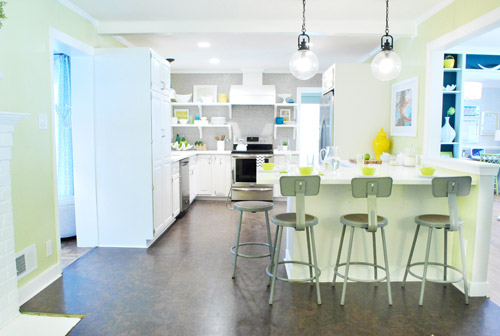
It was actually really nice how they tied into the stainless appliances, felt kind of geek-industrial, and even brought the gray color in the wall of penny tile over into the other side of the room. But after a nice long time of thinking it through and weighing our options, we decided… it’s time to paint them! It’s not that we don’t like how they look as-is as much as we think a new coat of paint could look infinitely better. From good to great if you will. So without further ado, our musings…
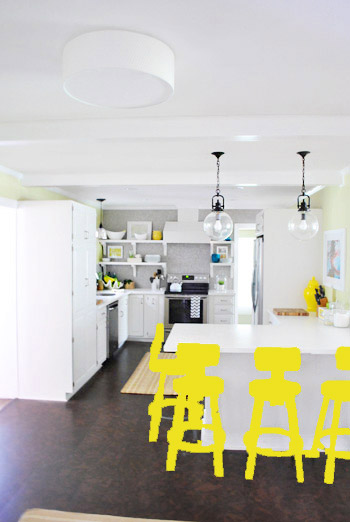
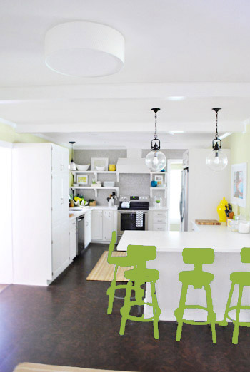
Our first thought was a dark teal color. Don’t mind our horribly photoshopped stool rendering (it’s not a very accurate portrayal at all, but in our brain we think we can almost picture it).
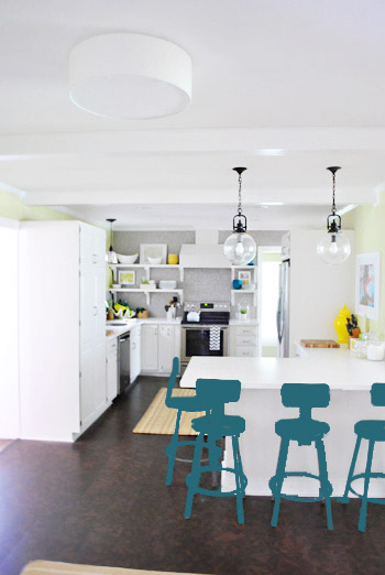
Why dark teal? Well, see the back of the built-ins in the adjoined dining room in this older shot of the room on the right?
Since the kitchen and the dining room are now open to each other, we just love seeing a sliver of that dark teal on the built-ins when we’re in there, so we thought bringing a bit more of that color in with the stools could be fun. Although it could be a little too matchy-matchy too, so we kept playing around with other options.
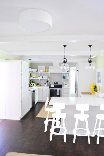
Like white, which is a little too… white for us. Haha. There’s just so much lightness in the cabinets and counters that although glossy white stools would look modern and clean, we think it’s just too flat for us.
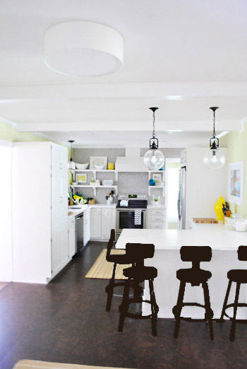
Next we tried ORB (oil-rubbed bronze), which would probably be an easy win. We worried it would blend in too much with our floor, but at least from this terrible rendering they look like they’d pop in front of the white cabinets/counter. And they’d balance the dark hardware on the pendant lights above (I also tried a dark charcoal gray but they didn’t look as good as the ORB rendering, so I figured that was the better option. But it’s not the most happy and exciting choice out there.
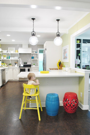
Then we tried yellow since we like the other random pops of yellow in the room – like that jar next to the fridge and that planter on the open shelves. But it looked crazy-scary. Might just be photoshop though, so I decided to bring Clara’s yellow highchair in and see how that looks in front of the peninsula (since surely it can’t look this nuts in real life).
Sure enough, it looks pretty cute:
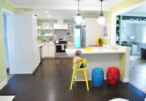
I also brought in a random HomeGoods/Joss&Main stools from other rooms (blue = HomeGoods, red = Joss&Main) just to see how those colors would look. We actually really liked all three of these color options. It’s fun to have a little pop of happy at the peninsula, right?
Of course the blue one looked awesome with the pops of blue on the open shelves, but this exercise actually got us seriously considering tomato red, since it’s not in many other places around the house (so it feels exciting and new). It would also pick up some of the red tones in our Lady Swimming print next to the fridge, which could be fun. But since the chairs wouldn’t be low-lying garden stools, and would be four metal stools with backs, in order to picture it, I bounced back to my good friend Photoshop.
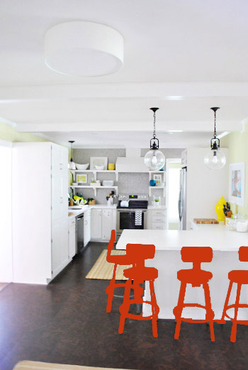
Our only fear is that with the yellow-green walls, red or deep orange chairs are a little too McDonalds for our tastes (especially when viewed from the other side of the kitchen – looking back towards the fireplace nook, which has a lot more green paint going on than this view). So next we decided to give leaf green a try…
… and a deeper emerald color…
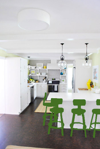
All of them could probably work, so they got logged as other alternatives. It was at this point that we realized that a number of things could work in our pretty neutral kitchen (white and gray and brown pretty much goes with everything), so it’s just going to come down to choosing whatever color we like best.
Next it was onto blue, where we tried a lighter teal color with a fair amount of gray in it:
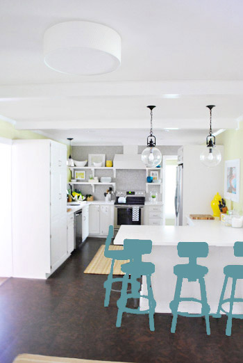
Of course these renderings aren’t very true to what things will really look like in real life with light bouncing around and not everything being the same flat shade – so something that looks the best here could totally read differently in real life. But the truth is that we love a room with a pop of color in the stools, like this, this, and this), and our minds change about what color we want to go with every day.
Oh and how funny is this? Right after I shot this picture…
… I walked into the office and saw this stack of books…
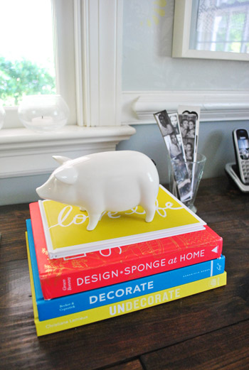
Guess I’m just a die-hard fan of those colors. Haha. For accessories, potential stool colors, and beyond!
You know we’ll keep you posted when we make a final decision! Hopefully within the next week or two – because these renderings are getting us excited. Haha. And this little photoshop exercise was comforting because it helped us realize that there are any number of ways we could go instead of having to find the “one right color” like hunting for a needle in a haystack. I’m sure you guys will weigh in with your favorite stool colors in the meantime, right? Anyone else playing around in Photoshop or bringing items from other rooms to see how certain colors or shapes will work?

Marcy says
I love the leaf green – it seems to blend in and stand out at the same time. I know what ever you pick will be amazing in your home.
rennie says
I love the yellows and greens, but I think they compete/clash too much with the wall color. The teals are best. Go with the slightly lighter/grayer one if you don’t want to match the dining room shelves too much. It complements all of your kitchen colors very well and is still a pop of color. The red is fun too and just stands out without competing. Another fun idea — what about white or gray on top and then a pop of color (teal, red?) from the seat down? That would be fun without being too rainbow-ish since the white is already in the room a lot. And the darker color on bottom would ground the stools a bit. Love them!
YoungHouseLove says
Always another way to go! Thanks for all the thoughts everyone!
xo,
s
Miranda says
I really love the teal but based on the (awesome) photoshop coloring I think the leaf green looks great! Can’t wait to see what you choose?
Emily says
You could maybe just leave them as they are for the most part but paint or make a cushion for the bit you actually sit on? Maybe a stripey pattern! Teal and yellow?
Loving your blog all the way from scotland! I’ve not long discovered it so thoroughly enjoying looking through all the old posts!
YoungHouseLove says
Aw thanks Emily! Say hi to Scotland for us! Adding a colorful cushion is definitely another way to go!
xo,
s
Lisa G. says
I have a photoshop tip for you that you might enjoy:) When painting a color over the stools, set your brush mode to “soft light”. It will allow you to see the details of your stool underneath. If the original color of your object is quite bold or dark (you can’t see light pink over navy very well for example) then just set your mode to “saturation” using grey first, and then paint over with the color of your choice on “soft light”. I hope that I’m not being annoying/anal, but it will help you to see the potential color a little better:) I like the dark blue to match the bookshelf!
YoungHouseLove says
Love that tip! I didn’t bother making a mask or using the multiply/opacity tools, but that’s another way to get a much more accurate look. Love it!
xo,
s
Alix says
I’m probably the only one who thought this, but when the title “stool musings” came up in my Google Reader, I definitely wasn’t thinking about chairs…
YoungHouseLove says
Haha, a few others have mentioned that too!
xo,
s
Mandi says
Funny thing – at the bottom of this post in my Google Reader was a McDonald’s ad with a bright blue background with their red and yellow logo right at the top. It matched your last picture of books perfectly!
YoungHouseLove says
Haha- so funny!
xo,
s
Lisa G. says
I’ll inbox you to youngsters@younghouselove.com my rendering using soft light if you are interested.
YoungHouseLove says
Sure, sounds like fun!
xo,
s
Tara says
My 7 year old boy and I really like the yellow. It’s bright and cheerful! I know whatever you choose will look fabulous!
Rachel says
Not loving the idea of all the different colors as others have suggested…I LOVE the leaf green. It provides some color, but also has a neutral tone in a way, so it isn’t overpowering. Next choice would be the light teal. Soooo, I expect you to follow my advice. lol
Sue says
Purple! No one has voted for purple! Just kidding!
I think once the rug comes, the color choice will be easier to make. Any one of your ideas could work and look great. And it’s nice that you can always paint them again down the road if you get tired of whatever you choose.
Laura says
team yellow all the way!
Kim S. says
For what it’s worth, I vote dark teal or yellow!
Debbie @ My Little Mess says
I vote for the green (both light and dark) to pick up the greener shades of the paint, but the blue or teal would be fun to, though!
Julia says
Ok, so first of all, the visual of you guys coming up with “stool renderings” made me almost spit coffee all over my computer monitor.
And second, I vote for turquoise/teal! So pretty! Maybe you could apply the same color as the built-ins? Or maybe that would be too matchy-matchy?
And finally, are you toally married to the idea of painting the entire chair? I think they would look fab in their original color, with just the seat painted with a pop of color? Or maybe upholstered with some fabric in a fabulous print?
YoungHouseLove says
Haha, stool renderings. As for painting the entire chair, we think it’s what we’d like most but who knows where we’ll end up!
xo,
s
Kai says
I vote red!
Katy says
I agree with a lot of the other comments– I think having each stool be a different color would be a great idea! They are still obviously a set, since they are the same shape, but instead of bringing in a large amount of one color, maybe small(er) pops of each would look good! Plus, it’s just paint so if you hate it, you an always change them in the future.
Sara says
I just love all this color talk in general! I connect so much more with your new(wer?) house than with your first house – and even though I’m very impatient, it’s great to read about your thought process and why you rule things out the way you do…very educational for a design-novice like me:)
YoungHouseLove says
Aw thanks Sara!
xo,
s
jackieb says
I really like the red and the greens because they make such a statement, but the grey teal looks like it’s been there all along. Can’t wait to see what you guys do.
Sarah says
For me, the choice is an easy one. I think the muted teal works really well in the space. Not too bright and demanding of attention, but just enough oomph to really liven it up.
And John- you can still get those bold stripes you wanted if you upholster the seats in a graphic black and white. It would be a bit more subtle than a giant rug, and would read really nicely on the softer color of the chairs. Good luck with the decision! Picking a paint color is always the fun part for me.
Adrienne says
I know you weren’t really asking for a vote, but my vote is for dark or light teal! Even the funky photoshopped version looks great.
Dlichten says
I still like the industrial look! My sister had chairs sandblasted to the bare metal at a car shop. It is a cool look.
Samma says
Liking the yellow & the teal (but the eggplanty purple sounds great to me, too). But what about a Bright color to Steel Ombre?
YoungHouseLove says
Always another possibility!!!
xo,
s
Carly says
I love all the paint ideas! Not to be repetitive, because I know others have mentioned a fabric seat, but I was thinking you could paint your favorite color and if you wanted, you might be able to do a “slip cover” for just the back rest – unless you think that’d look too funky :) I could see some fun geometrics or florals (cool -not gaudy- ones) working there way in there!
YoungHouseLove says
Another fun possibility! Thanks for all the thoughts guys!
xo,
s
mp says
Ooooh, I like that idea!
Emily says
I’m loving the leaf green and the blue color from the HomeGoods stool. Can’t wait to see what you pick!
threadbndr says
I’m voting for one of the teals – I like them both, but the lighter, greyed one inches out the ‘matches the bookcase’ one by a nose. I thought I’d like the ORB, but you’re right about it being too close to the floor color.
Suzy says
Like the yellow for some reason…probably because of a darling little toddler sitting their modeling!!!I know you will go with what works best for you. Happy painting!
I like the idea of painting them all the same color. More pleasing to the eye!
Frida says
Mmh…not knowing what your rug is gonna look like I’d go with blue..it stays within the vicinity of green/teal without being too matchy I think. While looking at your kitchen I always thought that raspberry pink as an accent (with red undertones rather than hot pink) would look awesome with the grellow walls. Or do you have a strict “no pink policy” as far as furniture is concerned? (Maybe Jarvis could also make his comeback in “raspberry” ;-))
YoungHouseLove says
Haha- I think John would nix four pink stools but you never know…
xo,
s
Courtney F. says
Leaf Green! It plays off all the other shades in the room, without being too matchy-matchy.
christa says
I say either the ORB, yellow or the light green.
Kristine says
I vote for teal or blue! What about consulting with Sue the Napkin?
YoungHouseLove says
She’s actually down with a bunch of options!
xo,
s
Karri says
Def the blue. Love it. Not the red. I like red, but it did look too McDonalds-y.
Serina says
How about a gradation of the same color? Hombre is so in these days! ha!!
YoungHouseLove says
Haha, a few others have said that too! You never know where we’ll end up! Will keep you posted…
xo,
s
mp says
Why not a different color for each chair, like Clara’s high chair and the red & blue stools? I think it adds interest.
Does sitting ever get uncomfortable? I can’t sit on uncushioned chairs very long without having back pain and difficulty straightening out once I get back on my feet. But I’m also an old person.
YoungHouseLove says
They’re actually really comfy for a few hours (I wouldn’t watch Titanic or read Moby Dick in them, but they’re great for dinner or approving comments for a few hours). As for different colors, we think we’re into all one color more just because we love the look in the inspiration kitchens we linked to in this post! Who knows where we’ll end up though!
xo,
s
Emily @ The Happy Home says
you know what might be a fun, happy medium? i love the ORB against the white, but what if you did that popular “dip” effect on the bottom of the chairs? you could do it in white, those three cute primary colors, or something metallic-y to not lose the industrial feel of the chairs. i want to do a gold dip on my kitchen chairs!
YoungHouseLove says
That’s another possibility for sure!
xo,
s
Alli says
I vote all one color. You can’t go wrong with teal, but the yellow seems more fun and currant. Love your blog and I marvel how much you get done in a day especially with an active toddler in the mix…..
YoungHouseLove says
Aw thanks Alli!
xo,
s
sherri says
All of those pops of colors look like fun, but have you considered a brushed nickel/chrome to match the appliances with a bright colored seat?
YoungHouseLove says
Always another possibility! We promise to keep you guys posted!
xo,
s
Sue says
I think the ORB is my favorite. It has a sophisticated and grounded sort of look, which I think works well with fun pops of whimsy like you have. Having said that, I think you’d need a darker frame on the swimmer art and not sure you’d want to do that. My next favorites are the blue/gray and leaf green.
Tara says
I’m totally in for the orangey-red color!! I’d want to toy around with the dipping technique and have 4-6 inches of the stool legs in white or something.
karla says
I love posts like these! I like seeing your process and how you work. Often times people just want the instant gratification of a lot of your posts but don’t actually appreciate the time it takes to get to that end point. This actually does show that you think about things and sit on the computer and do renderings and mill over things for a while. That takes alot of your time to do as well! I personally love all of the color choices but the kelly-ish green and tomato red/design sponge color would defiantely be my faves!! I love the idea of gradiating the colors as well but that could end up busy as well. Good luck with your final decision! I was looking forward to doing some furniture painting outside but its cold and rainy here in Nebraska, so It will have to wait :(
YoungHouseLove says
Aw thanks Karla! Hope it warms up for you soon!
xo,
s
Ellen says
Wow, I’m so sorry there are haters out there! How many people would be able to keep up with everything going on in your lives?! Sheesh. Anyway, I love the first and the last colors for stools! The last one is my favorite – a sort of Restoration Hardware color. :) Good luck with everything!
A Wife and her Carpenter says
So, I was noticing a trend in the pictures of the bright colored stools, that you linked to near the bottom of the post: they all are below the counter height. Have you ever thought of changing out the ones you have for something that wouldn’t obscure the line of the counter top?
I love the ones you have an think they would look awesome painted, but was just curious what your thought process was on that.
P.S. I love your blog and am so thankful that you guys do these “opinion” posts. My husband and I have our own blog and I love throwing out posts and asking for people’s opinions! :) It makes big decisions a lot easier.
Oh also, how do I submit something for a reader redesign?
YoungHouseLove says
We can actually remove the back-rest of the stools to make them under-counter stools, but we love the back so much and they’re so comfy- so we’re willing to take a chance with them as-is! As for a Reader Redesign, check out the contact us link on the button on our sidebar with our grinning mugs on it! Haha.
xo,
s
A Wife and her Carpenter says
Ooo that is great that you can remove the backs if you want! I agree with you, stools with backs are way more comfy!
Thanks for the info on the reader redesign! :)
Nicole says
Well it looks like I would be a minority with my suggestion, but I say that the orangey color in your first house reference would be the way to go!! Oh, it would SO bring out the color in the swimming lady picture! Plus, its kind of an “industrial-geeky” color! :)
YoungHouseLove says
We tried orange in photoshop but didn’t really like it! Who knows where we’ll end up though!
xo,
s
erika m says
I am sorry I haven’t read through all(500+) comments, but my 2 cents..did you consider painting the top of the stools with a pop of color and ORB the bottom half or do the bottom half a different co-wherever a good stopping point is-its hard to tell. That way it would feel grounded but colorful. I love the yellow and green. The teal felt clashy against the floor for some weird reason. I think anything would look great…but I agree with your idea of no white…too matchy
YoungHouseLove says
Oh yes, that’s definitely another possibility!
xo,
s
karla says
Oh! or you can do the chairs in like ORB and dip the legs or feet in a bright color! That would be fun too!
YoungHouseLove says
Another fun idea! So many thoughts here guys – thanks!
xo,
s
Sherri says
I love the teal and the yellow!! It is definitely your house/kitchen but the dark green reminds me of the hunter green/maroon takeover of the 90’s. But I do think a bright green would look fun like granny smith apple. I can’t wait to see what you pick!!
Katie says
team teal!!
Wrenaria says
Clearly you guys need some Photoshop help. Maybe this will make it easier to visualize:
http://bit.ly/JCiuAK
:)
YoungHouseLove says
Haha- yeah I did it the lazy way- no masking or opacity or multiplying!
xo,
s
Wrenaria says
Well. I did the work for you in like 10 minutes, lol. A pdf for ya: http://bit.ly/JCiuAK
YoungHouseLove says
Would love to see it but I can’t open it. Maybe my computer thinks it’s a virus? Can you link to it on flickr? So sorry for the trouble!
xo,
s
Wrenaria says
Oh sad. Here, I made a Flickr set for you: http://www.flickr.com/photos/wrenaria/sets/72157629986798846/
Use them however you like!
YoungHouseLove says
Awesometown! I love it!
xo,
s
Kitty O says
Ah, much easier to visualize! I’ve said I think painting them yet another bright color will look too busy, but in those pics, the light blue probably looks the best. The darker colors are just too much of a focal point, too overwhelming.
I don’t know if this will work any differently for you, but here’s the URL for Wrenaria’s photoshopped pics: http://people.oregonstate.edu/~hescockk/temp/yhl-chairs.pdf
YoungHouseLove says
Love all of them so much!
xo,
s
Samma says
Wow, big difference between the photoshop mockups and the quickndirty! This way, I like the aqua, light green and teal. White, ORB, Yellow & Tomato look ‘wrong’ and the grey just disappears.
Nice of Wrenaria to whip that together = )
Erica says
Yellow no teal no yellow… I vote one of the two
Sarah says
I love the yellow too! What if you did the tops yellow and ‘dipped’ the legs with the teal blue or white or something? I love that dipped look!
YoungHouseLove says
Another possibility! You guys are all full of ideas today. Love it.
xo,
s