Me + a picture of our kitchen + photoshop = this post.
Back in December when we bought our kitchen stools (from a school supply store for $32 a pop) we mentioned we were entertaining a number of ways to tweak them down the line (painting them, upholstering/staining the seat, etc) but just couldn’t shake the feeling that we should live with them a while first – just to make sure we weren’t doing anything rash in the middle of a kitchen remodel. We basically wanted the room to come together, live with them a little, and then make the call.
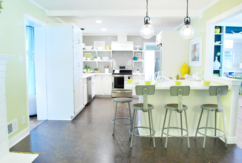
It was actually really nice how they tied into the stainless appliances, felt kind of geek-industrial, and even brought the gray color in the wall of penny tile over into the other side of the room. But after a nice long time of thinking it through and weighing our options, we decided… it’s time to paint them! It’s not that we don’t like how they look as-is as much as we think a new coat of paint could look infinitely better. From good to great if you will. So without further ado, our musings…
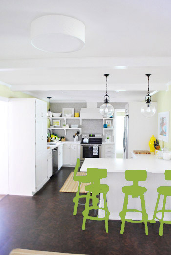
Our first thought was a dark teal color. Don’t mind our horribly photoshopped stool rendering (it’s not a very accurate portrayal at all, but in our brain we think we can almost picture it).
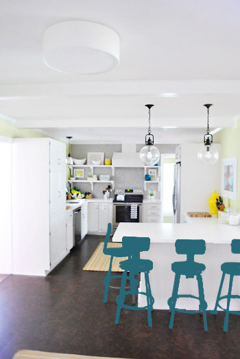
Why dark teal? Well, see the back of the built-ins in the adjoined dining room in this older shot of the room on the right?
Since the kitchen and the dining room are now open to each other, we just love seeing a sliver of that dark teal on the built-ins when we’re in there, so we thought bringing a bit more of that color in with the stools could be fun. Although it could be a little too matchy-matchy too, so we kept playing around with other options.
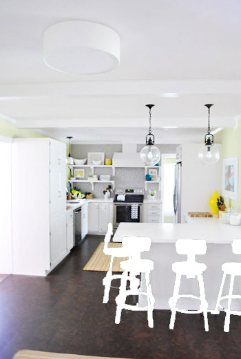
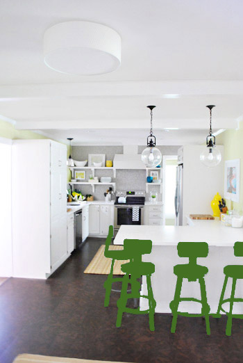
Like white, which is a little too… white for us. Haha. There’s just so much lightness in the cabinets and counters that although glossy white stools would look modern and clean, we think it’s just too flat for us.
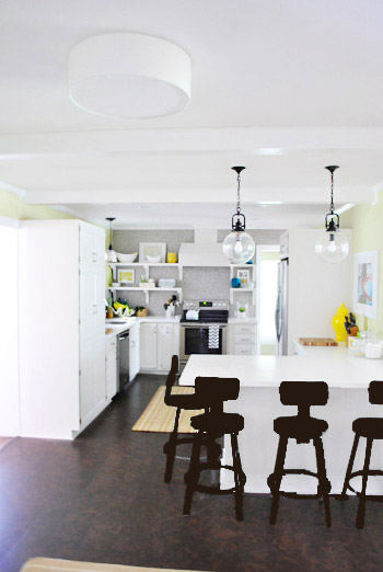
Next we tried ORB (oil-rubbed bronze), which would probably be an easy win. We worried it would blend in too much with our floor, but at least from this terrible rendering they look like they’d pop in front of the white cabinets/counter. And they’d balance the dark hardware on the pendant lights above (I also tried a dark charcoal gray but they didn’t look as good as the ORB rendering, so I figured that was the better option. But it’s not the most happy and exciting choice out there.
Then we tried yellow since we like the other random pops of yellow in the room – like that jar next to the fridge and that planter on the open shelves. But it looked crazy-scary. Might just be photoshop though, so I decided to bring Clara’s yellow highchair in and see how that looks in front of the peninsula (since surely it can’t look this nuts in real life).
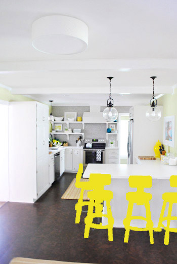
Sure enough, it looks pretty cute:
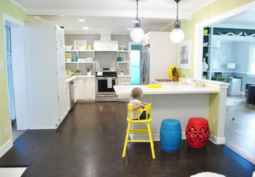
I also brought in a random HomeGoods/Joss&Main stools from other rooms (blue = HomeGoods, red = Joss&Main) just to see how those colors would look. We actually really liked all three of these color options. It’s fun to have a little pop of happy at the peninsula, right?
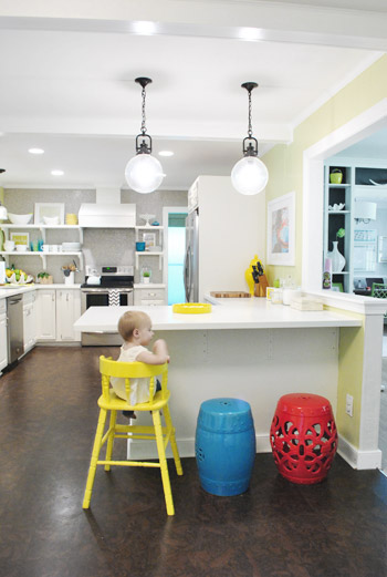
Of course the blue one looked awesome with the pops of blue on the open shelves, but this exercise actually got us seriously considering tomato red, since it’s not in many other places around the house (so it feels exciting and new). It would also pick up some of the red tones in our Lady Swimming print next to the fridge, which could be fun. But since the chairs wouldn’t be low-lying garden stools, and would be four metal stools with backs, in order to picture it, I bounced back to my good friend Photoshop.
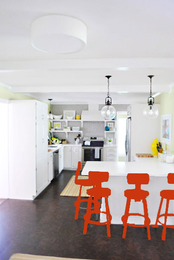
Our only fear is that with the yellow-green walls, red or deep orange chairs are a little too McDonalds for our tastes (especially when viewed from the other side of the kitchen – looking back towards the fireplace nook, which has a lot more green paint going on than this view). So next we decided to give leaf green a try…
… and a deeper emerald color…
All of them could probably work, so they got logged as other alternatives. It was at this point that we realized that a number of things could work in our pretty neutral kitchen (white and gray and brown pretty much goes with everything), so it’s just going to come down to choosing whatever color we like best.
Next it was onto blue, where we tried a lighter teal color with a fair amount of gray in it:
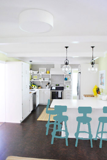
Of course these renderings aren’t very true to what things will really look like in real life with light bouncing around and not everything being the same flat shade – so something that looks the best here could totally read differently in real life. But the truth is that we love a room with a pop of color in the stools, like this, this, and this), and our minds change about what color we want to go with every day.
Oh and how funny is this? Right after I shot this picture…
… I walked into the office and saw this stack of books…
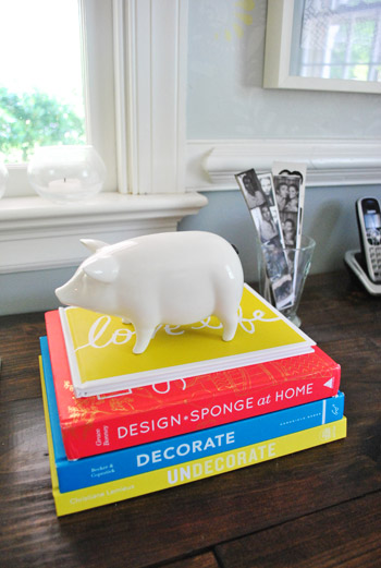
Guess I’m just a die-hard fan of those colors. Haha. For accessories, potential stool colors, and beyond!
You know we’ll keep you posted when we make a final decision! Hopefully within the next week or two – because these renderings are getting us excited. Haha. And this little photoshop exercise was comforting because it helped us realize that there are any number of ways we could go instead of having to find the “one right color” like hunting for a needle in a haystack. I’m sure you guys will weigh in with your favorite stool colors in the meantime, right? Anyone else playing around in Photoshop or bringing items from other rooms to see how certain colors or shapes will work?

Rebecca Crowell says
What if you paint parts of each stool different colors or shades…each stool being slightly different – like gray legs on one, gray back on another…mixing and matching but no 2 stools alike exactly. Hey, you can always repaint if it doesn’t work for you in the end.
YoungHouseLove says
Another fun possibility for sure!
xo,
s
Kristen Mackowiak says
Just a friendly photoshop tip.
To see a more accurate look of the stools with the color on top, just change the layer drop down from normal to overlay or you could even change the opacity so that you can see the chair underneath with the color choice on top.
YoungHouseLove says
Oh yes, I just did it fast with the paint dump tool, so I didn’t make layer masks or do anything with opacity/multiply!
xo,
s
Monica B says
I love the yellow!!!
Maribeth says
You’re right, there are so many options that would look great! My favorite is the teal though. It just sings!
Tiffany says
You guys have lots of awesome choices! When you paint the stools, are you only painting the metal part, or are you also planning on painting the brown seat and back part?? Whatever you guys go with will be great!
YoungHouseLove says
We’re planning on the whole shebang!
xo,
s
Laura says
The first dark teal was hands down my favorite. The yellow was a little too in-your-face-cute for my taste, whereas I felt the teal really connected the two rooms and the other blue accents in your kitchen.
Heather says
Team Yellow for sure! I feel like red could be overwhelming and the others were sort of boring, but the yellow is so eye catching and fun!
Stephanie says
Have you considered putting a poll on your blog to let everyone vote? My vote is red!
YoungHouseLove says
Last time we had a poll it crashed our site. Boo technology!
xo,
s
Bonnie Morscher says
At first, I was rooting for the teal, both because of the tie-in with the dining room shelves and because I love blues. But, after seeing Clara’s chair in there and even though yellow is my LEAST favorite color ever, the yellow option was the clear winner for me. And yellow and teal do look good together, so maybe teal fabric seats on those stools would be the icing on the cake.
Kerri says
Love the yellow, leaf green and the last blue/teal! What a fun way to throw some colour in the kitchen! Can’t wait to see what you guys choose :)
Tiffannie says
I’m digging the leaf green or the yellow.
Christine says
Love the teal to bring out the back of the book shelves.
Abby3 says
Light Teal or yellow FOR SURE! When you scroll through all of the pictures, those two just really seem to “work” seamlessly…..
Shona says
I see that several people have already suggested painting the stools all different colors, which occurred to me as well. But you’re probably right that it’s a little too Rainbow Brite.
BUT… has anyone suggested maybe painting two of the stools one color, and two of the stools another? Like blue and yellow, or blue and red (definitely not yellow and red due to the McD’s effect which you already mentioned)? It could give the stool area a little dimension without being too chaotic. I have no idea if it would work well, but maybe it’s worth a look in Photoshop :)
YoungHouseLove says
That’s definitely another way we could go! Not sure where we’ll end up, but we’ll keep you posted!
xo,
s
alex says
While the idea of colorful chairs is fun…I think with so many bright elements, it’ll start to look a bit funhouse-y and not mature patterns and textures…I love the bright patterns and fun pops of texture you always incorporate, and i love claras fun yellow chair but what if yoy went with a more exaggerated stainless steel look and then did pops of color on the actual seat part…or a fun stencil design to still bring color to the stools but while keeping the big colorful focus to the painting, rug, walls, pennytile, and the open shelving rotation. Love your kitchen love the bright fun elements but sometimes, less really is more.
YoungHouseLove says
Always another possibility Alex! In person our kitchen is extremely white (white cabinets and counters, even a white chair in the corner and a white fireplace) along with soft tones of gray (the tile, the stainless appliances, etc) so although there are small accessories with color, the room is really color-less when compared to other rooms we love (our living room has lots of colorful pillows and a big green rug, our bedroom also has a bright rug and pillows, etc) so it’s like the kitchen has bright pillows (in this case accessories) but no bright rug (which we’ll do with stools instead, and go with a more neutral gray rug to layer in). Hope it helps!
xo,
s
alex says
Okay, I see your point…also, sometimes photographs don’t do a room justice. My vote is yellow or leaf green! I def didn’t hate the color ideas, I kbow that your stools are also not chunky and square so it was har d to actually picture it..
Amanda says
the light teal is definitely my favorite! i feel like its a great combo with the wall color and ties in great with the white cabinets, floor, and penny tile too!
Caroline says
I thought the yellow looked the happiest! I’ve been trying to talk my husband into yellow dining room chairs for AGES!
Samantha says
I love the teal or either of the greens, but really any of them would look great (I’m sooo helpful, right?!). I can’t wait to see which color you choose!
Juliegolf says
I’m obsessed with the leaf green! It looks so nice and there is something about green and white that seems so clean!
Sarah says
I kind of love the teal that goes with the dining room built-ins, but it doesn’t make me happy the way the yellow does. But I think 4 yellow chairs more substantial than Clara’s might overwhelm the other fabulous kitchen elements. I like the greens okay, but they’re a bit attention grabbing as well. Then, the light blue/teal…be still, my heart! I think those are the perfect pop of fun color without taking away from the rest of the kitchen! It also helps that I’m a UNC Chapel Hill alum, so anything anywhere close to Carolina blue is a win for me!
To add another option to the mix, did you/would you consider a plummy color similar to Jarvis the ceramic chicken? I also think just the right coral color could be TO DIE FOR!
YoungHouseLove says
We tried an eggplant color along with sort of a pinky/purple Jarvis color in photoshop and we didn’t like them at all, but you never know what we’ll end up with in real life!
xo,
s
Ally says
GO TEAM GREEN! :)
(I’m a fan of either of the two colours you’ve shown :)
xox
Bonnie Sayers says
I vote for TEAL =) (Although I like yellow as well.) I was also thinking that you might want to include your rug choices in this painting decision. Maybe something like this Dash and Albert rug with teal chairs??
http://www.dashandalbert.com/product/view/fisher-ticking-woven-cotton-rug–RDA155
I can’t believe I’m giving you decorating advice. HA!
YoungHouseLove says
Haha, love the advice Bonnie! We’re definitely going to wait for the rug we have on order to come before making any final stool decisions! Will keep you posted!
xo,
s
Sarah says
can’t wait to see what you choose. I think a bright color that goes well with the grellow, grays, and white would be perfect. I also can’t help but say i’m astonished at how many catty comments there are. you guys are awesome, keep up the good work :)
Rae says
For what its worth I thought several of the colors would work great, but Yellow was my fav!
Erica says
My vote is for 4 different colors!
Rita says
Have you thought of brining the wall color to the back of the pennisula since from the “living” side of the kitchen all you see is the gray penny tile & white cabinets in that direction. It might make the “gray” stools pop off the counter and still bring the penny tile color over to that side of the room. You could always photoshop it just to see!
YoungHouseLove says
We did think about that but decided we like it white best since on the side of the peninsula where the white cabinets meet the color might look really weird (to have that seam, you know?).
xo,
s
Rita says
You were talking about doing something with the back of the pennisula so maybe some “Grello” panels? Even with painted stools it might help bring down the wall color?
YoungHouseLove says
We think we’re settled on keeping the back of the peninsula white (maybe adding beadboard or wainscotting there thought) just because the cabinets on the other side are white and it would look kind of odd from the side where you saw the painted color meeting the white cabinets on that side seam, ya know?
xo,
s
Myrna says
I really like the stools the way they are now and maybe you should wait until you make a decision on the rug for the fireplace area. That could give you even more options (as if you need more!!!)
YoungHouseLove says
Oh yes, no final decision will be made until the rug we ordered arrives! Should be any day now (we’ll share pics as soon as it’s here)!
xo,
s
Belinda says
I think I like Yellow the best – plus it would mean Clara’s highchair could have a permanent place at the counter and coordinate with your other stools!
Carli says
Love all these posts you guys do to show us the steps you take when deciding to tackle, yet another, amazing project in your sweet home. Thanks for sharing it all :)
YoungHouseLove says
Aw thanks Carli!
xo,
s
Susan says
I read your blog in Google Reader, so I see ads at the bottom of each post. I guess because you mentioned McDonalds, GoogleAds thought a McD’s ad would be appropriate. :) Anyway, the ad at the bottom was for the blueberry banana oatmeal, which meant the ad was blue, yellow and red, and for a second I thought you posted that as an inspiration picture! When I realized my mistake I laughed at the irony of the ad. Here’s a link to it on their site (enjoy!): http://www.mcdonalds.com/us/en/promotions/blueberry.html
YoungHouseLove says
Hahahahahaaha that’s hilarious!
xo,
s
Lisa says
I’m loving the leaf green!
Tiffany says
I love those pendant lights over your counter! Where did you find them? Brand? Style #? We’re remodeling and looking for inspiration. Thanks much and love your blog!
YoungHouseLove says
Those were from a local lighting outlet for $60, but I think you can find them on shadesoflight.com for a little more!
xo,
s
rowis says
I loooove the teal! And although I think the yellow/Clara’s chair looks good, I’m worried it might clash with the color of your walls? Kinda like when you tried that yellow rug in the kitchen a few days ago?
YoungHouseLove says
Yeah, we definitely wonder that too! Will keep you posted!
xo,
s
Meg says
What about a dark, METALLIC teal (surely there’s a metallic teal spray paint out there, right?)? I think that would be really lovely. Like the teal version of ORB, basically, haha.
Barb says
I say keep them the way they are.
You are definitely over thinking this one. If they were meant to be painted…you would have been able to buy them that way.
I say…Keep it gray!!! But I know you won’t……
B.
YoungHouseLove says
You can definitely buy them that way too! Lots of people sell them painted! Like this: http://www.etsy.com/listing/72550744/vintage-industrial-metal-atelier
xo,
s
HB says
Do. Not. Touch. ;) I have no idea why youl wouldn’t want to paint them….
angela says
What about the dipping trend? Paint them one color and just “dip” the bottom in another color? Maybe white with a funner (yes that’s a word) color below? LOVE the teal or apple green if you are going solid…or maybe dip with those colors…
YoungHouseLove says
Always another fun possibility!!
xo,
s
Aunt Lesa says
How about a tangerine or deep orange? Just throwing it out there.
YoungHouseLove says
We tried orange in photoshop and didn’t really like it but you never know where we’ll end up!
xo,
s
Tessa says
I love dark teal. But I also liked the suggestion of another commenter to do a *subtle* gradiation of colors across them. I think the teal/yellow/red could be too rainbow bright for my tastes, too – but a slight variation (dark teal – teal – light teal – or something) could be a cool way to add depth. The yellow high chair did look cute there, too!
YoungHouseLove says
Always another fun idea! We’ll definitely keep you guys posted!
xo,
s
Megan Circelli says
I love the dark teal look best! It ties everything together nicely!
Angela says
BLUE!!!!
I love the tie-in with the cabinets, plus all your other accents are yellow, so the blue would compliment that well. Like White and Gray are your main colors, then Yellow (walls, accents) then Blue (pop of color on chairs).
good luck deciding.
Teresa says
If you’re taking votes, I choose yellow!
Paula says
I like the teal. It would tie the two rooms together nicely. But then again my daughter always says I am too matchy-matchy.
Jaime says
I guess I’m safe… I would do the oil-rubbed bronze and then add a thin cusion in the teal coloring- it could get changed out if you want. I personally think too much bold spray painting could cheapen your beautiful kitchen… or you could just use a darker, warmer gray to enhance the stools and maybe make a colorful cushion that is removable. I hope I’m not offending you. You guys are very talented!
YoungHouseLove says
No worries Jaime! There are definitely lots of ways to go- and that could look awesome too!
xo,
s
Amy @ a new old house says
I’m loving the yellow! Can’t wait to see what you pick!
Do you think you’ll hold off on stool painting until you find the perfect rug, just to make sure it all goes?
I always get nervous about making decisions like this!!!
YoungHouseLove says
Oh yes, it’s on the way! We ordered it and it should be here soon- so we’ll share pics and hopefully have an easier time picking stool colors when it’s down in the room!
xo,
s
Dawn says
Wow, decisions, decisions. Here’s some food for thought, the area rug for the sitting area, that I believe you are still looking for, could influence your choice since those 2 areas are so close to other.
YoungHouseLove says
Oh yes, it’s on the way and should arrive soon! We’ll share pics as soon as it’s here and then hopefully find it easier to make a stool color choice!
xo,
s
Jenna says
My favorite part of this post is this sentence: “Don’t mind our horribly photoshopped stool rendering (it’s not a very accurate portrayal at all, but in our brain we think we can almost picture it).” I just love how you guys have one brain. I feel like my hubs and I share a brain at times too. :)
YoungHouseLove says
Hahahahahahahaha- hilarious. I promise we have two brains. John’s is just much bigger and full or more knowledge. Haha. I joke that he’s the brains of this operation.
xo,
s
Kellie says
definately the last grayish teal color!
dyna says
leave them as is for a change…
YoungHouseLove says
We left them as-is for five months and just decided it’s not our favorite look! But we definitely gave it lots of thought! We know there are lots of things people would do differently if this were their house, but we just gotta do what we love since we live here. Haha.
xo,
s
Mary Fitzgerald says
I vote teal or yellow! (probably because those are my favorite pops of color in my own house! haha).