Me + a picture of our kitchen + photoshop = this post.
Back in December when we bought our kitchen stools (from a school supply store for $32 a pop) we mentioned we were entertaining a number of ways to tweak them down the line (painting them, upholstering/staining the seat, etc) but just couldn’t shake the feeling that we should live with them a while first – just to make sure we weren’t doing anything rash in the middle of a kitchen remodel. We basically wanted the room to come together, live with them a little, and then make the call.
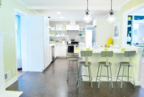
It was actually really nice how they tied into the stainless appliances, felt kind of geek-industrial, and even brought the gray color in the wall of penny tile over into the other side of the room. But after a nice long time of thinking it through and weighing our options, we decided… it’s time to paint them! It’s not that we don’t like how they look as-is as much as we think a new coat of paint could look infinitely better. From good to great if you will. So without further ado, our musings…
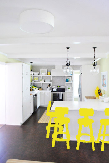
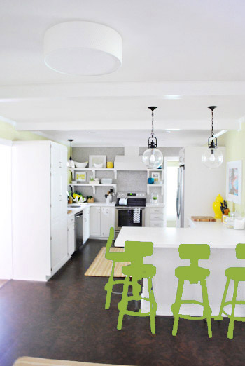
Our first thought was a dark teal color. Don’t mind our horribly photoshopped stool rendering (it’s not a very accurate portrayal at all, but in our brain we think we can almost picture it).
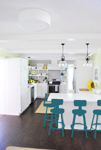
Why dark teal? Well, see the back of the built-ins in the adjoined dining room in this older shot of the room on the right?
Since the kitchen and the dining room are now open to each other, we just love seeing a sliver of that dark teal on the built-ins when we’re in there, so we thought bringing a bit more of that color in with the stools could be fun. Although it could be a little too matchy-matchy too, so we kept playing around with other options.
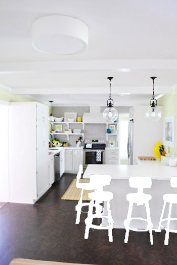
Like white, which is a little too… white for us. Haha. There’s just so much lightness in the cabinets and counters that although glossy white stools would look modern and clean, we think it’s just too flat for us.
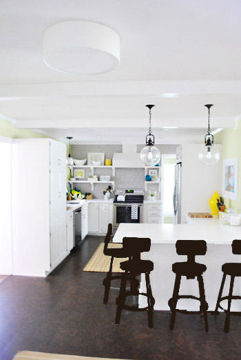
Next we tried ORB (oil-rubbed bronze), which would probably be an easy win. We worried it would blend in too much with our floor, but at least from this terrible rendering they look like they’d pop in front of the white cabinets/counter. And they’d balance the dark hardware on the pendant lights above (I also tried a dark charcoal gray but they didn’t look as good as the ORB rendering, so I figured that was the better option. But it’s not the most happy and exciting choice out there.
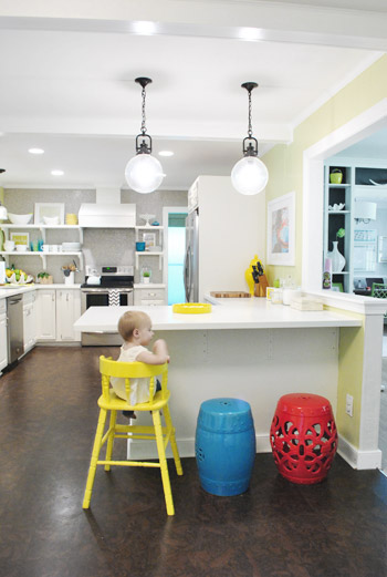
Then we tried yellow since we like the other random pops of yellow in the room – like that jar next to the fridge and that planter on the open shelves. But it looked crazy-scary. Might just be photoshop though, so I decided to bring Clara’s yellow highchair in and see how that looks in front of the peninsula (since surely it can’t look this nuts in real life).
Sure enough, it looks pretty cute:
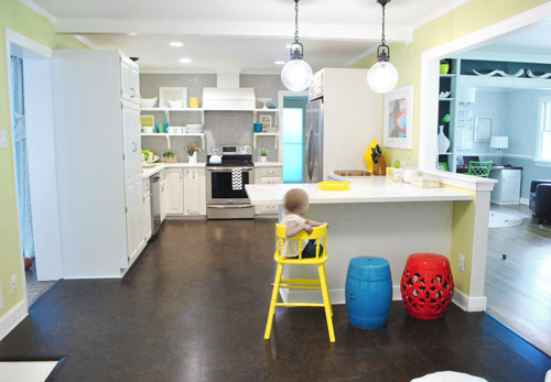
I also brought in a random HomeGoods/Joss&Main stools from other rooms (blue = HomeGoods, red = Joss&Main) just to see how those colors would look. We actually really liked all three of these color options. It’s fun to have a little pop of happy at the peninsula, right?
Of course the blue one looked awesome with the pops of blue on the open shelves, but this exercise actually got us seriously considering tomato red, since it’s not in many other places around the house (so it feels exciting and new). It would also pick up some of the red tones in our Lady Swimming print next to the fridge, which could be fun. But since the chairs wouldn’t be low-lying garden stools, and would be four metal stools with backs, in order to picture it, I bounced back to my good friend Photoshop.
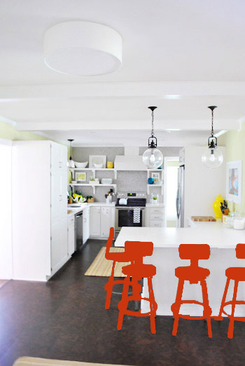
Our only fear is that with the yellow-green walls, red or deep orange chairs are a little too McDonalds for our tastes (especially when viewed from the other side of the kitchen – looking back towards the fireplace nook, which has a lot more green paint going on than this view). So next we decided to give leaf green a try…
… and a deeper emerald color…
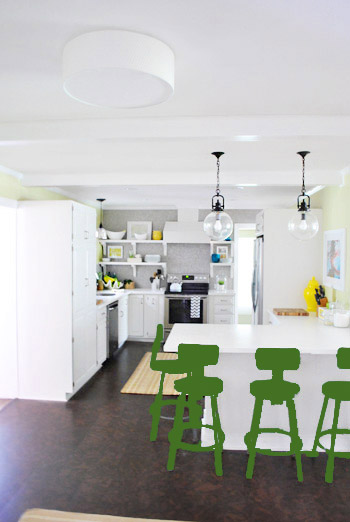
All of them could probably work, so they got logged as other alternatives. It was at this point that we realized that a number of things could work in our pretty neutral kitchen (white and gray and brown pretty much goes with everything), so it’s just going to come down to choosing whatever color we like best.
Next it was onto blue, where we tried a lighter teal color with a fair amount of gray in it:
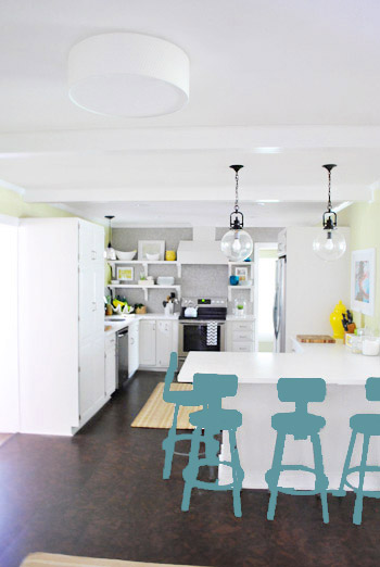
Of course these renderings aren’t very true to what things will really look like in real life with light bouncing around and not everything being the same flat shade – so something that looks the best here could totally read differently in real life. But the truth is that we love a room with a pop of color in the stools, like this, this, and this), and our minds change about what color we want to go with every day.
Oh and how funny is this? Right after I shot this picture…
… I walked into the office and saw this stack of books…
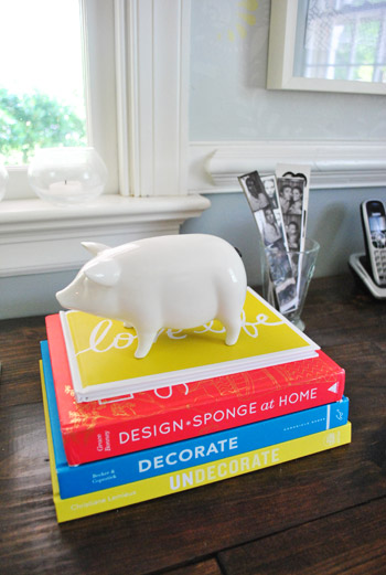
Guess I’m just a die-hard fan of those colors. Haha. For accessories, potential stool colors, and beyond!
You know we’ll keep you posted when we make a final decision! Hopefully within the next week or two – because these renderings are getting us excited. Haha. And this little photoshop exercise was comforting because it helped us realize that there are any number of ways we could go instead of having to find the “one right color” like hunting for a needle in a haystack. I’m sure you guys will weigh in with your favorite stool colors in the meantime, right? Anyone else playing around in Photoshop or bringing items from other rooms to see how certain colors or shapes will work?

Melody says
Multiple colors might be too rainbow bright… but what about just two colors? I vote yellow-teal-yellow-teal.
YoungHouseLove says
Another possibility I think! Will keep all of you posted. Thanks for all the thoughts!
xo,
s
Jara says
I love the yellow. Almost all the one you link to have accessories that match the stools. I’d think about switching out the dish towel for one with yellow and going for it
Katy @ The Non-Consumer Advocate says
Take them to an auto body shop and have them done in chrome!
Katy
YoungHouseLove says
Ooh another fun idea!
xo,
s
Briel K. says
I love the dark teal! I think that could turn out really well. I think it would look cute with some nice fabric if you decided to cover the seats later too. :)
Julie says
Cool post – always fun to read about your thought processes! You’ve got so many great choices. What I would wonder is how will the stools look with the future rug?
YoungHouseLove says
The new rug should be here soon and we’ll share pics (we won’t pick a final stool color until that’s in of course).
xo,
s
Jennifer @ Dimples and Tangles says
I vote for red! Never would have thought “McDonalds”, it just looks bright and happy!
Hannah says
What a well-timed post! I just purchased one of those stools for myself yesterday! (buying one versus buying four at the group price = not fun, but alas, gotta do what ya gotta do)
Long story short, I’m an architecture grad student and we have these stools (without backs) in our intro/core studios. Now that I’m in upper design, everyone has purchased coushined tall chairs, but I tend to fall asleep in those while drafting/building models (4am is quite unkind to the sleep deprived…) so I decided to buy a stool with a backrest! They are still comfortable, but I’ll be less prone to dozing off (I hope). I plan on leaving it gray, but will be painting the seat a white/gray chevron pattern, and adding my monogram to the backrest! I am insanely excited!! That little bit of happy in my studio space will bring me smiles, I am sure of it :)
And for what it’s worth, I’m totally on Team Light Teal! (with Dark Teal as a close second) I can’t wait to see what you guys choose!
Hannah says
Oooops *cushioned !
Clearly not an Enlish major.
YoungHouseLove says
Haha, I love the stool story! Hope it works out for you perfectly without any snoozefests. Haha.
xo,
s
Julie says
Oops total geek moment! Just saw the comment about the rug :)
YoungHouseLove says
No worries!
xo,
s
Paige says
Totally unrelated…but are these photos of your wall of frames featured on laurenconrad.com today??
http://www.laurenconrad.com/post/picture-perfect-how-to-hang-a-wall-collage-gallery
I thought they looked familiar!
YoungHouseLove says
Isn’t that cool? Such a small world!
xo,
s
RebeccaMac says
It’s so helpful to have the Photoshop skills, isn’t it? I just did a rendering in Illustrator and Photoshop of what it would look like if we built a screened porch on our back deck.
Stephanie M. says
Teal, yellow or leaf green. I’m actually kinda diggin’ the leaf green the most. I’ll wait to see the rug for my final decision. :)
Amanda says
I like the yellow a lot.
That or a light blue/green (not one of the options), but it would pick up on the Anthropologie glasses on your open shelves.
Perhaps not painting the wood of the stools the same color as the rest, too.
Maybe going with a darker wood color (closer to the floor color) for the wooden seat portion and spray painting the rest a bright color. That would probably make the stools look more expensive, post-touch up.
YoungHouseLove says
Always another possibility. Thanks for all the ideas everyone!
xo,
s
Andrea says
definitely voting for the lighter teal!
Wendy says
The obvious answer is… one of each color – yellow, teal, AND tomato!
Maureen says
Teal, please! The yellow looked really cute too, though. And, it matches Clara’s high chair, which is a bonus. Hmmm…. So maybe now I am rooting for yellow! Lol
Shellie says
Whoa, the title of this post does not give the best impression. I thought it was gonna be a little to in-depth cloth diaper update, LOL!
I cast my vote for leaf green or teal for sure!
What about a subtle gradient hombre going up the stool legs? That way each stool is the same but they have a little something special when you look at them.
So glad you are painting them. Can’t wait to see!
YoungHouseLove says
That could be fun too! Thanks for all the thoughts everyone!
xo,
s
Cherie says
My vote is for the leaf green :)
Lauren says
My vote is definitely for yellow – I like how it ties in with all of the accents in the kitchen and built-ins, and even to the stenciling in the office. I liked the teal at first but the longer I look at it, I think it’s too dark next to the floors and too matchy so close to the built-ins. And I agree about the red/McDonalds concern – though I liked the red at first as well. Can’t wait to see results!
cd says
Red. Just basic, nice bright glossy true red. Not red-orange.Not orange. All of the others you tried out, if you’re going to paint them anything, are just too coordinated to existing colors and thus too flat. I said red at the first post and I’m still team red! Team red, team red, team red!
cd says
Also – to reply to myself – NOT all different colors, either. Too much.
But I would say that I’d be curious about an eggplant shade as someone wayyyy upthread said. Was that color in Sue the Napkin? I don’t remember it, but either way. You need something as different from the rest of the palatte in there to not make it all toooooo samey samey. Go outside that box YHLers! Hooray!
(Or if you go neutral, shiny black)
Hannah says
*English!
Hahahaha jeeze ok I give up, consider me dying of embarrasment over here.
YoungHouseLove says
Haha- no worries Hannah! We knew what you meant!
xo,
s
Lora says
Loving this option:
lighter teal color with a fair amount of gray in it
Seems to be very YHL and would have some staying power.
Keep up all your hard work! You guys rock.
Debby says
I like the tealish gray. Oh, you weren’t asking for my opinion?! Sorry! :)
The yellow is also fun but I think the sweet little girl would make any color stool be awesome! :)
Kim says
Stool musings?! The middle schooler in me is cracking up.
I just painted our kitchen stools a key lime green and LOVE them. They make me so happy every time I look at them.
Liz says
I’m going to be a rebel and go with ORB. I think it tieless into the light fixtures and the black on the range.
Jamie says
I really like the teal and the yellow. Have you thought about purple or a dark mauve? Just tossing it out there. Maybe the color of your rooster? I love that color!
(I’m sure you know what I’m talking about, but here’s the link anyways lol: https://www.younghouselove.com/2012/01/a-giant-rooster-who-does-that/)
YoungHouseLove says
We tried that in photoshop (along with eggplant) and didn’t love it- but you never know where we’ll end up!
xo,
s
Nicole says
The first stool color mock-up (dark teal) looks like Rust-oleum Painter’s Touch 2x Lagoon, which, after painting a new yard sale find with it this weekend, is gorgeous. Suffice it to say, teal has my vote!
Beth in DC says
fun to watch you playing around with colors. The red (and I love red) made me wonder if you’re wandering away from Sue the Napkin. Haven’t heard much about her lately…
YoungHouseLove says
Still love her dearly! Just thought a pop of color in a non-sue color should be allowed once in a while! Haha. Not all over the walls or anything, but in accessories (which is why we grabbed that red stool). Ya know?
xo,
s
Rebekka says
love the leaf green! can’t wait to see what you guys end up with!
Amanda says
Oooo, leaf green! Leaf green! It looks subtle yet perfectly pretty with your color scheme. I like the yellow for second place if you want to go for the “happy look”. :)
Katherine says
Maybe this is trying too hard with colour. What about a matte silver finish to play off of the stainless. I used a hammered metal finish spray on cabinet handles once – it was a good effect. Paint the actual ‘seat’ black to play off of the ‘other finish’ on the appliances.
Do you ever get sick of people telling you how to decorate your house?
YoungHouseLove says
Haha- never! When we get to that day we’d stop blogging I think! We love chatting about this stuff, though!
xo,
s
Esther says
i think one bright colour would look best, im loving the yellow!
Shannon (in VA) says
I love playing with color ideas! I would love to see how a pop of orange would look there? The orange-ish looking flowers by the stove and oranges sitting in the fruit bowl with the orange tone of the knife holder by the fridge, looks like it might be a fun unexpected color. But orange might not be your thang lol. Orange is not for everyone but I love it!
YoungHouseLove says
We tried an orange tone in photoshop but it looked off for some reason. Probably for the same reason the rugs we tried with yellow/orange/wheat undertones just didn’t work with the cool-toned tile and grellow walls.
xo,
s
Michelle DuPuis says
I was going to say my vote is for the emerald green, but it looked so much better on my iPad. Like a dark olive. Can’t wait to see what you come up with!
Rania says
Just a thought, but you could paint just the ‘arm’ that holds the back rest, in different colors….
YoungHouseLove says
Always another fun possibility!
xo
s
Monika says
The color for your stools = so much fun!!! I think the yellow is a hit. I’m sure you’ll pick the right one though!
cathy says
loved the leafy green, and the teal. Also loved the idea of the eggplant, how about some deep orange-y colour? i love orange in a kitchen!!(my kitchen chairs are orange lol) but it wouldn’t really match with Sue. O well, i look forward to anything you guys come up with! good luck!
Erin says
As much as I am a fan of ORB, my vote is for teal or yellow!! Those stools are fantastic and deserve a sweet color to make them stand out and look ultra unique. We have 3 white kitchen stools that we ordered for our new kitchen (we’re in the thick of the reno process right now) — since our kitchen will have gray walls and white cabinets, I’ve been leaning towards painting the stools a minty green (which is the color of the penny tiles we picked for the back splash). Either that or a light aqua color (the color we picked for the ceiling paint!)
Kelly Mann says
Not to throw another idea into your ever growing list of ideas, but have you thought about dipped legs? It might be something to have to ORB with a bright dipped leg color, you know sort of a pop of fun with all the practicality of the ORB?
just a thought, Jenny did a post on dipped legs if you didn’t see it: http://littlegreennotebook.blogspot.com/2011/08/dipped-legs.html
YoungHouseLove says
Love that! Always another possibility!
xo,
s
Christine says
Or how about an ombre effect?
YoungHouseLove says
Another fun idea!
xo,
s
Jeff Patterson says
The teal looks really great and ties in the adjacent room. But you guys always make good decisions no matter what.
Jill says
Yellow for sure!!
Andreea says
You should have a poll! I’d vote for the dark teal. You guys always have tons of accent stuff (like the stuff on the shelves) in bright, cheery colors, so it’d be nice to have something not so in your face. But I’m sure whatever you guys go with will look neat!
Jenna says
My vote (because I know you have been dying to know) goes for the dark teal. Connecting the colors between the built-ins and the stools makes for a really classic look.
Sheryl J says
My pick is the teal! Yellow is too close to the wall color, and kinda looks bland. Gray is too close to the original color; again, bland. Red just clashes (red and avocado walls?… no please, unless you want it look resemble a Mexican restaurant). In the end, I hope you guys are comfortable with your pick, cause that’s what really matters.
Kay says
Gosh…maybe you could do them all in different colors?
Ha, ha. Just kidding.
Love the teal.
Christine says
The leaf green is my favorite, because it’s not quite the grellow, not quite the blue, but relates to both. It’s cheery and neutral in it’s own way, and gives you the green-chair-collection you’d wanted for the dining room, too! I’d love to see a navy-version photoshop, too. Whatever color the chair is, have you thought about doing a darker, weathered wood look on the chair seat? And what is that circle on the seat made out of, anyway? Can’t wait to see what you choose! I’m guessing it will be a none-of-the-above color.
YoungHouseLove says
It’s made of a thin wood-veneer type material. Should take paint well we hope – we also could stain it I think!
xo,
s
Donna says
I’m with you on all of the stools being painted the same color. I really like your inspiration pictures. The only thing I would wonder about is if the stool color I chose at this point would look OK with my future rug choice. I’d almost get the rug thing down, figuratively and literally, before I chose a stool color, just to be sure they would play nice with each other.
Michele says
STOOOOL BOOOOOOM!
(i can’t help it, i hear that song EVERY time we talk stools here.)
i’m no help. every color you rendered i would think “that’s IT!” upon seeing it. (okay, except the ORB and white, i’m definitely in the “pop of color” camp.)
i think ultimately i’d vote yellow…?! maybe? i love how Clara’s chair is looking in there. i was on Team Tomato Red until you mentioned the view with all the green, I only embrace green/red for about one month a year. :)
(also: totes Team Eric.)
YoungHouseLove says
Haha- I love Stool Boom. And Eric. Let’s be friends.
xo,
s
Amy says
Team light teal :) Can’t wait to see what you guys pick!
Teresa @ wherelovemeetslife says
Inspiring as always!! :) I never thought much on painting stools, but now that you mention it – our incredibly dull and boring kitchen bar stools would be so much better with some paint and some new seating fabric…hhmmmm now to start brainstorming.
tracy a says
I just bought a beautiful colour of spray paint from American Accents (a Rustoleum product). It is called Lagoon. It is the most gorgeous teal colour. Only problem is that it is flat…so, you’d have to put a clear glossy coat on top.
YoungHouseLove says
Oh yes, I’d use a clear gloss coat on top for protection if it’s flat!
xo,
s