Me + a picture of our kitchen + photoshop = this post.
Back in December when we bought our kitchen stools (from a school supply store for $32 a pop) we mentioned we were entertaining a number of ways to tweak them down the line (painting them, upholstering/staining the seat, etc) but just couldn’t shake the feeling that we should live with them a while first – just to make sure we weren’t doing anything rash in the middle of a kitchen remodel. We basically wanted the room to come together, live with them a little, and then make the call.
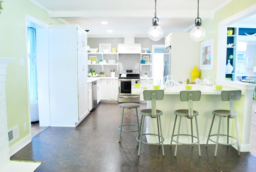
It was actually really nice how they tied into the stainless appliances, felt kind of geek-industrial, and even brought the gray color in the wall of penny tile over into the other side of the room. But after a nice long time of thinking it through and weighing our options, we decided… it’s time to paint them! It’s not that we don’t like how they look as-is as much as we think a new coat of paint could look infinitely better. From good to great if you will. So without further ado, our musings…
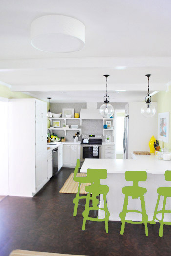
Our first thought was a dark teal color. Don’t mind our horribly photoshopped stool rendering (it’s not a very accurate portrayal at all, but in our brain we think we can almost picture it).
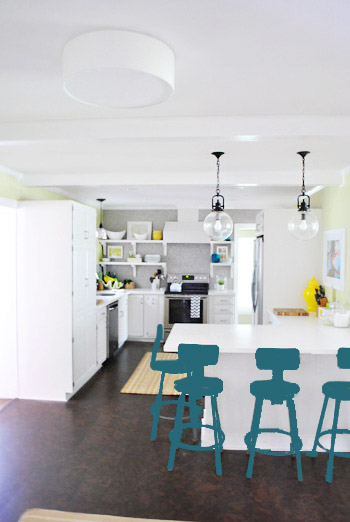
Why dark teal? Well, see the back of the built-ins in the adjoined dining room in this older shot of the room on the right?
Since the kitchen and the dining room are now open to each other, we just love seeing a sliver of that dark teal on the built-ins when we’re in there, so we thought bringing a bit more of that color in with the stools could be fun. Although it could be a little too matchy-matchy too, so we kept playing around with other options.
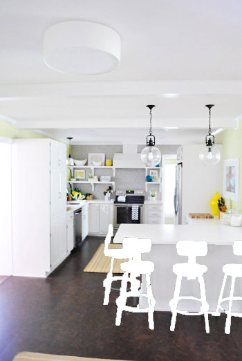
Like white, which is a little too… white for us. Haha. There’s just so much lightness in the cabinets and counters that although glossy white stools would look modern and clean, we think it’s just too flat for us.
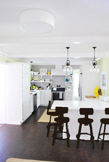
Next we tried ORB (oil-rubbed bronze), which would probably be an easy win. We worried it would blend in too much with our floor, but at least from this terrible rendering they look like they’d pop in front of the white cabinets/counter. And they’d balance the dark hardware on the pendant lights above (I also tried a dark charcoal gray but they didn’t look as good as the ORB rendering, so I figured that was the better option. But it’s not the most happy and exciting choice out there.
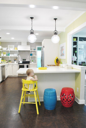
Then we tried yellow since we like the other random pops of yellow in the room – like that jar next to the fridge and that planter on the open shelves. But it looked crazy-scary. Might just be photoshop though, so I decided to bring Clara’s yellow highchair in and see how that looks in front of the peninsula (since surely it can’t look this nuts in real life).
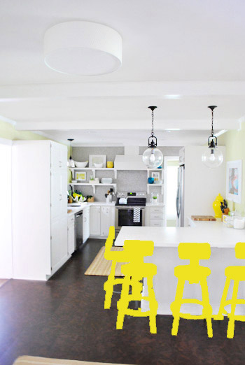
Sure enough, it looks pretty cute:
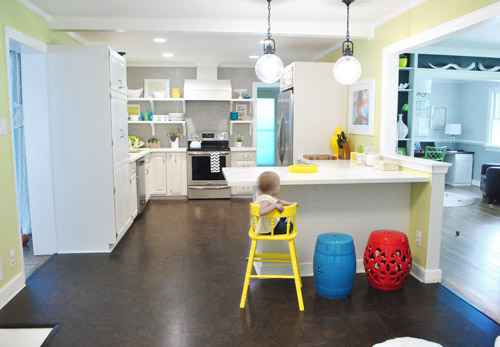
I also brought in a random HomeGoods/Joss&Main stools from other rooms (blue = HomeGoods, red = Joss&Main) just to see how those colors would look. We actually really liked all three of these color options. It’s fun to have a little pop of happy at the peninsula, right?
Of course the blue one looked awesome with the pops of blue on the open shelves, but this exercise actually got us seriously considering tomato red, since it’s not in many other places around the house (so it feels exciting and new). It would also pick up some of the red tones in our Lady Swimming print next to the fridge, which could be fun. But since the chairs wouldn’t be low-lying garden stools, and would be four metal stools with backs, in order to picture it, I bounced back to my good friend Photoshop.
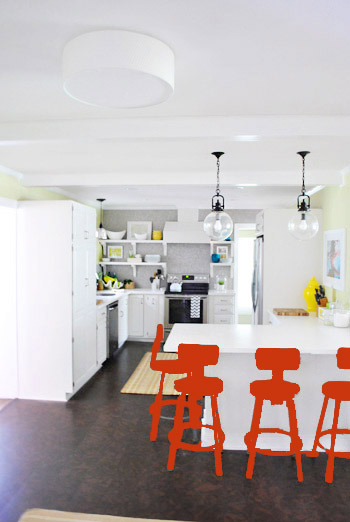
Our only fear is that with the yellow-green walls, red or deep orange chairs are a little too McDonalds for our tastes (especially when viewed from the other side of the kitchen – looking back towards the fireplace nook, which has a lot more green paint going on than this view). So next we decided to give leaf green a try…
… and a deeper emerald color…
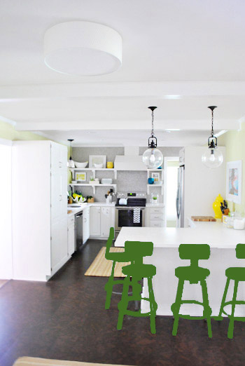
All of them could probably work, so they got logged as other alternatives. It was at this point that we realized that a number of things could work in our pretty neutral kitchen (white and gray and brown pretty much goes with everything), so it’s just going to come down to choosing whatever color we like best.
Next it was onto blue, where we tried a lighter teal color with a fair amount of gray in it:
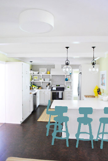
Of course these renderings aren’t very true to what things will really look like in real life with light bouncing around and not everything being the same flat shade – so something that looks the best here could totally read differently in real life. But the truth is that we love a room with a pop of color in the stools, like this, this, and this), and our minds change about what color we want to go with every day.
Oh and how funny is this? Right after I shot this picture…
… I walked into the office and saw this stack of books…
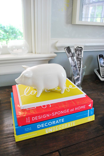
Guess I’m just a die-hard fan of those colors. Haha. For accessories, potential stool colors, and beyond!
You know we’ll keep you posted when we make a final decision! Hopefully within the next week or two – because these renderings are getting us excited. Haha. And this little photoshop exercise was comforting because it helped us realize that there are any number of ways we could go instead of having to find the “one right color” like hunting for a needle in a haystack. I’m sure you guys will weigh in with your favorite stool colors in the meantime, right? Anyone else playing around in Photoshop or bringing items from other rooms to see how certain colors or shapes will work?

Christy Z says
I can appreciate all of the color choices…but lean toward the yellow. But if it was me, I would have to find my rug love first and then pick a color for the chairs. I wouldn’t want to have to paint them again.
YoungHouseLove says
Oh yes, the rug we ordered should be here asap, and then we’ll get to make a final stool decision before making any decisions!
xo,
s
Jenn @therebelchick says
My favorite is the light teal color, followed by the three different colors together! I love mis-matchy things!
Ashley@AttemptsAtDomestication says
My favorite was definitely the teal at the beginning! Love it!
Laura says
Teal teal teal!
Stephanie says
I have to say I love the yellow. I don’t know if this is because the yellow looks best to me or if it’s a direct result of my yellow obsession I just recently discovered.
Either way, I’m sure whatever you pick will look awesome.
Sarah S says
I do like the stools as-is in the grey, but of the Photoshop options, I vote for the deeper emerald color – just in case you’re keeping a tally ;-)
emma says
Love the photoshop fun! Would you consider combining colors on one stool? ie all yellow but the back of the back support green? Or all yellow and the round seat part blue? Seems like you like the color but want to break it up a bit – just a thought! Can’t wait to see what you decide!
YoungHouseLove says
Always another possibility!!
xo,
s
Deb says
leaf green or yellow!!! hey, you should do another post like this after the rug is down! Instead of putting the cart before the horse… this is putting the stools before the rug!!! so, if that phrase becomes the new rage “putting the stools before the rug”… you can tell your nieces and nephew that you have swagg!!!!
YoungHouseLove says
Oh yes, the rug should be here any day now and we’ll share pics galore and try to make a final stool choice once it’s down!
xo,
s
Kim says
Ya know, I’m not actually hating on the white. ESPECIALLY if you “color dip” the legs in a fun color to contrast the white island, and maybe just the seats of the stools.
Like this: http://farm7.static.flickr.com/6059/6304558958_374d1ea194_o.jpg
I also like the leaf green color. I think it’s a nice layered look with your paint color but not too matchy-matchy.
Good luck with your final decision!
YoungHouseLove says
That’s another fun idea too! Thanks everyone for sharing your thoughts!
xo,
s
Jessica says
Since people are casting votes, I love, love, love the yellow! I think it really pops and would give you a fun surprise moment when walking into the kitchen, and yet also just fits in with your guy’s design aesthetic :)
Good luck making the choice! :)
Melissa says
I love the blues the most!
Why not try eggplant/purple? Its a color on Sue the napkin, right? I think it would go best with the walls.. (greenish/purple-ish)
YoungHouseLove says
We tried it and it didn’t look great in photoshop but it’s always another possibility!
xo,
s
Vega says
Yellow, yelloooowwww, please!
stephanie says
You guys have inspired me to add some color to my living room. It’s really neutral and I’ve been trying to sort out what colors I want to add to make things brighter. And this post gave me some great ideas on how to do it. Hooray for photoshop, spray paint and color-courage!!
Missy G. says
Haha, oh my, you opened a can of worms with this post!
And you are counting votes, right? If so, I choose to split my vote between the grayer teal and the leaf green, but probably 65% leaf green. Maybe the same green from your office chairs? But it’s so hard to really know what color to choose since monitor colors are always off and we are only seeing a smidgen of the room at once, instead of a full peripheral view to really tie everything together. But I also know that y’all are pros at taking all these comments with a grain of salt. Can’t wait to see what y’all choose!
Emily says
Love the leafy green and light teal. Yellow is nice option too. What about going wild with a few inch wide yellow bands around the legs on a teal stool? Even experiment w the look w some colored duct tape :)
Happy designing and love love love the site!
YoungHouseLove says
Love the colored tape experiment – fun! We’ll have to see where we end up!
xo,
s
Michelle says
I love the blue of the Homegoods stool and the accessories on the open shelves! Cheerful, not too matchy-matchy and it doesn’t clash with anything. Plus it looks nice with Clara’s highchair in there.
Amber says
I love all the color choices, and I’m sure whatever you land on will be great. I’ll be a bit of a nay sayer though and admit I like the unpainted version best. It gives some age or something to the room, so it doesn’t feel so new and bright. A little age and roughness never hurt anybody- right?
YoungHouseLove says
Haha, it’s true! That’s why we wanted to wait a nice long time to be sure we wanted to paint them. A few months later- we’re sure! But we have seen them left like this in a few cool restaurants and they look awesome!
xo,
s
Melanie says
In the months that I’ve followed your blog, I’ve never read what other people say. Geez! Ya’ll put up with some interesting comments! You must have tough skin. :) I know I’m invested in your kitchen because the other day I was wondering about the stools with the rug trials. I like the suggestion of yellow with a fabulous fabric on the seats. Maybe incoporate the strips the Jon liked for the rugs or some Chevron action? Your kitchen is so wonderful, I love how well it came together.
Jessica says
I so love the teal!! I have my fingers crossed for teal!
Mary says
I didn’t read all the comments (just p.1) so sorry if this has been suggested many times but-
With 4 stools, each with about 20 surfaces, I think I’d go something neutral (but new) on the frames and just paint the backs and seats one bright color. So much of ONE bright is overwhelming to me. I guess you can’t do ORB frames and yellow backs/seats? I actually was picturing a bright orange pop. Is there orange in the swimming pic?
YoungHouseLove says
We tried orange in photoshop and didn’t like it much- but it’s always another possibility!
xo,
s
Amanda says
Don’t know if you’re a Lauren Conrad fan, but it seems she may be a fan of yours. Check out her post today: http://www.laurenconrad.com/post/picture-perfect-how-to-hang-a-wall-collage-gallery
I thought the first pic looked familiar. :)
YoungHouseLove says
No way! So funny!
xo,
s
Andrés & Candice says
LOVE the light teal. It jives well with the walls and connects with the back of the built-ins but isn’t too matchy-matchy.
The difference between your kitchen and the kitchens with the pops of color in the stools, is that those kitchens appear to be entirely neutral except for the stools. You guys took more risks with the awesome grellow walls, which, in my humble opinion, means that color is competing for attention with whatever you pick for the stools. I think the light teal works with the teal & doesn’t compete with it.
Amanda C says
Must say, I’m swooning over the yellow, and I am not a yellow person! So yellow gets my vote! Can’t wait to see what you decide, and whatever you choose, I am sure it will be lovely!
Nicky says
oooooh, definitely leaf green! but that’s my favorite color, so take it as you will, hehe ;)
but, in all (chair-painting) seriousness, i think it would be a great choice because it brings all of the colors of the room together, without being matchy-matchy. blue + yellow + avacado green = leaf green!
nicky
Michelle says
I really liked that blue-gray in the last photoshop rendering. I think if you found a spray paint color that was very similar to the color in the rendering, you’d be good to go :)
Just my vote though. I’m confident you’ll make it look fabulous.
Although I personally love that spectrum/ range of relating hues idea. In blues, you could tie in the grey blue AND the dark teal AND that bright blue… :) I see you like the one color idea, that’s awesome too!
I’m excited to see what you end up doing! :)
Jill says
I say paint them yellow, like Clara’s high chair! Yay Team yellow!
Erin says
I kinda like your first choice, the dark teal to coordinate with the dining room bookcases. It seems to work with everything. And when you add Clara’s yellow chair, that pop of color would be fun with the teal.
Liz says
I admire your boldness! Do you guys ever get scared of ruining 4 perfectly good stools with colors that you really don’t like? Since I already really like the stools just the way they are I’d be too scared to try something and end up hating it, and wishing I could just go back to the way they started. But I’m the girl who has lived in a house for over a year and has yet to paint anything for fear of picking the wrong color! This summer that’s going to change! I’ve gotta pull up my brightly colored big girl panties and get over it! Oh, and from the photo-shopped renderings the leaf green is my favorite, but I’m also loving the deep teal!
YoungHouseLove says
As for if we get scared of ruining 4 perfectly good stools, nah- we figure we can spray paint them gray or silver again if we’re craving this look, but since we lived with them a nice long time we’re more confident than ever that we’d be happier with a pop of color!
xo,
s
Nicole says
I personally LOVE the deep teal and think it’s really fun. The other ones have possibilities too (my second favorite is probably the ORB – what about ORB with teal cushions? or Teal with an ORB seat?)
It also looks like you’re selecting the stools in photoshop and then painting them, so they’re just the solid color. Have you ever used the “Adjust Color” function? You can select the stools and then open that tool, then if you change it to be drastic changes, it’ll let you totally change the color of the stools without losing the detail of the stools the way you do when you use the paint bucket or brush. It’s kind of a fun tool to play around with and it’s how we were taught to do color changing in one of my media classes.
Thanks for such a great blog! I really enjoy it!
YoungHouseLove says
Oh yes, I like the adjust color function! Just did it fast by dumping color on them, but using things like that or multiply/opacity/masks could have made it look better!
xo,
s
Carrie says
The last blue color is cute but the yellow just takes it over the top. It’s so bright and cheery. Yellow get’s my vote for sure.
Chelsea says
Aw i’m sad that you’re painting those stools! They are my favorite things in your whole house! But I guess it’s your house not mine, lol.
Martha says
I think dark teal or plum. The kitchen is so light as it is that the yellow was just too bright, in my opinion. I think a darker color would look a bit more “grounded.”
Sofie says
I’m actually sort of digging the red – or perhaps an eggplant-y colour? If I remember correctly, Sue the Napkin has some eggplant in her, but you haven’t incorporated any yet.
YoungHouseLove says
We tried eggplant in photoshop and didn’t like it, but who knows where we’ll end up!
xo,
s
Kristen H says
are you tired of typing rainbow bright yet? :D
YoungHouseLove says
Haha- I’m mostly cutting and pasting it. Can’t keep up with comments otherwise! Haha.
xo,
s
beth says
love either teal option – what about dipped legs?! maybe in yellow, maybe in different colors. could be fun!
YoungHouseLove says
Love all the ideas guys!
xo,
s
Jan Holder says
ORB. It will be a nice balance to all the lovely white and bright colors. It will make the chairs look a titch more sophisticated, and keep the room from looking too precious. And, you won’t get sick of the color in two years.
emily says
leaf green with the legs “dipped” emerald!
YoungHouseLove says
Another fun idea!
xo
s
Shawna says
I have to admit, I was a gonner when i saw the chevron rug you considered from home goods and even went to try and find it but didn’t have such luck. Doing the ORB on the chairs really grounded it, and could look really cool with some Sue the napkin in another life action, aka as a seat cushion… although like some mentioned im loving the looks with the pop of yellow (Clara and her chair looked absolutely adorable and oh-so-photogenic), I even liked the brighter green as it still keeps with the tones of the grellow walls while still adding a pop. Can’t wait to see the new rug and your chair over all! You guys have absolutely inspired me in my own home and i read both of your blogs religiously… if I lived closer I think id have to talk you into needing an assistant, babysitter, or something (I mean that in the most non-creepy-stalker way possible lol). Thank you for just being you and being so brave to share that with everyone, you really are such an inspiration and encouragement!! :-)
YoungHouseLove says
Aw thanks so much Shawna. You’re so sweet!
xo,
s
Christi says
I like them as they are. I think you all have SO much great color in those space that the natural look is awesome! But you have done great stuff with colors that I would have never have thought of.
Also, I sooooo want the Pig for my ipod!
Tirsa says
I’m loving the leaf green and light teal. Without the rug its hard to say which would work best though. I can’t wait to see it all put together with the rug.
Brynn says
I kind of liked them the leaf green, Also, I was wondering what about painting the bottom of the island? Had you guys mentioned that before? I think that would look great in the teal color, and then maybe make the chairs and lighter grey.
I also think the yellow looks good, but with Clara’s chair, its under the counter, so it looks better, to me. it the photo shopped version (Which is maybe not an accurate depiction) it looks like too much. Maybe 2 grey and 2 yellow?? Ok sorry for rambling.
Whatever you do will come out fantastic. Can’t wait to see what you pick.
Thanks for all the inspiration!
YoungHouseLove says
We’ve decided the back of the peninsula will stay white (although we might add beadboard or wainscoating) because a color on one side with the white cabinets on the other side might look kind of weird at the side seam where they meet.
xo,
s
Alex says
i think they would look great in yellow! or tealy blue
Or, charcoal, with the bottom portion of the legs (under the metal ring) in a different colour, or just white, for a dipped look that would pop from the floor. and then with colour in a fun seat cushion would just look AWESOME.
how will you guys ever decide. We’re moving into a new apartment soon and i have so many ideas swarming me. Do you find it tough to stick to a cohesive “look” or design style, when there’s always so many directions you could go?
I DO!
YoungHouseLove says
We just take our time – as this post demonstrates! Haha. We are over-thinkers to the max, so we just try to weigh all of our options, which usually teaches us there are more than a few ways to go (all of which will work, so it’s just personal preference) and then we’re finally ready to make a decision so we just go for it!
xo,
s
robin says
what if you picked 4 shades of one color, for an ombre effect??
YoungHouseLove says
Always another option! We thought about a subtle gradient but weren’t sure if we like them all the same (like the inspiration kitchens we linked to in this post) better! Will keep you posted!
xo,
s
Sarah says
What about a more coral color than tomato red? That’s what I thought the J&M stool looked like in the first picture and it looked great with the lemon lime walls. I also think eggplant would look fab, but it sounds like you tried purple and it was a no go….
I can’t WAIT to see what you land on!
YoungHouseLove says
Always another possibility!!!
xo
s
aimee says
I really like the leaf green, or the teal, especially with the colors in the dining room. Yellow is fine, and ORB is a little too safe. Did we ask Sue the Napkin what she thought of these colors? ;) Can’t wait to see how they turn out!
Sherry from BC says
I like all the options and I am sure you will settle on the right one for you but have you thought of doing a trial run with one of them? I mean if you have some fabric or even construction paper in the yellow or whatever and just taping/draping or whatever to one of the chairs. I know photoshop helps but sometimes actually seeing it in your room makes a difference. The other, pricier idea would be to pick up 3 chairs already in colours and try them out and then take them back to the store. Sorta like your carpet fashion show. Then you could do a post on pricing and sourcing as well as picking a colour? I know you can always repaint if you get it wrong but with all the little fiddly bits, it will be time consuming.
YoungHouseLove says
Always another option if we can’t make up our mind!
xo,
s
Lynette says
Love the teal! Second choice would be yellow. Can’t wait to see what you choose!
Eve says
Hot pink would be so much fun but probably a lot more vivid than what you’re looking for. ;) That said, purple could be a fun twist on the darker color wagon. And I love the idea of teal! I’m sure you’ve seen, but Painter’s Touch has the best teal – it’s called Lagoon. We just sprayed our Adirondack chairs for our deck (pic here) and I *love* them. They have a lesser known, more green toned teal called Jade but I’ve never seen it at Home Depot, only locally at AC Moore and online through Amazon. Both are beautiful, just depends if you want to go more bluish or greenish.
YoungHouseLove says
Those chairs look awesome!
xo,
s
Rach says
I love your ideas, but I keep thinking I love the way they look now…like a restoration hardware look. I am sure whatever you choose to paint them will look great!
Beth Thorson says
I haven’t read all the comments, so don’t know if it’s been suggested, but have you considered just painting the seats? You’d get to keep the fun industrial look of the stool and add a pop of color.
YoungHouseLove says
That could be fun too- definitely another option!
xo,
s