Me + a picture of our kitchen + photoshop = this post.
Back in December when we bought our kitchen stools (from a school supply store for $32 a pop) we mentioned we were entertaining a number of ways to tweak them down the line (painting them, upholstering/staining the seat, etc) but just couldn’t shake the feeling that we should live with them a while first – just to make sure we weren’t doing anything rash in the middle of a kitchen remodel. We basically wanted the room to come together, live with them a little, and then make the call.
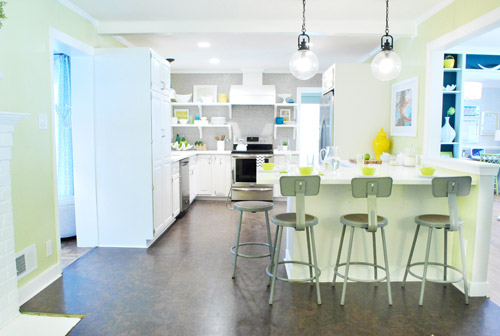
It was actually really nice how they tied into the stainless appliances, felt kind of geek-industrial, and even brought the gray color in the wall of penny tile over into the other side of the room. But after a nice long time of thinking it through and weighing our options, we decided… it’s time to paint them! It’s not that we don’t like how they look as-is as much as we think a new coat of paint could look infinitely better. From good to great if you will. So without further ado, our musings…
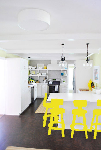
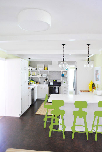
Our first thought was a dark teal color. Don’t mind our horribly photoshopped stool rendering (it’s not a very accurate portrayal at all, but in our brain we think we can almost picture it).
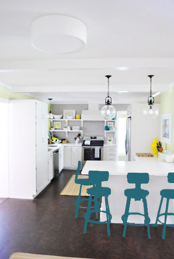
Why dark teal? Well, see the back of the built-ins in the adjoined dining room in this older shot of the room on the right?
Since the kitchen and the dining room are now open to each other, we just love seeing a sliver of that dark teal on the built-ins when we’re in there, so we thought bringing a bit more of that color in with the stools could be fun. Although it could be a little too matchy-matchy too, so we kept playing around with other options.
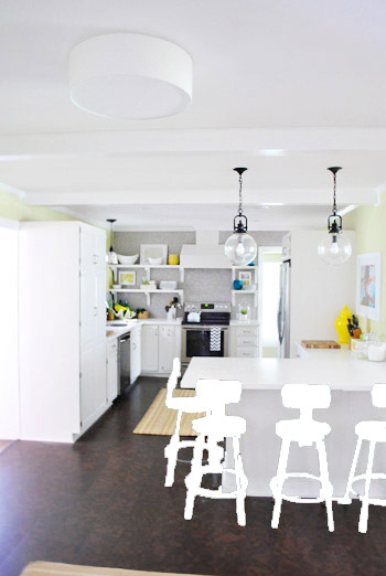
Like white, which is a little too… white for us. Haha. There’s just so much lightness in the cabinets and counters that although glossy white stools would look modern and clean, we think it’s just too flat for us.
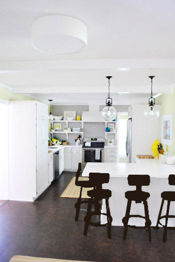
Next we tried ORB (oil-rubbed bronze), which would probably be an easy win. We worried it would blend in too much with our floor, but at least from this terrible rendering they look like they’d pop in front of the white cabinets/counter. And they’d balance the dark hardware on the pendant lights above (I also tried a dark charcoal gray but they didn’t look as good as the ORB rendering, so I figured that was the better option. But it’s not the most happy and exciting choice out there.
Then we tried yellow since we like the other random pops of yellow in the room – like that jar next to the fridge and that planter on the open shelves. But it looked crazy-scary. Might just be photoshop though, so I decided to bring Clara’s yellow highchair in and see how that looks in front of the peninsula (since surely it can’t look this nuts in real life).
Sure enough, it looks pretty cute:
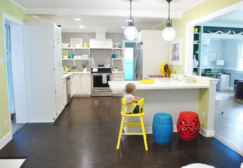
I also brought in a random HomeGoods/Joss&Main stools from other rooms (blue = HomeGoods, red = Joss&Main) just to see how those colors would look. We actually really liked all three of these color options. It’s fun to have a little pop of happy at the peninsula, right?
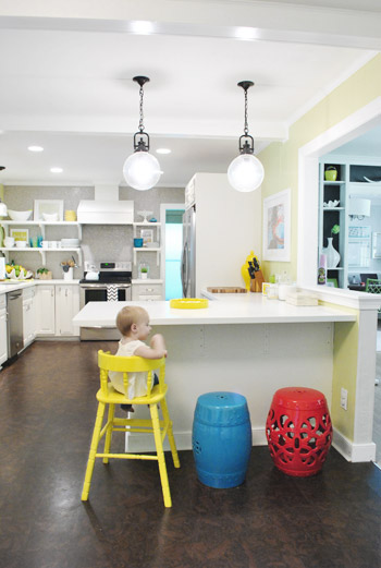
Of course the blue one looked awesome with the pops of blue on the open shelves, but this exercise actually got us seriously considering tomato red, since it’s not in many other places around the house (so it feels exciting and new). It would also pick up some of the red tones in our Lady Swimming print next to the fridge, which could be fun. But since the chairs wouldn’t be low-lying garden stools, and would be four metal stools with backs, in order to picture it, I bounced back to my good friend Photoshop.
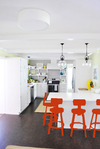
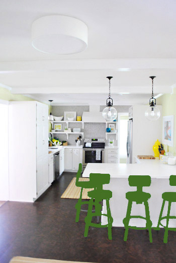
Our only fear is that with the yellow-green walls, red or deep orange chairs are a little too McDonalds for our tastes (especially when viewed from the other side of the kitchen – looking back towards the fireplace nook, which has a lot more green paint going on than this view). So next we decided to give leaf green a try…
… and a deeper emerald color…
All of them could probably work, so they got logged as other alternatives. It was at this point that we realized that a number of things could work in our pretty neutral kitchen (white and gray and brown pretty much goes with everything), so it’s just going to come down to choosing whatever color we like best.
Next it was onto blue, where we tried a lighter teal color with a fair amount of gray in it:
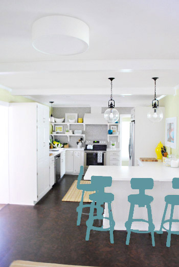
Of course these renderings aren’t very true to what things will really look like in real life with light bouncing around and not everything being the same flat shade – so something that looks the best here could totally read differently in real life. But the truth is that we love a room with a pop of color in the stools, like this, this, and this), and our minds change about what color we want to go with every day.
Oh and how funny is this? Right after I shot this picture…
… I walked into the office and saw this stack of books…
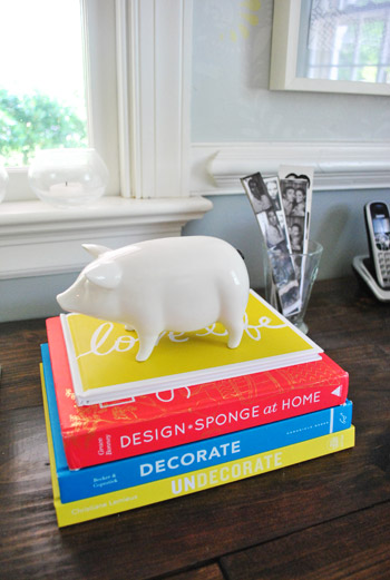
Guess I’m just a die-hard fan of those colors. Haha. For accessories, potential stool colors, and beyond!
You know we’ll keep you posted when we make a final decision! Hopefully within the next week or two – because these renderings are getting us excited. Haha. And this little photoshop exercise was comforting because it helped us realize that there are any number of ways we could go instead of having to find the “one right color” like hunting for a needle in a haystack. I’m sure you guys will weigh in with your favorite stool colors in the meantime, right? Anyone else playing around in Photoshop or bringing items from other rooms to see how certain colors or shapes will work?

LaTonya says
Have you considered a light orange? I think it would look really nice with the walls and the floor. It would be a nice bright option to consider if you like the yellow. The yellow was a bit much for me, but you’re right about photoshopped version not being the best representation.
I love what you guys are doing. I can’t wait to see what you do with the deck!
YoungHouseLove says
We actually tried orange but it looked sort of fast-food-ish and a little too warm with the gray tile. Sort of how some of the rugs we tried clashed since they were too honey-orange colored?
xo,
s
Crystal @ 29 Rue House says
I’ve played around with Microsoft’s Paint some doing this type of stuff. A couple weeks ago I decided I wanted to splurge and get Photoshop…and then I saw the price! Haha. I’ve been wanting to try Paint.net (it’s free) but haven’t made time for it yet.
I think any color you choose will look great! ;)
Jen says
GIMP http://lp.vertitechnologygroup.com/gimp/?c=1F2E1EDA-FC98-44A8-B6FE-C081697DE639 is a good free alternative to download!
YoungHouseLove says
Oh yes, we hear good things about them!
xo,
s
Crystal @ 29 Rue House says
Thanks for the tip Jen – after a quick glance on their homepage it looks pretty cool!
Erin says
Glad the decision is all yours! Every option looks nice, it’s going to be hard to choose :)
Kristy says
gray teal.. definitely!
Michelle M. says
Love the dark teal. Perhaps dark teal legs/seat with a warm gray back?
YoungHouseLove says
Ooh always another possibility!
xo,
s
Jen@The Decor Scene says
Love all the color choices you came up with. I actually think I love the yellow in the high chair the best. Can’t wait to see what color you pick. Will you paint the cork seat the same color or will that get material on it? Sorry if it was asked already. ;)
YoungHouseLove says
We’ll paint the seat the same color (a few other folks with stools like this seem to have success with that). Here’s hoping!
xo,
s
Among says
Sherry, I actually love what you have right now…. but if at all I have to pick, it would teal–very classy.
Please please no yellow, green, or blue! too much of that going in the house. Gosh! I’m insane, I’m more interested and attentive to what goes in your house than mind. Is there a YHL Rehab program yet? :P :D
YoungHouseLove says
Haha – the funny thing is that I thought we had too much blue going on here, but there’s not much when we walk around looking for it! We actually only have a dark teal bedroom, a gray-blue bedroom, those teal built-ins, and a blue painting in the bathroom! I think our first house had a lot more blue, but this guy has a lot more green and gray going on (lots of rooms are gray, some are green, and we have green office chairs and green dining room curtains and gray living room curtains, etc).
xo,
s
Crystal says
My choice doesn’t mean anything haha but I really love the dark teal, yellow, and blue. I really like the look of the red stool in the kitchen but I’m not diggin the tomato red mock up on PhotoShop. Anyway as always I’m obscessed with your blog and can’t wait to see which you choose. Keep up the amazing work!
janetl says
I loved the idea up above about gradient stools in one color but it’s a tough choice. What happened to the rooster? Could purple be an option? It’s hard to pick but if I had to…I lean more towards the lime. The dark colors really stand out to me but it’s so subjective. Can’t wait to see what you pick!
YoungHouseLove says
We tried purple and it looked too Barney when it was bright and sort of just like ORB when it was dark so we gave up on it. Haha. As for Sir Rooster, he’s living in the bedroom for some reason these days. Maybe because we think it’s funny to wake up and see a rooster in the morning?
xo,
s
Courtney says
What about multi-colour? In such a crisp kitchen I think it could be fun and this kitchen that I saw on Pinterest {http://pinterest.com/pin/276267758361462301/} is one of my all-time favs! So happy and cheerful.
YoungHouseLove says
That’s really fun too! I think we tend to prefer them all one color, but that’s so playful too!
xo,
s
Katie says
I vote yellow! It looks sunny and happy!
Amanda C. says
I like all of the colors! But as a suggestion to help you see which one you like more, you might use a color wheel. Pick the major color of your room (the walls) and then you can see which colors are across the wheel (contrast) and next to it on the wheel (compliments). It might help narrow down the options!
Good luck, I am sure anything you choose will be fun, and if it isn’t, well it is just paint right? :)
YoungHouseLove says
Thanks for the tips Amanda!
xo,
s
Meagan says
My vote is the back of the built in teal. 2nd choice the lighter teal.
Keilah says
Go with the dark teal!!! Its such a beautiful, timeless color, AND it would look great between your kitchen and dining room!
Ericka says
I vote the yellow or leaf green! The red I think is too much. My third choice would be the teal gray color. Whatever you guys choose I’m sure will look spectacular:)
Meaghan @ lovelee honeybee says
That was fun to look through! It’s a tough call!
My faves are a yellow like Claira’s chair, the lighter teal colour or the blue like your HomeGoods stool.
Jen says
I really think eggplant would be just the thing. I was surprised you didn’t try it in the post!
YoungHouseLove says
We actually tried it but didn’t share it because it looked bad. Haha. Too bright made it look Barney and too dark made it just look like ORB. Boo!
xo,
s
linda says
I liked the lighter teal but was hoping you would try a shade of plum with grey undertones. I love this color and believe it also harks back to Sue. I’ve used primary colors in the past and always tire very quickly of them, but of course, that’s just me!
YoungHouseLove says
We tried that in photoshop but it didn’t work (too bright = Barney and too dark just looked like ORB). Maybe it was just bad photoshop, but it wasn’t one of the most exciting choices when we were playing around!
xo,
s
Jillian {Her Split Ends} says
Love that you “test” out forty-five different options…so a girl after my own heart. I agree the red is lovely but a little too much Mickey D’s {or ketchup and mustard} my favs are the yellow or the more grayed blue at the bottom of the post! Thoughts on adding a subtle pattern with paint either in the stools or on the seat?!?
Cheers
~ Jillian
http://www.hersplitends.com
YoungHouseLove says
That could be fun down the road!
xo,
s
Jenn says
this is hard. so many options. i think i’m team yellow.
But i won’t be heart broken if you go another direction. I’m def not team Rainbow Bright.
em says
My vote is for that turquoise blue. Yellow is one of my favorite colors, but I think it’s too close to the color of the kitchen walls. And too me the teal is too matchy with the built-in. Hope you don’t ming the unsolicited advice!
Laurie says
Leaf Green! You guys are awesome!
Chrissie says
I actually love how the leaf green picks up some more subtle pops of green in the kitchen – the green bottle-type things in the far left corner and a green something to the right, plus the green tones in both the grellow and the teal.
I love some of the other colour ideas on their own, but in terms of cohesion with the rest of the room that one seems the most right to me. I feel it in my bones, you might say ;-)
I can’t wait to see what you guys come up with!
April says
My 2 cents:
I’d give them a nice glossy coat of something that ties into your backsplash/stainless appliances (light-medium gray). Granted, it’s not as fun as yellow or teal, but it would prevent the peninsula from looking too disjointed next to the “meat” of the kitchen.
YoungHouseLove says
Always another possibility! Will keep you guys posted for sure!
xo,
s
Laura V. says
Photoshop hint – if you make a black and white layer of the object your are coloring and then a layer of what ever paint you want and change that layer to the “color” blending mode you will get a more realistic representation. The end result is a recolored object without even pulling out your spray paint socks ;)
YoungHouseLove says
Ooh, love that! Didn’t even try multiplying and opacity things, just dumped on the color and took a screen grab for each option, haha.
xo,
s
Liz says
I vote for either teal shade.
Alison says
I am not sure…try photo shop with orange, to tie in the orange in your picture. Those chairs look terribly uncomfortable, but your young and limber! haha Guess we need to wait to see the rug, before we vote.
YoungHouseLove says
We tried that actually! Sadly it looked too McDonalds like the tomato red. I think it might be the same reason some of the honey-orange rugs didn’t work.
xo,
s
Dina says
I’ll play! I think you need a deeper color to balance out all the white/yellow in the kitchen and tie in with the floors, so of the option above, my vote is for dark teal (maybe even darker than what you Photoshopped) or leaf green. Also, have you thought about a shiny eggplant color, maybe? That could tie into the dark brown of the dining room curtains (without being too matchy). I also think the grey could work if you made it shinier (does Rustoleum make a “stainless steel” color perhaps?) to tie in with your appliances, and then cover the seats in a fun color. All the options look great though, have fun picking! The best part is you can always change it up later if you don’t like it, or just for kicks. :)
YoungHouseLove says
We actually tried eggplant in photoshop but didn’t like it! Wish I had shared it so you guys could see!
xo,
s
mary says
I vote for multiple colors in multiple styles.
Sue says
I really like the lighter teal later in the post. Maybe because it’s pretty much my favourite colour in all situations but also I think it looks great in the renderings. How will you go about painting the metal or is that a wait and see kind of thing?
YoungHouseLove says
We’re not 100% sure about our approach but when we get down to painting them we’ll share every last step!
xo,
s
bekah says
Oh man, so many options! I actually just really like them the way they are! Haha…maybe that is just my indecisiveness peeking through though. I am excited to see your final choice!
Sarah says
How do you plan on painting them? With spray paint or with a brush? I have kitchen chairs that I want to paint each one a diff. color but I can’t decide what to use. What would you do with wooden chiairs?
YoungHouseLove says
We’re not 100% sure about our approach but when we get down to painting them we’ll share every last step! With wooden chairs I’d prime and paint them (either with spray paint if you can have a light hand and avoid drips or with a brush and very thin/even coats. Good luck!
xo,
s
Lisa says
I think I love the green the most, or maybe a shade in between the walls and the emerald. Like green grassy?
Valerie @ makingitworthy.com says
since you “asked” for our opinions…well, kinda right? My “vote” is for yellow. it looked the best and coordinated without being too matchy.
Anne Lee says
How about waiting until you choose the rugs and then picking up a color from the rug? But with the ikat patterned rugs so varied and beautiful now, I’d think one of those and popping out a color from it for the stools would be the way to go. Since you know that many colors work for the stools, might be an easier choice to fall in love with a rug and then paint the stools than to need to find a rug to match the stools.
YoungHouseLove says
Oh yes, the rug we ordered should be here asap, so once it’s here we’ll make a final decision (and share pics of the rug with you guys of course!).
xo,
s
Valerie @ makingitworthy.com says
i would also do a dark teal and white pattern (fabric perhaps) on the stool seat for contrast, maybe Sue the napkin?
YoungHouseLove says
Always another fun option! Will keep you posted!
xo,
s
Erica says
The yellow definitely gives the pop of color….and the lighter teal adds some color but is more muted. Can’t decide which I like better between the two!! Maybe mix them together to create teallow to go with the grellow walls?
Kara says
I kinda like them the way they are. What about just painting the legs to add some color? My favorite color combo is yellow and grey. I think it would look awesome like that!
YoungHouseLove says
Always another possibility!
xo
s
Reanna says
Love the dark teal! I would stay away from the green options only because when standing in your dining room it might seem matchy matchy with your green office chairs.
YoungHouseLove says
Yeah, I worried that anything green was a bit too much with the green office chairs (we also have green walls and lots of green in other areas- like the dining room curtains- so we’re thinking it might be too much). Will keep you posted!
xo,
s
Whitney says
Team dark teal!
Have you guys thought about painting the circular inset on the seat of the stools a different color? It may look cool to do ORB there.
YoungHouseLove says
We did think about staining or painting that another color, but think we’re leaning towards all the same color (like the stools in the inspiration kitchens we linked to) – at least for now!
xo,
s
jennifer says
I saw an eggplant comment!! YES! That (I think) would get my vote?! But I was also game for lime green dining room chairs. I do love all the colors (I’m a real life yellow girl and I’d say turqouise is my fave), my photo shop vote would be for one of those!
Good luck! Can’t wait to see them!
kris says
What about a gray/silver that matches a little better with the stainless and then put colored fabric on the cushions (I’m partial to the last grayish blue/teal). You could easily switch the fabric out whenever you wanted.
Also, saw this post this morning and thought you’d get a kick out of the instant garden. http://mamacjt.blogspot.com/2012/05/plantin.html
YoungHouseLove says
Haha- so funny! Love that link! As for fabric cushions, that’s definitely another option! Will keep you posted!
xo,
s
Crystal says
love the yellow & the teal. Good thing is..it’s just paint. You could could choose one color, live with it for a while, and then change it up just for fun…and another post ;)
Kaileigh says
I like the teal (but I might be biased as it’s my favourite colour!), but teal is just something that a lot of people don’t do so it’s different! I also liked the leaf green against the green walls, and the lighter teal. I think that these colours pop the most. And why not have a bit of fun with it?
Amanda Hevener says
I like the idea of ORB-ing (did I just turn it into a verb?) the stools. It goes well with the light fixtures and all of the other ORBed goodies that you have around the house.
Dina says
Also just FYI, I keep getting some Flash script error messages on your site today. I don’t know if it’s you or it’s me (I’m in Chrome), but I just wanted to give you a heads up – you don’t have to publish this!
YoungHouseLove says
Thanks Dina! Anyone else having any Flash script errors? We haven’t changed anything but it could always be a google ad or something else making trouble. Anyone else?
xo,
s
Stacy says
While I personally love the red (which shocked me). I think doing a sublte ombre or dipped legs look could be could be super neat…though a pain in the arse. I think Design Sponge had a good tutorial on doing the ombre (heh I now have that 80’s song, Da Butt, stuck in my head).
YoungHouseLove says
Always another fun idea! Thanks everyone for sharing!
xo,
s
carra says
I have those same blue garden stool x 2 (TJ Maxx was actually where I foudn them.) Love them so much!
I love the yellow color but it may be because you can really visualize it with the high chair there. I am sure whatever you guys choose will be awesome. Looking forward to it!
YoungHouseLove says
Aren’t they the best?! I totally am going to buy another one if I see one (jealous you found two- haha).
xo,
s
Heather W says
Me too Carra! My T.J Maxx had the blue and the leaf green color. They had two of each. I about died. They were only $39.99 most I have seen are at least $100.00 I really debated on which one to get but ended up getting the green. I would love to get a blue one too.
Trela says
Definitely teal. I noticed the teal-colored thingys on your floating shelves at the back of the kitchen for the first time with that set of images. Love the yellow, but it’s a bit too in-your-face. (Unless you wanted teal stools with yellow seats, or seats with the stenciled 1 -2 – 3 in yellow. That I could totally support. Because you asked my permission. :)
Thanks for your earlier post about choosing the kitchen rugs — I hadn’t even thought about clashing with a rug in a room next door, and I nearly made a design boo-boo for my exceptionally long basement into office space. Of course, now I’m stuck again, but isn’t that a big part of the fun?
YoungHouseLove says
Aw, thanks Trela! So glad you were able to avoid that design boo-boo. Love that term but the way- haha. It made me picture a big bandaid on a rug.
xo,
s
Melody @CCC says
I love the lighter teal/gray!