Q: Hi guys! I was snooping around your blog to try and find a floor plan of your new home with the colors you used for each room (like you did in the post from Feb 24/2010) but I didn’t find one! I would L-O-V-E to see what your new house looks like now, with a visualization of the color scheme per room. Is this possible, or am I asking way too much? HAPPY NEW YEAR by the way! – Danielle
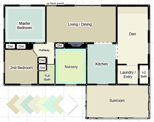
A: Oh yeah – we’re way overdue on that! So when Danielle submitted that comment here, we officially bumped it to the top of our to-do list. We did one of them for our first house, and it was fun to see how our paint colors have evolved over the years. So without further ado, here’s our current house’s color palette as it stands now (we still have to paint the guest bathroom and the spare room). It’s not too easy to see all of the colors (ex: the back of the dining room built-ins are dark teal, but it’s not as easy to see those little slivers of color in the image below as well as the office stencil and Clara’s closet stencil) but it was fun to play around in photoshop and make an updated floor plan for this house’s paint picks so far. Note: click here for a full list of these paint colors.
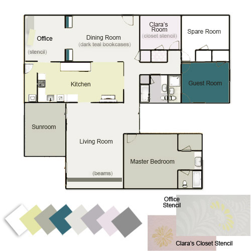
The cool thing we’ve realized is that most of our rooms with brightly colored walls tend to have a few more neutral choices to balance things out (ex: our greeny-yellow walled kitchen has white cabinets/counters and a soft gray backsplash with brown cork floors). And our rooms with more neutral colors on the walls tend have more color added in with brightly patterned curtains & pillows, geometric rugs and bold art, painted furniture, etc. But we’ll get to that a little more in a second.
First, just for fun, here’s our first house’s color palette. We still seem to love blues and greens with a fair amount of neutral tones, but we traded in the creams and tans for soft and taupey grays and added plums, pinks, and warm yellow-y green to keep it from feeling too cold. We’ll always have a special place in our hearts for the “sea glass” colors of our first house though. Especially in a smaller home with some pretty tiny rooms, keeping things flow-y and neutral was really helpful when it came to making it feel open and airy. Our current house is larger, so a few hits of color among the other more toned down walls make us happy (and don’t seem to chop things up as much as they could in a smaller floor plan).
We’ve actually seen lots of pretty homes with the same exact color on every wall of the entire house (whether it’s a crisp white tone, a soft tan color, a taupey-gray, or even something more daring like celery, yellow, or a muted blue-gray tone everywhere). Meanwhile we’ve also seen a ton of gorgeous homes with a different paint color in every single room. We tend to fall right in the middle of that spectrum, preferring to use a handful of colors in a few different spaces.
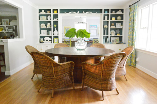
I think we like to reference a few over-arching wall colors in a few different places just so there’s some sort of flow and relation among the spaces, but not too much straight up cloning going on (thanks to varying other items like rugs, art, pillows, curtain fabrics, etc). For example, we have the same soft grey tone on the walls in our living room and our dining room, but the dining room has deep teal paint on the back of the built-ins to differentiate it, and also has colorful curtains and a bright yellow door…
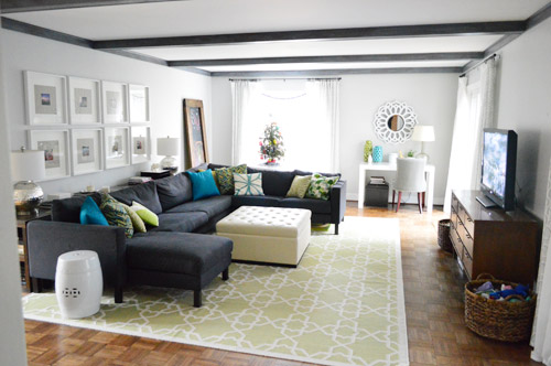
… meanwhile the living room has a green geometric rug, colorful pillows, and softer tone-on-tone curtains with dark painted beams. So we’ve found that in rooms where we have softer or more neutral walls we layer in more patterns and colors than the rooms with brighter walls (like our kitchen).
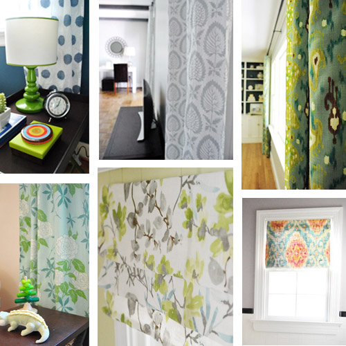
Maybe the biggest change? Our first house had white curtains in every. single. room. except for Clara’s bedroom. So one major difference here has been that we’ve embraced more colorful and patterned curtains in nearly every room.
Bold color was definitely less present in our first house. Comparing our color-coded floor plans above might make that pretty clear, but it’s even more evident when you actually look at room shots. While our first living room was softly layered with tone on tone colors…
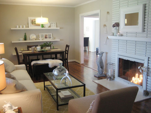
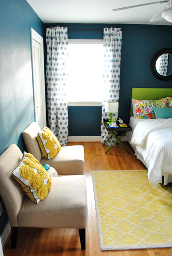
… our current living room (the pic above this one) definitely has more pattern and color going on (bright pillows and vases, a larger geometric rug, etc) as well as more high contrast choices (dark beams and a dark sofa).
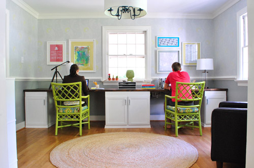
Another place we tend to bring bright color into our current house would be art and painted furnishings. See how the green chairs and bright wall of art in the office really liven things up? Yet we have neutral tones in there to add balance, like the white cabinets, wood counter, and natural jute rug.
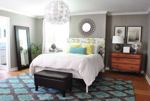
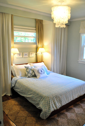
And of course things like the homemade headboard in our bedroom – and guest bedroom – add some interest, pattern, and color along with a few more bold and geometric rugs:
The green headboard from our guest room above was also in our first guest room, so we were inching towards our current color preferences back then, but we definitely kept it more toned down in there with neutral tan walls, plain white roman shades, no rug, etc.
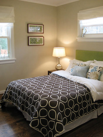
Just for fun, here’s a picture of our first bedroom to compare with our current bedroom shot three pictures up. It appears as though our love of cozy bedrooms has remained (especially with pretty chandeliers and breezy white curtains) but we’ve definitely turned up the dial with brighter pillows, a patterned headboard, and a bold rug in our current house.
We still have moments of calm tone-on-tone color here though, just to balance those hits of bright hue that occur almost everywhere else. For example, there’s our sink nook…

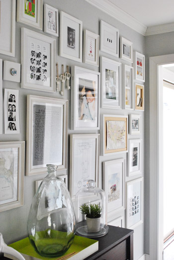
… and our hallway of frames…
… and our laundry room. There’s some soft avocado color on the walls, but the rest of the room is pretty neutral (white cabinets and shelves, a natural-toned light fixture, white appliances, cork floors, etc) since it’s such a small space and we didn’t want it to feel cramped.
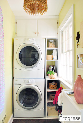
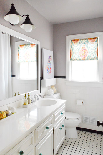
Actually if you look back at the commonalities among those three spaces that I just mentioned, they’re all small – so I think that’s definitely a factor when it comes to how much color and pattern we add. And then there are rooms that are a bit larger, like the hall bathroom, which got a plum undertone in the grey paint (it’s subtle but definitely noticeable in person) and some bright art along with a colorful window treatment and some teal knobs on the vanity.
So there you have it, a meandering brain dump with a much overdue floor plan of our house’s color palette. It’s nice to stop and examine these things occasionally because then we can look back on them (posts like this are essentially a time capsule for us, since pages like our House Tour are constantly being updated – so all the in-the-middle stuff gets bumped out). Welcome to our time capsule.
How do you guys like to decorate? Do you prefer one or two paint colors throughout your entire home? A different color in every room? Or a handful of colors that reoccur in a few places? There’s definitely not one right answer, so we’d love to hear how you guys like to color your world!
Psst- For a more exhaustive tour of our first house followed by all of the before & afters of our current house, click here and then here.

Megan says
Awesome post! We just bought our first house and have been using Benjamin Moore paint for most all the rooms. I love how you all have the floor plans with your paint colors. What sort of computer program do you guys use to display your floor plans? Thanks!
YoungHouseLove says
I just used photoshop to build this floorplan but sometimes I used floorplanner.com too!
xo
s
Wendy says
Love your amazing blog! Can you tell me where you find all of your frames for your collage walls? I love how they are all different but fit perfectly together.
YoungHouseLove says
Mostly Ikea but also Target and yard sales!
xo
s
Val says
I bought a house that needed painting in almost every room (except the grass-green kitchen, which I kept)–luckily it is a small house, because I went with BM Aura paint, which I highly recommend. My whole-house palette was inspired by this decor8 post:
http://decor8blog.com/2009/02/02/color-cravings-shades-of-green/
I deviated somewhat, but I paid a lot of attention to where you can see from one room into another. The colors make me happy, but I can totally see myself going with a neutral palette — in my dream retirement home that has a view of nature, that is!
YoungHouseLove says
I love that inspiration! So cool!
xo
s
Kim Wethe Rily says
My house looks like a box of crayolas by comparison! :) I’ve got a cherry/brick red living room, lavender/periwinkle bedroom for DD, three colors of blue on the walls in son’s room, blue and white tile in bathroom, a golden/brown texture office/guest room, warm dark yellow kitchen and a mostly neutral bedroom with an olivey green accent wall. Hubs wanted to put in some orange in there somewhere, but I put my foot down.
YoungHouseLove says
Aw it sounds cheerful and fun!
xo
s
CohoesMom5 says
We went color crazy in our first house – dark pink walls in the girls’ room, dark teal in the main bath, red and white in the boys’ room, medium purple in the living room and front hall, dark purple in the dining room, medium blue in the master bath, bright yellow (think Cheerio box) in the kitchen, and white in the family room (didn’t paint it until we put it up for sale).
When we bought our new house, everything was painted white by the builders. We painted the bedrooms (each kid picked their own colors) and left the common areas white until I could decide on the colors that I wanted. In November (after almost 2 years), we finally painted the family room and kitchen (big open connected rooms). We picked two different shades of green that were on the same paint card. That way I was able to separate the different areas/rooms but they blended together. Now I am planning to paint the foyer and main hall areas either the same green as the kitchen or the next lighter color on the same card.
We still have some bright colors (the mudroom is red with white trim) but my color tastes have definitely been toned down on the walls and perked up in the accessories.
Through reading your blog, I have learned to wait to paint until I find the color I really like and to live with what I have until I find something I really love and not just to settle to just fill the space (which is why my family room windows are curtainless).
YoungHouseLove says
Aw thanks! That’s so sweet.
xo
s
Melissa Shipman says
This helps so much to remember to think of the house as a whole. We have a LOT of gray in our house(www.lovinghere.com) and I always feel guilty or boring for going back to that when I think about any design updates. Now that I know I don’t have to differentiate each room with a new paint color, I feel more free to go with what I like. Gray is the new awesome and I’m sticking with it! (Of course, color is also awesome, especially yellow, which is why my office has a bright yellow desk and 2 teal walls! LOVE that room!)
Mary | lemongroveblog says
What a great way to show all the colors in the house! It really helps to see everything laid out like that. Love the little photo collage with the curtains – little pops of color sure do make a difference!
Karen says
Our first apartment was tiny and we just painted each room a color we really liked. Each room was beautiful but when you stood in the bedroom and could see its green walls plus the bright blue living room walls and the lemon yellow kitchen it felt like we were living in an Easter basket! When we moved into our new place we decided to still do various colors (we like variety!) but this time we made sure they all went together. To accomplish this we picked out our favorite local artists print and pulled colors from it…so now the rooms remind us of something that we love, plus they flow nicely and are still totally “us.”
Danielle Ferretti in Miami says
Hello dear Petersiks ! :) It was such a good surprise to see your reply to my question this morning ! Especially since I know how crazy busy you too have been… So, THANK YOUS ! <3
I LOVE to see how different your house is now from the first one ! My house is a complete open floor plan, and we basically have had the same 2 colors since we bought 6 years ago (light yellow and a terracota). Can you say B-O-R-I-N-G ?! LOL So, now I have caught the painting bug ! Hopefully will be making some changes updates soon….
ps – did I see a sneak peak of a certain C Superhero Cape multi-tasking as a blanket on Gee last night on Instagram…? LOL L-O-V-E it !!!
YoungHouseLove says
Haha, thanks so much Danielle! Happy to finally get to that question you asked a few weeks back! And yes, that was the cape on Gee. Told you Clara LOVES it!!
xo
s
Ash says
I have a pillow that I got right before buying my house that was my inspiration! It’s a dark chocolate-brown suede with squares of lavender, burgundy, golden yellow and sage green. So I used that color combo to decorate! My living room (with said pillow) is sunny golden yellow with a sage green couch, my music room (I’m a pianist) is paler yellow with a lavender accent wall, kitchen and bathroom are the same golden yellow, dining room is sage green and my bedroom (my favorite) is paler yellow with a big burgundy accent wall, complete with burgundy bed curtains (my bedding set is burgundy and gold). I’m working on the loft/upstairs in lavender and green, and the basement will probably be golden yellow in the storage side, lavender for a (pending) laundry room, a TBD half-bath, and so on. My parent’s house ONLY ever had white/off-white/ecru walls and exterior, so I was DYING for some serious color saturation in my first house. The only thing white in MY place is the crisp white trim – which was inspired by you guys!
Funny story: when my mom was helping me to paint this new house with all of these fabulous colors, she kept saying how pretty the burgundy turned out, or how much she loved the sage green. I asked her if that meant she was going to incorporate color into her house now, and she said “oooooooh, noooooo.” Ah well, I tried! ;)
YoungHouseLove says
Haha, that’s so funny!
xo
s
Cassondra says
My husband is into “saturated colors” and so it takes a lot of compromise to get some neutralish colours on the walls so we can add more pops and change the look of our room more easily in accessories!
Kendra says
Thank you for posting this! Perfect timing. We are actually painting our foyer, hallways, and kitchen moonshine TODAY! We had considered gray horse for our family room, but worry it’s got too much of a green undertone. Do you happen to notice a green undertone in the gray horse you have painted in your office?
YoungHouseLove says
We haven’t but paint can read really differently depending on your lighting and the way your house faces :)
xo,
s
heather says
There are two things I really like that you and John do:
1.) You find a nice compromise between what you like and he likes and agree on big items for the house (and even little).
2.) You’re “in-between” with paint colors (not too many, not too few) and you accessorize with pops of color.
Andy and I have different styles but we meet in the middle on shaker. He tends to go more woods/masculine and I tend to go lighter, cleaner lines and brighter. It’s been fun trying to figure out. I get surprised at some stuff he hates, and some stuff he likes but at the end of the day I want him to be as comfortable in his home as I am and that means not looking at a rug he hates all the time just because I like it. As far as paint goes, I think we’ll do a similar neutral throughout the “open” areas of the house and other colors in the closed rooms. The first time we painted I chose cooler colors but this next time I’m going for those with warmer undertones. Winters are way too long here to feel cold in your home just from paint.
Heather says
Is it a full moon? I came on here *specifically* to look up a color you had used (dark teal in dining room). Thanks!
YoungHouseLove says
Haha!
xo,
s
donna sita says
hello, i love your site and really enjoyed the “whole House Palette” posting. Would you be willing to let me know of the tool/site used in the first picture that organized your palette so beautifully? Thank you!
YoungHouseLove says
For that I just used photoshop, but sometimes we use floorplanner.com too.
xo,
s
Keisha says
Being stuck inside staring at the walls all winter has made me want to paint. We are currently debating on what color for the kitchen. We are leaning towards a grass green color. The rest of our house is pretty neutral since it’s open. We are trying to find something that goes with our golden oak cabinets since we aren’t going to be changing them anytime soon. I am updating the brass hardware by ORBing it. Just so hard to decide! Thanks for posting your house colors, gives me some inspiration.
Adriana says
I just love your color palette. How do you decide on colors?!
I never thought of a whole house palette. Granted we lived in an apt for a while so had no choice and we had white. Then we moved. The boys picked orange and yellow for their shared room. Somehow it works. We picked a green for our daughter. The other rooms we haven’t touched- not that we like the colors (we don’t). I’m stuck and a bit confused deciding what colors to go with, maybe I’m too used to white?
So in the mean time we have a deep peach living room, a lemonade yellow family room, a two toned yellow/olive master bedroom, and a two toned yellow and burgundy office. Ick!
YoungHouseLove says
As for how we pick colors we just hold up paint chips and see what we like. Sometimes we get test pots of paint too. That helps if you’re on the fence!
xo,
s
Katie @ Suburban Fervor says
I wish there was a website I could enter the color I love for my living room (BM Dusky Blue) and it would give me a whole house color palettes to choose from. Benjamin Moore will show you 2 – 3 color palettes, but I am not in love with them.
YoungHouseLove says
Such a fun idea! I love that!
xo,
s
Gina says
Wow, this was great!! I have a major paint issue at my house! I want to add color to our living room and kitchen but there is one huge problem.. We have a split entry (boo) so our entryway connects to the basement hallway, to the upstairs living room, to one kitchen wall, and to the upstairs hallway…. So what it seems like is we’d have to basically paint our WHOLE house the same color except for the bedrooms and bathrooms… Which our master is a dark gray even darker than yours our daughters room glows pink but once she’s in a big girl bed I’m going to do a total rehaul of that room… So back to the big problem… It seems like were stuck with this builders grade paint? Would a light gray color match a geenish, oranges, woodsy tone living room and a avacodo green chair dining set with rich brown table and white cabinets? What color would? I just feel STUCK! Pretty much if you guys came over and decorated our main living space we would be set but since that won’t happen maybe just a tip? If not, that’s cool too! I know you’re busy!!
YoungHouseLove says
I think any soft tone would work with those tones, so a soft cream, subtle tan, light gray, etc – they’re all neutrals and will lay right in there :)
xo,
s
Rachel says
Oooh, Sherry, thanks so much; this post has perfect timing! J. (the bf) and I are closing on our first home in two days and have our final walk-thru tonight. We’re lucky enough to have found a house where all the major things are done, and all we have to do is put our stamp on it: like getting rid of the REDREDRED dining room walls, and thinking of things to do with the built-in slide in the rec room… yep, the sellers had a slide built into their basement. (Hand to God, people; you can’t make this up!)
I think I’m leaning toward a super-adaptable shade of gray through much of the place… do you find that you feel like you have more space when you “streamline” the basic colors?
Thanks for all the inspiration and for opening your home to us!
Now, off to print out some of those handyman-style posts and leave them for J. to find… you know, so it’s “his idea”… :)
Karen says
I’m not sure how I’ve never noticed your map on a cork board with pins on your frame wall. Is there a post about that or one that mentions it? I’d love to know where you got that cork frame! I made one for my son’s room (he had been in 10 states by the time he was 4 months old), but I’m not feeling it so right now there is a hole in his frame wall! Haha
YoungHouseLove says
Oh yes, here’s that post: https://www.younghouselove.com/2008/02/the-frame-game/
xo
s
Lauren says
I need to make one of these for us…such a good idea! I bet you have a lot of new pins to add now thanks to the book tour :)
YoungHouseLove says
Oh yes, I want to do them all in the same color (so we look at the red pins and say “ooh those were the book tour pins!”
xo
s
Katherine says
While you’re on the topic of paint- has either of your houses had heavily-painted walls that look rough and imperfect even with a fresh coat of paint? It seems like in older houses the walls have been painted so many times that they have an emphasized roller texture and any spackling or patching looks really obviously smooth. Does that make sense?
YoungHouseLove says
We haven’t had that issue yet. Has anyone else? Any tips?
xo,
s
KatieLou says
Home Depot makes a spray can that can put the texture back on the wall after a patch. It’s easy to use, but practice just a bit on a scrap piece just to feel it. But it works great to blend things back in.
Holli Anne says
Oh I love your colors! I also love that you made a color-coded floor plan! I just might have to do that to visually see all my new house colors (that we are hopefully choosing this week!) together.
Katharine says
I love, love, love the guest room. It’s so colorful, and, even though it has dark walls, it still comes across as cheery! The green headboard is probably my favorite part, but it’s hard to dissect because each thing is playing off everything else.
Lauren says
Great post! It’s funny that the old floor plan looks more colorful, but in real life your new house is much more vibrant thanks to your fun accessories. I’m going to have to remember that in our next house. More neutral walls + colorful accessories.
I have a question that I know you’ve posted about before, but I can’t find it now… what were those guards called that you put on the top of Clara’s crib rails to prevent her from chewing the wood? Our little one just started pulling herself up and I’m hoping to get them on her crib (we have the same one as you) before she starts chewing on it!
YoungHouseLove says
I don’t remember the name other than teething guards or something but we got them at Babies R Us I think. Hope it helps!
xo
s
Brooke says
Hi there! I love the way the Benjamin Moore Moonshine looks in your pictures. I actually want to use it in our (baby girl’s) nursery. Do you feel like it’s a true gray in person and looks the way that it does in your pictures? Does it have any blue undertones? I’ve used grays before that end up looking baby blue, and I definitely don’t want that in the nursery! I’m using white trim and furniture and having pink and gray accents throughout the room, so I just want to make sure that it all goes. Thanks in advance!
YoungHouseLove says
In our house it’s a true gray but paint changes depending on the lighting and the direction your house faces, so it can be totally green or blue in another house! I’d get a small text pot to be sure if you’re on the fence :)
xo
s
Ashley F says
Hi Sherry and John,
I love you color palette! I have some similar colors in my own house, but I’m trying to flow better and this post will kelp for sure.
I had another question thou. I love the part of your book where you have different furniture arrangement options for a square/rectangle living room. I however have a L-Shaped Living/Dining room with the fireplace basically in the corner between the two and I just can’t seem to get it right.
From your two house layouts I know you have never had a living/dining room like this but I would love to hear any suggestions you have for furtiture arrangements.
Thanks
Ashley :)
YoungHouseLove says
Hmm, I think I would go for a sectional or an L shaped seating area (with a sofa and loveseat or sofa and two chairs in the shape of an L) so they both sort of face the corner fireplace and you can put the TV on one of the walls next to it so people on the sectional (or the sofa and loveseat or sofa and two chairs) can still watch TV too. Hope it helps! There are sites like floorplanner.com where you can play around with different arrangements too!
xo
s
EvY says
Thanks for this, very timely and good reminder to do a whole house color palette to see how the colors vary from room to room.
Question: how do you obtain the color swatches from Benjamin Moore? Do you have a paint fan deck you use or do you just go to the store and grab a bunch of paint swatches?
YoungHouseLove says
Oh yes, we have a ton of decks. I collect them like an addict. It started with one I made from chips that I hole punched and zip tied together, but eventually I ordered a few more through the store!
xo
s
jenh says
random question, Your house is very cohesive, and i know clara isnt old enough to really have input now, but what about later? What if she wants her room some crazy color that doesnt go with the rest of the house, or is just something you think is ridiculous? (cough, clouds on closet doors, cough) will you allow her to make choices like that, or will you want her to keep her decisions within a certain scheme?
YoungHouseLove says
Heck no, we’re already planning to get her involved with her big girl room! That’s all part of the fun! One way I’ve heard is that you can give a paint deck to a kid and say “pick your favorite color” and if it’s too crazy for the walls (think neon green) then it can be used for accents like art or even painting a frame or a smaller accessory like a lamp base. Then you can choose five or six colors you think might look good for the wall and say “pick which one you like” and then they still get to choose something but you don’t worry they’ll point to black or dayglow orange!
xo
s
Gina says
ah! just realized today that I used the same fabric for my kitchen window shade… I love your house – obviously have similar taste – and hope I can get as much done to mine!
http://ourcraftycasa.blogspot.com/2013/01/diy-roman-shade.html
YoungHouseLove says
So funny! Love it!
xo
s
Lynn @ Our Useful Hands says
I really like your color palette throughout the house. We are trying to achieve a punch ya in the color lobe when you enter the house with a royal blue living room and then make the rest of the house calmly escort you around in more pleasing earth tones. So far, so good. But we still have ALOT of rooms to still get done. Aaaand now I’ve spontaneously started sweating just thinking about it.
My best, Lynn
YoungHouseLove says
Aw Lynn, you can do it!
xo
s
Carrie says
Hello,
When you say “Proposal by Benjamin Moore’s Affinity Line color matched to Olympic No-VOC paint in satin”…
How and where do I color match? Do I just go to Lowe’s or wherever and tell them that I want this specific color from Benjamin Moore and they know what I’m talking about or do I supply the chip?
Dumb it down for me :)
Thanks! Carrie
YoungHouseLove says
Yes, if you bring the chip they can scan it but most places have the formulas in their computer so they can look it up on their system and whip up a batch for ya.
xo
s
Kelly V says
Love the polka dot curtains in your guest room! Would you mind sharing the source please? Thanks!
YoungHouseLove says
Those are from Ikea!
xo
s
Cathy C says
Speaking of house tour, i happened to be on that page just yesterday and noticed that some things were not updated recently. Not like you have been busy with a book tour or anything (*wink*), any idea when that page may get a makeover? Thanks!
YoungHouseLove says
Oh yeah, that’s on my list! Maybe by this Friday or Saturday? Here’s hoping!
xo
s
Kathleen@ Home Wasn't Built In A Day says
Love the color palette in your home! And I love your washer and dryer being a stackable! I’ve always thought that would be a great space saver…
Elizabeth says
Hello – there! I have been reading your blog as of lately and thanks for brightening my days and providing me with endless options! (I have copied your laundry room picture several times and sent it to my husband – i am trying to convince him to close in our back porch and move the washer and dryer upstairs – I told him he would never have to do laundry, again if i had that small piece of heaven right next to the kitchen…hehe!)
I must ask where did you find the baskets that are located on both sides of your television? Also, where do you “search” for all your different bedding and/or fabrics? Do you have a favorite store/place?
I love every room in your house(s)!
YoungHouseLove says
Aw thanks Elizabeth! You’re so sweet! We got those baskets at Target and our bedding and fabrics usually come from a local fabric outlet and sometimes from a site like West Elm or Ikea. Hope it helps!
xo
s
Rachel says
I’m neutral all the way, but I love color. I think I just get too scared when wanting to do something that’s super bright or has a pattern to it. I’m learning, though – I’m slowly embracing the little “pops” of pattern and color here and there. Mostly in decorations, though. We’re renting, and our landlord painted the house this lovely tan-ish color. I really like it.
Katie in VA says
THANK YOU for sharing this!!! We are getting ready to close on our brand new Townhouse in March and the builders paint everything stock white. Which means paint colors are at the top of our project list!
We have an open concept through the main living floor so seeing how y’all pull different (yet matchy) colors together is so inspiring!!!!
Jen says
QUESTION: Have you ever done a post about choosing curtains or finding inexpensive curtains. I have a very very large bow window in the front of my house and finding curtains that are large enough, aren’t expensive and are pretty is impossible! HELP!
YoungHouseLove says
Oh yes, if you check out our Projects page we make curtains all the time from fabric without a sewing machine on the cheap! Hope it helps!
xo
s
Molly Smith says
I have two huge windows in my old craftsman home and I just made curtains out of painters tarp-$40.00 for both and I love them!
YoungHouseLove says
So cool!
xo
s
Lisa in Seattle says
I always love seeing so many pics of your house in one place like this, because I forget what some of the rooms look like (hello, guest bedroom!). One thing that really stands out to me is how well you incorporate circles into your rooms. I am sensitive to straight lines and angles (oh lordy, don’t ask), and every pic of your rooms has some delightful calming, circular shape for my eyes to rest upon. Is that a conscious decision, or do you just like curves too?
In our older house, you literally cannot see any room from any other room, with the exception of the living room/dining room L. We don’t worry as much about a cohesive palette as a result. I yearn for a Craft$man bungalow, so our bedroom is a Sherwin Williams historical color called Birds Eye Maple, a soft gold, to play off the Mission furniture. The basement is MS Toasted Marshmallow, which in our light reads like a paler version of the Maple. The craft room/library is a pale sky blue with dark green carpeting because it was a sunny summer day when I shopped for paint and I subconsciously wanted to be frolicking outside instead. I don’t have any idea what to paint any of the rest of the house, which right now is something probably optimistically named “Candleglow” but is actually “Pale Swine.” Maybe I’ll look at Swiss Coffee like my PNW comrade upthread.
YoungHouseLove says
Haha, that must be a total accident about the circles! So funny! Who knew we were doing that?! I love it!
xo
s
Jessica Jolly says
I never noticed in floorplans of your home before, but tonight I noticed ya’ll don’t have that much closet space. I guess storage ottomans, and being super organized helps?! hmmm… maybe I need to get to some organizing so our small closets feel utilized better.
YoungHouseLove says
Haha, yes, that helps! Our first house had like nooooo storage, so this house feels like a palace with its five closets! Haha.
xo
s
Anne says
I absolutely LOVE the colors you used in your house!!!!!! You guys never cease to amazing me.
Question- Have you ever considered repainting the Moonshine with Rockport? I know that you have recently fallen in love with Rockport and the way it makes the white trim pop, so I wondered if you thought about replacing the Moonshine with it.
YoungHouseLove says
Oh yes, if I could snap my fingers and have it done I might make the living room Rockport Gray, although sometimes it feels dark in there (we don’t have any overhead light in that room) so I might regret it (and it’s a huge room and a hard-to-clear-out room)… so I think we’re happy with the Moonshine in there for now!
xo
s
Maria Lendt says
Hey guys- Love this post! Quick question, where is your master bedroom white duvet from? Do you love it? Ive been trying to find the perfect one and cant decide!
thanx
YoungHouseLove says
Ours is from Ikea and we’re very happy with it!
-John
Meredith Jones says
I’m a color loving kinda gal, but I’m also nervous to paint a room or wall an exciting color because I’m afraid it wont “go” with everything else. When we moved into our house, I chose this cool looking green color for the kitchen, and it was awful! It’s still that color by the way… trying to find a better one still lol :)
Lauren says
I’m a renter, often feeling like I’m drowning in a house of vanilla ice cream. (The houses/apartments never seem to be that “right” shade of white!) We stick to neutral furniture, but add as much color with everything else. Curtains are huge. Our bedspread is colorful. Pillows, art, postcards, storage, tablecloths, napkins, and anything else that we can come up with. While I would love to paint, this does make everything flexible. If we want to change something, it’s not a big deal and rarely is it expensive. Perhaps when my husband gets out of the Navy we’ll develop a more permanent style, but for us- it works well enough.
Brandy says
Our family room in a large rectangle with the whole far wall being a red brick fireplace half way up. Weve found it quite difficult not only to arrange furniture in here but also to paint. Righ now it is benjamin moores baby turtle green. That color seems to go with the pinkish red brick well but i would like to go with a whole house color scheme similar to yours. We arent really wanting to paint the brick. Any suggestionson choosing colors to go with brick?
YoungHouseLove says
I would try bringing home a ton of swatches and just holding them up to the brick to see what goes. I bet some shades of tan and even maybe some taupey-grays will look awesome with the brick if you want to go more neutral with it. Hope it helps!
xo
s
Miranda says
My parents living room has a beautiful old weathered red brick fireplace that takes up most of the one wall. They currently have the room painted a bright turquoise color that just looks wrong with the fireplace. But a warm tan color. Oh, that would look so good.
Tirsa says
Love all the colors in your house. I love color and have quite a few in our home with some greige here and there to temper the yellows, greens, and blues on our walls. Nothing beats coming home to a happy looking place that’s all you.
Bea says
side note : oh gosh! if I had been asked to draw your floor plan I still wouldn’t have got it right! That’s for making everything clear -to me ;) !
Jo Donkin says
We lucked out and found an interior decorator who put our scheme together for free (worked for the paint shop). We have Hollyhock mostly though out which is a slightly pinky beige neutral. And we added hits of colour as accent walls so we used hot pink in the kitchen (with white cabinets and black granite), a rust colour in the living room, purple-brown in the snug, and a huge three storey teal wall in the hallway. Oak floors set off all the colours beautifully.
I love it, and the colours are fun. What amazes me is the number of people who claim to love it, but say they wouldn’t be brave enough to do it in their house!? If you can’t decorate your own place how you want, it’s a bit odd! Renters excepted of course.
Molly Smith says
Good Morning! I love your home. I was wondering if you have an apple green paint color that you love? We will be painting our family room (it’s big, about 700 SF) and I would like a nice apple green that isn’t going to make us feel like we live inside of the apple! I am thinking I may need to add another color on a wall or two to avoid feeling like a worm in an apple. I would love any suggestions from you or your readers! Thank you!
YoungHouseLove says
Hmm, does anyone have an apple green they love? We don’t know of one offhand.
xo
s