At first I had typed the original “I like to move it, move it” lyrics but then I realized that I don’t really enjoy the moving process at all, so it was sort of an unpleasant deja vu moment when we started unloading furniture into the Homearama showhouse on Monday. But my glass half-full version of the situation is: we’re finally getting to the furnish the showhouse! Note: for anyone wondering what the heck this showhouse is, and how it benefits Habitat for Humanity, click here and here for more info.
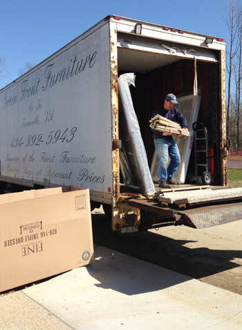
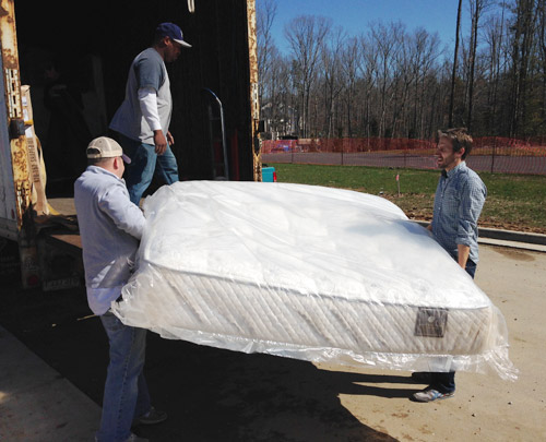
With almost everything done construction-wise in the house, we greeted a truck from Green Front Furniture (the local place loaning pieces to many of the houses in the show). They were delivering a bunch of bigger items like beds, desks, and sofas, so we had an “all hands on deck” day to carry things in and place them. Here I am with Charlie the listing agent hoisting the king-sized mattress out for the main bedroom.
Not everything is coming from Green Front, so more stuff has been trickling in as the week went on. And Sherry and I have spent a few hours every day going to thrift & secondhand places, small local shops, and big box stores to buy all that makes-a-house-a-home stuff to fill blank walls, empty shelves, and other empty feeling nooks and crannies.
There has also been some great progress outside. The wood beams have been stained and sealed, which made their color a bit richer/darker as planned. It still looks somewhat naked without any landscaping, so we can’t wait to see that stuff go in (should be rolling out sod this weekend) but the front door has officially been painted.
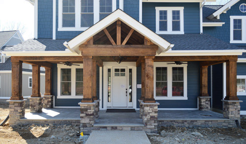
After the rest of the Homearama team weighed in on the door color debate, the write-in vote for white from you guys stuck (we all liked the idea of making the door look more substantial, so keeping it the same color as the white sidelights gave it more visual heft). The real stars of this exterior are the deep siding color and the rustic wood porch anyway, so we were all happy to let the door take a supporting role rather than competing for attention. Especially since we’ll be adding things like landscaping/potted plants/porch furniture to the mix. We even have a hanging porch swing that’s going up soon.
Moving inside, the kitchen is looking much improved now that it’s all put together. The appliances are officially in, the backsplash has been tiled, and we even got our island stools put together, which are these comfy saddle stools donated by West Elm. (For anyone wondering about the island color, it’s Hale Navy, the gray cabinets are just a stock color by the cabinet maker that we picked from a sample, and the gold pendants over the island are from Shades of Light).
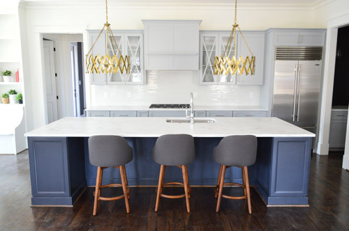
And look, you can see a sliver of styling stuff sitting in the built-ins of the eat-in nook to the left of that picture. Sherry’s probably working on those as you read this.
I don’t think we’ve showed that little corner of cabinetry on the right of the kitchen until now, so there it is. It’s a nice big open space (the island is 11 feet long if that helps put things into perspective) and Sherry can’t wait to get stuff on those counters and in those glass-fronted cabinets to make it feel more homey. Just seeing the stools pulled up to the island made it feel more “like a real kitchen” for us, though.
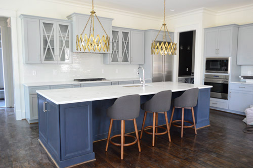
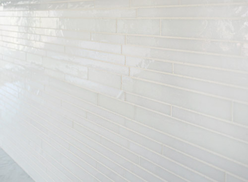
We wanted the backsplash to be fairly subtle, mainly just bringing a little polish and light-reflection to the room. So we chose this white blend waterfall glass tile from a local company called Mosaic. This is another case of “this didn’t need to be the star” since we have things like the gold light fixtures, that big navy island, and those x-fronted glass cabinets – so we just aimed to make it a solid supporting player.
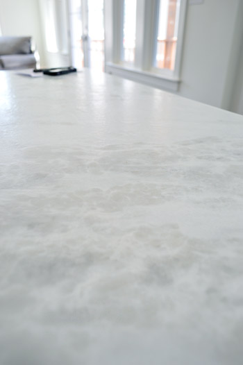
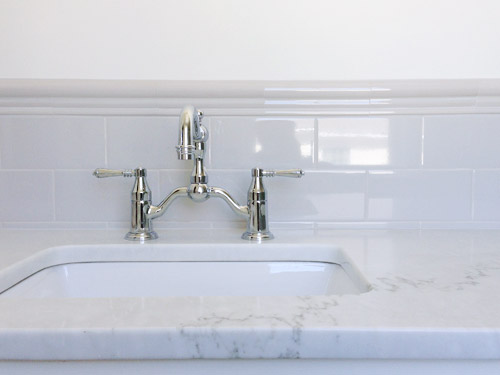
I tried to get a better shot of the counters, but didn’t totally succeed. It’s a leathered marble called White Moura which means that rather than having a smooth, glossy finish it has a slightly pebbled texture to it, along with a more matte finish. It actually feels kind of like leather (hence the name) but obviously is a lot harder/denser. And apparently the way they seal these, along with that added texture, makes them durable and easier to keep clean/maintain.
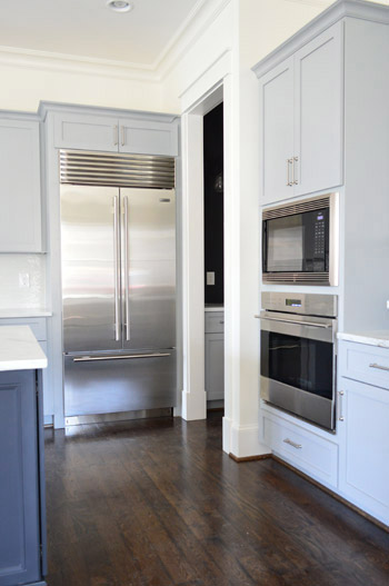
Let’s talk about the fridge. I’m mad jealous of this fridge. Well, actually, I’m mad jealous of Yolanda Foster’s fridge (I do my best to ignore the housewives entirely, but Sherry paused it to show me that fridge and it did something to me). But I’d still feel like a king if a fridge like this ended up in our house someday. We picked all of the appliances at a local contractor place called Cline. We had started by choosing a nice Whirlpool line, but the builder wanted to go big or go home, so he upped the ante and had us select a Sub-Zero and Wolf package.
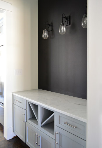
The area through that doorway above is the butler’s pantry which has the same cabinetry and counters as the kitchen. We put in the traditional wine / servingware storage in the bottom, but ditched the usual upper cabinetry in place of some cool industrial teardrop sconces from Shades of Light and a wall full of chalkboard paint. It’s a pretty small transition space so we thought it would be nice to let the upper walls breathe a little – and we have some plans for that chalkboard area soon…
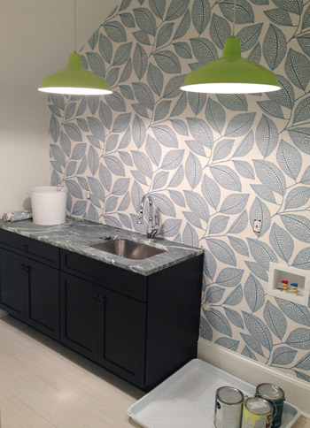
Moving upstairs, the wallpaper we’ve been way too excited about has finally been hung in the laundry room. It’s called Pebble Leaf by MissPrint and was donated by Wallpaper Direct. We waffled a little bit on adding it, but in the end we said “showhouse! take risks! stop waffling!” and went for it. So glad we did.
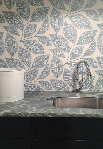
The counters are soapstone (purchased through a local place called Eternal Stoneworks), the faucet is called Leland (donated by Delta), and the cabinets are a dark wood stain (purchased from Affinity here in Richmond) while the floors are a nice, light and modern tile (called Travertino White Field Sunrock, purchased from Mosaic in Richmond). The lights are from our Shades of Light collection (they’re these in “Extra Lime”), and we bought two of them to hang in a row for fun. We’re still waiting on the washer and dryer (we ordered them in a deep gunmetal color) so that should complete that wall and balance things out.
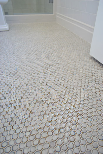
We haven’t shown you the guest bathroom yet, since it’s still missing a few major things like finished tile work and a mirror over the vanity. We wanted sort of a vintage vibe in there so we did a tile wainscot around the whole room, which we can’t wait to show you when it’s finished. In the meantime, here’s a peek at the floor, which was donated by The Tile Shop. It’s the hex version of the penny tile that we put in our last kitchen.
We also had fun with some vintage inspired fixtures, like this this bridge faucet that was donated by Brizo.
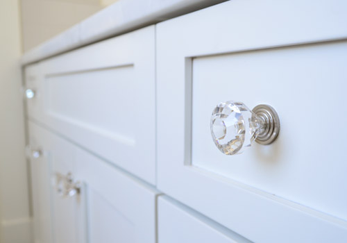
Even little details like having the hardware on the cabinets is making it feel that much closer to complete (these were donated by Liberty).
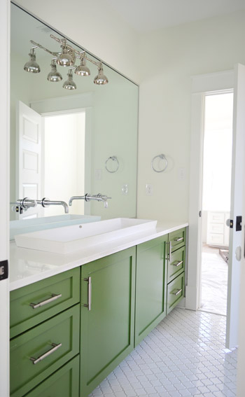
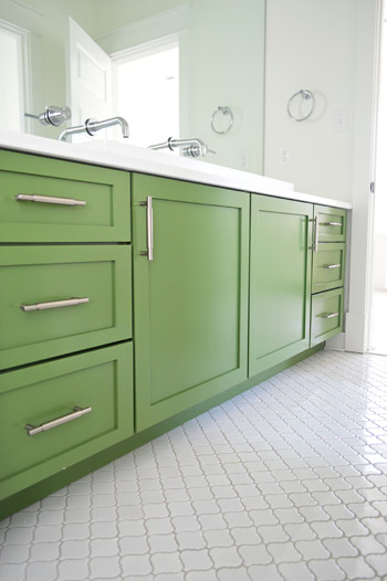
As much as we love the old-school/classic feel of the guest bath, our favorite bathroom in the entire house is the kids bathroom. You had seen a preview of the green vanity and the white lantern tile a few weeks back, but the wall-to-wall mirror finally got installed, along with our wall-mounted faucets, and that fun industrial light fixture (donated from Shades of Light).
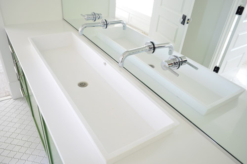
The white solid surface top has a double trough sink recessed into it, which the folks at Ferguson helped us find. It’s hard to see how deep it is since it’s half recessed (it doesn’t just sit on the counter, it drops beneath it) but it has over 5″ of depth, 14″ of width, and is nearly 48″ long. Can I just tell you how crazy Clara would go for this set-up? It’d be like the grandest swimming pool ever for her Barbies. We also had fun adding a pair of wall-mount faucets (donated by Delta) that come directly from the mirror.
Don’t mind me. Just another shot of the vanity since the lighting was about as perfect as I’m ever gonna get in there.
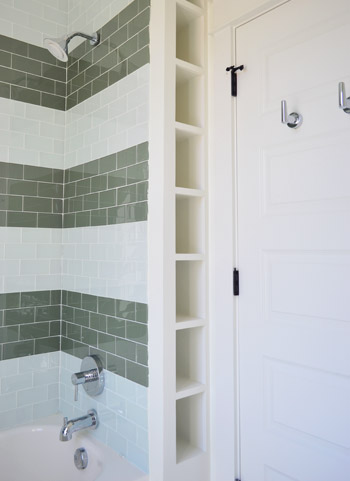
Another fun feature in that bathroom is the attached toilet/shower area, which is sectioned off by a door (so one kid can shower or use the toilet while the other one washes up/gets ready). Inspired by the cubbies in this bathroom, we had the builder squeeze in a set of wall shelves behind the shower that are perfectly sized for rolled up towels, shampoo, and other small bathroom accessories (you can read more about the striped glass tiles we chose for the shower here).
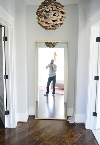
Other little nooks that are starting to come together include the Main Bedroom “Atrium” between the bathroom and closet. We got this brass floor mirror from West Elm so the future owners can look at themselves taking photos (I kid), and of course you guys have seen a peek of that branch chandelier here. Ah to have 10′ ceilings on the first floor and 9′ ceilings on the second floor. Update: these walls are Stonington Gray by Ben Moore.
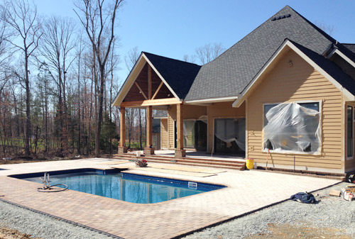
And we can’t forget that there are six other awesome houses going up right around us for the show – each done by a different team. So the other day we took a super quick field trip (the clock was ticking for preschool pick-up) to see some of the other exteriors. How amazing is this backyard? Pools aren’t super common in Richmond so it’s a nice treat to see one going in. We wouldn’t blame you guys if you just hung out back here during most of the show…
Things are going to be really showhouse heavy in real life for us over the next couple of weeks, so forgive us in advance if we’re behind or off schedule. We don’t want to let down our team or Habitat, so we’re hustling to get this baby done… well… before our other baby is done. We’re supposed to have as much finished as possible by April 4th (yes, a week from today) so it can be photographed by the Homearama organizers and then judged shortly thereafter (we’ll continue tweaking things and tying up loose ends for the following week or two). So we’re basically living out there these days. Good thing there are mattresses now.
Psst – Wanna see more showhouse info & photos? Click here for Our Full Showhouse Tour, which includes final pictures of every room, the floor plan, budget info, a video walk-through, and shoppable showhouse furniture & accessories.

Sarah @ Sarah's Daybook says
Obsessed with those stools in the kitchen! And still drooling over the green vanity…
Sarah
http://www.sarahsdaybook.wordpress.com
Tandra@Little Houses Big Dogs says
I’m still head over heels in love with those light fixtures in the kitchen show house. As well as the driftwood sphere! I guess I have to ask the question again, what is your “rule” on the gold/brass when you decorate? I’m trying to capture the vintage look and still modernize our 1948 home…I don’t want all brass nor all oil rubbed bronze, or brushed nickel, how would you mix the metals? ( I’m already looking up two tone hardware for the kitchen, but still thrown) Thanks guys it looks fabulous!
YoungHouseLove says
Thanks Tandra! We love mixing metals, we just like to make them reoccur a few times to tie things together. So if the faucet and pulls are chrome but the lights and a fruit bowl and tea kettle and a few other accessories are gold it’ll hopefully look layered and intentional instead of having one finish feel like he’s the odd man out.
xo
s
Jillian says
I’ve been on the Shades of Light website for an hour trying to find those kitchen pendants. They would look amazing in my dining room. Do you have a link?
YoungHouseLove says
If you search “accordion” they’ll hopefully come up for you!
xo
s
Plein Jane says
John and Sherry also provided a direct link to the accordion lighting when they first chose them. That’s how I found my way back to them!
Aimee says
Long ago, we gutted the baad late 1940s reno of a 1920s bath. No choice, the tub’s main, original, cast iron drain let go and waterlogged the floorboards and destroyed the ceiling/wall below. (WHY do they not tile ceilings in tubs rather than putting in those ugly shower surrounds?) Besides the drain on the toilet blowing as well!
That tub was also cast iron amd we’re lucky it didn’t crash through into the lower bath. Unfortunately the contractor told us that was unsalvagable. Wish I hadn’t listened to him and had it refinished.
5 layers of lino on the floor and lino on the lumpy plaster and lathe walls! I think the wall lino was an attempt to cover up DIY gone bad.
Anyway, I used chrome for the fixtures because I found a great Edwardian-style faucet that was true to original period, but picked white lights in a similar style. It exactly matched (bowing to light fixture goddesses) the color of the ceiling and upper walls – lower were midnight blue and hey, it was the 80s, so I separated that with a celestial wallpaper border of midnight, gold, and white. Ended up looking pretty good.
White lights blended right in and were barely noticeable at all, let alone being noticeable as a different finish from the fixtures. It was a good choice for that room.
I would’t fret too much over what the DIY experts say about mixing. Do what looks/feels good for you. They’re not going to live in it.
Carrie K says
Really, REALLY wish I lived in Richmond! Well done you guys! :)
Dani says
Er…April 4th is a week from today ;)
Lindsay says
Heh. I thought the same thing. I’m hoping that they just wrote this a week or so ago, and not that they think they have TWO weeks left from today before their deadline!
Good luck, guys! It looks AMAZING so far!! :)
YoungHouseLove says
It was sort of a combination brain fart between having a week until it’s due to be shot and two weeks before judging, so we have a first “softer” deadline for the shoots (they don’t shoot the whole house, just a few choice spots) and then a “harder” deadline a week later for judging – although we expect to keep tweaking and filling things in right up until that baby of ours shows up!
xo
s
Renee says
Everything looks fabulous! I love the green vanity and the drift wood light fixture the most.
I have to say though, I’m not really feeling the gold/brass light fixtures in the kitchen. They seem out of place with the stools and the cabinetry you used.
YoungHouseLove says
Aw thanks Renee! I think every room will look wacky until it’s accessorized, especially those with mixed woods or metals, since the tie in objects are still missing. For example, a few gold accessories like a fruit bowl and a tea kettle will hopefully tie that stuff right in – as well as some hits of gold in the breakfast nook nearby. At least that’s the plan…
xo
s
Lo says
Hi, I don’t think Renee means the *color* of the light fixtures looks out of place, but more the style… Or rather the style of stools don’t really go with the lights. I agree.
Personally, I think you’ve made some nice choices overall and the house is looking good! :) Love the rustic elements, green vanity, striped tile especially. I will say though, I am not a fan of the gray cabinet color or the X glass cabinets. But c’est la vie!
YoungHouseLove says
Thanks Lo! There have definitely been 1,001 choices that we had to make sort of all on top of each other to get this house together, so there are definitely things our eyes are still adjusting to, as well as things we’ve said “huh- that’s not what I pictured…” about as well. We’re just trying not to be too quick to undo something or condemn any decisions before the rooms are more pulled together – but I’m sure there will be things we tweak and things we wish we would have done differently in the end! This whole experience has been a giant learning curve for us!
xo
s
Aimee says
No, no, I think navy/midnight blue should ALWAYS be paired with gold! It looks/feels so much warmer than silver or plain old white. It’s making cold grey stools recede into nothingness. The pattern is also making those X-fronted cupboards stand out as one of the room’s shining stars and drawing focus to the oversized island itself, not its accessories. Gold stools would’ve been overkill and have competed with the stellar room features, making it too busy.
I think John and Sherry hit it out of the park on this one. Very unexpected and elegant.
I wasn’t sure when I saw the navy fireplace, but I’m hoping this sets that off as it was intended. Can you guys grab a pic showing them both?
YoungHouseLove says
Aw thanks! We’d love to snap one for you in the next week or so (a table for the eat-in nook is being built in the middle of the living room but once that’s installed we can hopefully grab some wider shots).
xo
s
Zuzanna says
My colleague just asked me if you can come over to Holland and help her with her house as well ;) A gal can dream, right? Ever thought of hosting your own show “pimp my house” and making an international edition? I am sure Dutch houses would give you some interesting challenges to think about (especially the steep and narrow staircases). Pretty pleaaaseee :)
YoungHouseLove says
Haha, thanks Zuzanna!
xo
s
Robin says
Oh wow! I love every inch of this house! Cannot wait to tour them all!
Jessie says
I hate to burst your bubble, but April 4th is one week from today! The show house is looking beautiful!
YoungHouseLove says
Yes, sorry! Scrambled brains. Fixed that for ya :)
xo
s
Laura says
The house looks great. You may have mentioned it before, but how many square feet is the design home you are decorating? It seems like it’s not that huge, but rather really open and “smart space” as opposed to closed off rooms no one ever uses.
YoungHouseLove says
It’s around 3,500 square feet, which feels really big to us (decorating it is hilarious because we pack the car with accessories and bring them in and we just fill two built-in shelves and the rest is bare) but it’s one of the smaller ones in the show.
xo
s
Ann says
I think that’s (one of) the hidden expense of upgrading to a bigger house… wayy more decor is needed, and sometimes a lot more large-scale things that will just look “average” sized comparatively. That house is very enviable though! Good luck next week!
Lynne says
I love the kitchen layout! It looks so functional in there. And the kitchen light is the best! I’d put it in my kitchen if it wasn’t a rental. Hmm, maybe I could, and then reinstall the old one and take it with me when I move – that would be crazy, would it?
YoungHouseLove says
I have so many friends who do that! They switch them out to live there, and then take them with them and put the original lights back.
xo
s
Anele @ Success Along the Weighn says
Industrial teardrop scones = LURVE!
Kerry says
I always wondered (worried — why?!) what you might do when you’re current home is “complete,” but now I know — you can do be the next Jeff Lewis(es)!
You guys did SUCH an amazing job.
The level of detail is dizzying and you’ve put as much love into a stranger’s home as you do in yours.
BRAVO! I’m already jealous of the lucky future owners!
YoungHouseLove says
Ahh! Stop it Kerry. You’re too kind.
xo
s
Carrie K says
April 4th is A WEEK from today! Hopefully, that doesn’t give you a heart attack….typo?
YoungHouseLove says
Yes, brain fried = typos everywhere. Haha! All fixed :)
xo
s
Maya says
Wow, it’s looking amazing!! I LOVE the subtlety of the backsplash in the kitchen, love the wallpaper, love… basically everything.
You said you were inspired by that pinned house for the bathroom cubbies, but as soon as I saw them, I was reminded of your closet in the bathroom of your first house!
YoungHouseLove says
So funny, it does look like that!
xo
s
Kendra L. says
I am with Anele….. those industrial teardrop sconces bring a happy tear to my eye. With the chalkboard paint backing? nirvana
Hope this whole process is still FUN!!
Also, PLEASE advise on the Master Bedroom color! Our painter is coming this Tuesday. It is down to BM Gray Fox, Wickham Gray, or this Showhouse Master Color. Thanks, all!
YoungHouseLove says
That’s Stonington Gray by Ben Moore. Really pretty in person!
xo
s
Sarah says
Love the house! Did you choose flat panel shaker style cabinets or do they have a slight beveled edge?
Thank you!
YoungHouseLove says
I would describe the choice as a clean-lined shaker-style cabinet, but they do have a slight bevel to soften them (you can sort of make it out in this pic.
xo
s
Aimee says
Even if I didn’t have kids, that would be a turn-off. We are all about minimizing the cleaning as we get older, and it would drive me nuts to see that mirror constantly splattered with dried water drops.
Lee Ann says
Wow! Looks great. I’m fascinated by the mirror-wall-mounted faucets in the kids’ bath. Would love to know how difficult it was for whomever (plumbers? mirror-installers??) to make that happen.
YoungHouseLove says
The plumber seemed to have an easy time with the wall mounted faucet since he knew the plan since the room was framed out, so even before drywall he could run the plumbing through the wall to come out in the right spot. As for the mirror, the fabricator just measured for where to put the holes and it didn’t seem hard for him either (he slipped it over the plumbing fittings and then the plumber added the knobs and faucet over it. Hope that helps!
xo
s
Blaze says
Love the green vanity! I also love the look of those faucets through the mirror but I think I’d have saved that for the guest bath where they’ll be used less. My immediate thought was of kids with poorly rinsed hands leaving a trail of drippy soapy mess all up the mirror to the handle. Yikes! Wouldn’t want to be the one trying to keep that bathroom clean.
I can’t tell if the vanity is more shallow than usual, but do you envision any problem with kids being able to reach those controls mounted up the wall? When you mentioned the trough sink I assumed the faucet would be at one end, or even both ends.
I was expecting to love the green vanity, but actually my favorite thing has to be the chalkboard wall.
YoungHouseLove says
Aw thanks Blaze! We’ve envisioned the kids in this house being a bit older (the price range/neighborhood is less of a starter family home and feels more like tweens or teens would live there) so we have designed the kids rooms with that in mind (there’s a full sized built-in desk in the girl’s room as opposed to a small kid-height one, and we didn’t picture anyone needing stools in the bathroom since we figured they’d be taller/older). Definitely something to think about if you’re designing a house for younger kids though!
xo
s
Kristen says
Hm, this comment struck me as odd… Not all parents with young children are looking for starter family homes. Many are having kids later when they’re more financially stable. I feel like it would have been better to design something that would work for young and old.. but hey, to each their own :)
YoungHouseLove says
We just were told by Homearama to make up a pretend family in our head. Apparently it’s a tip for designing rooms when it’s a house for a show since you might decorate it half for young kids and half for old kids unless you have this specific description in your heads. So we made up The Petersons in our minds, who have a teen daughter and tween son. I think a stool for kiddos in the bathroom would work for a real family with young kids though. As John mentioned, Clara would LOVE that sink :)
xo
s
Isabel says
This is looking so fabulous, I really cannot wait to see it in person! Really loving those WE stools and the chair you showed us on Instagram. I was just telling hubby the other day how fun and rewarding it must be to do something like this, tiring I’m sure, but fun :)
Katie {deranchification} says
Those teardrop lights. That trough sink. That bridge faucet. L.O.V.E.
Evelina says
This house is BOSS. I can’t wait to see more of the rooms! Faves so far: the kitchen floors, chalkboard wall, guest bath cabinet hardware, kids’ bath vanity & sink & tile & cubbies, atrium branch chandelier. Wait I think I just listed everything. Ok, I love everything. Obvs!
Sina says
The house is looking great! EVERY deatil you guys have picked out is PERFECTION!!! Keep up the great work! I can’t wait to see it when it is done!
Can you remind me who the builder is again?
YoungHouseLove says
John Waters of Biringer Builders. The man is a genius.
xo
s
Jennifer says
That house is off the chain! I love everything about it. Wish it were mine! Beautiful design choices. You guys rock :))
AE Reed says
Hey guys! LOVE what is going on with the house! (yours and the show house!)…Greenfront Furniture is a great place. I went to school in Farmville and would wander through Greenfront from time to time just to look at ALL of it!!!! :) Keep up the great work!! :)
Samantha @ Fabulous Fabris says
Wow! Everything is coming together beautifully! I just love that wallpaper in the laundry.
I can’t wait to see it all complete :)
Heidi says
That island is still insane. Who needs a dining room table when you’ve got an island that big! You guys have done an amazing job with all of the finishes and I can’t wait to see this house when it’s done.
http://jax-and-jewels.blogspot.com
Lisa | Winter Heights says
Everything is amazing!!!! Love those sconces on the black chalkboard wall. And the laundry room looks awesome…that wallpaper and those lights! Great job guys, bet you’re loving seeing it all come together. :))
Jennifer says
I mention this in every comment I leave about the showhouse, but omg, it’s SO FUN watching this all come together. I love the posts about the projects you do on your own house because they’re detailed and specific, and I can learn from them, but I like the change of pace over here, too, where it’s BAM! LOOK AT THIS! So exciting.
Also, your guest bathroom tiles look like they might be the white version of the tiles we put in our upstairs bathroom last year (also from The Tile Shop) our house was built in the 1920s so we were trying to do an updated bathroom but still have some nods to the past, so we used those larger “kinda like subway tiles” as wainscoting and added an accent row:
http://www.flickr.com/photos/cutiemoo/13217515613/in/photostream/
Actually, you can see the size of the tiles better in the shower (that’s the original-to-the-house over-sized tub that we had reglazed in a fresh, bright white, too!):
http://www.flickr.com/photos/cutiemoo/13217697114/in/photostream/
We decided to save money on the floor tile and just do a simple ceramic, but man, I was tempted to do a hex tile! Love the one you picked!
But seriously, the green vanity in the kids bathroom is obviously the big star! NEVER would have thought to do that!!!
YoungHouseLove says
Aw thanks so much Jennifer! And I love those flickr pics. Such a pretty room!
xo
s
Aimee says
I LOVE that you retained those big thick chunky 1920s baseboards! I miss mine. They’re made so insubstantial and meekly cowering in the corners nowadays.
Somer says
As much as I love the white door, coming from experience, it’s going to get so beat up! I’ve had to do more scrubbing and repainting from the amount of kicks the door gets. It’s like people can’t properly judge distance to the door and the amount of steps it takes to get there! And for some reason, I keep just saying “toe kick” in my head right now.
YoungHouseLove says
Thanks for the tips Somer! We actually leaned away from a white door after worrying about how dirty/beat up it would get in the initial door-color poll post and it was amazing to hear from dozens of folks with a white door who said it wasn’t an issue for them (here’s one of those threads). Here’s hoping it’s not too much trouble!
xo
s
Debbie says
We have a white door. It’s under a porch and it would be too dark with a darker color. We use our garage or side door a lot. So the front door does not get too dirty.
YoungHouseLove says
So glad to hear it! This house has a garage entry (two cars, on the side) so maybe they’ll have the same luck? The show will be a giant test with tons of people going in and out, so we’ll have to see how it weathers the storm.
xo
s
Jessica says
Love the kitchen! Several months ago we gave our little kitchen a face lift with blue/gray paint on the cabinets, white silestone counters, and a clear glass backsplash! I didn’t realize we were so on trend :) It’s such a beautiful and comfy look!
YoungHouseLove says
Sounds really pretty!
xo
s
Hannah Rose says
I’m a “word” girl. I look forward to reading your post titles as much as the blog itself!
Kristine says
Love your choice of light fixtures and that leaf print wallpaper. Thanks for stop waffling! Hope you make a “lessons learned” from designing a show house from scratch post.
YoungHouseLove says
Definitely will! There have definitely been some “woops, now we know” moments. Haha!
xo
s
Michelle says
Love!! I know you guys are going to share alllll the details soon, but would you mind sharing the wall color in the master atrium? Just what I’ve been looking for!
YoungHouseLove says
That’s Stonington Gray by Ben Moore.
xo
s
Trista says
You guys…this is looking crazy good. Thanks for all the inspiration.
erin says
i LOVE the green vanity!
Sara says
The house looks awesome!
Are you going to make a video tour when it’s finished?
YoungHouseLove says
Yes, we’d love to!
xo
s
MB says
You guys must be having so much fun with this…at least I hope! I bet you’re run ragged about now. Anyway, it looks great and I can’t wait to see the ‘vintage’ guest bath. I wish I could see the house in person! Will you do a house crash of all the other homes??
YoungHouseLove says
Yes, we’d LOVE to crash the other six homes when they’re done! We have posted about this event in past years (just walking through and snapping photos of our favorite features in all of the houses) so we can’t wait to do that again!
xo
s
Lindsey d. says
I don’t think y’all have covered this yet, but how about a wrap-up post later that details the difference in thought processes between design for “a house from scratch” versus “working with what you have/is already built?”
YoungHouseLove says
We’d love to do that! It’s completely a different animal, and there are so many pros and cons to each approach. Lots of learning moments for sure!
xo
s
Carrie K says
I second that idea!!
MissyV says
So many great touches – love the house! What brand and color are the hardwood foors? I would love that color wood for my home. Thanks!
YoungHouseLove says
They’re basic oak floors that have been stained/sealed on site in Jacobean (that’s the stain color).
xo
s
Richelle B says
I really wish I lived closer so I could come to this event, it’s something my mom and I love to do together. The last few years here in Texas have been 10 houses that all seem to be exactly the same, I love that this event has different decorators, different builders, etc.
I love reading the comments on your blog too, it’s funny how everyone has such different opinions about things. Someone above said they didn’t care for the accordion fixtures in the kitchen but they are one of my favorite things.
YoungHouseLove says
Aw thanks Richelle! We are hoping to do a video tour so anyone who’s too far away to come out for the show can hopefully feel like they’re walking through :)
xo
s
Annie says
As I was scrolling through, I couldn’t get over how amazing I thought everything looked… except the stools in the kitchen. They just don’t work for me. Same with the brass mirror in the atrium. For some reason I’m apparently not digging the West Elm additions to the house.
Otherwise, love it all. That green vanity is so bold, but it totally works. Great job!!
YoungHouseLove says
I definitely think things look crazy unfinished right now (the gold mirror in the atrium ties into the bedroom fixture, which has gold accents on it, but we haven’t shared that yet since that room is a mess). Hopefully as things get more complete they’ll make more sense! We can’t wait to have more big panned out shots and even make a video of you guys to “walk you through” the space :)
xo
s
Tessa says
Me, too! I LOVE everything… except the stools – such a grand, classic kitchen and the style of the stools seems more casual or mod. Enamored with the butler pantry. Intrigued by that leathered countertop. The bathrooms are near perfection. <3 the color palettes. It's really coming together!!
Rachel B. says
Looks beautiful! I’m hoping that you might do some house crashing of the other homes the designers are doing, pretty please? I’m curious to see all the different styles and what bold moves they made.
YoungHouseLove says
For sure!
xo
s
Kathryn Ferrie says
So many great details! I love the green vanity. I know you had toyed with green in your last house and I’m glad you went for it in the showhome!
We have that colour green vanity too and it’s so fresh and fun!
I can’t wait to see it all done! xoxo
Adrienne says
Literally giddy when I saw that this was going to be a post showing more show house pics. I’m finishing my 3rd level- it has 11 foot ceilings, after 14 years, and am drawing much inspiration from some of the things you are doing. (in this house, your past projects, and other bloggers) I LOVE the green vanity in the kids room and decided to paint the basic white one I bought for my bathroom. I painted it the yellow from your past house’s front door. IT LOOKS AWESOME! I can imagine the future kids in this house brushing their teeth together and finding great joy in their spits mixing- gross, yes, but it will happen! Looking forward to the next weeks and seeing the finished house.
YoungHouseLove says
Love that Adrienne! It sounds awesome!
xo
s
kerri says
i could cook in that kitchen all. day. long. :D plus, i’m loving the tiles in the kids bathroom… we installed the same ones earlier this year and i get happy every time i walk in our bathroom and see them!
YoungHouseLove says
So glad to hear you have those same tiles in a kids room and you have loved them! We did gray grout with them to hopefully make them more kid-friendly ;)
xo
s
susan says
Oh my goodness, there isn’t a single choice you two have made that I don’t love. My favorite things are the bathrooms, and I love all of the tile. I can’t wait to see the kitchen and dining nook once everything’s in.
YoungHouseLove says
Thanks so much Susan!
xo
s
Heather says
I would move in immediately if I could. Everything is so pretty! I love what you guys have done!
SRPQ says
Could you tell me where you’re kitchen and bathroom cabinet pulls are from, please? Love them!
YoungHouseLove says
They’re all from Liberty Hardware.
xo
s
Brien says
This house is absolutely beautiful! Great job. Can’t wait to see it 100% finished. Friends of ours used the leathered marble in the their kitchen and it is a show stopper for sure. I am obsessed with the island!
Linda Loo says
Not to be pesky Mrs. Smarty Pants, but I don’t want you to be behind schedule… isn’t April 4th only 7 days away??
YoungHouseLove says
Thanks Linda Loo! That was a typo that we updated around 9:15 this morning, but I think if you’re reading through a reader it might not have updated yet :)
xo
s
Amber says
Just out of curiosity, why isn’t the kitchen sink centered on the island? The lack of symmetry is driving me bonkers, especially with the tall faucet being so close to one gold light and so far from the other. I’m sure you have great plans to make it feel balanced, but right now those gold lights are just too much. LOVE everything else!
YoungHouseLove says
Good question! A centered sink just couldn’t be accommodated due to getting the dishwasher next to the sink on the back side of the island. The choice was a centered sink without function (a dishwasher in a weird spot, etc) or function with a slightly off-centered sink, so we went for function. I’m hoping that once I style it, we’ll balance things out though. It’s funny how many island sinks are not centered when I’m looking at dream kitchens on Pinterest, so that makes me feel better. Sometimes just putting a cutting board next to them and making that a prep zone can solve it, etc. It really is a bummer we couldn’t get the sink centered without throwing off the dishwasher though!
xo
s
Bethany says
I didn’t even notice the sink wasn’t centered, shows how observant I am! I kind of like the idea of an off-centered one though. I’m in a rental with a teeny kitchen right now (I have 4 very small patches of countertop, not super practical) so that huge spanse of countertop looks AWESOME to me. So much room to spread out and prep! Will be a great space to decorate cookies at Christmas time :)
Amber says
Function would definitely be my choice too! You’d think with such a large island, the dishwasher wouldn’t be an issue. Can’t wait to see it all balanced :)
Blaze says
I assumed it was intentional. Depending whether you’re left or right handed you’ll tend to work to one side of the sink vs the other. Same reason you locate the dishwasher left of right to simplify the scrape/rinse/load dishwasher process. Our dishwasher had to be to the right of our sink, but as a righ handed person it would have made more sense to the left (I hold the dish in my non-dominant hand, and scrape, rinse etc with the other (right) so it would be easier to load a machine to my left. Not a huge deal and we’re both righties and used to it now, but in future if I have a choice about placement the sink vs counter, and sink vs dishwasher will be corrected. I know, I know, first world problems…
YoungHouseLove says
So interesting! Thanks for the tip Blaze!
xo
s
Danielle says
Blaze – this is totally genious! If I ever get to design a kitchen I am keeping this tip in mind!
Sam says
I was wondering the same thing. Also why didn’t you guys pick out double sinks?
YoungHouseLove says
Adding another sink would mean staring at the wall while using it (this kitchen is in the middle of the floor plan and there are no windows), so after working on a bunch of layouts with the builder, architect, and a group of cabinet pros, we all thought a big single sink looking out into the living area and breakfast nook was the best option.
xo
s
Heather says
Uh oh… Right- vs left-handed sinks?? One more thing to consider when my lefty partner and righty me buy/build a house at some point.
I can’t stand my MIL’s set-up. They put all the dishes right above the dishwasher… so no one (not even the 6’5″ son) can put dishes away while the dishwasher is open. They have to empty the dishwasher to the counter, close it, then put everything away. Invariably, because the dirty dishes sit on the counter right above the dishwasher, it means co-mingling clean and dirty dishes so that some things get washed a few times before being put into the cupboard, and some things get put away dirty. Drove me batty living there a year and a half, drives me batty every visit, and it was all set up the wrong way for it to be easy for my partner who was washing all the dishes! Perfect for a righty though, at least on the dirty end of things.