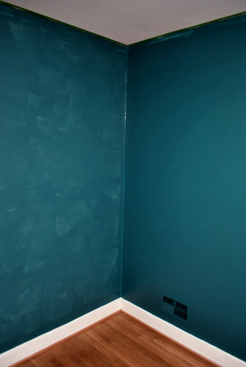
We finished painting the guest room. And boy is it bold. Seriously, it’s like no room we’ve ever painted before. And we luuurve it. With a capital urv. This is probably the most accurate pic (well I guess it’s as accurate as your monitor) of the dark teal that we went with:

The color was of course inspired by none other than Sue the Napkin. It’s kind of similar to Dragonfly (the color that we painted the backs of the built-ins in the future dining room) but when we held up a ton of swatches in the guest room we preferred this color (Dragonfly was darker and greener).
It’s called Plumage by Martha Stewart, but of course we got it color matched to Olympic Premium paint since it’s No-VOC (even the colorants they add are now VOC free). We went with an eggshell finish (so it’s a bit more wipeable and durable than flat but not too shiny since it’s such a deep tone, which can show lots of flaws and imperfections when it’s glossy). Lowe’s actually had a bit of trouble getting a good match, so if your paint pro can’t get it close enough – our lady finally got it within .03% accuracy – Olympic’s Azalea Leaf is an extremely similar alternative. Of course you can also just go with Martha’s Plumage and not color match it to any other base to avoid matching worries completely.
But back to the whole room painting process. Let’s just say that as soon as we started rolling it on there were some oh em gee moments. And a fair amount of melodramatic nail biting.

But after we got to the second coat, the coverage was great and it was looking deep and rich and bold and fun. See how much more coverage coat two gave us below (the wall on the right has two coats while the wall on the left just has one). Pardon the semi-odd coloring in this shot and the one above, they were taken at night so the rest are more accurate thanks to daylight.
After we completed that second coat we were sold. Seriously. We got all hyper and slap happy. There’s just something about pairing in your face color with crisp white trim that makes you giddy. And amazingly enough, we got ‘er done with just one gallon of paint (with some to spare actually) since it only called for two coats – probably thanks to the tinted primer we used beforehand.
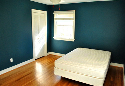
The first thing we did this morning was run into the guest room to admire it in the daylight. How can a $22 paint job make such a difference? It’s amazing. We were about to snap some after pics for you guys when the doorbell rang. It was our new guest bed arriving 30 minutes early. So it ended up in the pics since we didn’t have a moment to take any without it (more details on our mattress buying adventures later). Anyway, here’s the view of the room from the adjoined guest bathroom:
And here’s a shot of it from the hall:
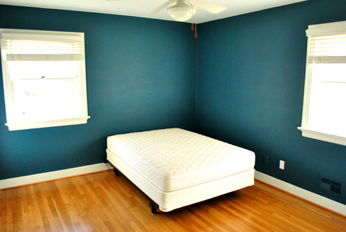
The off centered windows are definitely going to make the floor plan interesting, but we’ll share how we land on our final layout when we, uh, land on a final layout. We’re just going to play around with things until we figure out what we like best.
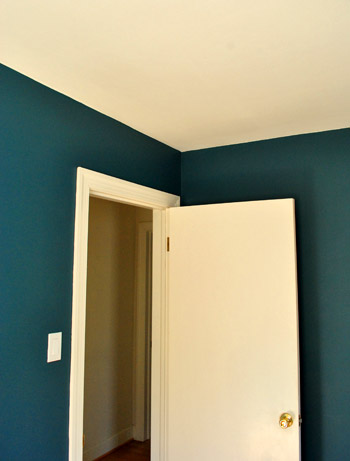
Oh and you’ll notice that we painted over some of the wall warts (as they so lovingly call them) like the vents and an old Bell Atlantic phone jack to the left of the white outlet plate above. They were already painted over by the previous owners so we repainted them to match the new wall color. We did keep all of the unpainted outlets unpainted though.
Speaking of painting over things, after a surprising number of requests I finally remembered to make a cutting in video, so you can enjoy the riveting play by play below and see how I use my favorite brush to get a nice clean line next to baseboards and trim:
As for down the road projects, we’d love to add crown molding and possibly paint the ceiling a lighter tone than the wall (or at least freshen it up with crisper white paint along with the trim). But that’s definitely not something we have time for with my mom & stepdad rolling into town this Thursday.
So there you have our dark teal guest room. Now we just have to hang the headboard, dress the bed, get a shower curtain and bath mat, change out the toilet seat (it’s old and rusty), hang curtains (if we have time), and figure out the side table & lamp sitch (might not get to that either). Should be an interesting few days…

Sara @ Russet Street Reno says
This color looks exactly like Ralph Lauren Reflecting Pool, which I have used in several rooms of my house – love it! It’s a great choice with white trim. Bravo!
Audrey says
LOVE it! So glad to see you all taking real risks!
annabelvita says
Oh my goodness I love it!
I didn’t realise how big the room was before seeing it with that bed in it. Between the bold colour, the large size and the sweet en suite (heh) your guests will feel like they’re staying in the cutest hotel ever.
Jane says
pretty!
Anita says
L.O.V.E.
LOVE! It’s fantastic. Can’t wait to see what bedding and accessories you use!
Melissa says
I LOVE the bold colour! Great job! Great Choice!
RA says
Can’t wait to see how the duvet from your former master bedroom plays against these lovely walls.
Cait @ Hernando House says
It’s so funny to see a dark color in your house. I think I like it, though. Looking forward to seeing it with curtains, duvet, etc.
Jen in Maryland says
I LOVE LOVE LOVE the wall color!! It looks so warm with the hardwood floors and white trim. Wish I had the courage to paint a room in my house this color. Until I do, I’ll live vicariously through you guys. :-)
Emily says
It’s stunning – nice pick!
fd says
LOVE love LOVE. well done!
Heather says
Wowzers! :) LOVE it!
Rachie says
Totally love it ! Am all for the bold colours, we’re painting our study navy which everyone likes to say will make it dark!??! But I love it! The teal looks so stylish and expensive looking and i love it with the white.
Fab job!
Rachie xo
Jessica says
Looks great! Loving teal with the white trim. Reminds me alot of that inspiration bathroom photo you guys showed…
“Dress the bed..?” Are you using the BB&B bedding you already had or did you find something else?
YoungHouseLove says
We’re planning to use the bedding we already own for sure. I tossed it onto the bed as soon as we finished snapping the pics for this post and clicking publish. Looks pretty cute actually! Stay tuned…
xo,
s
Jessica says
I figured it would! I was trying to mentally picture it (even with the lime green headboard)and thought it would totally work! Happy decorating – the real fun part! :)
Anna says
I think y’all are sponsored by Lowe’s, but if you ever want to try Benjamin Moore instead of just matching their colors, their Aura paint is scrubbable in matte. And it looks so gorgeous!
YoungHouseLove says
Thanks for the Benjamin Moore info! We’re definitely not sponsored by Lowe’s (or Home Depot or any other home improvement store). We just want to be clear about that since we prefer certain products so we talk about them often- but we haven’t been compensated for anything we post about (all of our sponsors are clearly marked on our sidebar under the word “sponsors”). When it comes to Olympic paint, we love that it’s much cheaper than Ben Moore and 100% VOC free (it was recently reformulated so that even the colorants are VOC free, which is extremely hard to find at that price point). Hope it helps!
xo,
s
Beth says
I LOVE it! This is close to washed denim by Martha that I’m thinking about doing in my entryway. Do you think it’s too bold for an entry that is next to a bright green playroom??
Can’t wait to see how the room develops!
YoungHouseLove says
No way. Now we’re loving bold, so we say go for it!
xo,
s
Rachel says
We did our family room in Washed Denim, and it’s a great color! We debated over Plumage too, funny enough. I’m a bold color girl – just go for it!
Nicole says
Looks GREAT! Good Luck with the rest!
Lindsay says
That is such a fantastic color. So beautiful and, of course, it matches the napkin’s palette beautifully. I cannot wait to see the room as a finished product; it’s going to be breathtaking with that teal as the background. So bold!
rebecca a. says
L.O.V.E. IT!!!!!
OMG it’s so amazing! It’s so much better than I could have imagined. I can’t wait to see it all come together!
Megan says
I also LOVE it.
This will definitely appease the “you guys never take risks” crowd- not that they matter at all ;)
Gorgeous!
Robin says
So dramatic! Maybe too dark for my taste but I love it in your room! Looks great, can’t wait to see what bed linens you pick? White? Pink? Yellow? Green? Oh my!
Shannon says
the color is stunning!!! I’m really looking forward to seeing your layout. This room is EXACTLY my master bedroom. windows and door in the same place, the size even looks the same. i’m hoping to be inspired. i’m freshening up our room as we speak. our walls are benjamin moore valley forge tan, a medium taupe, and the bedding from West Elm that I’m dying for actually has a color similar to what you’ve painted your room.
Stephanie says
Me too Shannon. I didn’t notice it until it was empty but my MB is exactly the same. I can’t seem to get an arrangement that is perfect. Very excited to see what happens in here!
Linda says
Lovely. I’m a bold color girl. We have an indigo blue room and it never fails to please me when I see it. Can’t wait to see the finished room.
Becky says
Wow!! That is absolutely gorgeous!!! I wish the rooms in my house were bigger so I could paint darker colors, but they are wwwaaayyy too tiny to not do light, bright colors. I LOVE the way the white stands out so much against the teal. Wow.
Amanda @ Our Humble A{Bowe}d says
Love it, but now I’m wondering where Caponata will end up? I can’t wait to see that color in action!
YoungHouseLove says
That color reads differently in different rooms of our house, so we’re still debating that too. Maybe on a cool thrifted dresser or cabinet?
xo,
s
Samantha says
LOVE IT you guys! Great choice!
Robin says
also just wondering: do you guys put any sort of plastic or protective sheeting on the ground while you paint? I of course would drip and make messes on those beautiful hardwoods but perhaps you’re that much of professionals?!
YoungHouseLove says
Nope, we’re crazy. We just wipe those rare errant drips as soon as they happen (thanks to the floor being poly’d, the paint blob comes right up). But the pros definitely cover everything with drop cloths- we’re just lazy/overconfident. Haha.
xo,
s
Katherine O says
I love it. I am using this color as an accent in my daughter’s room (she is one, and I am changing her room now that we’ve moved into our first house). How bold and wonderful.
Tracy says
LOVE IT! I can’t wait to do something BOLD!
maryann says
Very pretty. Will you paint the bottom piece of floor molding white also? It’s usually not wood colored.
YoungHouseLove says
That’s a 50/50 thing. In both houses we have owned the quarter round (also often called shoe molding) has been unpainted in every room, so we’re happy to leave it the same finish as the floor instead of painting it to match the trim. It should save me about 500 hours of time, and since it’s already consistently unpainted here, I’m happy to stick with that formula!
xo,
s
Heather says
Since this seems to be so hotly debated, I thought I’d note that we live in a 12 year old house and the shoe molding/quarter round is wood like our floors. The baseboard is white. It touches both the floor and the baseboard – I like that it matches the wood…and less likely to chip or be obviously nicked. To each their own. :)
Hollie says
My house is only 3 years old and the shoe molding is also wood colored. I think it’s just personal preference. I happen to like it painted white in my home so that’s on the to do list.
Stephanie says
Very nice!! Sherry, you have an amazingly steady hand and an amazing amount of patience! Do you ever make a boo-boo though? I’ve tried and tried cutting in without taping off, but I always end up messing up somewhere and then I end up taping off anyway. So, after accepting that I don’t have a steady enough hand, or enough patience, I tape first. The walls look great!!
YoungHouseLove says
Oh yeah I make paint mistakes all the time. Thankfully the precious owners left the trim paint clearly labeled in the basement so knowing I could quickly touch things up was definitely a comfort!
xo,
s
Elisa says
Golf clap! This turned out great! We’ve got a teal accent wall in our bedroom.. you can never have enough teal, and it’s got a great soothing feeling for bedrooms. Can’t wait to see how this room comes together :D
Ellen says
LOVE the color. Now you’ve got me thinking about it for *our* guest bedroom…
Melinda says
What a great choice! I think your color taking risk definitely paid off in this room. Can’t wait to see how the rest of the room shapes up!
Karen says
Gorgeous! I just love that color. I wish I had enough courage to paint my bedroom that shade.
Is this the bedroom that adjoins the yellow bathroom? Are you going to tie the two colors together, or go in a completely different direction?
YoungHouseLove says
We’re going to tie that yellow bathroom in for sure (we’re planning to bring in a shower curtain that hopefully makes a connection to the bedroom and add our yellow rug (from the living room) into the guest room to tie that into the bathroom tile. Should be interesting…
xo,
s
Megan @ reFind says
What – the yellow rug?! What are you going to put in its place?? Can’t wait to see it
YoungHouseLove says
Well we’ve been saying that we need a much bigger rug for the giant sectional (that rug’s only 5 x 8) so we’ll have to hunt something down…
xo,
s
mribaro says
The green and yellow combination reminds me of another makeover of yours I’ve been admiring:
http://images.younghouselove.com.s3.amazonaws.com/2010/10/farah-cave-after.jpg
It’s from this post: https://www.younghouselove.com/word-to-your-motha-cave/
Ok, that green is much softer but nevertheless, I am anticipating some fun elegance in your new guestroom :) Your style is infallible, if you ask me!
Stephanie Phillips says
BEAUTIFUL!!! Love it, love it!!
Sarah says
amazing! love the contrast and now i’m inspired to paint my office a deep rich hue. didn’t you have a double/queen bed in your old guest room (@ the old house) before it turned into the office? why didn’t you keep that one for the future guest room at your new house (granted you might not have known you were moving at that point…)?
YoungHouseLove says
We had a full sized bed in that room but nearly a year before we moved (or even knew we’d be moving) we realized we no longer had room for it (Clara was born, John came on full time at YHL – which means we needed a full time home office for two, etc) and it was an extremely old mattress (we’re talking about a 20+ year old hand-me-down) so we were happy to craigslist it for $60 – instead of storing it up in the attic or basement for an undetermined amount of time before we gained a guest room back (it would have been all musty and gross by the time we needed it, plus we decided that it was high time we grew up and purchased a new bed for our guests instead of making them sleep on the old “secondhand” one- haha).
xo,
s
Katy says
Love it!! We’ve had turquoise in our den for some time now and LOVE it. I’m all about saturated colors it creates such a warm cozy feel.
Don’t ya just love a deadline to focus your efforts! Looking forward to seeing the finished product!
http://eatdrinkanddecorate.blogspot.com/2009/01/little-rearrange.html
Tobe | Because It's Awesome says
it’s AMAAAAZING!!! kudos!
Michelle says
That looks great! I love it with the white trim! So dramatic and moody.
Oh, by the way my husband and I are going to Richmond this weekend for a wedding (we’ve never been there) any must-go-to spots??
YoungHouseLove says
We actually have a post planned for this Friday all about our favorite Richmond spots! Spoiler alert: a few faves are Bottom’s Up pizza, Kuba Kuba for lunch, hanging out at the river in Pony Pasture, walking around Carytown, strolling through Maymont, etc. Hope it helps!
xo,
s
Stephanie S says
The VMFA (fine arts) museum is great, but might be crowded since we have a big Picasso exhibit. The Tredegar Civil War museum is great, and the grounds are wonderful for walking. Richmond is also a great restaurant city, so you can look at Urban Spoon or Yelp to get some ideas. You’ll probably be busy with wedding stuff, but Richmond is a great town and offers oodles of things! Enjoy my adopted city.
Tamisha says
Edgar Allen Poe Museum, Hollywood Cemetary, Maymont Park (Greatest house tour and gardens), Lewis Ginter Botanical Gardens, Carytown (shopping), Tredagar Iron Works and Belle Isle, John Marshall House, Museum of the Confederacy (if you’re into that kind of thing), VMFA (but will be very crowded), Richmond Valentine Museum (great city museum), Walk through the Jefferson Hotel, walk up and down Monument Avenue, Segway Tours of Richmond, for sight seeing.
Richmond has good eats. There are lots of food blogs for the RVA. Check them out.
Cristy @ DoubleKnotted says
And the Byrd Theatre! That’s our favorite cheap date.
Cat@BudgetBlonde says
If you or your hubby like history, all the National Park sites are free in Richmond. That’s where I work. :)
xoxo,
Ranger Cat :)))
Tanya from dans-le-townhouse.blogspot.com says
Wow! I love it. I’m such a sucker for anything turquoise or teal, though – I’m biased. But I think it looks great.
Andrea says
This is the color I wanted to paint our bathroom!!! I LOVE it. The hubby has convinced me to go with red in the bathroom instead (BM raspberry truffle), but we haven’t tested it yet so there’s always time to change my mind…
We painted Martha’s Darkening Sky in our kitchen/family room and I totally love it. In fact, we have 4 MS blues in our house now.
Christin says
LOVE the color! It looks fantastic. Can’t wait to see how the rest of the room comes together. Congrats on a taking a risk – I’d say it’s a huge success!
Melody says
Funny! That’s exactly the color I was imagining. It looks great! Also, I’m super impressed with Sherry’s cutting in technique.
Laura says
Love it! We have a small bedroom that we use as a closet, but as we transition into a time where we are thinking about having kids, we want to make it into a nursery. This is a VERY similar color to what we are thinking. We are going to accent it with black, white, silver and grey, and are trying to choose the pop of contrasting color that we might like, maybe eggplant, maybe yellow.
I love this color and can’t WAIT to see it with the bed.
Sherri says
Very cool! The color looks close to the bathroom post from The Lonny mag…are you still planning on doing your bathroom that similar color?
YoungHouseLove says
Nope, we decided to go for this color in the guest room so we don’t want the hall bathroom to look too similar. We’re still pondering another hue for that bathroom (since we also want that to be bold and fun, but not too blue-heavy).
xo,
s
annabelvita says
I vote caponata!
Cameron says
Oh no!!! Now I’m horribly depressed. I love the paint in the bedroom, but I was sooooooo excited about that bathroom. I thought the inspiration was dreamy, so I couldn’t wait to see y’alls take on it. Off to cry now…..
YoungHouseLove says
We still definitely plan to incorporate a lot of inspiration from that photo. Should be fun! No crying allowed.
xo,
s
Blog is the New Black says
I absolutely love that deep, rich shade! Very cool.
Lauren Q. says
We just did our living room accent wall this kind of dark teal and I love it!! We used Valspar, color matched with Sherwin Williams Cote d’Azur – love it!
Thresha says
The color looks great!! I think it’s the white trim that makes it look so good. And thanks for the tutorial!
Lara says
That’s the same color as my master bedroom… after almost three years, we still love it! :)