Please tell me you sung that title to the tune of the Brady Bunch? If not I’ll give you a minute to get to it.
Now that we have that out of the way, I thought I’d share our inspiration command center when it comes to the new house. It’s this napkin that we scored on clearance from Crate & Barrel (which you might recognize from this post of yore).
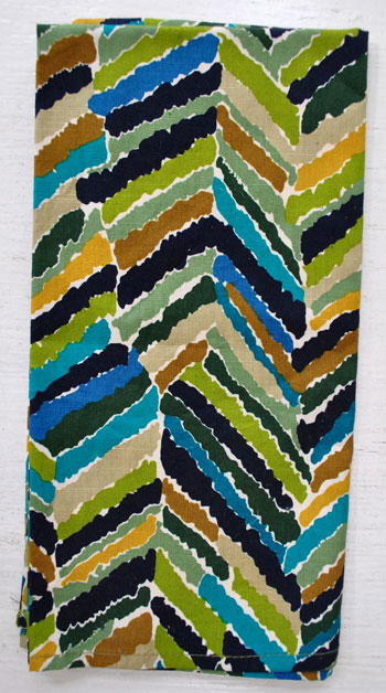
I kid you not. That napkin is like the Sue Sylvester of Casa Petersik when it comes to picking colors and pinning down that ever elusive whole-house-color-scheme. She’s loud. She’s totally in charge. And she’s fun to watch. Thankfully no bullhorn though. That wouldn’t go over well with Burger.
When it came time to choose a color for the back of the built-in bookcases, Ms. Napkin was the inspiration. Same with our bedroom walls and the artichokey green color that we’re thinking about in the kitchen. We literally pull swatches, hang them on the wall in each room to see what we like, decide on a favorite, and then make sure that they look nice next to El Napkin before running to the store to get paint. We definitely haven’t been holding swatches up to the napkin to find a perfect match to every color or anything (we’re picking based on what looks best on the wall in each room, and then just making sure it “goes” with Sue). Look, here we have some of our favorite swatches with her:
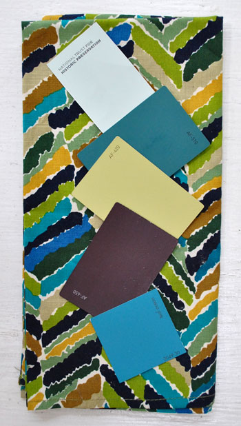
Not all of the swatches are reading exactly as they look on the wall (which of course is par for the course, so always hold something up to the wall in your space to see how it looks depending on the lighting sitch), but the top swatch is our blue-green-gray bedroom swatch (looking quite tame next to all that color and pattern): Catalina Crescent Roll Carolina Inn Club Aqua by Valspar (get that joke here). The second swatch (which is reading less dark and moody in this pic) is the color that we used on the back of the bookcases (Dragonfly from Benjamin Moore’s Affinity line). The third one is the color we’re contemplating for the kitchen walls… when we finally work up the momentum to tackle that room (Agave from Benjamin Moore’s Affinity line). The fourth one is a deep aubergine plummy tone with chocolate undertones (Caponata from Benjamin Moore’s Affinity line) that we’d love to work in somewhere when I put on my big girl pants and grow some cojones). And the bottom swatch is a super layered and moody deep teal (the photo does its depth of color no justice) that I’m working up the guts to use in the hall bathroom (Benjamin Moore’s Teal Ocean). Yeah, it should be interesting to say the least…
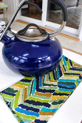
What is it about that napkin that speaks to us? We have no idea. Other than the fact that we like the colors and we like how they look together. So if they can work on a square of fabric why shouldn’t they work in a house? It might be a foolish plan of attack, but we intend to see it through either way. And it’s so easy to pop Sue in my purse and keep her with us when we’re out shopping. Because even though our colors don’t match her to a T, they definitely “go.” So if we see something that goes with El Napkin, it probably will go with our house. Look, it even looks good with my Christmas teapot from the hubs. Nicely done Mr. Petersik.
Who really knows where we’ll end up. We’re just taking things one day at a time and are definitely dedicated to taking more risks with bold color and pattern than we did in our first house. Especially with the bambino around. We’re just feeling the more-playful-splashes-of-color approach over the whole beachy-airy-neutral thing that we did last time. Should be fun.

Kaitlyn says
Have you seen the new end-cap stuff from target? It’s like they released an entire line just for you! Lots of inky blues. I would totally snatch up the blue glass lamps
but then I’d have to redecorate my whole living room around them…
YoungHouseLove says
Yes! In love.
xo,
s
beth says
As someone stressing over a color scheme for the house we’re moving into in less than 2 weeks, I love that you took your inspiration from this napkin :) For the new house, I want to create a little notebook with swatches, etc. so that when I’m out shopping I can get a better idea of what will work with our paint, textiles, etc. (in my imaginary world where I’m that organized ;) ). So do you carry the napkin around *with* you places? Or have you already just internalized the colors going on there and kinda know what goes/doesn’t go? I realize you don’t really aim to *match* the napkin, but how handy to be able to pop it into your bag while out shopping!
YoungHouseLove says
Yes, Sue is in my purse at all times. We don’t leave home without her.
xo,
s
Anita says
I think the napkin plan is a great one! I did a similar thing with our wedding – we found a photo that had all of the right colors, emotions and lines that we wanted the decor/ambiance of our wedding to have. We checked everything back to the photo before we finalized it to make sure it fit with the feel we wanted for our wedding day.
Although we aren’t doing the exact same thing with our house – we are doing something similar. Picking out paint colors that work well with our other rooms, bringing accents from adjoining rooms in to give the whole style a better flow.. it works well! I have the similar plum color on my radar too – it’s currently in use in our living room with faux-silk drapes, a glass lamp, and the spoon/tong container in our kitchen!
Can’t wait to see how things turn out!
Stephanie Phillips says
Since I’m at work today while the rest of the world is off, I vote you jump into the hall bathroom painting so I have something to read about this afternoon. ;) Thanks!
I love the Avocado color!
YoungHouseLove says
Hey Stephanie,
We have a few other projects planned for the next few days, but we’ll there someday!
xo,
s
Beth@Just{Heart}It says
I think you mean “plummy” if you’re talking about color. No b. :-)
That napkin looks great. I love it!
You guys have inspired me to do some drastic things in my bedroom recently, so thanks for going bolder! :-)
YoungHouseLove says
Haha, you’re right. I’m so used to saying things are plumb (level or flush) that I spell that wrong all the time!
xo,
s
Hanna says
That is certainly one in-charge napkin! And it has sparked some really awesome color choices. I am very interested to see what you do with the dark plummy one!
Nichole@40daysof says
Wow! You guys really are going bold. I love it! I love color! Really interested to see where that aubergine goes. :)
http://40daysof.wordpress.com/2011/01/17/swag-yay-or-nay/
Sherri says
I’m confused! Inn (haha) the first bedroom post, I though you said that color came from Valspar?
YoungHouseLove says
Hey Sherri,
You’re right! Off to fix that.
xo,
s
Cait @ Hernando House says
That’s too funny about the napkin!
Anita says
Working my way down my google reader this morning – Mrs. Obama’s shirt matches your color scheme! http://mrs-o.org/newdata/2011/1/17/happy-birthday-mrs-o.html
YoungHouseLove says
Hey Anita,
That’s too funny! Love it.
xo,
s
Ali H says
I love your colors! We have a kitchen with a eat in “nook” and we painted the kitchen a wheat-y color and the nook and back of the island a similar artichoke – it’s a great pop without being too loud. And, we also based all our downstairs color around an inspiration piece, a painting of Tuscany we got as a wedding gift that hangs in our living room. Has all the fall-type colors we love :)
Tanya says
Wow! That napkin sure is bold. Your colour choices have been gorgeous so far. I’m so excited to see where you go from here. I love the mirror in the second inspirational photo!!!
~Tanya
dans-le-townhouse.blogspot.com
Maya says
I love all those colors, and I’m really starting to feel the new color scheme! I LOVE the dramatic inspiration pics.
I’m really wondering what else you’re going to do in the bedroom, since the pattern on the blanket seems like it would stymie me… it’s so pretty, but I wouldn’t know what other patterns I can match to it.
Also, love the plummy aubergine– I keep buying shirts/scarves/sweaters in that color!
Ann says
Fun and bold colors! I too have a fabric swatch for my house colors. Keeping something with your colors on hand eliminates problems because the swatch will keep everything from furniture to walls to accessories flowing nicely through the house. I gravitate to warm colors and once in awhile, I’ll totally fall in love with something on the cool side. I pull out the swatch, and say ‘no’.
Corley says
I had a blue bathroom that color when I lived with my parents. I Loved it! It had previously been hunter green, navy, and maroon (pre owners) but the bright blue with flowers and white trim was so bright and welcoming. Loved fixing my hair in there for school!
Melody says
I love the napkin idea. Especially because all of the colors look good together, but they’re really different so you’re not going to end up in a house of blues (literal and figurative).
katie b. says
We bought that napkin recently too and love it. It’s a great pop of color and really invites in all these new colors. My vote is for the teal on for you guys. I love the bookshelves so much!! Great job.
Sophie says
That’s funny!
When my friends ask me about which color they should use in their kitchen, bedroom or whatever (and that happens very often) , my first advice is to pick a pillow, or a piece of curtain or wallpaper with 4 colors or more so they won’t be in trouble with harmony issues.
Good work with Sue. Can’t wait to see your kitchen painted with this agave green. And the aubergine swatch you’ve picked is a beauty and allows infinite color combo.
Peg says
I really love the napkin colors, but I feel as though you NEED the napkin to “get” the whole picture. I’m wondering how you are going to achieve the feel of continuity you loved about your old house? It seemed like those old colors “went together” in a more obvious way, and these colors, while lovely on their own, are a bit more jarring. I’m just asking because it seems like that color continuity was something you really strove for in your old house. In this house, will you keep the decor consistent, and do up all the floors in a similar way and that will be enough? Or keep a napkin in each room (hehe)?
YoungHouseLove says
Hey Peg,
We plan to use some of the colors in a variety of places (like the color on the back of the bookcase might go on a bathroom vanity and on the kitchen island cabinetry). Bold curtains and accessories in those colors throughout will hopefully tie things together too. We’ll have to see how it all goes down, but of course we’ll share every development as it occurs!
xo,
s
Donna says
Your BOLD color palette is truly inspiring! I can’t wait for the kitchen transformation. Have you decided on a color for the cabinets yet?
Kitchens are my fav space most probably due to my italian heritage. BTW…Precious Clara is a bambina!
YoungHouseLove says
Hey Donna,
We have considered painting the cabs every bold color in the book but love the idea of classic white with bold walls and maybe even a deep teal colored island.
xo,
s
Blog is the New Black says
Lovin’ it! I have that napkin and it’s my FAV for food photos!
Harper says
Wow, I can’t wait to see what you come up with – I love that napkin and your tear sheets. Perhaps the reasoning behind your light and airy feel for the first house was because of its size? I know with my small house, I’m afraid to go with the darker, bolder colors, even though I love them, for fear of making the space look smaller. With your bigger house and bigger rooms, you can get away with bolder colors and have it still look great! :)
YoungHouseLove says
Hey Harper,
Yes! We totally think it was the small size overall and the modestly sized rooms. Plus we think we were subconsciously trying to decorate “like adults” to break out of the college aesthetic, and now we’re embracing more bold patterns and colors since we have a little girl to spark our sense of adventure again!
xo,
s
jessicookie says
Love it! We’re going bold with paint in our dining room–a rich, deep green with lots of white accents to brighten it up a little. It’s just paint, right? Totally fixable if it turns out to be a little too much! (Although of course I’m hoping it won’t need fixing!)
Laura@JourneyChic says
Funny, I was ripping up old HB magazines last night and tore out that 2nd image (teal wall, quatrefoil mirror) to add to my inspiration binder. I’m a huge fan of teal as an accent color!
angela says
Love the new color scheme! If you are thinking of green for your kitchen, you have to check out Sassy Green by Sherwin Williams… LOVE IT!!!
Claudia says
Love the colors! Would you consider color for the bathroom or will that remain all white?
YoungHouseLove says
Hey Claudia,
We’re not sure. We were thinking it could go goldy green in there like the comforter leaves (we’ll be bringing in more of that color in accessories). Who knows!
xo,
s
EHayes says
Hysterical, I repainted one of kitchen walls based on the color of a Crate and Barrel dishtowel. (the darjeeling dishtowel with all the teapots – right up Sherry’s alley)..
The blue we had (BM New York State of Mind)was a bit too bright, I went more muted with Ralph Lauren Canyon Blue bc it more closely matched the dishtowel… Love that I’m not alone
Angela says
On the second inspiration sheet the mirror looks so similar to the one in your bathroom! Was that on purpose or just a happy coincidence? I LOVE the cloud picture hanging above the couch in the 1st pic… any idea where I could find it? (or something similar…)
YoungHouseLove says
Hey Angela,
Holy cow. Totally subconscious! Didn’t even notice that until now!
xo,
s
Tiffany says
Come on, Sherry! How many times have you guys pointed out that it’s just paint? How many times did you guys paint the old house? Just go for it! At worst, you paint over it. At best, you get a fabulous, moody, teal bathroom! Look how well the bookcases worked out and dive in.
YoungHouseLove says
Hey Tiffany,
That’s the plan! We just can’t paint every room in one day- so bear with us as we balance the blog, the baby, and our brushes!
xo,
s
Tracey Jones says
Is your Bedroom Color Carolina Inn Club Aqua from BM (as stated) or Valspar (which I thought you mentioned before)? Just wanted to make sure that there weren’t 2 versions of this color that I NEED to check out….can’t imagine two companies coming up with the same tongue twister name.
Thanks
YoungHouseLove says
Hey Tracey,
It’s Valspar. Just updated that typo. So sorry!
xo,
s
michelle says
Did you consciously pick out the mirror for the master bath straight from your inspiration tear sheets or was that just a happy accident.
YoungHouseLove says
Hey Michelle,
Total accident. Isn’t that funny? Scroll down to see when we realized that (just a few comments back on this post). We’re still giggling about it!
xo,
s
danielle says
Go for the dark colors! We painted a wall in our master bedroom a dark purple like that, with the other walls a light gray color – makes for a very sexy bedroom!
Our bathroom is white and a bright teal, like the one above.
We get a lot of compliments on both :)
Lynn says
Love the colors and Sue Sylvester. You might also check out dill pickle – it’s a Ben Moore paint. Not sue what it says about us but most of the colors in our house have food names. In addition to dill pickle in the den we have nacho cheese in the kitchen and there’s October pumpkin in the livingroom. Also, yesterday we painted the brick in our livingroom. Inspired by you – we did it! Six hours later and with a few destroyed brushes – we love it! Thanks and keep the inspiration coming!
LittleMissEclectic says
I love avocado and crisp white. Do we get to vote?
YoungHouseLove says
Hey Little Miss Eclectic,
We’re planning to include every color that we mentioned in this post (along with some elements from each of the tear sheets that are inspiring us) so there’s no need to vote. It’s all gonna get in there someday. Just not tomorrow. We like to take it slow and let rooms evolve over time instead of rushing into things!
xo,
s
Katie @ Epistle says
I LOVE the color inspiration. The breezy, white theme you had going in your first house was great, but I’m excited to see what you guys do with more color.
Meagan says
Hi guys,
Just as another data point: I saw Caponata from BM on Apartment Therapy a while back and LOVED it… until I painted a swatch on my bathroom wall. Way more of a brown hue than I was expecting. Obviously you guys’ll do your research but just thought I’d throw that out there. Can’t wait to see whether you’ll end up using it or not!
And loving the teal behind the shelves, by the way. That might end up being my new bathroom color. (Again thanks to AT: http://bit.ly/eCR2IU)
YoungHouseLove says
Hey Meagan,
Colors definitely read differently in every lighting scenario, but in some rooms of our house it’s definitely plummy looking (and brownish, a nice mix of both actually). We might get a test pot of paint just to make sure we like the look before fully committing though!
xo,
s
sarah @ perpetual blind date says
Love love love the inspiration. Isnt it crazy what a can of paint can do to a room? I am a twenty something in an apartment and super jealous of you guys. If only they allowed us to paint the walls… oh the possibilities.
tarynkay says
I really wanted to paint our window-seat nook that aubergine color, but I couldn’t find one that read as purple on the wall- no matter how purply the swatch was, once on the wall, it looked grey or brown or anything but purple. Now I am down to just painting the outside of the front door that color- it reads better in the outside light. Maybe my house is just too dark? Anyhow, I am looking forward to seeing you make aubergine work (b/c I know you can make anything work.)
J'Anns Boutique says
Love that pattern.
http://jannsboutique.blogspot.com/
Future Mama says
The color inspiration looks great! I love it when little pieces can inspire such a big idea!!
Much love,
Future Mama
http://expectingablessing.blogspot.com/
Andrea says
This is exactly the approach we’re using with our house palette. We travel around with a pillow case from a discontinued multi-colored honeycomb duvet cover from Company Store that we LOVE but that has seen better days. And when we’re done using it as our handy guide to picking our paint colors, we plan to revamp our beloved duvet set into DIY art, pillows, and who knows what else. And now I feel so validated, since I know you all do the same thing. :)
Kitty says
I totally got the Brady Bunch reference from the subject line, but I don’t get the “Sue Sylvester” reference. I’m off to Google that.
Michelle says
Is it weird that I was singing Fresh Prince of Bel Air…?!
YoungHouseLove says
NO THAT IS AWESOME. Comment of the day goes to Michelle. Just for being random and weird like me.
Heeere’s the story, all about how, our napkin twist-turned upside down…
xo,
s
Ana Silva says
I am really liking the colors. I cannot wait to see how it all comes together. I am having to go the opposite direction a little because we might eventually rent our house and need some more neutrals to work with peoples things.
Melissa T says
I loved the pattern on these napkins so much that I went and bought a pair at Crate & Barrel in December after your first post. I hope to make some pillows with them!
Here is a link to some pillow covers that I have been eyeing on Etsy that are similar to the orange ones in the pictures above. Only $21 for a pair, which I think is pretty good!
http://www.etsy.com/listing/65438888/set-of-two-2-16-inch-throw-pillow-covers
YoungHouseLove says
Hey Melissa,
Ooh those are so much fun. Love the pillow-from-napkins idea too!
xo,
s
karen @ our slo house says
Did you ever notice that your bathroom mirror is the same shape as the mirror in tear sheet #2? : )
YoungHouseLove says
Hey Karen,
We just noticed when someone pointed that out this morning. Isn’t that funny?!
xo,
s
Sara @ House Bella says
I am digging your color picks. Especially that green and white kitchen in the tear sheet!
Bryn says
Love the napkin inspiration!
I just painted our dining room a similar aubergine/dark plum purple if you want to see some inspiration: http://brynalexandra.blogspot.com/2011/01/dining-room-update.html
I highly recommend the color – Martha Stewart (Home Depot) in Kalamata Olive. It’s a perfect color that is every changing depending on the time of day. During the day it looks PURPLE, at evening it looks like a dark chocolate brown, and when the lights are off it looks black (which I love).
hth!
YoungHouseLove says
Hey Bryn,
Gorgeous. You’re a brave girl!
xo,
s
Mona Alicia says
Oh, oh, oh! Your bathroom mirror matches the shape of the one in the tear sheet! (You probably already noticed that, but just in case you didn’t I thought I should point it out.)
YoungHouseLove says
Hey Mona,
Isn’t that crazy?! We didn’t even notice that until a commenter pointed it out this morning. It’s amazing how many things subconsciously creep into your mind. Love it!!!
xo,
s
alice says
Saw this this morning and thought of you…the piece of furniture she repainted reminds me of your napkin and color inspiration…thought you may appreciate the bold color choice on the furniture against an otherwise neutral space…
http://littlegreennotebook.blogspot.com/2011/01/jennys-loft-entry-progress.html
YoungHouseLove says
Hey Alice,
Thanks for the link! We LOVE that painted dresser. Amazing, especially in that entryway!
xo,
s