I know it sounds kinda crazy, but after painstakingly removing five different wallpapers from this house… we’re considering putting some up. I think I even passively mentioned it in this post about the nursery mobile.
Ever since we imagined the idea of these built-ins, we pictured making the space between the two of them sort sort of accent – either with a color or pattern or treatment of some sort (in our first post we even mentioned a planked wall). Those ideas fizzled a little bit after completing the built-ins and realizing they had a lot of stuff on them (so we didn’t want to clutter up that space between them above the crib too). But neither of us could quite shake the idea of still doing an accent of sorts somewhere in the room. And one night while perusing possible wallpaper ideas for the showhouse, this puppy caught John’s eye.
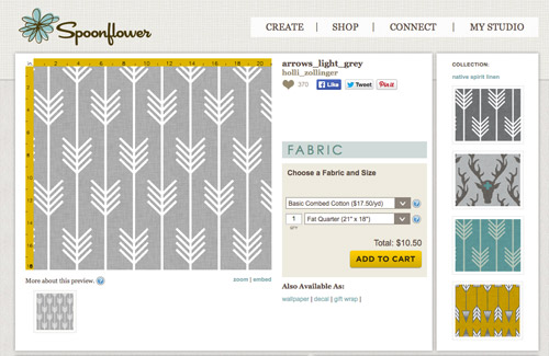
He went rogue and without even consulting yours truly (cue your outraged gasps) and ordered a sample of it and its darker counterpart, for $5 each. With tax and shipping it was $13 total. Thirteen bucks that would either earn him a sour look from me, or make him a hero.
Well, he got the sour look alright – not for the $13, but because I can still vividly remember the claw-hands I had from wallpaper peeling. The good news is that when he explained that Spoonflower wallpaper is removable, all was right with the world again. And I really liked the pattern too (it feels like something that could grow with the bun, and not be too fleeting or “young baby”). The hero part is still TBD though.
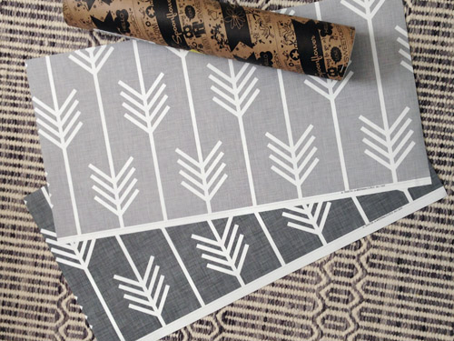
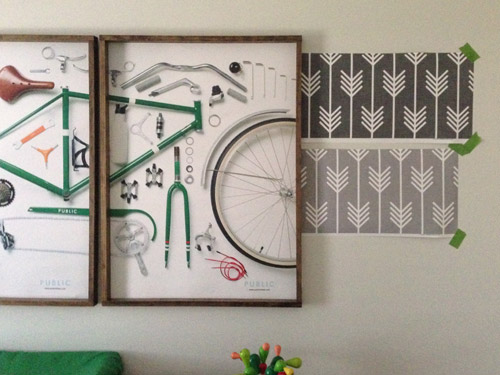
The samples arrived a couple of weeks later. They’re nice and big, and they revealed a detail that John hadn’t detected online: a subtle linen-like texture in the gray tones that I also thought was a nice touch.
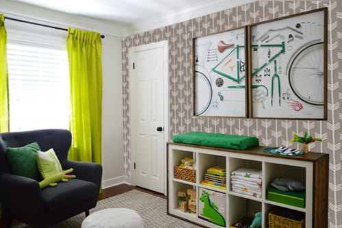
We ran upstairs to tape them up on the walls, just to get a feel for them in the room, and John went rogue again and put them on the wall with the bike prints. He must be getting braver (I think it’s the beard, guys). Since we’re both less tempted to mess with the look of the built-in wall, he said he thought that wall might be the answer instead. Forgive the terrible phone pic.
We snapped that with my iPhone so I could mock-up a full-wall version of the space in Photoshop. For those wondering how I did it, I just dragged the photo I shared above into Photoshop and laid it over another picture I took of (almost) the full wall. Then I just adjusted the size of the overlaid detail photo of the wallpaper until the patterns matched up and were the same size (I had the opacity of the top layer down a little so I could see when that happened).
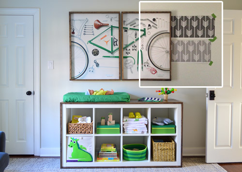
Once I knew the wallpaper pattern was the right scale, I put the opacity back up to 100% and cut out the rest of the iPhone pic so I was just left with a rectangle of wallpaper that I could manually tile until it filled the whole picture. Lastly, I cut out around the objects like the frames, doors, and the changing table (which were still in the image behind the tiled wallpaper) so as I deleted the wallpaper in front of them, it appeared to run behind them.
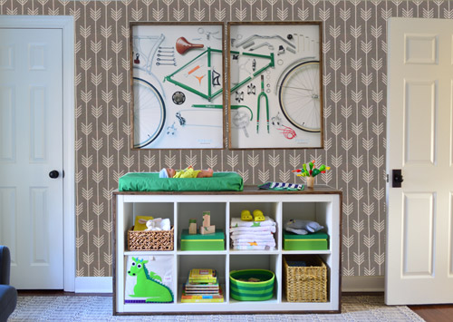
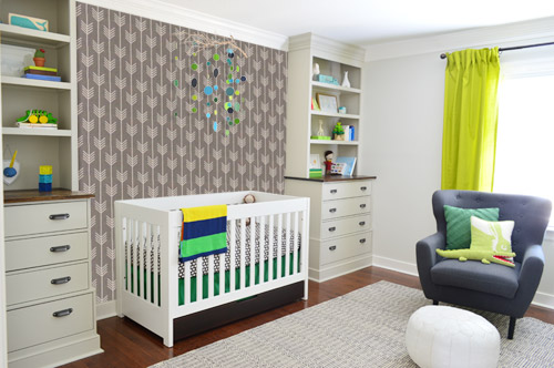
I also tried a version where I adjusted the color to look like the darker sample that John also ordered, but it was pretty clear to both of us that we preferred the lighter one.
I thought it was a little hard to judge without seeing a plain wall meeting the accent wall to give it context, so I used the same technique to mock things up on this photo that I already had of the room. The colors probably aren’t perfect (the curtains look neon here), but it definitely helped us to picture everything – and it confirmed that the light version wouldn’t clash with the wall color or anything.
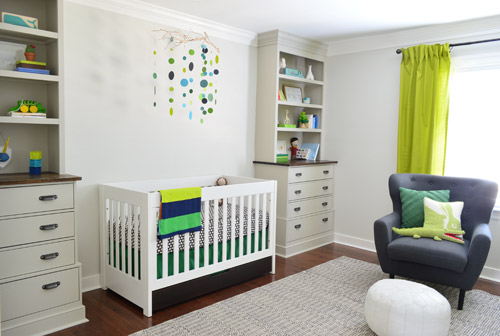
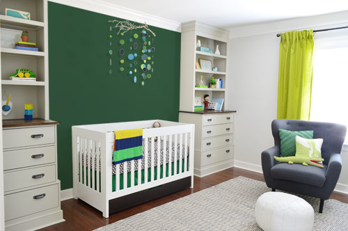
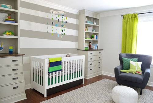
I still wasn’t convinced that was the right wall for an accent (I feared it might look too busy with the bike art in real life) so we also mocked it up on the crib wall to see if our original idea was better. We stared at it for a second, but I think we both prefer the bike wall. It just felt too crazy over the crib with all the items on the built-ins, the mobile, the patterned crib skirt, etc.
I also tossed some bold green up there just to see if a hit of that above the crib would be fun. It’s not great photoshop (looks pretty flat) but we didn’t really love it.
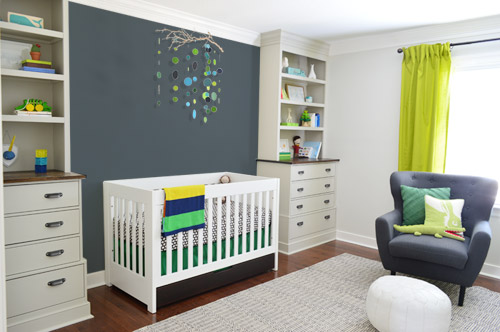
I also tried something sort of charcoal-ish to balance the chair out. This one made both of us do that “eh, not bad” face while staring at the computer. It looks kinda nice with the white crib and the mobile.
To add yet another possibility to the ring, a sweet reader named Annie had emailed us this quick mock-up she did with some chunky stripes painted behind the crib, which also gave us pause. You know we love a striped wall…
We’re still sort of letting things simmer, but we’d love to hear what you guys would do. Would you go for the wallpaper on the bike art wall? We like that it’s removable, so it’s not too much of a commitment. Do you prefer a solid wall of green or charcoal or even some stripes behind the crib? Or should we just stop being crazy and leave things the heck alone? Part of us is really excited to add one more layer of interest into the room (we’ve never put up wallpaper so that would be a new adventure – and most of the elements in here are really neutral). Then again, we still want this room to be a mixture of playful and cozy (as opposed to that’s-just-straight-up-crazy). What do you think?
VOTING ON THIS POLL HAS CLOSED


Leave a Reply