I know it sounds kinda crazy, but after painstakingly removing five different wallpapers from this house… we’re considering putting some up. I think I even passively mentioned it in this post about the nursery mobile.
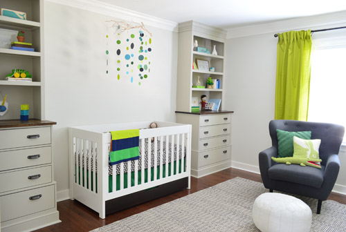
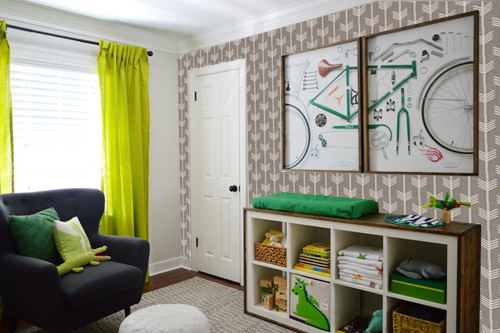
Ever since we imagined the idea of these built-ins, we pictured making the space between the two of them sort sort of accent – either with a color or pattern or treatment of some sort (in our first post we even mentioned a planked wall). Those ideas fizzled a little bit after completing the built-ins and realizing they had a lot of stuff on them (so we didn’t want to clutter up that space between them above the crib too). But neither of us could quite shake the idea of still doing an accent of sorts somewhere in the room. And one night while perusing possible wallpaper ideas for the showhouse, this puppy caught John’s eye.
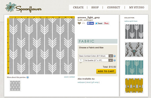
He went rogue and without even consulting yours truly (cue your outraged gasps) and ordered a sample of it and its darker counterpart, for $5 each. With tax and shipping it was $13 total. Thirteen bucks that would either earn him a sour look from me, or make him a hero.
Well, he got the sour look alright – not for the $13, but because I can still vividly remember the claw-hands I had from wallpaper peeling. The good news is that when he explained that Spoonflower wallpaper is removable, all was right with the world again. And I really liked the pattern too (it feels like something that could grow with the bun, and not be too fleeting or “young baby”). The hero part is still TBD though.
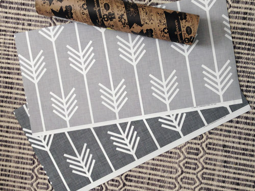
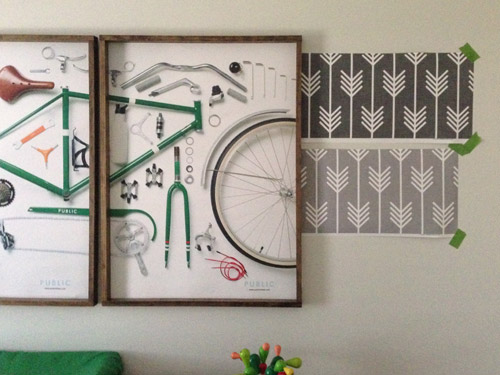
The samples arrived a couple of weeks later. They’re nice and big, and they revealed a detail that John hadn’t detected online: a subtle linen-like texture in the gray tones that I also thought was a nice touch.
We ran upstairs to tape them up on the walls, just to get a feel for them in the room, and John went rogue again and put them on the wall with the bike prints. He must be getting braver (I think it’s the beard, guys). Since we’re both less tempted to mess with the look of the built-in wall, he said he thought that wall might be the answer instead. Forgive the terrible phone pic.
We snapped that with my iPhone so I could mock-up a full-wall version of the space in Photoshop. For those wondering how I did it, I just dragged the photo I shared above into Photoshop and laid it over another picture I took of (almost) the full wall. Then I just adjusted the size of the overlaid detail photo of the wallpaper until the patterns matched up and were the same size (I had the opacity of the top layer down a little so I could see when that happened).
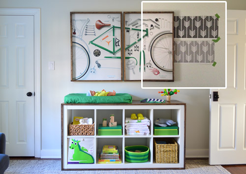
Once I knew the wallpaper pattern was the right scale, I put the opacity back up to 100% and cut out the rest of the iPhone pic so I was just left with a rectangle of wallpaper that I could manually tile until it filled the whole picture. Lastly, I cut out around the objects like the frames, doors, and the changing table (which were still in the image behind the tiled wallpaper) so as I deleted the wallpaper in front of them, it appeared to run behind them.
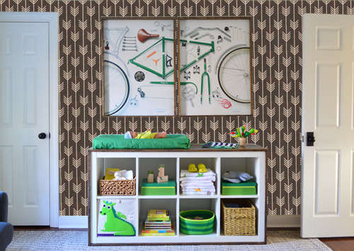
I also tried a version where I adjusted the color to look like the darker sample that John also ordered, but it was pretty clear to both of us that we preferred the lighter one.
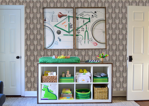
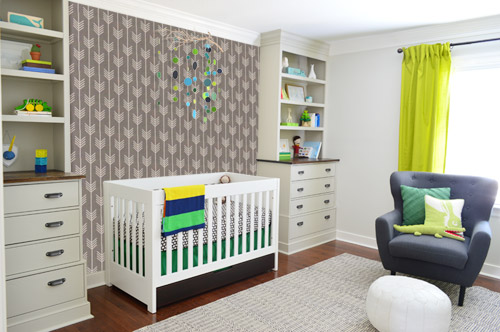
I thought it was a little hard to judge without seeing a plain wall meeting the accent wall to give it context, so I used the same technique to mock things up on this photo that I already had of the room. The colors probably aren’t perfect (the curtains look neon here), but it definitely helped us to picture everything – and it confirmed that the light version wouldn’t clash with the wall color or anything.
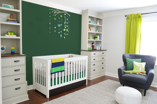
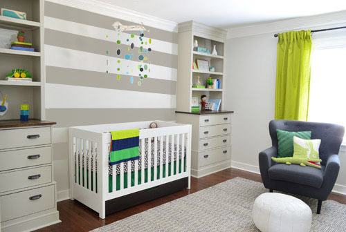
I still wasn’t convinced that was the right wall for an accent (I feared it might look too busy with the bike art in real life) so we also mocked it up on the crib wall to see if our original idea was better. We stared at it for a second, but I think we both prefer the bike wall. It just felt too crazy over the crib with all the items on the built-ins, the mobile, the patterned crib skirt, etc.
I also tossed some bold green up there just to see if a hit of that above the crib would be fun. It’s not great photoshop (looks pretty flat) but we didn’t really love it.
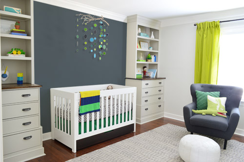
I also tried something sort of charcoal-ish to balance the chair out. This one made both of us do that “eh, not bad” face while staring at the computer. It looks kinda nice with the white crib and the mobile.
To add yet another possibility to the ring, a sweet reader named Annie had emailed us this quick mock-up she did with some chunky stripes painted behind the crib, which also gave us pause. You know we love a striped wall…
We’re still sort of letting things simmer, but we’d love to hear what you guys would do. Would you go for the wallpaper on the bike art wall? We like that it’s removable, so it’s not too much of a commitment. Do you prefer a solid wall of green or charcoal or even some stripes behind the crib? Or should we just stop being crazy and leave things the heck alone? Part of us is really excited to add one more layer of interest into the room (we’ve never put up wallpaper so that would be a new adventure – and most of the elements in here are really neutral). Then again, we still want this room to be a mixture of playful and cozy (as opposed to that’s-just-straight-up-crazy). What do you think?
VOTING ON THIS POLL HAS CLOSED


Beth says
I love the stripes on the crib wall option, as well as the arrows on the changing table wall option. My only concern (if it was my wall) was that the arrows on the one side would make the crib side look even more… empty? So hard to choose, though, because the arrows are awesome.
Heather MacFeather says
I agree. I like the idea of arrows on bike wall AND paint or stripes on the crib wall. I wonder if there is a plain linen (non arrow) version of the wallpaper that could go on crib wall.
vicki says
Love the ‘ coordinate linen’ idea on the crib wall
amanda says
I agree. Stripes behind the crib and arrow wallpaper on the bike wall. I like mixed patterns.
Dana says
I agree with Beth on all points.
betty says
i was torn between the strips and the wallpapered bike wall.. I love the idea of the linen too. love all this! and i’m gonna need some of that wallpaper in my future nursery.. even though a kid isn’t even on my radar yet :)
Corinna says
Agree. Love the lighter arrows on the big wall and the stripes on the crib wall. Oh yeah, also like the linen plain idea.
naomi says
I was thinking the same thing. I think it you did a wallpaper on the bike art wall, the stripes would be great to balance things out.
Melissa @ Loving Here says
I agree that by highlighting the changing table wall, it might make the crib wall look more bare. It’s great as is because the entire room is neutral, but if you add in something “crazy/fun/exciting” on one side, I think you’ll need to balance it on the other side so it doesn’t feel too heavy on one end of the room. That being said, I’m in favor of stripes or charcoal on the crib wall…and maybe something that ties into that on the changing table wall. Perhaps stripes over there and a solid color on the crib wall?
I’m sure it will end up looking awesome!
http://www.lovinghere.com
Ashlyn says
Stripes on the crib wall, and arrows on the bike frame wall. Same color to tie them together.
Your poll should have allowed us to pick more than one option! :)
YoungHouseLove says
We actually tried that but it was glitchy and wasn’t allowing people to (see the first page of comments). Boo poll tech issues. Haha!
xo
s
JessicaL says
Yes, light grey wallpaper on the bike wall, stripes on the crib wall. Love both!!!
Jessica says
Same here. I couldn’t vote for two, but I would definitely do the stripes on the crib wall and the wallpaper on the bike print wall. These would really step the nursery into super fun and whimsical territory. I also like how the stripes help tie together the built-ins, making the wall space in between seem less like a big blank void.
Caitlyn says
I feel the opposite! The crib wall has built ins, the crib and the mobile – there is so much going on! The wallpaper would balance out the other wall by bringing some interest to the that side of the room.
Veronica says
I agree with Beth, I think the wallpaper on the bike wall (which I think looks awesome!) makes the crib wall look sort of bare. I personally think the charcoal color on the crib wall and the wallpaper on the bike wall would be great. I think the stripes may be a little much seeing as those are also a pattern. I think you’d have a nice balance with a pattern and a solid color.
Caroline says
Agree! At first I thought the wallpaper on the bike wall was going to look terrible. But after the photoshop rendition, wallpaper that wall!!
Stripes ALL THE WAY above the crib. You said the green paint looks flat and the stripes lengthen it! Wish I could vote twice… once for the striped wall, once for the wallpaper wall!
Of course we’ll love whatever you do!
Gabrielle says
Put the wallpaper on the backs of the shelves!! And I vote for the stripe wall.
Kati says
I think we’re all forgetting that there will be a HANDSOME LITTLE MAN to balance things out on that side haha :-) Sherrybeth (harhar) what if y’all mocked up the space with the bike prints on the crib side, and the mobile above the changing table (a la Clara’s nursery) with the wallpaper on the changing table side of things? BTW your photoshop was SO good in the angled pic I thought you were going to say “So we went for it and here’s the after” because SERIOUSLY you did a Great-with-a-capital-G job photoshopping!
Shanelle says
I was thinking the same thing! Stripes on crib wall, wallpaper on bike art wall:)
stefani says
Yes, I agree, please consider doing BOTH!! I actually cheated and voted twice so that I could vote for both the wallpaper on the bike wall AND the stripes on the crib wall. I love both and feel like they would compliment each other and look AWESOME :)
heather says
I agree! I like crib/stripes and change/paper. Hard to tell if both would be too crazy, though. Wallpaper is number 1, but no matter, I think still need something in void behind crib. I was thinking green, but the example wasn’t my favorite…Maybe more like show house vanity color? If don’t do stripes, that is :)
Leah says
Agreed! Wallpaper on changing side and stripes on the crib side!
Jessica Romansky says
YES. Stripes on the crib wall and light gray wallpaper on the opposite wall.
cassandra says
what about some design like you did on Claras baby bassinet. random and organic, could add pops of color too
normaleverydaylife says
I just spent a couple weeks removing wallpaper in our kitchen, so I vote for any kind of paint!
Anele @ Success Along the Weighn says
The beard is a forcefield. Approach future projects with caution. ;-)
I voted on mine. Can’t wait to see what the masses say.
Lacey says
I love the stripes on the crib wall. I think the wallpaper DOES get a little busy, especially with the bike art and the changing table. The stripes look simple, add interest, but still give nice contrast.
Sarah says
LOVEEEE the striped wall! Really ties in the white crib and is so playful without being busy!
Brenna says
Ohhhh that’s a great point about tying in the crib, too! =)
Katie says
I think I would do the wallpaper on the bike wall and then do the exact se gray in between the built ins- or match they grey to the chair. That way you don’t do another color.
Sunnie says
I agree with Katie! ^^ I think the same gray from the wallpaper between the built ins would look great!
Sarah says
I had the exact same thought as Katie! I love the wallpaper on the bike wall, but think that the wall between the built-ins needs a little something extra.
Momlady says
I agree. The solid color (matching the wallpaper) won’t fight with mobile (awesome) or the built-ins. Too many non-related horizontal lines if you do the stripes…crib,bookshelves.
Melissa says
I agree with Katie, too! I came here to post this exact thing!
Sarah says
Also in agreement with Katie! I personally wasn’t as fond of the charcoal color on the wall, but I really liked the lighter gray that you used in the stripes.
Sarah says
Oh! Even an ombre wall might be interesting behind the crib. It could incorporate all the grays!
Steph says
I agree! Light grey arrow wallpaper on bike art wall and solid colour (charcoal or same light grey as wallpaper) on wall between built ins.
Kati says
FYI, even though the pol said ‘check all that apply’ it would only let me do one at a time. I’m using Chrome.
YoungHouseLove says
Sorry, it was doing that to us too! For some reason it was displaying “check all that apply” but set on “check one” so now we have that fixed for ya! We could only get it to let people check one, so now at least the directive says that too.
xo
s
Lisa E says
It is now 9:49 am EST and I was only able to pick one, FYI. Can’t wait to see what you decide!
Anya says
So much fun to play around with photoshop! I love the wallpaper but it just looks too busy on the wall with the already busy bike art.
Also, I was only able to check one option for my voting (not more than one as your guidance suggests). Not sure if you want to change either the type of check box or the sentence :)
Evelina says
I voted for stripes behind the crib and wallpaper on the bike wall. I am especially enamoured with the stripes. What if you go stripes on both? Too much? What does Clara think?
PS – I am digging John’s beard.
Katie says
Second vote for stripes on both walls! Wallpaper + bikes = overwhelming.
Kerri says
Stripes on both walls maybe!
But at least on the crib wall :)
Kelly says
Was so surprised that I loved the stripes on the crib wall so much! I think the extra-large scale pattern of the stripes is a nice counterpart to the smaller, subtler patterns you’ve got going in the rug and the crib sheet! Can’t wait to see what you choose!
Ellie says
Hey guys,
I like a lot of the options, but I think you would enjoy trying something new with the wallpaper. I agree with you that it looks better on the bike wall than the one above the crib. Plus, you don’t want things too busy right where you are hoping your little one will be sleeping. I also think if you leave that wall plain now, when he outgrows the mobile you could add some sweet family photos there or one big colorful one (maybe of him and Clara). What do you think?
YoungHouseLove says
Thanks for all the suggestions guys! We’re definitely still percolating, but we’re reading every single idea. It reminds us of when we photoshopped the wall behind Clara’s crib and asked what everyone thought- which ended up leading us to something that we love – with Clara’s input too!
xo
s
ne says
Oh that was fun! For me Wallpaper on Crib Wall is such a clear winner, I am trying to make sense of the popularity of stripes on the Crib Wall ;P
Lygia says
agreed! wallpaper on crib wall is clear win! it really adds interest to that area, and agree that once they outgrow the mobile, you can make it a gallery wall, etc…
think stripes are over-done. the arrows are much more interesting
Wendy says
I agree. The stripes look nice, but they’re so “yesterday” and so overdone. For me, you guys are so fun to follow because of your classic choices mixed with fresh and new ideas. Those stripes don’t seem to be either. Love the arrows on either wall. If you put the wallpaper on the crib wall, maybe the beautiful gray/charcoal color could go on the closet door. Look forward to seeing your choices. Have fun!
Kerry says
Wowza! So many fantastic ops! I am SO IMPRESSED by your PS skillz.
Would stripes (call me traditional) on the crib wall, PLUS the light gray arrows (which make me think of Katniss, a strong hero for little Barn(ey Stinson) to look up to, be too busy?
Brenna says
What if you did the light wallpaper on the bike wall and maybe just two or three chunky stripes (in the same color of the wallpaper to tie them in together) on the built in wall instead of from floor to ceiling? Maybe it would make it less distracting from your gorgeous mobile but still tie in the two walls and light gray color?
=)
– B
Lidia says
Happy Friday YHL! My vote is the grey striped wall on the crib wall but I’d also mimic that on the bike wall (the stripe kind of reminds me of a road) :)
Lily says
I am madly in love with the wallpaper, and think the lighter one looks insane behind the bike. I hope you do it!! Can’t wait to see the results.
xo Lily
http://whilemyboyfriendsaway.blogspot.com/
Evelina says
Also, how did you decide on down arrows? Did you consider flipping them to face up? This reminds me of the Great Ironing Board Debate of 2011. https://www.younghouselove.com/oh-the-iron-y/
YoungHouseLove says
Totally feels like that! I think we are down with up or down- so it was just random. Up might be more optimistic for some reason though. Haha!
xo
s
DawnSC says
They look like little trees to me in the orientation now, so I would vote to leave them as-is if you end up using it. :) Although, for what it’s worth, I voted for charcoal on crib wall. Possibly combined with the wallpaper, though, as I do really like it.
Off to paint our own nursery now! :)
Kirsten @ Wild Oak Stream says
I agree. I use those arrows in a lot of my chalkboard designs and I would turn them to point upward on the wall of choice. I feel like you can’t notice the arrows when they are pointing down.
Elle says
I know you guys don’t really talk about your disagreements much so I’m way, way overdramtizing The Wallpaper Reveal in my head. There is the possibility that I’m imagining Sherry going “WHAT DID YOU DOOOOO?!?!?” and advancing on John with wallpaper-claw hands.
For what it’s worth, I like the wallpaper on the bike print wall and then a darker grey between the built ins. It’s hard to tell through some pictures on the computer, but I *think* that would make it feel more balanced in the room without being crazy busy.
YoungHouseLove says
Hilarious. It wasn’t quite that dramatic, but I did look at him like he went off the deep end for a second.
xo
s
Valerie says
I agree with Elle on the wallpaper/dark grey combo.
I love how the darker grey adds contrast making the built-ins and crib pop without being too busy (like the arrows on crib wall or stripes would).
I also love the idea of treating both walls—I think if you just do one the other could end up feeling very empty/plain/unbalanced. The arrows are so fun on the bike wall but I also think the wide grey stripes could work on the bike print wall too allowing you to avoid the dreaded wallpaper.
Can’t wait to see what you choose!
Sharly says
Just so you know, the voting options are limited (radio not check buttons!)
I love the stripes but the lighter wallpaper on the bike art wall is fab, I love the way you mock things up so that you can see from all angles how it will look.
Sarah B says
Hey guys! Been reading your blog for a year now and it is AWESOME. A few quick thoughts…
Prefer the wallpaper on the bike wall, it adds an extra “omhf” and will balance out the built-ins (have you tried turning the paper so the arrows point up?).
With the extras on the crib wall: it may be tempting to balance out the crib wall with a little something extra, but in a few years when there is a bed in that space instead of a crib, it will be a LOT fuller, and then the stripes may be overkill.
Sandy says
What about chalkboard paint between the built-ins? (Or is that…over?) That dark charcoal color looks great and I can just imagine the sweet messages and drawings you guys would come up with for the Barnacle above his crib!
Love the wallpaper on the bike wall too!
Sharly says
Oh… just noticed… it now says “Check One” not “check all that apply”! D’oh
YoungHouseLove says
Sorry, for some reason it was displaying “check all that apply” but set on “check one” so now we have that fixed for ya!
xo
s
Amy says
The wallpaper on the bike wall is so cool; but would you then do something to break up the mono-color on the crib wall a little? Not necessarily a pattern or anything that covers that entire space behind the crib, but maybe an art/photo collage framing the mobile? Or…something.
Because that wallpaper…SUPER cool. But it would maybe leave the crib wall looking plain.
The Modern Gal says
I like this idea the best. The crib wall feels like it needs SOMETHING. I feel like there’s not enough contrast between the built-ins and the wall. But on the flip side, I love the wallpaper on the bike wall. I think you could really balance out the room by doing the wallpaper there and a plain coordinating color behind the crib.
Elise @ Expeditions of Elise says
I like the charcoal accent on the built-in wall! I am not a fan of that wallpaper though…it feels like one step too far into over-done land. Have you ever heard the quote (I think it’s Coco Chanel) that you should look in the mirror after getting ready and take one thing off? It’s kind of like that! You don’t want to do that one extra thing that becomes too much.
Stahli says
I tried to vote…but I had more than one that I wanted and it wouldn’t let me pick them. I agree with Katie that you should do the wallpaper on the bike wall and a darker grey on the crib wall. When I saw the picture of the crib w/the grey it just seemed to make everything POP!
Stephanie says
I actually think the wallpaper looks far less busy on the crib wall than the striped wall. I really like the wallpaper, but paired with the bike prints and the bookcase/changing table it all feels a little too much. On the crib wall there’s such a smaller area that it is a nice focal point.
Sally says
Striped crib wall, leave the wallpaper for another time/place (sorry, John). Looking good!
Anima says
I guess. The wall paper look so busy and like u are trying too hard.stripes or even some paint treatment like Clara’s wall would look better.
indigorchid says
I’d like to make a suggestion – how about on the wall with the window? I think the wallpaper is great, but a little too much on either the built in, or the bike art wall.
CandiceMcC says
Hmm, that’s an interesting idea. I agree that the wallpaper is too busy on either wall you photoshopped. And I picked the charcoal crib wall but I’m not sure about it either. It feels like the crib wall needs something but I wouldn’t do multiple accent walls. What if the crib wall were just some texture?
Patti says
I was just coming to suggest this too. Mock up the wallpaper on the wall with the windows. I think the other two walls already have too much going for them, it would be interesting to see what it looks like on the other wall.
Otherwise, I really like the gray stripes above the crib.
Tash says
I was also thinking wallpaper on the wall with the window might look great! Especially since the curtains are plain
Marlene says
I vote for the wallpaper on the window wall too. Not much going on on that wall and it would be nice to see it on the wall directly across from the door.
Annie says
I agree that it’s worth testing out another wall for wallpaper…by the windows or the wall opposite the windows? But of the options you listed, the charcoal paint is my favorite!
Natalie says
Ditto the wallpaper on the window wall. Wallpaper makes the wall it’s on a focal wall, I’d rather focus on a window than a changing table (although yours is lovely and I almost did exactly that treatment to my ikea shelf last year for my second baby’s changing table).
Brigid says
I also was coming to comment that the wallpaper would look best on the wall with the windows. That windows won’t clash, yet they will break up the wallpaper so it isn’t to much.
Tanya says
I was thinking the same thing. Then I thought maybe accenting the window wall would be weird? I don’t know, but it may be worth a Photoshop session to see.
Ally says
That’s not a bad idea at all. I would love to see a Photoshop view of wallpaper on the window wall, too! I think the wallpaper on the changing table wall is too busy with the bike print and all. The stripes or charcoal on the crib wall are my favorites of the options above.
Allison says
Yes! Wallpaper on the window wall – that gets my vote over all the others!
Kate says
I really like the wallpaper you show, but I prefer the stripes. Maybe the laundry nook would be a fun place to experiment with wallpaper instead?
Ally says
That’s a good idea! I saw a laundry nook on Pinterest with an awesome stenciled wall. It looked really good and almost made you want to do laundry.
Allyn says
I really love the wallpaper, but I think you really need something on the crib wall . . . the stripes really look terrific, in my opinion. Once you add the stripes, I think it could be a little “clashy” to put the wallpaper on the other wall.
Oh, by the way, the Homearama ticket site worked just fine yesterday afternoon!
Leigh Anne says
I know everyone is voting for the striped wall but I think it would be too much on one wall. Especially if you look at the room as a whole instead of one side at a time. The builtin wall would look way overdone whereas the bike art wall would seem small and sparse. Just my two cents! I vote for the wallpaper on the bike art wall :-)
mary says
The wallpaper is beautiful but, to me, too busy with the bike art or the mobile.
I like something between the built-ins to make them stand out more, though. So gray or stripes would be my vote. Stripes are fun for a kid but there’s a lot of horizontal lines there already. Though the round mobile shapes add some relief.
deb says
I also think the bike art wall has enough going on without the wallpaper. But…I do like the gray stripes on the crib wall. Maybe do nothing for a bit and see what the Barnacle thinks when he gets in there??!!
Brit [House Updated] says
I love the wallpaper and used the dark version as part of a temporary backsplash I did in my kitchen! But I have to say the picture with the stripes behind the crib was my fave. Good luck deciding!
Lindsey says
Not loving the wallpaper, as much as I hate to say.
I think a wood planked wall is the way I would go. I think it would be a nice bridge between the builtins and give you some nice texture without being to in your face or “look at me, I’m a statement wall”. It would also be a nod to the nautical theme, but not be too themey and have a bit of a masculine feel and be able to grow with him. Plus it’s just a classic look.
I like this look: http://www.pinterest.com/pin/42713896436683596/
And also think adding some color via whitewashing technique would be cool (although this example might be a little too heavy). Something like this: http://www.pinterest.com/pin/250442429251137773/
Carrie Lea says
Yes! Planks!!!!
Molly says
What if you did the wallpaper on the wall with the curtains.
Kind of to center the 2 walks with all the detail like the bike art and built ins?
Mina says
I agree! The curtains would look great with the wallpaper!
liz says
I wanted to vote for more than one wall treatment… ::sadface:: but it will only let me check one!
YoungHouseLove says
Sorry! The poll software was acting crazy (saying “check all that apply” but only letting people click one anyway, so the only way to make it make sense was to do the “check one” thing so at least the directions matched what it was letting people do).
xo
s
Lauren says
What happens when you flip the wallpaper upside down so the arrows are pointing up instead of down? (Just curious). Man, I like the wallpaper on the accent wall and the gray paint behind the crib…both would be too much, but I can’t tell which one I like better!!
YoungHouseLove says
It could go either way for sure. After I did all that photoshop I wished we had faced it up (seems more optimistic that way, haha).
xo
s
Kate says
hi guys-
someone a while back suggested a reclaimed plank wall-
I think that would look amazing and add a lot of texture and depth to the room…thoughts??
YoungHouseLove says
Thanks for all the suggestions guys! We’re definitely still simmering, but we love hearing all of them and debating them at home. Wish this little guy was old enough to give us input like Clara did for her raindrop wall with the pink door.
xo
s
Jennifer B. says
Oooh, I changed my mind. Before I said combine the charcoal with the stripes.
THIS.
Loren says
The wallpaper is really lovely. But there’s still something kind of missing. I voted for the green accent wall, I don’t think the color in the photo is quite the shade you are looking for. But I love the playful color, especially in a kids room.
Stephanie says
I agree, that is exactly what I was thinking.
Nora says
My thoughts also. The crib wall needs something and green would be good. Just not that forest green. I find the wallpaper rather dull, sorry :( Something with more fun shapes would also work between the crib.
Elizabeth says
I love the accent wall behind the crib! I vote dark grey or stripes. The wallpaper is pretty cute on the opposite wall, but it seems a little busy with those prints. So much fun any way you do it!
Mary says
Slightly off topic, but have you guys ever painted over stripes? I’d like to re-do a striped room in my house and I’m trying to figure out if I need to sand down the slight edge of the stripes, “fill in” the base layer with an extra coat of paint to even out the edges, or some other technique?
Loving the sophisticated yet whimsical vibe of your nirsery so far!
YoungHouseLove says
We’ve heard that if you prime over them first and then paint you shouldn’t have ridges or anything offensive showing through unless you applied really thick coats (think about how if you painted a test swatch on the wall and then painted over it with that color – it most likely wouldn’t bump out around that test swatch). Never tried it ourselves though, so I think it would matter if you ran your hand over the stripes and felt some sort of ridge or not (in our striped half bathroom we didn’t feel any difference from stripe to stripe – but we left it painted so we never got to see what would happen…).
xo
s
Robin says
This reminds me of the situation in my parents house. They are selling this spring and my dad painted strips (and other shapes) on most wall – with textured paint! I feel soo bad for whoever buys it if they don’t have the same taste! Hint – textured paint on small portions of your wall does not equal resale easiness! oh jeez.
Katie says
I just painted over yellow and purple stripes in my daughters room. (Looked like the LA Lakers lived in her room) I had bought paint with primer in it, however, after 2 coats of the paint, I could still see some of the purple and yellow popping through. Ended up needing 3 coats of paint, but I think it’s because of the colors I was covering up and I didn’t have any issues with ridges being seen. Good luck!
liz says
PS – I love love love the wallpaper on the bike wall… and the charcoal color behind the crib.
Paulette says
I absolutely love the stripes on the wall! When looking at the wallpaper on the bike wall, I thought it could work but I think it could look too busy. Once I saw the stripes, I knew that was the better option (IMO). But one other option (don’t know if you thought about it) – what about the wallpaper on the window wall? That might look less busy (with the windows to break it up) but it could tie the other two walls together? Just a thought. But I still love the striped wall! Can’t wait to see what you decide! ;)
Meru says
I really like the wallpaper, but it feels too busy in the room with all the other textures you have. Maybe save it for the closet? LOVE the chunky stripes on the crib wall, though!
Melanie says
The striped wall is awesome!!!!
Alexia C says
Normally I come up with an awesome thought… and then see that 20 other people have already suggested it. Not this time! So here goes… If the wallpaper is too busy for a full wall, but you’re still hoping to appease the beard (I mean it was cool of him to find something awesome and order swatches!), would the closet be a crazy place to put it? A fun pop but not in an overwhelming way?
Jamie Smith says
That could be such a cool way to make his closet fun, like you did in Clara’s old room! I love this idea! :). Btw, John is rocking the beard. Sherry, do you like it? My husband has one and I never want him to shave it. I love beards (nicely trimmed of course, not the duck dynasty variety).
YoungHouseLove says
Oh yeah. I’m a total John-beard groupie. Haha! He’s my rugged man ;)
xo
s
Erin says
My fiance starting rocking the beard a few months ago too. He says it makes people respect him! haha
Toni says
The stripes can totally mimic the quilt you made for the barnacle. Or you can go crazy with just one giant chevron between the built ins.
Lauren says
One giant chevron….that’s a really intriguing idea!
Lisa says
Whenever I see a single chevron stripe, I immediately think “Charlie Brown’s shirt.” haha!
Grey | lovewishfully.com says
I LOVE the lighter wallpaper on the crib wall!!
~Grey
http://lovewishfully.com
Lauren says
The charcoal on the built-in wall and the light-coloured wallpaper on the bike frame wall look great! If you have a way to see how they would do *together*, that might not be a bad idea. I love the look!
Heather says
This was my thought too! Light wallpaper, and charcoal on the crib wall. I guess I’m in the minority that I don’t particularly like stripes so I cringed at the last one a little. That’s why we’re all different though and our houses are all more awesome for it! Lord knows my house style isn’t for everyone (I’m not sure I even have one besides “wood wood and more wood”).
Chris says
This is my favourite combination too. I love the way is shaping up and I also love the layering stage. We’ve used wallpaper sparingly three time in our home. Accent walls and powder room and we’re really happy with the texture they’ve added to our place. Good luck! Beautiful space for a special little guy.
Catherine says
I was going to suggest this combo too. Maybe even a lighter gray rather than a darker charcoal. I think both would look good though. The crib wall just looks a little too plain.
Katie says
That was my suggestion too. Love the wallpaper and then the solid on the opposite wall, giving the mobile a chance to “pop”.