From the moment we painted that brick wall in our sunroom, we were itching to get some art hung. And we finally found time to get ‘er done after returning from a six-flights-in-four-days blitz on Friday. It’s weird how much more “lived in” a room feels when you slam some art on the walls. Seriously, I know the feeling of dragging your feet on the hanging of the art, but after nearly seven years of house-fixing-up, it never ceases to amaze us how that little step makes such a difference.
In continuing with the general theme of this sunroom design, we’re trying to spend as little money as possible and just use things we’ve already have around – at least for the meantime while we save our pennies towards things we might want to invest in down the line. We’re currently saving towards tackling Clara’s furniture-less big girl room and a guest bathroom that we haven’t touched as well as a front porch and carport makeover). So not purging money in the sunroom makes sense to us – especially since we have piles of to-be-hung art cluttering up the to-be-cleared spare room.
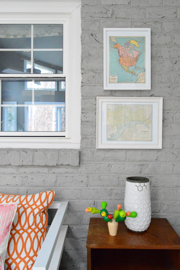
So that’s exactly how this little eclectic asymmetrical arrangement came to be. We decided it would look a lot better on the wall than in a pile on the playroom floor. Oh and the wood side table on the right looks a little heavy right now (even with the wooden art on the left side of that wall that we added to help balance things out) but we have plans to make it work a lot better down the line, so stay tuned…
We basically brought in a bunch of frames / art-sized objects and played with them until we found a grouping that felt somewhat balanced – both with one another and with the other furniture in the room, while also subtly mimicking the slope of the ceiling. Plus, we were lucky enough to find art that tied into the colors in the pillows as well as some darker pieces to bring some visual weight into the room. The goal was a bit of an eclectic look – nothing too matchy-matchy and perfect.
And if you’re curious about how we hung everything, we put together this animated GIF to show the order in which things got added to the wall. After each one we just stepped back, held the next one up, shimmied it around until we liked the placement, and moved on to hanging that one:
There wasn’t any methodical measuring since we wanted a casual and eclectic outcome, so the good news is that you don’t always need to break out any crazy math to get a collection of frames on the wall (although that’s usually necessary if you’re going for a completely balanced grid, like the one over our sofa).
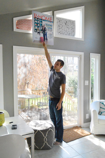
If anyone’s curious about how I created the graphic above, check out this Photoshop tutorial. And if you’re wondering how we dealt with the crazy light and shadows that we get in that room, here’s our professional technique. Yep, that’s a giant poster of our local magazine cover that I’m using (given to us after a Richmond tour event). Work with whatcha got, am I right?
The items on the right are both maps – a North America map from a calendar we’ve had for a while (with the intention of using it for art) and the other is an old map of Richmond that has lived everywhere from our first home’s guest room to this home’s kitchen. Personally I think it’s a little “Hey, look! This is the side with the maps!” to have both of them there. But of what we had around, they were our best options for now – especially since the colors in the top one work so well in the room. We’re definitely open to letting everything on this eclectic frame wall evolve though – so it hopefully won’t be a maps-only zone forever. And we’ll keep you guys posted whenever we swap things out.
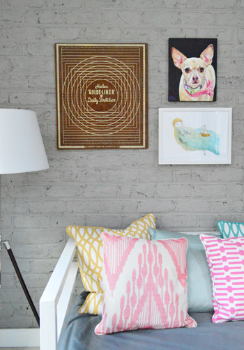
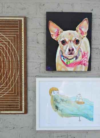
The left side is an odd mix of things I never thought we’d hang together. But somehow it kinda works for both of us. Call it stepping out of our white framed comfort zone, if you will. The big brown item on the far side is doily stretcher that we got at a thrift store this summer for $4. It caught our eyes back then because it was big, geometric and (okay) cheap. So I’m glad we finally found a spot for it. Especially since it begins to sort of subconsciously balance the wooden end table on the other side of the wall.
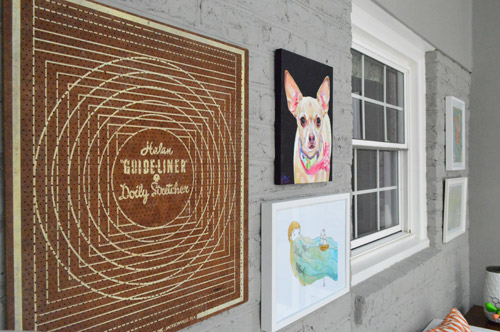
Next to it are two pieces of painterly art (one’s a watercolor print and one’s actual paint on a wood canvas). The bottom one is a print that someone brought us at one of our book tour stops. She hadn’t done it herself but she said it reminded her of us (it’s by Sally at sadlyharmless.com). We love it. Especially Clara, who is very much intrigued by the beard, the sharks, and the boat (in that order – yes the girl loves beards). The top item in the arrangement is an amazing painting of Burger that a reader’s husband painted (we met her on the book tour too, so Sherry got to gush about how talented her husband Joe is). Does that not look exactly like Burger? He’s got the same soulful give-me-your-cheeseburger eyes.
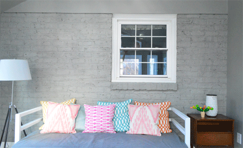
We hung all of these at night, so it was too dark to get pics of the process. Here’s our single attempt below…
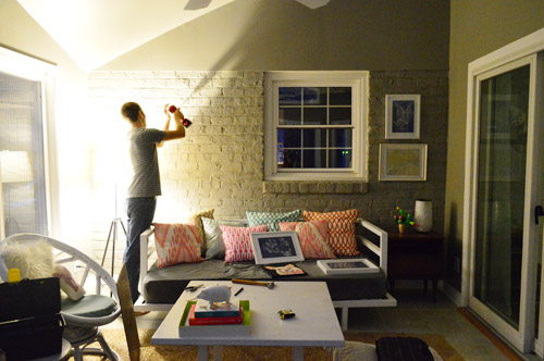
… but for those who are curious about how to hang art on a brick wall, this is the method that works for us:
- use a masonry bit (you can buy them separately for your drill) to make a plastic-anchor-sized hole into the brick (or into the mortar when you can, since that’s easier)
- hammer a plastic anchor into the hole
- screw a screw into the anchor, so it’s held strongly in place (leave about half an inch of the screw sticking out of the anchor so the picture hook or the picture wire on the back of the frame can be hung on that)
I find this method gives me a strong enough hold to hang pretty much any picture frames – I’ve even used this approach to hang some pretty heavy mirrors. And as for undoing any unwanted holes down the line (sounds pretty hardcore slash irreversible to drill into brick, right?) we’ve had some pretty great success with patching holes in painted brick or mortar – so it really isn’t irreversible at all! Just yank out the anchor with the back of a hammer, shove some paintable caulk into the hole, and paint it for a fix that’s not obvious at all thanks to the craggy and uneven nature of painted brick.
What was far less involved than hanging frames on the brick? This. It’s two prints that I coveted for a while and have finally found a place to hang (don’t mind the table and chairs under them – they’re just things we’ve had forever so they’re sitting there until we figure out something more substantial and balanced for that spot). We think a piece of furniture with storage in it will be more functional since we can sit on the daybed and the egg chair, so more seating seems like overkill). You know we’ll keep you posted…
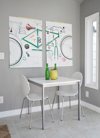
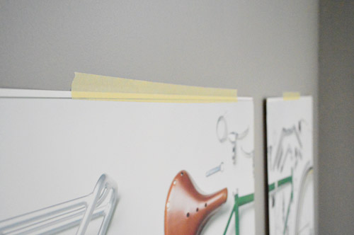
As for the bike prints, they’re only held up with masking tape at the moment (just so we could figure out the placement) but I think I’m going to build some simple wood frames for them soon. That is, unless you guys like the raw tape look. Kidding.
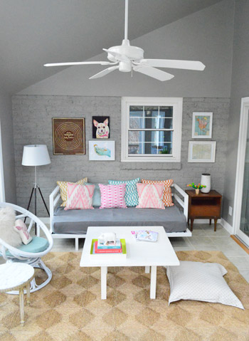
We wouldn’t be surprised if some of this stuff moves around a little bit still – or gets changed out entirely (I’m talking to you, map wall) – but for now it’s a BIG step in making this room feel more lived in while buying nothing but paint so far (all of the furniture is just stuff we already have, which might not be there forever, but definitely works for the meantime). Here’s the new “with-art” view of the sunroom from the living room:
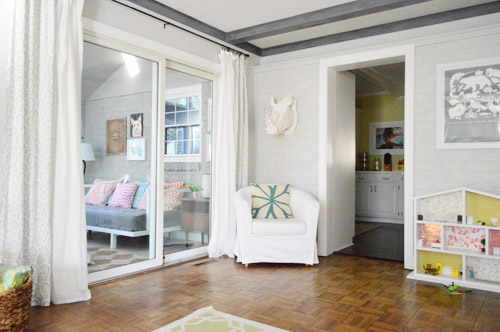
It’s really nice to sit on the sofa and actually see what resembles a room through that big slider (art on the wall = a huge step towards turning an old storage zone into a real-ish looking room). Can’t believe we just started working on the sunroom after over two years here! What are you guys working on? What rooms do you get to first? Is it the living room, the dining room, the bedrooms, and the kitchen like we tackled in the first two years? Which ones end up in the end of the pack? I guess we use those other spaces the most – so our guest bathroom, playroom-turned-storage-room, and our porch & carport are hanging out towards the back of the list going into year three…
Psst- We finally (FINALLY!) wrote about Sherry’s mom’s pre-Christmas visit over on Young House Life. Here ya go.

Leave a Reply