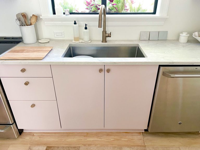
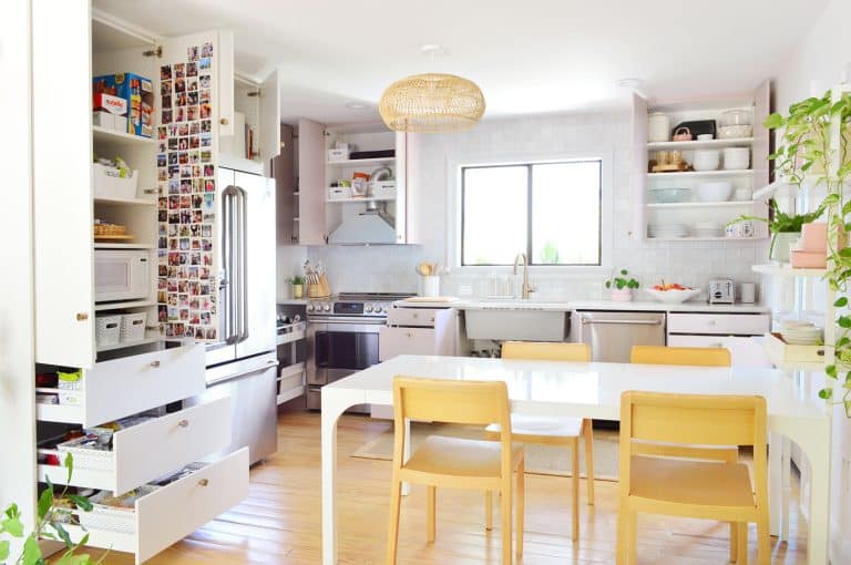
Author Archive
Reader Redesign: Four The Girls
Projects like Shannon’s almost make us wish we had four daughters running around. I should emphasize the “almost” on that. Haha. But, once you see the project Shannon took on, you’ll see why the idea of having four girls around sounds kinda awesome (and this is coming from a guy who grew up with three sisters).
Hey guys! It’s so funny reading your blog. We were and are where you guys are – but we started almost ten years ago when we bought our first house. Since then we’ve brought our total baby count to five (yup, five!) and we’re still in the same house – trying to make it work. Anyway, with the birth of our fifth baby/fourth girl last may we couldn’t figure out how to break up the kiddos among the 3 bedrooms we have for them. Initial plans were 2 girls/2 girls/1 boy… but then we found the double bunk room over at augustfields.blogspot.com and it was love at first sight! So last month the mister took off the week between Christmas and New Years and we got our major renovation groove on.
In ten days we took out a wall, merged two rooms into one, built a double bunk bed unit and finished the room – if not to completion, at least a good portion of the way. And we did it all on the super cheap. SUPER, super cheap.
Creating secret storage spaces like pull out drawers (on casters) have really come in handy.
I made these silhouette pillows for each of the girls, to add something personal to each of their beds.
We went with a playful striped ceiling (like the one here), and love the bold color it brings into the room.
Inexpensive dressers (three Malm ones from Ikea) and turquoise walls make the room fun and functional.
The girls love it, and so do we!
Thanks for checking it out! – xoxo, Shannon
How fun is that? We’re sending out a huge thanks and a giant bravo to Shannon and her mister for sharing their awesome project. If you wanna see more of the inspiration, progress, and reveal pics – be sure to click over to Shannon’s blog too. Who knows, maybe we can all score a sleepover invitation. Hah. Oh and let’s play the what’s-your-favorite-part game. I’m loving the built-in drawer storage and Sherry’s dying for the stripey ceiling.
Clara Petersik: Fabric Designer
With Clara’s 23 month photo in the can (see the full photo project here), it means the next monthly picture in line is the big 2-4… otherwise known as age 2.

And since we concluded her first year of weekly-fabric-backdropped photos…

… with a custom fabric design that we made through Spoonflower by scanning her name drawn out in marker on paper (and tiling it in Photoshop), we though we’d make it a tradition and create more homemade fabric for her second birthday.

We thought about doing something similar with Clara’s name for our she’s-two fabric (perhaps in Sherry’s handwriting instead of mine) since we liked how personalized it felt, but then we realized it could be even more special if we left it to someone else. Enter our latest fabric designing project- it’s a bit more subtle than last year’s but it’s so much more meaningful to us because… Clara drew it herself!

It basically just involved some Clara scribble, photographing said scribble, playing around in Photoshop, and tiling it in Spoonflower, but we’ll get to that in a minute.

It started on Easter afternoon when we broke out a big sheet of paper and some markers and let Clara do her thing:

We gave her an orange and pink marker, since they’re her current favorite colors (and the ones we’re planning to use for her party) but eventually she requested a black one and we handed that over too. Gotta let the artist do her thing.

She was definitely in the zone. Which was good because we were determined not to interfere so the drawing would truly be hers.

And although it might be hard to see them in the final work of art, Clara not only incorporated her party colors – but also her party theme, which is, by her own request: “WORMS!” (the girl is so in love with worms that she regularly tells us she dreams about them and looks out the window and says “Oh, hi worms.”). It’s kind of hilarious.
Here’s the final result… which had us scratching our heads thinking “how exactly is this going to become fabric?” and wondering if maybe we should’ve “assisted” a bit more.

But sometimes you’ve just gotta trust the artist and her “vision.” So I snapped this pic of it straight on (since the paper was too large to scan):

Then using Photoshop we put the design on a plain white background (by upping the contrasting and then selecting and deleting the rest of the background). The black marker sort of turned navy, but we didn’t mind, so we went with it. Still not looking very much like patterned fabric though, is it?

Just like with the first-year fabric, we figured we might be able to make it look more “pattern-like” by repeating it. So we duplicated the layer and began playing around with different ways to tile it in order to make an abstract pattern out of the bean’s masterpiece. Here’s what it looked like when I duplicated the layer once, rotated it 180-degrees, and placed it on top of the original drawing:

Then we took a second copy of the original (also rotating it 180-degrees) and lined it up on the bottom:

Confusing, I know, so here we’ve put a red box around the original rectangle (and two blue boxes around the flipped and shifted ones) so you can hopefully see how they’re layered a little better:

But of course if we want the Spoonflower program to tile the pattern accurately, we had to crop it in a way that it would repeat seamlessly. So I just found an easy reference point for where I could cut it off at the top and bottom, like this:

So here’s what the pattern looks like cropped and without those colored boxes on each section. The alternating orange circles with the navy squiggles and the dark pink splotch were starting to look kinda cool. At least to proud parents like us.

But we’d have to upload it to Spoonflower and see it as a sheet of fabric to really see if were were on to something…

Spoonflower actually gives you a lot of options for resizing and adjusting how your pattern repeats. We didn’t really explore this much in our our last fabric-designing adventure, but here’s just an idea of the different ways you can tile your pattern (the one on the bottom right with the stripe was achieved by adding a bit of white space on each side of our JPG before uploading it to Spoonflower).

After some contemplation we chose the Basic Repeat just like last time (we initially liked Mirror Repeat, but Sherry said it was a bit female-form-ish and once we saw that we couldn’t unsee it – or stop giggling like twelve year olds). So then Basic Repeat became the favorite. It’s kind of ikat-esque, and not obviously kid-scribble until you get closer, which is part of the fun. So we ordered two yards of it for $36 + $3 shipping (for a total of $39) thanks to a discount at checkout for uploading our own design. Yes, it’s still more expensive than our usual fabric budget, but you gotta splurge sometimes, right?

Not only do we plan to use it for the backdrop of her big birthday photo, Sherry wants to sew something memorable with it (along with the Clara fabric from last year) – so we’ll keep you posted on that. She’s already made a birthday banner, a quilt, and a beanbag from other weekly photo fabrics.
Fast forward about a week and our fabric arrived. Woot. These photos don’t really do it justice (it’s bolder/brighter in person), but it’s awesome. It probably won’t be winning any fabric design awards or anything, but it’s the coolest thing we’ve seen in a while.

We have to wait a few more weeks before Clara is officially 24 months old to put it to use for a photo session…

… but Clara decided she couldn’t keep her hands off of her own creation, so we had a little playtime with it in the guest room…
…which turned into a little impromptu photo shoot as well. She liked hiding under it.

And gazing lovingly at her creation.

At one point she even asked to take a nap under her “blanket.”

This is the expression I got when I reminded her that naps involve closed eyes:

Then fabric playtime turned into pillow playtime. And there was some hiding…

…and some spirited “Clara popping out!” (her words, every time it happened).

Receiving her scribble fabric makes us even more excited for Clara to hit the big 2 year mark, though we’re also in disbelief. It seems like just yesterday we were designing fabric for her… and now she’s doing it on her own. Well, sorta.
Anyone else use Spoonflower lately? Or do something else with your son or daughter’s artwork?
Psst- Check out Clara getting her Rihanna on here on Young House Life.
House Crashing: John And Sherry Plus 8
You know how excited we get to snoop around houses and share the goods with you guys (we’ve even crashed open houses and stores), so just picture our excitement to crash EIGHT houses on one block for your viewing pleasure.

It definitely wasn’t our most traditional house crashing adventure – it was actually a home show here in Richmond called Richmond Homearama, where home builders team up with local designers to construct and decorate eight houses in a variety of styles. Most of the homes are already sold by now, but you can still stroll around for ideas and inspiration. So we thought we’d show you a few of our favorite nooks and crannies.
It was pretty cool how from one house to the next you could go from a casual elegant dining room…

… to a polished transitional one. And since all of the rooms were done by local design pros, they seemed to be more layered and intricate than the average staged-for-sale new construction. A lot of the designers tried to do something different and take interesting risks (like two large light fixtures over a table or a backsplash made from river rocks) so it was fun to see them stretch the usual “keep it basic and neutral” house-selling rule.

As much eye candy as there was to take in, some rooms definitely stood out to us as favorites. One being this could’ve-been-overlooked mudroom in the “European Elegance” home.

My penchant for old boxes and crates was satisfied, while Sherry appreciated the open space under the built-in bench where shoes could be casually kicked off while still remaining wrangled (let’s face it, kids don’t always put them in baskets, but the least they can do is kick them into that zone under the bench).

But our favorite details by far were these coat hooks made from brightly-colored valve handles. The designers picked them up at a local hardware store (Pleasants, for all you Richmonders) and spray painted them in a few happy colors (there are also ready-to-order collections on Etsy if you’re looking to recreate the look).

This house also featured one of our favorite bedrooms. And come to think of it, this was also where we found the first dining room pictured above (who would’ve thought we’d be so into European Elegance?). See that cute dog on the bench at the foot of the bed? He’s not real. But he could have fooled us when we walked in (and we later admitted we were sad that he wasn’t).

We liked this gutsy and graphic choice for the headboard. Maybe cranes (herons?) aren’t something we’re brave enough to do in our own home, but it was certainly fun and very memorable.

We also liked that they woke up the room with a big blast of color on one wall, thanks to this kick butt piece of art (from Crossroads here in Richmond, for anyone interested). It’s like, just when you thought the room might be too gray-washed… BAM! How you like them florals?

Speaking of gray + color, this guest bedroom from the “Swift Creek Cottage” also had a cozy stay-a-while vibe. We thought the shutters on the inside was a fun touch to play off the whitewashed wood wall. The whole room felt like a comfortable sun porch or something.

Here’s a closer shot of that wall, which they made from reclaimed pieces of lumber. And isn’t that yellow inset on the headboard a nice detail? Most of the furniture in all eight houses came from The Greenfront Furniture Market (although some of it was altered by the designers) so hopefully that helps if you’re looking for something.

One room I’m bummed I didn’t get better pictures of is what I call the “Angel Kitchen.” Why? Because when they flipped on the lights it was like a chorus of “Hallelujahs!” It was like we had died and gone to white, glass-fronted, brilliantly-lit cabinet heaven. Feel free to play this music while staring at this picture for the full effect.

This home, named the “Modern Craftsman” was probably the closest to our current style. Actually, speaking of which – see that upholstered chair in the background of this striped side table shot? We actually used that fabric in one of our book projects!

This house is also a good place to point out one trend that we noticed across all of the houses: lots of molding and trim that went the extra mile on both the walls and ceilings. For example, here’s the staircase right beside the table shown above. This was a huge double height entryway, so the trim-work cozied things up and made it feel less like an ampitheatre when you walked in.

This house also carried the feature moldings into the bedroom with this pretty tone-on-tone coffered ceiling. Oh to have high ceilings like this…

Coffered ceilings seemed to be all over the place actually. Some were more subdued (like the one above) while others were more bold, like this living room from the “European Elegance” house that used a darker color to cozy things up.

This sitting room in the “Swift Creek Cottage” used the white paneled wall to offset a bold blue accent wall, showing that just because a wall has some trim detail doesn’t mean it needs to be the only focus.

Back on the bolder end of things, the designer of the “Vintage Rediscovered” home had this outside-the-box solution for the monstrous ceiling in the master bedroom – she had the builder add faux beams (surprise, they’re actually just painted drywall).

Though in this house it was the master bathroom that caught our eye the most. The mixture of textures and tiles just made the whole space feel really comfortable and lived in. Sherry was thisclose to drawing herself a bath (and rubbing her face on that grasscloth wallpaper).

Another trend we noticed across the homes was how the builders didn’t miss opportunities to steal extra storage space by adding nooks and recessed shelves in the walls. Like this stylish kids’ bathroom in the “Swift Creek Cottage” with some built-in storage on either side of the sinks.

It seemed like every kitchen island had an open shelf or built-in bookcase on at least one end. And the kitchen from this same “Swift Creek Cottage” also had a little shelf in the half-wall next to the benched breakfast area.

Now if only ceramic animals had been more of a trend in all of the spaces. Although we did find these guys chillin’ on the dining table…

And while we’re still in the “Swift Creek Cottage”, let’s finish out some of the other cool details that we spotted there that certainly go beyond average builder finishes. Like this hammered copper apron sink (the first one we’ve ever seen in person):

They also traded out standard double-doors for these cool rolling barn doors in an upstairs media room. Still gotta figure out a place to use these guys in our house somewhere…

We even found the entrance of the “Swift Creek Cottage” inspiring. Check out the fun green door:

Speaking of entrances and outdoorsy stuff – we noticed more than one home that featured rain chains (which are basically downspout alternatives since rain hugs the chain and is led down to the ground). Looks like those are becoming more and more of a thing, even in new constructions. Sherry always wanted one for our first house, so we might have to make it happen in our current one.

This home below was called “Simply Flexible” and featured another space that’s apparently really “in” right now which is known as the command center. See that area to the left with the pencil art? It was a small area that housed some built-in cabinets, a built-in desk and functions somewhere between a drop-zone and a mini office. Perhaps it’s the 2012 version of having a small desk for a laptop right in your kitchen?

Of course, beyond these broader building trends there were still little decorating/crafty projects that we noticed. This Check Your Pockets sign in the laundry room of the “European Elegance” home (with jars to stash change, pens, candy, and money before they go into the washer) is a cute functional idea. Plus it’s inspiration to make sign art from scrap wood with any message stenciled on the front.

The equestrian-themed kids room in the “Historic Richmond” home had this cool idea of showcasing prize ribbons by clipping them on a couple of old shutters. We thought it was a fun idea even if you’d rather hit up eBay instead of the stables for your ribbons.

And speaking of themed kids’ rooms, I couldn’t resist showing you guys this Angry Birds room. Yes, it’s definitely bold, but I’ve gotta give them points for creativity. I loved how the bed, shelves, and even the nightstand were constructed to look like the game. Let’s just hope things don’t fall over or get blown up as easily as they do on my iPhone.

Obviously we’ve only scratched the surface of all eight houses at Homearama, so it’s totally worth a visit if you’re a local (it runs Wednesdays – Sundays through May 6th). As a heads up, it’s $10 for adults but free for kids 12 and under. Oh, and we’d love to know what home jumps out as your favorite, or if there’s a particular room or idea that you’d love to make yours. Or what general trends you’re noticing in new constructions when it comes to their layouts/design.
Psst- Still feel like snooping? Check out over 35 other houses we’ve crashed right here.
A Time of Transitions
Since sharing this photo over a month ago, some of you have asked for more detail about putting the transitions around the cork floor in our kitchen (and around the fireplace’s floor surround).

Oh but remember we’re eventually going to be refinishing the rooms with the orange wood flooring to match the darker cork tone, so it should look something like this down the line (pardon the bad photoshop):

Finding the right thing for the job was a bit of an effort on our part since our Lisbon Cork doesn’t come with matching transitions. In fact, the guy at Lumber Liquidators recommended against any kind of cork transition because they’re not as durable as a harder wood when it comes to the kicks and bumps that transitions may have to withstand. Lumber Liquidators sold oak transitions that we could’ve stained to match (I think the price was around $45 for a 72″ piece), but I found an engineered option at Home Depot for $27 that was a pretty darn close match already. The only bummer was they only carried 48″ pieces in stock, so I had to special order the 72″ pieces (and then wait a few weeks for them to arrive at the store where I could pick them up) which is why only our shorter doorways got transition-ed back when we finished the floor in March. So yeah, it was about time we got on the rest of them.

When it comes to installing transitions on cork floors, there aren’t a lot of tutorials out there (at least not that I could find) so while I’d love to create one, I’m not sure I’d call my methods perfect – but I’ll tell you guys about my process so at least there’s something out there on the ol’ internet. Since I didn’t photograph the process of putting in the transition above back when we finished the kitchen, let’s follow the story of this guy instead (who we finally tackled last week).

Since we installed our floating cork floor over an existing floor (due to an asbestos liner under our vinyl tile), our transitions have a smidge of a step down. Around 1/4-1/2″ because the existing floor was already a tiny bit higher than the original hardwood in the dining room (keep in mind these rooms didn’t connect like this until we made them). In instances where hardwood floors aren’t the same level, you need a transition piece called a “reducer.” I’m sorry the photo below looks like a hand puppet choking on a giant piece of wood, but you’ll see how one side slopes down and one side steps up – that’s how it connects a slightly lower floor to a slightly higher one without making a big bump that everyone trips over. The key to the most seamless look is to keep it gradual and not go for anything that looks crazy curved, like the letter C.

Once I stripped the plastic off of them (that’s what looks marked up in the third picture), I drew a line with a ballpoint pen where I needed to cut it in order to get a good fit. Then I made the slice with my miter saw.

Some of the tutorials I read suggested using adhesive to keep the transitions in place. All of the transitions in our house are nailed in, and that’s how the transitions were in our last house too – so I decided to go that route again. Since we haven’t purchased a nail gun (although we do plan to take that plunge soon), I pre-set the nail into the wood before putting it into place in the doorway by partially banging it in with a piece of scrap wood underneath to get it started (pre-drilling a very small hole could also work, especially if you worry about your transition splitting).

Here’s how I was positioning the transition along the doorway. Since this was the most drastic drop, I actually rested the small lip on the high end on the top of the cork to keep it in place.

After banging it all in to get things flush (tip: we like using a $3 nail punch to avoid denting the wood), it actually came out looking pretty good. And now it’s no longer the toe-stubbing hazard that it’s been for the last four months, though we’ve somehow dodged getting tripped up on it (perhaps because the for-now floor color change makes it so obvious).

The transition along the hallway was pretty much the same exact process, so I’ll skip right to how we finally tackled the unfinished fireplace. It was an interesting case since it has corners that I had to miter, but I just cut 45 degree angles with my miter saw after measuring the length of each side. You might remember seeing the raw edge most recently in this post.

Right now the fireplace is lower than the cork, so we needed to use the reducers again. It’s kind weird, but it’s only temporary (once we find tile that we love enough not to feel like we’re settling, we’re planning to retile this area, which will raise things up so it’s all flush and we’ll scrap these tide-us-over-for-now transitions).

But for now, our transition trim actually works pretty well. It’s so funny how sometimes these little steps like trimming something out can make such a big difference when it comes to something looking polished and complete. Three cheers for no more raw edges!

Here’s a view from the hallway of the new transition in that doorway (and the fireplace beyond it). Oh and yes, that is a giant faux clam shell in the fireplace. It was the item from our Joss & Main collection that we bought for ourselves (you know how Sherry is about giant fake clam shells…). It’s huge and probably weighs twice as much as Clara, but oddly enough at least five of our friends/relatives have asked where they can get one for their empty fireplace. Haha, let’s start a clam-shell-in-the-fireplace movement.

And now for a shot of all three freshly transitioned-areas at once. Ta-dah! We have officially trimmed out our way to a completed cork floor. Don’t mind the place-holder rug in there (it’s leftover from our first kitchen, but would love to replace it someday).

Anyone else have any transition adventures? Or need to take care of some doorways around their house? I was so surprised there weren’t as many cork transition posts on the interweb as I thought there’d be. In the words of Keenan Thompson: what up with that?


