Archive for May, 2011

Fab Freebies: Family Ties

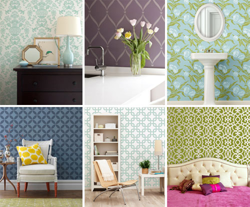
***This giveaway is no longer accepting entries – see who won below!***

Although only 3 will win free prints, everyone can score free shipping on Genuinely Yours orders before June 30th with code YHL2011FS. And according to random.org, our trio of winners are… Alicia (whose family all shares their mom’s dark eyes), Sondra (who feels like she gave birth to three exact clones of her husband) and Erica (whose first two kids have her eyes, but the third got daddy’s). Congrats ladies!

This giveaway combines some of our favorite things: silhouettes, colorful art, and family (if there were a ceramic animal or a map involved, our heads might explode). So needless to say, this prize from Etsy seller Genuinely Yours gets us going. She designs graphic prints that are customized to feature your family, your choice of color, and even your preferred language (good thing, since this prize goes anywhere in the world). So this week THREE of you can pick either her modern spin on the family tree or her silhouette-y take on the family portrait (she does couples too).

Note: We weren’t paid or perk’d for hosting this giveaway, we just like rewarding our lovely readers! See our Giveaway FAQs page for more info. Pics from Genuinely Yours.

  Leave a comment

My Little Ponies

First, let’s appreciate how fun My Little Ponies really were. I think I had this one (found here). And it was magical.

But in house-news-that’s-somewhat-related-to-the-throwback-above, after what feels like months (ok, it actually has been months) we’re finally ready to fill the empty wall space on either side of the sink nook in our bedroom with something.

And since I had fun making a little Pinterst inspired painting (but then resolutely decided that I didn’t want it to live in the bedroom)…

It was time for John and I to have a few long chats about what we really wanted to fill the empty space across from the bed (no pressure, we’ll just wake up every morning and see whatever’s hanging there). The unanimous choice: bold and kind of moody photographs. Beautiful photos, but not too soft and pretty- something semi contrasty and interesting and sophisticated. Since our bedroom chandelier is kind of playful and our duvet is pretty bright and fun, we figured we needed some art to balance things out and point the room towards “grown up” (so it doesn’t begin to skew towards “playroom-esque” or “dorm-ish”). So we decided to troll around online to see where we’d end up.

The winning subject? Why horses of course. You all know that I have an uncommon love of almost every type of animal (usually of the white ceramic variety, but I like them all “in real life” too). And ever since I saw a few fancy glossy mag rooms with giant horse art I’ve been itching for some of my own. And this recent house crashing adventure (which includes some giant horse art in the nursery of all places) was the proverbial straw that broke the camel’s horse’s back. So I let my fingers do the walking to a few online art print sources (including etsy.com, 20×200.com, art.com, allposters.com, etc) and found everything from racehorses and black beauties relaxing on a farm to some wild gorgeous ponies in motion and even a charming serene horseback rider on a moody beckoning beach. And in case you can’t tell which of those descriptions I was most partial to, it was the last two (found here and here, both by the amazingly talented Jan Lakey):

John definitely has a voice when it comes to art selection, so he felt strongly that the photos shouldn’t be “too energetic” and should be “a little calming and scenic” since it is our bedroom after all (you know, where we sleep). With this in mind, I figured the moody horse-on-the-beach shot would probably go over well, but I did worry that the blurry motion-happy horses might strike the hubby as too high energy. So I pulled out one of the tricks John laid out here (in an old post of yore about getting your hubby on board with a decorating decision that he might not be as thrilled about as you are) and figured the best way to sell him on my two favorite print picks would be to photoshop them into our room. That way he’d have a nice clear idea of what it would look like and I could hopefully soothe any worries that it’ll feel too chaotic or anything but sophisticated-and-a-little-moody-but-restful-and-serene-at-the-same-time. My quick little photoshop mock-up ended up looking a little something like this (ignore the “progress” label on the pic, I just used one from our House Tour page):

Of course that’s not how they’ll look fo’ real, but it made it a bit easier to picture how they might layer into the room. We both agreed that the room needed a nice slap of sophistication and contrast, so it wasn’t like we were looking for something pastel or blown out like a big cloudy sky or a gorgeous sandy beach. As I mentioned, we kind of thought the wacky Ikea fixture and the in-yo-face bedding needed something a little bold and contrasty and sort of chic (not that John would ever use that word). We also thought that something with some subtle gold undertones would relate to the curtains and the gold leaves in the bedding without looking downright matchy-matchy (like oil paintings or abstracts with that color might). And after I mocked everything up I was so so so sold.

Oh but you’re probably wondering what John thought. Just as I suspected, he loved the print on the right immediately. But then he did this pause thing when he looked at the one on the left which definitely freaked me out. But a second later he said “I like them.” Not one mention of the worry that the moving horses would feel too crazy or anything. And he said that he liked how the prints obviously weren’t a matched set but worked really nicely together. Just like that, he was so so so sold too. Oh sweet photoshop, how do I ever thank you for making things that could be five day heated arguments debates into two minute “I’m down” convos? Perhaps with this video of a dog saying I love you? This goes out to you photoshop:

Of course as far as art selection goes, it’s definitely one of those personal things. These horse prints surely won’t be everyone’s jam (and maybe not anyone else’s), but they’re ours and we can’t wait to get ‘em. We’re having a lot more fun taking risks in this house. Even if it means doing things that might not have mass appeal – as long as something speaks strongly to us, we’re in. There’s actually freedom in letting go of the notion that your house should please everyone who walks in the door. It allows you be more true to yourself and your place starts to feel more special. Plus it means that your rooms won’t be in danger of looking like everyone else’s, which isn’t a bad thing either.

Now for the cost. Big a$$ prints (the ones that we ordered were over three feet wide at 40″ x 30″) can easily run you around $100+, but these two happened to be priced at a cool $49 a pop. And thanks to googling around for a coupon code to save me 22% off my entire order (it was “ZOLA” if you’re wondering, hope it still works), I scored both of them for a total of $77.98 (down from $100 for the pair) and paid just $5.98 for shipping, for a grand total of $83.96 spent. Which isn’t bad for over six feet of giant photography (printing our own photos that large with a local printer would probably cost us more).

But giant frames are expensive, so how do we plan to avoid paying another 200 beans for two 40 x 30″ frames? By mounting the prints on 40 x 30″ canvases that I got a while back on super clearance from Michael’s with those two bedroom wall areas in mind (we even taped off the wall first to figure out what size tickled our fancy):

They were only $23 each after 50% off with another 25% off on top of that (we mentioned ‘em at the end of this post a while back). In fact it was such a great deal that after we drove these two home I went back for a third for the entryway – which is the one that I painted here.

But back to the two I got for the bedroom – it means that we’ll have spent around $64 for each giant piece of photographic bedroom art when it’s all said and done (including the canvas and the art). Which isn’t bad when you consider that many printed canvases of that size sold by places like Ballard Designs or Pottery Barn are in the $200-300+ range (each).

After I spray mount (or somehow glue) each print onto one of our 40 x 30″ canvases, I might even cover them with matte Mod Podge for a more dimensional printed canvas look. Not sure how it’ll all go down yet – but you know I’ll share the details when I get there. Should be interesting. Hope I don’t blow it. Then I’m out $64 bucks a pop. Haha. More details when they arrive and are (hopefully) hung up nice and purty.

Psst- John and I watched the most incredible documentary last night called Catfish. We’re still talking about it. Definitely a must-see. It’ll make you wonder how well you know anyone online- including us. Hah.

  Leave a comment

The Clara Photo Project Continues… Sorta

Clara’s first birthday last Saturday made for a natural conclusion to 52 weeks of fabric-filled photo-y goodness (click here to see ‘em larger).

But we’re going to keep going. Kind of. Before we move on to that though, let’s talk about the last photo-filled year.

We’re just as surprised as anyone that we managed to maintain our weekly ritual fifty-two times in a row. In fact, today is the first Friday in 12 months that we haven’t busted out the camera, a yard of discount fabric, and a white-onesied Clara, and then used Photoshop to add the week number to her onesie after the fact. It’s kinda sad in a way. But just looking at all of the photos that we captured of our growing bean cheers us up pretty quickly. And it really surprised and flattered us to hear from many of you who were doing your own version of the project with fabric and photoshop too. The craziest thing about our weekly photo session is that our project actually got featured in a book about photographing kids: Mamarazzi, by Stacy Wasmuth. Yeah, we’re kind of in shock. And the grandparents went freaking crazy (“our grandbaby is famous!”).

And of course there were all of the sentimental items that the project spawned around here – like the bound photos books that we’ve ordered for ourselves and the grandparents (more on those when they arrive), the photo display that we created at Clara’s party

… and the items that Sherry sewed out of the leftover fabric – like her birthday banner and quilt:

For any of you who have considering starting (or are in the midst of) a similar project of your own, we thought it might be helpful to toss up this link back to the original “making of” post for a look at how we took and edited the pictures. Though we should add one piece of advice that didn’t become clear to us until recently: your baby won’t be a motionless blob forever!

In the early weeks many of you said “I can’t wait to see what you do once she starts moving around!” At the time we wondered how hard it could be to keep the bean on her back. Heck our biggest challenge was getting her to move enough to make the picture somewhat interesting in the early days (“oooh, that burp looked like a smile!”). But as you can see from many of our recent pictures, of course it was harder than we originally thought. Once those rolling / crawling / pulling up skills kicked in, let’s just say that Clara had little interest in waiting patiently for me to white balance. These last few photo sessions could be subtitled as “how many parents and objects are needed to block a baby from crawling off a daybed while singing and waving your arms around frantically?” The answer: a lot.

We did find that giving her an object to hold (aka: to distract her) helped make her less wiggly – like the carrot in her Easter photo (week #49). So part of us wished we had included an object from the beginning – even if for the first few weeks it just laid by her side. Plus, if we had used the same object throughout there would be a clearer reference for scale.

The only object that was consistent in our pics was her onesie, but that wasn’t the clearest way to show off her growth. In fact, it almost looked like she got smaller when we switched from a (tight at the time) 0-3 month size to a (loose at the time) 6 month one for her 14 week picture.

Because of that hiccup we actually squeezed her into that some 6 month onesie for the rest of the project (don’t worry, it stretched enough that she was plenty comfortable). The irony is that she’s such a tall glass of water that some 18-24 month pants are too short for her, but miraculously the onesie just stretched to fit her the whole time.

So even though there are a few things we might’ve done differently (someone suggested starting her in a 12 month onesie from the beginning so we could watch her gradually fill it out), we’ve got no regrets. We’re just turning those lessons learned into “adjustments” for the next year. So without further ado, here’s the beginning of year #2.

We were really excited to use the fabric that we designed on Spoonflower for this shot. As for what’s different, allow me to point out the obvious (or maybe not-so-obvious):

So that’s the new plan. We’re excited to continue the project in some form, while letting the first year stand alone as a complete and finished set of pictures. We’d hate to “ruin” what we started by trying to keep weeklies going and then abruptly fall of the wagon somewhere randomly around week 71 or something. Plus, if taking these sitting pictures turns out to be easier, maybe baby #2 will get this treatment from the start (or an entirely new photo project concept – who knows).

And yes that’s green painter’s tape holding the fabric in place. Would you expect anything less from us?

Psst- We announced this week’s giveaway winner. Click here to see if it’s you.

  Leave a comment

Somebody Get Me A Beret

What is it about painting that makes me feel all frenchified and beret-worthy? Anyway, I finally got around to painting one of the giant (and deeply discounted) 40 x 30″ canvases that we scored for $23 from Michael’s thanks to 50% off with an additional 25% off on top of that (more details about how that happened at the end of this post). Ever since discovering this inspirational poster design from here (thanks to my good friend Pinterest) I knew I wanted to adapt it a bit. You know, go wide instead of vertical and have some fun with a few $2 paint samples from Lowe’s (total spent on paint: $9 for three pots which I then mixed with white craft paint that I had on hand to create a ton of different tints of the same few hues).

First I used a yardstick to space out equal vertical lines (I just used the width of the yardstick itself to keep things even) which I drew with a pencil:

Then I used the corner of a little card that we got in the mail (from an oil-change place) to create those angled peaks to mimic the prism-like shapes from my inspiration.

Then I just filled each shape in with a variety of shades of blue and green (all derived from the three test pots of paint from Lowe’s and some white craft paint to make some of the shapes lighter). As for the specific paint colors, I used testers of Tropical Waters, Embellished Blue, and Thermal Spring by Behr. Here was what I was left with at first:

It was fun and kind of high-energy, but the contrast was a little too much for me. So my foray into painting reminded me why I love painting so much: you can always paint right over it. So I mixed up a much lighter shade of greeny-gray and went over all of the darker green parts for a much more subtle tone-on-tone effect. I ended up here:

I love the imperfect lines and painterly brush strokes and the varied shades of the same few tones. The only thing I don’t like is the location. It just doesn’t feel right in our bedroom since the walls are a similar shade (and we thought the tone on tone look of the art might layer in nicely but it’s feeling a bit too monotone-ish and blah for us). So we’re thinking we might hang it in the dining room once we have a nice big buffet or console to go under it near the front entryway. Or it might end up somewhere else entirely. Just not on a soft blue-green wall. I guess I just like tone on tone art that’s not also on a wall of that tone. Go figure.

I went into this project expecting it to take an evening or two and it actually took a while longer (maybe four or five two-hour sessions) but in the end I almost didn’t want it to end. It’s just fun to paint again. Maybe I’ll tackle something else soon. I hope so. Have you guys painted any canvases recently? It totally took me back to my high school and college days (I took every art class my high school offered and then went off to art school in NYC for college- where I somehow ended up with a BFA in Advertising Design). Although using the paint pots from Lowe’s definitely made me smile since I’m used to paying five million dollars for oil paint (ok, that’s an exaggeration, but it wasn’t always cheap for a broke college kid).

And speaking of art school, that’s where a drawing professor of mine dubbed me “the narrator of life.” Apparently I’d just sketch and jabber on about everything as it happened (ex: “oops, I dropped my charcoal” or “now for the foreground” or “yikes, it’s noon already”). I sound really annoying right? Thankfully most of it was under my breath. My teacher had to lean in and ask what I was saying, which prompted me to realize that I was actually saying things out loud (I was in the zone, I knew not what I did). That “narrator of life” nickname embarrassed me at the time, but now I find it hilarious that my actual profession is essentially to narrate my life. Who would’ve thought. Maybe I should hunt down that professor (on Facebook?) and tell him where I ended up. Just don’t tell him I used house paint instead of oil paint. Scandalous.

  Leave a comment

The Ones That Got Away

Well, it’s more like they’re in the act of getting away. Because they’re still readily available so it’s not like they got away yet. But they will. And I’ll be sad. And then I’ll get over it.

The fact is that I’m obsessed with these West Elm curtains (in oregano/clay) for the living room and the sliders in the adjoining hallway with the balcony that leads to nowhere (seen here).

The reason I want the same set of curtains for the slider in the hallway as well as the sliders in the living room and the big window in there is just because the hallway is so open to the living room and vice-versa (so I think it’ll tie everything together in a nice way). You can see what I mean in this old house tour video (even if you mute it at work you should get the idea).

And these curtains used to be waaay out of my budget at a whopping $512 for eight panels (I want two for each of the three sliders and the window). But they recently went on sale for $49 a panel, which took them down to $392 for eight panels.

With free shipping to boot.

But alas. We’re still too cheap to spend almost $400 on curtains. Oh man but I can just picture them in here (I’m writing this post from my little chaise lounge and squinting at the sliders and I can totally see them). I think they’d add two things that the room desperately needs: sophistication and softness – all without being too bright and crazy (since the big green shag rug has that covered).

Oh well, if I really can’t forget them maybe I’ll hunt down some affordable fabric and try to stamp it with fabric paint and a stencil to create a similar look. Or I’ll just find something else entirely to obsess over (which is likely- I’m an all over the place kinda person). I bet by the time you’re reading this I’m already well on my way to my next curtain crush.

I guess it’s kind of a good thing that I can fall hard for something but if it’s not in the budget I can bounce right along. I’m a rebound shopper. On to the next thing. We do have a trip planned to one of our favorite fabric stores (it’s about five hours away) in a few weeks. So maybe I’ll just wait for that and cross my fingers that I find something perfect there. Either way I’m convinced that curtains will completely change the entire vibe of the living room (along with upgrading our media cabinet to something heftier and aged to balance the giant honking console table that we built on the other side of the room).

So I guess it’s fitting that curtains are taking us a while since I think they’re going to be such room-makers. I’m not even a betting woman but I’d bet $1 (what? we’ve already established that I’m cheap) that curtains will make more of a difference than paint in this room. Even though we painted the dark trim, which can be pretty dramatic. I just think that hanging the perfect curtains high and wide on the window and the sliders will kill it. And I can’t friggin wait. Oh perfect curtains (or fabric) – come to me. I will love you forever and whisper sweet nothings to you every night. You think I’m kidding but I’m not.

UPDATE: Just heard from two people who got these that they’re brown and even a little blue-ish (and not as gray and green as they look in the West Elm photos) which isn’t what I’m looking for with our soft gray walls. So in the end it looks like they weren’t meant to be after all. On to the next ones…

  Leave a comment