Archive for February, 2010
Reader Redesign: Tile For Miles
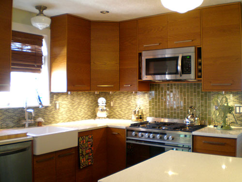
When Amanda and her husband Ken sent over the amazing before and after photos of their kitchen, let’s just say our mouths literally watered. Here’s their letter:
I really enjoy your blog and your knitty-gritty do-it-yourself attitude, so I thought you might be interested in our own kitchen remodel. We live in a little brick house in St. Louis, built in the 1930′s. The kitchen had been redone in the 70′s and the cabinets were kinda shoddy- plus, we needed A LOT more storage. Last summer we took the plunge and decided to tackle it. My husband and I are both graphic designers and very particular about design but the room came together so smoothly, with very little head-butting. The cabinets are IKEA and go all the way to the ceiling to add much needed storage. The wall with the new island was previously empty, so those 12 inch deep cabinets almost double our availability. We also widened the “nook” where the fridge is by two inches to squeeze in an actual pantry. We hired a friend to do the electric, my brother installed the floor and the tile backsplash, and the counters were professionally done but everything else is our own doing! We had NEVER done a project of this scale. Not bad for learning on the fly, right? It adds so much value to our home and we enjoy every minute of using it. Hope you like it! -Amanda and Ken
Here’s their kitchen before the major overhaul:


And here’s the same space after they worked their makeover magic:


Can you believe that upgrade? Amazing. We love how they maximized every inch of space with ideas like building in that pantry near the fridge and adding that island (flanked by even more built-ins) to extend their workspace. This kitchen just goes to show that if you put a lot of thought into optimizing the space that you have you can end up with about 100 times more function and available stash space without sacrificing an ounce of beauty. Oh and here’s a handy little source list from Amanda & Ken:
- Cabinets and island table: IKEA
- Flooring: BR111 from Lowes
- Lights: Schoolhouse Electric (we live behind a school so we thought it appropriate)
- Appliances: Fisher & Paykel range, LG microwave, dishwasher and fridge
- Counters: HanStone quartz in Swan Cotton
- Backsplash: Glass Blox
So what do you guys think? Didn’t they do a fantastic job selecting those luxe looking finishes and layering both function and form into a formerly blah kitchen? We love that they were able to come together to create something they both adore while doing a lot of the work with their own four hands. And of course we’re obsessed with that gorgeous backsplash of theirs. Yes please.
Burning Question: Got Any Burning Questions?
We’ve loved getting your read on quite a few surprisingly controversial subjects over the years (from whether you prefer wood or carpeted floors in the bedroom to which way you like to dispense your toilet paper):

Some topics elicited way more responses than we ever thought possible (like this chatter about how early is too early to decorate for the holidays). While others got unexpectedly heated (who knew there were such strongly opposing views when it came to being pro or anti cul-de-sac?).

So now our big question is: got any more questions?
It’s not really that we’re “out” per se. There are always about a million things to ask, from what upholstery fabric you prefer (velvet? chenille? microfiber? duck?) to whether you like sofas or sectionals better (and why). But we thought it was about time that we asked you guys what big important home-related conundrums are plaguing you so we could officially add them to our roster of Burning Questions.
So what say you our curious readers? Is anyone out there dying to discuss the pros and cons of slate roofing vs. metal or asphalt ones? Anyone else wondering if a wood deck or a stone patio is more popular among our bevy of opinionated readers? Just comment on this post with any and all home or decor related burning questions (general ones where everyone can chime in, like “this vs. that”- nothing too personal to your house or your sitch) and we’ll do our best to address as many as we can moving forward. Sounds like a good time, eh?
First image courtesy of Toothpaste For Dinner, second image from Google Maps (it’s actually my childhood subdivision).
Look & Learn: Pendant Lamps & Pops Of Color
We’re introducing a new feature here at YHL called Look & Learn, and it’s all about taking an inspiration room and trying to figure out how and why it works. Because admiring a beautiful space is always fun, but figuring out what elements and ideas can actually be borrowed or adapted for your very own casa (preferably on the cheap) is the icing on the cake. First we’ll take this gorgeous office/lounge by Sarah Richardson (one of my hands down favorite designers who’s right up there with Candice Olson and Nate Berkus):

The first thing you’ll probably notice is that the background (rug, sofa, desk, etc) is very light and neutral. Except for a few dark furniture legs and a small end table in a nice ebony finish (which add a pretty dash of contrast and interest) the whole room almost feels like a fluffy cream cloud. And no, this room probably wouldn’t survive three dogs and five kids with red Sharpies, but a few adaptations could really make it more pup/child-friendly (like a washable slipcovered sofa and a durable berber carpet that’s a tad darker). But the neutral background is less intriguing to us than the two touches that Sarah added to amp up the entire space:
- A large statement-making drum pendant (it’s like a stunning metallic sculpture in the room)
- Cheerful pops of punchy yellow (in the curtains, accent pillows and even the spine of one of the hardcover books on the coffee table)
The takeaway: any room with a subdued neutral base can definitely be transformed from blah to brilliant with a large look-at-me pendant light (even one from a thrift store that you spray paint) and some brightly colored curtains & throw pillows in a happy shade like sunshine yellow. Picture that room with white curtains and a white flush mount ceiling fixture. Yawn, right? I mean it wouldn’t be ugly but it wouldn’t be nearly as happy slash inviting slash charming as it is with those printed curtains, a few yellow throw pillows and that gorgeous metal pendant (it’s really like jewelry for the room).
So even if you don’t have much money you can probably find some discount fabric and use this tutorial to make no sew curtains and hunt down some sort of pendant on eBay, Craigslist, or even from a garage sale (and perhaps even go as far as to spray paint it a rich hammered gold tone). That’s a pretty straighforward to-do list for anyone with a basic neutral room that they’re looking to spiff up on a dime, right? We loved the simplicity of the single accent color idea (how easy is that?) and the DIY-worthy appeal (seriously, anyone can implement this plan to upgrade their space with a quick pillow, curtain, and light switcheroo).
Now let’s take a look at this cozy (and seemingly much more kid/dog friendly) space that we spotted a while back on A Life’s Design:

Again we’ll notice that the background is very neutral. White walls, a cream sofa, a sand colored rug, and a light woven ottoman add up to another airy and simple looking “base.” But it’s easy to see what really makes the room- and it’s surprisingly similar to the list that we came up with for our first inspiration image:
- A large statement-making drum pendant (this one’s even more oversized and full of natural texture like the ottoman and rug)
- Cheerful pops of punchy orange (in the art, accent pillows, throw and even the oranges on the ottoman)
Isn’t that funny? It’s almost as if it’s now an official formula. Any neutral room + some pops of one punchy accent color + a large pendant light = a cheerful and inviting space that feels polished and welcoming. So again, anyone with a relatively low-contrast room can adapt this idea for their very own home (it doesn’t matter if your walls, sofa and rug are varying shades of white, tan, mocha, gray, cream, etc- as long as they’re all generally similar in tone when you squint your eyes and look at the room from afar).
Just pick up some brightly colored pillows and maybe a throw for the sofa (we love TJ Maxx, Target, Home Goods, Marshall’s and Bed Bath & Beyond for chic yet cheap-o throw pillows) and you’re well on your way. Then introducing the big pendant light will add to the entire room’s posh-factor (check out how we upgraded a bare ceiling bulb with a $25 linen-like lamp shade right here) and bringing in a bit more of your accent color in everything from small scale art to fruit in a bowl on the coffee table should finish things off nicely (think of that last step as extra credit).
So that’s our first installment of Look & Learn. What do you guys think? Do you like the idea of taking inspiration rooms apart to see what really makes them tick (and hopefully adapting some ideas for your very own home on the cheap?). And while we’re on the subject of surprising room formulas that really seem to work, do you have any fail-safe decorating equations that you follow when it comes to adding style and interest to your casa? Spill it.
Psst- Looking for more decorating help? Check out our How To page and scroll down to the “Decorating Lessons” category to see tons of tutorials about everything from picking the right rug and sleuthing out the best window treatments to avoiding matchy-matchy syndrome and decorating an apartment or dorm.
Housewears Freebie Winners!
The response to this week’s giveaway from Lisa Leonard Designs sure makes one thing clear: you guys enjoy decorating your necklines just as much as your interiors (not that I should be surprised, considering Sherry’s natural instinct to be distracted by shiny things). And even if jewelry isn’t your thing, Lisa Leonard’s got your house covered with items like this pewter heart wall hanging (which practically screams “instant family heirloom”).
Oh, and to help you end February with a bang some bling, Lisa’s offering a special 20% off discount through Sunday, Feb 28th. Just enter “younghouse” at checkout and you’ll be one step closer to wearing your heart (or a frame, a chandelier, a key…) around your neck.
But let’s get down to the business of our winners. The two lucky ladies who were hand picked by random.org for an $100 gift certificate to Lisa Leonard Designs are: Hil (who loves her hot, knee-high boots despite them being unrelated to decor) and Shannon (who’s gonna make a pillow out of an old dress as soon as her sewing skills kick in). Congrats!
And if you didn’t win this week, there’s always this coming Monday when we’ll be marching in with another giveaway that provides a surprising solution for updating a few tired items in your house (no tricks up your sleeve required).
Find more freebie info on our Giveaway FAQs page. Pics courtesy of Lisa Leonard Designs.
Reader Redesign: Pop The Cork
When Emily emailed us with a great textural and natural DIY project we had to share the goods. Here’s her letter:
I really REALLY enjoy reading your blog. I’m totally hooked on it- you have so many GREAT and accomplishable ideas. I’m constantly inspired by the things that you guys create and recently I completed one of my own DIY projects: a wine cork bulletin board. It was a simple project but really rewarding. You can check out the full story here on my blog, but I wanted to share the photos with you and let you know how inspiring you are to me everyday (from painting a wall to traveling around the country with your little furbaby). Thank you very much. –Emily
Isn’t she sweet? We’re blushing over here. But on to the eye candy. First Emily used inexpensive old frames that she already had laying around:

And she painted them black just in case any of the background showed through after she glued the corks in place:

Here she is gluing everything down with a glue gun:

And here’s the gorgeous grid of DIY cork boards that Emily ended up with (on a serious budget to boot):


Didn’t she do a great job? We’re no strangers to having corks around the house for texture and a splash of natural interest so we especially love what she did because it would fit right into our home. How about you guys? Is there anyone else out there who’s thinking of trying their hand at a cork bulletin board after seeing Emily’s fantastic finished product? Tell us all about it.
Psst- Wanna see one two of our favorite cork-decorating ideas? Here’s a super speedy table setting where old collected wine corks are the star and here’s a quick and easy in-cabinet cork board that we whipped up for some great kitchen organization on a dime.


